5

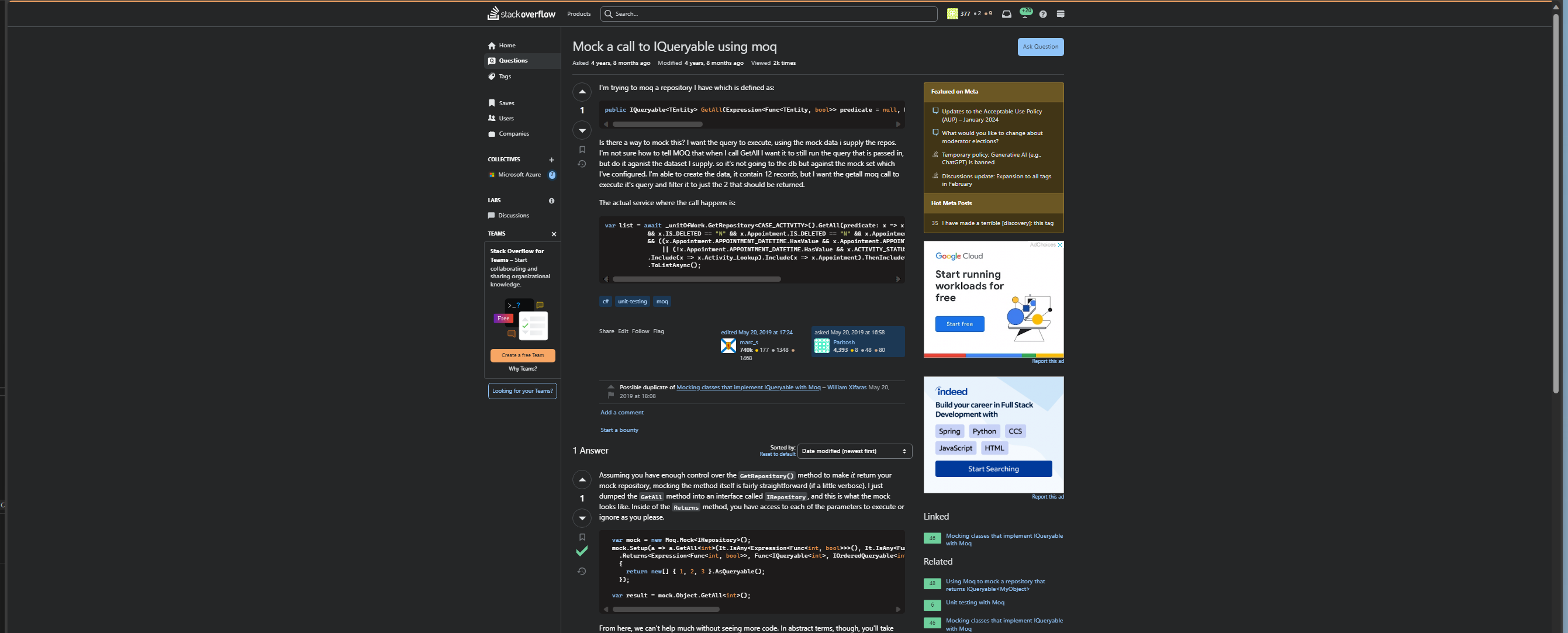
It always bothers me when I see code snippets, like in the screenshot below, with a horizontal scrollbar when the content area of the site could use so much more space.

Could it be time to update the site layout to be more responsive to wider screens? Not a single developer on my team isn't using a screen that isn't at least 2560 pixels wide. I appreciate that I may be in a bubble and this isn't the norm, but a site designed for 1280 pixels seems antiquated.

Enter image description here

18
  • 2
    Does this answer your question? Please make an option to have post width responsive Commented Feb 1 at 6:23
  • 3
    There’s also a lot more reading material if you put site:meta.stackoverflow.com widescreen into your favourite search engine. Even if you consider that the situation has changed, please edit your question to at least discuss why the main points no longer apply. Commented Feb 1 at 6:26
  • 12
    Not sure if you considered it, but the issue with the code on that screenshot isn't that the site is not wide enough. The issue is the way the code is written and even if it's fully visible horizontally, it'd be hard to read because it chains more and more operations horizontally. If it was edited to chain vertically it'd be vastly clear (you can read in a single pass in a single direction) and it wouldn't even need scrolling. Compare how this looks - the same code but aligned to not chain horizontally.
    – VLAZ
    Commented Feb 1 at 6:58
  • 3
    There is no point in posting these kind of things on meta. None of us have the power to do anything about it (well... maybe people who are really good with browser extensions might but then it becomes more of a programming problem). Site design changes are done entirely behind the scenes and generally we're informed a minute after they're rolled out, not a moment sooner. Out of our hands, so keep it out of your mind as well for your own sake.
    – Gimby
    Commented Feb 1 at 8:39
  • 1
    "generally we're informed a minute after they're rolled out" or often enough, more than that. After we've had several questions and bug reports related to the release which nobody even expected.
    – VLAZ
    Commented Feb 1 at 11:07
  • 5
    All that open space that could be used for ads,
    – Kevin B
    Commented Feb 1 at 16:32
  • 4
    Availability of large, high-resolution displays does not make long lines of text any more readable.
    – Dan Mašek
    Commented Feb 1 at 17:42
  • 2
    fwiw, the majority of my SO browsing happens on an 18” monitor that the site fits perfectly within when the left sidebar is disabled, or mobile. Not saying the site shouldn’t be more responsive and support larger screen sizes, but don’t forget those that aren’t using them
    – Kevin B
    Commented Feb 1 at 18:32
  • 1
    @DanMašek While that's true, in what situations would the user be unable to adjust their viewport to a narrower width? If the site was fully responsive, wouldn't nearly all visitors be able to adjust their view of the site to the width that works best for them at that time? Right now, users can't, without userscripts or editing the page/CSS, make the view larger, even though they would prefer it and they feel it would make things better for them at the time. Currently, the site imposes an opinion as to what the widest width should be, rather than letting people choose.
    – Makyen Mod
    Commented Feb 1 at 23:49
  • 2
    I don't think anyone has said "let's force the page to be wider for everyone, all the time". I believe all, or the vast majority of, requests like this one have been "let people choose a wider view when they want to".
    – Makyen Mod
    Commented Feb 1 at 23:51
  • 7
    status-planned!? I eat my humble pie then. I am kind of flabbergasted actually.
    – Gimby
    Commented Feb 2 at 0:03
  • 1
    @Makyen Per-User width only works if width is a setting preference, not implied by the browser width which also has to accommodate other sites. The latter is what responsive design provides, and that has been what requests often ask for - including this one. Commented Feb 2 at 4:27
  • 2
    @MisterMiyagi I wasn't talking about having a set width per user, but allowing the user to select the width by selecting their window/viewport width, which is one of the benefits of a design that's fully responsive. Yes, obviously, if the user chooses to use that same viewport for a different site, then they need to either let the viewport size which they are currently using be used for that other site or choose to change the viewport size. The point is allowing the user the control over their display, rather than presuming that someone other than that user knows what's best for them.
    – Makyen Mod
    Commented Feb 2 at 4:48
  • 3
    @Makyen I'm aware of what you were talking about. My point is that using the browser width to imply site width also doesn’t equal letting the user choose. Unconstrained responsive design would be forcing the page to be wider for a lot of people, all the time. Commented Feb 2 at 5:15
  • 2
    Admittedly, perhaps I am just being paranoid from seeing status-planned and "This is something we (ux) have been thinking about." on a question that was just unilaterally promoted to "the request" by removing its link to previous discussion and stance going in the opposite direction. Commented Feb 2 at 6:59

2 Answers 2

16

I agree. This is something we (ux) have been thinking about. We have a meta post planned that goes into more details about our plans regarding site width in a couple weeks.

8
  • 15
    Wow. That sounds like a reversal of a decade, or so, of adamant refusals on this issue. I'm interested in seeing what y'all have been thinking about and what caused the change in position.
    – Makyen Mod
    Commented Feb 1 at 18:14
  • 3
    @Makyen 10 years ago the site wasn't responsive. The fact that we can respond to anyone's screen size now is very helpful. I will say that some folks have very valid points about line length and readability, so a quick spoiler that the site will not span the entire width of the screen.
    – Piper StaffMod
    Commented Feb 1 at 21:43
  • 4
    Piper, I appreciate y'all working on this. It will be helpful to a lot of people. The limited-to-narrower responsiveness the site has had since 2018 is greatly helpful to a lot of people, particularly on mobile devices. I don't want to take away from the work that all of you have done and are doing. It's a lot of work. I know how much work it is, because I wrote a userscript to add full responsiveness to SE/SO back in 2017 into 2018, just prior to the announcement that the company was working on it in early 2018, and, yeah, it's quite a bit of work (and the company did it a much harder way).
    – Makyen Mod
    Commented Feb 1 at 23:03
  • 7
    However, my saying a decade is accurate. Wider was requested at least by 2009 and explicitly declined since at least 2013, with responses on various FRs over time that SO refused to be wider, because the company felt users must be prevented from making text lines long enough to reduce readability. [Note: the FR linked above was for wider responsiveness, but was inaccurately marked as completed with the 2018 "responsiveness", which did not permit wider views].
    – Makyen Mod
    Commented Feb 1 at 23:03
  • 2
    Woaw!, good news...! Humm funny to see that the Qt went from -4 to +3 in a few hours after getting status-review + status-planned from Staff... (I was probably the only UV'er (on the Qt) before...) // Been using the 'SO Wider Mode' UserScript from @samliew since a few years (on FF[v56-v122] + 'GreaseMonkey'/'Tampermonkey', works just perfect... (Maybe "useful" for Devs to have a look at it, as it already tackles all aspects of Screen-Width on all 'SO'-Pages... :idea: )
    – chivracq
    Commented Feb 2 at 2:44
  • 2
    Please keep in mind that allowing it to resize to the full width available might not be a good idea. Too wide content is harder to read. Commented Feb 6 at 11:03
  • @MarkRotteveel Please see my comment above
    – Piper StaffMod
    Commented Feb 7 at 15:00
  • Link to that "meta post"...? MSO or MSE...? This Answer was posted in Feb 2024, "in a couple [of] weeks" = March or April 2024, now end of August 2024, 7 months later, I didn't see any Announcement in those 7 months about enlarging the Viewport horizontally..., nor did I notice any difference in UI-behaviour in that time..., but I use a Userscript... (Except Tags being vertically truncated in the 'Staging Ground' because Mobile Users ore more important than Desktop/Laptop Users...)
    – chivracq
    Commented Aug 29 at 21:39
-1

You can use a UserScript to edit the StackOverflow web page and increase the width of the main content:

  • Install the Tampermonkey browser extension, for either Google Chrome or Mozilla Firefox.
  • Login to StackOverflow with your account and enable Settings ➔ Interface ➔ Hide left navigation.
  • In the Tampermonkey dashboard, create a new UserScript with the following code (including all the comment lines):
// ==UserScript==
// @name         StackOverflow larger width layout
// @namespace    stackoverflow_larger_width
// @version      1
// @description  StackOverflow larger width layout
// @author       Author
// @match        https://*.stackoverflow.com/*
// @match        https://*.serverfault.com/*
// @match        https://*.superuser.com/*
// @match        https://*.askubuntu.com/*
// @match        https://*.mathoverflow.net/*
// @match        https://*.stackapps.com/*
// @match        https://*.stackexchange.com/*
// @match        https://stackoverflowteams.com/*
// @match        https://*.web.archive.org/web/*/https://stackoverflow.com/*
// @match        http://*.web.archive.org/web/*/https://stackoverflow.com/*
// @grant        none
// ==/UserScript==

/**
 * Use this to change the CSS style of elements in a web page.
 * Use Firefox -> Tools -> Web Developer -> Inspector; or
 * Google Chrome -> View -> Developer -> Developer Tools -> Inspector,
 * to see these CSS elements. Sources and help guides:
 * https://somethingididnotknow.wordpress.com/2013/07/01/change-page-styles-with-greasemonkeytampermonkey/
 * https://stackoverflow.com/questions/19385698/how-to-change-a-class-css-with-a-greasemonkey-script
 */
function addGlobalStyle(css)
{
    var head, style;
    head = document.getElementsByTagName('head')[0];
    if (!head) { return; }
    style = document.createElement('style');
    style.type = 'text/css';
    style.innerHTML = css;
    head.appendChild(style);
}

// ===== Increase the area of the page content (Also applies to mobile responsive view) =======

addGlobalStyle('#content { padding: 10px !important; max-width: 1400px }'); // Originals: padding was 24px, max-width was 1100px
addGlobalStyle('html.html__unpinned-leftnav body > .container { max-width: 1400px; }'); // Original: max-width was 1100px
addGlobalStyle('#mainbar { width: 76%; }'); // Original: calc(100% - 300px - 24px);
addGlobalStyle('#sidebar { width: 21%; }'); // Right sidebar. Original size: 300px
  • Enable the UserScript and reload the page.

Then you will see width of the main column has increased. Here is a before and after comparison for the page Mock a call to IQueryable using moq , using a browser window width of 1920 pixels.
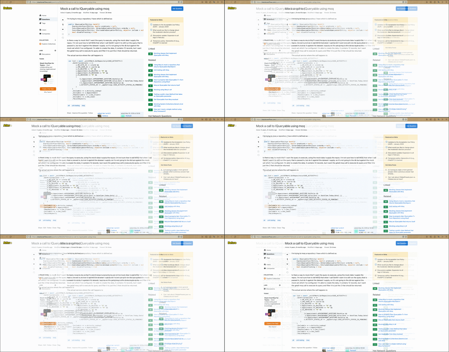
Before and After screenshot comparison, animated GIF

As mentioned by User chivacq's comment, other people have also created similar UserScripts, like these: https://github.com/samliew/SO-mod-userscripts?tab=readme-ov-file#stack-exchange-wider-mode
1
  • 2
    FYI: Most/all userscript managers have GM_addStyle(css) (everything except Greasemonkey) and/or GM.setValue (Greasemonkey) as a built in method of adding CSS. Even those are a bit superfluous, as (document.head || document.documentElement).insertAdjacentHTML('beforeend', `<style type="text/css" id="my-unique-id-for-this-scripts-CSS-so-it-can-be-found-easily">/*The CSS being added for my userscript, including any comments*/</style>`); can be used directly and allows you to format your added CSS in a readable manner.
    – Makyen Mod
    Commented Feb 7 at 20:05

You must log in to answer this question.

Not the answer you're looking for? Browse other questions tagged .