-1

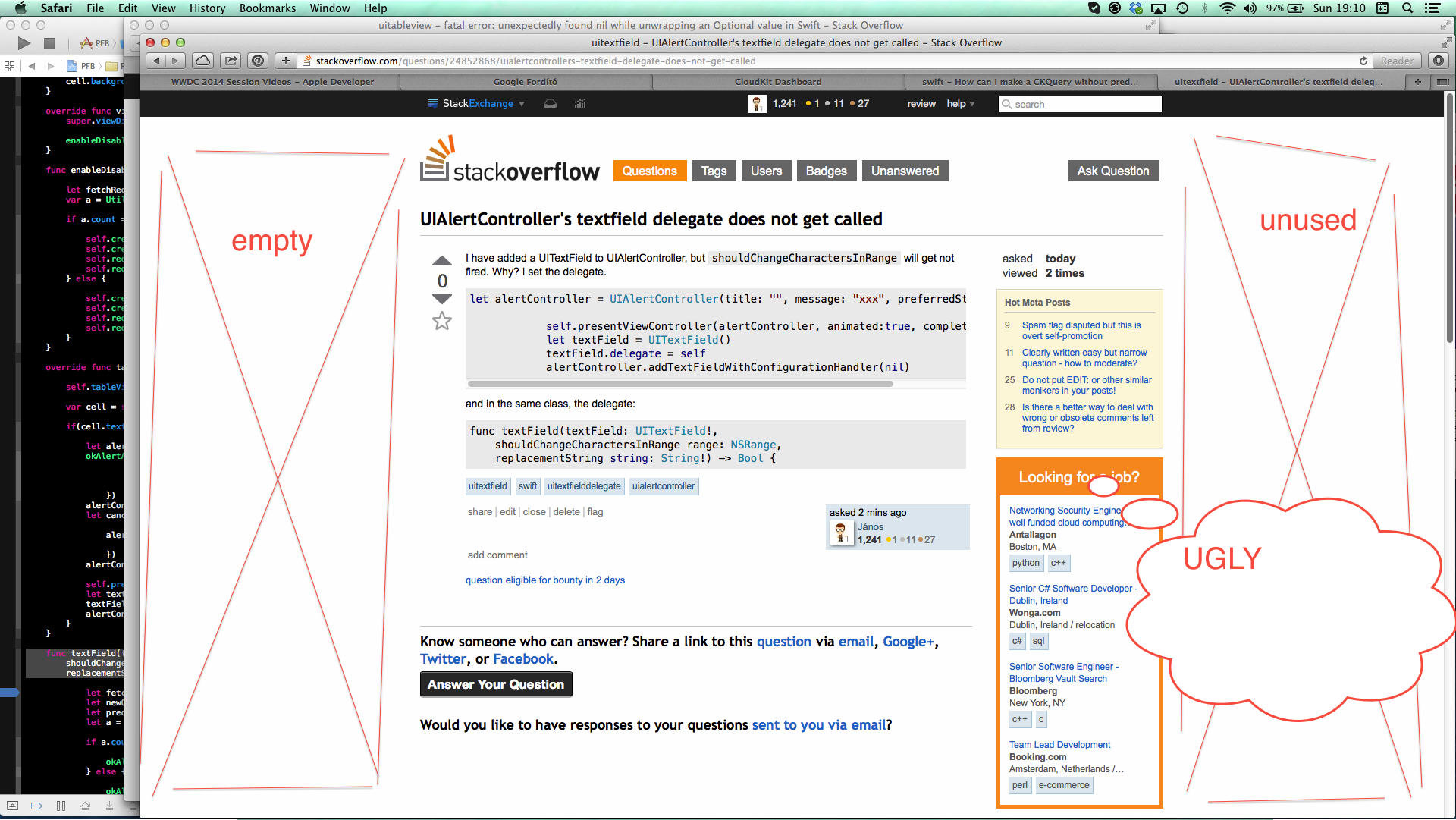
It is really annoying that stackoverflow's website is not optimized to big screen - my screen is 29 inch wide - all the left and right side is unused, empty, and in the same time question / answer textfield / view is small, can not see long code lines. You can see the overall look down here:

enter image description here

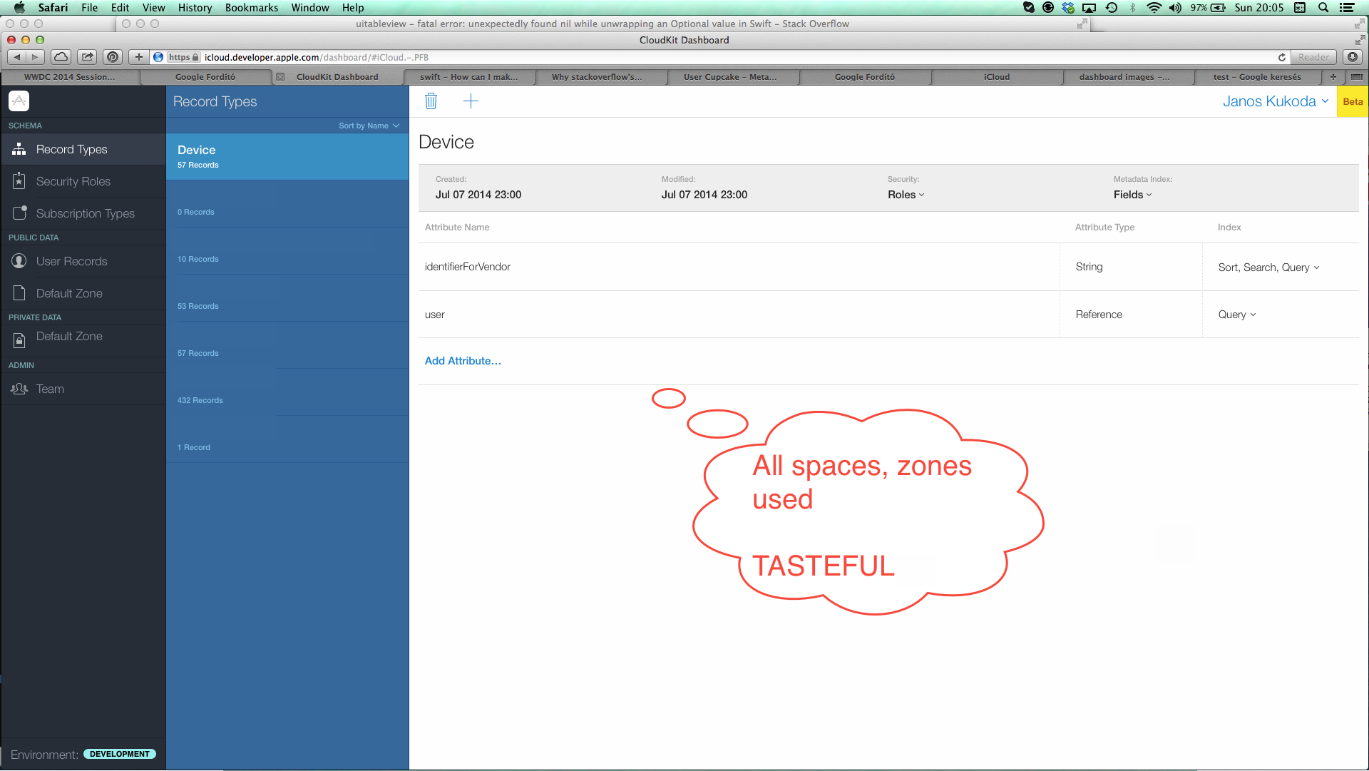
enter image description here

3
  • 3
    The center component is often narrower than I would like on a wide screen, even if I would not want it to be the full width of the screen. It would be much better if it were in a frame with draggabble edges so that each user could make it as wide or as narrow as suits them and their screen. Commented Jul 20, 2014 at 17:42
  • 2
    Closely related on Meta.SE: Utilizing blank space
    – jscs
    Commented Jul 20, 2014 at 17:44
  • 8
    Why is this downvoted so much?! On a 27" screen, the content's width is VERY VERY small! And even for creating a GreaseMonkey script I had to fiddle a lot with absolute pixels instead of percentages. Why are the values so hardcoded? Commented Mar 26, 2015 at 10:13

3 Answers 3

7

While wider lines would be useful for some code (usually overly long lines indicate bad code unless it's a big string literal e.g. for a log message), they make normal text incredibly hard to read. So I don't think it makes lots of sense to make the page much wider.

11
  • 1
    agree, but at least that white space would be used for something
    – János
    Commented Jul 20, 2014 at 17:32
  • 6
    @János no, the space on the sides should not be used for anything. You want to draw attention to the center, not have users be distracted by non-relevant items on the sides.
    – user456814
    Commented Jul 20, 2014 at 17:38
  • Yeah, nothing worse than ads etc. in that white space outside...
    – ThiefMaster Mod
    Commented Jul 20, 2014 at 17:43
  • 2
    I think if Steve Jobs would be your boss, he would not hesitate to fire you, because screen is designed to show something, and not show the emptiness .. it is not about advertisement .. put something there, allign the whole freaking website differently, but I do not want to see white empty spaces
    – János
    Commented Jul 20, 2014 at 18:00
  • 1
    @János see store.apple.com/us - yeah, I guess Steve Jobs would have made the space grey instead. Anyways, if you have an awesome idea for a specific "something" that should be put there, feel free to propose it; otherwise, enjoy your blank space like everyone else does. But keep in mind there's already people who want to hide the "hot meta posts" box, so I don't think adding even more content to the site will find a huge following.
    – l4mpi
    Commented Jul 20, 2014 at 18:12
  • 2
    I don't see the harm in resizing the width of the main text area if the browser window is wide enough to leave empty space otherwise. Nobody would be forced to make their browser window wider if they don't like long text lines. If the sidebars have a fixed width, and the rest of the window is used for the main text area, everybody can resize their browser to make the text as wide or narrow as they like. Commented Jul 20, 2014 at 18:34
  • 2
    @RetoKoradi that would be an extremely bad idea - practically, you would force users to use their browser window for SO and nothing else. I have many tabs open, some of them need a wide window. But I also want the SO text to be considerably smaller than my 24" monitor size. Implementing your suggestion would force me to use a second, smaller browser window for SO. And you don't even consider that not everybody uses a stacking window manager, it would be even more annoying with the tiling window manager I use at work...
    – l4mpi
    Commented Jul 20, 2014 at 18:47
  • @l4mpi: Good point. I'm not using any web sites that require a wide window, but I can see how that would be a problem if you do. I could argue that having to scroll left and right to read each line if people post code with long lines is worse. But an ideal solution would work for all these use cases. Commented Jul 20, 2014 at 19:56
  • 4
    The ideal solution for overly long code would be a small button somewhere that stretches the code block over the full screen width while leaving anything else as it is.
    – ThiefMaster Mod
    Commented Jul 20, 2014 at 20:11
  • 1
    I hate to scrolldown the screen too much, I preffer to read everything in one wider screen than moving the text up and down and remembering the code. I usually have to copy paste some SO codes to Notepad++ and read it better there.
    – pmiranda
    Commented Jul 4, 2019 at 18:04
  • Of course, we talk about Themes - we don't ask to spend 100s of hours. Why do you want to decide that a user must use narrow columns if he prefers wider columns?
    – Tom
    Commented Apr 9, 2020 at 21:11
4

ThiefMaster points out one very practical reason to avoid this; here's another: right now, if you format your code so that it looks good on your screen, it'll look pretty much the same on anyone else's. Maybe a few characters wider or narrower if you're unlucky in the font department, but pretty close.

Whereas if you format your code for your screen, chances are it'll look awful on mine, where I keep the window at half-width to leave room for other things (like editors...) on the rest of the screen.

Chances are, you're using a whitespace agnostic language anyway; just wrap the long lines and your readers will thank you.
3
  • 1
    I am developing in Xcode, how is it possible that either in big, wide window or in small, narrow window source-code looks good?
    – János
    Commented Jul 22, 2014 at 22:02
  • Easy - just get rid of the space-wasting sidebars in XCode.
    – Shog9
    Commented Jul 22, 2014 at 22:05
  • 1
    On Stackoverflow, a lot of code is cut because the lines are too long. But this is not the subject of this proposal: If users like to better use the Monitor space by changing to a wide Stackoverflow-Theme, then it is and it should be their decision.
    – Tom
    Commented Apr 9, 2020 at 21:15
3

The reason is user experience / readability.

StackExchange is so vast by now, it can answer this very question in itself:

https://ux.stackexchange.com/a/108803/101037

To address your specific arguments:

  • Parse Server Dashboard does not use "all the space", the empty space is just in between and information more scattered across the screen. This makes information such as the table in your screenshot harder to read, because your eyes need to scan the lines.
  • "Ugly" / "Tasteful" are is a subjective evaluations. You may as well ask why the site is called StackOverflow and not BufferOverflow.

You must log in to answer this question.

Not the answer you're looking for? Browse other questions tagged .