2

The box I'm typing in right now, on my iPhone 11 mini, seems to be 36 characters wide before it wraps. That's less than half the width of a 1970s punch card; I think it's fair to say writing code into 36 characters is hard work.

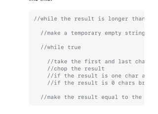
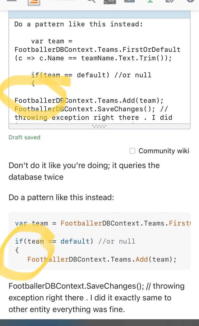
The top line of code in the image below is a fairly-reasonable-these-days single statement that has wrapped onto three(!) lines. The next line down (highlighted), I'm trying to indent:

Enter image description here

but on an iPhone the cursor jumps to the start of the next line when the words do, and because spaces are invisible I've lost all visual reference of how many spaces indent have been applied.

I would count every time I hit the space bar, but I'm not always indenting from 0 if I'm reindenting code pasted in, and I can't count the chars I can't see. This means I either erase the existing indent back to 0 and reindent by counting...

...or I have to scroll up and down the answer to look at the preview, try and work out how many spaces to add and then add them (I can't add them just by pressing space while the page is scrolled to the preview and watching the preview change because the page jumps back to show the caret as soon as a key is pressed)

Scrolling to see the preview isn't so easy when the text area takes up the whole of the touchable viewport above the keyboard:

  • First I have to zoom it out (because the iPhone likes to zoom in when you start editing),
  • then I try and grab the edge of the page outside the text area (and my thumbs are pretty fat - a lot of the time the phone thinks I'm starting a "go to previous page swipe-right"),
  • then scroll a bit, or tap to shut the keyboard so there is more page to grab
  • and finally scroll to the preview, see what indent errors need to be fixed...

But all in none of this resolves the problem that writing code into a box that wraps at 36, in this day and age, just doesn't work; I implore your developers to use the new UI on an iPhone 11 mini or similarly sized cell and see what a poor experience it is

I appreciate that I get 67 characters per line if I pull down the control center, and turn off portrait lock, flip the phone on its side, but then I have to try and scroll a text area that is just five lines high with the keyboard open. I also cannot grab too near the top of the screen otherwise I'm opening the control center again. I don't work with the phone in landscape because of that basic usability problem; there's just not enough area above the keyboard so I'd like to carry on using portrait. The old mobile site was better, because the text area held maybe three times more text (smaller proportional font).

As to solutions, how about

  • a smaller font,
  • a proportional font,
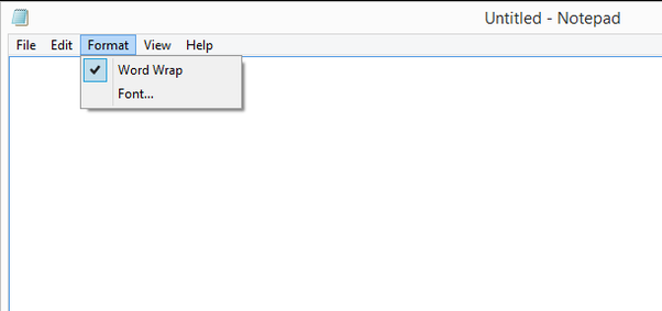
  • turning off wrap,
  • providing a ghost dot to indicate a space (like clicking the ¶ in Word does)

Even better, how about giving me the choice what font and size and wrap and pilcrow I use? All my other code editors do...

Oleg's noted that the editor is set to change again at some point - I hope it doesn't exacerbate the problem. On many of the sites I use to check my code works (.NET Fiddle, db fiddle, etc.) the editors are very intelligent, and sometimes unusable on a mobile - copy paste doesn't work, or is really tricky - auto completers often have usability issues, etc. Quite often I find myself wanting just a plain old textbox. It'd be a shame if incoming editor "improvements" make for more difficulty on a mobile device, but I feel that the plight of mobile users isn't raised much because there's an automatic expectation that everyone on SO uses a computer.
11
  • 1
    (FYI: Fonts smaller than 16px on iOS input fields cause the browser to zoom in, which isn't necessarily what you want)
    – Cerbrus
    Mar 14, 2022 at 8:29
  • 8
    Not to undermine the request, but do you know you can save yourself a lot of hassle by using triple backticks to designate code blocks instead of 4 spaces? Mar 14, 2022 at 8:34
  • 4
    I do know that, and it'll give me an extra 4 chars to play with. It doesn't appear to be a solution to the complaint, which is about nested indent levels. Indenting code involves more than prefixing every line with 4 spaces, which can also be done in a single tap using the {} button, though selecting the lines in the first place is also wearisome. The TLDR of the compliant is that 36 char wrap is for inadequate than the system it replaced, and I'd like to see it improved
    – Caius Jard
    Mar 14, 2022 at 8:56
  • @CaiusJard I explicitly said it's not to undermine the request :) sometimes folks forget there is an option not to indent with spaces to get a code block, so was just making sure you are aware of it (which you seem to be). Mar 14, 2022 at 9:02
  • 1
    I honestly doubt there's a solution, but we'll see. As for the "Why bother"... The responsive design works just fine on anything other than blocks of code...
    – Cerbrus
    Mar 14, 2022 at 10:28
  • Which would then lead me to wonder "why not a proprtional font?" - if we're suggesting it's not useful for writing code (and in it's present form I don't disagree!), why does the edit box need to be monospace? (Which leads back to the old mobile site using a prop font as more workable on small devices)
    – Caius Jard
    Mar 14, 2022 at 10:35
  • Perhaps I just need to stop complaining about it and write a proxy that I can use to access SO, that swaps out the fancy box for a basic one... :)
    – Caius Jard
    Mar 14, 2022 at 10:37
  • 1
    You could create a userstyle that just changes to font.
    – Cerbrus
    Mar 14, 2022 at 10:38
  • There is the same problem on desktop as well. At high zoom levels, there may be only on the order of 39 characters per line (for a particular screen resolution). Say, at the zoom level just before the panel on the right disappears. A workaround there is to use a general-purpose text editor (e.g. Geany) and copy/edit/paste. Mar 14, 2022 at 11:28
  • 2
    "That's less than half the width of a 1970s punch card" - well there is a bit of trivia being used as an argument I was not expecting to read. Ever. That made my day.
    – Gimby
    Mar 14, 2022 at 16:18
  • 1
    Here is an example with a "word" consisting of 69 characters: service.files().get(fileId="sheet_id",fields="createdTime").execute(). This is confusing at any zoom level, at least on the system I am currently using. Mar 14, 2022 at 23:38

2 Answers 2

4

Unfortunately, I don't think there's a real solution to this problem. You made some specific suggestions, but I don't think those will help (based on my own experience posting from mobile devices).

  • A smaller font won't help things, unfortunately. The small font is part of the problem already, as any font smaller than 16px causes iOS browsers to zoom in when you focus on an input.

  • Proportional fonts are horrendous when trying to create consistent indentation. I don't think switching to a proportional font would address this problem in any way, and even if it did, it would create a new set of worse problems.

  • Even if you turn off word-wrapping, you have to manually scroll left and right on a tiny touchscreen. That's a hassle; I wouldn't call that an improvement.

  • Ghost dots can get quite noisy, but something like those tab-level lines you see in some IDEs might be helpful... That said, you can't "style" space characters, so this could be rather problematic to implement.

When confronted with a frustrating UI, many users tend to reach for the argument that they should be given a choice, but this doesn't address the core issue.

We don't need more settings for more individual use-cases that can't all be supported equally. That'll just lead to more layout issues. SO's editor isn't an IDE, it's a tool to format your post. Ideally, you'd be copying your code, pre-formatted, from an IDE.


In the end, a mobile device really isn't suitable to write significant code blocks. The experience is always going to be sub-optimal, and I think we should match our expectations with the physical limitations of the device.

27
  • 4
    So the TLDR of your answer is "mehh, don't post from a mobile" - doesn't work for me because most the posting I do is from a mobile and I'm sure I'm not alone. The mobile site was phased out and replaced with the responsive one that adapts itself to small screens. SE are clearly still interested in extending the provision of services to people who use mobile devices to interact and the current experience is wanting. The old mobile site had a smaller, proportional font and it was fine for the indenting being discussed here
    – Caius Jard
    Mar 14, 2022 at 9:35
  • (I'm talking about start-of-line indent: it doesn't matter whether the font is proportional or not in that case, because it's consistent with itself).
    – Caius Jard
    Mar 14, 2022 at 9:36
  • Do you post from a mobile?
    – Caius Jard
    Mar 14, 2022 at 9:36
  • 6
    I do post from mobile, but I make a point not to answer questions that require significant code, because I can't verify my code works, and mobile devices are just not suitable to write significant code snippets.
    – Cerbrus
    Mar 14, 2022 at 9:37
  • 1
    and mobile devices are just not suitable to write significant code snippets - they would be in my opinion, if the editor was fixed sp I could make it show more than 36 chars on a line...
    – Caius Jard
    Mar 14, 2022 at 9:38
  • 3
    I have to note that discussions about improving the current editor are likely to be moot - SE is still determined to replace it with the new editor in the near future Mar 14, 2022 at 9:39
  • Then let's have them fed into that replacement so we dont end up with an further iteration that's worse (like the current iteration that's worse than the last)
    – Caius Jard
    Mar 14, 2022 at 9:42
  • In regards to the proportional font: Then you're suggesting we trade one problem for another... That's not a good solution
    – Cerbrus
    Mar 14, 2022 at 9:46
  • we should match our expectations with the physical limitations of the device - my expectations were set by the old site. The new site is worse, which automatically means there is a better solution than the current and doesn't preclude there being a better solution than the old
    – Caius Jard
    Mar 14, 2022 at 9:48
  • you're suggesting we trade one problem for another - I fully acknowledge that it's hard to get an ideal solution on a limited device, but specifically in the question above (the bit you skipped quoting at the end) I'm requesting that I could/should be the one to choose which problems I suffer
    – Caius Jard
    Mar 14, 2022 at 9:49
  • Adding more configuration options only serves to exponentially grow the maintenance load on the UI. Adding more options to choose between two broken systems isn't a solution.
    – Cerbrus
    Mar 14, 2022 at 9:50
  • So you agree that they're both broken?
    – Caius Jard
    Mar 14, 2022 at 9:57
  • 2
    No, because I don't think mobile devices are, at all, suitable to do what you want to do. "This can't be fixed properly" is sometimes an answer. It's not the answer you want, but it may very well be the answer you're going to have to work with.
    – Cerbrus
    Mar 14, 2022 at 10:02
  • 3
    Every setting / toggle you add, duplicates the maintenance work. Two possible layouts to keep compatible with other changes to the site... Two layouts to fix bugs in. Then another setting gets added and you have 4 variations.
    – Cerbrus
    Mar 14, 2022 at 10:11
  • 5
    Good note, @OlegValter. At that point, none of us will want to post anything at all, either from mobile or desktop, since that editor is so atrocious. Mar 14, 2022 at 21:56
-4

I had a look around at other sites on my cell:

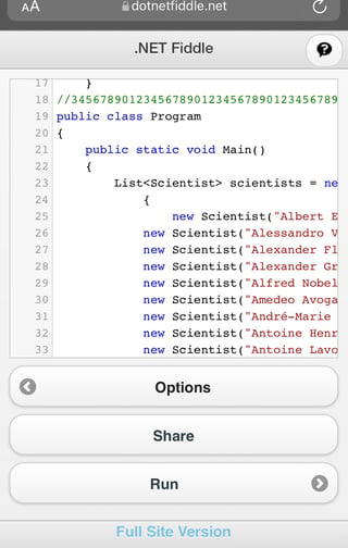
.NetFiddle

  • 39 chars wide
  • monospace
  • no wrap

Use this one a lot to check the code I write; it can be a bit awkward to select code in it for copy-out which is why I tend to write the code into SO and paste it into .NF. Panning round the non wrapping code isn't something I notice as being unduly awkward - I do it on most web content most of the time

enter image description here

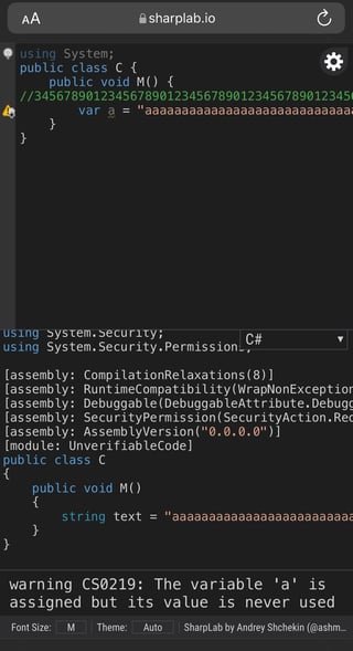
SharpLab

  • 45 chars
  • monospace
  • no wrap

A site that shows the results of decompiling code compiled from what is written, to get a handle on what is syntactic sugar/compiler generated. Not so useful for running code but handy for "does it compile"

enter image description here

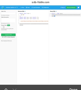
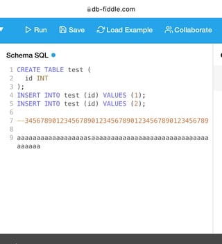
DB Fiddle

  • 50 chars x 2 side by side
  • Monospace
  • Wraps

Doesn't appear to make any responsive layout changes at all; it's way too small to be usable without zooming in but when zoomed my ancient eyes don't have any complaints about the text size

enter image description here

enter image description here

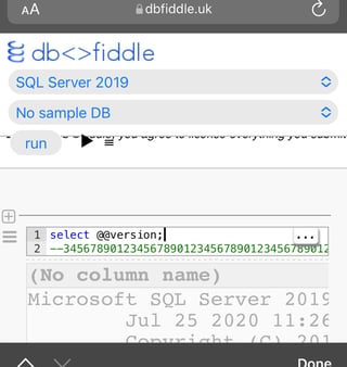
DBFiddle-uk

  • 42 chars
  • Monospace
  • No wrap

Perhaps the most irritating editor for mobile becuase it has a fly out widget that appears on the right of the box over the line where the caret is. This box holds operations like select all, copy, paste that most normal code-enabled people would do another way. They don't even work on some of my mobile devices and the widget makes placing the cursor on a line end impossible if the line is over 35 chars.

If I was giving an example to SO of "how not to design a new editor", this would be it

enter image description here

SO (View Mode)

  • 40 chars?
  • monospace
  • no wrap

View mode shows 33 chars but there's that huge vote margin that edit mode doesn't have - certainly it could fit more than 36 so view model font must be smaller than edit mode's.

enter image description here

Old SO mobile site

  • 50 chars+?
  • proportional
  • wrap

I do still have a picture of this one somewhere, I think in an answer I made on a thread about the incoming UI - I'll see if I can find it

Summmary

I fully appreciate that these are mostly code-only sites, whereas SO's edit box isn't always code only

Every site I looked at manages more chars than SO and though my vision ain't 20/20 I don't feel like the font is too small on any of them. As such I think we could survive having the size tweaked down slightly.

Significantly though, most sites I looked at don't wrap the code and I don't have any major usability complaints panning around those codes. Significantly, SO's View Mode doesn't wrap its code blocks - we have to pan around those to read them on a mobile.

I wouldn't advocate turning off wrap though because it only really benefits code and a lot of the content posted on SO is not code. In an ideal world I suppose the editor would be partly wysiwyg, like view mode is: non code blocks are proportional wrap and code blocks are monospace nowrap. I'll throw that suggestion in for a replacement editor

But right now for posting on mobile I feel small screens would benefit most from a toggle button above the editor that turns wrap on and off so the author can decide on its state depending on whether they're writing prose or code. Default would be on so there is no change to the current behavior, and I don't care that the setting is remembered - I'm happy for it to always start out as On

It's not perfect, and it's not even going to make things as usable as the old editor was on the mobile site, but I don't think we'll ever see a reversion to that so for me it feels like it's the single best-of-bad-bunch, easiest-to-implement option that would mean the current editor isn't so awkward on small screens

enter image description here

"Supported by the world's most primitive editor for more than 30 years" 😆

4
  • 3
    I really disagree that adding a button to the toolbar to disable wrapping would be an improvement. 90% of what I write into the editor should wrap. Panning around to see non-wrapped lines of text, even code, seems substantially more annoying than just having it automatically wrap for you. I also don't like the idea of more options that create a different site experience for different people, especially just based on a single button click. That results in a lot of confusion and an overall poor experience. Just need to fix the size to get more than 36 characters displayed. Mar 15, 2022 at 7:22
  • I never said you had to tap that button? You just carry on as normal, using the editor in wrap mode (the default) and never press the button. If I press it, it doesn't change it for you, it only changes it for me. I can press it again and toggle wrap back on
    – Caius Jard
    Mar 15, 2022 at 8:10
  • It's a button. I have to push it. There's no choice in the matter. Mar 15, 2022 at 8:59
  • Let's default it to toggled off for you then! 🤣
    – Caius Jard
    Mar 15, 2022 at 9:04

You must log in to answer this question.

Not the answer you're looking for? Browse other questions tagged .