85

Related: Too much whitespace at MSO's top

Related, not a duplicate. If anyone is voting for this as a dupe of something else, pick the thread where it's mentioned in the answers: Live: Left nav, new theming and responsiveness. But that's on MSE, not MSO.


Not just the top, but the side of MSO has too much whitespace as well. While part of that is inevitable, the most left part can be reduced by at least half without problem.

Let me illustrate:

Illustration of the whitespace

A tiny bit of whitespace there is good, sure. But the current situation is way overdoing it. Don't make me buy a wider screen just to browse MSO.

16
  • 12
    “Don't make me buy a wider screen just to browse MSO.” — while this reads like a joke, you know you can disable left navigation? Jun 12, 2018 at 6:50
  • 3
  • 1
    This is already a known issue. This is just a preview. Jun 12, 2018 at 6:52
  • 1
    @Xufox Somehow I missed that, thanks. Now I just hope that setting will stick to all sites once they roll it out or I'll have to check a lot of boxes.
    – Mast
    Jun 12, 2018 at 7:29
  • 6
    1280 width for everyone! Because none of us are at HD or 2560 or 4K or 5K or ...
    – John
    Jun 13, 2018 at 0:01
  • 4
    A collapsing bar would work better. Also it really would be nice to have some layout options to be able to choose to use 90% of the width of my monitor instead of losing half the real estate in white space... Jun 13, 2018 at 0:13
  • @Xufox it's on SO now.
    – user253751
    Jun 13, 2018 at 0:49
  • 2
    Possible duplicate of Too much whitespace at MSO's top
    – Stephen Rauch Mod
    Jun 13, 2018 at 3:12
  • 1
    I'm confused. Isn't this exactly the same amount of whitespace that existed there before the sidebar was added?
    – Ajedi32
    Jun 13, 2018 at 4:49
  • 2
    @StephenRauch No, that covers top whitespace. This covers left whitespace. Added an explanation.
    – Mast
    Jun 13, 2018 at 5:33
  • 1
    Center section feels (whether it actually is or not I don't know as I can't compare with the previous version) narrower and crunched. Definitely harder to read and use now. 2 opposable thumbs down on the new design. Jun 13, 2018 at 13:13
  • I've used SO for so long my eyes instinctively go all the way left. Now all I see is white space. Ugh! Maybe they can toggle the visibility?
    – Big Daddy
    Jun 13, 2018 at 13:17
  • Unless you have a narrow screen (and you don't because there is white space visible on the left and right), a wider screen won't make any difference. the question space is the same whether or not you have the sidebar visible. Jun 13, 2018 at 13:50
  • 1
    Design and functionality of that thing (like loading the whole page over and over again) is a shame for 21st century (for the company which serves Q&A site for developers). I'd better switch to the good old one.
    – Victoria
    Jun 13, 2018 at 20:00
  • 1
    Remove the max-width from .container and .content; it's particularly amusing on 3440x1440 resolution. :P
    – canon
    Jun 13, 2018 at 20:50

2 Answers 2

14

With the left-nav hidden, there is significant whitespace (shown in light-blue below) that creates an empty block where 2-questions used to fit, e.g.

enter image description here

If the user chooses to hide the left-nav, then the interface should revert to the way it was before the addition of the left-nav with just the little 3-bar widget in the top-left corner.

(rather than creating a second question, it seemed proper to address the left-nav whitespace concerns for both the displayed and hidden states in a single place)

3

I suspect what's triggering this perception isn't the sidebar so much as it is the top bar...

The old top bar on Stack Overflow - as well as all the other sites - was fixed at the same width as the content. Here's a screenshot taken from Archive.org's capture on March 10th, rendered in a maximized window on my main monitor:
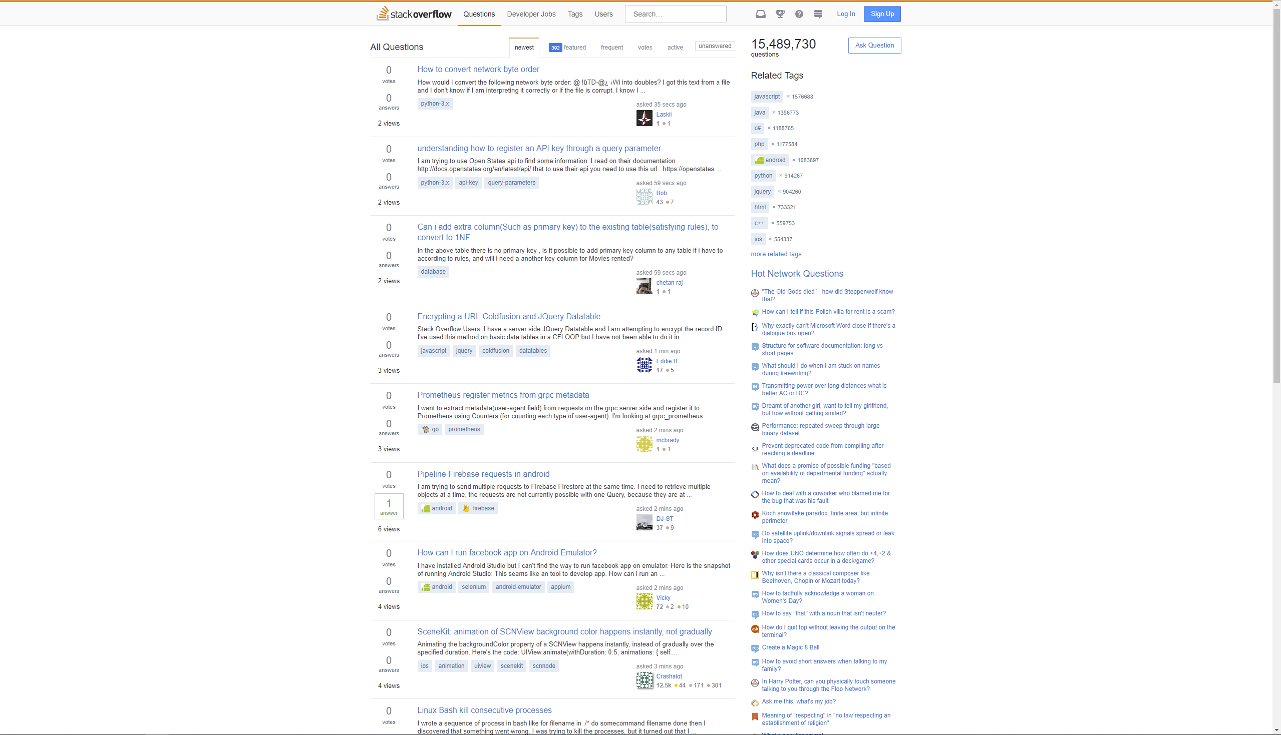
top bar same width as content, lots of whitespace on both sides

Two observations: there's TONS of whitespace, but it's consistent top-to-bottom.

Here's what that looks like today:
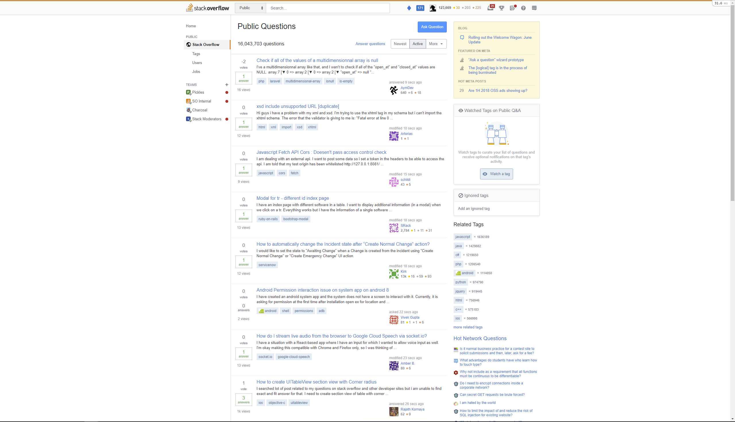
top bar extends over left sidebar; still lots of whitespace

The actual content area - the list of questions, excerpts, etc. - is actually slightly wider in the new design here. BUT, the sidebar extends beyond the left-hand side of that list to cover the new navigation sidebar.

As a result, even though there is slightly less whitespace in the new design, it looks like more is being wasted.

Now, we could just expand the content to fill the full width of the display...
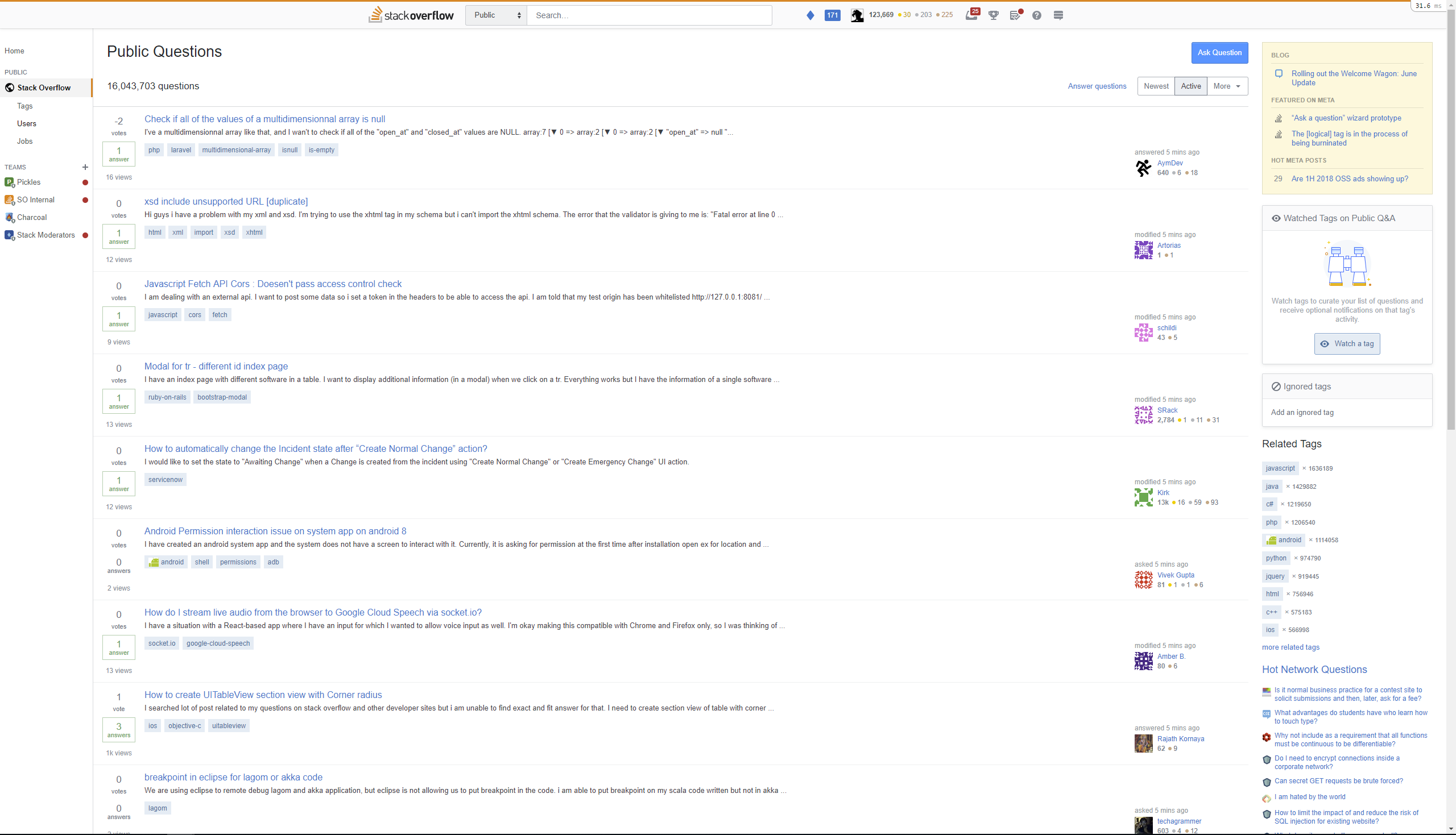
No maximum width for content - whitespace is now in the middle of the page

This is... Actually not very usable. In fact, one of the first comments we got when we started thinking about this design urged us not to do this; as a general guideline, textual content should be constrained lest it becomes difficult to read.

In practice, I don't ever maximize browser windows on this monitor unless I'm viewing a very large image; this is what my screen looks like normally:
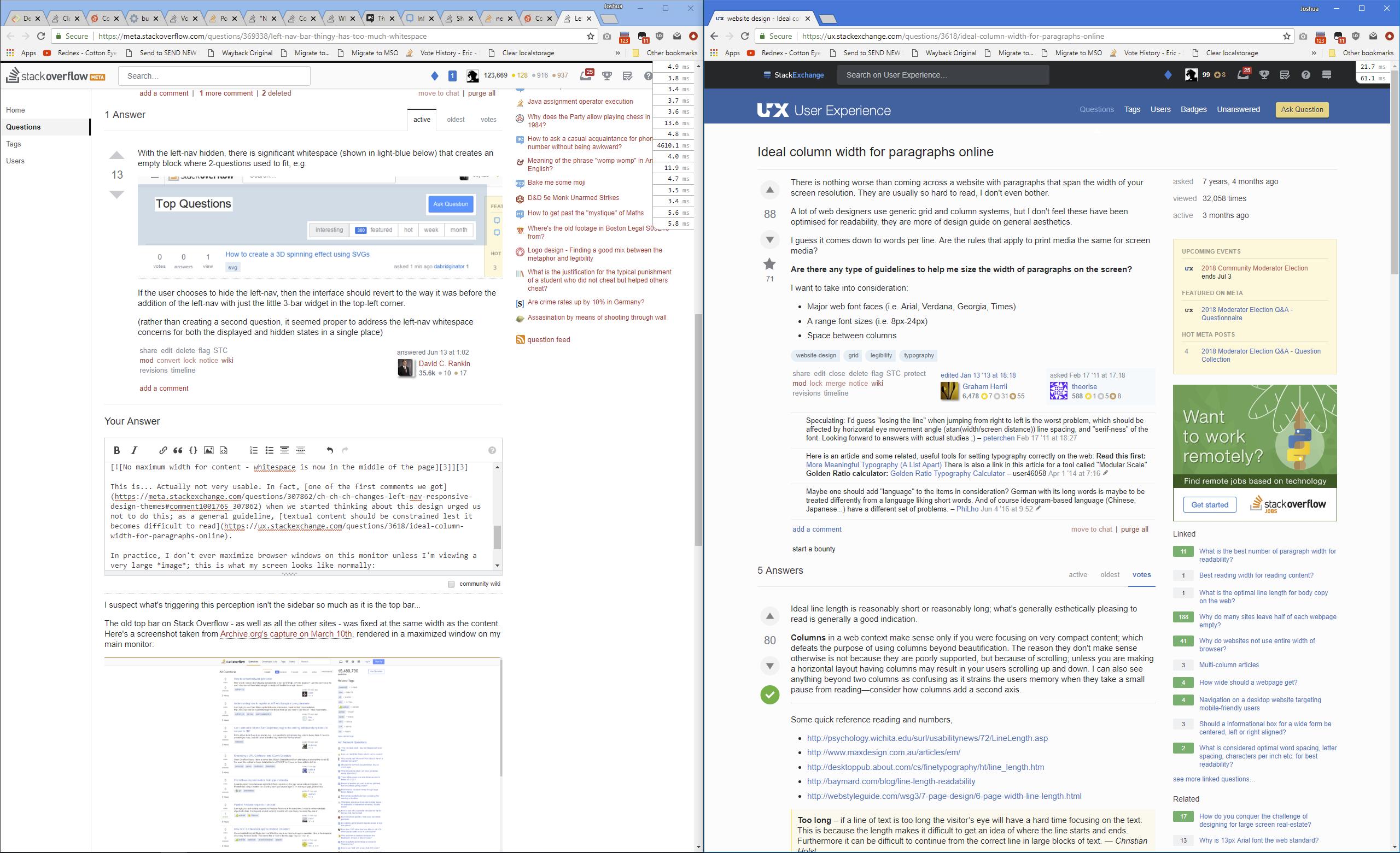
two windows side-by-side, no wasted margins

Without the excessive browser width, the margins disappear entirely in the new design. That just leaves the "inevitable" whitespace below the left sidebar items... Fortunately, there's a partial fix for this that balpha just rolled out: Left nav is now sticky

You must log in to answer this question.

Not the answer you're looking for? Browse other questions tagged .