49

A SO post width is 660px.
As a code related website, with plenty of code snippets all over, many of which are very wide, it requires using the horizontal scrollbar to be able to see what's "under the right edge". When the snippets are also high, it makes it even a worse experience having to scroll down to be able to reach the horizontal scroll-bar.

My suggestion is hereby, that as a geek-oriented website, perhaps the width of the screen can be made adaptive, so the posts exploit the entire screen width, make it easier to read code-snippets and also making the page shorter (in height).

I understand that this might be less a cleaner design, I'm just thinking from a nerdish-oriented POV, and also practically it'll be easier to read (again from my perspective).

Maybe this can be made optional in user-profile settings so only people interested in this can opt-in.
Obviously I'm only talking about SO on desktop website, not the rest of the StackExchange websites.

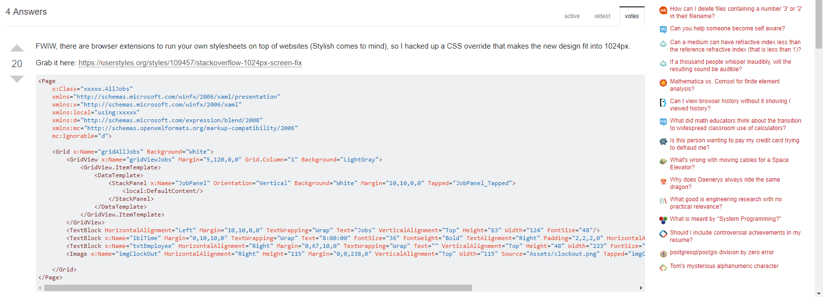
Here's (maybe exaggerated) a mock of what I mean:

enter image description here

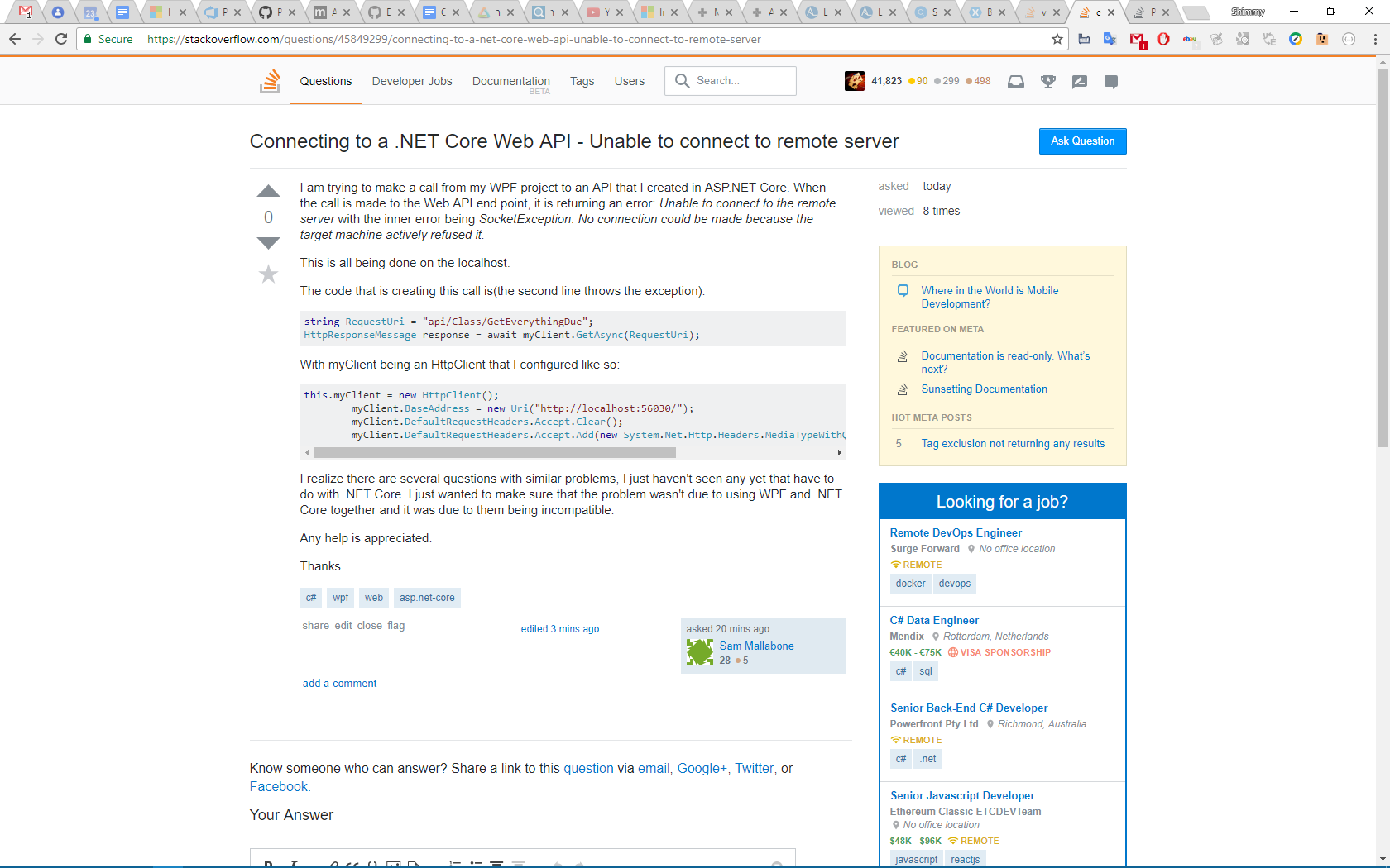
I want the white-spaces in the edges to be exploited, this is what my screen currently looks like:

enter image description here

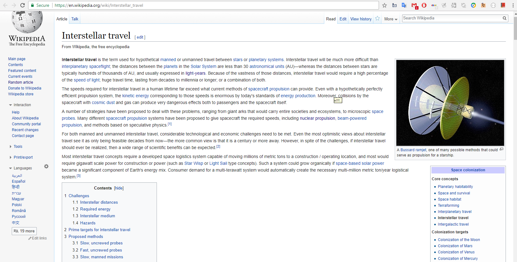
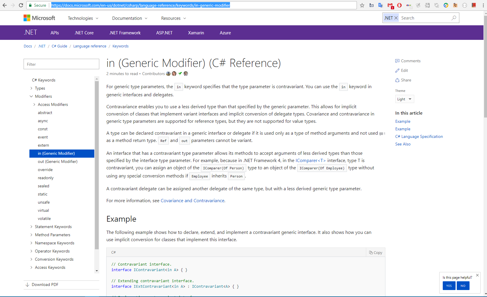
The best example I could bring is from Wikipedia, msdn, and definitely others. Here's what it looks like, and I actually like it a lot:

enter image description here enter image description here


Update

As per the comments by brandoscript and Gall, this sounds like what I'm after. Really what bothers me is the wide code snippets. Having an option to spread them over the entire screen on demand sounds like a great solution I'd want to see implemented in SO.
34
  • 4
    Community already said no for now
    – Makoto
    Commented Aug 23, 2017 at 21:23
  • 3
    @Makoto I'm not so certain about that, see this. Besides, I can see that many of the people are complaining about the site being too wide while I'm after the opposite. Commented Aug 23, 2017 at 21:32
  • 2
    No, the fact that the priority is elsewhere at the moment doesn't mean you should delete this question. Issues/feature requests are still being evaluated wrt. desirability/feasibility/etc. Just because it's unlikely to be implemented in the near-term, doesn't mean there shouldn't be a record of the desire to have the feature. In addition, you might find someone who sees this already has, uses, or writes a user script to accomplish what you desire. After all, it's not that much CSS to change the size.
    – Makyen Mod
    Commented Aug 24, 2017 at 5:37
  • 5
    This a subset of having a responsive design (multiple requests, IIRC). In the short term, a user script could do this. However, personally, I don't want this unless, it's either: A) implemented for everyone, or B) something that automatically turns off when I'm editing a post. My desire is because I work to format the code I write for SO such that it's viewable, in most cases, without the need for horizontal scrolling, so it's easier for people to view. (A) would allow me to ignore this issue. (B) would make it so I could preview posts while editing how they will be seen by other users.
    – Makyen Mod
    Commented Aug 24, 2017 at 5:49
  • 10
    For what it's worth... I currently actively try to ensure that no horizontal scrollbar is needed for code snippets I write, by inserting line breaks whenever necessary and possible in the language of the snippet. Commented Aug 24, 2017 at 7:57
  • 3
    I'm more concerned about how little I see on my 1366x768 screen..., especially in review. Commented Aug 24, 2017 at 8:24
  • 3
    SO may be code related but it is still about writing text in questions and answers. And you need a fixed width there in order to maintain readability. If there is a problem with horizontal scrollbars in code snippets, maybe you should just edit the post so that the scrollbars are gone. Biggest benefit of a fixed width: The width is the same for everyone, so if you can make your code fit into the screen, it will fit for others too.
    – poke
    Commented Aug 24, 2017 at 8:49
  • 25
    The column width is very much by design. Study after study has shown it is easier to read text when it is in relatively narrow columns, rather than extremely wide ones. As screens get even wider, this would become more and more of a problem if the "responsive" design was used in the way you describe. There is a reason newspapers and magazines use narrow columns for their text. I don't know why code would change this. Well over 80 characters can be fit horizontally into a code block in a post here. That should be enough, especially for expository code samples of the type posted on a Q&A site.
    – Cody Gray Mod
    Commented Aug 24, 2017 at 10:07
  • 4
    I think Shimmy has a point though. A option to change those settings could prove itself usefull. Maybe someone could create a demo on how it could look like. Personally speaking I would like to have more information without scrolling down too. Commented Aug 24, 2017 at 10:57
  • 3
    Nobody has written a Greasemonkey script for that yet? Commented Aug 24, 2017 at 21:28
  • 8
    Ah, "make it an option", the cry of lazy designers everywhere. I don't really think a radical redesign of the site's UI should be a configurable option. It would just lead to confusion and a lot of unpredictability over how the page will actually be displayed to different people. And that's putting aside the difficulty of implementing a complete redesign like this. I don't see why it isn't valid for code snippets. Code is still most readable when its horizontally constrained. 80 columns is a common standard. I usually prefer 100 for real code, but SO isn't real code.
    – Cody Gray Mod
    Commented Aug 24, 2017 at 23:56
  • 2
    And as I pretty strongly implied, they shouldn't.
    – Cody Gray Mod
    Commented Aug 25, 2017 at 1:06
  • 2
    Can we not just have a simple toggle button that allows you to expand the width of the post temporarily for that single post only? Not responsive, but a single, fixed-width alternative? Commented Aug 25, 2017 at 4:18
  • 2
    @Nathan Arthur: Don't feel bad just because the word "responsive" appears in the title. It's just a buzzword. There isn't a one-size-fits-all solution when it comes to RWD. The application varies from site to site. This just isn't a remotely good (UX-wise) way of implementing it. Your downvoting it doesn't mean you are against the site implementing RWD altogether.
    – BoltClock Mod
    Commented Aug 25, 2017 at 4:41
  • 2
    How about code blocks that expand on click (or whatever)? I have seen some of those on other sites/blogs and this was, to me, a comfortable alternative. Otherwise, I totally agree to the fact that the post width feels completely right at the moment.
    – Gall
    Commented Aug 25, 2017 at 14:47

3 Answers 3

19

Cody Gray♦ should know better than to write an answer in the comments, but as he's a busy moderator, I've copied his comment here:

The column width is very much by design. Study after study has shown it is easier to read text when it is in relatively narrow columns, rather than extremely wide ones. As screens get even wider, this would become more and more of a problem if the "responsive" design was used in the way you describe. There is a reason newspapers and magazines use narrow columns for their text. I don't know why code would change this. Well over 80 characters can be fit horizontally into a code block in a post here. That should be enough, especially for expository code samples of the type posted on a Q&A site.

We should be encouraging users to format their code so that it fits in the current space (possibly by just going ahead and editting it).

7
  • 1
    Please source when talking about studies. For now, top search result is quora.com/…
    – Cœur
    Commented Aug 25, 2017 at 14:31
  • 10
    Code block should not be considered equivalent to blocks of columns in a news paper. Do you really want a statement to be split into multiple tiny lines? I don't. Single line of code should be displayed as single line as long as there is space available
    – T J
    Commented Aug 25, 2017 at 14:44
  • 7
    @TJ : Yes, I really want a statement to be split into multiple (not very) tiny lines. Commented Aug 25, 2017 at 14:47
  • So, after reading all the quora answers, the reason for using columns that was the most convincing to me was "going from the end of a line to the beginning of the following line is easier when the line is shorter".
    – Cœur
    Commented Aug 25, 2017 at 14:55
  • 5
    @TJ: I want my developers writing code in multiple not very tiny lines. Not to mention on SO. I see 200+ character lines, whack...
    – Joe
    Commented Aug 25, 2017 at 15:07
  • 1
    @TJ it also doesn't really matter in the context of a post since copy and code are intermingled. If you make it wide enough to accommodate 1000 character code lines, readability of the copy suffers. Line tracking and all that...
    – canon
    Commented Aug 25, 2017 at 15:18
  • 3
    There is no "down vote" for comments, correct? The Stack community often encourages people to provide answers in the comments, especially since some members on SO are very quick to "let no good deed go unpunished" and down vote answers that are still helpful and constructive but perhaps not as detailed as they'd like. EVEN IF, a short answer or hint can still help someone, people get penalized. This is counter productive IMO. Commented Aug 25, 2017 at 16:30
6

UserScript solution

So I’ve just written a quick user script to enable a responsive fully flexible post width. Right now this only works on question pages since it would have been a lot more complicated to make it work elsewhere as well (e.g. the question list), but I think this is good enough for now. I have also fixed the maximum width to 1500px in total since above that, it gets really difficult to use the site. You’re more than welcome to edit the user script and remove that max-width rule at the very bottom to see what it looks like for yourself.

Primary reason for me writing this user script is to show off what kind of a terrible idea this is. I have it activated right now and even writing an answer is annoying… But judge for yourself.

Btw. props to SO for hardcoding the sizes all over the places, that really made writing this really easy…


Install and source

Changelog

  • 1.0.x: Initial release

Note: Since this is using CSS grid layouts, this user script requires a fairly modern browser.

5
  • 1
    Looks "weird" at first, but I like it.
    – Brandon
    Commented Aug 25, 2017 at 14:16
  • @poke, thanks for sharing, how do I add this to Chrome? Following the Click to install link just downloaded a js file, what am I supposed to do with it? Sorry for my illiteracy in user styles. I've updated my question. Commented Aug 27, 2017 at 4:44
  • @Shimmy Sorry, I probably should have mentioned that somewhere. You need a userscript extension like Greasemonkey or Tampermonkey. The latter is available for Chrome as well.
    – poke
    Commented Aug 27, 2017 at 11:16
  • Would be nice to have a simple list that indicates in detail what aspects this extension is affecting, and have a screenshot that demonstrates its impact on the page. Commented Feb 28, 2018 at 14:32
  • @Shimmy This affects only the question view, and will basically look exactly as in OP’s screenshots. Since this was mostly a proof of concept to show off how bad this idea is (IMO), I am not really interested in providing more than I’ve already done. Just install the script and look for yourself.
    – poke
    Commented Feb 28, 2018 at 14:45
3

One major issue with using "responsive" design in Stack Overflow, or any platform that allows users to contribute largely unlimited, unstructured content (as opposed to, say, a text-and-images no-html vBB forum), is that users are primarily not sophisticated layout designers, nor are they going to spend a whole lot of time on their posts typically.

They're also contributing a lot of different kinds of content - lots of text, small amounts of text, large code blocks, wide code blocks, tall code blocks, images, executable javascript - and all of that has to fit into Stack Overflow's design.

It has to fit into that design and look good to everyone. Not just look good to people who have screens that are the size of the user who posted it - but look good to everyone, or at least everyone except that one guy who's reading this on Lynx, anyway, who cares about him right?

If you're like me, you take some care to make sure your post looks nice on your screen before you post it - you scroll down some and see that everything fits neatly and nothing scrolls too much or is too hard to read. You can do that now, because you know exactly how much screen real estate you have to play with no matter who's reading it: it's going to look the same on my 22" 16x9 widescreen at work, as it does on my 24" 16x10 widescreen at home, as it does on Shimmy's 28" or whatever. It also looks the same on my mom's 4x3 18" monitor.

But if you make that page responsive, sure you get a wider display on Shimmy's screen and a narrower one on my mom's - but guess what, it now doesn't look as nice overall on either of those, because I am not a layout expert; I know how to make it look nice when it's in front of me, but I don't have the expertise to make sure it'll still flow neatly when it's narrower or wider. I might have too dense of paragraphs. I might have long code lines that StackOverflow will either have to wrap (screwing up languages where column position matters!) or will add a scrollbar to (which I take pains to avoid in my code). My images might not be placed in the right way to be neatly on the screen.

Make it a single consistent layout, and I know what my target is. It's easier for everyone that way. Yes, you get some white space that's unused - if you don't like that, don't use a fullscreen web browser, for heaven's sake.

And if you do in fact like looooooong lines of code - well, sorry, can't help you there. Learn to use the enter key, perhaps. Or just live with scrolling, because you know it's going to scroll - so at least it's a known, consistent behavior that you can accommodate or not as you wish.

1
  • Please see the update in my question. Commented Aug 27, 2017 at 4:45

You must log in to answer this question.

Not the answer you're looking for? Browse other questions tagged .