61

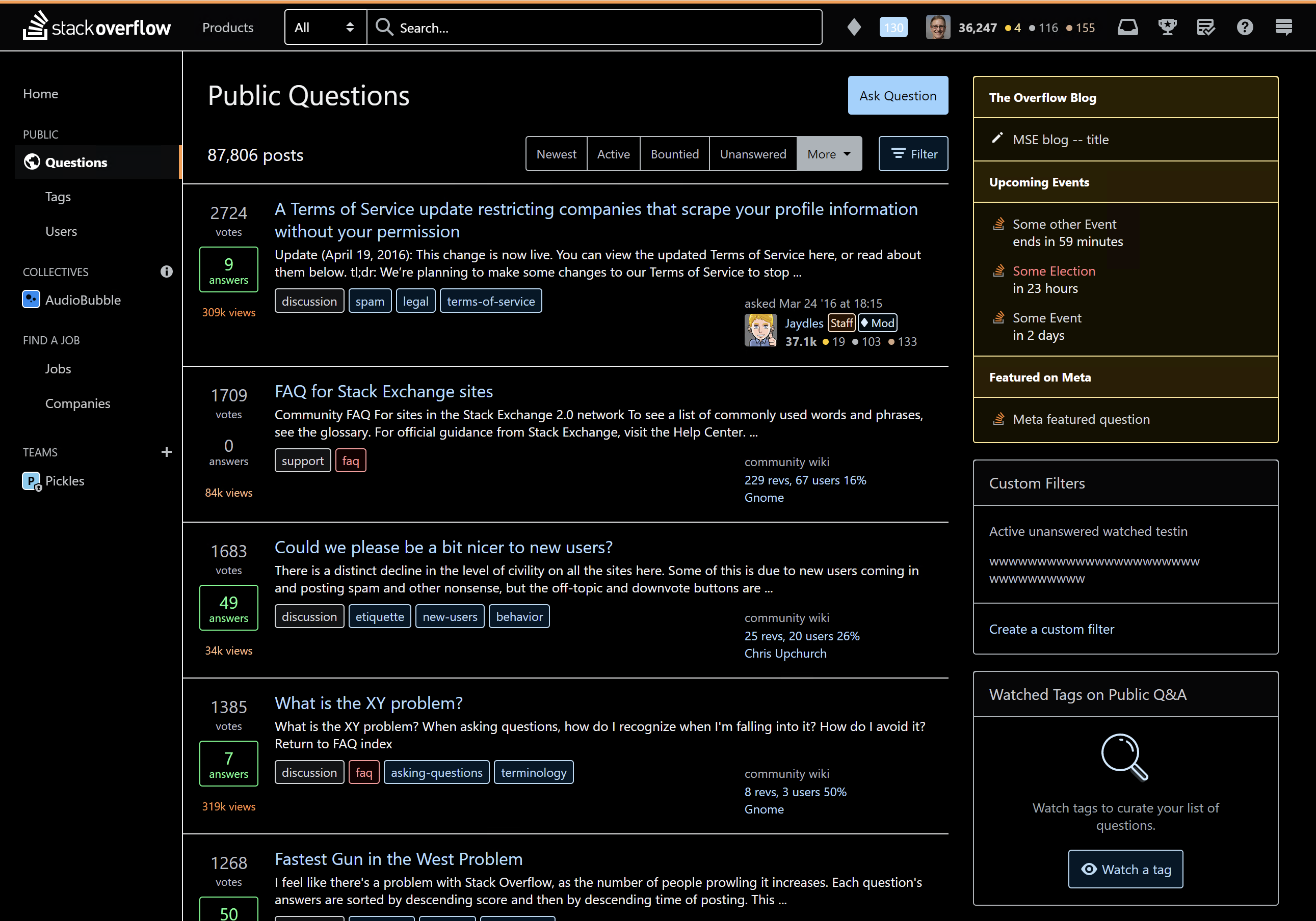
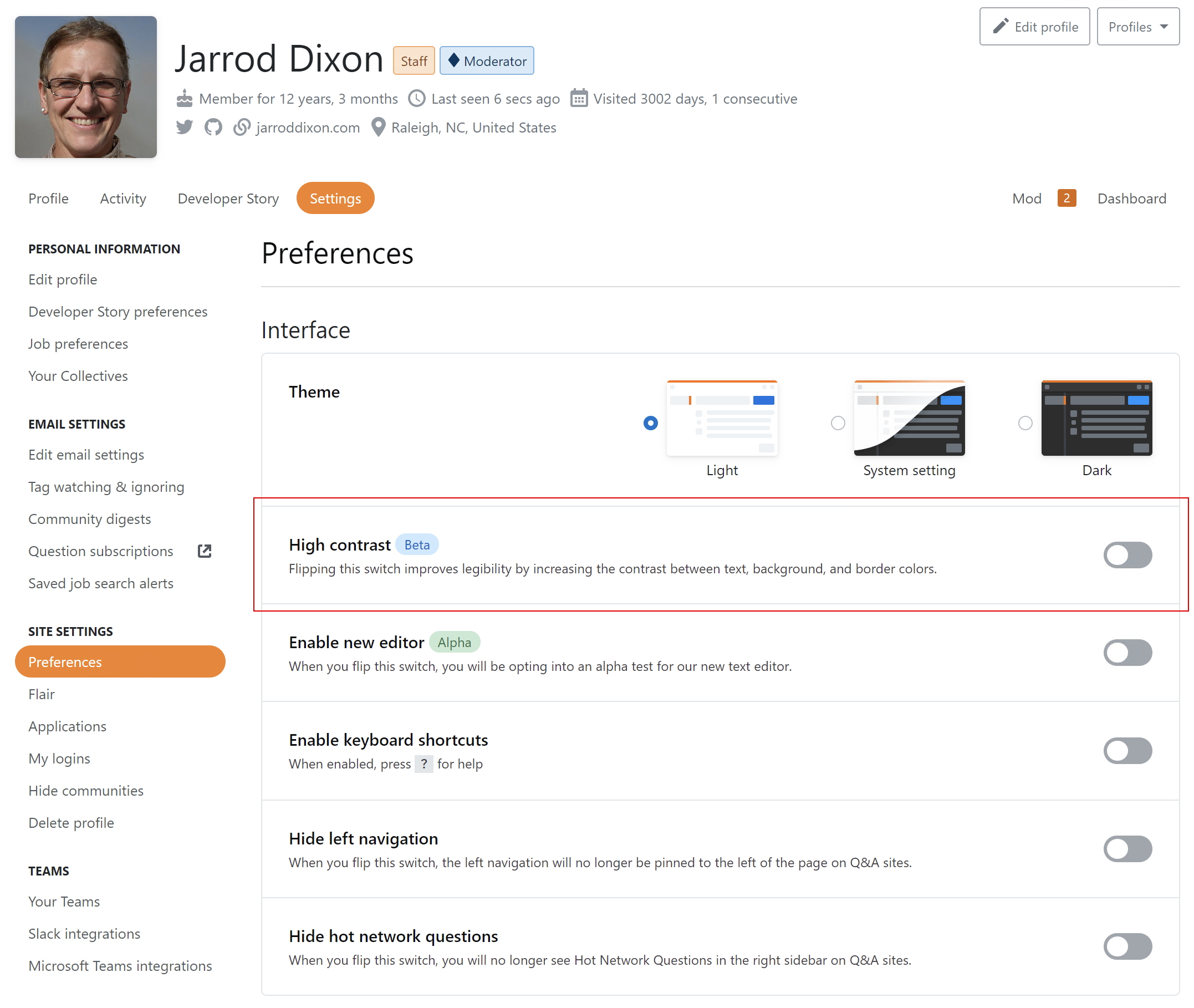
Today we’re introducing a beta of high contrast mode. You can enable it in your user preferences.

Settings

This setting will allow us to make the site more accessible for folks who need a bit more contrast without sacrificing aesthetics for those who don’t. Its goal is to make Stack Overflow meet or exceed WCAG AAA contrast criteria and more importantly, improve Stack Overflow for people with visual impairments. If you think you’d benefit from a high contrast interface, we’d love to know if this helps.

It’s available in both light or dark mode. Like dark mode, this was made possible by our design system Stacks. It will be available everywhere dark mode is. Currently, that’s Stack Overflow (And its localized sites in Japanese, Portuguese, Russian, and Spanish), Teams, and Enterprise.

Light

Dark

I’m sure there will be lots of areas that can be improved. Expect instances where high contrast isn’t applied properly or at all. If you find any of those, please add them as an answer here with some details about your operating system and your browser.
9
  • 11
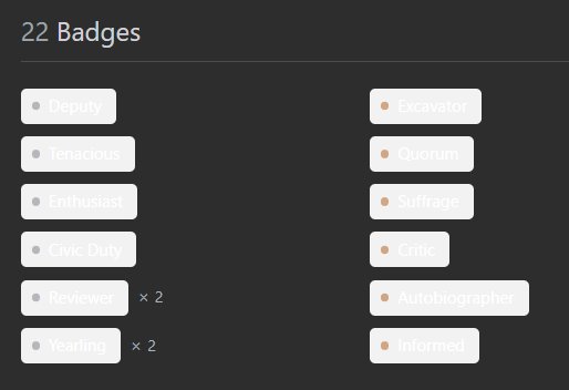
    Is this a bug? Badges have become light in dark mode
    – VLAZ
    Commented Sep 28, 2021 at 17:33
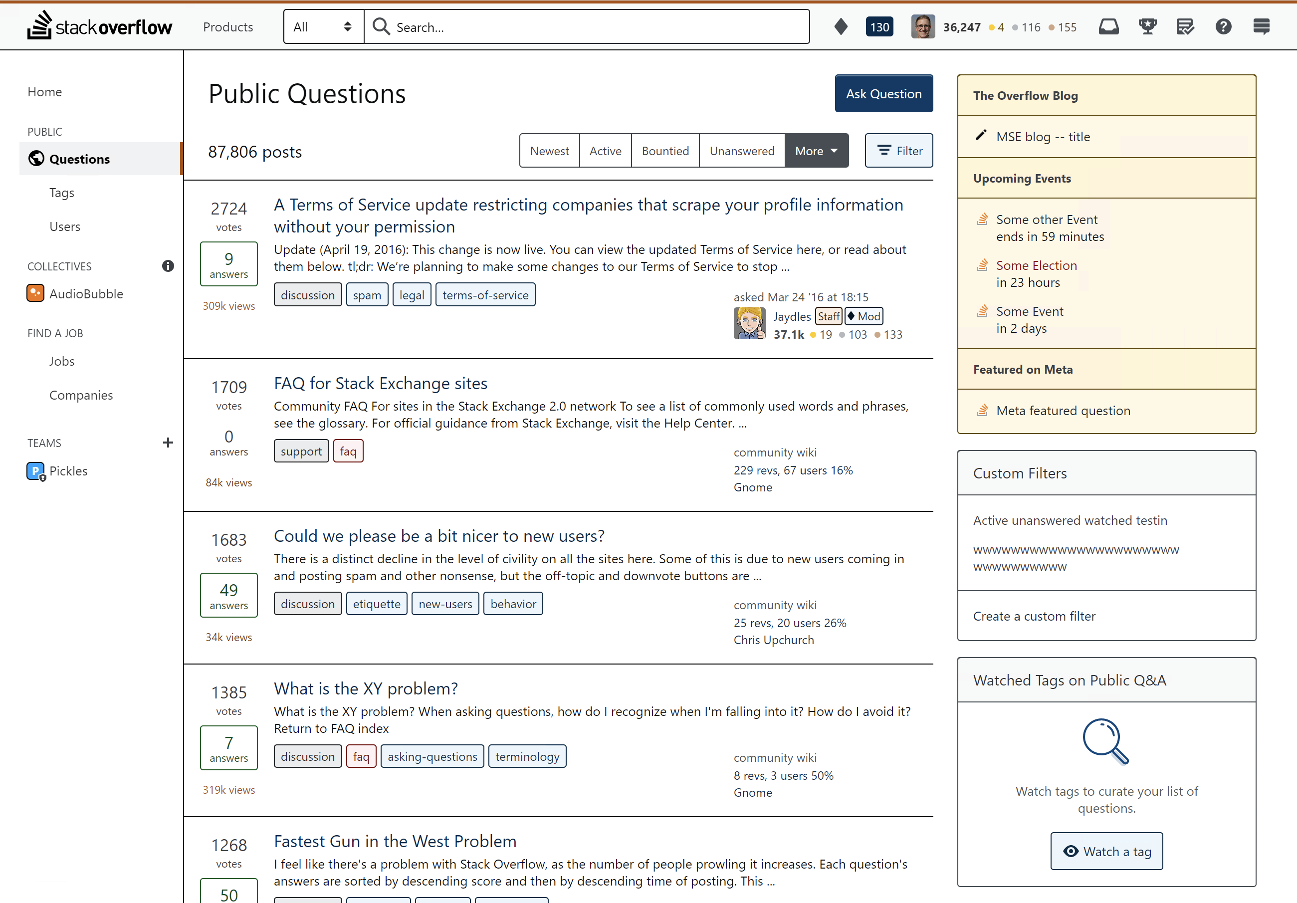
  • Why are Meta FAQs on the main site in the screenshot? Commented Sep 28, 2021 at 17:38
  • 7
    @Someone_who_likes_SE Our local development environment actually uses meta as its test database. I can update the screenshot if it's confusing.
    – Aaron Shekey StaffMod
    Commented Sep 28, 2021 at 17:42
  • 4
    Like this, but contrast is extra low for Teams completed items: i.sstatic.net/YeVxM.png Commented Sep 28, 2021 at 17:44
  • 4
    @Someone_who_likes_SE we've shipped a fix for the Teams completed items contrast. Thanks for reporting it!
    – Dan Cormier StaffMod
    Commented Sep 28, 2021 at 21:38
  • 2
    Nice for AMOLED screens!
    – ㅤㅤㅤ
    Commented Sep 30, 2021 at 11:32
  • lol, judging from the answers, I am one of the last non-dark SO user :P Commented Oct 1, 2021 at 16:56
  • 3
    Oof. The contrast is far too high in multiple places. There is only a 3:1 requirement for UI critical components. Other than that, borders, hr elements, etc. which are non critical, there is no defined contrast ratio. webaim.org/articles/contrast
    – Travis J
    Commented Oct 21, 2021 at 20:56
  • Any chance of getting a darker mode that doesn't have this high contrast? The dark+high contrast is a way better dark color than the regular dark, but I don't need the bright parts to be brighter also. Commented Apr 24, 2022 at 5:42

49 Answers 49

42

Low contrast of post interaction buttons (upvote/downvote, bookmark, history) in dark mode.

  1. Open any question.

The buttons are almost impossible to see in dark mode since they are dark grey on black background.

Image of the post buttons in high contrast dark mode. Very hard to see them as they blend into the black background

For comparison, here is the regular dark mode:

Image of the post buttons in regular dark mode. They are clearly distinguishable from the background

1
  • 4
    A fix for this has gone out and these buttons should have usable contrast now. Thanks for reporting!
    – Dan Cormier StaffMod
    Commented Oct 6, 2021 at 14:53
22

I don't have this mode enabled :

enter image description here

But I got issue with dark theme on google chrome, I can't read badge :

enter image description here

Except when I put my mouse on hover:

enter image description here

5
  • How can I add the "bug" tag on my answer ?
    – Elikill58
    Commented Sep 28, 2021 at 19:22
  • 4
    with [meta-tag:bug]
    – Kevin B
    Commented Sep 28, 2021 at 19:26
  • 8
    This bug is a byproduct of messing with badge CSS for high contrast mode (but not necessarily because of high contrast mode). We have a fix that'll be going out in the next release. See also: meta.stackoverflow.com/a/411824/652353
    – Dan Cormier StaffMod
    Commented Sep 28, 2021 at 19:33
  • 3
    Same problem in high contrast dark mode: i.imgur.com/N2j3quG.png
    – VLAZ
    Commented Sep 28, 2021 at 19:34
  • We shipped a fix for this late last week. Thank you for reporting this!
    – Dan Cormier StaffMod
    Commented Oct 6, 2021 at 14:54
21

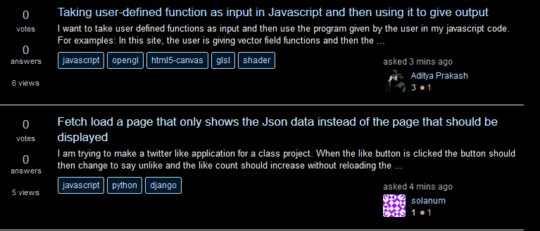
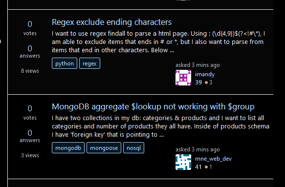
Very hard to tell difference between visited and unvisited links in question list

  1. Open a question list, for example a tag like like , or , or .
  2. Open one of the questions in the list.

This will mark the link as visited. However, it is very hard to tell which one is or is not visited as the difference between their colours in high contrast dark mode is very small. Here is an example where the second link is visited:

Image of two questions. The difference in the colour of their titles is very small.

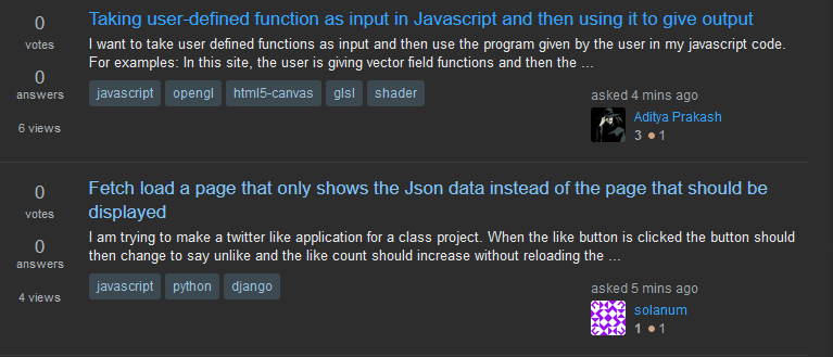
For comparison, this is normal dark mode for the same questions:

Image of two questions. The difference in the colour of their titles is easy to distinguish.

20

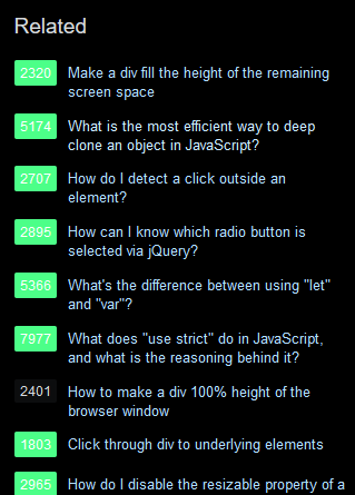
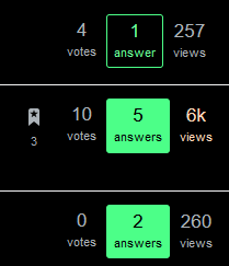
Low contrast of scores of questions with accepted answers in the Related menu

  1. Open a question.
  2. Look at the Related questions on the right.

The score is in white and if the question has an accepted answer, the score gets a light green background. This makes it borderline illegible.

Screenshot showing almost illegible scores of questions

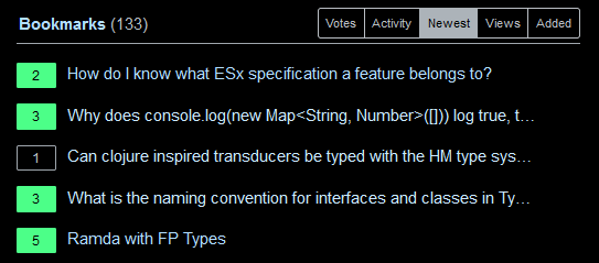
For comparison, profile shows the scores of bookmarked questions with accepted answers in dark numbers while the scores of questions without accepted answers are light. This looks a lot more legible on a green background.

Screenshot of the "Bookmarks| section of a profile. The scores are legible.

Related similar issue with score text in the profile

1
  • This is now fixed in production. Good catch!
    – Dan Cormier StaffMod
    Commented Oct 6, 2021 at 14:54
17

While the contrast in "Activity → All actions" for absolute dates is fine, it's a bit low for the relative ones.

Light mode (fails all WCAG standards):

Dark mode (fails all WCAG standards as well):

1
  • 1
    We shipped a fix for this issue late last week, but I'm not 100% sure we got all instances of this specific relative date contrast issue. I think we're good, but let us know if you come across this issue again. Thanks!
    – Dan Cormier StaffMod
    Commented Oct 6, 2021 at 14:57
11

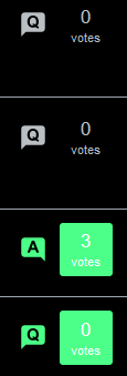
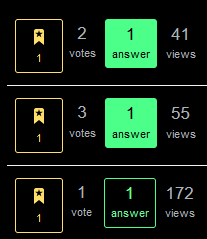
Inconsistency and low contrast of how scores are shown for followed posts in the profile

  1. Go to your user profile.
  2. Go to the Following tab.

The followed posts where there is an accepted answer have light letters on light green background. Posts where there is no accepted answers have light letters with no (the default dark) background. The light on light green is hard to read:

Image showing the hard to read scores for followed questions

This is inconsistent with the following tabs in the profile which show information in a similar way:

  • the "Questions" tab:

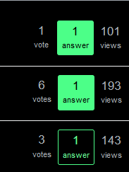
    Image showing the scores in the "Questions" tab in the profile. The ones with accepted answers have dark text on green background. Ones without accepted answers have green text without a background and a green outline around the score box.

  • the "Bookmarks" tab:

    Image showing the scores in the "Bookmarks" tab in the profile. The ones with accepted answers have dark text on green background. Ones without accepted answers have green text without a background and a green outline around the score box.

  • the "Bounties" tab:

    Image showing the scores in the "Bounties" tab in the profile. The ones with accepted answers have dark text on green background. Ones without accepted answers have green text without a background and a green outline around the score box.

A similar issue with score text

1
  • I believe this should now be fixed. Let us know if we missed a spot!
    – Dan Cormier StaffMod
    Commented Oct 6, 2021 at 14:58
10

I would really appreciate a higher-contrast color for showing up deleted posts in your flag history:

enter image description here

Or perhaps the [Deleted] tag on deleted followed posts:

enter image description here

It looks OK in the screenshot, but you'll have to actually go to the flag history to get it.

9

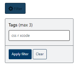
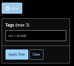
The filter button in review queues has low contrast when it's pressed.

Light Mode Dark Mode
Light mode dark mode
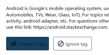
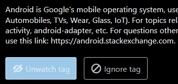
9

The "Unwatch tag" button on tag pages (example) has insufficient contrast in both light mode:

"Unwatch tag" button with black text on a dark blue background

And also in dark mode:

"Unwatch tag" button with white text on a light blue background

The "Filter" button has the same problem:

"Filter" button in light mode with black text on a dark blue background "Filter" button in dark mode with white text on a light blue background

8

Hard to distinguish the question author name in comments.

  1. Open a question where the author commented on any of the posts within.

For me, at least, it is impossible to tell which user is the question author or not in high contrast dark mode:

Image showing two comments. First from user "Angry John"; the second from user "T.J. Crowder"

Perhaps somebody else can tell which of the two users above is the OP but not me.

Here is normal dark mode for comparison:

Image showing two comments. First from user "Angry John" who has a distinguishable background set on their name; the second from user "T.J. Crowder"

1
  • 1
    This is true in light mode as well with contrast enabled
    – Suraj Rao
    Commented Oct 2, 2021 at 13:49
8

Low contrast for badge counts in top bar in light mode on Teams:

User icon, reputation, and two badge counts - silver and bronze, both dull colors on a black background

In fact, it looks lower-contrast than with high contrast mode disabled:

ser icon, reputation, and two badge counts - silver and bronze, both bright colors on a medium gray background

2
  • 1
    Your "light mode" looks very dark ;) But.. I don't know about the top bar in Teams.
    – Scratte
    Commented Sep 29, 2021 at 7:29
  • 5
    @Scratte the top bar in Teams is dark in both light & dark modes.
    – Ryan M Mod
    Commented Sep 29, 2021 at 7:58
7

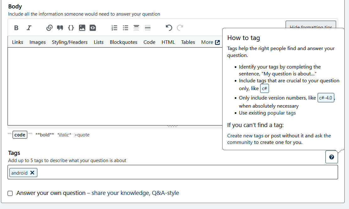
The button for adding an ignored tag has no padding at all:

enter image description here

2
  • This has been fixed! Thank you for reporting it!
    – Dan Cormier StaffMod
    Commented Oct 6, 2021 at 15:15
  • 1
    @DanCormier I saw, a week ago in fact ;), thanks for the ping though Commented Oct 6, 2021 at 15:17
7

Low contrast between watched and unwatched tag questions using dark mode (light mode is acceptable):

enter image description here

7

Low contrast on links relative to the surrounding text in light mode:

"Looking for more? Browse the complete list of questions, or popular tags. Help us answer unanswered questions." in black text on a white background, with "complete list of questions", "popular tags", and "unanswered questions" in very dark blue text that is nearly indistinguishable from black.

(there are three links in that text)

Spot the links (solution):

Screenshot of the ask a question page with many links in dark blue in the middle of black text

7

Low contrast of notification which allows a live reload

  1. Go to a tag like , or , or (picked top 3 most popular tags).
  2. Wait until a question is posted.

A notification appears which can be clicked in order to live load the questions.

The background of this notification is almost indistinguishable from the normal background of the page in high contrast dark mode.

Image shows a notification which reads "36 questions with new activity" but the background of it is hard to see.

For comparison, here is the notification in normal dark mode:

Image shows a notification which reads "2 questions with new activity". The notification has a visible background which makes it seem like a button.

This is the same for other notifications of this kind like ones showing new answers to questions or edits to posts. However, the steps here describe the easiest way to get this notification.

7

Enabling high contrast mode reduces contrast ratio of "Used by thousands of organizations around the globe" text on Teams signup page (from 2.14 to 1.28 —though neither meets accessibility standards).

"Used by thousands of organizations around the globe" in dark gray on a darker gray background

Compare to normal mode:

"Used by thousands of organizations around the globe" in medium-light gray on a medium gray background

A similar issue occurs in light mode (contrast ratio 1.26):

"Used by thousands of organizations around the globe" in light gray on a white background

6

Issue is very similar to this one.

The recommended badge tag has light text on green background. It would be easier to read with dark font color.

Recommended badge

5

Enabling high-contrast mode reduces text contrast on Press page in dark mode (compare to normal mode):

Press page with cards having light blue text on a light gray background

And light mode (compare to normal mode):

Press page with cards having dark blue text on a medium gray background

And despite appearances, I have correctly labeled the light mode/dark mode images...

5

On this page, the text under the green titles is hard to read.

screenshot of the issue

5

The upvote/flag button next to comments is barely visible.

screenshot of the issue

5

"Take a tour" button on Company pages has insufficient contrast in dark mode (it's fine in light mode).

"Take a tour" button with white text on a light blue background

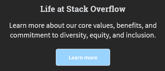
The "Learn more" button at the bottom of the "Work here" page is similarly broken:

Screenshot: "Life at Stack Overflow
Learn more about our core values, benefits, and commitment to diversity, equity, and inclusion." with a "Learn more" button below it with a white outline, white text, and a light blue background

5

Low contrast on "Read more" link in privacy policy announcement banner in light mode:

Banner reading "We changed our privacy policy. Read more." on a dark gray background with "Read more" in dark blue text

And in dark mode:

Banner reading "We changed our privacy policy. Read more." on a very light gray background with "Read more" in light blue text

4

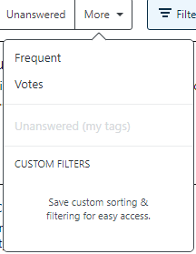
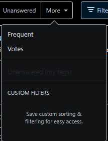
The "Unanswered (my tags)" link in the "More" popover has low contrast if it's disabled (that is, if the user has no watched tags).

Light mode (fails all WCAG standards):

Dark mode (fails all WCAG standards as well):

4

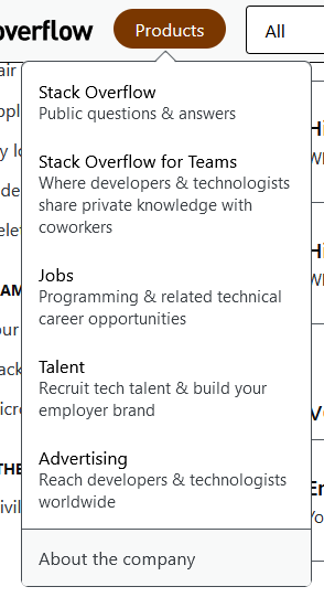
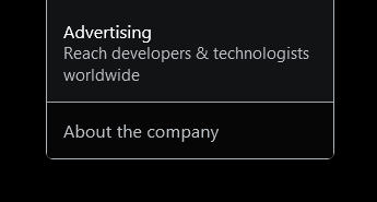
In light mode, bottom corners of "Products" dropdown are light while the rest of the border is dark:

Screenshot of a dropdown with a black border and grey curved bottom corners

The opposite problem occurs in dark mode:

enter image description here

4

On the Employer Branding page, the "Source:" text is hard to read.

screenshot of the issue

On the Talent page, there's a similar issue:

screenshot of the issue

3

Jobs/Search: the search/location icons are barely visible.

Jobs - Screenshot of the issue

3

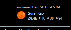
The gravatar within the flair in the side menu seems to have gotten a background color.

Flair in side menu

The gravatar in header and posts do not have these. This looks inconsistent.

Flair in post

3

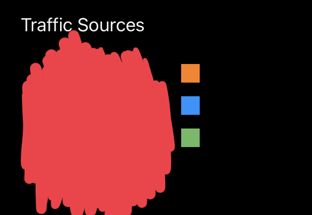
Site Analytics: traffic source legend labels aren't visible. (On the right of the 3 squares, there should be visible labels)

screenshot of the issue

2

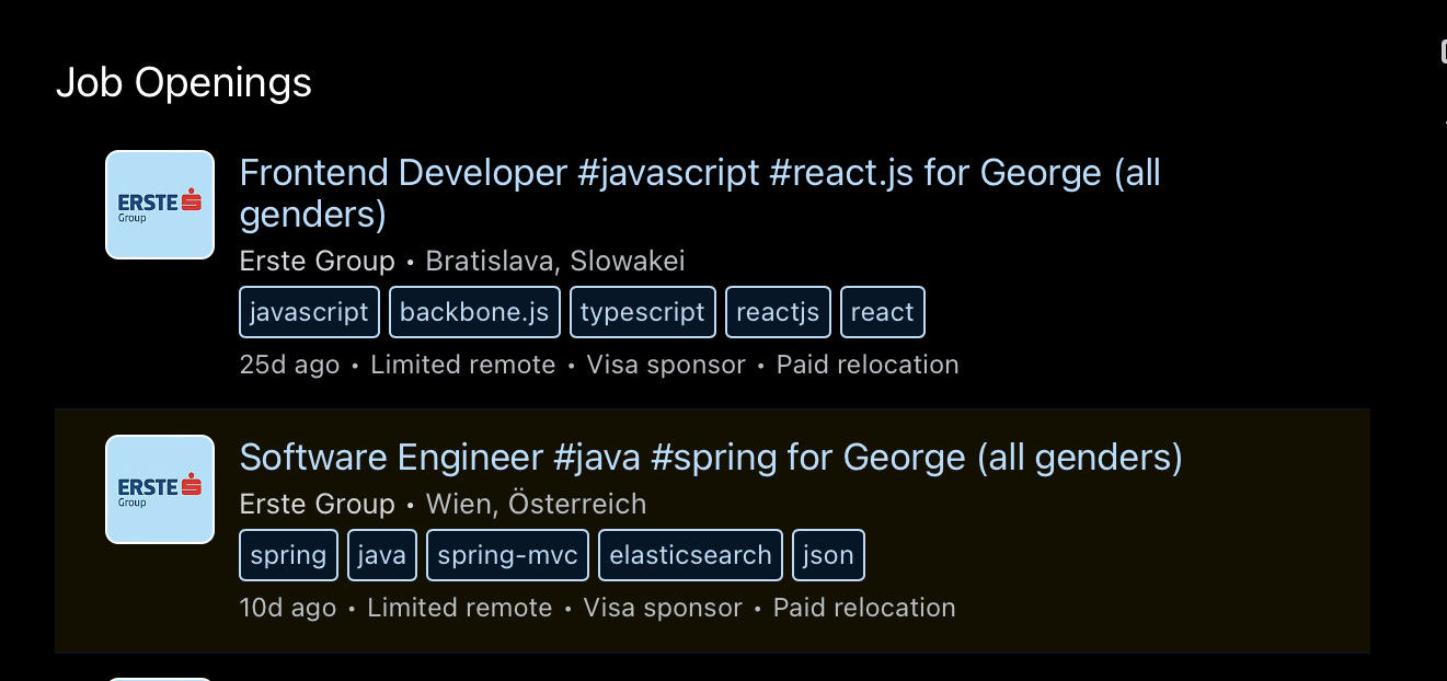
Similar to this bug: highlighted and not highlighted jobs are difficult to distinguish.

screenshot of the issue

2

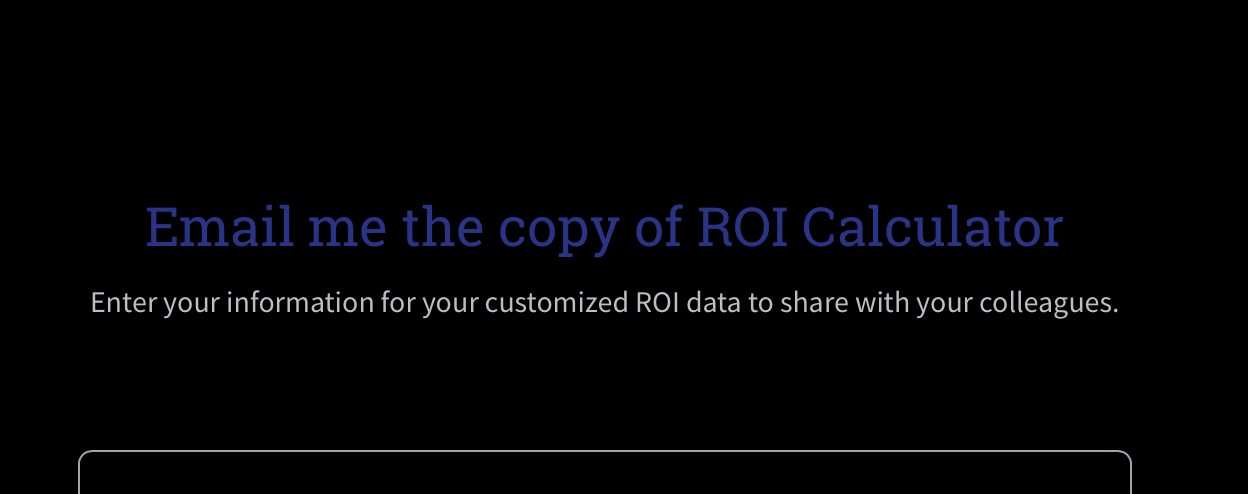
On this page, the "Email me the copy of ROI Calculator" title is not easy to read.

screenshot of the issue

You must log in to answer this question.

Not the answer you're looking for? Browse other questions tagged .