104

Today, we are rolling out a major redesign of Post Notices (the banners displaying the reason why a question is "Closed" or "On Hold") on Stack Overflow.

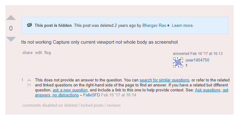
For our purposes, a "post notice" includes any status banner shown on questions or answers: deleted, merged, migrated, closed, locked, protected, bountied, as well as any informational notices that can be applied to posts by moderators.

Note that it is a phased rollout, which means that it will only be seen by 50% of users, with the other 50% of users continuing to see the old notices.

There is a big announcement post on the global Meta. Since this feature is destined for the whole network, please leave all comments, feedback, questions, etc. on the MSE post.

36
  • 18
    Were the off-topic close reasons supposed to change as well, or is that a separate action from this?
    – Machavity Mod
    Commented Oct 29, 2019 at 12:30
  • 5
    The actual root reasons have not changed, but the labels and descriptions have all been adjusted
    – Yaakov Ellis StaffMod
    Commented Oct 29, 2019 at 12:30
  • 4
    From Yellow at the bottom to blue at the top. Great! But may we have it at the bottom. When I dive in poor question, I would love to have the notice near the flag. So I dont have to scroll up. Or blame caching for not having enought choice in the Flag option. Commented Oct 29, 2019 at 12:53
  • 2
    @DragandDrop Thanks for the suggestion. For the time being, the new notices are going to all be above the question (old notices were inconsistent, some above and some below).
    – Yaakov Ellis StaffMod
    Commented Oct 29, 2019 at 12:55
  • 6
    @DragandDrop I believe top is the place where these should be! so that they would be immediately obvious to the reader. Commented Oct 29, 2019 at 13:22
  • 2
    @TimLewis can you please leave an answer with a link to the question and/or screen shot. Hard to work on it just through your description here. However, the blue background is here to stay. Will take a little bit of getting used to, but hopefully will work for everyone.
    – Yaakov Ellis StaffMod
    Commented Oct 29, 2019 at 14:14
  • 2
    Presumably, this 50:50 release in being synchronized with the new dialog boxes for flags and close votes? I'm seeing these - my first issue (almost an objection) is that the "Too Broad" option seems to have been removed. Any particular reason for that? Commented Oct 29, 2019 at 14:15
  • 1
    @Adrian "Too Broad" was replaced by "Needs more focus" Commented Oct 29, 2019 at 16:16
  • 1
    Instructions here are to leave feedback on the MSE post, but many of the changes here are SO-specific (since they're to SO's close reasons). I've left answers about those here, since it seemed like the only useful thing to do.
    – Mark Amery
    Commented Oct 29, 2019 at 17:02
  • 31
    How "here to stay" is the blue background? Personally I find it a lot harder to read, at least with that font color. Commented Oct 29, 2019 at 17:19
  • 38
    In addition to what @JohnMontgomery said, the blue color itself gives me the impression that it just represents a [temporary] notice, like "Due to a power outage you may experience some issues ..." or "This post is locked to prevent further editing" or even "This is a duplicate of ...". In my opinion, for questions that are put on hold it should be some variant of yellow so that it kind of calls out to tell you that an action is required! Commented Oct 29, 2019 at 17:52
  • 7
    I was seeing the new format this morning (Adelaide (+0930) time), but now I'm not. How did I switch from one 50% to the other?
    – Nick
    Commented Oct 30, 2019 at 7:32
  • 2
    @VisualVincent that's because you've developed a learned association for the original color yellow, and now the blue (the complementary color) looks odd. If SO had used blue from the start then yellow would look odd.. Remember when google chrome switched from faint yellow to faint blue for autocomplete fields, and it was "wtf?" .. and now it's normal..
    – Caius Jard
    Commented Oct 30, 2019 at 20:48
  • 5
    @Trilarion Unless you have eyesight issues... Yellow was better, blue is bad, bad, bad color... and contrast is reduced as well, fonts are smaller...
    – Dalija Prasnikar Mod
    Commented Oct 31, 2019 at 9:35
  • 7
    The canned text for the first dupe close vote offends me. Does this answer your question? invites the poster to specifically engage me in some sort of back and forth including pleas for how I dont understand how their problem is completely different from any which has come before... Not only are comment not the place for long conversations, the whole point of Dupe Closes is to close down pointless repetition Commented Nov 21, 2019 at 21:33

18 Answers 18

373

Apparently, once I, as a gold badge holder, close a question as a duplicate of another one, an automatic comment is left on my behalf below the question, reading

Does this answer your question? Link to duplicate

I have three problems with this.

  1. As a gold badge holder, I am responsible for judging if this is or is not a duplicate. Only if I'm certain about that fact, I would close the question. But in that case, why would I ask if it answers the question? Asking whether or not it answers the question would imply that I am not certain; this undermines the authority given to gold badge holders.
    Inversely put, I would only ever ask if some other Q&A answers this one, if I'm uncertain - in which case I would of course not close the question, and wait for a response of the OP.
  2. This being a question essentially invites for interaction, which is - as I understand - not desireable in comments. In most cases, neither am I interested in knowing if OP thinks this answers their question, nor am I interested in getting notified in case the answer is a simple "Yes, thank you.". However, such comments are practically asked for by the nature of the automatic message.
  3. There is a high chance this comment comes across as sarcastic. If the question is an obvious duplicate and I ask below if the duplicate answers the question, it will sure read as if I was making fun of the OP, asking for the obvious.

I would therefore propose to either not put any automatic comment below the question, or at least not on behalf of me, or to change the comment for something definitive. I could imagine this to be something like

I closed this question as duplicate of Link to duplicate. If you agree, no further action is needed. If not, please [edit] the question, to make it clear in how far the questions differ and/or the answers are not helpful for this problem. Then ping me in a comment, such that I can review the changes.

Of course such message could also not be put as comment, but in a yellow/blue box below the question - just like we had it before.

17
  • 31
    There are already a couple of answers in the linked MSE post regarding this. Bottom line: it's a bug. The comment should be auto-deleted as the question is closed. (Answer 1, Answer 2).
    – yivi
    Commented Oct 29, 2019 at 15:00
  • 61
    "neither am I interested in knowing if OP thinks this answers their question" - I am, actually. Getting feedback on duplicate votes - especially since they're binding by a gold badge user - is important to me, so that I can better judge questions in the future. Maybe the OP was asking about some specific aspect of the well-known problem, which warrants a proper answer (or a better duplicate target).
    – Bergi
    Commented Oct 29, 2019 at 21:33
  • 23
    @Bergi I think I have to disagree. Either that specific aspect is part of the question, in which case it may not be a dupe after all; or it is not, in which case they need to edit the question anyways. I wouldn't object a notification-on-edit-of-dupe-hammered-posts-functionality though. Commented Oct 29, 2019 at 21:49
  • 5
    @ImportanceOfBeingErnest Yes, that's all I meant to clarify: I'd like to be notified when someone disagrees with my unilateral close vote, especially the OP who might be new and not know that they can tag me in a comment. And yes, I upvoted your answer because I'm not quite sold on an automated comment as the right way to enable this kind of interaction.
    – Bergi
    Commented Oct 29, 2019 at 21:54
  • 4
    Whilst I personally am not adverse to some level of interactivity, and as has been mentioned by @Bergi there are somewhat positive aspects to this. Personally I would regularly leave a clarifying comment as to what specific part of a marked duplicate ( or even specific answer ) applies to the question put on hold. But I do share the main concern of point 3, and mostly in that in an attempt to use "inviting language" the tone could very easily be mistaken as a "taunt". There's enough issues with people crying murder over duplicate holds already without adding further fuel.
    – Neil Lunn
    Commented Oct 30, 2019 at 9:19
  • 2
    Would probably add that point 1 is certainly very valid. Again I see "inviting" here as taking a bit more precedence than granting due respect to gold badge holders that do indeed understand perfectly what a close/hold actually means and also treat that with the respect it deserves. Much again there is already too much commentary in backlash that "my question was not read or understood", and softening the language here might have the opposite effect of making this weighted decision sound like a suggestion, and from someone who is not sure. Which really should not be the case.
    – Neil Lunn
    Commented Oct 30, 2019 at 9:24
  • Why not have the auto-comment to the possible dupe be posted by a pseudo-user like "Stack Overflow System" instead of the person actually suggesting the dupe?
    – Ian Kemp
    Commented Oct 30, 2019 at 13:04
  • 14
    "Asking whether or not it answers the question would imply that I am not certain; this undermines the authority given to gold badge holders." You think too highly of yourself. I have seen many gold badge holders mark questions as duplicates that were not duplicates. Commented Oct 30, 2019 at 15:06
  • @IanKemp "Stack Overflow System" is basically what "Community" does.
    – user10957435
    Commented Oct 30, 2019 at 20:45
  • 2
    @jmarkmurphy indeed. Some would even argue that the question is actually a dupe even when you try to explain that no, it's not a dupe or it's actually a dupe of a different question. Not all, of course - many are reasonable people but it happens. The attitude of "I'm right, since I have a gold badge" is what's wrong.
    – VLAZ
    Commented Oct 31, 2019 at 8:47
  • @jmarkmurphy Whilst I will not discount some people abusing the "gold badge privilege", rest assured that I do see plenty of evidence that the majority of dedicated contributors do indeed take due consideration into the "dupe hammer" hold vote. Also please note this is a hold and not damning your question to oblivion. A good deal of people will actually note that if there is an edit to a question with sufficient merit to distinguish it from others, that it should indeed be re-opened. And "gold badge" holders can indeed do that with a "single stroke", as it were. We're not all bad.
    – Neil Lunn
    Commented Oct 31, 2019 at 9:58
  • 1
    Some extended discussion has been archived in chat.
    – Cody Gray Mod
    Commented Nov 1, 2019 at 15:00
  • 1
    @Holger Some of them edit the question. Some of them write a comment. Some edit the title. Sometimes they use uppercase or expletives. In either case, I rarely get a notification like I would on a response to a comment.
    – Bergi
    Commented Nov 11, 2019 at 13:39
  • 4
    Yeah, really don't like having that question put in my mouth. "Possible duplicate" says "look here if you want help". "Does this help you?" says "yes please, dear person who answered 'it doesn't' less than two minutes after I suggested the dupe and therefore clearly didn't read it, continue to ping me in comments to beg me to do your debugging for you".
    – manveti
    Commented Nov 12, 2019 at 2:03
  • 1
    You can't be certain that you understood someone else's problem correctly. Therefore asking for confirmation is just polite. (even if you are certain ;) )
    – hek2mgl
    Commented Nov 20, 2019 at 13:14
82

This is specific to SO, so I am posting this here.

We discussed this in detail a few months back. While the new closure reason is nice, it really needs to have a link to the help center page in the close reason.

MRE 2.0

13
  • 40
    Also, it should be "... and the shortest code necessary to reproduce the problem", instead of "... and the shortest necessary code to reproduce the problem".
    – Makyen Mod
    Commented Oct 29, 2019 at 13:18
  • @Makyen It seems the description for all the close reasons has been rewritten, which I guess means more than one of this type of thing will happen.
    – yivi
    Commented Oct 29, 2019 at 13:22
  • @yivi Here's the new off-topic list
    – Machavity Mod
    Commented Oct 29, 2019 at 13:26
  • 1
    @yivi Yes, such things happen, but that doesn't mean they shouldn't be pointed out and corrected.
    – Makyen Mod
    Commented Oct 29, 2019 at 16:50
  • 1
    The post notice currently links to the /help/closed-questions. We could replace this or add another link but we think that two links to documentaiton in a post notice is too much. So we're thinking we should just include a link to the the MRE page within the new close UX for this close reason.
    – Yaakov Ellis StaffMod
    Commented Oct 29, 2019 at 18:22
  • 1
    In future changes, we'll be offering guidance at multiple steps throughout the post author's edit/reopen workflow so there are a few places we could link to it. That way there is access to it while the user is attempting to edit/reopen their q, but we're not overloading the post notice with links to more reading. So the plan is to defer this for now and roll this change into the close UX change project.
    – Yaakov Ellis StaffMod
    Commented Oct 29, 2019 at 18:23
  • 11
    @YaakovEllis That doesn't sound like a good UX. You are basically saying "We'll wait to surprise users with more information later." Normally, when a new concept is introduced, you should link further explanation at the first place a user is going to see it on a page. Over-linking is usually when you link every occurrence of something, even linking multiple times to the same thing within a short piece of text. You're effectively saying "Thou shalt learn this my way", rather than letting users make the choice about how they are going to learn. That is almost always counter productive.
    – Makyen Mod
    Commented Oct 29, 2019 at 18:37
  • 3
    @Makyen the close topic guidance has been changed to "...shorted code necessary...". And thanks for your opinions on the UX.
    – Yaakov Ellis StaffMod
    Commented Oct 29, 2019 at 19:00
  • @YaakovEllis Thank you for making the change. It reads quite a bit easier now.
    – Makyen Mod
    Commented Oct 29, 2019 at 20:38
  • 15
    I hope that is a typo for "...shortest code necessary...".
    – Cody Gray Mod
    Commented Oct 30, 2019 at 0:10
  • "It needs more specific information". The boldface still asks for more information when there should be less. Commented Oct 31, 2019 at 4:46
  • 2
    @AnttiHaapala The close reason is used for both situations. The "minimal" part can indicate that the question is too long and needs to be narrowed; the other parts apply when there isn't enough.
    – jpmc26
    Commented Nov 1, 2019 at 1:39
  • @YaakovEllis ah, those features that will come “in future changes”… I’m still waiting for the future uber navigation that gave reason to kill the already working new navigation that performed well in beta testing…
    – Holger
    Commented Nov 11, 2019 at 12:21
74

The new MCVE reason:

It's seeking debugging help but needs more information. The question should be updated to include desired behavior, a specific problem or error, and the shortest necessary code to reproduce the problem.

... is misleading and self-contradictory in the scenario where we're closing because the code provided isn't short enough.

Dumping an unnecessarily massive wall of code previously violated the Minimal part of the MCVE/MRE guideline (and the Short part in the old SSCCE guideline), and therefore justified closure under the MCVE/MRE close reason. Presumably this rewrite doesn't imply any intent to change that, since the phrase "the shortest necessary code" is still there. Yet the first sentence of the close reason states as fact that the question "needs more information". If we've closed a question for containing too much code, that's not the case - and is in some sense the opposite of the truth.

4
  • 28
    I agree. I think it would be more accurate to say it's seeking debugging help but it does not clearly demonstrate the bug. Commented Oct 29, 2019 at 17:32
  • 1
    @Don'tPanic +1, great wording.
    – Mark Amery
    Commented Oct 29, 2019 at 17:44
  • It might. We know SE has been trying to be "welcoming" to new users.
    – S.S. Anne
    Commented Oct 29, 2019 at 19:23
  • 5
    When less code is needed, the question does need more information--in the information-theoretical sense.
    – philipxy
    Commented Nov 3, 2019 at 23:39
70

Screenshot of it being muuuuch better


Original post follows:

I've now encountered this "in the wild" for the first time:

Screenshot of new banner in action

This is a big, flat wall of text, that requires a high cognitive load to parse.

The old notice had line breaks and indentation that allowed the eye to separate the different sections of information:

  • Summary
  • Recommended action
  • "Learn more" link
  • Timeframe
  • People involved

There is now, of course, an additional piece of information:

  • Who can see this banner

… which is similarly munged into the block of prose.

Could you reorganise the banner to accommodate this UX principle?

It's also not clear at a glance how the two "Learn more" links differ, though they do in fact lead to different pages.

10
  • 39
    I even wonder why that who can see this banner is relevant. I can see it so thanks for confirming my awesomeness and if you can't see it, well .. you don't know you didn't see it ... I suspect it might have been meant as an UX hint for development / demo purposes, not to be included in the actual prose ...
    – rene
    Commented Oct 30, 2019 at 11:29
  • 4
    @rene: They're deliberately keeping it for now (and I've just realised this whole answer is on the wrong Meta; dangit) Commented Oct 30, 2019 at 11:37
  • 4
    This just feels like SO jumped backwards 10 years
    – j08691
    Commented Nov 1, 2019 at 15:35
  • 7
    OMG. I clearly don't visit this space enough. Love the changed username. Hilarious. Or maybe not, as the case may be. Generally agree though. Passive blue and the placement might not be the best framing, and again I will re-iterate that "soft inviting language" is really getting in the way of expressing the point. Seems someone forgot the previous "harsh directness" employed by prior messages actually encouraged people to research and learn.
    – Neil Lunn
    Commented Nov 2, 2019 at 8:59
  • 3
    The bottom section has been reorganized to hopefully help with the readability
    – Yaakov Ellis StaffMod
    Commented Nov 5, 2019 at 13:48
  • 2
    @YaakovEllis Ahhhh much better, thank you and good job :) Commented Nov 5, 2019 at 14:34
  • 2
    @YaakovEllis Just one little niggle - is the "not viewable" icon now in the wrong place maybe? Or does it mean summat else... Commented Nov 5, 2019 at 14:36
  • I think the specific reason for off topicness is not included for third party viewers.
    – Braiam
    Commented Nov 5, 2019 at 14:39
  • 1
    @LightnessRaceswithMonica icon stays where it is
    – Yaakov Ellis StaffMod
    Commented Nov 5, 2019 at 14:53
  • 1
    It doesn't even tell you the close reason! Commented Nov 26, 2019 at 0:36
58

The current reason is

It's caused by a typo or problem that can no longer be reproduced. While similar questions may be on-topic here, this one was resolved in a way less likely to help future readers.


Changing this reason:

This question was caused by a problem that can no longer be reproduced or a simple typographical error.

... to this:

It's caused by a problem that can no longer be reproduced. While similar questions may be on-topic here, this one was resolved in a way less likely to help future readers.

... entirely eliminates a possible reason ("simple typographical error") for closure. What's more, since "The actual root reasons have not changed, but the labels and descriptions have all been adjusted", this change retroactively renders previous closures for that reason nonsensical. We presumably now have a bunch of questions that were closed for being simple typographical errors and yet are now displayed as being closed for what is essentially a wholly unrelated reason.

If you want to scrap the typo closure reason entirely (on which I've got no strong view), you should retire the old reason and create a new one (so that the old reason's text will show on posts) instead of just altering its text. That way, you'll avoid retconning the close reason of old typo questions into something that both wasn't the true reason for closure and would've made no sense if it were.

1
35

The new reason for Too broad is now Needs more focus.

I've closed gimme teh code questions (ones where the OP has 0 code and asks us to implement something that will probably require hundreds to thousands of lines of code) with it.

This is leading to confusion. I've seen the OP editing in a ton of details about his exact setup to add focus to the question, but those details are not the problem.

How do we handle this? Is this still the appropriate close reason for such questions?

4
  • 4
    That still seems appropriate IMO. They need to focus on a specific answerable problem. Commented Oct 30, 2019 at 17:20
  • 6
    @JohnMontgomery Yes, it does need to be more focused on a narrow, answerable problem, but that's not what the close text indicates based on a simple reading. As it is, it's, potentially, more confusing and frustrating to users who are trying to edit their question into shape such that it can be reopened.
    – Makyen Mod
    Commented Oct 30, 2019 at 19:30
  • 14
    Actually I think too broad doesn't really fit to tthose cases either? Maybe there should be another close reason, like too much effort required on our side, and too little on your's. Please note that this is a community of volunteers, and we don't have the time to write whole programs for you. Please try to start on your own, do some research, then when you get stuck, we are glad to help Commented Oct 30, 2019 at 19:51
  • 4
    "Too broad" was by far my most used close reason. I've almost stopped casting close votes because no close reasons fits that type of question now.
    – Roland
    Commented Nov 13, 2019 at 13:28
33

enter image description here

I had to read over that section of a "dupe-closed" banner two times to understand that the bold text only applied to the lower half of the block.

There are a couple of ways to make that block easier to understand:

  • Linebreaks & :: enter image description here
  • Linebreaks & move the "visibility" message to a <sup> footnote: enter image description here
  • Or just completely remove the message. There's no need to explain that you can see the message when you can see the message: enter image description here
5
  • 14
    +3 (1 for each of these) -- any of them would be better than the current situation, in my opinion.
    – TylerH
    Commented Nov 1, 2019 at 20:39
  • Yes please! The current wording and display confused me: meta.stackoverflow.com/questions/390992/…
    – mbauman
    Commented Nov 1, 2019 at 20:54
  • 6
    You make some good suggestions, we are taking them under consideration. Thanks!
    – Yaakov Ellis StaffMod
    Commented Nov 3, 2019 at 8:57
  • 9
    This has been implemented: Linebreaks & move the "visibility" message to a footnote. Thanks!
    – Yaakov Ellis StaffMod
    Commented Nov 5, 2019 at 12:24
  • 4
    Awesome, thanks for the (SE & Answer) update, @YaakovEllis!
    – Cerbrus
    Commented Nov 5, 2019 at 12:26
27

The new description text on duplicate-closed questions says

Some community members have associated this/your post with similar questions.

Previously, it was the much stronger

This question has been asked before and already has an answer.

Does this mean that duplicates do no longer need to be exact duplicates, but just similar?

Of course, this is the more or less established practice already, and I like that we're conveying it like this to the asker now. Still, is this supposed to change what questions should/will be closed by the community?

2
  • 2
    The second version sounds as if the question is closed forever. I think the new version might encourage OPs to actively question our decisions, which is a great thing IMO. I guess that was the main intention. And I don't think that the communities behaviour can be changed by the wording of this message, it's rather the other way round. Commented Oct 30, 2019 at 19:59
  • 2
    @JonasWilms I'd agree with that intention, but it seems they failed to convey that
    – Bergi
    Commented Oct 30, 2019 at 20:20
21

What happened to the mention of typos in the "Could not be reproduced" close reason? Is this still the appropriate close reason for typo questions? If not, what should we use instead?

I'd actually be happier if there were a separate close reason for typos and questions that are founded on other minor mistakes, where permanent answers are not useful to the community. This used to be the "Too localized" close reason.

For example, how should we deal with I'm getting "ValueError: invalid literal for int() with base 10: '\n ::\n ::::\n :: ::\n ::\n ' " error?

9
  • 7
    Close reason has been changed to: It's caused by a typo or problem that can no longer be reproduced. While similar questions may be on-topic here, this one was resolved in a way less likely to help future readers.
    – Yaakov Ellis StaffMod
    Commented Oct 29, 2019 at 19:19
  • @YaakovEllis Please use [meta-tag: for tags specific to Meta, such as feature-request, discussion, support, and status-*.
    – S.S. Anne
    Commented Oct 29, 2019 at 19:26
  • @YaakovEllis Silly me, I was looking in the detailed description, I didn't look in the reason itself.
    – Barmar
    Commented Oct 29, 2019 at 19:47
  • 1
    "Typo" still means "minor issue", right?
    – Bergi
    Commented Oct 29, 2019 at 21:38
  • @Bergi Yes, I generally conflate them for lack of anything better.
    – Barmar
    Commented Oct 29, 2019 at 21:40
  • Why are people upvoting my post that was based on misreading the new text?
    – Barmar
    Commented Oct 30, 2019 at 14:49
  • @Barmar Not sure what you mean, unless I'm misreading. The text was updated again after you posted this answer. Commented Oct 30, 2019 at 17:26
  • @JohnMontgomery Oh, I misunderstood, I thought I just missed it!
    – Barmar
    Commented Oct 30, 2019 at 17:29
  • I didn't realize it was changed after my question, I thought he was describing the original change to the close reason.
    – Barmar
    Commented Oct 30, 2019 at 17:30
18

The list of people should be there, but it's empty instead.

image

If this is because I shouldn't see the list of voters to begin with (no deletion rights), it should end at "just now." without the "by".

4
13

The date that questions were deleted is wrong. On Can Bash's C functions safely be called from dynamically loadable builtins?, I see this: This post is hidden. This post was automatically deleted 0 months ago by Community♦. Learn more. However, when looking at the revision history, you see that it was actually deleted back in May.

4
  • 4
    Thanks, I'll add this to the list of things to look into
    – Yaakov Ellis StaffMod
    Commented Oct 31, 2019 at 12:17
  • Interestingly, now it says "1 months ago" instead. So two bugs in one: it's the wrong amount of time, and it doesn't use the singular form of "month". Commented Nov 1, 2019 at 1:26
  • 1
    @YaakovEllis The date is wrong on answers as well. See here for instance: the answer was deleted "19 months ago", but was asked in August.
    – Blackhole
    Commented Nov 3, 2019 at 22:59
  • 3
    Relative post close times are now being shown accurately
    – Yaakov Ellis StaffMod
    Commented Nov 5, 2019 at 13:03
13

This is trivial feedback, but the blue background makes me skip over the box. I'm not sure why. Perhaps it looks too much like a banner ad.

11

The "protected" question notice is very distracting when I get to a question because I want to see answers, not because I want to answer it myself. Perhaps this message would be better placed near the answer box.

Also, "highly active" doesn't sound like an accurate description of old questions that have been around for a long time and aren't currently "active" in any meaningful way. They're just protected because they initially or over time attracted some non-answers asking for some variation on the question. And/or code-dumps of bad ways of solving it.

10

A minor styling issue exists on "this post is hidden" notices. Compared to normal posts, there is about double the amount of space above a post when this notice is displayed. I would expect margin-top to not be applied to this post notice in this specific case to have consistent styling between all answers. The post can be found here.

A deleted post


Update: here is how it looks now

fixed deleted post

3
  • 3
    This is fixed. Top margins on deleted answer post notices are now showing up as would be expected.
    – Yaakov Ellis StaffMod
    Commented Nov 5, 2019 at 12:31
  • @YaakovEllis Unless A/B-testing is over, when checking the linked post myself it appears that the notice is gone completely for me.
    – Sumurai8
    Commented Nov 5, 2019 at 18:16
  • 1
    I added a new screen shot
    – Yaakov Ellis StaffMod
    Commented Nov 5, 2019 at 18:19
4

I don't think this information is of any use to users that meet the reputation requirement, while taking up space and grabbing visual attention.

How about just replacing this big blue box with just the small fire icon to the side of the votes for the majority of us, and only show the information for the users where it's relevant?

enter image description here

7
  • 3
    Thanks for your feedback. The notice is there because a mod wanted to protect the post for this reason. It is shown to make users aware of the special status of the question. We aren't going to be changing this interaction right now.
    – Yaakov Ellis StaffMod
    Commented Nov 5, 2019 at 17:14
  • @YaakovEllis How is the special status relevant for us that can answer? Is the intention that we should think twice before adding yet another answer?
    – Alex
    Commented Nov 5, 2019 at 17:40
  • 3
    The notice is informational, @Alex. It's not new; we've shown protected status on questions for years. The only change here is to the wording and position (bottom of question -> top of question). But yes - you probably should think twice in these situations: once about whether another answer is needed, once about whether maybe the question doesn't need to be protected at all.
    – Shog9
    Commented Nov 5, 2019 at 18:58
  • 1
    @Shog9, Yeah of course, I've seen the old one many times. That was general message if I'm not mistaken. This new text is directed specifically to me, approving my reputation. It's become personal, and because of that it suddenly feels very pointless when I'm individually addressed with information that is useless to me.
    – Alex
    Commented Nov 5, 2019 at 19:07
  • 6
    @Shog9 And if the only informational value is to make us think twice about answering or the protection status, just write that instead?
    – Alex
    Commented Nov 5, 2019 at 19:20
  • 1
    That's a pretty good idea, @alex - suggest it!
    – Shog9
    Commented Nov 6, 2019 at 3:27
  • @YaakovEllis Or if the post is "hot" and the Community AI decided to protect it.
    – S.S. Anne
    Commented Nov 8, 2019 at 12:35
2

I have an issue with the general positioning of the new notice.

We had inconsistency in the old notice positioning with either:

  • Top/Bottom notice (Ex.), or
  • Bottom only notice (Ex.).

But the Bottom notice was closed to the flag button.

Now on long post, When clicking the flag button there is no way to know if the question is already closed. Except from the limited choice in the flag choice. If the closure happened when you were reading you have to scroll up to discover the close reason.

After this change, for two minutes I was clearing cache/refreshing, trying to close a question before understanding that it was already closed.

6
  • 1
    If you don't mind, I can remove the duplicate box on the Java question. It was old and from a long time ago.
    – S.S. Anne
    Commented Oct 29, 2019 at 15:54
  • 1
    @JL2210, randomly chosen exemple got a review. I see no issue with that. Commented Oct 29, 2019 at 15:59
  • 1
    You already did something right? I get a Zoidberg effect now. I see both notice i.sstatic.net/RbAUR.png Commented Oct 29, 2019 at 16:01
  • I removed "Possible Duplicate" from the question.
    – S.S. Anne
    Commented Oct 29, 2019 at 16:03
  • Ho that was in the question it self.. ooh. Hooooo… It killed the dupe link for the Group B... They now only have i.sstatic.net/m4mnf.png Commented Oct 29, 2019 at 16:09
  • 8
    We feel that the benefit of consistent, prominent positioning outweighs the minor inconvenience here. The user can scroll on long posts to overcome this issue. We are going to stay with all of the notices on top.
    – Yaakov Ellis StaffMod
    Commented Oct 29, 2019 at 18:56
-8

I'm generally in favor of most of the wording changes, although one now means it's not entirely off-topic to just post your homework or even work requirement and say "do it for me". I think a slightly softer tone will help the more easily frustrated accept that their current question won't get the answer they were looking for.

Are we planning to invest time and effort as much as we have for making Stack Overflow a welcoming place, as we will to retain them to get them to help others? I've seen over my time here some incredible rudeness to people who comment or provide answers.

6
  • 1
    I'm doubtful that there would ever be a version of close notices that would change what people post or comment. If you find posts that do not follow the community guidelines, flag them.
    – Unihedron
    Commented Oct 30, 2019 at 16:43
  • 1
    @Unihedron Im beginning to wonder why i care for SO. 2 down votes for agreeing with the changes and asking if we are going to take as much care not to offend people who answer and keep people once they get here.. It just doesnt seem like this place is a good place to be now, the poison is in the system
    – BugFinder
    Commented Oct 31, 2019 at 8:15
  • 3
    1 of the down vote is from me and it's because it's off topic - not what's being asked.
    – Unihedron
    Commented Oct 31, 2019 at 8:38
  • 3
    -1 from me, same, the commentary does not appear germane to the subject at hand., Commented Oct 31, 2019 at 17:26
  • Kinda demonstrates my point in a way, Ive shown support in the conversation and asked if it will be extended and yet thats off topic..
    – BugFinder
    Commented Oct 31, 2019 at 18:11
  • 7
    Posting a complete assignment and saying "do it for me" is rude and warrants a downvote for no demonstration of effort, not asking a specific question about how to solve it should be voted to close as <s>too broad</s> needing more focus. Not sure what has changed here.
    – Bergi
    Commented Nov 1, 2019 at 16:35
-11

What about high privileged users actually informing what they don’t like?

To me “off-topic” to a question is like a teacher grading every exam with “not correct” - it does not help. For you it’s one button, but for us who really have interest in what we ask it’s discriminating.

First of all, duplicates are not always duplicates, as I saw many times. When your question is marked as duplicate i’d like to see a button “it helps” or “different question”. The current way is like any secret agency with alien objects - does it answer your question? no? lem’me mark it as duplicate anyway. - And sometimes it’s just the english that makes you not understand it. You need to understand, SE is pretty international.

Second, off-topic is good, but not perfect. I remember asking about poker code on a poker SE is forbidden, as there’s SO.com. Then there’s poker and boardgames yet both are being asked about poker stuff. You can’t, of course, tell nor predict every possible question and 100% define what’s good and bad. But ‘off-topic’ is ... (deep disappointment breathe)

Last and least, make the allowed characters in comments a bit more. One had to message me in three comments.

6
  • 2
    There is more to every off-topic message than just "off-topic". They are listed in the help center under What topics can I ask about here? and What types of questions should I avoid asking?. As far as disagreement with closure, there's a section for that: What if I disagree with the closure of a question? How can I reopen it?, as well as on for duplicates. Commented Nov 26, 2019 at 20:59
  • Yes, but no. Help centers may be unclear, and - in fact - every question is good. If more people would move it to other SE sites rather than hiding it.
    – user9144436
    Commented Nov 27, 2019 at 5:40
  • 5
    Every question is good?! Noooo, no and thrice no!
    – DavidG
    Commented Nov 27, 2019 at 12:47
  • @DavidG See; youre going against what i wrote in the main post. A statement without a reasoning. You’re likr a ghost, actually like a nobody.
    – user9144436
    Commented Nov 27, 2019 at 12:48
  • 1
    So if someone comes to this site and asks "Would you rather fight 100 duck-sized horses or one horse-sized duck?" you think that's a good question?
    – DavidG
    Commented Nov 27, 2019 at 12:50
  • 4
    I think you've misunderstood of the scope of Stack Overflow as outlined in the tour; important takeaways are "Not all questions work well in our format." "Don't ask about...Questions you haven't tried to find an answer for (show your work!), Requests for lists of things, polls, opinions, discussions, etc., Anything not directly related to writing computer programs". Regarding comments: "It's not a discussion forum. There's no chit-chat."; "Use comments to ask for more information or clarify a question or answer." Asking for more info or clarification should not take 3 comments. Commented Nov 27, 2019 at 14:04

You must log in to answer this question.

Not the answer you're looking for? Browse other questions tagged .