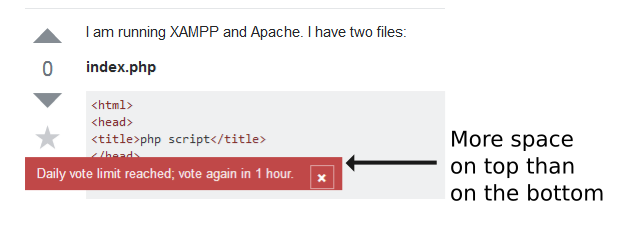
When voting (up or down) on a question, I noticed it contains more space on top of the "x" to close the popup dialog box than at the bottom.
Is this a (CSS) bug?
Here is a screenshot:
It would look better if it contained the same amount of space top and bottom.
