48

The new responsive design is now live and I think it (mostly) works well. However, there is one thing that has been driving me mad.

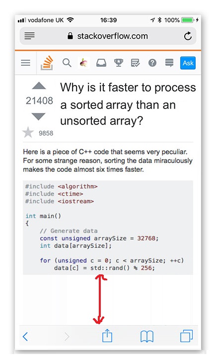
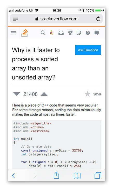
The vote controls take up around 25% of the page width on my iPhone 6 even when they aren't visible on the page.

enter image description here

This is a lot of space to lose on a small screen and makes the text and code difficult to read. It doesn't look too great either once you have scrolled past the controls.

I think this space should be reclaimed in order to give the post body more room. The vote controls would obviously need to be moved.
6
  • 4
    I'd be inclined to implement this on Desktop too. Let's get those votes upfront.
    – Paulie_D
    Commented Jun 13, 2018 at 16:16
  • 1
    Thank you for making your screenshots of the mobile interface large enough to see the problem, but not so large I have to scroll a lot. Commented Jun 13, 2018 at 20:46
  • @ <194px comments and answers collapse to 1 character per line, which is pretty amusing given at 194px they have 10 or so characters per line. Commented Jun 13, 2018 at 22:31
  • Related on MSE: meta.stackexchange.com/a/310941/284336 See the comment on that answer from Joe. :)
    – Catija
    Commented Jun 13, 2018 at 23:32
  • I noticed this too: meta.stackoverflow.com/questions/363642/…
    – Mr-IDE
    Commented Jun 14, 2018 at 10:36
  • 1
    That question title badly needs to be wrapped around that 'Ask a Question' button, too.
    – TylerH
    Commented Jun 14, 2018 at 16:03

4 Answers 4

31

I'll post my sketch as an answer so that it can be voted separately to the question...


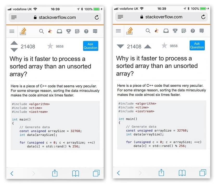
My first thought was to move them above the post body. Something along these lines:enter image description here

17
  • 2
    Thanks to CSS-Grid this is a snap. I may just play with Stylish!
    – Paulie_D
    Commented Jun 13, 2018 at 16:26
  • 6
    Pity you couldn't fix the header while you were in there too to allow more than 3 or 4 words per line. ;) Commented Jun 13, 2018 at 19:27
  • 1
    @RoddyoftheFrozenPeas Yeah. The "Ask" button taking up the same space as the tile is a little crazy.
    – Turnip
    Commented Jun 13, 2018 at 19:58
  • How about rotating the buttons 90 degrees so right increases and left decreases? Having up and down on the left and right sides is confusing. Although that would probably mean this needs to be done everywhere else where there's voting too. Ok, never mind. Commented Jun 13, 2018 at 23:33
  • @Dukeling I wouldn't know if increasing was supposed to be to the left or to the right. Commented Jun 14, 2018 at 10:42
  • @Dukeling I agree they should be the other way around. Just a mistake when Photoshopping. I've switched them around now.
    – Turnip
    Commented Jun 14, 2018 at 10:48
  • @DenysSéguret Numbers on horizontal lines (e.g. graphs) tend to increase from left to right. And I'm sure you'd be able to figure it out by trial and error. Commented Jun 14, 2018 at 10:48
  • 3
    Instead of struggling to determine which vote direction should be on the left and which one should be on the right, it would be better to have both arrows kept together. Either Up/Down/Score or Score/Up/Down.
    – Cœur
    Commented Jun 14, 2018 at 10:51
  • @Cœur or... rotate them, then people can stop complaining about downvotes. There's no negative connotation to a left vote... right?
    – user4639281
    Commented Jun 14, 2018 at 18:12
  • 1
    @Coeur Vote buttons : I like them separated; nothing is more annoying than aiming for upvote and accidentally push downvote. It's not that it cannot be corrected, it's just frustrating. But the ask button still take too much place, if Turnip solves the Ask button, this is the best design Commented Jun 14, 2018 at 18:35
  • That gap between the votes and favourites would be huge on desktop... Commented Jun 14, 2018 at 19:21
  • @Dukeling what makes you think we wouldn't be using the current design on large screens?
    – Cœur
    Commented Jun 15, 2018 at 1:24
  • @Cœur How do you determine which arrow should be on the left and which on the right when they're together? Down/Up/Score and Score/Down/Up are also possibilities. Commented Jun 15, 2018 at 7:00
  • @Cœur I thought the whole point of this was to have a single design across all screen sizes. Commented Jun 15, 2018 at 7:12
  • @Dukeling the point of this is to fix the layout on screens that have less available space. Desktop is OK as is IMO
    – Turnip
    Commented Jun 15, 2018 at 10:32
21

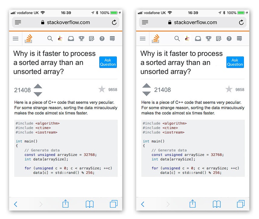
What about putting them next to the title?

8
  • 20
    What about the votes for answers?
    – jwg
    Commented Jun 14, 2018 at 10:06
  • @jwg Oh, right. I suppose we'll need to keep those next to the answers, which brings us back to roughly the same problem (although even having more space for just the question might be good). Commented Jun 14, 2018 at 10:34
  • 1
    Should favorite count be under the star instead of to the right?
    – user202729
    Commented Jun 14, 2018 at 13:48
  • @user202729 That could work too, but would make shorter titles look worse due to more empty space (and longer titles look better due to maybe having more horizontal space for the title and less wasted space on the left). We should probably do some statistical analysis on the length of titles (ideally taking into account where the lines will be split) to determine which way will look best (at least once we've decided to go with this approach). Or just dynamically change it based on the length of the title. Commented Jun 14, 2018 at 14:43
  • This is pretty much the approach we took in the Stack Overflow iOS and Android apps. There we have voting next to the title and favoriting moved down to the share/edit/flag action list. Answers were still indented because we didn't have a good way to collapse that information, and they could have a score, accept indicator, and bounty award attached to them.
    – Brian Nickel Staff
    Commented Jun 14, 2018 at 17:36
  • +1 for ask button well placed, but downvote button is too close to favorite button Commented Jun 14, 2018 at 18:59
  • @jwg They'd be in the exact same place, just without a title. This would also make it easy to see if you're viewing an answer (no text/title) or question (is text/title)
    – James
    Commented Jun 16, 2018 at 10:33
  • This is the better answer as it retains the same format of the arrows above and below the vote score.
    – James
    Commented Jun 16, 2018 at 10:35
8

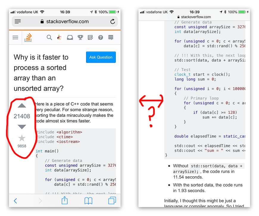
Assuming we put it on a separate line, as other answers suggested, here is a suggestion to put the "Ask Question" button on the same line, and put the line at the top (because the "Ask Question" button is not related to the question, so it shouldn't be in the middle of it).

We can also keep the line where it is, but one thing at a time.

1
  • Another way of doing it on the same line would be: "21408 ▲▼ 9858 ☆"
    – Cœur
    Commented Jun 15, 2018 at 7:43
-1

Here's an answer based on (a misinterpretation of) Cœur's suggestion on the other answer to keep the vote arrows together.

As some minor improvements, also removed some unnecessary whitespace and wrapped the "Ask Question" button text to give more horizontal space to the title (if we insist on keeping the button there). I also think the button looks better in the center instead of it having an awkwardly large gap below it (even if it doesn't logically fit in the middle, since it has nothing to do with either the question or the title).

5
  • I mean on one horizontal line. Anyway, thank you for the screens.
    – Cœur
    Commented Jun 15, 2018 at 1:26
  • @Dukeling If you're going to do something like this, at least put the major different options in separate answers, so people can vote on what they like. Putting multiple options in a single answer just makes the voting confused, and results in not having any decent information as to peoples preferences between different options.
    – Makyen Mod
    Commented Jun 15, 2018 at 2:18
  • @Makyen Done, pretty much. Commented Jun 15, 2018 at 7:38
  • To clarify: I meant on one line like: "21408 ▲▼ 9858 ☆"
    – Cœur
    Commented Jun 15, 2018 at 7:41
  • Those arrows being so close together might be a faff to press on smaller screens
    – James
    Commented Jun 16, 2018 at 10:35

You must log in to answer this question.

Not the answer you're looking for? Browse other questions tagged .