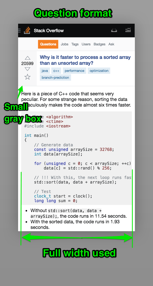
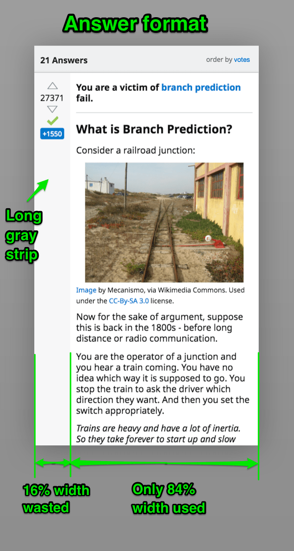
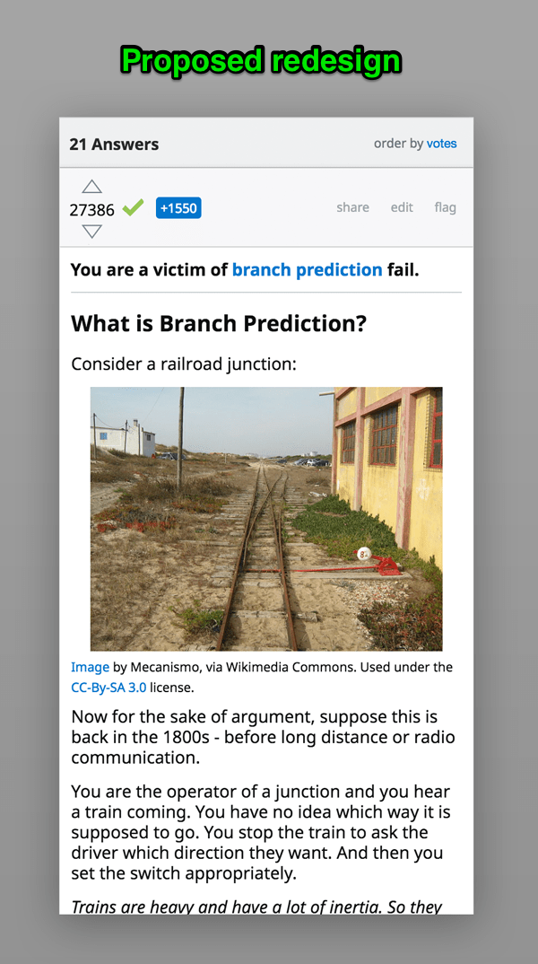
There is a way to almost fix it, but it's fairly technical and hard to setup, and it only works on Firefox mobile browser for Android devices (version 68 and below). This technique uses a Tampermonkey user script to alter parts of the web page styling. This is the JavaScript code:
// ==UserScript==
// @name        StackOverflow altered page
// @namespace   stackoverflow
// @include http://*.stackoverflow.com/*
// @include /^https?:\/\/(.*\.)?stackoverflow\.com/.*$/
// @include /^https?:\/\/(.*\.)?serverfault\.com/.*$/
// @include /^https?:\/\/(.*\.)?superuser\.com/.*$/
// @include /^https?:\/\/(.*\.)?stackexchange\.com/.*$/
// @include /^https?:\/\/(.*\.)?askubuntu\.com/.*$/
// @include /^https?:\/\/(.*\.)?mathoverflow\.com/.*$/
// @include /^https?:\/\/discuss\.area51\.stackexchange\.com/.*$/
// @include /^https?:\/\/stackapps\.com/.*$/
// @include https://web.archive.org/web/*/https://stackoverflow.com/documentation/*
// @version     1
// @author      StackOverflow user 'Mr-IDE'
// @grant       none
// ==/UserScript==

// Inspired by: https://meta.stackoverflow.com/questions/288674/custom-date-format

// Use this to change the CSS style of elements that don't look good.
// Use Firefox -> Tools -> Web Developer -> Inspector; or Google Chrome
// -> View -> Developer -> Developer Tools -> Inspector,
// to see these CSS elements. Help guides and original source:
// https://somethingididnotknow.wordpress.com/2013/07/01/change-page-styles-with-greasemonkeytampermonkey/
// https://stackoverflow.com/questions/19385698/how-to-change-a-class-css-with-a-greasemonkey-script
function addGlobalStyle(css)
{
    var head, style;
    head = document.getElementsByTagName('head')[0];
    if (!head) { return; }
    style = document.createElement('style');
    style.type = 'text/css';
    style.innerHTML = css;
    head.appendChild(style);
}

// Disable the large gray left margin. See:
// https://meta.stackoverflow.com/questions/363642/mobile-web-page-layout-has-small-width
// https://meta.stackoverflow.com/questions/369472/vote-controls-consume-horizontal-space-on-narrow-viewports
// https://stackoverflow.com/questions/1248081/get-the-browser-viewport-dimensions-with-javascript

// screenWidth is typically around 375 in portrait and 667 in landscape on most mobile phones,
// regardless of density or physical screen size. Check this with Firefox -> Tools -> Web Developer
// Inspector -> Click "Responsive Design Mode" icon on the right -> Select iPhone or Android phone (at top).
var screenWidth = Math.max(document.documentElement.clientWidth, window.innerWidth || 0);
if (screenWidth <= 700) {
    // Make the Answers use the full width, but start below the Up/Down arrows
    addGlobalStyle('.answer .answer-body .s-prose { width: unset; }');

    // Make the Up/Down arrows shorter in length, by reducing the padding
    addGlobalStyle('.-summary .-votes { padding: 6px 0 6px 0; }');
}
How to use:
- Install Firefox web browser on your Android mobile phone. Use version 68 or below, which you can download from Mozilla's website, for example from: https://archive.mozilla.org/pub/mobile/releases/68.11.0/ . Version 80 and above does not allow using the Tampermonkey add-on, as of April 2021.
- Install the Tampermonkey Add-on on both Desktop and Mobile Firefox.
- Create the new script on the desktop Firefox. Test it by loading a Stackoverflow page, then do Firefox ➔ Tools ➔ Web Developer ➔ Inspector ➔ Click "Responsive Design Mode" icon on the right ➔ Select iPhone or Android screen size (at the top).
- Export the above userscript + your Tampermonkey settings to a file: Click Tampermonkey toolbar icon ➔ Utilities ➔ File ➔ Export.
- Transfer the exported file to your mobile device, for example using Bluetooth or Dropbox.
- On Firefox mobile, import this file: 3-dots menu ➔ Add-Ons ➔ Tampermonkey ➔ Options ➔ Utilities ➔ File Import
The page should reload and apply the user script settings.


