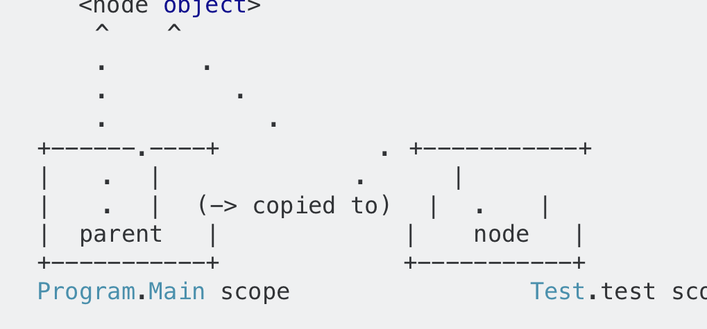
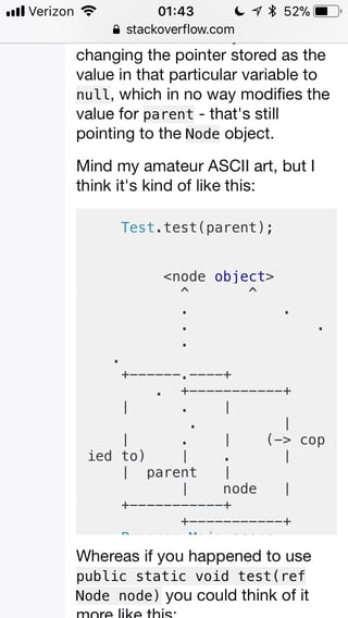
On my phone (iOS Safari - not the app) I followed a link to an old SO answer where I used ASCII art to illustrate a point, and was quite in seeing the art disfigured:
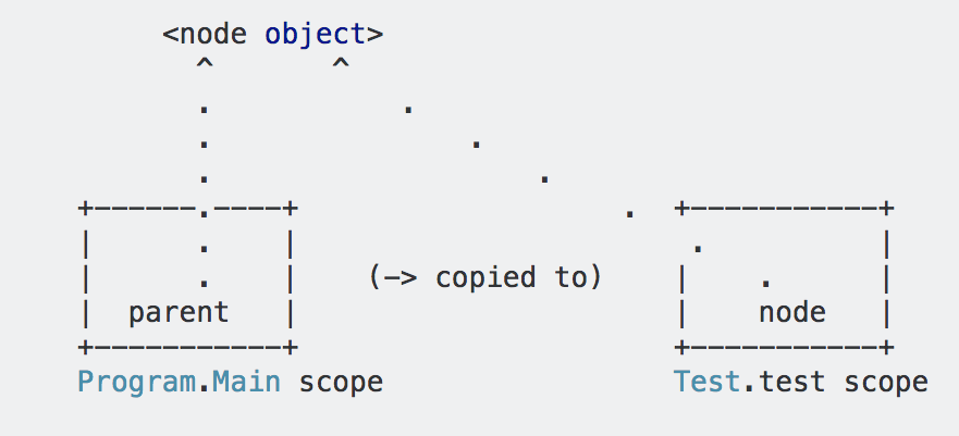
I put a reminder to fix it on my laptop later. When I got to that, I was even more surprised to find that it looked perfectly fine on the laptop (Mac Chrome):
What I find especially confusing is that this is just text - my intuition tells me that it shouldn't be subject to issues of styling or responsiveness. Specifically, it looks like sets of 4 spaces are being replaced by 2 (non-recursively) when being served to my mobile device.
Is this by design, or a bug? If it is by design, then should this design be reconsidered, or is ASCII art too niche of a case to worry about?
Dawdling: My guess-timation is that it is by design, to improve the readability of code snippets which have a lot of indentation. But even that would break if the code snippet was pasted from an editor which already used 2 spaces for tabs/indentation. Maybe some "smart detection" is required before compressing these spaces, which checks that all lines are indented by multiples of 4 spaces before doing so - and only applies to the beginning of the line.
The plot thickens
Following @Adam Lear's answer, I investigated further, and observed the following behaviours:
I apparently switch SO to desktop mode at some point in the past, and that setting was cached. So what I was seeing, with that bugged display, was in fact with desktop styling/rendering. Landscape mode did not help here because the width didn't actually change (due to it being much wider already, in desktop mode).
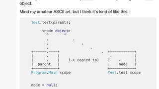
I reopened the page in a private session (thus not rendering in desktop mode) to see an image more similar to @Adam Lear's, which looked fine in landscape mode. I can see that the line is wrapping here instead of using a horizontal scroll bar. This is different to the problem I first observed, where spaces were being compressed - spaces are NOT being compressed this time...
I installed the Chrome browser and observed the same phenomenon as in point 2., which is interesting considering @chade_'s comment - Chrome on Android does NOT have this problem.
I tried viewing the site on my laptop while using the inspector to treat it as a small mobile device, where this error didn't occur.
So the behaviour in points 1 and 2 are quite different. In 2, the spaces are working fine, it's just the line that's wrapping when it's not supposed to. However, I still have no idea what's going on with 1.
It's interesting that the behaviour 2 occurs in both Safari and Chrome on iOS, but it works fine for Chrome on Android. Chrome on Mac worked fine, while Safari exhibited the behaviour in point 2.
I'm going to accept @Adam Lear's answer - landscape is the way to go, I'd guess that the problems causing these behaviours are quite "deep" and could be nightmarish to fix.


