264

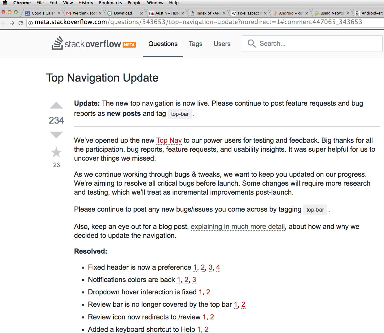
Update: The new top navigation is now live. Please continue to post feature requests and bug reports as new posts and tag .


We’ve opened up the new Top Nav to our power users for testing and feedback. Big thanks for all the participation, bug reports, feature requests, and usability insights. It was super helpful for us to uncover things we missed.

As we continue working through bugs & tweaks, we want to keep you updated on our progress. We’re aiming to resolve all critical bugs before launch. Some changes will require more research and testing, which we’ll treat as incremental improvements post-launch.

Please continue to post any new bugs/issues you come across by tagging .

Also, keep an eye out for a blog post, explaining in much more detail, about how and why we decided to update the navigation.

Resolved:

  • Fixed header is now a preference 1, 2, 3, 4
  • Notifications colors are back 1, 2, 3
  • Dropdown hover interaction is fixed 1, 2
  • Review bar is no longer covered by the top bar 1, 2
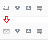
  • Review icon now redirects to /review 1, 2
  • Added a keyboard shortcut to Help 1, 2
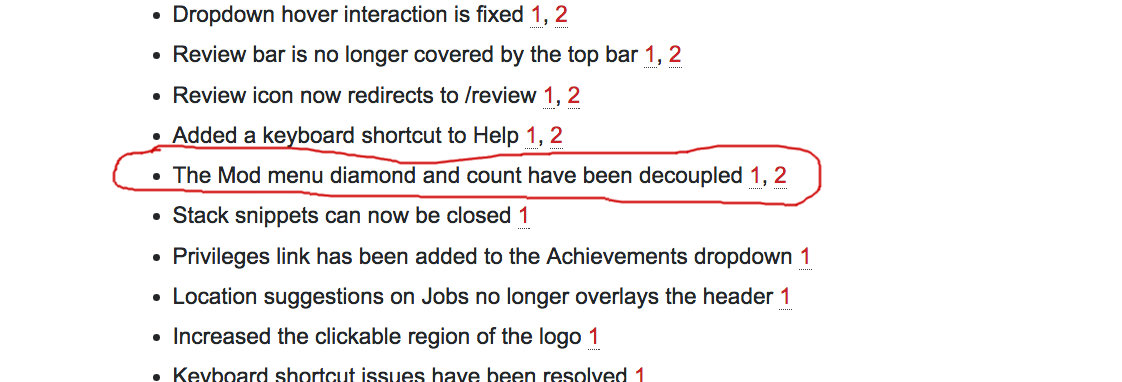
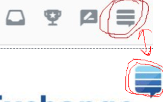
  • The Mod menu diamond and count have been decoupled 1, 2
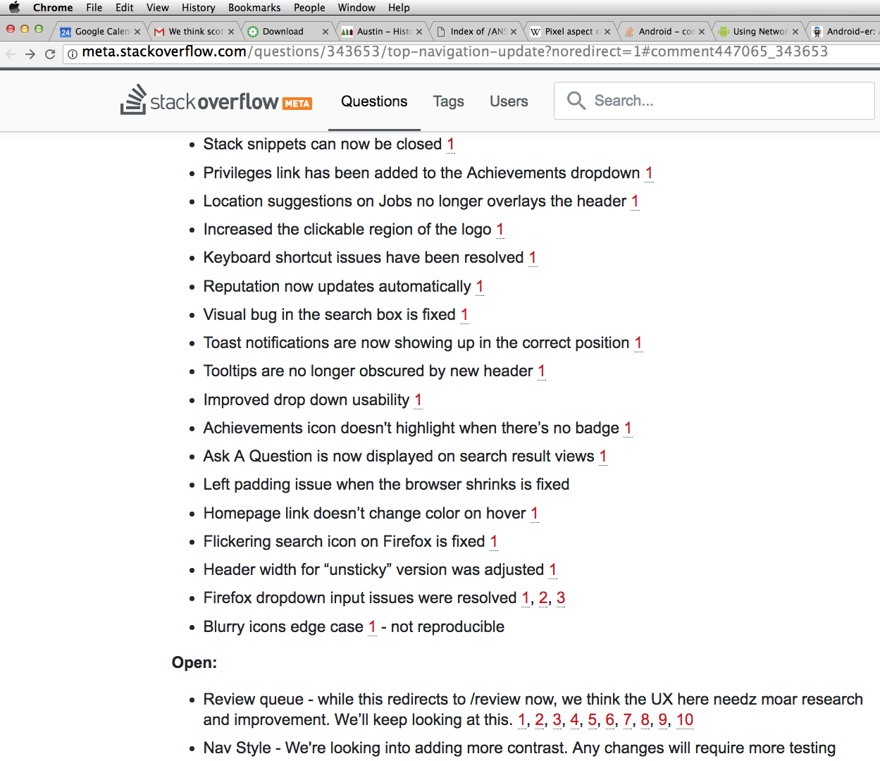
  • Stack snippets can now be closed 1
  • Privileges link has been added to the Achievements dropdown 1
  • Location suggestions on Jobs no longer overlays the header 1
  • Increased the clickable region of the logo 1
  • Keyboard shortcut issues have been resolved 1
  • Reputation now updates automatically 1
  • Visual bug in the search box is fixed 1
  • Toast notifications are now showing up in the correct position 1
  • Tooltips are no longer obscured by new header 1
  • Improved drop down usability 1
  • Achievements icon doesn't highlight when there’s no badge 1
  • Ask A Question is now displayed on search result views 1
  • Left padding issue when the browser shrinks is fixed
  • Homepage link doesn’t change color on hover 1
  • Flickering search icon on Firefox is fixed 1
  • Header width for “unsticky” version was adjusted 1
  • Firefox dropdown input issues were resolved 1, 2, 3
  • Blurry icons edge case 1 - not reproducible

Open:

  • Review queue - while this redirects to /review now, we think the UX here needz moar research and improvement. We’ll keep looking at this. 1, 2, 3, 4, 5, 6, 7, 8, 9, 10
  • Nav Style - We're looking into adding more contrast. Any changes will require more testing because changes here could invalidate previous tests. But we promise, we are looking into this. 1
  • Access to Help - this is currently available in the nav for anonymous & low rep users. We’re not sure it’s necessary as a persistent nav item, but we are thinking about it. 1, 2, 3, 4
120
  • 78
    Awesome update. A lot of fixes in a very short time. Thanks!
    – Kobi
    Commented Feb 13, 2017 at 18:56
  • 31
    Yes, thanks for the detailed fix list and all the hard work!
    – Joe
    Commented Feb 13, 2017 at 19:04
  • 16
    "We’ve opened up the new Top Nav to our power users": Nitpicking: It was already available to power users, it is now enabled by default. "Open up" implies opt-in. I see no way to "Opt out".
    – Cerbrus
    Commented Feb 14, 2017 at 13:47
  • 18
    Is it change site top navigation month or something? Github updated theirs as well... Commented Feb 14, 2017 at 13:51
  • 98
    How can I get back the normal stack overflow? I don't like this nav, it's too big and distracting. Commented Feb 14, 2017 at 13:52
  • 52
    The change just hit me literally while browsing StackOverflow so I'm still getting used to the new menu. I just wanted to add that the "old minimal black topbar" felt iconic and was a huge part of the StackOverflow identity. Kudos for working on improving StackOverflow, but I'm never forgetting my old safe-haven little black topbar ;-) Commented Feb 14, 2017 at 13:54
  • 26
    @Des It really disaster. Now I forced to use Tampermonkey or UBlock to remove it. Fixed-positioned elements is distraction! When we read and write code and prose, we want to think about code and prose. We don't need see our badges and login options permanently.
    – john c. j.
    Commented Feb 14, 2017 at 14:06
  • 70
    I don't understand what problems does this oversized top bar solve. Commented Feb 14, 2017 at 14:26
  • 63
    @Pogrindis: minimalism? The new bar is twice the size of the old one.
    – Cerbrus
    Commented Feb 14, 2017 at 15:19
  • 26
    @Pogrindis those are very subjective... I don't like the bar being twice the size it needs to be. There's no practical reason for it being that high.
    – Cerbrus
    Commented Feb 14, 2017 at 16:02
  • 88
    Oh My Deity -- I HATE the new top nav bar!!! CHANGE IS BAD! It looks so weird and you're fixing something that wasn't broken. I hate it so much. Can you give an option to use the good version if we aren't up for this? I know, I know, most comments are positive and I'm sure the UX guys know what's best, but maybe I'm not ready for it.
    – Hack-R
    Commented Feb 14, 2017 at 16:30
  • 57
    Why do you people have to keep changing things that aren't broken? This is a Q&A site, not some web brogrammer muscle-flexing exposition.
    – helrich
    Commented Feb 14, 2017 at 18:28
  • 55
    I hate the new nav bar. I dunno if I'm just not used to it or if its actually bad. I kinda liked having my new notifications inbox not tucked away in the far right corner where I never look. It used to be the first thing to catch my eye. Also, meta is now harder to get to. The help menu seems to have disappeared. If your fixing the top bar meta should have been made easier to get to (clicking on the help menu was never intuitive for me, and a button to get to chat should have been added). I also seriously hope you fixed the terrible search before making it so prominent. Commented Feb 14, 2017 at 20:59
  • 61
    If it's not BROKEN don't FIX IT.... I'm glad some people have the time to "hypothesize[d] that a lack of engagement with the nav was due to a combination of browsing habits, ...", the problem is these designers with excess time on their hands usually get it wrong... Switching the inbox, points, etc. to the far-right of the bar is a visual train-wreck. While in the grand scheme of things, it doesn't really matter, this "let's dork with something that is working well for reasons we just dreamed up and that make sense to me" has been the downfall for some pretty good user interfaces. Commented Feb 15, 2017 at 1:43
  • 8
    The new top nav is not much satisfying. White white looks weird. Commented Feb 15, 2017 at 4:58

41 Answers 41

304

The new top nav needs a dark theme. Since the design/moderation team has gone through with the white/white theme, all I can do is to help people get the dark theme back. To that end, you can use the Stylish add-on with Dimitri’s dark theme:

alpha

Or my dark theme with reduced height:

bravo

23
  • 31
    Under Open: "We're looking into adding more contrast. Any changes will require more testing because changes here could invalidate previous tests. But we promise, we are looking into this." Commented Feb 14, 2017 at 2:46
  • 8
    I'll repost my version too: i.sstatic.net/SIx8L.png - Light gray, no shadow, no orange line - gist.githubusercontent.com/kobi/…
    – Kobi
    Commented Feb 14, 2017 at 5:08
  • 31
    I disagree - the nav bar did need some kind of contrast, but not a dark colour necessarily. FWIW I think the light gray adds a nice touch of contrast without making the whole thing "in your face" Commented Feb 14, 2017 at 12:50
  • 13
    I think the light gray adds a nice touch of contrast Huh? Contrast??? Really? Not in a long stretch should 'light gray' (which is more 'ghost white' btw) and 'contrast' be in the same sentence!
    – TaW
    Commented Feb 14, 2017 at 13:48
  • 7
    I think what @MacroMan meant by contrast was that it stands apart from the rest of the site content as a distinctly different area.
    – Kurtis Beavers Staff
    Commented Feb 14, 2017 at 13:50
  • 10
    @Kurtis: Yeah, well but IT DOESN'T. In fact it is even a tad brighter than the Firefox bars! A good UI will always make it clear where the frame ends and where the content starts. It tries to do that with that weird orange line; "so sad".
    – TaW
    Commented Feb 14, 2017 at 13:52
  • 6
    I think the whole thing is very subjective, so we will have to agree to disagree Commented Feb 14, 2017 at 14:01
  • 2
    Aw, I just changed my profile pic to match the old reputation icon when it's green. Now I have to earn reputation and crank up paint.net again. =(
    – ourmandave
    Commented Feb 14, 2017 at 15:00
  • 6
    @KurtisBeavers Right, I understand you don't want regressions. I was just pointing out cheekily that while white on white is a stark and clean look, it's a bit strenuous on the eyes.
    – TylerH
    Commented Feb 14, 2017 at 16:13
  • 5
    I just logged in today and see the new white nav bar. Quite blinded by the light. Yes I couldn't agree more it needs a dark bar.
    – gideon
    Commented Feb 15, 2017 at 8:22
  • 4
    Looks like it has some contrast now and is not pure white. #fafafb Commented Feb 15, 2017 at 18:15
  • 10
    Seriously, you have to disclose your affiliation. I don't want to lock this, but I absolutely will if you insist.
    – Undo Mod
    Commented Feb 16, 2017 at 1:51
  • 14
    Seriously, Steven? Even after @Undo locks your post to stop you from rolling back, you wait for the unlock and roll back anyway - without even bothering to justify yourself in the comments? Whether the edit the mods are insisting on here is reasonable or not - and there's perhaps a case to be made that it's sufficiently clear that you are the author without that edit - it's common sense that if you're going to repeatedly defy the men with the big sticks, you should at least try to persuade them or others that you're right to do so.
    – Mark Amery
    Commented Feb 17, 2017 at 10:53
  • 3
    There should be "Steven's dark theme". I don't know that guy "my"!
    – brzuchal
    Commented Feb 20, 2017 at 11:54
  • 5
    The link to Steven's the dark theme looks like it is broken. Should we edit the whole thing out if that was removed? Commented Feb 23, 2017 at 12:53
199

The review icon is problematic.

  • It has a notification number which can never be dismissed. This is painful to constantly see. It is so distracting that I removed the entire icon with a userscript.
  • It is a link in a group of dropdowns. This makes it likely to waste time from users aiming at the dropdowns.
  • As an icon which represents only one link, it wastes important space, which could be used by other tools.

Make the review icon a dropdown. Remove its floating count. Have the dropdown contain links to:

  • review (only for 500+)
  • tools (only for 10k+)
  • tour
  • help center
25
  • 14
    From the question: "Open: Review queue - while this redirects to /review now, we think the UX here needz moar research and improvement. We’ll keep looking at this.". We are painfully aware that it isn't doing a good job - mostly due to its history - give us some time to figure things out.
    – Oded StaffMod
    Commented Feb 13, 2017 at 20:36
  • 9
    I disagree with the removal of the review count number. But if it's going to be removed, they'll have to change the icon itself, because it looks like a notification/message/chat icon. On meta (which rarely has a review count) I always mistake the icon for the inbox.
    – Floern
    Commented Feb 13, 2017 at 21:55
  • 3
    @Oded - That is fair. I just wanted to reiterate the point here. Thanks for the response.
    – Travis J
    Commented Feb 13, 2017 at 22:01
  • 2
    @yellowantphil: I think you mean less than 3000 rep. The suggested edit queue on Meta is open to 2kers, but only ever shows anything to 5kers, as there are no suggested edits on child metas except for tag wikis. Commented Feb 13, 2017 at 23:26
  • I was under the impression you could review first and late posts at 500 rep from this privilege: stackoverflow.com/help/privileges/access-review-queues so that is where the 500 rep suggestion came from.
    – Travis J
    Commented Feb 13, 2017 at 23:35
  • 1
    I noticed a significant increase in review activity, which I think is definitely related to the new review icon design. (Not sure if this is good or bad for the overall review quality..)
    – Floern
    Commented Feb 14, 2017 at 14:54
  • 5
    I agree with a notification number you can't dismiss being a big UX no-no. Hope you guys are looking at that aspect as well. It's always been problematic, but it wasn't really an issue when there were 1800 pixels between it and the notifications I cared about. It's the proximity that is exacerbating it. Overall great work! Commented Feb 14, 2017 at 16:02
  • 2
    Upvoted for "make it a dropdown". I disagree about the task count: we sure as hell want it there, because we want people to go there and do stuff. Make the number zero!
    – Raphael
    Commented Feb 14, 2017 at 17:21
  • 7
    @Raphael: Didn't Wikipedia have an epidemic of qualified authors leaving the site because editing was being shoved down their throats? I think it's a cautionary tale...sure you want to encourage editing and moderation, but not at the expense of driving away the qualified people who are interested in donating their time to answer questions. Not everyone who is interested in one will be interested in the other. Commented Feb 14, 2017 at 19:44
  • 4
    @Raphael: As I mentioned in my first comment, there was a major difference in the old bar because that button was right-justified, far away from your other notifications. Your peripheral vision can easily tell when things are 10 inches away from the area you care about. Half an inch? Not so much. So much harder to ignore. Commented Feb 14, 2017 at 22:34
  • 1
    "It is a link in a group of dropdowns. This makes it likely to waste time from users aiming at the dropdowns." Holy cow yes. I just misclicked on it twice while trying out the site switcher. That's a nasty little UX bite: navigating away when all I wanted was to open a menu.
    – jscs
    Commented Feb 15, 2017 at 12:56
  • 1
    Yeah, it's weird that four icons right next to each other result in three dropdowns and one hard page navigation...
    – enderland
    Commented Feb 15, 2017 at 13:50
  • 4
    Agree 1000% the review count is visually distracting. We need an option to completely disable displaying the review icon, for those of us who have given up on participating in review queues. If you want to reduce the sizes of the review queues make it harder to post crap to begin with. Commented Feb 16, 2017 at 23:23
  • 1
    How can I hide review notifications? Commented Feb 19, 2017 at 4:05
  • 1
    This is done-ish: meta.stackoverflow.com/questions/252843/…
    – Shog9
    Commented Apr 7, 2017 at 22:13
168

The thin colored border along the top is suggestive of a loading bar and feels out of place to me. I think it would look better left out.

19
  • 50
    I never saw that on meta (grey bar), but with the orange on Stack Overflow I can't unsee it now - good point.
    – Nick Craver Mod
    Commented Feb 14, 2017 at 13:56
  • 5
    Same impression. Commented Feb 14, 2017 at 13:56
  • 7
    Doesn't bother me - adds small detail which I find quite attractive Commented Feb 14, 2017 at 14:18
  • 13
    Same here. Feel agony that something is still loading...
    – luiscrjr
    Commented Feb 14, 2017 at 14:35
  • 8
    Its like the page has completed loading, but not finished yet somehow. Waits for page to complete loading :)
    – midhunhk
    Commented Feb 14, 2017 at 15:37
  • 6
    Wipe that out.My eyes on that orange bar grrrr who add this -_- Commented Feb 14, 2017 at 16:56
  • 4
    I didn't notice it in the context of a loading bar, but I do think it makes the whole bar look top-heavy. I think it would be better either gone or at least diminished to be symmetric with the thin gray bar at the bottom.
    – Ajean
    Commented Feb 14, 2017 at 17:13
  • 4
    Agreed -- I think it's particularly out of place due to the abundance of all the other horizontal orange lines you can already see, as evident in this screenshot. Plus the oranges aren't all the same orange, which throws me off.
    – Cᴏʀʏ
    Commented Feb 14, 2017 at 18:57
  • 4
    Please remove the orange line - or make it configurable as well - like the stick nav
    – gavgrif
    Commented Feb 14, 2017 at 20:25
  • 6
    Then I guess the site is always [puts on sun glasses] Fully loaded. YAAAAAAAOW
    – Nkosi
    Commented Feb 15, 2017 at 1:33
  • 2
    So much this! The orange bar reminds me far too much of YouTube’s red loading bar, so I just keep thinking the page isn’t loaded yet. It’s not even that I need to look at the bar, I just realize it’s there and have this uneasy feeling.
    – poke
    Commented Feb 15, 2017 at 7:39
  • 1
    From the bar, I always get the feeling that I'm not at the top of the page, but further down, and there is space to scroll up... And then there isn't. I find it very unsettling.
    – Jost
    Commented Feb 15, 2017 at 11:43
  • 4
    Yes! Please remove the coloured bar! It feels like you have drawn on my browser, and makes things feel very inconsistent when flicking between sites (non SE sites)
    – musefan
    Commented Feb 15, 2017 at 14:06
  • 2
    I could almost understand the orange line if it were placed below the navbar as a separator, but what is its purpose sitting there at the top of the page? It's so bright and distracting for no reason. Commented Feb 16, 2017 at 18:22
  • 3
    I came to this post for the same reason. That orange colored line is very annoying. Just what's the point of it?
    – M A
    Commented Feb 16, 2017 at 18:49
109

I dislike some key aspects of it:

  • It's much too tall in my opinion.
  • Not enough contrast. Maybe it would bother me less with the dark scheme, but the not-so-dark gray of some of the content vs the light gray is not enough. Or the grayish orange (of the bronze badges).
  • The "Questions" section is highlighted - as I write this reply - with an underline, even though I'm not looking at a list of questions (actually, this underline is generally annoying when there isn't some open pane directly under it).
  • The dark colorscheme from before is much more to my liking.

End result: It's distracting and makes me kind of edgy. Please consider reverting it.

10
  • 5
    Agreed, a height of even 50px instead of 57px, with a 1px top-border, would be a large improvement.
    – TylerH
    Commented Feb 14, 2017 at 15:24
  • 6
    The height isn't really much of an issue once you turn on the "Disable fixed site navigation" setting in your user preferences.
    – Ajedi32
    Commented Feb 14, 2017 at 18:23
  • 7
    @Ajedi32: Umm, it's also less of an issue when I'm not using my computer... more seriously, though, it's too tall whether you can scroll away from it or whether you can't. It's visually disturbing. I didn't complain about lack of screen real estate for other content, it's just too tall.
    – einpoklum
    Commented Feb 14, 2017 at 20:47
  • 2
    You're entitled to your opinion I guess. Keep in mind though that the total size of the header is actually smaller than it used to be. The logo and nav buttons used to be below the old bar, and they took up a lot more space in that position. See: i.sstatic.net/ea5NY.png I'm really suprised people are complaining about the new nav being too big even though it's smaller than it used to be.
    – Ajedi32
    Commented Feb 14, 2017 at 21:32
  • @Ajedi32: The navigation bar and the header are two different things. Looking at the images, I'd say my discomfort is with how the new bar sort of "sticks the header into the navbar".
    – einpoklum
    Commented Feb 14, 2017 at 21:50
  • 1
    @einpoklum Not anymore they're not. Personally I find the size of the new bar to be just fine. It's very much in line with many other sites I use regularly like GitHub, GitLab, Gmail, etc. Like I said though, everyone's entitled to their opinion.
    – Ajedi32
    Commented Feb 14, 2017 at 22:04
  • @Ajedi32: (1) It's larger than GitHub's (2) GitHub's is also on the large side (3) In GitHub, you can mostly ignore the bar other than for searching (notifications are not that significant AFAIAK), but here you use it a whole lot. (4) GitHub's bar doesn't feel bloated, while SO's does. I can't put my finger on it exactly, it's just that you overdid it any they didn't.
    – einpoklum
    Commented Feb 14, 2017 at 22:38
  • 2
    This new nav bar is just awful, no contrast, too tall, the placement of the Inbox doesn't match up with the rest of the StackExchange sites, and most importantly, if something isn't broke, why was it "fixed"? A down-vote belongs to the brainiac designers who came up with this hot mess.
    – T-Heron
    Commented Feb 18, 2017 at 3:23
  • The bar "feels right" when it is at the top of a page - it seems they designed it solely looking at that. When you start scrolling down the size just feels out of place and wacky. I think as most modern pages do nowadays the bar should reduce in size a bit when you don't look at the top of the page (or if that's too much effort: just make it always smaller).
    – paul23
    Commented Feb 25, 2017 at 0:47
  • @paul23: Disagree. It should be shorter everywhere and not grow and shrink.
    – einpoklum
    Commented Feb 25, 2017 at 7:06
90

Assuming this will eventually be rolled out to the broader network:

Access to Help - this is currently available in the nav for anonymous & low rep users. We’re not sure it’s necessary as a persistent nav item, but we are thinking about it.

As a moderator, I use the help menu often when assessing requests to migrate something to another site. It's good to have a reasonably fast way to get to /help/on-topic without typing it out manually.

20
  • 2
    Select a random post in the site and type [help/on-topic] :P
    – Braiam
    Commented Feb 13, 2017 at 22:42
  • 8
    We did add a keyboard shortcut - G -> E will navigate to the help center.
    – Oded StaffMod
    Commented Feb 13, 2017 at 22:48
  • 2
    That's probably good enough for me, @Oded, although it still makes it a bit more difficult on a tablet. I can't stand moderating on a tablet anyway, but I know some others do.
    – Undo Mod
    Commented Feb 13, 2017 at 22:49
  • 1
    @Undo - current state of affairs is not set in stone. There are a few good use cases for having help more easily available to higher rep users - it is a matter of figuring out where to put it.
    – Oded StaffMod
    Commented Feb 13, 2017 at 22:51
  • 32
    @Oded Any reason it couldn't live in the site picker? i.sstatic.net/Fz5qq.png Seems like a logical place to put it and not too messy/crowded.
    – Undo Mod
    Commented Feb 13, 2017 at 23:27
  • 2
    I think this has been now rolled out to broader network as It just changed my nav to this update even though I never signed up for the trial.
    – NSNoob
    Commented Feb 14, 2017 at 13:39
  • 40
    Scenario. Arrogant veteran user responding with comment to inane newbie user: "This question is not very good, did you even read the site help?" Inane newbie: "Nope! I didn't know there was one. Where can I find it?" Arrogant veteran: "Umm... it used to be up there to the right... umm... ask on meta." Inane newbie: "What is a meta and where can I find one!" Arrogant veteran: "Umm... it used to be up there to the left... err..." Inane newbie: "I don't get it. Code plz! Now!"
    – Lundin
    Commented Feb 14, 2017 at 13:54
  • 17
    What @Lundin said, but s/arrogant/helpful/g. Commented Feb 14, 2017 at 14:00
  • 4
    @Oded Wow, G followed by E to go to the help center...that's so obvious and discoverable! And easy to remember! Because G is...ummm....the first letter in "Ghostbusters"...and E is the second letter of "Help". There's absolutely no way that a new user won't automatically know that this keyboard shortcut exists. Well done!
    – user554546
    Commented Feb 15, 2017 at 22:10
  • @JackM See the question - a link is supposedly available for anon and low rep folks (I haven't confirmed that). The shortcut is enough for my power user needs.
    – Undo Mod
    Commented Feb 15, 2017 at 22:12
  • @JackManey - what do you suggest? H was already taken by Homepage. If you have the keyboard shortcuts enabled, the ? shortcuts show you a menu leading you to the different ones - it is discoverable. It is possible we are all idiots at Stack Overflow - it is also possible we are not.
    – Oded StaffMod
    Commented Feb 16, 2017 at 0:02
  • 1
    @Oded I know this sounds a bit old-fashioned, but I'd suggest a link that is either in the sidebar or navbar and is consistently placed for every single user, regardless of rep level or whether they're logged in.
    – user554546
    Commented Feb 16, 2017 at 0:07
  • @Oded Oh, and incidentally, pressing ? has no discernable effect.
    – user554546
    Commented Feb 16, 2017 at 0:10
  • 3
    @JackManey - you seem to ignore - we are looking at it. Things do not happen immediately. I guess that's not good enough for you.
    – Oded StaffMod
    Commented Feb 16, 2017 at 0:17
  • 1
    @Oded How did this get through user testing? Did no one bring this up at all before rolling out the new navbar? I find that a bit hard to believe.
    – user554546
    Commented Feb 16, 2017 at 0:17
78

I see two flaws that should be addressed.


The current inbox icon is the only skeuomorphic element in the UI, the rest is nice and flat. Because of its shape, the icon forces an unnecessary 3d look to the entire bar. The inbox icon should be changed to a flat 2d look, so it is consistent with other icons. This is a good time to fix it. For example:

enter image description here


The other is the height of the new navigation bar. Since the posts are restricted by width, and scrolling is required, the usable screen height is a valuable resource and should not be wasted. I think there are a few pixels that could be shed away from it:

enter image description here

12
  • 12
    I agree with screen real estate being at a premium, especially on laptops. I raised this same issue - so we added a preference. You can disable the sticky behavior completely in your settings: stackoverflow.com/users/preferences/current - it's called Disable fixed site navigation.
    – Nick Craver Mod
    Commented Feb 14, 2017 at 14:09
  • 15
    "the usable screen height is a valuable resource and should not be wasted": You might want to crop that 2nd image a little ;-) @NickCraver: This one isn't about the bar being sticky. It'a about the bar going on a diet. It's fat.
    – Cerbrus
    Commented Feb 14, 2017 at 14:10
  • 3
    @NickCraver Actually my answer is about the whitespace in the bar itself, not its behavior. I think that the 'sticky' behavior is a good optional feature.
    – 2501
    Commented Feb 14, 2017 at 14:12
  • 6
    FWIW I agree, I hope we slim it down a little, especially given it's sticky by default. That being said, it is far less overall height at the top of the page than there was before. It was about 146px before site content (see serverfault.com), now it's about 80px. So make sure you're comparing apples to apples on usable space. Still a step up...but yeah I wouldn't complain if it was a bit thinner than current.
    – Nick Craver Mod
    Commented Feb 14, 2017 at 14:17
  • 6
    Not to mention the current notification icon is a dead-tree physical box, which, let's be honest, most people don't recognize these days. An envelope would be much more obvious for "notifications/messages" as that's the standard 'mail' icon.
    – TylerH
    Commented Feb 14, 2017 at 15:26
  • @NickCraver I'd love to see it slimmed down to 1px top border and 50px header height :-)
    – TylerH
    Commented Feb 14, 2017 at 15:27
  • 2
    I agree about the height of the bar - thanks for making the stickiness optional, but even then I think it feels too fat. However, I may be one of a minority of folks that actually likes the paper tray icon. Makes me feel nostalgic :).
    – Ajean
    Commented Feb 14, 2017 at 17:05
  • @Ajean I wasn't arguing against the object in the icon, but how it is represented. I can be a tray, as long as it is 2d.
    – 2501
    Commented Feb 14, 2017 at 17:24
  • 1
    @NickCraver As I explained here making the bar unsticky doesn't solve the issue of it being too tall. I like the sticky bar and don't mind it taking up space if I think it has a purpose, yet I still don't want unnecessary space used. I created a userscript to change the height to 40px and .so-header .my-profile { padding:13px 10px; } and it still looks good. I also made the search bar a few pixels shorter.
    – Tot Zam
    Commented Feb 14, 2017 at 17:50
  • @TotZam I didn't claim it does, but it is actually smaller both initially and still 0 when scroll initially. It's just aesthetically an issue if it conflicts with your preferences. I'm lobbying to get it slimmed down a bit internally as well - don't worry, I like my screen space too :)
    – Nick Craver Mod
    Commented Feb 14, 2017 at 17:55
  • FWIW, once you "Disable fixed site navigation" the amount of space taken up by the header on SO is actually significantly less than it used to be. Compare the old nav: i.sstatic.net/ea5NY.png with the new one. There's no SO logo on the page anymore, and the nav buttons have been moved to the bar.
    – Ajedi32
    Commented Feb 14, 2017 at 18:25
  • +1 for adding the word 'skeuomorphic' to my (non-native speaker's) mental dictionary. I concur to reduce the height of the bar by eliminating the superficial vertical whitespace. The overall vertical space need (bar + title section) has been reduced but why not going all the way ? Given today's prevalent screen dimensions you need all the vertical space you can get unless functionality is compromised. There is a subjective aspect to the latter, but the whitespace appears to be of aesthetic value only - anyone disagreeing pls supply hard evidence aka papers.
    – collapsar
    Commented Feb 15, 2017 at 15:15
58

This is somewhat of an addendum to Travis' answer.

Please change the review icon.

Right now it is a speech bubble with what looks like a writing utensil either on a flat surface or next to an eraser. A speech bubble is almost universally used on the internet for chat messages, but we have a 3D physical desk-top inbox for letters as our notifications/messages icon (there's already an answer addressing that).

Now that I know it's the review icon, I know what you're going for, but there are a ton of better (read: more obvious) icons out there to draw inspiration from that connote "review" more clearly than a speech bubble with a pencil. Even changing the speech bubble background to a document icon would be a big improvement.

11
  • 1
    I'll second this - I had zero idea what the review icon was for until I hovered for the tooltip.
    – Jeutnarg
    Commented Feb 14, 2017 at 16:24
  • Thankfully, uBlock Origin can make short work of the annoying number hovering on top of the review icon.
    – user554546
    Commented Feb 14, 2017 at 16:48
  • 9
    I mean.... you can't really see the review icon due to it always being covered by 3-4 numbers anyway
    – Kevin B
    Commented Feb 14, 2017 at 17:14
  • 5
    @KevinB There's almost never a number on Meta, and the issue if seeing numbers on it compounds with the issue of it looking like a comment notification icon. When I logged on today and saw the new nav for the first time, I thought "WTF, I have 500+ notifications?" I may not be as confused in the future, but I'll probably still do a double take for a while, and new (or new rep-threshold) users will be confused too. It's an easily-avoidable problem by just changing the icon a bit.
    – TylerH
    Commented Feb 14, 2017 at 17:20
  • 2
    @JackManey Unthankfully, that doesn't address the issue raised by my answer.
    – TylerH
    Commented Feb 14, 2017 at 19:28
  • 3
    oh, cool. adblock to the rescue.
    – Kevin B
    Commented Feb 14, 2017 at 20:22
  • Book / Document and reading glasses is my vote.
    – user692942
    Commented Feb 15, 2017 at 0:11
  • I only knew this was the review icon because of the number sitting over it
    – user3956566
    Commented Feb 15, 2017 at 12:31
  • 1
    We'll consider this. It won't be before we fix more major issues, but we'll at least consider if there's a better, more clear option. Thanks for the feedback.
    – Kurtis Beavers Staff
    Commented Feb 16, 2017 at 22:35
  • @KurtisBeavers Thanks Kurtis. By the way, were the top bar icons crafted in-house or taken from a pre-existing pack?
    – TylerH
    Commented Feb 16, 2017 at 23:51
  • 1
    @TylerH Both. We use the same pixel grid as Google material icons. All of the icons in the top bar are custom except review, which is a slightly edited version of the Google review icon. Maybe a more custom version based on this use case would be more immediately recognizable. We're planning an icon overhaul soon to utilize inline SVG's.
    – Kurtis Beavers Staff
    Commented Feb 17, 2017 at 0:56
55

Could popups please stay on top of the toolbar? I don't like how it currently can hide the top of the popup under the toolbar:

Enter image description here

47

I think we should to inverse our brain so we can adapted with this new top bar, the right content are now in the left, why you changed the order, i think it was good?

5
  • 38
    Maybe they switched from Big Endian to Little Endian.
    – Lundin
    Commented Feb 14, 2017 at 14:54
  • 5
    I actually think having stuff like that on the right is far more common than having it on the left. Most sites I know if with notification trays place that information on the right side of the screen.
    – Ajedi32
    Commented Feb 14, 2017 at 18:30
  • 19
    I'm sad that this isn't upvoted more. Using this site for years, my mind is trained to look at the top-left when I open the site. What are we supposed to get out of this? I hate this change more than I can properly articulate.
    – ildjarn
    Commented Feb 14, 2017 at 22:11
  • 6
    I hate that the things that I care about most (reputation change, acheivements) disappear when the screen gets narrow, and things that I care about least (Documentation, Jobs) get priority.
    – Mike Wise
    Commented Feb 16, 2017 at 20:49
  • 4
    Ya. I came here to echo this. I also dislike having something fundamental and useful such as the network of other sites moved to the right and stuck under a generic pile of lines icon. I hate that UI convention, as to me it means "the company's design theory is that useful functions should be hidden under a generic Options icon". I hate it on Firefox, I hate it in Windows, I hate it everywhere. Just saying. But how do I really feel about it? It's annoying and makes me like everything that uses it less.
    – Dronz
    Commented Feb 21, 2017 at 5:02
35

For those of us who use the site switcher (i.e. the hamburger) a lot, it's now a lot harder to do that (as it's way up on the right). More eye and mouse travel, and once you click on it more travel again (as it's left aligned, and for some reason I at least can't convince myself to click on the reputation number even though it is obvious it's the right row!).

Any chance we could get keyboard shortcuts to make it easier to switch to the sites on our top 5 list? Something like W,1-5 would work, for example, or add to the G the 1-5 options.

8
  • This is a repeat of my post from the last thread - made a few minutes or so before the 3rd iteration thread was detopped in preparation for this thread...
    – Joe
    Commented Feb 13, 2017 at 19:04
  • Why does being "way up on the right" make it "a lot harder" than being "way up on the left" like it was before? I use the site switcher all the time, and my problem is just retraining my muscle memory, not that it is somehow "harder". Commented Feb 14, 2017 at 15:49
  • 9
    @NicolBolas Mouse travel. Because most of the content is on the left, mouse travel is shorter to top left than to top right (and eye travel). Voting buttons, questions, etc. are all on the left, so most of the time my mouse is on the left side of the screen.
    – Joe
    Commented Feb 14, 2017 at 16:19
  • 1
    One more thing about this: are all sites in StackExchange going to adopt the new layout? Or is this specific to StackOverflow? Because if this is only SO specific, then it's breaking consistency.
    – giusti
    Commented Feb 14, 2017 at 20:37
  • 1
    @giusti This request would work on all sites - there's nothing special about the new layout that would make it a problem to implement everywhere (all sites have a site switcher, it's just in different spots).
    – Joe
    Commented Feb 14, 2017 at 22:28
  • I created a tampermonkey script here which will remap Questions to go to my most commonly used tab, which will do for now until/unless this gets implemented.
    – Joe
    Commented Feb 14, 2017 at 22:49
  • 1
    Yeah, the left justification of the menu items is a problem. First you go all the way right, open the menu, then you go all the way back left to get to the selection you want. (Yes I know the rows trigger along their whole length, but a) that doesn't give me as good a mousing target as an icon, and b) the right end of the row is the "log out" link.) Right justification would probably look weird, though; not sure what the best answer is. Maybe left-justfy the site logos to present a target on that side...
    – jscs
    Commented Feb 15, 2017 at 12:56
  • I thought the site switcher was removed until I read this answer.
    – galdin
    Commented Feb 25, 2017 at 1:42
27

Honestly, my first reaction was: "Oh, you hopped on the new trend of fixed "menu" bars consuming vertical screen space? Grrreat..."

And the first thing I wondered was: "How do I get this bar out of the way"?

Thanks for providing an option to let the top bar scroll up!

It's called "Disable fixed site navigation".

You have to be logged in for this to work, it's an option in your profile (click your avatar icon). Then go to the Settings tab, look for the Navigation group > Disable fixed site navigation. Details here.

I would really like this option to be available when I'm not logged in, though.

19
  • What text would you suggest for the option to make it more intuitive?
    – TylerH
    Commented Feb 14, 2017 at 16:41
  • 1
    Something like "Let the top/menu bar scroll"?
    – Agostino
    Commented Feb 14, 2017 at 16:42
  • 2
    Or a pair of radio buttons with labels of, eg, "Keep the navbar at the top of the screen when scrolling" and "Let the navbar disappear when scrolling down"? Almost anything other than the cryptic phrase "Disable fixed site navigation".
    – user554546
    Commented Feb 14, 2017 at 16:49
  • 2
    Where is it hidden? The default is extremely annoying. Commented Feb 14, 2017 at 19:03
  • Unfortunately, it's not technically feasible to for logged out users. Tracking the state with no reliable persistent cross-session store for tens of millions of visitors is just a crazy problem to tackle. We could do a simple drop-dead cookie, but then those add up to a very bloated request pipe added together.
    – Nick Craver Mod
    Commented Feb 14, 2017 at 19:40
  • 2
    @NickCraver I get your point, on a technical level. When I use it, however, I feel like I would be much happier with a checkbox right inside the top bar to let it scroll. I really care about vertical space when I'm reading code. I feel this need on other websites too.
    – Agostino
    Commented Feb 14, 2017 at 19:49
  • @NickCraver So we will have to set it on every Stack Exchange site separately? Commented Feb 14, 2017 at 19:54
  • 5
    @VladimirF I need to talk so some people - but I plan to make that setting propagate across the network. Same for keyboard shortcuts.
    – Nick Craver Mod
    Commented Feb 14, 2017 at 19:56
  • @NickCraver Look. I'm not a web developer or designer by either trade or profession. But even I know enough to know that it's quite possible to keep a navbar at the top of a page regardless of whether a user is logged in.
    – user554546
    Commented Feb 15, 2017 at 0:10
  • 4
    Maybe you just could change default setting? Fixed top bar is more than annoying :(
    – Arvo
    Commented Feb 15, 2017 at 12:51
  • 1
    Maybe make it hidden when scrolled down, show when scrolled up and hide again on idle (assume that user is reading)? Commented Feb 16, 2017 at 1:04
  • 7
    Since the mid-80s when I started programming, vertical screen space grew by a factor of 2.7 (400 vs. 1080 pixels). In the same time, the amount of RAM grew by a factor of 8,000 (1 MB vs. 8 GB) and the CPU speed by perhaps 100,000 (1.4 MIPS at 16 bit vs. 100,000 MIPS at 64 bit). Screen space improvement lags behind by a whopping 3-5 orders of frigging magnitude. If things had gone my way I'd be using my walls as monitor by now. I defend my screen space with claw and nail. And everybody wants the vertical space. Put the bar on the side, you are not using that space anyway. Commented Feb 16, 2017 at 10:03
  • @JackManey Of course that part is easy. I never said it wasn't. Where you store the preference for tens of millions of anonymous users (a day) is not a trivial problem to solve though. Give me a solution that scales and I'm all ears. We'd love to solve this for many reasons, but that doesn't make it an easy problem. All solutions we've seen have major tradeoffs.
    – Nick Craver Mod
    Commented Feb 16, 2017 at 14:14
  • @NickCraver Cookies.
    – user554546
    Commented Feb 16, 2017 at 14:38
  • @JackManey that doesn't work well. It doesn't work across browsers (or devices), isn't in any way related to a user, and adds quite a bit of request overhead (in bytes) times several billion requests. It also doesn't scale as you start adding things to the cookie. And you have to decode it every request. As I said: tradeoffs, major tradeoffs.
    – Nick Craver Mod
    Commented Feb 16, 2017 at 14:39
24

Reading the explanation on the blog, it would appear the navigation was changed to please users who come from Google and immediately scroll down.
Reasoning was quoted from users who "do not notice anything above question title".

While I understand how removing things above the question title may have pleased such users coming from Google, what I don't understand is why said pleasing had to be at the expense of the users who use this website regularly.

I do care about what I do here, I often revisit questions I recently answered (because on many many occasions people fail to use @notifications properly), and in doing so my inbox and my rep changes icon are my main tools, along with the "all actions" tab in my profile.

Now that they are on the right, they are much less noticeable and go not only against the muscle memory but also against the natural habit of looking in the top left corner (1, 2). My most used tools are now in the zone of the least attention.

The prominent StackExchange dropdown is reduced to an icon that does not immediately tell you what it does, so Meta is now less discoverable.

The lack of the Help link is another inconvenience for experienced users who are willing to educate people by pointing them to certain help pages, as Help pages are now less discoverable too.

The logo before "Questions" which links to the home page does not look to be a link just like the others ("Questions", "Jobs" etc), it looks like an icon for "Questions", and because of that I have clicked "Jobs" several times already, simply because I know there must be two "question" links (https://stackoverflow.com/ and https://stackoverflow.com/questions), but my mind fails to treat the logo as a separate link, and so I end up clicking the second word in the list which is Jobs. I will probably train myself to not do it eventually, but it's another example of lesser discoverability and added confusion, in my opinion.

I understand it will not be reverted, so I had to start a stylesheet that udoes most of the unwanted changes. Very much disappointed about having to do that.

On the blog you are reasoning that only 1% percent use the navbar; that may very well be true, but something tells me that the 1% of users that use the tools contributes much more than 1% of overall goodness to SO.

14
  • Why can it not be reverted? It could be...
    – einpoklum
    Commented Feb 14, 2017 at 20:49
  • @einpoklum meta.stackoverflow.com/a/343764/11683
    – GSerg
    Commented Feb 14, 2017 at 20:53
  • 3
    They could just "consolidate" by reverting, rather than changing the other sites to the new, undesirable design.
    – einpoklum
    Commented Feb 14, 2017 at 20:54
  • 6
    Very important point about the eyes' "natural habit of looking in the top left corner". This re-design is very disorienting, for me. Most of the SE activity(votes, flags, edit) all take place on the left hand side of the page. Now activities are split across the page. Not very efficient for my usage. Commented Feb 14, 2017 at 20:56
  • 3
    I'm not sure I agree with notifications on the left-hand side being the most efficient place. As stated in the answer, muscle memory is a big factor for users who've been using this site for years, and we understand that this change causes discomfort. At the same time, we stand by the decision to separate notifications to the right, not as an afterthought, but as a location that's a commonly used layout convention in web apps.
    – Kurtis Beavers Staff
    Commented Feb 14, 2017 at 21:37
  • 2
    @KurtisBeavers: The thing is, it's a combination of many discomforts in one (see my answer).
    – einpoklum
    Commented Feb 14, 2017 at 21:51
  • @einpoklum regarding the other points: We are planning on thinking through getting help back in as said in the OP, the Logo was a link in the previous version, and the site switcher and all of the other notifications are performing better in the new version, so that makes us believe that they're not less discoverable.
    – Kurtis Beavers Staff
    Commented Feb 14, 2017 at 22:00
  • 2
    @KurtisBeavers The logo was a link in the previous version, but it contained a word (stackoverflow). Currently it's an icon-only logo which looks like an icon that belongs to the next word, "Questions".
    – GSerg
    Commented Feb 14, 2017 at 22:14
  • 1
    you've been using old nav for long time so you get used to it, that's obvious. but instead of creating stylesheet to immediately revert those changes try to give new nav another week and see if you can get used to it as well.
    – Paweł Staff
    Commented Feb 15, 2017 at 6:48
  • 2
    @Paweł That's what I'm trying to do now (which is mostly because the stylesheet alone does not work because there is javascript involved that sets absolute positions on elements which cannot be overridden with a stylesheet). Obviously it's possible to get used to anything; my point is that we should not make changes that introduce discoverability/branding issues on the basis that we will eventually get used to it.
    – GSerg
    Commented Feb 15, 2017 at 6:58
  • 3
    @Paweł (The branding issue is that the word "stackoverflow" now only appears in the basement. Am I on Stackoverflow? Is that a website that copies Stackoverflow on a very similar URL, showing the logo but being careful not to display the actual stackoverflow word? I cannot tell. You would need to have previous experience to comprehend the new look properly, which kind of goes against the stated goal of pleasing new users.)
    – GSerg
    Commented Feb 15, 2017 at 7:03
  • 1
    @GSerg: "The branding issue is that the word "stackoverflow" now only appears in the basement." That's more the fault of "Documentation"; If that weren't there, then there'd be room for the full title of the website. Yet another reason to ditch that garbage. Commented Feb 15, 2017 at 16:26
  • 3
    The redesign combines an unwanted shift of notifications to the far-right side along with what looks like a chat-bubble-icon for review counts. That's incredibly distracting. I've tried liking the new header, in good faith, but dang it, I just don't. I don't like the loss of SO's previously unique graphic demarcation. I don't like the absence of contrast, nor the push to make the site monetization aspects more prevalent. And I also realize I'm just a dog whose owner has decided to repaint the food dish.
    – David W
    Commented Feb 15, 2017 at 18:47
  • 1
    Let's just call the new Nav Bar for what it is - a hot mess of a change foisted upon us by a small minority of people in charge who thought they were doing it for the "better good". I've given it two weeks - and I still think the execution of this change by those "in charge", like the the new bar itself, was poorly done.
    – T-Heron
    Commented Mar 1, 2017 at 0:28
18

The bar is too big on smaller resolution screen (1366x768). Please either fold it when scrolling up/down (and unfold it when hovered) or make it smaller.

Also, consider moving it to the side if the resolution allows it (https://ux.stackexchange.com/questions/104705/why-do-many-sites-leave-half-of-each-webpage-empty). That'd be a nice usage of the empty space. (Don't clog the side, though, just like said in the link as well!)

4
  • 5
    You can un-stick it: meta.stackoverflow.com/questions/343483/…
    – Floern
    Commented Feb 14, 2017 at 14:14
  • 1
    Oh, nice. Thanks. This is so much better (in my opinion). Commented Feb 14, 2017 at 14:26
  • 2
    It's great that there's an option, but is it really a good idea to have the bar sticky in the first place. Wouldn't it be better to at least make it disappear when you scroll down (and reappear when you start scrolling back up)?
    – Ajedi32
    Commented Feb 14, 2017 at 18:32
  • 3
    @Ajedi32 No, it's already bad enough on mobile. I most certainly don't want that in my desktop. Commented Feb 14, 2017 at 18:44
17

Would be better to make it dark, like the new GitHub nav:

enter image description here

10
  • 7
    Or like the old SO bar twitter.com/codinghorror/status/830155273884930048
    – zx8754
    Commented Feb 14, 2017 at 14:15
  • 2
    Yep exactly, just needs contrast Commented Feb 14, 2017 at 14:16
  • 2
    Then GitHub would have to switch back too
    – Machavity Mod
    Commented Feb 14, 2017 at 15:24
  • I agree that there's too much white everywhere on both Stack and meta and it would be nice to make things a bit more distinct between the header and content, so you have my (up) vote here, just not black though ;-) Commented Feb 14, 2017 at 17:07
  • 6
    The new GitHub navigation looks really bad, and personally, I don’t want a tall navigation bar with that much contrast.
    – Ry- Mod
    Commented Feb 14, 2017 at 17:30
  • 1
    @Ryan That's because they (GitHub) know the difference between black and white and not white/bit less white / black/black'ish. Their new look makes a lot more sense, IMHO and others I'm sure. Commented Feb 14, 2017 at 17:46
  • 2
    The GitHub black is too dark and I find it very jarring. I think a lightgrey is a nice compromise.
    – Tot Zam
    Commented Feb 14, 2017 at 17:56
  • @Fred-ii-: What?
    – Ry- Mod
    Commented Feb 14, 2017 at 23:57
  • 2
    I agree with dark, but not as dark as the one in your answer
    – user3956566
    Commented Feb 15, 2017 at 12:33
  • Yes dark screen! This is horrible. Commented Feb 25, 2017 at 2:39
14

Green color of reputation

I think the old green of reputation is better than the new one, i suggest to change it to the old color.

Old color of reputation

and here the new :

New color of reputation

1
  • 9
    I got a rush everytime I saw that old green label with the white numbers on the black ground. Started to crave it even. Now, not so much, it is hard to find, have to look for it. Could even lead to me caring less about reputation, have to see. But just looking at it now makes me crave reputation again.
    – Mike Wise
    Commented Feb 21, 2017 at 15:38
11

I often have SO open in a 'split screen' arrangement, where I snap the window to occupy half the screen, or at times even less.

half screen navbar

When the window occupies half the screen, the nav is obscured by the scrollbar, and the search is almost uselessly narrow.

When I try to make the window even narrower, the nav remains fixed (you can't horizontal scroll the nav) and there is no way of accessing the far right buttons, except for resizing the window.

narrow window nav

I'm not knowledgeable enough to fix this, but I know this is something that need attention. My first thought would be a narrower logo (perhaps just the stack image) to free up some space.

10

The toolbar on Stack Overflow Meta seems to understand that my screen is only 1024px wide (and when I make the window even narrower, the search box is squashed):

Stack Overflow Meta toolbar

However, on Stack Overflow itself, the "review queues" and "all SE sites" icons fall off the side (and when I make the window even narrower, the font in the search box becomes smaller, but the box itself retains the same width):

Stack Overflow toolbar

Using IE on a 1024x768 screen probably puts me in a tiny minority, but still, I was wondering whether this is by design?

2
  • 1
    do you have it sticky on both main and meta sites? or have you made it ubsticky somewhere?
    – Paweł Staff
    Commented Feb 15, 2017 at 6:49
  • @Paweł You're right, I made it unsticky on SO, and that's what causes it. Commented Feb 15, 2017 at 12:47
10

To get back something that looks like the old bar:

For Firefox/Chrome/Vivaldi, install the Stylish extension:

Then install a custom theme that looks like the old one:

Then do not forget to disable the stickyness in your profile ("Edit Profile & Settings" tab):

enter image description here

Then to get rid of those useless buttons (I'm talking about "Jobs", "Documentation", the search bar (you want to use google instead) and the distracting review icon), add the following rules to your favorite ad-blocker:

stackoverflow.com###nav-jobs
stackoverflow.com##.js-review-button.-link
stackoverflow.com###nav-docs
stackoverflow.com##.js-search-field.f-input

Et voilà, something usable again:

enter image description here

3
  • Hmm. Same thing here also!?
    – Shashanth
    Commented Feb 15, 2017 at 11:18
  • 3
    @Shashanth Yeah, cross-posted this practical solutions so people can see it
    – ken2k
    Commented Feb 15, 2017 at 11:18
  • 1
    Ok. just kidding. +1 for the links.
    – Shashanth
    Commented Feb 15, 2017 at 11:19
9

Height on this thing is freaking silly. Also I can't see icons behind notification counters.

@-moz-document domain("stackoverflow.com") {
  .so-header {
    border-top: none !important;
  }
  .so-header .-logo,
  .so-header .-list,
  .so-header .-link,
  .so-header .my-profile {
    height: 34px !important;
    line-height: 34px !important;
  }
  .so-header .searchbar > * {
    height: 30px !important;
  }
  .so-header .indicator-badge {
    top: -1px !important;
    right: -10px !important;
    z-index: 1;
  }
}

Much better:

8

Based on this:

@Floern there are plans to at least create some consistency between the two, they may be an incremental update (given the number of custom headers there are across the network sites). They're still in early exploration, but the short answer is yes. – Kurtis Beavers 3 hours ago

Can I put in another

If it's possible, please at least move the site switcher/hamburger on other sites to the right, if you're going to keep this one there? It is very confusing to my muscle memory to go left on some sites and right on others.

1
  • 2
    Yes it is, agree it's super-weird to have it one way in one place and a different way in the others.
    – Kurtis Beavers Staff
    Commented Feb 14, 2017 at 1:41
8

This is a common problem with most websites that have a sticky navigation bar as a header: page-up and page-down no longer work properly. (Of course they still work fine if the sticky nav-bar is disabled).

Here are images to explain the situation. The first page displays the bulleted list all the way to "Added keyboard shortcut to Help".

enter image description here

And then when you hit page-down, you see the next page of bulleted items.

enter image description here

Everything looks fine, right? WRONG! Here's what was missed:

enter image description here

The page-up and page-down keys need to be modified so that the scroll takes the height of the stick navigation bar into account.

Sorry for all the full-page images, but this is a full-page issue.

6

I'd still like to see it decluttered further. Maybe...

  1. Remove "Tags" and "Users", which I certainly use less often than the Help Center.
  2. Remove "Questions", too, because ... why would I click that instead of the homepage again? It could at least be shrunk down to "Q&A".
  3. Remove my profile glitter/guff (rep, badges), putting ...
    • ... an "account" link to http://stackoverflow.com/users/edit/<uid> under the hamburger (in a position like "badges" in the achievements dropdown), since every other site on the web has such account settings on the far right.
    • ... the glitter near the top of the achievements dropdown if it's really important that it be kept.

That is, the only links and widgets I want are: Home, Notifications, Profile link, Search bar, Hamburger, Account Settings. I can tolerate Docs and Jobs, but would appreciate reduction in clutter where possible.

What's driving my clutter hate?

enter image description here

As seen here, my window is typically low-width, so I value the horizontal real estate up there. I'd like to see the bar shown above look more like:

enter image description here

And similarly on the main site (albeit with Docs and Jobs).

Yes, I'm no designer, and my paint skills rise scarcely above a freehand circle.

Anyway, I generally like the changes and how responsive y'all have been to feedback.


Edit: I care about this a bit less now that I know the site's keyboard shortcuts. Since I can press "S" to get to the search bar, it's less important that I can find it above by muscle mouse memory.

I learned the shortcuts because the Help Center (removed from the top bar) can be reached with them.

9
  • 2
    The argument for "Questions" is that it presents a different list of questions than the one you get when you click the logo... though i prefer the list i get from the logo too.
    – Kevin B
    Commented Feb 13, 2017 at 20:19
  • 4
    How well does your design work for someone new to the site? How will you make them aware of the rep game? Badges? The different sections of the site? I get the "it doesn't work for me" argument - but we need to design for a lot of different users and use cases.
    – Oded StaffMod
    Commented Feb 13, 2017 at 20:38
  • 10
    @Oded Are "Users" and "Tags" important parts of the site new users have to become familiar with? I didn't use them when I started and don't use them now. As a new user, I would find the distinct Home and Questions pages quite confusing. (Btw, I'm not saying to drop the Docs and Jobs links; they just didn't apply to the screenshot I took, of meta.) A new user would learn the gamification side through notifications and by visiting profiles. I'm just advocating going low-key with the rep and badge counts; whether new or not, no user needs to have such stats front-and-center all the time.
    – Frank
    Commented Feb 13, 2017 at 20:48
  • (And by front-and-center I mean taking up prime real estate in my window at all times, because I do like the floating top bar.)
    – Frank
    Commented Feb 13, 2017 at 20:50
  • @KevinB I don't think the questions link is useful at all, especially when you have the logo to click and the uncurated list of posts it provides can be added to the tabs below. I mentioned this in my answer on the previous post
    – DavidG
    Commented Feb 14, 2017 at 0:30
  • 1
    @Frank, you can disable the floating aspect: meta.stackoverflow.com/questions/343483/…
    – Andy Mod
    Commented Feb 14, 2017 at 0:36
  • @Andy Thanks, I meant to say that I like the floating aspect. (And because I will leave it floating, I'll be seeing a lot of my profile flair, along with the other stuff.)
    – Frank
    Commented Feb 14, 2017 at 1:44
  • Doesn’t SO collect usage metrics on UI elements? I don’t think I ever used the Users or Badges tab deliberately in months.
    – poke
    Commented Feb 14, 2017 at 10:25
  • 2
    @poke YMMV. Most users don't have ~600 badges, so they are probably interested still in what it takes to earn some of them. I have a few badges myself but visit the badges page quite regularly.
    – TylerH
    Commented Feb 14, 2017 at 15:38
6

I suggest to make the logo (and the link around it) fill up all space to the left of the screen - I use it quite frequently to get to the home page, and it is hard to hit in the current state. Especially on Stack Overflow, since the logo is so small.

4

Shouldn't the site-switcher button have 2 lines in the middle, just like the original stack exchange logo?

enter image description here

I'm not asking for changing it, but was just wondering if it's only because 3 lines fits better with other logos in the bar.

3
  • 4
    This has been asked before, Let me see if I can find the link to this specific change request
    – NSNoob
    Commented Feb 14, 2017 at 14:32
  • 6
    Here we are
    – NSNoob
    Commented Feb 14, 2017 at 14:34
  • 4
    tl;dr this is [status-bydesign]
    – Floern
    Commented Feb 14, 2017 at 14:36
4

I'd prefer the Questions tab going away and it's space being taken up by increasing the size of the logo. The questions tab as it is is redundant because you can get the same list of "newest" questions by clicking the logo and then the newest tab, and I find the list of questions that you get when you click the logo to be far more relevant/useful when looking for interesting questions.

As far as the other three tabs, I don't see much of a reason to have "Users" front and center, SO isn't a social network and doesn't revolve around individual users, so this tab is mostly useless in my opinion. Tags I can see as being somewhat useful for getting stats and information on tags.

I'd rather Documentation not take up so much space in the Nav. It's underregulated at the moment with the 100 rep bar for reviews with no tag based restriction, and not enough emphasis on stopping plagiarism. It's just in a state right now where I don't think we should be pushing more people to it until we actually know what it is supposed to be.

2
4

Personally, I think it would be better like this:

enter image description here

If you agree, here is a user-style override for you:

@namespace url(http://www.w3.org/1999/xhtml);

@-moz-document domain("stackoverflow.com") {
  .so-header .navigation,
  .so-header .my-profile .-rep,
  .so-header .my-profile .-badges,
  .so-header .secondary-nav > .-list > li:nth-of-type(2),
  .so-header .secondary-nav > .-list > li:nth-of-type(3) { display: none }
}

(I decided I didn't need to be reminded of my rep on every page, either.)

3
  • 2
    That's actually very similar to a userscript I'm currently using. It doesn't make much sense for non-power-users though.
    – user4639281
    Commented Feb 14, 2017 at 21:21
  • I also got rid of the bright orange bar at the top, for some reason i found it very annoying. What do you use to add your scripts to pages? I use chrome extension Style Bot.
    – Andrew
    Commented Mar 3, 2017 at 16:10
  • @Andrew I prefer Firefox, so Stylish.
    – zwol
    Commented Mar 3, 2017 at 17:46
4

My name is Yakk.

You moved my Cheese.

Prepare to Dye.

Problems: Lots of vertical space consumed. Low contrast. Unclear what opens up a pop-down, and what navigates away from the page, without clicking and seeing what it does. Tool tips missing on half of the options (everything Search and left).

3

I think the sticky navigation header is:

  • A waste of space. The worst case is probably Google Plus design.
  • Distracting. Welcoming the user to jump around, but not stimulating to do anything useful.
  • Is unsuitable for "long read" sites.

Stack Overflow is a site with long questions and long answers. Sticky elements are cumbersome and are totally unworthy, while the main attention should be on the question, the answers, and the comments.

EDIT: There is "disable stickyness" setting in the profile. It's probably ok this way.

1
  • 1
    I agree. I made use of the configuration setting that allows turning it off. (in your profile settings)
    – Pekka
    Commented Feb 15, 2017 at 18:42
3

I just scanned through the question, the answers, and the blogpost, and didn't find any mentioning of this. Forgive me if I missed this.

Why did you decide to omit the site name ("Stack Overflow")? It is here on meta, but not on the main site (neither on question pages nor the front page). Do you think your logo is readable enough so the text is not needed?

3
  • 1
    The full logo is present on the logged out version. If you're logged in, we think the logo is enough because, hey, you're logged in.
    – Kurtis Beavers Staff
    Commented Feb 16, 2017 at 22:33
  • See this comment
    – user4639281
    Commented Feb 16, 2017 at 22:36
  • Same thought here!! I like the "stackoverflow" text, and I like to see it even though I signed in!! Commented Feb 19, 2017 at 14:39
3

I am not sure about this problem, but it looks like the wording is just still under costruction.

While other title attributes show texts with leading capital letter, this breaks.

enter image description here

You must log in to answer this question.

Not the answer you're looking for? Browse other questions tagged .