105

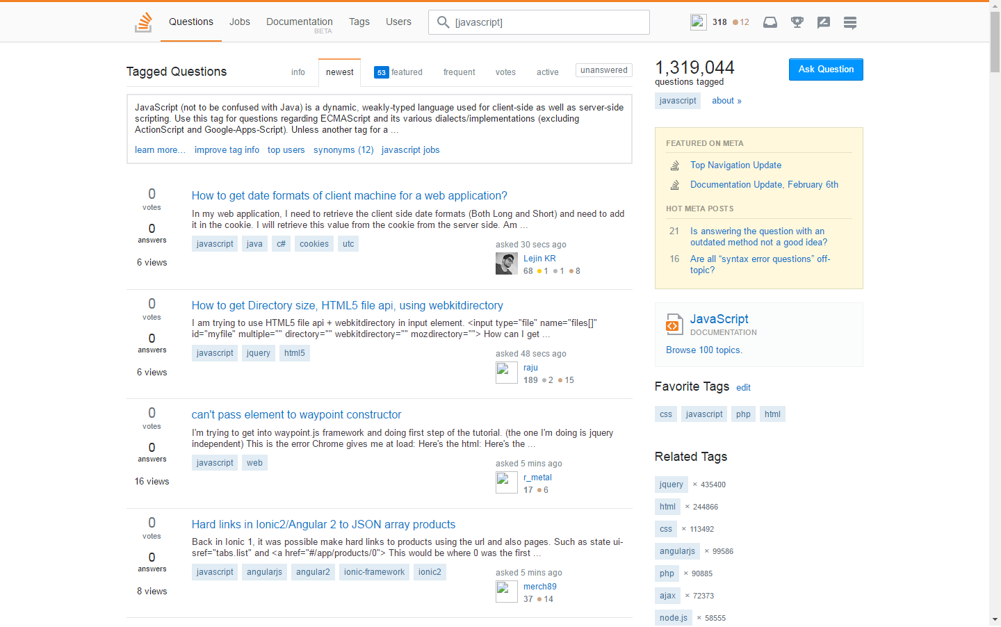
How can I change the theme of the site back to the normal black bar and all of the rest? It just changed right now without any warning and I want it back. Currently, it looks like this:

screenshot of front page with new top bar

How it used to look like (this is the top-bar from Code Review):

screenshot of front page with old top bar

30
  • 103
    Agreed. Do not like. Commented Feb 14, 2017 at 14:09
  • 2
    Get the CSS of the old one and create a Stylish profile for stackoverflow.com and if you like to change the DOM, then you could use a Greasemonkey script.
    – Tom
    Commented Feb 14, 2017 at 14:22
  • 4
    @TomášZato It's only active on SO and MSO currently. The rest of the network still uses the "old" top bar.
    – user247702
    Commented Feb 14, 2017 at 14:22
  • 30
    I personally like the change, I think it looks a lot cleaner. I just wish it had been rolled out to the other sites at the same time.
    – user142914
    Commented Feb 14, 2017 at 15:24
  • 10
    What don't you like about it? It looks cleaner, fits with the site better and all the old stuff is still there....
    – Brandon
    Commented Feb 14, 2017 at 15:29
  • 12
    I notice your avatar failed to load. Commented Feb 14, 2017 at 15:39
  • 14
    Personally, I do not care for it either. There is too little contrast and visual distinction between the elements. Too much solid white (or even gray) and everything blurs together IMO.
    – Leigh
    Commented Feb 14, 2017 at 16:12
  • 3
    I didn't like it at first, but I got used to it in about a day... meh.
    – Dan Lowe
    Commented Feb 14, 2017 at 16:15
  • 7
    So many upvotes and that, I guess I'm not the only one searching and discusting this topic. I don't mind that they change, but please add a button for the people who want it as it was. Commented Feb 14, 2017 at 16:59
  • 8
    Damn I hate change. You'd think they would have given people a choice for a year or so and see which one people preferred. Guess I'll get used to it and just +1 my (relatively low) resentment counter for SO.
    – Bill K
    Commented Feb 14, 2017 at 18:57
  • 3
    My biggest concern isn't aesthetic, but rather that when I double-click some text the search bar to edit (such as the text between [..]), it expands to the left and doesn't actually select (usually catches the trailing ])
    – nbryans
    Commented Feb 14, 2017 at 21:16
  • 4
    For me the problem is that the notifications have moved far to the right, and if I zoom in the page they disappear :(. I was happy with the notifications always present on the top of the page.. Is there a way to reverse this?
    – A.S.H
    Commented Feb 14, 2017 at 21:16
  • 3
    So much irony in this new theme! Programmers don't tend to like bright things! Commented Feb 14, 2017 at 21:42
  • 4
    @Hrishi Most people don't like it when you change the UI, so it'd be nice if UX folk would only do that when the new version is significantly better. Consistency with users' expectations is important. We were all used to the old version, and now everything is in a new place for no clear gain. (It'll probably be a bit less annoying once the rest of SE changes too; at least then I won't be getting my old reflexes reinforced every time I go to another SE site.)
    – Ray
    Commented Feb 15, 2017 at 0:56
  • 7
    Personally, the layout changes do not concern me much. I can adapt to those in time. However, the lack of contrast created by the flat, almost-white-on-white theme presents some real usability issues to those without perfect vision, and unfortunately that is not something that will be solved by "giving it time". The eyes have to work just a little bitter harder every time they search the screen, and when you consider how many times a day that happens it makes for a less than pleasant experience IMO.
    – Leigh
    Commented Feb 15, 2017 at 18:18

3 Answers 3

57

This is the new top navigation. It was available for testing during the past weeks/months, and just now went live for everyone. For some info, see Top Navigation Update and related posts. There's also a blog post explaining the design decisions.

You cannot change it back into the old one, but you can do some things to change it to something you like better:

14
  • 30
    Was it really that difficult to have an official dark theme that one could easily switch to?
    – camden_kid
    Commented Feb 14, 2017 at 15:54
  • 37
    @camden_kid: Nothing else on the site is themed. Why should this be? Commented Feb 14, 2017 at 16:58
  • @LightnessRacesinOrbit "You can also vote on the answer if you wish to see an official dark theme". That seems to me that an official dark theme is a possibility. So why not just implement it if it's not difficult? If it is difficult to do then fair enough.
    – camden_kid
    Commented Feb 14, 2017 at 17:11
  • 31
    @camden_kid: In engineering, you need a reason to do things, not a reason to not do things. Commented Feb 14, 2017 at 17:15
  • 12
    If you don't like it being sticky, there's a preference to change that. It's a pity that you have to select that option on every site.
    – YowE3K
    Commented Feb 14, 2017 at 20:36
  • 1
    @YowE3K I can't find the source right now, but the devs have said that there are some technical challenges to overcome for that to be possible.
    – user247702
    Commented Feb 14, 2017 at 20:41
  • 6
    @YowE3K: All two sites, such a burden. Commented Feb 14, 2017 at 20:42
  • 9
    @NathanTuggy - I had thought that the intention was to role this out to all sites at some (not too distant?) future time. So, although it is only two sites at the moment, why wait until it annoys a lot of people before fixing an issue.
    – YowE3K
    Commented Feb 14, 2017 at 20:44
  • @YowE3K: That'll take a fair amount of design effort, so while it's certainly nice to get on it, it's not quite as urgent as all that. Commented Feb 14, 2017 at 20:50
  • Don't worry, the preferences will be SE wide along with the keyboard shortcuts one @YowE3K someday... we have hope!
    – Braiam
    Commented Feb 15, 2017 at 0:42
  • hmm, I don't need a switchable theme - but more contrast between the nav bar and the site would be nice^^
    – Rhayene
    Commented Feb 15, 2017 at 11:05
  • @camden_kid Where do you read that quote about voting on an answer in order to get an official dark theme?
    – TylerH
    Commented Feb 16, 2017 at 16:04
  • @TylerH It's the last sentence of the second bullet point.
    – camden_kid
    Commented Feb 16, 2017 at 16:35
  • Disable sticky bar preference doesn't work correctly. :( Works on the preference page only. how strange. Neigh Commented Feb 25, 2017 at 2:56
25

I made a similar comment here:

I don't particularly dislike the new theme but I spend my time on 3 SE sites regularly. It's very annoying to switch between the two layouts. Wonder if I can stick to the old one until the change is rolled out to all SE networks so that I can get some sense of consistency? From what I have seen on meta so far, I think the answer is no?

Oded♦ replied:

NSNoob - sorry, I don't think I got you. There will be no way to revert. We are going to consolidate the design on other SE sites to match this new design.

So no there is no way provided officially by SE to revert to the old navigation and there are apparently no plans to provide an option to users either.

5
  • 9
    "So no there is no way to revert to the old navigation." No way provided by SE, but an individual user still can revert the top bar using browser plugins like Stylish (for CSS styles) and Greasemonkey (for JavaScript). Just sayin'.
    – Tom
    Commented Feb 14, 2017 at 14:49
  • 1
    Cheers, edited to reflect that.
    – NSNoob
    Commented Feb 14, 2017 at 14:50
  • 8
    @Oded♦: So just consolidate everything to the old design, what's the big deal?
    – einpoklum
    Commented Feb 14, 2017 at 20:54
  • 2
    @einpoklum - very funny.
    – Oded StaffMod
    Commented Feb 15, 2017 at 18:32
  • @Oded♦: (shrugs) I call'em like I see'em.
    – einpoklum
    Commented Feb 15, 2017 at 20:22
14

For Firefox/Chrome/Vivaldi, install the Stylish extension:

Then install a custom theme that looks like the old one:

Then do not forget to disable the stickyness in your profile ("Edit Profile & Settings" tab):

enter image description here

Then to get rid of those useless buttons (I'm talking about "Jobs", "Documentation", the search bar (you want to use google instead) and the distracting review icon), add the following rules to your favorite ad-blocker:

stackoverflow.com###nav-jobs
stackoverflow.com##.js-review-button.-link
stackoverflow.com###nav-docs
stackoverflow.com##.js-search-field.f-input

Et voilà, something usable again:

enter image description here

4
  • 2
    +1 for practical solution. This is much better than having SO team spend time to add and maintain legacy modes every time they change something.
    – user694733
    Commented Feb 15, 2017 at 11:10
  • Thaks for posting this. By the way I actually use SO search quite often for searching tags, my own posts etc... Commented Feb 15, 2017 at 11:54
  • 1
    Any help for Safari browser users in terms of going back to the old theme (black bar & narrower)?
    – T-Heron
    Commented Feb 21, 2017 at 13:42
  • 1
    It looks very ugly, because icon and text colors are not adjusted.
    – Maxim
    Commented Feb 22, 2017 at 23:00

You must log in to answer this question.

Not the answer you're looking for? Browse other questions tagged .