164

We're happy to report that phase one of our top navigation redesign testing went very well. We're going to be starting phase two very soon, and wanted to give you a preview of things to come and some details about the test.

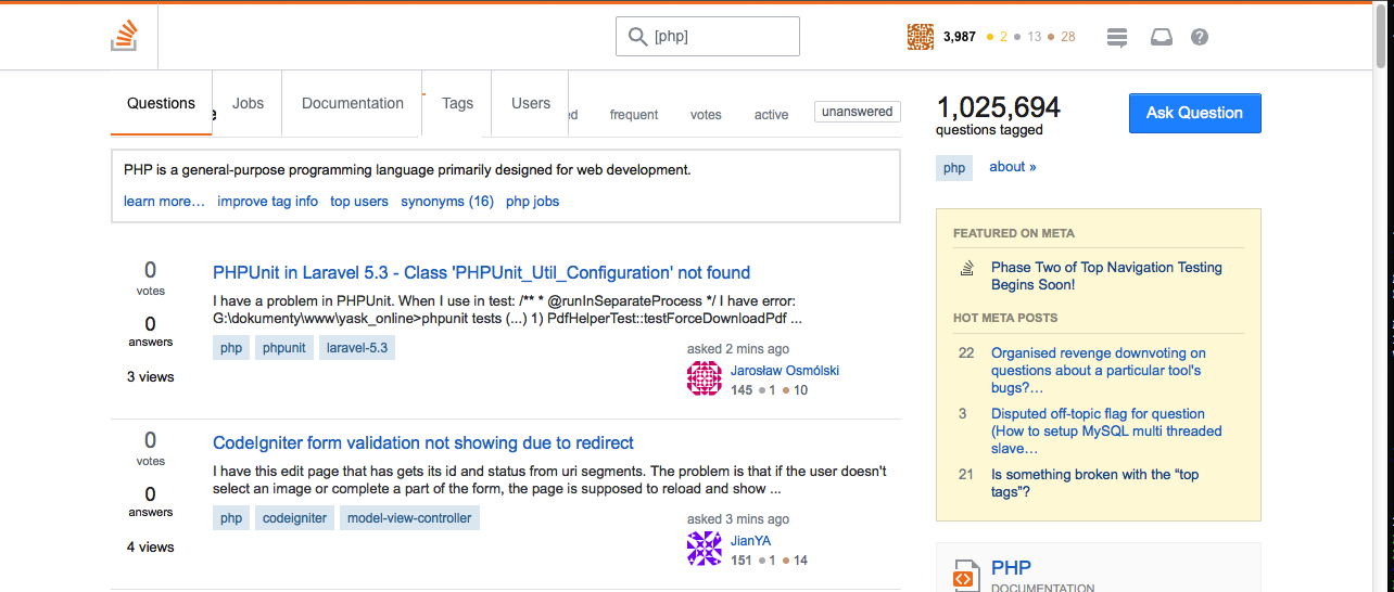
As soon as the test begins, users with 499 rep or below stand a good chance of seeing the new top navigation when they visit the site. Here's a mock up of what it looks like from the viewpoint of the front page:

New Nav! Shiny!

Wait, why users with 499 rep or less?

That's a darn good question and I'm glad you asked. As you'll note, we've combined both top navigation bars into one, which presented quite a challenge! We're almost done making sure the nav works nicely for users with access to review and things that you see with even higher rep levels (including moderator access), but there's still a tiny bit of work to be done. Restricting the test to users with less than 500 rep allows us to test the majority of functionality while we finish up the last few bits.

When does the test begin, how long will it last?

Under ideal circumstances the test will run 1 - 3 weeks, but it's hard to predict this without seeing at least some data from the test. We're reasonably confident that we're not going to cause any unintentional effects on user behavior (e.g. users clicking at random parts of the screen we didn't anticipate), but we can't be sure until we see some data. If more tweaks and iterations are required, the test will need to run longer; we'll keep you posted if that's the case.

I have 500+ rep and I want to play too!

You'll be able to, don't worry! Once this test is done we'll probably be in rather good shape when it comes to the more complex cases (e.g. you're a moderator and currently see lots of special stuff up top on the existing nav). Higher rep users will be able to opt in to test by enabling it in the preferences section of their profile.

Can you give us a vague idea of how it would look for higher rep users?

Since high rep users don't typically need the help link visible all of the time, we'll be changing it to an ellipsis that opens a menu with shortcuts to the things higher rep users have access to. Counters (such as flags / review) will become visible pretty much the way they do now.

There might be a small heads-up-display for moderators in the right sidebar with more information that matters to them, along with convenient links to get to common tools.

All of this is still being worked on and is very much up in the air.

I have a question, a comment, and if it's Friday I also have a haiku.

Leave a comment or answer and we'll do our best to help!

If you have a haiku and need a reply, try to leave a hint to that effect.

Update (2017-02-06)

Alpha testing of this is now enabled, so you'll see it if you selected the new header option under the 'preferences' menu from your profile.

66
  • 270
    I'm very disappointed to see that the contrast with the standard page content wasn't increased during phase one. I can understand eliminating the stark black background, but I would really like to see the top navigation visibly set off from the main content.
    – Cody Gray Mod
    Commented Jan 18, 2017 at 14:18
  • 10
    Will this change break the userscripts that modify the top bar (such as Stack Overflow Extras)? Commented Jan 18, 2017 at 14:19
  • 22
    What are the plans for that other new-nav? Is that still being worked on, on-hold, binned,... ?
    – user247702
    Commented Jan 18, 2017 at 14:22
  • 31
    Aaargh, Why Capitalize almost Every Word In The Title? </Triggered>
    – Cerbrus
    Commented Jan 18, 2017 at 14:24
  • 16
    Aw man, people with low rep get all the good stuff ducks and runs. Commented Jan 18, 2017 at 16:02
  • 15
    @Cerbrus It will be. To be perfectly honest, I like to not feature something for at least a few hours to identify any major problems I didn't anticipate - because fixing that once millions of eyes are on it is more stressful than being locked in a dunking tank with a toddler that has to poop. That's my basic blanket answer to "why isn't this featured?" :)
    – user50049
    Commented Jan 18, 2017 at 16:07
  • 118
    Please, Tim, please; some contrast is needed on that header. Please don't make it the same color as the main site background.
    – TylerH
    Commented Jan 18, 2017 at 17:02
  • 7
    Yay, new shiny things! For the record, I disagree with the contrast needing to be more contrasted [sic], and with the search bar being hard to find. I have no such problem. Commented Jan 18, 2017 at 17:10
  • 19
    In my humble opinion, there's too much orange now. Orange logo, orange bottom highlights for current area, orange tab tops for filter tabs, useless orange border at the top of the page. Each one appears to be a slightly different orange as well. The orange clashes with the red inbox notification count badge. I agree with @CodyGray that it would be nice to see more contrast up there.
    – Cᴏʀʏ
    Commented Jan 18, 2017 at 18:04
  • 17
    Why so much vertical space on the tabs? They look so tall and skinny.
    – Drathier
    Commented Jan 18, 2017 at 22:07
  • 8
    There are way too many floating gray lines. Instead of helping to separate the parts of the page, they are making the page crowded and confusing. And the two tab rows are way too similar.
    – Tot Zam
    Commented Jan 18, 2017 at 22:36
  • 21
    @CodyGray I would also like to see some more contrast, fiddled around, thought of something along these lines: i.imgur.com/DFaCJCz.png
    – Goombah
    Commented Jan 19, 2017 at 10:06
  • 9
    What I really dislike about this new design is that Stack Overflow lost its name and was replaced only by an icon.
    – poke
    Commented Jan 19, 2017 at 10:32
  • 4
    Where is the review link on this new navbar? Commented Jan 19, 2017 at 12:49
  • 12
    Looks like you are trying to fit 10 kilos of sugar in a 5 kilo bag. The Nav Tabs and Personal/Notifications bars are Two Different Things with 2 (or more) purposes. Squeezing them into One Thing (apparently wider) makes it look more cluttered. The aversion to Contrast in the recent improvements doesnt help. Next survey, poll about site usability and readability. Commented Jan 20, 2017 at 1:21

30 Answers 30

257

Please add a dark theme, this is so bright it hurts my eyes. If that's not possible please introduce a little color to reduce the amount of white on the page. It's pretty atrocious at the moment and makes the site hard to use.

A reminder that in general users see shapes rather than reading words. The new design makes it harder to distinguish things.

22
  • 65
    I agree with the possibility to switch between Dark and Light themes. Commented Jan 19, 2017 at 13:00
  • 4
    Dark theme is not on our list for now. But we will for sure consider it if there's a need for dark theme.
    – Paweł Staff
    Commented Jan 19, 2017 at 16:07
  • 1
    Only on a programmers site such a request is valid. I dont think Yahoo or CNN allow you to change themes...
    – JonH
    Commented Jan 20, 2017 at 14:28
  • 17
    @JonH no but arstechnica does, and I thank them for it every day.
    – Mgetz
    Commented Jan 20, 2017 at 14:34
  • 8
    The real reason that text/code editors have dark themes is because programmers seem to think they look cool, @stijn. The mythology around light-on-dark being "easier on the eyes" than dark-on-light is just that—mythology. There is no scientific backing for it whatsoever. There is ignorance here, but it doesn't count as "proof" that dark-on-light is hazardous because an alternative exists.
    – Cody Gray Mod
    Commented Jan 21, 2017 at 12:50
  • 3
    Translating what Cody said: people like colors because reasons.
    – Braiam
    Commented Jan 21, 2017 at 15:41
  • 35
    @CodyGray Yeah I guess you're right, the occasional headaches and my eyes feeling more tired back when I didn't use a dark theme, I must have been imagining all of it. Subconsciously, I'm just trying to be cool. ¯\_(ツ)_/¯
    – user247702
    Commented Jan 21, 2017 at 16:45
  • 3
    That's probably because you didn't configure your screen correctly @stijn. Commented Jan 21, 2017 at 19:01
  • 1
    I love the dark themes too, but actual opticians, the ones that sell glasses after studying vision for years, speak of correctly configuring the colors of your screen much more than black backgrounds @Stijn Commented Jan 22, 2017 at 19:48
  • 5
    Despite implications to the contrary, I wasn't just talking out of my rear end. There are loads of scientific studies that back this up, and are much more credible than anecdotal evidence about eye strain (which, as Carpetsmoker mentioned, is more than likely due to either a poorly-adjusted screen or a poorly-lit ambient environment). A question was asked over on the UX site about this, and the answers reference a couple of studies. There are plenty more out there for the finding via the Google.
    – Cody Gray Mod
    Commented Jan 24, 2017 at 6:49
  • 1
    You could just write a userstyle/userscript, that's what I've done...
    – Jacob G
    Commented Jan 25, 2017 at 17:03
  • 7
    @CodyGray say what you want, but white toolbar against a white background is just an awful choice. of course like many UX decisions, the votes on this answer will be ignored and this change will be rammed through, because someone with a degree in design (who doesnt actually use the site) likes it. You can see this already in Paweł comment; completely discounting the 100+ votes already
    – Zombo
    Commented Jan 26, 2017 at 23:28
  • 1
    @steven I'm not sure why you're targeting that at me. I've been a vocal advocate for increasing the contrast of this thing since the very beginning. I certainly do not think that white on white is acceptable. I'm merely pointing out that white-on-black is no better for your eyes than black-on-white. I agree completely with the entirety of your comment.
    – Cody Gray Mod
    Commented Jan 27, 2017 at 7:35
  • 6
    @JacobGray: Can you post that userscript somewhere? Black just makes my eyes feel calmer and I don't care what studies say. Experience speaks louder than some guy's "study" in my book.
    – Maxwell175
    Commented Jan 29, 2017 at 3:49
  • 2
    @CodyGray I have an impairment where a dark theme would absolutely help. Not because it helps with eye strain (by itself), which is most helped by an LED display I've found, but because it is easier to adapt it to the environment I code in and a low-contrast theme helps with other aspects of my condition. So, though I agree that black-on-white is usually no better than white-on-black (or red-on-black). I think your tone in the original comment came off as harsh to some of us who have more than empirical evidence (may have medical recommendations) that point to a dark theme being helpful. Commented Feb 13, 2017 at 1:27
98

It took me 10 full seconds to find the search field. At first I presumed that it was behind the site switcher along with the ask button, since I was trying to figure out the relative positions of each other, but then I saw it in the middle of the screen...

I've never seen a search field on the middle of the screen. It's either at the right side, on a corner using as little horizontal space as possible, or on the left using as much horizontal space as possible. I don't think the users are going to find the search field easily.

31
  • 11
    @Stijn well, if you haven't noticed, the search bar on search engines is rarely snuggled up in the upper border of the viewport... it's in the dead center of the screen that it's impossible to miss it.
    – Braiam
    Commented Jan 18, 2017 at 14:34
  • 14
    Redesigning header will be something really huge for Stack Overflow. Users get used to current (old) header - it's been there for years. So no wonder someone needs to spend, let's say 10 secs, to get familiar with new thing (not talking about search but generally). That being said, we do plan to experiment with different styles for search field and different interactions. We're pretty sure, we will fix this for launch (not talking about upcoming experiment, but actual launch of new header)
    – Paweł Staff
    Commented Jan 18, 2017 at 14:48
  • 11
    @Paweł considering that it will be the UI shown to new users, it's critical that they don't need "to get familiar" with the UI. Principle of least astonishment should be taken into account.
    – Braiam
    Commented Jan 18, 2017 at 15:16
  • 90
    A big, big problem with the search box's findability is that lack of contrast I've been on about for a while. In the current nav bar, it is easily identifiable because it is a light-gray rectangle on top of a black background. In the new version, it is white on white—no wonder you couldn't find it. I don't actually think it being in the center as opposed to in a corner is a real problem. The issue is just you can't see it. So increasing contrast solves two problems at once.
    – Cody Gray Mod
    Commented Jan 18, 2017 at 15:33
  • 2
    I've slightly updated screenshot in post. It has now style of search closer to what we plan for launch. As I mentioned previously: we have multiple ideas for search design and interaction and for sure we will run multiple tests to see which one performs best.
    – Paweł Staff
    Commented Jan 18, 2017 at 16:15
  • 2
    A note on these tests - search did perform a little under what it used to on the first test - but we also took away that giant honking "ask question" button from the main navigation (phew!). It's hard to say if that changed made folks search frantically for that button by clicking randomly or not. From a testing perspective this is .. interesting, to say the least. We're totally open to feedback and really appreciate how much we've gotten so far.
    – user50049
    Commented Jan 18, 2017 at 16:43
  • 5
    I think it probably took you so long to find the search bar because you're so used to it being on the right at Stack Exchange. New users won't likely have this issue, and experienced users will adjust after the first time they find it, because it will piss them off and they'll remember it for that reason :-P
    – TylerH
    Commented Jan 18, 2017 at 17:05
  • 5
    @TylerH new users will be used to Facebook (upper left corner), reddit (upper right corner), several wiki's (upper right corner), etc. etc. There are many more examples of popular pages that users cum programmers use where the search box is not in the dead center of the top bar.
    – Braiam
    Commented Jan 18, 2017 at 17:15
  • 6
    gosh. 10 seconds. can you imagine? this is close to ridiculous... Commented Jan 18, 2017 at 17:40
  • 7
    @FélixGagnon-Grenier An intelligent human knowing all the elements that should be (and are) there, should not take 10 seconds to search for something as big as the search field. It's not cataclysmic, but it is damn long. (I was not much faster, btw.) Commented Jan 18, 2017 at 19:56
  • 1
    This one is halfway decent. If you want a true example of a search box fail, try to figure out how to search on Ars Technica
    – Machavity Mod
    Commented Jan 18, 2017 at 20:00
  • 2
    @Machavity That one's not hard to find at all. I frequent Ars Technica but have never looked for the search option until just now; took me ~ 1 second.
    – TylerH
    Commented Jan 18, 2017 at 20:25
  • 6
    @Sayse First of all, most of those examples aren't "search bar in the top bar", Google has it in the frigging middle of the entire screen, which is very difficult to miss, considering that Google is a "search engine", it's quite obvious they would do it that way. Amazon and ebay were covered in my answer "or on the left using as much horizontal space as possible", here the key is the horizontal space use. Also those bars aren't crowed of elements at the left or the right, which is not the case on SE. I don't see how Twitch has to do anything with this...
    – Braiam
    Commented Jan 18, 2017 at 22:05
  • 2
    @HermannDöppes let's agree to disagree then. Just think all the time every one of us passed thinking about that, compared to 10 seconds, times those of you who don't find the search bar right away. FTR, it jumped to my eyes, through a screen shot, without even searching for it. It just did "search input". It's also not like you'll forget and have to use 10 seconds each time you use the search bar. And who uses that anyway? Haven't you all noticed google is much better to actually search on stack overflow? heard of site:stackoverflow.com as search argument? Commented Jan 19, 2017 at 6:12
  • 5
    Personally, I'd love to see a great big search box right across the top of the page. I'd like people to think of SO as a place to search for questions, and a little less as a place to ask for questions (they can do that do... but "have you tried our big pretty search bar?"). But that's probably asking too much.
    – JDB
    Commented Jan 20, 2017 at 18:24
78

IMHO, new navbar has following problems:

  1. It's sticky. It wastes valuable vertical space. I'd appreciate such approach if I used 24" vertically aligned display and not the 15" laptop.
  2. In addition to stickiness, it is too tall. Font size doesn't match such height.
  3. Most of the buttons are rarely used. I do not understand the reason behind making them always visible.
  4. Font and badge colors do not match with white background. They are too bright, nearly indistinguishable from the white background.
8
  • 6
    sticky is good - deal with it!
    – JonH
    Commented Jan 20, 2017 at 14:29
  • 39
    I too hate sticky bars. They are acceptable when working on a large high-resolution desktop monitor, but a complete waste of real estate on my 13" travel laptop. Commented Jan 20, 2017 at 14:29
  • 13
    I vote for hiding on scroll down, showing on scroll up.
    – dev
    Commented Jan 20, 2017 at 19:25
  • 43
    @edjroot no, please no! I am very often scrolling up and down, I don't wish to be distracted while trying to understand a hard problem by some shiny thing getting in and out of sight. And what if I wish to use the scrollbar after scrolling down? Scrolling back up to be able to see it? I prefer sticky to that. Commented Jan 20, 2017 at 22:19
  • 11
    @edjroot The worst of both worlds…! D-:
    – deceze Mod
    Commented Jan 23, 2017 at 8:18
  • 14
    Ugh; didn't realize it was sticky from the description. They're occasionally OK on mobile, but I've never seen a sticky top navbar I liked on the desktop version of a site. Guess I'm writing yet another position: relative custom CSS file.
    – James
    Commented Jan 23, 2017 at 16:32
  • I agree that top sticky is a really bad solution for desktops, but what are the options for phones? A sidebar? Floating buttons? Horizontal swipes? (Honest question; I don't know a lot about phones or UX.) The one thing I know is that top (non-sticky) navs aren't ideal either. There were many times when I'd be on a reeeally long page and needed to access something on the (top; non-sticky) nav bar and then come back to where I was. What should I do? Scroll all the way up, do stuff and then scroll all the way down again (or use the "find" feature on my browser)?
    – dev
    Commented Jan 25, 2017 at 11:50
  • #2. !!!! (and the white-ish background). another problem is the faint black shadow underneath the task bar that only disappears when scrolled to the very top. This takes away another row or two and is quite distracting. There should be no shadow at all! If it were done properly, ppl wouldn't have complained and demanded to unstick it in the first place.
    – Will Ness
    Commented Feb 16, 2017 at 17:55
42

Unpin the navigation bar. The usable part of my 1280x800 13" screen is already small enough normally (after system menu bar/taskbar, browser controls, browser tab strip, etc). It doesn't need to be visible at all times and it's definitely not worth the space.

3
  • 1
    FYI: separate feature request here
    – user247702
    Commented Jan 19, 2017 at 14:10
  • Aha, I knew I had seen a request somewhere but I couldn't find it anywhere on this page.
    – nobody
    Commented Jan 19, 2017 at 14:27
  • 1
    Really, they just need to make an option to have it pinned or not.
    – Cullub
    Commented Jan 19, 2017 at 16:00
40

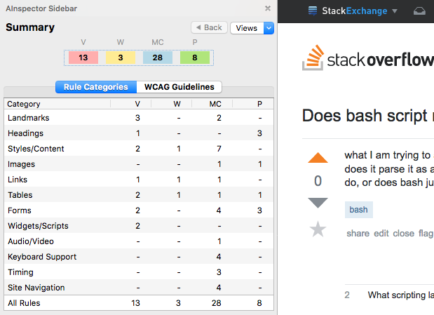
Have you given any thought to Accessibility Testing? Because honestly, right now you aren't doing too great...

AInspector Sidebar results for a random question

Key:
V = Violation
W = Warning
MC = Must Check Manually
P = Pass.

These are from AInspector Sidebar, but there are many compliance checking tools.

3
  • 4
    Also why would you up-vote this question: stackoverflow.com/q/41755292/2642059 I'll get my coat. Commented Jan 23, 2017 at 20:59
  • 2
    Since this is about the new navbar it would be better if these metrics were run against the proposed interface as well. Commented Jan 25, 2017 at 0:37
  • Yes, but my understanding is it is at present only being shown to very low XP users, which excludes me... Commented Jan 25, 2017 at 4:12
35

I don't use the Jobs and Documentation tabs but do use the Badges and Ask Question tabs. On the new header the first two have been given a much, much bigger precedence to features not everyone users. And the others seem to have disappeared completely. So basically I think these two shouldn't be striking you in the face but scaled down and then you could fit more tabs on that are used, at least by me.

Also I can't see where the help menu has disappeared to, unless it is the tiny question mark icon. Something as important as help, that we really want all users to read, shouldn't be hidden behind an icon.

18
  • 9
    They needed the extra three characters from Help to use toward the horizontal space for the Documentation button. :P
    – canon
    Commented Jan 18, 2017 at 16:52
  • 27
    You really use "Badges"? I think I've clicked that twice…ever. Why do you navigate there so frequently?
    – Cody Gray Mod
    Commented Jan 18, 2017 at 16:56
  • 1
    You use the Badges tab?, frequently?
    – Lamak
    Commented Jan 18, 2017 at 16:59
  • 20
    @CodyGray you've already got loads of them... not like us paupers frantically looking to see which gold one we can achieve the easiest :D
    – CalvT
    Commented Jan 18, 2017 at 16:59
  • 2
    @CodyGray I don't navigate there frequently but I've used it a few times whereas I've never used the other two. I added badges to the comment to emphasise the fact that this new bar removes features to give mass amounts of space to some others which is a negative IMO. Commented Jan 18, 2017 at 17:00
  • 2
    I didn't have loads of them when I started, of course. And seeing which one you can earn the easiest is…easiest when looking at your profile. Since I was a pauper, they revamped the profile page and introduced a nifty badge tracker. @calv
    – Cody Gray Mod
    Commented Jan 18, 2017 at 17:00
  • @CodyGray was about to edit my comment to mention that! I think I may have visited it four times since the revamp?
    – CalvT
    Commented Jan 18, 2017 at 17:01
  • 20
    I navigate to Badges frequently because the sidebar on the badges page includes a link to Privileges and that's the fastest way to get to the Privileges page since they removed the direct link.
    – TylerH
    Commented Jan 18, 2017 at 17:03
  • 6
    @CalvT Yes... solidifying my point?
    – TylerH
    Commented Jan 18, 2017 at 17:07
  • 4
    @TylerH You know, there's this new invention called a "bookmark", also known as a "favorite" or "favourite". As little as one click to your favorite pages! ;) Commented Jan 18, 2017 at 19:38
  • 5
    @MikeMcCaughan Your somewhat condescending comment misses the point, which is that people often visit or need to find the Badges page, for various reasons.
    – TylerH
    Commented Jan 18, 2017 at 20:21
  • 5
    @MikeMcCaughan I'm quite relaxed, I just wanted to hint that your joke was more offensive than funny.
    – TylerH
    Commented Jan 18, 2017 at 20:30
  • 7
    I agree with this completely. SO's main purpose is the Q/A part of the site. Jobs is a complete separate feature has nothing to do with Q/A. The rest of the tags, though, do have what to do with Q/A. Documentation can help prevent bad Q/A. Tags can help find Q/A. Badges are reward for good Q/A. Ask a Question is the Q part of Q/A. So why is the one item completely unrelated to Q/A being considered the second most important??? If anything, Jobs should be moved to the very end, and for sure should not be placed before Documentation.
    – Tot Zam
    Commented Jan 18, 2017 at 21:12
  • 2
    @TylerH Based on your comments upvotes, you are not the only user using the Badges tab as a way to get to Privileges. This shows another flaw in the current design and should be fixed instead of making it harder to get to these pages. You shouldn't need to navigate to the help center and then scroll down to the correct link to get to these pages. Perhaps it would make sense to have a quick links icon next to the help question mark that opens a menu for pages like Badges, Privileges and possibly even Tags or Users. This would clear up space, yet still leave the pages accessible within 2 clicks.
    – Tot Zam
    Commented Jan 18, 2017 at 21:40
  • 3
    @TotZam: Keep in mind that Jobs pays for Q&A and draws its audience (on both sides of the market) from Q&A. Commented Jan 20, 2017 at 7:02
31

Will it be possible to hide buttons/tabs/whatever-you-want-to-call-them in this new nav? I don't use Documentation, I rarely look at Jobs, and I don't see much use for Users.

Obviously, I can do this with a user script, but it would be nice to have it built in.

Update?

The new nav items are ID'ed, so it's pretty trivial to hide them using GreaseMonkey, Stylish, et cetera; I used this stylesheet (based on https://gist.github.com/g00glen00b/328bba7fdb392d3b8a7f2e6f7d468dbc) in Stylish to tweak what I didn't like:

@-moz-document domain("stackoverflow.com") {
    /* Uncomment if removing sticky header */
    /*body.newheader {
        padding-top: 0;
    }*/

    .so-header {
        background-color: #f3f3f3;
        /* Uncomment to remove sticky header */
        /*position: relative;*/
    }
    
    .so-header .indicator-badge {
        border-color: rgba(255,255,255,.75);
    }

    .so-header .navigation .-link,
    .so-header .secondary-nav .-item .-link,
    .so-header .my-profile .-rep,
    .topbar-dialog .header h3,
    .topbar-dialog .header a,
    .topbar-dialog .header a:visited {
        color: #666;
        transition: background .3s, color .3s;
    }

    .so-header .navigation .-link:hover,
    .so-header .navigation .-link:focus,
    .so-header .my-profile:hover,
    .so-header .secondary-nav .-item .-link:hover,
    .so-header .secondary-nav .-item .-link:focus,
    .so-header .navigation .-item._current .-link {
        background-color: #dedede;
        color: #555;
    }
    
    .so-header #nav-jobs,
    .so-header #nav-users{
        display: none;
    }

    .topbar-dialog .header {
        background-color: #dcdcdc;
    }

    .topbar-dialog .header a:hover {
        color: #fff;
    }
}

@-moz-document domain("meta.stackoverflow.com") {
    .so-header {
        background-color: #f3f3f3;
    }
}
6
  • 8
    Good idea, this may be a way to get the badges tab back as well. Perhaps have at most 5 tabs that can be selected, default the set shown, and then allow one of the tabs to be deselected and another chosen (such as badges, or others as well). This may be considered "nice to have" versus "need to have", but it doesn't seem overly complex to implement and it would improve UX or at the very least user enjoyment :)
    – Travis J
    Commented Jan 18, 2017 at 22:24
  • 1
    And this can be a way to get a privileges tab back.
    – Tot Zam
    Commented Jan 18, 2017 at 22:25
  • 1
    Custom ordering would be a nice addition too, as long as it doesn't become as big a mess as the new-nav.
    – Tot Zam
    Commented Jan 18, 2017 at 22:27
  • @TravisJ Maximum of 5 tabs… Hm, where have I heard that before?
    – Jed Fox
    Commented Jan 18, 2017 at 23:26
  • Great minds....
    – Travis J
    Commented Jan 19, 2017 at 4:56
  • right now we don't have plans to make header customizable.. but maybe in future, if there will be need for that - who knows.
    – Paweł Staff
    Commented Jan 19, 2017 at 12:07
24

I have >500 rep and ended up with the new design. I can't find the "review" button here. Does it have it? Has there been a mistake?

7
  • 12
    I have... significantly... more than 500 rep, and I'm seeing the new design. Commented Jan 19, 2017 at 13:03
  • 14
    if we thought the close vote queue was a problem before... it'll be much worse if people can't find it.
    – Mgetz
    Commented Jan 19, 2017 at 13:06
  • 3
    Re: >500 rep, moreover, it's so random. Refreshing the page may/may not give the new header. It's a bit disorienting...
    – Andrew T.
    Commented Jan 19, 2017 at 13:23
  • 3
    @AndrewT. I get the new design consistently (but have also quite a bit more than 500 rep).
    – Roland
    Commented Jan 19, 2017 at 13:27
  • ditto - I've just refreshed and got the new layout as well. Also no 'review' button any more... Commented Jan 19, 2017 at 14:37
  • 10
    Oops; looks like I inverted some logic when refactoring a method that way playing up (I also restructured it to improve performance, which is where the fail came in). This is my bad, and should be fixed real soon.
    – Marc Gravell Mod
    Commented Jan 19, 2017 at 14:38
  • 2
    im back to the old layout & have the review button back where I expect it :) Commented Jan 19, 2017 at 14:51
24

Not sure if it's a screen size issue (using a 13-inch MBP), but the top navigation is now covering the top content on the recent questions pages for me.

And while trying to add this image I also just noticed that uploading an image does not work on this screen size as the bottom of the upload box is cut off. So you guys definitely have some responsiveness work to do.

20

DO NOT force focus into text boxes (like happens with the "Type to find tags:" box on the "Tags" page). It breaks navigating back/forwards with Command-arrows in Safari (and maybe other browsers too), and it also breaks scrolling with arrows and spacebar.

3
  • I'm looking at you, Google!
    – user247702
    Commented Jan 19, 2017 at 14:09
  • 2
    I think it's not related to new header.
    – Paweł Staff
    Commented Jan 19, 2017 at 14:42
  • 1
    @Paweł: lets keep it that way ;-) The new navigation suffered from this for a while, here's to hoping the new top-bar doesn't accidentally make the same mistake.
    – Martijn Pieters Mod
    Commented Jan 19, 2017 at 15:35
18

Once there is being a whole redesign, can you please make the logout button visible!

There have been many posts discussing the illogical placement of the current logout button:
Log out button illogical placement
I can't find the logout button!
How can I log out of Stack Overflow website
Where is the Sign out link?

3
  • 4
    I agree with this but I use SO frequently on private devices so have no need to log out and I'm pretty sure most other users are in similar situations Commented Jan 18, 2017 at 20:46
  • 3
    @TheLethalCoder I agree that many users don't ever logout, yet I know I personally have had times where I logged out for various reasons, and I'm sure others have also. There wouldn't be so many questions asking where the button is if users never tried looking for it. I just included the first 4 posts I found, but there are more like them. I'm also sure there are plenty of users who access this site through college or public computers. The current position of the button is simply really bad design, especially for new users who aren't familiar with the site.
    – Tot Zam
    Commented Jan 18, 2017 at 20:59
  • 3
    [status-planned]
    – Kurtis Beavers Staff
    Commented Jan 18, 2017 at 22:01
16

Where will reputation changes appear on this new header? In the trophy tab? Or will they be lumped in with post/comment notifications?

Neither one seems thematically appropriate compared to the existing graph icon. I'm interested to know... what kind of user testing did you do that led you to believe a trophy icon was a good indicator for privileges and numerical iterations?

4
  • 4
    This issue—particularly the iconography surrounding reputation—was brought up with the first round of testing, but it doesn't look like any changes were made. There was one comment from a team member that shed a tiny ray of light on their testing process here.
    – Cody Gray Mod
    Commented Jan 18, 2017 at 17:49
  • 3
    Multiple new users in testing did not understand what the current 'achievements' icon meant. Even some veteran users didn't know what it was. This is the reason we're updating it to a different icon that is more recognizable with achievements. It's only an icon update, reputation gains won't be lumped with notifications.
    – Kurtis Beavers Staff
    Commented Jan 18, 2017 at 18:49
  • 1
    One of the reasons we're testing is to ensure that these changes don't negatively impact the number of people acknowledging that they have gained reputation or privileges. If we see a significant decline, we'd consider testing more iterations.
    – Kurtis Beavers Staff
    Commented Jan 18, 2017 at 18:51
  • 6
    @KurtisBeavers Considering it's a trophy, will it 'glow' gold for a new achievement (considering you want gold when going for trophies or medals), or will it glow green like the current graph icon?
    – TylerH
    Commented Jan 18, 2017 at 20:12
16

I'm surprised that no one made an answer for this even though it was mentioned several times in comments.

Is it possible to add a little contrast to the top nav? Doesn't have to be much but maybe add just a bit of gray. That will help make it stand out from the white of the page background. Especially since the nav is now fixed to the top of the viewport so it will be hard to distinguish when you scroll down.

2
14

When pixels do span
Closer, say, to one thousand
Will this over run?

I know it isn't Friday quite yet, but it was such an open invitation. My screen width is not the average monitor, and using $(window).width() yields 1007. Will this cause the new design of the top bar to side scroll or have content overlap with itself?

2
  • 5
    Current header is 1060px wide. New header will be the same, so no change in width. Also, very nice poem.
    – Paweł Staff
    Commented Jan 18, 2017 at 19:40
  • Okay, nice :) I run a small user script to adjust the 1060 down, so as long as it is still the same type of scenario that works for me!
    – Travis J
    Commented Jan 18, 2017 at 20:20
11

Putting the least frequently used stuff to the left and the most frequently used to the far right is a really expletive idea. Just sayin`.

4
  • Just because something is on the right doesn't necessarily mean it's less important. It is a common UI pattern to have primary navigation on the left and profile/settings information on the right (i.e. Facebook, Twitter, Google, GitHub, LinkedIn, reddit, etc.)
    – Kurtis Beavers Staff
    Commented Jan 24, 2017 at 13:47
  • @KurtisBeavers This could only hold true if the layout is flexible and content as well as sidebar shrinks when reducing horizontal window size. Also, there could still be disagreement what side is better, especially for users that read from left to right. I think looking at Apple's past user interface design guidelines and the principles from which they stem could be useful (on their operating systems, all important stuff is always left to right: menus, buttons, window controls, content, sidebars.
    – user121391
    Commented Jan 27, 2017 at 13:54
  • @user121391 The navigation will be responsive (even though the rest of the site isn't yet.)
    – Kurtis Beavers Staff
    Commented Jan 27, 2017 at 16:56
  • @KurtisBeavers That's good to hear, thanks!
    – user121391
    Commented Jan 30, 2017 at 8:08
9
  • Search in the site drop down is gone (Seriously, who wants to scroll through that entire list looking for a site? Thanks for making the entire drop down useless.)
  • Review button is gone
  • Help button isn't nearly as prominent as it used to be, and it already wasn't that attention grabbing
  • Takes too much vertical space and wastes most of it

Overall, hate the change. Looks like mostly "fixing" things that weren't broken and making other things worse in the process.

6
  • 2
    Nothing will change in the site dropdown. The screenshot shows a version where the user does not have access to review. It will be there for users who have access.
    – Kurtis Beavers Staff
    Commented Jan 19, 2017 at 14:30
  • @KurtisBeavers Seriously? The loss of that search in the site drop down is not a trivial thing - I can no longer go directly to any SE community from there, you're saying you're forcing me to load up the page with every single site (somehow) and scroll all the way down for any community that I don't happen to be signed up for (yes, I do peruse other sites that I don't particularly want to sign up for). What is the point of removing that??
    – Ajean
    Commented Jan 19, 2017 at 21:00
  • @Ajean I think you're misinterpreting what I was saying. I'm saying that search in site drop down should in no way be impacted by this change. The user in the screens simply belongs to a lot of communities, thus their search is pushed outside the visible box of the popup.
    – Kurtis Beavers Staff
    Commented Jan 19, 2017 at 21:03
  • @KurtisBeavers Begs the question of why it's below them, but that's a separate issue than this change since the site is already like that. Thanks.
    – jpmc26
    Commented Jan 19, 2017 at 21:04
  • @KurtisBeavers Aha! I see what you mean now, yes I had misunderstood. Thank you for the clarification!
    – Ajean
    Commented Jan 19, 2017 at 21:07
  • @Ajean no problem. Communicating through comments leaves a lot of room open for misinterpretation. I can see how what I said could be read differently.
    – Kurtis Beavers Staff
    Commented Jan 19, 2017 at 21:18
8

Order the sections to be familiar to old users, or at least make it customizable like Safari.

Currently it's a mess.

The messages, reputation, and network tabs have switched sides, and merged with the users section. My workflow depends on moving my mouse to the top-left, and I'd like it to stay that way.

Revision suggestion

In my revision:

  • The home button stays where it was.
  • The messages, reputation, and network tabs go back to their normal spot (although I'd still prefer their order to be like normal too)
  • The tabs slide over to the right.
  • The account info slides over to the right.

A lot of browsers allow you to control your navigation strip, most notably Safari.

]

The concept would be the same, but the home button would be locked to its position in the screenshot.

Also, this would work per-network user so that it doesn't change across sites.

4
  • 3
    Don’t agree with the “most notably Safari”, but other than that, I agree that the order feels very messed up now.
    – poke
    Commented Jan 19, 2017 at 10:31
  • 8
    I agree with the proposal to make the new order resemble the current order, since there are a large number of existing users that it pays to make happy. But I very much disagree with making it customizable. Not only is that a cop-out on the design front, but it also makes it much more difficult to explain to someone (e.g. on Meta or in on a Help page) how to do/find something. The only way to make things more confusing than jumbling them up is to have some people's jumbled up differently!
    – Cody Gray Mod
    Commented Jan 19, 2017 at 10:49
  • 2
    I think the site should be designed as far from "like Safari" as humanly possible. It's far and away the worst browser of all the major/minor ones.
    – TylerH
    Commented Jan 19, 2017 at 18:54
  • @TylerH As in the way you can customize it. Commented Jan 19, 2017 at 22:04
7

I haven't seen it live so am basing this on your image, but... did you really put an essential navigation control all the way over to the right, on a site with a design that is not responsive to browser window size? With this design, would my choices be to either have a 1300px-wide window (so much for that tablet) or scroll horizontally every time I want to use the most important part of the top bar?

Please remember that we are not all using large high-res displays, and that some of us have other reasons not to use super-wide windows (legibility of normal text, wanting to put browser and code windows side by side, poor vision requiring bigger pixels, etc).

3
  • 2
    Also 24 inch monitors are still widely common, meaning you get less than 960 px horizontal space if two windows are viewed side by side (for example IDE/editor and browser). Currently, you already have to scroll to the side when asking a new question, which is annoying, but having all important buttons on the right would be outright hostile to users that do not run fullscreen or have huge displays available.
    – user121391
    Commented Jan 27, 2017 at 13:49
  • The navigation will be responsive (even though the rest of the site isn't yet.)
    – Kurtis Beavers Staff
    Commented Jan 27, 2017 at 16:55
  • @KurtisBeavers great to hear! And I also see that "yet" -- yay! Commented Jan 27, 2017 at 16:57
6

Very small nitpick, but when I click one of the logos on the right side, a menu opens. If I then move my cursor horizontally to another logo, another menu opens and the previous one closes. This works for notifications, achievements and the list of communities, but not for the help menu, although it still has a menu.

The reverse doesn't work either: opening the help menu and then moving the cursor horizontally will do nothing.

1
  • 4
    [status-planned] This will be fixed in the final version.
    – Kurtis Beavers Staff
    Commented Jan 19, 2017 at 22:03
6

No floating on the mobile site

Can you please make sure this doesn't float on mobile?

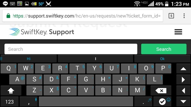
I can't understand why web designers think that trend is a good idea. All it does is trade like 25% of the already cramped screen real estate (especially in landscape mode with the keyboard out, made worse by browsers that insist on showing their address bar when you're typing) for the ability to avoid a couple quick swipes down (gasp).

Nothing worse than trying to type in a text field that you only get to see like a 30 pixel high sliver of, or being forced to switch to the tiny one-handed portrait mode keyboard just to see what you're doing.

Not all of us carry an iPad around in our pockets as a "phone". If you must float the nav bar (which I assume you'd do because the web devs have convinced themselves that it's cool and modern), at least make it do it selectively based on screen size.

I haven't actually seen it first hand on a mobile browser yet, so I'm not sure if it floats (I hope not), but if it doesn't, I want to preemptively take a stand against frustrating UX before you get any ideas.


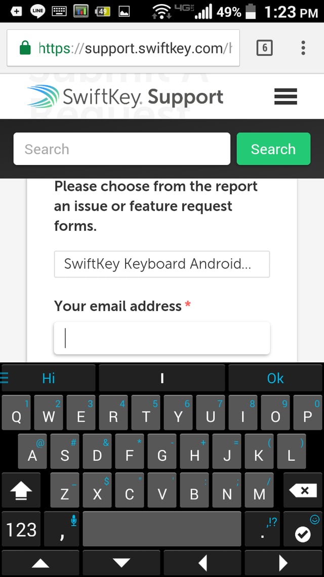
Example fail:

enter image description here

The horror reveals itself in landscape mode:

enter image description here

2
  • 2
    This change won't impact the mobile site theme.
    – Kurtis Beavers Staff
    Commented Feb 6, 2017 at 19:34
  • @Kurtis Exxxxxxcellent. Music to my ears / eyes. Thanks.
    – Jason C
    Commented Feb 6, 2017 at 19:38
5

The thing that bothers me most about this new navigation is that the boxes separating "Questions" "Jobs" "Documentation", etc. are not all the same width, and are separated by oddly-spaced gray bars.

It would look much better if there was some sort of equality between them, or maybe if the gray bars were removed.

1
  • 1
    This is related to what I commented above.
    – Tot Zam
    Commented Jan 24, 2017 at 14:35
4

I dislike the new navigation bar for the following reasons:

  • First and foremost, it's too large. roughly double the height of the old bar, and for little reason. None of the text size dictates it to be so tall, it just sort of is.
  • It's sticky. There are other comments about this, too. I'm not on a small laptop screen, but I already have my web browser tabs and URL bar. Some people presumably also have browser menus above. The new sticky nav bar removes another layer of what could be page content. There's nothing on the nav bar, old or new, that needs to be accessed so immediately. On a mobile device, it's understandable, but computer users generally have a home key.
  • Lack of contrast. The old bar is (at least by default) black on a white page. This makes it easy to quickly differ it from page content. It's also quick to locate when you pop-back up to access it, which works well with it not being sticky.
1

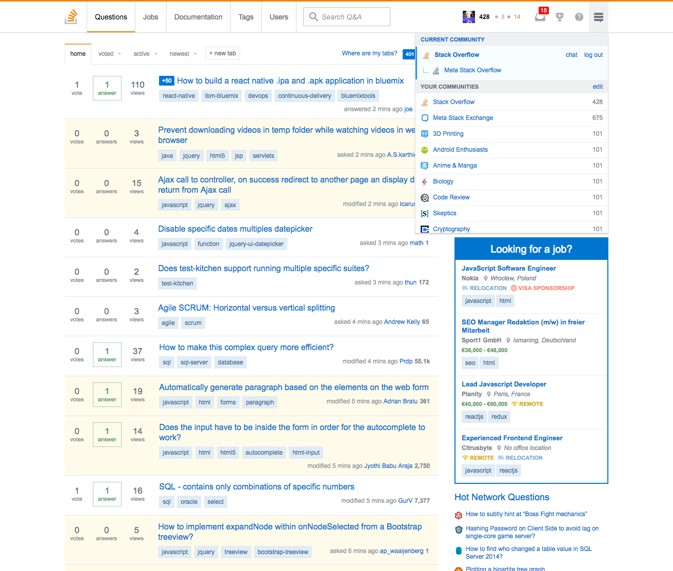
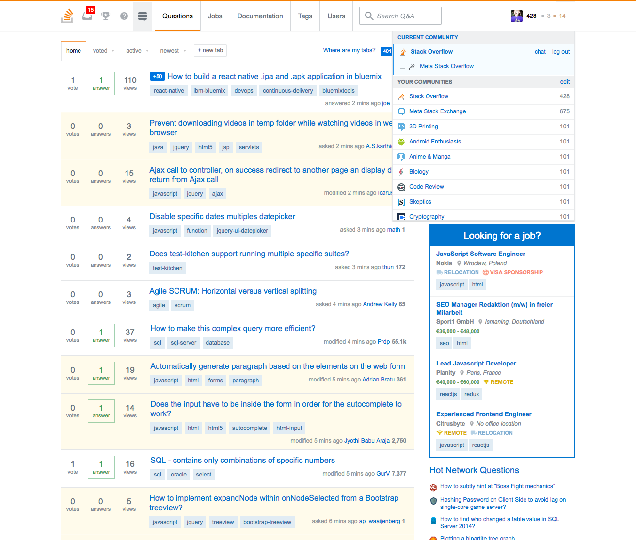
For those not seeing the new Stack Overflow navigation or design yet here is the new navigation broken into two sides:

Left
Left side of Stack Overflow's new navigation

Right
Right side of Stack Overflow's new navigation

Bugs

  1. You can no longer reach the Documentation review queues from this navigation. The link to review proposed changes has disappeared.
  2. There is an HTML and/or CSS bug causing the following issue with the display toggles and add question button; I am using Chrome on Windows 10.

Display toggle buttons overlapping ask question button

1
  • We have now concluded the A/B test - there was an oversight in regards to the documentation review queue, the new version (which is what you were seeing) did not include a review queue link and was supposed to only be shown to users who had no access to the review queues. The oversight was in testing for the higher rep privilege - Access Review Queues. We will be also looking at the display issue you have raised.
    – Oded StaffMod
    Commented Jan 30, 2017 at 17:00
1

The site switcher menu is a bit awkward to use, it's easy to accidentally hover the review queue icon.

One option is to swap those around, but I'm not convinced it'd be the best solution.

Another option is to move it to the right a bit when the browser's viewport allows it, but I'm not sure how tricky this would be to implement.

1
  • 1
    thanks for feedback. we've done some user testing and it has never been an issue. but i totally understand this COULD be an issue and for sure we will do some additional rounds of tests looking at this particular thing.
    – Paweł Staff
    Commented Feb 7, 2017 at 9:24
-1

This only showed up in my work's computer which was FullHD monitor, in my notebook which is 1366x768 i still seeing the old bar.

1
  • 2
    It is still somewhat random whether you are going to see it or not. You just have a higher likelihood of seeing it than in the first phase of testing if you had been an anonymous user.
    – user4639281
    Commented Jan 25, 2017 at 3:26
-3

I got the new navigation but is there a way to switch back to old nav? I really didn't like the new navigation design for the obvious reasons stated on other comments.

0
-3

Is testing over already?

My top navigation bar is gone, 1 day after I first saw it. I havent turned it off manually. Is testing already over? I thought it would go for 1-3 weeks. Do you have all the data you were hoping to collect during the testing?

1
  • 5
    The testing is still ongoing. There was a point where we had to restart it, which is likely why you saw it for a day, then didn't. It's a random sampling of users with less than 500 rep.
    – Kurtis Beavers Staff
    Commented Jan 25, 2017 at 15:31
-4

A good addition would be to have the navbar stationary on the top of the screen rather than scroll. Especially handy for people on macs and mobile devices without proper scrollbars allowing them to rapidly return to the top of the page.

3
  • No. No no no no no. Stickiness sucks. Plenty of mobile site utilize this, and with the sharing bar at the bottom, the browser address bar at the top and their fancy pinned menu there's 50% vertical screen estate remaining for actual content. Edit: according to this answer it's sticky already?
    – CodeCaster
    Commented Jan 26, 2017 at 13:36
  • @CodeCaster personal preference. I like it if it's a narrow bar (like youtube for example), not if it takes up half the screen, obviously.
    – jwenting
    Commented Jan 26, 2017 at 13:58
  • 3
    Hold down the Cmd key and press the up arrow. Or learn how to configure your device to show scroll bars, if you want to see them. Don't expect web sites to accommodate deficiencies in the client, especially when they inconvenience everyone else.
    – Cody Gray Mod
    Commented Jan 26, 2017 at 14:24
-4

Noooooo-oo-oo-o-o-o do not make it WHITE, please!

-4

I absolutely hate this, mainly because of the bar that won't scroll away. Is there any way to go back to the old interface?

1

You must log in to answer this question.