added 2 characters in body
Source Link
Jason C
  • 40.2k
  • 12
  • 57
  • 93

No floating on the mobile site

Can you please make sure this doesn't float on mobile?

I can't understand why web designers think that trend is a good idea. All it does is trade like 25% of the already cramped screen real estate (especially in landscape mode with the keyboard out, made worse by browsers that insist on showing their address bar when you're typing) for the ability to avoid a couple quick swipes down (gasp).

Nothing worse than trying to type in a text field that you only get to see like a 30 pixel high sliver of, or being forced to switch to the tiny one-handed portrait mode keyboard just to see what you're doing.

Not all of us carry an iPad around in our pockets as a "phone". If you must float the nav bar (which I assume you'd do because the web devs have convinced themselves that it's cool and modern), at least make it do it selectively based on screen size.

I haven't actually seen it first hand on a mobile browser yet, so I'm not sure if it floats (I hope not), but if it doesn't, I want to preemptively take a stand against frustrating UX before you get any ideas.


Example fail:

enter image description hereenter image description here

The horror reveals itself in landscape mode:

enter image description hereenter image description here

No floating on the mobile site

Can you please make sure this doesn't float on mobile?

I can't understand why web designers think that trend is a good idea. All it does is trade like 25% of the already cramped screen real estate (especially in landscape mode with the keyboard out, made worse by browsers that insist on showing their address bar when you're typing) for the ability to avoid a couple quick swipes down (gasp).

Nothing worse than trying to type in a text field that you only get to see like a 30 pixel high sliver of, or being forced to switch to the tiny one-handed portrait mode keyboard just to see what you're doing.

Not all of us carry an iPad around in our pockets as a "phone". If you must float the nav bar (which I assume you'd do because the web devs have convinced themselves that it's cool and modern), at least make it do it selectively based on screen size.

I haven't actually seen it first hand on a mobile browser yet, so I'm not sure if it floats (I hope not), but if it doesn't, I want to preemptively take a stand against frustrating UX before you get any ideas.


Example fail:
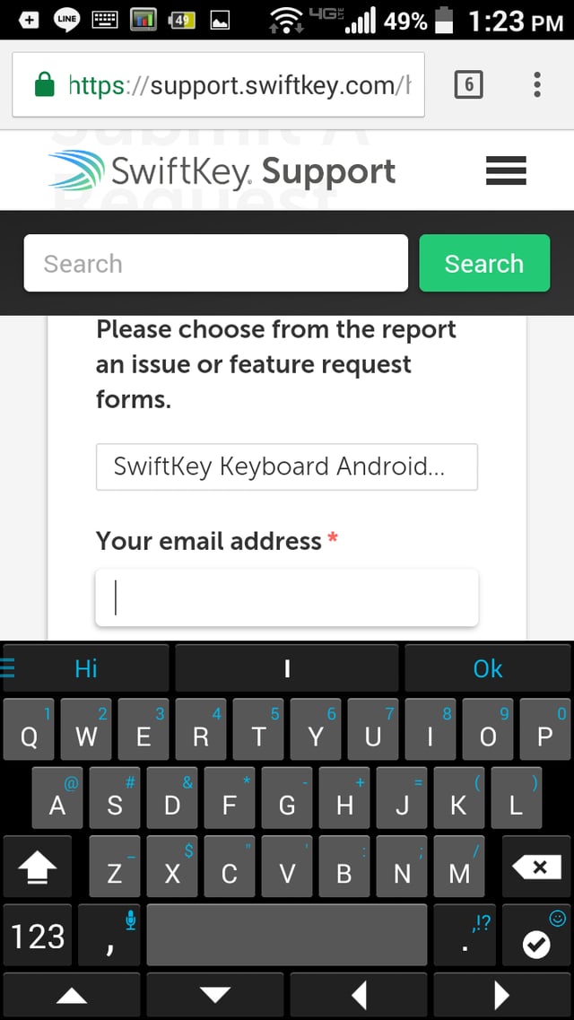
enter image description here

The horror reveals itself in landscape mode:

enter image description here

No floating on the mobile site

Can you please make sure this doesn't float on mobile?

I can't understand why web designers think that trend is a good idea. All it does is trade like 25% of the already cramped screen real estate (especially in landscape mode with the keyboard out, made worse by browsers that insist on showing their address bar when you're typing) for the ability to avoid a couple quick swipes down (gasp).

Nothing worse than trying to type in a text field that you only get to see like a 30 pixel high sliver of, or being forced to switch to the tiny one-handed portrait mode keyboard just to see what you're doing.

Not all of us carry an iPad around in our pockets as a "phone". If you must float the nav bar (which I assume you'd do because the web devs have convinced themselves that it's cool and modern), at least make it do it selectively based on screen size.

I haven't actually seen it first hand on a mobile browser yet, so I'm not sure if it floats (I hope not), but if it doesn't, I want to preemptively take a stand against frustrating UX before you get any ideas.


Example fail:

enter image description here

The horror reveals itself in landscape mode:

enter image description here

added 214 characters in body
Source Link
Jason C
  • 40.2k
  • 12
  • 57
  • 93

No floating on the mobile site

Can you please make sure this doesn't float on mobile?

I can't understand why web designers think that trend is a good idea. All it does is trade like 25% of the already cramped screen real estate (especially in landscape mode with the keyboard out, made worse by browsers that insist on showing their address bar when you're typing) for the ability to avoid a couple quick swipes down (gasp).

Nothing worse than trying to type in a text field that you only get to see like a 30 pixel high sliver of, or being forced to switch to the tiny one-handed portrait mode keyboard just to see what you're doing.

Not all of us carry an iPad around in our pockets as a "phone". If you must float the nav bar (which I assume you'd do because the web devs have convinced themselves that it's cool and modern), at least make it do it selectively based on screen size.

I haven't actually seen it first hand on a mobile browser yet, so I'm not sure if it floats (I hope not), but if it doesn't, I want to preemptively take a stand against frustrating UX before you get any ideas.


Example fail:

enter image description here

The horror reveals itself in landscape mode:

enter image description here

No floating on the mobile site

Can you please make sure this doesn't float on mobile?

I can't understand why web designers think that trend is a good idea. All it does is trade like 25% of the already cramped screen real estate (especially in landscape mode with the keyboard out, made worse by browsers that insist on showing their address bar when you're typing) for the ability to avoid a couple quick swipes down (gasp).

Nothing worse than trying to type in a text field that you only get to see like a 30 pixel high sliver of, or being forced to switch to the tiny one-handed portrait mode keyboard just to see what you're doing.

Not all of us carry an iPad around in our pockets as a "phone". If you must float the nav bar (which I assume you'd do because the web devs have convinced themselves that it's cool and modern), at least make it do it selectively based on screen size.

I haven't actually seen it first hand on a mobile browser yet, so I'm not sure if it floats (I hope not), but if it doesn't, I want to preemptively take a stand against frustrating UX before you get any ideas.


Example fail:

enter image description here

The horror reveals itself in landscape mode:

enter image description here

added 214 characters in body
Source Link
Jason C
  • 40.2k
  • 12
  • 57
  • 93

No floating on the mobile site

Can you please make sure this doesn't float on mobile?

I can't understand why web designers think that trend is a good idea. All it does is trade like 25% of the already cramped screen real estate (especially in landscape mode with the keyboard out, made worse by browsers that insist on showing their address bar when you're typing) for the ability to avoid a couple quick swipes down (gasp).

Nothing worse than trying to type in a text field that you only get to see like a 30 pixel high sliver of, or being forced to switch to the tiny one-handed portrait mode keyboard just to see what you're doing.

Not all of us carry an iPad around in our pockets as a "phone". If you must float the nav bar (which I assume you'd do because the web devs have convinced themselves that it's cool and modern), at least make it do it selectively based on screen size.

I haven't actually seen it first hand on a mobile browser yet, so I'm not sure if it floats (I hope not), but if it doesn't, I want to preemptively take a stand against frustrating UX before you get any ideas.

No floating on the mobile site

Can you please make sure this doesn't float on mobile?

I can't understand why web designers think that trend is a good idea. All it does is trade like 25% of the already cramped screen real estate (especially in landscape mode with the keyboard out, made worse by browsers that insist on showing their address bar when you're typing) for the ability to avoid a couple quick swipes down (gasp).

Nothing worse than trying to type in a text field that you only get to see like a 30 pixel high sliver of, or being forced to switch to the tiny one-handed portrait mode keyboard just to see what you're doing.

Not all of us carry an iPad around in our pockets as a "phone". If you must float the nav bar (which I assume you'd do because the web devs have convinced themselves that it's cool and modern), at least make it do it selectively based on screen size.

I haven't actually seen it first hand on a mobile browser yet, so I'm not sure if it floats (I hope not), but if it doesn't, I want to preemptively take a stand against frustrating UX before you get any ideas.

Source Link
Jason C
  • 40.2k
  • 12
  • 57
  • 93
Loading