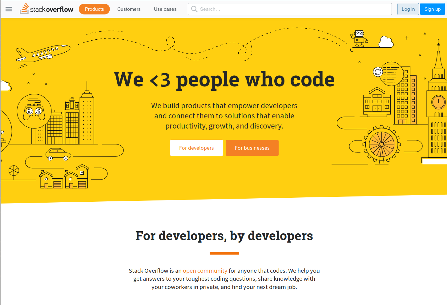
An un-logged-in user visiting stackoverflow.com. This is what they see:
I have all sorts of reservations about this page, but many of them are a matter of taste, or are debatable (maybe) - this post is not about all of those, especially since the homepage is not just now being introduced in this form. There's just one point that's really bothering me:
A (non-logged-in) person visiting this page will likely not realize that "Stack Overflow is a question and answer site for professional and enthusiast programmers."
While the statement that Stack Overflow "loves people who code" is intended to make people feel welcome - neither this statement, nor the graphics, nor the subtitle, suggest what people are welcome to. . It takes at least two clicks in - selecting one button out of two, then one box out of three - before the public Q&A aspect of SO takes center stage. (Either that or a search in the top bar - but the user would not know what that search bar is for and will be unlikely to use it.)
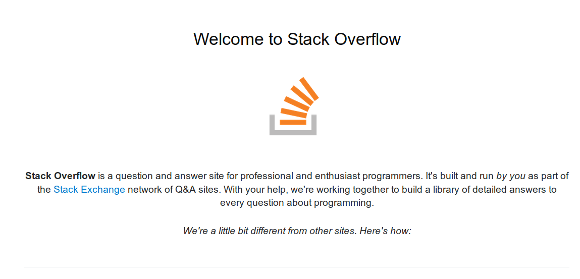
For contrast, consider the StackOverflow.com Tour page - from where the quote above is taken. It presently looks like this:
I'm not saying that should be the site front page. But when you look at it, you know what goes on in SO.com, without you having to scratch your head.
Now, I realize the community doesn't control what appears on the site's main page, so this post is intended to:
- Bring this up for discussion among MSO readers.
- Appeal to SE Inc. to consider making changes to the homepage to address this issue. (Note I didn't say "replace" or "redesign"; it could be a significant change or a minor one.)

