695

I will start off by saying that I'm a bit of an oddball. I browse exclusively in private browsing mode. When I'm logged in to Stack Overflow and close a tab, I'm no longer logged in. So despite being a regular, I log in manually every day.

Today before I logged in I saw the new home page, and it immediately felt the same to me as going to Facebook or LinkedIn before you have an account. There's a big wall of gibberish that essentially says, "You can't do anything here until you start handing over information about yourself."

I clicked on the "For Developers" button and it scrolled down the page to show me products. I'm not looking for products. I'm looking to get questions answered. After scrolling through all of it, there was no content I actually wanted to see. Where did the questions and answers go?

Now, being a long-time user, I can just log in to see the questions. But being curious, I clicked around and found you can click on the hamburger menu and then click "Stack Overflow" to get to the questions. That is not at all obvious, and I doubt most new users will try that.

In all, this feels very unwelcoming for new users. I can understand the need to tell the world about the great products Stack Overflow provides. (We even use them at my workplace.) But this feels like the wrong way to do it. It also feels like advertising to the wrong people. I don't have any control over whether my workplace buys your products. I just want to get my questions answered.

87
  • 70
    Related, but I think we're getting at different things. One part is how to quickly get to the questions, but the bigger thing for me is that it doesn't seem like there are any questions anymore. It seems like a walled garden that you have to pay (with information) to access now (even though it's not). Commented Jun 27, 2019 at 2:06
  • 93
    Can we stop calling everything 'unwelcoming'? If you believe the new page is hard to navigate and advertising to the wrong people, say that.
    – Rob Mod
    Commented Jun 27, 2019 at 2:10
  • 195
    I'm trying to point out that the web site is not achieving one of its stated goals, so I'm using their wording. Commented Jun 27, 2019 at 2:12
  • 57
    I see "unwelcoming" on a Meta post anymore and I instantly get so triggered behind it...yeah, the screen is crowded, and quite noisy, but unwelcoming? Really?
    – Makoto
    Commented Jun 27, 2019 at 2:16
  • 78
    Well, feel free to edit. I didn't intend to trigger anyone. I honestly thought that word expressed what I was trying to say in a way this community would understand. It kind of felt like: "When I come here, it no longer seems like it's for what I intended to do here. It looks like you have to spend money here to do stuff, and people wanting free help are no longer welcome to use it." So yes, I really meant "unwelcoming". But if that's the new trigger word, then substitute whatever you feel better describes this scenario. Commented Jun 27, 2019 at 2:18
  • 117
    @Catija As a new user, I'm not going to read anything. Making me click a button to get to the content is the problem. Think of it this way - when I go to a news web site, I automatically ignore the banner ads because they have never provided anything useful to me in almost 30 years of web surfing. It's the same with the design of the new home page. I'm not even going to read it. If I see buttons, that means it leads to entering personal information, which I'm not going to do for a free Q&A site. I see a button and I immediately scroll past it out of habit. Commented Jun 27, 2019 at 2:48
  • 147
    @Catija: I think the problem is in this statement: ""Public Q&A" is SO." No, SO is SO. You're trying to create the notion that SO is bigger than or otherwise distinct from Q&A, but it's not. At least, that's not how most people see it. To most people, the Q&A site is what SO is; Teams, Careers, whatever else are additions, sideshows to the main attraction. The main product, the reason why we're here, is Stack Overflow. SO is not bigger than Q&A; it is Q&A. The best way to clarify how to get to SO's Q&A site is to stop getting in the way of people trying to get to SO's Q&A site. Commented Jun 27, 2019 at 5:03
  • 131
    Wow, does it ever make it seem that way. I just accidentally landed on this after getting logged out on mobile. I had previously felt that this, while it had an undeniable ring of truth, was a bit of an overreaction. I no longer feel that way. I feel duped, taken advantage of, and embarrassed about my association with this platform.
    – Cody Gray Mod
    Commented Jun 27, 2019 at 6:02
  • 45
    I can't believe I'm the only person who wondered what "We less than three people who code" meant. We're developers we don't do cuddly. Commented Jun 27, 2019 at 8:28
  • 90
    @SList simple, this means "We fired all but 2 developers" - and hired 100 MBAs in Marketing instead. Welcome to the new SO.
    – user3458
    Commented Jun 27, 2019 at 14:40
  • 47
    @Catija If you're really serious about improving it, then I have some recommendations. 1) reduce the size of the hero banner by ~50%. 2) Remove the "for developers, by developers" section and have the "Developers" button at the top go straight to stackoverflow.com/questions. 3) Remove the section on SO for Teams pricing -- that belongs as a click-through page via the "Private Q&A" link on the "For business by developers" section. On that subject, "Private Q&A" should say "Teams (Private Q&A)". 4) Remove redundant .talent-slope div and .py64 div below it
    – TylerH
    Commented Jun 27, 2019 at 15:39
  • 102
    Holy crap. That's even worse than the hyphenated site.
    – BJ Myers
    Commented Jun 27, 2019 at 15:48
  • 77
    I'm about to do a lunch-learn on why we should contribute to SO and how. When I get to the part about navigating, I was going to say that it's self-explanatory. I haven't looked in a while. It's not. I'll have to guide them through it. Ignore this, select that option, etc. I hate to be harsh, but one of the worst things you can say about a site's navigation is that you need someone to tell you how to navigate it. Maybe someone should ask for help here. Commented Jun 27, 2019 at 18:01
  • 55
    With all the concern about SO's direction and values that's been going on lately, this seems like a spectacularly and bafflingly inappropriate moment to choose for making such a predictably offensive change to the site. It's a real head scratcher.
    – Crowman
    Commented Jun 27, 2019 at 19:06
  • 53
    I think what looks even worse is that the bit of description shown in a Google search only refers to their product.
    – Steve-o169
    Commented Jun 27, 2019 at 20:48

14 Answers 14

-223

It was not our intention to hide or make it harder to access the public, open Q&A. Our values around this have not changed.

We will be making tweaks in the current design to make it clearer and easier to get the public questions without having to register for an account.

Overall changes in design will not be made at this moment (we are still collecting the feedback you are all posting - thanks for that). And we are carefully reviewing it and will make them later if it's necessary, however, we do want to make it easier to get to the open Q&A as fast as possible, and that means not changing the design right now.

I'm not touching on the other points intentionally, because I want to first address the biggest point which is: It's hard to get to Q&A right now, and that doesn't mean we are ignoring everything else, though.

Update 1: To address the immediate concern, for now, we've hyperlinked the "Open Community" in the description and made the big blue button link directly to the questions, de-emphasizing the Sign-Up button to in-text hyperlink.

Update 2: We've made the old homepage accessible through the magicurl ?questions. So going to stackoverflow.com/?questions should take anonymous users to the old homepage. This isn't a homepage improvement yet, but something I'd like people to be aware of still.

Homepage showing updated buttons

60
  • 161
    Was it really necessary to work on a homepage redesign when the community is waiting for some improvements to the user moderation tools?. I get it that the push is towards showing that Stack Overflow is no longer just a Q&A site but also includes private spaces and jobs, but some improvements in the Q&A area would be nice.
    – Bhargav Rao Mod
    Commented Jun 27, 2019 at 17:52
  • 60
    Barring that, is there at least a roadmap of some sort showing company priorities to moderation tools? We're left to react to changes that are surprises, and leave your long term users feeling like they're ignored. Knowing that there's something in the pipeline addressing their concerns would go a long way to alleviating that issue.
    – fbueckert
    Commented Jun 27, 2019 at 17:57
  • 25
    @BhargavRao the resources for those two efforts are non-competing. It's not taking time off from Community team developers. We are still committed to delivering improvements to Q&A including mod tools. We also plan on delivering a sort of roadmap and improving communication around what we have planned for those improvements.
    – Cesar M StaffMod
    Commented Jun 27, 2019 at 18:00
  • 98
    Thanks for the change, but I don't believe it "address[es] the immediate concern". As long as you need a red free-hand circle to find the actual Q&A from stackoverflow.com the front page has failed its task. Commented Jun 27, 2019 at 19:02
  • 16
    While I appreciate making ability to visit programming questions more visible that it was this morning I don't think it is enough. Main purpose of this site was (and I hope still is) to be repository of easily searchable programming questions and answers. Because we believed in that great idea we devoted quite amount of our time (read life) to build and take care of this repository. So I can't agree with making 90% of main page into an advertisement for any product(s). That is not what this site was for so please don't go that way.
    – Pshemo
    Commented Jun 27, 2019 at 22:04
  • 20
    (cont.) I guess the most obvious way to reach SO is the “Browse questions” in the “Public Q&A” box, but it's pretty low on discoverability: you have to find a button in a box below the fold. The impression I get is that you're preparing to shut down SO, and this is the first step in driving users way from it. Which wouldn't make be confident if I was considering purchasing a private instance: are you preparing to go out of business? Commented Jun 27, 2019 at 22:51
  • 24
    I just went to the homepage in incognito having read this question for the first time, and was confused as to what the practically problem really was. As far as I could see, it was easy enough to find questions. Then I realised that the text "Browse Questions" is brand new since the question was posted. I went back and re-checked the screenshots throughout this question and noticed that it used to be a link to sign-up and agreed that it was bad. Then I saw your answer. To me, this all shows that the label change was in itself a significant improvement. Thanks! Commented Jun 28, 2019 at 10:06
  • 78
    "It was not our intention to hide or make it harder to access the public, open QA. Our values around this have not changed." This is even sadder than I thought. The only conceivable justification for this change was that Stack Overflow is in such dire financial straits that it is going to have to shut its doors if it doesn't drive more people to purchase its products. That wouldn't be good news, but at least it would explain the decision. Instead, what I see here is evidence of utter incompetence. Do you really not see how you've made it nearly impossible to access the public, open Q&A?
    – Cody Gray Mod
    Commented Jun 29, 2019 at 0:31
  • 93
    "Overall changes in design will not be made at this moment." Well, thanks for at least letting us know where you stand on that. I guess I can stop holding my breath for the Stack Overflow that I knew and loved to return. This isn't the site that I joined, helped build, and loved for so many years. It's no longer a site that I am proud to be associated with. I have recommended that my coworkers and others stop using it until such time as you decide to re-deploy a site that I am no longer ashamed to be associated with, one that does not hide content behind a paywall or ad banner.
    – Cody Gray Mod
    Commented Jun 29, 2019 at 0:35
  • 35
    You have to find the button. That's the "nearly impossible" part. I still haven't found the magic entry point. Neither has anyone else that I've talked to or tested the site on. I have, however, found lots of places where Stack Overflow is trying to take my money. Appearances matter---far more than intention, unfortunately. I have to take your word for the fact that the intent is not to hide away Q&A, but that is, in fact, what is happening. You used to go to stackoverflow.com, and you would see Q&A. Now you don't. This is far from "not 100% ideal". This is a disappointing watershed.
    – Cody Gray Mod
    Commented Jul 1, 2019 at 17:08
  • 45
    "we do want to make it easier to get to the open Q&A as fast as possible" - I just cannot fathom how you can say this with a straight face. It was maximally easy and maximally fast to get the open Q&A when the open Q&A was the homepage. Literally any change went against your stated goals. You've completely destroyed all trust I has in StackOverflow. You're either supremely incompetent, or supremely evil.
    – OrangeDog
    Commented Jul 1, 2019 at 20:58
  • 15
    @CesarM The original version did hide the actual Stack Overflow site very well, the current version still obscures it efficiently by putting the one reasonably visible link among a lot of other stuff. You switched the main site of Stack Overflow the Q&A site with the landing page for SO the company, it's entirely predictable that people are going to be confused, angry and disappointed by this change. Commented Jul 1, 2019 at 21:42
  • 58
    Is "Update 2" a joke? In response to the community being upset that you've made Q&A invisible and nigh-inaccessible, you've decided to let us know about a newly introduced hidden "magic" query string? Anonymous users are not going to find that. [ Sarcasm removed --Shog. ]
    – Cody Gray Mod
    Commented Jul 3, 2019 at 6:56
  • 13
    Am I the only one who is irritated by the fact that https://stackoverflow.com/?questions leads to the same page as https://stackoverflow.com/questions ? I mean, yeah, you can add a question mark in the URL. What's the point?
    – Marco13
    Commented Jul 3, 2019 at 10:28
  • 11
    @CesarM here's some feedback to take into account: any version of the page that doesn't directly show the Q&A is inacceptable. I would suggest you throw the new homepage away and instead show the questions view again. If you want to push your products into peoples faces, then show a modal dialog on that page which contains some marketing stuff like the "private Q&a" and "jobs" widgets from the current homepage.
    – l4mpi
    Commented Jul 5, 2019 at 9:36
363

This is pretty bad. Getting to the actual meat (questions) is buried in either a hamburger menu or in a standard marketing type three column structure with lots of graphics and fancy words but nothing to immediately point you there while actual screen real estate is given to all kinds of products.

I thought we wanted to be different from this "Here's all our stuff and maybe some questions if you ask nicely" type of nonsense that's so common on the web these days. Yikes.

Your greatest asset is your core Q/A site. Every product you sell (and want to sell more of, understandably) only works and provides value based on the buyer's previous experiences with the Q/A site. I won't buy a team or enterprise instance from your marketing pitch, I might if I use SO regularly and like the structure. I won't use your job board based on your marketing pitch, which makes it sound like Linked In without the clout to pull it off, but I might if I have a profile I put lots of effort into anyways and it gives me a good way to capitalize on that.

Every money making endeavour outside of ads you run is dependant on people understanding and liking the core Q/A system. Therefore it should be in your best interest to put that best foot forward even from a sales perspective, and it definitely should be in the best interest from an ethics perspective.

Please reconsider this design

15
  • 14
    Aparently meta.stackexchange.com/questions/314134/… is only for all the other sites. Stack Overflow is the cash cow that needs to be milked it seems. Commented Jun 27, 2019 at 12:17
  • 21
    Sure, if you still make the mistake of referring to a royal "we" ;) That partnership has ended long ago, the business venture behind Stack Overflow does not know what you are talking about. There are products, a landing page should advertise them. Commercialise website according to modern web design templates: check in the box.
    – Gimby
    Commented Jun 27, 2019 at 14:32
  • 134
    This seems completely counterproductive to me. IMO the whole draw of Careers, developer story, etc. was "You're already here for the Q&A, how about using some other cool tools too?" You don't go to the Google homepage and get met with a barrage of "try Adsense" and "buy an Android phone".
    – BJ Myers
    Commented Jun 27, 2019 at 15:54
  • 31
    @BJMyers Shhh... don't give Google any ideas. Commented Jun 27, 2019 at 18:02
  • 13
    It almost seems as if people making that home page don't actually use SO. Welp, I guess we can't have nice things.
    – user10417531
    Commented Jun 27, 2019 at 18:55
  • 11
    IMHO It's not "pretty bad." It's down right terrible. I never even new this page existed. Commented Jun 28, 2019 at 12:32
  • 3
    Actually, there is a “Browse Questions” button in the “Public Q&A” box. Still, not very prominent…
    – Holger
    Commented Jun 28, 2019 at 12:58
  • 5
    @Holger That wasn't there when this answer was posted. This has been added later after this outcry happened. meta.stackoverflow.com/a/386566/1356107 See the first image in my answer to see what is used to look like. Commented Jun 28, 2019 at 13:02
  • 3
    Most importantly, the potential customers for Teams etc are the existing users, not some anonymous passer-by who happen to step into the main page by accident. I could personally take the decision to use the services offered for the company I work for and pay up lots of cash for it, right here, right now. But since I'm a longterm member of I would never even consider that. Besides SO being a rapidly dying product - imagine the badwill my company would suffer if the SO community found out that we are financially supporting SO the company's inane changes to the site. It would be very bad PR.
    – Lundin
    Commented Jul 3, 2019 at 8:55
  • 1
    @Lundin seems like the target audience for teams is fundamentally long term users of the site who like and are familiar with its mechanics and then go to their manager or purchasing department and advocate for getting it, and because they're devs and most decent employers give devs the tools they can use for increased productivity, they'll then buy it. I'm not sure if anyone actually buys teams due to a pitch on the start site, but I'm not in SE's marketing team and can't know for sure.
    – Magisch
    Commented Jul 3, 2019 at 8:58
  • 5
    @Magisch It does seem as if SE's marketing team has never used the site and doesn't have a clue about the product they are selling. If implemented correctly, you wouldn't even need to market Teams because it would sell itself to the millions of existing customers. The problem is that SO has alienated those millions of potential customers, to the point where they will receive a middle finger instead of millions of dollars, if prompting them to buy anything.
    – Lundin
    Commented Jul 3, 2019 at 9:30
  • @Lundin I'd probably disagree with that. They alienated a few thousand contributors at best, the vast majority of users does not read meta and does not care beyond finding their solution to the problem they're currently working on. I think they have a blog post coming about how consensus on meta isn't actually consensus and resetting expectations about that, too. It's disheartening yes but lets not pretend we represent anything but a vast minority of users here.
    – Magisch
    Commented Jul 3, 2019 at 9:46
  • @Magisch It is still a few thousand potential business cases, each with some 10-20 potential client licenses on average.
    – Lundin
    Commented Jul 3, 2019 at 10:37
  • 1
    no contest on that, and it was probably a disproportionate number of people who'd have otherwise considered buying a team
    – Magisch
    Commented Jul 3, 2019 at 10:42
  • 1
    Almost Full Ack to this answer, with the sole exception of Therefore it should be in your best interest to put that best foot forward even from a sales perspective: If the company wants to sell the SO Teams/Enterprise Collaboration Tool, today's site reputation might suffice for bootstrapping while the relevant future reputation and testimonials will come from the corporate clients and their cordoned-off realms. In that scenario, the sales division's prime interest would probably not be the public site.
    – collapsar
    Commented Jul 5, 2019 at 0:24
338

I just landed there by accident in incognito mode, and I was totally confused and blindsided.

I do not remember a meta discussion with the community if this is an okay experiment to do, I do not remember the community being polled about this anyway.

Isn't Stack Overflow for the users, by the users? Of course Stack Exchange/Overflow needs to make money, but this, a huge ad, with no easy way to dismiss, to go question view by default, no way to escape it that's intuitive, and only the hamburger menu or footer menu, is very bad design.

I've been a member of Stack Overflow for years, but these are the kind of steps that kind of turn you off and make you consider making your own Q & A site that doesn't pull these kind of shenanigans without consulting the community.

My first impression of Stack Overflow now is, if I were to see the front page, oh, this is an elitist site you need to pay for. Screw that, I'll post on a forum, or ask in chat rooms.

This is my reading flow when encountering this and how I interpret it.

Reading flow

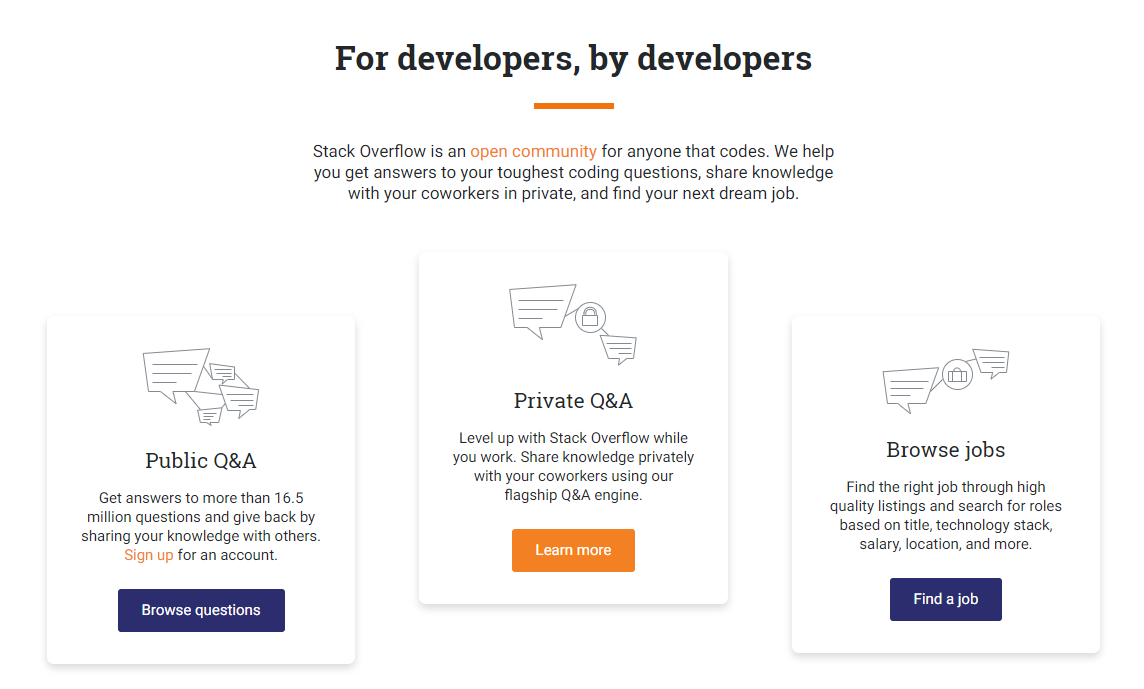
  1. Private Q&A. Oh, this one of those exclusive sites, maybe a forum, where you get to discuss stuff in private, probably need to pay for it, it says coworker, flagship, those are pricey words.
  2. Jobs? Oh, this must be like LinkedIn. Probably only professionals and such that only elevate themselves and talk boring stuff. You probably need to pay for exposing your account or something, as you need to on those other job sites to stand a chance
  3. Create an account? And next they'll ask for my credit card, right? No thanks, I'll move on to TechNet or wherever.

The words free community, do not get read or interpreted. They are not part of the message that is seen in this picture. There is no option to browse the free community. There is only this forced "CREATE AN ACCOUNT" which is a huge turn off.

But say I don't give up just yet (I will have), and I scroll one segment down.

I am encountered by this image:

For businesses

  1. For businesses
    Okay. I'm an open source hobby developer. I am not a business. This site is not meant for me. I'm off, and this site is definitely not for me.
  2. Hire skilled developers?
    I'm a private person. Why do I need this? I do like to work effectively, but I don't have a team, nor money.
  3. Again, I don't need to find talent! Also, expensive word, I'm reaffirmed that this site is not for me, a hobby developer, a starting developer, and a working developer. This sounds like a site for managers/recruiters.
  4. Advertising platform? What do I need that for?
  5. Private? Who will answer my questions? What... how do I get to the idea of questions?... So far I've seen nothing about asking and getting a question answered.

Okay.... maybe it's like AVG free. You just need to scroll down to get the free option.
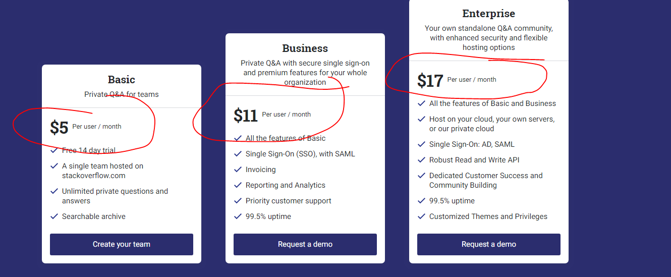
Ca-ching

No free option? Need to pay? 14 day trial? Why do I need private questions? I don't need customer support. I only want to ask a question how to find the foo in the bar! Sips tea angrily

Okay... I just need to find an ask question button. My patience is reaching infinity, and my curiosity is morbidly big.

Talent and ads

Talent? Ads? Didn't I dismiss those just now as not relevant? Why am I seeing this. I just want to find foo! I'm a developer for Christ's sake, not a recruiter. What is this site anyway?

Sweet diabolical relief

  1. YES! I can ask questions!!!
  2. What... what.... WHAT???? Why can't I ask a question. The image changes? How do I ask a question... I need to find my foo!
  3. ??? Create an account? But... I want to ask a question. I haven't seen any link between creating an account and asking questions. I'm more angry and confused at this time and not thinking rationally. There is nothing for my confused and frustrated brain to link create an account with being able to ask a question.

This is nice

Well, finally something that appeals to me, a developer! Now give me a button to ask a question, I like this message. Why wasn't this at the top?

As a normal person, I see only red flags and mismatch with my needs and desires. I'm off.

Did a psychologist look at this and consider the normal user? Or only a marketing team trying to reach targets in teams and advertising sales?

You're alienating the product that makes you big. But that's okay, all companies do that eventually, giving rise to the competition that appeals to the alienated user base.
10
  • 126
    Oh, hey look. That curl question that's off topic, closed, and locked is nicely featured there. Nice that we can prominently show off topic content for advertising purposes, but can't have a useful UI.
    – Dragonrage
    Commented Jun 27, 2019 at 15:58
  • 6
    @Dragonrage hahaha, that's hilarious, I completely missed that! Commented Jun 27, 2019 at 19:08
  • 2
    @Dragonrage heh, yea. On mobile the close reasons fill the entire screen. Commented Jun 27, 2019 at 19:24
  • 1
    @Tschallacka To be fair you can only make text so small before it gets unreadable. There's probably a lot of stuff like power user functions that aren't meant for such a tiny 'on the go' device.
    – TylerH
    Commented Jun 27, 2019 at 21:20
  • 28
    This answer is delightful. I reget that I can't offer a bounty on meta.SO :/
    – canon
    Commented Jun 27, 2019 at 22:23
  • 7
    @TylerH I don't think it's a secret that SO on mobile is more of an afterthought at the best of times.
    – VLAZ
    Commented Jun 28, 2019 at 7:24
  • 9
    I do not remember a meta discussion with the community if this is an okay experiment to do, I do not remember the community being polled about this anyway - Are you serious? That ship has sailed long ago.
    – juergen d
    Commented Jun 29, 2019 at 13:09
  • 9
    +1 for extensive use of red circles Commented Jun 29, 2019 at 16:46
  • 14
    "Did a psychologist look at this and consider the normal user? Or only a marketing team trying to reach targets in teams and advertising sales?" I think we all know the answer to this one, sadly...
    – Ian Kemp
    Commented Jun 30, 2019 at 15:01
  • 2
    Best laugh I had all week taking this awesome tour to nowhere!
    – charlietfl
    Commented Jul 22, 2019 at 2:46
165

I'd like to pull in a few things from the Twitter thread. I was talking about this with someone and a few other points

  1. Why is this even a thing?

    Fortunately this hasn't infected the rest of the network, but this completely goes against a lot of the founding principles of the network. People are supposed to find what they want fast. The network's always been, for better or worse, designed for low friction for folks. This is... at least a small wall.

    So here's what has been done. Unless you're coming in from a search engine (admittedly that's a lot of people) or are logged in, you need to scroll down, find "Public Q&A" and click on it. It's basically taken discoverability for anyone logged out on the main page, torn it up, set fire to it, stomped on the ashes, then set fire to it again

    I guess it stops people from typing stackoverflow.com, having heard of an awesome website for coding questions from friends and finding it.

  2. Why is this even a thing??

    Well, maybe, just maybe, Stack Overflow is overloaded. It's the company (well, at least the branding). It's the great big famous Q&A site. It's other products. Y'all just turned your main property into a landing page for some odd reason.

    The funny thing is no one who actually uses the site would know till they log off.

    In a sense this slightly feels like misdirection though I'm not sure what the benefit of showing these different views to people benefits anyone.

  3. Public Q&A is more than SO. SO is SO

    SO is one public Q&A site of many. I thought we were getting better about small sites being forgotten :/ . In a sense though, this kind of relegates SO (the site) to being hidden behind SO (the corporate billboard).

  4. How does this even help discoverability?

    Remember the hyphen site? How they'd hide everything behind a paywall and force you to scroll down to actually find the answer you needed? Let me draw you a user story.

    I'm a new user who just found SO trying to exit Vim:

    Animated screenshot showing page on how to exit from vim on SO, and what the SO landing page shows with just the URL

    I found SO through my favourite search engine. I have a new issue. I remember the site, I type it in and...

    Erm... where do I ask a question? What's "Public Q&A?" I'm looking for SO...

    Imagine if I just got the URL from a co-worker and... well, it's confusing. We just hid our site behind a huge ad.

  5. You could have made it easier with one simple trick

    Add a banner saying

    'Looking for Stack Overflow Q&A? Click here'

    It wouldn't even need to take up half a page

  6. Sometimes the smartest people paint themselves into a corner. Maybe it's time to re-evaluate.

Ok, this is grumpy and slightly bitter. Let's consider all the lovely outcomes of that period of time we were focusing on SO, SO Careers, SO Documentation and...

Actually, it was kind of terrible. A lot of the current issues we have now are inherited from that period.

One might even call it a bit of a winter of discontent.

I mean, I get SO's trying to work out a long term, sustainable plan for making revenue. But the folks who're going to be making the decisions, and talking to their bosses are folks who're using the sites. We basically just made the site really unfriendly to new users to make it 'easier' for folks to find the paid offerings.

It feels like there's a series of somewhat unforced errors being made, with things that probably could be thought out better. This feels heavily like the single-minded focus on careers repeating itself.

In short, it's pretty terrible, and people mainly just want to see the questions.

8
  • 6
    You don't even need to edit the address bar. Just click on the stack overflow logo. Commented Jun 27, 2019 at 12:22
  • 13
    I hate to say it but... That felt like it had more dramatic impact.... Commented Jun 27, 2019 at 12:23
  • 6
    "So here's what we've done." I didn't realize you were part of the company. I also find it slightly amusing to come in with the whole "well it doesn't effect the rest of the network" angle when Stack Overflow is the only reason the rest of the network works. If this site goes down, the whole place shuts off. No one talks about SE failing as a whole for this reason, only about if SO fails, because that is literally the only conversation which has any impact. "A lot of the current issues we have now are inherited from that period." ? What? Not really.
    – Travis J
    Commented Jun 27, 2019 at 17:26
  • I'll fix the we to a you. And meh - I kinda think that a lot of the current issues, of the culture crashes and communication issues are rooted in the period that folks were focused on SO ancillary stuff. Felt a lot like there was a lack of focus on the community. As for SO is the only reason the rest of the community works? I've always felt that focus was a mistake and the network's most vibrant time was when we acknowledged the diversity of the network. Sure SO is the big site but it's not the only one. Commented Jun 27, 2019 at 17:52
  • 16
    This part would make a good TL;DR: "It feels like there's a series of somewhat unforced errors being made, with things that probably could be thought out better. This feels heavily like the single minded focus on careers repeating itself. In short, its pretty terrible, and people mainly just want to see the questions. "
    – bob
    Commented Jun 27, 2019 at 18:32
  • You need to add "Welcoming" to that list of periods of time.
    – jpmc26
    Commented Jul 3, 2019 at 2:19
  • Honestly? I don't have as much of a problem with that, and its completely irrelevant in this specific context. Its got nothing to do with the front page and trying to take on a second front at the same time weakens my point. Commented Jul 3, 2019 at 2:45
  • @JourneymanGeek I disagree that including yet another failed company focus weakens your point, but your answer.
    – jpmc26
    Commented Jul 3, 2019 at 9:55
139

Please remove that yellow crap:

crap title

And make this as https://stackoverflow.com:

gud title

Because 99.9999% of visitors don't need a product or business when they visit Stack Overflow and those who needs it, you know, they are probably not complete idiots and should be able to find it.

There is no need to make it flashing, big, animated, orange, and with a yellow background.

There is no need to double, triple, and cross-link all these ads what we have now.

Nobody will buy Teams without actually using the site for a while. Nobody will put here their 0 reputation profile for job without actually using the site first.

What you are doing is terribly wrong for users.

15
  • 54
    At least they got the color of crap right.
    – Bhargav Rao Mod
    Commented Jun 28, 2019 at 8:38
  • 18
    I think they forgot these other products are only viable because there are some people asking questions and posting answers... those are the ones who will recommend their companies to have a Private Q&A, that will tell the HR guy about this Jobs product on SO, and so on. People won't do it just because you are advertising.
    – Berriel
    Commented Jun 28, 2019 at 9:22
  • 30
    I read that as "we less than three people who code". Yes I know it's supposed to a be a heart but c'mon, enough trying to be cute. Tweens aren't our target audience.
    – j08691
    Commented Jun 28, 2019 at 15:08
  • 1
    Maybe the "active" tab should be the first thing possible askers see when visiting this site, rather than the "newest" tab which contains a lot of bad questions that were not closed / deleted yet. Commented Jun 29, 2019 at 13:59
  • 26
    @j08691 we should all wear a "We less than three people who code" yellow T-shirt.
    – Cœur
    Commented Jun 29, 2019 at 14:21
  • 3
    Meh, I actually think dumping new users onto a list of questions with no context is a pretty poor landing page; it's like if Google's home page was a random selection of other people's search results. So I actually approve of having a proper landing page; it just needs to put public Q&A front and centre, as the original product around which everything else is built, and which most users will want to visit first, including people who are deciding whether to buy one of the other products.
    – IMSoP
    Commented Jul 1, 2019 at 9:54
  • @IMSoP, not really random, but you are right, maybe "All" questions is not the best, "Featured" would be better I guess. Question: what new user expects to see when he types "stackoverflow.com" in browser address bar? ACTUALLY, copy any answer address into incognito chrome window and then click Home on the left side there or SO logo.. It's awful. As a user I want to see list of other questions to start playing SO, not that yellow thing I see now.
    – Sinatr
    Commented Jul 1, 2019 at 10:40
  • @Sinatr Don't get me wrong, I'm not defending the current marketing page. I just feel like "put it back how it was" is a reactionary comment, and doesn't account for maybe both versions being bad. I think the home page should include an introduction to what the site is, links to other services, and prominently feature public Q&A. A dynamic set of Hot Questions could absolutely be part of that, but the first page you see doesn't need to look like search results.
    – IMSoP
    Commented Jul 1, 2019 at 11:15
  • @j08691 Maybe I am one of your Tweens Audience ;)
    – Gourav
    Commented Jul 5, 2019 at 3:54
  • @IMSoP NO why ? Google looks the same the first time you visit and the 1000th time you visit. Your logic is flawed.
    – user10417531
    Commented Jul 9, 2019 at 0:24
  • @reportgunner I'm confused. Which comment in particular are you saying "no" to?
    – IMSoP
    Commented Jul 9, 2019 at 8:37
  • @IMSoP I'm sorry, I just skipped to the bottom to react. I was reacting to I actually think dumping new users onto a list of questions with no context is a pretty poor landing page
    – user10417531
    Commented Jul 9, 2019 at 16:08
  • I beg to differ, it's a great landing page - much better than one that pushes you to buy something or create an account first in case of stackoverflow and in my opinion
    – user10417531
    Commented Jul 9, 2019 at 16:09
  • @reportgunner As I said in other comments, I'm not saying the current homepage is better than what was there before, only that it's possible to do something better. There are more than two possible homepage designs, and "just make it how it was" is less productive than "here's how to make it good". Specifically, I think a better homepage would be one with more explanation of the site and its affiliated products as well as getting you to interact straight away. I absolutely agree this should not push you to create an account straight away, or imply that you will need to spend any money.
    – IMSoP
    Commented Jul 9, 2019 at 16:29
  • @IMSoP that's true, I agree. But then again, when I go to google (to use your example) it does not explain to me what it is and what are their other products - it doesn't even tell me what or how to write into the search box. I feel like we are on the same page though.
    – user10417531
    Commented Jul 9, 2019 at 16:39
51

What you're missing is a gigantic Proceed to Q&A button somewhere above the fold on the home page. Preferably just below the main headline.

enter image description here

11
  • 73
    It's not some kind of oversight, the design is very intentional.
    – user247702
    Commented Jun 27, 2019 at 7:53
  • 7
    Well, that's fine as long as they track abandonment. Which I'm sure they do. Time will tell. Commented Jun 27, 2019 at 7:54
  • 148
    The design looks like the typical bullshit company trying to sell their overpriced useless hype product. Note how they do not even advertise what they are doing, but place a prominent slogan "We <3 people who code" instead of e.g. at least showing a screenshot of the site. Or telling in large letters "We build a Q&A site for developers" What will come next? Blurring the answers for users that are not logged in?
    – allo
    Commented Jun 27, 2019 at 8:26
  • 5
    Presumably they score 12 in the Joel test and thus do hallway usability testing (at a minimum). Commented Jun 27, 2019 at 8:33
  • 13
    @allo: Blurring the answers and truncating them to 280 char and serving those as JPG images with artifacts due to high compression.
    – user21820
    Commented Jun 27, 2019 at 11:59
  • 47
    @allo The slogan, at first glance, suggests that fewer than 3 coders work for SO now. Perhaps this explains the increased focus on marketing...
    – James
    Commented Jun 27, 2019 at 13:32
  • 30
    For only $9.99 a month, you can view up to 100 answers and 25 comments! But consider our deal of $49.99 a month, where you can now view up to 1000 answers and 100 comments! (Our best package deal).
    – user7143559
    Commented Jun 27, 2019 at 15:11
  • 7
    @allo not to get too far off track but I have to agree, the language used to promote teams, etc. wouldn't help an engineer make a decision, plus to be honest I'm pretty sure anyone who has ever bought anything on behalf of a company before has a powerful filter in place to automatically skip past words like "empower", "enterprise", and the entirety of the "customers" section (bandwagon stuff). I always figured writing like that was targeted more at investors than customers.
    – jrh
    Commented Jun 28, 2019 at 3:36
  • @jrh I think you underestimate how a lot of purchasing decisions are made -- sales and management people will see wording like that and then demand the IT department purchases and implements it.
    – TylerH
    Commented Jun 28, 2019 at 13:59
  • @TylerH "I read about this trend on <Business Magazine Name here> in an airplane for 5 minutes and we need to get more efficient so I'm going to buy this thing I googled without even consulting the people who have to use it" -- yeah I can imagine that happening I guess. Our local guys are immune to fluff for the most part but maybe somebody sufficiently high up who wanted to uh... "modernize the collaborative business process" or something like that would do that as part of a "bold vision". But they'd probably at least have to meet face to face with the service provider, FWIW.
    – jrh
    Commented Jun 28, 2019 at 17:14
  • 13
    Old-ish person here. I didn't even realize at first that this was an emoticon of sorts, I literally read "We (are) less than three people who code", which I thought was a really odd tagline for an Q&A page. Commented Jul 1, 2019 at 14:27
45

If a new user actually manages to find the Q&A site on this new landing page, this is what they'll see in the main navigation area on Stack Overflow.

enter image description here

There are three Stack Overflows here and one Home. The Stack Overflow logo goes to the products page (which is the new landing page). The Home link also goes to the products page. The Stack Overflow in the Products dropdown goes to the products page as well, though only if you're already on the Q&A site, if you're on the products page it goes to the Q&A site. The Stack Overflow with the earth icon actually goes to the Stack Overflow questions page.

I'm no UX expert, but I would guess if you asked new users where they'd expect those links to go, they would probably get almost none of them right. The only way to understand how to navigate SO here seems to be trial and error.

3
  • 2
    I guess this replaces the Tour...
    – rene
    Commented Jun 29, 2019 at 17:20
  • 1
    Especially because a globe icon sometimes means "change language". Commented Jun 29, 2019 at 21:49
  • 1
    I think the overloading of the name "Stack Overflow" is a significant part of the problem with this whole situation. There really needs to be a distinctive branding for "Stack Overflow Public Q&A" which can be consistently highlighted both on marketing pages and within the main site. There also needs to be consistent binding of labels to actions, rather than the word "Home" meaning something completely different to logged-in and logged-out users.
    – IMSoP
    Commented Jul 1, 2019 at 9:48
43

My company does not allow us to log in to websites (security measures). For that I use Stack Overflow as private mode and phone. About the new look of the home page, I guess this is the new policy of Stack Overflow, and I don't have any comment about this.

I just want to suggest that if it is possible to create a new button in the top bar beside Products, Customers, and Use cases, we can access the questions quickly, please.

For example, like this:

Enter image description here

4
  • 11
    Agreed - SO is programming questions and their answers. People who land here looking for questions or answers are not gonna find them easily. Maybe that's actually a really good thing and will turn off the spigot of bad/low quality questions? I don't know. But design 101 says 'make your product discoverable' and right now the meat & potatoes of SO is not discoverable on that new landing page.
    – TylerH
    Commented Jun 27, 2019 at 16:02
  • 9
    That seems like a very strange policy that would make it harder to get things done.
    – Joe W
    Commented Jun 27, 2019 at 18:13
  • 26
    @JoeW Isn't the purpose of a company policy to make your job harder?
    – TylerH
    Commented Jun 27, 2019 at 21:15
  • 6
    With how it's placed and aligned, the "Questions" button here might be interpreted as "questions for our products", like an FAQ section?
    – TrebledJ
    Commented Jun 29, 2019 at 0:11
27

It's been mentioned in comments, but I don't think in another answer, so I want to bring it out in bold letters:

The best advert for the paid services is the public Q&A.

I totally understand wanting a better landing page that shows off the different products; in the long term, it could actually reduce the need for spammy self-advertising on the rest of the site. But right now, the focus of this page is entirely wrong; the public Q&A is not just one product among many, it's the hub that everything else is built around.

  • Most of the people landing on the home page are looking for public Q&A. You want them to see the other products as they pass, carry on, and come back later to learn more, not turn away to another site.
  • Showing off the free and open Q&A community demonstrates the attitude of the company, and builds trust.
  • Anyone evaluating Private Q&A is going to want to see how the platform works before buying. Public Q&A gives them an opportunity to do that.
  • Similarly, anyone interested in Careers, or other advertising opportunities, wants to see what they're buying into.
  • The people using public Q&A may well be influencers not decision-makers when it comes to the other products. Enlist them as your sales assistants!
  • Your strongest advocates will be established users. Why hide this page from them?
  • The Stack Overflow brand is built on public Q&A; you want to say "we also do this" not "we now do this instead".

So, some concrete suggestions:

  • Start the page with a "welcome to Stack Overflow" that talks about how great the public Q&A site is, and lets people jump straight in. Replace the yellow box, which any startup could claim, with a message that actually means something.
  • Make the home page the same for logged in and logged out users, but make sure the current logged-in homepage is easily accessible too. Maybe make the landing page the target of the header logo, and replace "Home" in the sidebar with a different label.
  • Include some dynamic content on the home page; a set of "Hot" or "Featured" questions, or perhaps just tags. Something to lure the user deeper into the site, without being as overwhelming as the old homepage.
20

On the one hand, you have SO actively attacking veterans with the "Welcoming" philosophy and changes. On the other, they've now replaced the home page with one that provides no apparent avenue for asking questions even after the link change. About the only way they could make it look more like they don't want any users is to shut down the site. The kind of PR this generates is only going to make the situation worse.

15

Metrics! Metrics!! Metrics!!!

If the new home page is unwelcoming, shouldn't it show up in the metrics?

I agree it's seems bad to me, but I'd love to see by just how much.

5
  • 29
    I estimate that it is 1.32 unwelcoming. Commented Jun 28, 2019 at 9:52
  • 1
    ... with a margin of error of plus or minus 3 percentage points at the 95% confidence interval :)
    – Berriel
    Commented Jun 28, 2019 at 12:20
  • @Berriel If the margin of error is that big, we really need a larger sample size ;)
    – Davy M
    Commented Jun 28, 2019 at 16:02
  • @AndrasDeak Is that a percentage? Or is the site really 132% unwelcoming?
    – S.S. Anne
    Commented Jun 29, 2019 at 16:10
  • 5
    @JL2210 it's a score. Commented Jun 29, 2019 at 16:24
12

For general example only.

Imagine What if GOOGLE does like this? - Marketing its most popular products on the home page like put products blocks, tell users what company does, remove that Search Text Input field and put a button (anywhere in Hamburger menu or in other menu) which tells Click to Search. All users will be frustrated.

As far as I know, the main purpose for Google is to provide a SEARCH ENGINE to everyone. They have had that Search Text Input field since they started. User wants to search something. User opens web browser and opens Google website. User types in that Search Text Input field whatever they want to search, gets results and fulfills their purpose.

Later on they have different products like YouTube, Play Store and many more. But they still didn't change that Search Text Input field (their main purpose) and put all other products in top right corner in Products tab.

Did Google change their Home Page Search Text Input field? - NO

We all know Stack Overflow is one of the great sites for anyone that codes. But as previously, user comes to Stack Overflow site, they should be able to see All Questions.

But if we want to go with new design then provide at least Button Link like Browse Questions (directly on rendering the primary above-the-fold content without scroll or clicking anywhere) which they already have BUT now we have to scroll down or click on For Developers or on Products or on Hamburger Menu.

All users (New ones and old ones) will eventually find it out how to get to the questions page, but my point is users should get to the questions page with minimum clicks and without scrolling, if we can't put all questions on home page as before.

-20

Perhaps put a "take a tour" button by the "create an account" button?

enter image description here

-38

As someone who has never asked or answered a question on Stack Overflow, I never got a good idea of what's expected of a question, even after looking at so many for work...

As someone that has talked with a few long-time users of Stack Overflow about troubles with a huge amount of incoming questions and not enough people to properly moderate them... I kind of actually like this. All the essentials are still there (log in, sign up, search bar), and it may actually send a better message than the page of active questions.

I jotted down a quick thought in The Tavern a while back:

What I remember from being new... I read a lot of posts. But a site can have a frontpage full of bad questions, but you don't really see it until they're actually closed. (If no one comments, you may see downvotes on stuff that seems totally reasonable and you won't find out why it's bad until it's closed).. so you see a lot of broken windows

It's especially true for visiting the home page of Stack Overflow. You get dropped into this huge wave of new questions and activity, and as a new user you might not be likely to ever see one closed or downvoted enough to make you think twice. Instead, the constant stream of questions sends a message of 'okay, time to drop one like that too!!'.

Right now, there's this big giant search bar at the top, instead of a flood of activity. That new user that remembers Stack Overflow from a previous visit?. They can use the giant search bar. The more experienced user that accidentally got logged out? They can find the log in button exactly where it always was.

The user coming in through a search engine won't see this page at all before they get to their answer. That person that got told about this awesome site with questions and answers? Well, hopefully they got told to use the search function too!

Someone that's already moderate familiar with other parts of the network? They should know about the existence of the search bar already.

And from what I remember, you won't be able to ask a question without having at least an unregistered account. So the sign-up button is also still there, for those who are in a hurry. I think there will be only a very, very small amount of people that will be confused here, thinking Stack Overflow is suddenly behind a paywall.

So, this makes me wonder... what do people without accounts/logged out need with a list of active questions, most of them broken windows anyway? If you're logged in, you can use it to help moderate or find interesting stuff to answer, but if you're logged in then you won't see the page. If you've visited Stack Overflow before and had a tiny bit of experience here getting your answers, you know where the search bar is or to log in before you can ask/answer anything.

Instead of adding some kind of banner or big 'Go to Public Q&A' button that drops new users into the big chaos that's Stack Overflow, tweak the search bar a bit to make clear the one that seeks shall still find free answers (hopefully). And I'm kind of curious to see if Stack Overflow is collecting data on this, if the amount of bad questions by first time users will go down or the amount of searches up, or something...

18
  • 37
    I agree that "here's a bunch of random low-quality questions" is not a great landing page, but you haven't mentioned anything better about this new homepage; it might as well be lorem ipsum. If the aim is to persuade people to use the search function, there should be a great big search box right in the middle of the page. If the aim is to welcome people to the public site, the public content should be more than just a passing mention hidden among the business services.
    – IMSoP
    Commented Jun 27, 2019 at 15:46
  • @IMSoP the 'better' thing for me is that I don't see the chaos of random low quality questions anymore. I already mentioned tweaking the search bar, putting it on a more prominent part of the page might be part of that too. I'm not denying no change is needed there, just that I for one am glad to be rid of the chaos! :) Commented Jun 27, 2019 at 15:53
  • 1
    That's funny, because we suggested when they were redesigning the homepage years back to copy the good thing quora (or something) has that is basically a search bar.
    – Braiam
    Commented Jun 27, 2019 at 15:56
  • 3
    @Tinkeringbell That's why I said "might as well be lorem ipsum". As far as you're concerned, this page is now blank, a less distracting way of reaching the search bar; but if that's the requirement it's a terrible implementation, because there's still a whole lot of text for you to ignore. That doesn't just require "tweaking the search bar", it requires a fundamental rethink of what belongs on this page.
    – IMSoP
    Commented Jun 27, 2019 at 16:00
  • @Braiam I guess not Quora, or it's changed since then, because their home page just asks me to sign in, without even telling me what I'm signing in to!
    – IMSoP
    Commented Jun 27, 2019 at 16:02
  • 4
    I hadn't seen this change from the perspective of crap questions encouraging more crap questions. It's definitely a good thing to hide that away. I'm not sure that positive outweighs the marketing slant it's gone to now, though.
    – fbueckert
    Commented Jun 27, 2019 at 16:17
  • 22
    Huh... Interesting angle. My initial reaction was "this won't matter - almost no one who isn't already logged in asks or answers from the homepage" - but that ignored folks who use the homepage to log in. Gonna chew on this for a while, thanks. Love the idea to emphasize search btw.
    – Shog9
    Commented Jun 27, 2019 at 16:38
  • 5
    Thank you for adding a productive counter to this discussion. While I concur with the thought that seeing a bunch of broken windows is bad, I think there are other solutions for that. I also agree with the comment that you haven't told us what would be better or why the current page is better. In my mind, what's up now is far worse because I can't even tell there are questions and answers I can access for free without creating an account. I absolutely abhor sites that make you create an account before you even know whether you want to use the site. Commented Jun 27, 2019 at 16:46
  • 11
    Do people use the search bar? I tend to use Google. For the fun of it I searched for ".net register delegates with IServiceCollection" on the site. The result was a single question with no answers. I did the same search on Google and got tons of results, including useful answers on SO. What's up with that? Commented Jun 27, 2019 at 18:21
  • 1
    Yeah, they should make search work properly before expecting anyone to try to use that.
    – tripleee
    Commented Jun 27, 2019 at 20:22
  • 2
    This is a very interesting take, but I doubt it was the thing that SO marketing department was thinking about.
    – user3458
    Commented Jun 27, 2019 at 20:28
  • 1
    @ScottHannen I use the search bar almost every day. However, if I'm trying to find a specific question, I usually go to google and add site:stackoverflow.com at the end. The search bar is bad for that, and the 'duplicate question finder' is somehow worse.
    – TylerH
    Commented Jun 27, 2019 at 21:17
  • 16
    @Shog9 I thought about as much that rarely anyone will likely just visit stackoverflow.com randomly. Then I visited a question as a new user, like about 10k people per second do from Google, and I instinctively clicked the big logo to get to the home page...and got to this weird sales page, too. Maybe it's still my training from being a user that makes me click the big logo to get to the questions list, but when I saw that happening I quite changed my mind about the practical impact of this thing. Commented Jun 27, 2019 at 23:55
  • 1
    Hi @Tinkeringbell, personally, I have only one problem with your comment to IMSoP and your answer that I think no one has highlighted at this point, but you're inactive in SO overall. How can you say that you see low QA answers if you don't answer any question or ask questions? It's like I'd say that X beer is bad when I don't drink at all. I can see your activeness in IS, MSE, etc. But you have only the newcomer points inherited from your other networks in all SO sites. I'd first start asking and answering some questions in our network and then, let's talk about QA. Commented Jul 2, 2019 at 11:25
  • 1
    There is one more problem with emphasizing the current search bar - its search quality is very low compared to Google - cf. meta.stackoverflow.com/questions/357462/… . In the few cases I have forgotten this and used the in-site search by mistake I was usually unable to find what I was looking for and had to use Google anyway.
    – Suma
    Commented Jul 18, 2019 at 11:12

You must log in to answer this question.

Not the answer you're looking for? Browse other questions tagged .