399

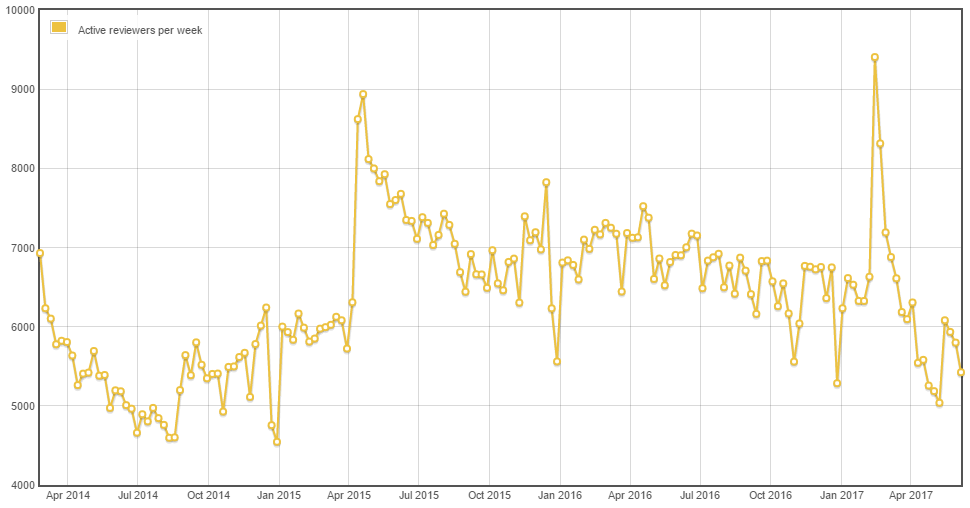
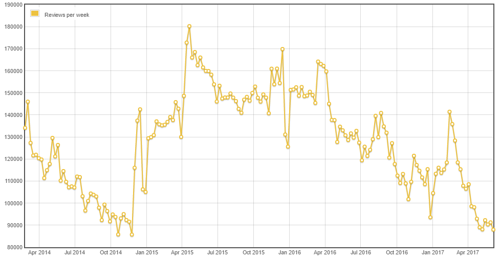
It's become pretty clear by now that, whatever the other merits of the top-bar redesign, it has been a disaster for review:

active reviewers per week, over time

reviews per week, over time

As a result, Triage isn't able to handle VLQ flags on questions, Low Quality isn't able to handle flags on answers, and Suggested Edits are just piling up until further edits are blocked. We managed to relieve the congestion on the last one for a couple of weeks by reducing the number of reviews needed, but as reviewing continues to decline it's been hitting the limit regularly again.

Now... There are probably a lot of things contributing to this in one way or another. But it's hard to ignore that, after the initial "novelty" spike, the activity in review has been declining pretty consistently ever since we changed the textual link to an icon.

what does it mean?

As much as I appreciate the elegance and consistency of the new design, it's somewhat more important to me that moderation on Stack Overflow actually works - and for the past 5 years, we've leaned heavily on thousands of people lending a hand via review to make that work; if that falls apart, we're gonna have to elect a lot more moderators, really fast.

So... Can we please have a plain ol' textual link that says "review" back?
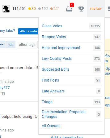
a text link

89
  • 297
    Alternative feature request: change the review icon to something more readily identifiable, like 💩 Jun 16, 2017 at 17:05
  • 150
    @Cody Gray: That's reserved for the mod queue.
    – BoltClock
    Jun 16, 2017 at 17:06
  • 24
    Give it 6 to 8 weeks ... I would organize elections anyway, in case it slips ...
    – rene
    Jun 16, 2017 at 17:11
  • 48
    IMO, it would also be helpful to have the badge back for reviews (regardless of if we have the text "review", or the icon), but only if the badge is only displayed when the review queues are particularly full. Having the badge always displayed was ineffective. When it's always displayed people become use to it being there and just ignore it. If it is displayed only at times when the queues are particularly full, people are likely to pay attention to this "new" thing in their view and actually act on it.
    – Makyen Mod
    Jun 16, 2017 at 17:14
  • 32
    So... the new Review icon managed to break Triage even worse than it was already broken? That's quite an accomplishment
    – Machavity Mod
    Jun 16, 2017 at 17:36
  • 38
    Agree with @Makyen here. There are three icons there (I'm not counting the sites one) and two of them call for attention. The third doesn't... so you don't click on it. I propose something like this to show up when a queue you have access to gets more than say 70/75% full.
    – CalvT
    Jun 16, 2017 at 17:43
  • 27
    Honestly, I don't see any need to make this obnoxious @Zanon - a text link worked remarkably well for years. We've seen a drop in traffic across the board for links that were converted to icons; I strongly suspect folks just gloss over 'em.
    – Shog9
    Jun 16, 2017 at 19:08
  • 18
    @Shog9 what bugs me is to mix text links with icons. If we need to go back to text links, I hope that the design team will propose a better layout than to use 1 text link between 3 icons.
    – Zanon
    Jun 16, 2017 at 19:17
  • 46
    Are you absolutely sure that edits piling up is because of the new design? Could it be that since February some dedicated users decided to stop contributing because of the "Take a stand" mess and your reaction? Also, if suggested edits fluctuate based on Q/A posted you might want to make a graph taking that into account.
    – user
    Jun 17, 2017 at 7:45
  • 41
    I blame the drop in Triage reviews on the fact that the powers that be refuse to correct the blatantly incorrect review guidance for the "Requires Editing" button that continually causes reviewers to fail review audits when they use the button in the exact (incorrect) manner the guidance suggests they should. Why don't we try finally correcting that first?
    – user4639281
    Jun 17, 2017 at 22:05
  • 51
    I thought the icon meant "Ask Question". It would never have occurred to me that it meant "Review".
    – Womble
    Jun 18, 2017 at 0:51
  • 19
    Have you considered making the review queues less painful to use instead?
    – jpmc26
    Jun 18, 2017 at 9:09
  • 18
    Like @Womble it is always a surprise to me that the icon means review. I'm not sure what the iconography is supposed to represent but it doesn't scream out review to me. Also, I agree with the 5 second rule here nngroup.com/articles/icon-usability : "if it takes you more than 5 seconds to think of an appropriate icon for something, it is unlikely that an icon can effectively communicate that meaning."
    – Elin
    Jun 18, 2017 at 13:21
  • 14
    Peter Reid's suggestion to move "Users" to be an icon made me wonder... why is Users even there? It seems like it could be easily dropped to make room for Review as a top level text link next to Questions, Tags, etc. Aside from easily telling how far behind Jon Skeet you are at the moment, the Users link doesn't seem like it has a lot of value to me. Not enough to warrant its prominent placement, at least.
    – Dan Lowe
    Jun 20, 2017 at 2:25
  • 18
    I stopped reviewing because of the review process, not because of an icon. Fix the engine before you start debating about whether to keep the new paint job or not. Jun 20, 2017 at 15:12

14 Answers 14

428

Go for a hybrid, imo. When accompanied by an icon, maybe the text doesn't have to be as big as the first-class links.

icon text hybrid links

Run this in your browser's developer console to get a preview:

((d,o,c,s) => {
  c = d.createElement("style");
  c.textContent = '.s-topbar--item:not(.s-user-card){display:flex;flex-direction:column;justify-content:center;}.-menuitem-caption{font-size: 10px;}';
  d.head.appendChild(c);
  for (let n in o) {
    s = d.querySelector(o[n]);
    if (!s) continue;
    c = d.createElement("span");
    c.className = "-menuitem-caption";
    c.textContent = n;
    s.appendChild(c);
  }
})(document, {
  inbox: ".js-inbox-button",
  awards: ".js-achievements-button",
  review: ".js-review-button",
  help: ".js-help-button",
  network: ".js-site-switcher-button",
  hats: ".-link.icon-winterbash"
})
16
  • 73
    Nice! This would, at least, justify that the new top bar is almost twice as tall as the old one.
    – Melebius
    Jun 22, 2017 at 8:37
  • 2
    So allow people to disable the image, leaving them just with the text that explains what happens when they click on the text?
    – user146043
    Jun 22, 2017 at 8:51
  • 61
    That looks super clean and professional. It really fills out the area in a way that doesn't make it feel over-filled either. I love it.
    – user4639281
    Jun 22, 2017 at 21:40
  • 9
    Nice, I love this idea! Keeps the icons consistent but still allows people to see what they do at a glance. Fantastic work!
    – Clonkex
    Jun 23, 2017 at 4:36
  • 10
    This is definitely the way to handle it. I've been thinking on the review icon for a few days and I still can't figure out what it's supposed to look like. And I have absolutely no clue what other icon might be more clear to replace it. Text is the only fix.
    – Dan Lowe
    Jun 23, 2017 at 14:51
  • 4
    +1 Now wait for the edit by a Moderator which includes status-completed tag for your post.
    – Shashanth
    Jun 25, 2017 at 15:24
  • 2
    Now if you tell the same on UX@SE, you'll get heavily downvoted. Icon with text is frowned upon, because there's too much "paint" for this functionality. If the icon requires a text to be understood, that's a bad icon. Fixing or removing the icon is a better option than monkey-patching the design. Also your icons are now off center line, unlike all the other items in header. Jun 29, 2017 at 12:25
  • 4
    I've never been a fan of labels being fully lower-case...I have to make an exception for this. This looks like an outstanding improvement. Jun 30, 2017 at 14:16
  • 7
    Yes, please -- many icons are cryptic to some and illegible to others. I don't see that well; combine that with a "WTF is that supposed to be?" icon and usability of a site tanks for me. Yeah yeah tooltips, but I'd bet that actually making the information passively available instead of requiring user action will produce better results. (If I can turn off the icons and use only the text, I usually do -- that'd be a nice option to offer people.) Aug 14, 2017 at 20:16
  • 3
    This mockup is fabulous. Absolutely fabulous. Yes please!
    – Ajean
    Sep 13, 2017 at 0:35
  • 3
    @polkovnikov.ph Since when have UI designers ever recommended icons with zero explanatory text? That's the opposite of usable.
    – endolith
    Sep 14, 2017 at 18:24
  • 2
    @canon Well hopefully people rediscover what "usability" means and that fad goes away.
    – endolith
    Sep 14, 2017 at 21:08
  • 4
    @canon So this is why more and more phone apps have just icons at the top with no way of knowing what they do until after you click on them. Ugh.
    – endolith
    Sep 14, 2017 at 21:24
  • @canon Yeah, it cost Android users billions of dollars spent on phones. Or is material not "flat" enough? Irrelevant article. Sep 15, 2017 at 9:21
  • 3
    OH my, this is so perfect WHY HAS IT NOT BEEN DONE
    – Menasheh
    Sep 20, 2017 at 17:12
72

To me also the two rightmost icons are meaningless and unclear. I certainly have reviewed much less after the change.

What's more, in that particular area the first couple of items are "personal": my picture, my rep, my medals, my inbox, my recent achievements. Then suddenly the last two aren't personal, instead they are sitewide/networkwide, but without visual aide or distinction.

Last but not least, because some of the personal items show count badges, I feel that subconsciously I assume that 'no count badge' = 'no need to click it'.

Perhaps the Review should be moved into a bigger block similar to 'Featured' and 'Hot posts'. Or you could even make a single block with rotating contents: if it is different on every page load then it will grab more of my attention than blocks that are static for hours if not days at a time.

10
  • 8
    "Then suddenly the last two aren't personal" The last one is very much personal. It has the "your commujnities" listing which are the sites you choose to put there. Followed by all available communities. So the only odd one out is the review section. Jun 19, 2017 at 15:38
  • 7
    I see, but the tooltip promises otherwise: "A list of all 169 Stack Exchange sites". That makes it a button I will hardly ever use.
    – Peter B
    Jun 19, 2017 at 15:46
  • 11
    It does show those 169 sites. But it shows them after your user communities sites. And I use that button all the time. Just like I used the down arrow beside the website's name all the time in the old layout. That's good, useful functionality, even if you personally don't use it. Jun 19, 2017 at 15:48
  • 1
    I never even realised that right-most button switched to the other sites, and I thought I had just imagined that functionality existing.
    – Clonkex
    Jun 19, 2017 at 23:49
  • 28
    subconsciously I assume that 'no count badge' = 'no need to click it'. <-- this is the perfect response. Jun 20, 2017 at 22:07
  • @MacroMan When it was first switched, the reviews icon always had a big red indicator, identical to the inbox messages. I wonder how many were like me and used something like Stylish to just permanently hide it because of that, and then never bothered to check if they fixed it...
    – Izkata
    Jun 22, 2017 at 13:52
  • 1
    @Izkata: They actually had that in the beginning. But they removed it because, unlike the other indicators next to it, it would never go away. Remember: the top bar moves with you; it's always there. So seeing an alert is like being poked in the eye. Alerts you can get rid of are fine. But alerts that you can never get rid of simply become annoying. Jun 23, 2017 at 16:29
  • @NicolBolas Yes, that's what I said. I'd also forgotten that the bar by default moves with you, that makes it even worse; that's another thing I've changed with Stylish. It just sticks to the top of the page for me.
    – Izkata
    Jun 23, 2017 at 16:46
  • You don't have to hack it with Stylish, @Izkata. Having the top bar not move with you is a preference: stackoverflow.com/users/preferences/current. Oded implemented this because legions of established users descended upon SE with pitchforks when this stickiness was demoed. Jun 23, 2017 at 17:22
  • Oh! I had assumed it was a hamburger icon ( bbc.com/news/magazine-31602745 ), and hence led to some settings. Apparently it's a sitelist. Who knew? Jun 23, 2017 at 18:32
68

The review icon is indeed perfectly unclear. Dominos? Someone drawing a line with chalk on a blackboard? A stapler? Some sort of marker pen?

This does however go hand in hand with the other fashionable monochrome icons. Because the right-most icon is even more confusing. The only thing it is close to resembling is a hamburger. Most users don't know what to expect when clicking on a hamburger.

The point here is, if the reviews have started to drop because of the domino icon, then you should experience a similar pattern for items below the hamburger icon.

Has meta participation by new users dropped after introducing the hamburger? Are there fewer new users finding their way to the chats? Do other sites get fewer re-directs from SO?

If you could assemble similar statistics for items below the hamburger, then indeed that would be proof that the icons are to blame. If not, then the dropping review participation depends on other factors. (I could name a lot of those, but lets not derail the topic.)

20
  • 22
    The "hamburger" is (a smaller version of) the logo for Stack Exchange, and clicking on it allows you access to any site on the exchange. That seems logical to me.
    – Mage Xy
    Jun 19, 2017 at 15:50
  • 17
    The left-most icon is pretty unclear, too. What happened to the envelope icon? Is this an old tape recorder or a toolbox with a handle?
    – vojta
    Jun 19, 2017 at 17:39
  • 16
    @vojta - I think it is an inbox/tray
    – amflare
    Jun 19, 2017 at 18:00
  • 8
    Agreed! When they introduced the icon I found myself clicking on the icon over and over because I kept forgetting what it was supposed to mean.
    – idmean
    Jun 19, 2017 at 18:45
  • 3
    Yeah, clicks on the Help and site-switcher drop-downs (the two icons which were formally text on the far left and far right sides of the top-bar) have also diminished significantly, @Lundin. The secondary effects there are harder to gauge - it doesn't look like the site-switcher was responsible for most traffic to meta or other sites, and the help menu definitely wasn't responsible for sending very many people to help (context-sensitive links such as those in the close reasons and "you can't vote" pop-up are far and away the biggest sources of traffic to help).
    – Shog9
    Jun 19, 2017 at 20:04
  • 2
    Thought you meant Dominos the pizza...
    – Clonkex
    Jun 19, 2017 at 23:48
  • 5
    @MageXy You know what, I would actually have realized it was the logo if it had colors. Now someone had to explain it to me instead. But monochrome icons are fashionable, so who cares!
    – Lundin
    Jun 20, 2017 at 6:17
  • 5
    @Shog9 Well there you go then, seems like the new top bar is to blame. Should be easy enough to rollback to the old one.
    – Lundin
    Jun 20, 2017 at 6:19
  • 20
    "The left-most icon is pretty unclear, too. What happened to the envelope icon? Is this an old tape recorder or a toolbox with a handle?" --- It appears to be a cat litter box.
    – Daniel
    Jun 20, 2017 at 14:45
  • 10
    "Most users don't know what to expect when clicking on a hamburger." - yes they do, .. it's just not what happens here when you click on it. en.wikipedia.org/wiki/Hamburger_button
    – commonpike
    Jun 20, 2017 at 19:12
  • 3
    @commonpike Okay so there is a different term called hamburger button. But this is not what this is meant to be - it is meant to be the SO logo. And it is not 3 straight lines, it is 1 straight in the middle and 2 rounded, hamburger bread-shaped lines where to lower one has got a bit sticking out of it (some onion ring or salad about to escape, perhaps). That being said, I don't think the symbol in the linked wiki is particularly intuitive either.
    – Lundin
    Jun 21, 2017 at 8:39
  • 1
    I'd rather not have something with a number in it. Jun 21, 2017 at 23:59
  • I don't find this a logical argument at all. For a start, the hamburger icon is very common. But more importantly, the use is totally different. Review is something that people can be encouraged to do. It is logical to think that having a text link with the word review encourages people to do so and reminds them about it. The hamburger leads to other sites and is a totally different case. To say that unless there is the same data on the hamburger icon, it's not true, is plain nonsense.
    – user2493235
    Jun 22, 2017 at 5:33
  • @SuperDuperApps If it is not a logical argument but nonsense, then your argument must be that a monochrome, hamburger-shaped icon is more intuitive to humans than various click-able text labels named "help", "chat", "meta", "SE network". Okay... If the hamburger icon is very common, kindly share some examples of sites using one, apart from fast food restaurants. Again, it is not supposed to be the "hamburger button" in the linked wiki, it is supposed to be the SE logo. (Yes, it is very hard to tell.) If other sites are using the SE logo I believe they might be up for a lawsuit.
    – Lundin
    Jun 22, 2017 at 6:33
  • 4
    I honestly couldn't figure out how to navigate to other SE networks anymore until this thread. Some still have the old banner at the top, so I thought the functionality was removed from some of the sites. I think the issue is the site name in the top left exists on all SE network sites but has different functionality in different places. Jun 23, 2017 at 13:42
54

In general:

Icons are always unclear. They force people to spend precious seconds trying to figure out what this symbol is supposed to mean. The number of icons that have entered the general consciousness can probably be counted on one hand.

(the save icon is one - how long has it been around? Plan on something being around for that long, and standardized for every program, if you want people to start to recognize a new icon. And note that by this point, meaningfulness is gone - recognizability is all that matters)

Words? We invented those for a reason (and block printing > cursive > hieroglyphs by Darwinism). They are always instantaneously clear (as long as it's a sane font, and not a homonym). Even if it's not a native language, people are good at learning words.

For that matter, if completely nonsensical words were assigned, people would learn them and get up to real-word speed very quickly.


In specific:

As it is, the only icon that is even slightly intuitive is the "trophy" icon ... which is also the least important. The others are just "generic square #1", "generic square #3", and "generic square #4".

14
  • 17
    To be fair, The inbox looks like an inbox Jun 19, 2017 at 17:47
  • 3
    @NathanOliver Understandable, but for how much longer?
    – Booga Roo
    Jun 19, 2017 at 17:57
  • 6
    @BoogaRoo How much longer will people know what an inbox is? Jun 19, 2017 at 17:59
  • 19
    @NathanOliver Are you sure that isn't an Out box?
    – ajb
    Jun 20, 2017 at 6:34
  • 7
    @NathanOliver OK, after looking at the picture, I can see that the icon is supposed to be in "perspective", i.e. the part in the back appears narrower than the part in front even though they're supposed to be the same length. Trouble is, there's nothing in the icon that makes it look like it's supposed to be a 3-D picture, unless one is already expecting a 3-D picture. It looks to me like a trapezoid with some lumpy stuff at the bottom. In fact, there are some sedans with that approximate shape, and those lumps look like tires. So this looks more like a car than a box to me ...
    – ajb
    Jun 20, 2017 at 6:39
  • 4
    @NathanOliver Inboxes look different in my country... more like this
    – vojta
    Jun 20, 2017 at 8:28
  • 7
    @NathanOliver "How much longer will people know what an inbox is?" I, of course, don't have any priviledged information about the future, but it could keep its meaning "forever", even after inboxes are long gone. I mean... it has happened before! Time will say. (I, for one, have never ever seen a real inbox in my life but I recognize the icon)
    – xDaizu
    Jun 20, 2017 at 10:18
  • @ajb Looks more like my "in progress" box...
    – user
    Jun 20, 2017 at 11:35
  • 4
    I don't associate the trophy icon with reputation and badges, it's more of a "click here and participate in our ongoing contest.......". But I'm sure the developers did proper A/B testing and came to the conclusion that these icons are great and everyone loves them so who am I to judge their bad taste.
    – Daniel
    Jun 20, 2017 at 14:51
  • 1
    +1 to this! The review icon does not clearly say "review" to me. I still keep mixing up it and the SE logo when I click because they're both gray speech bubbles. Giving it a unique shape would go a long way towards fixing that.
    – user812786
    Jun 20, 2017 at 19:20
  • I wonder how long it will be until people don't even know what the picture-that-is-the-save-icon even is (a 3.5" floppy disk, if (generic)you are one such person). Jun 21, 2017 at 20:11
  • Lets just have the worst of both worlds and just use WingDings text!
    – Tezra
    Jun 22, 2017 at 14:38
  • 6
    Um... what's an Inbox? I haven't seen one of those physical things in 20 years. On the other hand a cat box -- yeah that's where my kitty leaves me special messages. Jun 23, 2017 at 16:06
  • 1
    A thousand times this! We were made for words, and we've honed our wetware our entire lives for words. Hieroglyphics are always confusing. Bring back labelled navigation with real honest to goodness words, not hieroglyphics alone.
    – tchrist
    Sep 21, 2017 at 5:19
26

After some thought, I think the best thing to do is keep the icon but add the number of pending edits on top of it, like the number of new inbox items:

This will make people notice the item better and want to click it.

14
  • 14
    Honestly, I think having a badge icon anywhere on the top bar would stress me out. It would definitely draw attention, but I think this might be going too far the other way. Jun 20, 2017 at 13:57
  • 8
    @BiscuitBaker I don't think so. It was the same in the old design, just without icon. Maybe have a different color, e.g. the old orange. Jun 20, 2017 at 13:58
  • 2
    A more muted colour would definitely reduce the feeling of urgency. I'd completely forgotten that this was part of the old design! Jun 20, 2017 at 14:07
  • 1
    @BiscuitBaker I didn't, lol. The number was always off but still, it was there and was useful IMO. Jun 20, 2017 at 14:12
  • Yeah, I'm definitely not opposed to this if it was part of the old nav. It obviously didn't bother me if I've completely forgotten about it. Jun 20, 2017 at 14:13
  • 3
    ++ Exactly this. Having the number there (in bright red even), tells you not only that there is a queue, but also how large it it and that it's changing. Having just the icon, either orange or grey, isn't calling you to action. And of course the other icons work, because they are for the users themselves. I want to jump to the other community or fap over all the rep that I gained. Nobody is looking for the review queue; people need to be reminded that it exists. All. The. Time. I think this red number is the most subtle way that could still work.
    – GolezTrol
    Jun 20, 2017 at 14:17
  • 5
    I like this idea, but at the same time.. I don't. As someone who reviews rarely (only when I'm incredibly bored) that little box is going to get annoying always popping up. I'll be clicking on it to simply get rid of, which I don't want to be doing every time I'm navigating around. I think just the review text would work best like Shog9 suggested.
    – Joe
    Jun 20, 2017 at 16:00
  • I'm having flashbacks of the email icon on my old iPhone... Jun 20, 2017 at 22:09
  • 1
    The main problem touched upon here is that you don't see what the truth is until you navigate to a specific page - showing a number of just one queue is only solving a tiny part of the total equation. A (configurable) block on the side which shows the cached numbers on the different queues makes it far easier to see what is up in any of the queues while you're out and about doing your regular SO things. Or otherwise I want a stock-tip type of scrolling banner which shows the numbers :) Show people when its prudent to dump their close votes!
    – Gimby
    Jun 21, 2017 at 8:25
  • 6
    For me, when I see a number badge that's always there, I just learn to ignore it. Like @MacroMan mentioned, my iPhone always tells me I have a billion new emails because I get a lot of emails, and I don't read them all. That big red number on top of the icon doesn't tell me anything useful, so my eyes don't even notice it anymore. Jun 21, 2017 at 20:17
  • 3
    Related: "we no longer show a count for this at all" (your question, by the way!). The count was removed also because the queues contain several hundreds of items, which is just distracting.
    – Kobi
    Jun 22, 2017 at 11:21
  • 1
    Even a no-count red pip would be a call to action, and worth doing. Jun 23, 2017 at 18:35
  • A problem could be that if it is lit all the time, people might get used to it so it won't do any good. I suggest just lighting it sometimes, like suggested in this comment. It would also be a good idea to add an option in the profile settings to disable it lighting up in case some users think it's stressing. Jun 24, 2017 at 1:24
  • Please don't do this. It used to be this way but it was incredibly irritating! Jun 30, 2017 at 17:52
18

I... hesitate to post this, but I don't understand. The people who do the reviews, are not newcomers. They are people that have

  • an account
  • sufficient reputation
  • the desire to review stuff

How is it that they wouldn't learn from day one that the icon is the new review icon?

To be honest, I was confused when the new design was rolled out, I searched for the review icon, exactly once. Then it was done. I know what icon it is.

So while I agree that it's not exactly crying out loud "review" just by looking at it, I can't fathom how someone will be seriously discouraged from reviews by an unwieldy icon.

... Sadly for me, numbers seem to contradict my thinking.

11
  • 12
    Don't feel bad; you're not the only one caught off-guard by this. I totally didn't expect it either.
    – Shog9
    Jun 22, 2017 at 2:00
  • 21
    Fact of life: bad UX hits everyone to some extent, even experts. Jun 22, 2017 at 3:49
  • 5
    Goes to show the importance of UX. It's a great case study, this.
    – commonpike
    Jun 22, 2017 at 10:31
  • 4
    my experience was the same, confused first time -> search for new icon -> use it -> get surprised to find that numbers show it had such a pronounced impact on others. The only reason that comes to mind is folks who dropped were uncomfortable doing reviews. You know, those who waste half an hour or more breaking through 20-40 unfiltered reviews without even skipping. When word "review" was there it could serve like call of duty, "please do it, site needs your help". After it disappeared they maybe felt nothing but relief. "Out of sight, out of mind"
    – gnat
    Jun 22, 2017 at 13:07
  • 1
    There is also the problem that, as old reviewers retire, new reviewers need to take their place. The Super problem is that, Retired-Rate > New-Rate. That is the real issue that needs to be addressed.
    – Tezra
    Jun 22, 2017 at 14:42
  • @Tezra you might find it interesting that statistics shows "old reviewers retire" happens typically after mere 50 reviews, go figure
    – gnat
    Jun 22, 2017 at 18:13
  • 1
    @gnat I'm not surprised. Reviewing isn't the funnest task. (The badges keep me going =P) 1 rep for x approved reviews, or being able to earn silver/gold badges repeatedly would REALLY help the motivation =P
    – Tezra
    Jun 22, 2017 at 18:21
  • 1
    "Sharp drop at 10-50 likely indicates that many users find it difficult to work in review queue. Drop after 250 (silver badge) suggests that even after substantial amount of reviews, many users still fail to discover a way to work productively..."
    – gnat
    Jun 22, 2017 at 21:12
  • 7
    "the desire to review stuff" is not always really true. Many people review out of sheer boredom, when they have nothing better to do, So if you make it harder for them, they will simply find something else which is easier to find/do, possibly outside of SE. :/ Jun 24, 2017 at 9:50
  • 1
    "Sadly for me, numbers seem to contradict my thinking." But they don't. The data are not convincing at all. There's a massive leap being made in the OP's conclusions. Jun 30, 2017 at 17:53
  • Because I can't remember icons well - text I understand every time - icons I have to look up most times
    – mmmmmm
    Sep 19, 2017 at 13:44
13

Basic UX suggests that the upper right hand corner is one of the least viewed webpage areas.

I suspect that the move of the review button there (vs the previous location in prime "eyes on" screen real estate) had a significant effect as well. I am less convinced the button vs name is the root and core problem here.

I know for a fact I am less aware of the review button because I generally ignore the right hand side of webpages (particularly SE because most of the content there is ads). Particularly since on the browser I use, the icon is actually nearly off the page because of the top bar's width.

Anyone who is not browsing on a very wide screen simply is not going to even see the icon regardless of what it's called.

I would caution against only renaming the icon vs also being aware of the impact that moving it and removing the count has had.

Add in the removal of the count and identity crisis of the top bar?

2
  • But the old review button was also on the top right side of the screen, wasn't it? It still is on other SE sites.
    – Mage Xy
    Jun 22, 2017 at 14:32
  • @MageXy sort of? It's nearly centered (probably about 10% to the right of center on my monitor), is aligned with the parts of the page you actually read, and has both a notification count as well as the "review" text.
    – enderland
    Jun 22, 2017 at 14:37
13

I've actually been searching everywhere for the review link. I just recently got enough points to be able to access it and I wanted to check it out, but in all the questions and the documentation pages about the review process, they all say to click the review link at the top of the page. Until this post I didn't know where it was and had to manually type it in the url. I thought it might just be a bug that it wasn't there or something was wrong with my account. If they do keep the icon, please update the site documentation to reflect it.

4

Perhaps it's not the icon itself that's the problem, it's the fact that even when highlighted, it doesn't draw enough attention (orange is a common branding color throughout the UI, so the brain immediately learns to ignore it). Changing it back to a text link would obviously break the new design; instead, we could consider improving it's visibility, while keeping the icon itself. Something like:

Obviously this is a bit of a crude example, but you can see how the bright red color, combined with the urgency of the badge count, draws attention.

1
  • So true. People who were used to reviewing can certainly find this icon, but you're just not invited to click it.
    – GolezTrol
    Jun 21, 2017 at 15:24
4

There are lots of opinions about icons in general here. I think the main point is the icons (all 4 of them) are just not very clear. The 'review' icon, even if you recognize it- what does it do, speak or write, or both ? And the hamburger balloon, why is that a balloon anyway ?

There are widely recognized icons for all four actions, though; no need to revert to text; just improve them. But first define what these actions really are:

  • 'incoming' stuff is usually an arrow down to some plate at the bottom, differentiating it clearly from outgoing.
  • 'awards' is the least obscure icon, but a star would already do leave it as it is
  • 'review' - I would say this icon means 'moderate' instead. moderators wear crowns or police caps. if you dislike the hierarchical implications, it may mean 'meta/discuss', which is often overlapping speech balloons
  • 'other SE' takes you out of this site. that's usually an arrow escaping a box, often to the top right. If you would claim this is a 'network' icon, that's a number of connected bubbles.

I think all these icons are widely accepted and recognizable, unless you are an icogynist.

@PeterB made the valid observation that the last two icons are of quite a different level or scope. The first two belong to you, the last two belong to the site. They could be visually separated a bit more.


https://www.google.com/search?q=icon+incoming&tbm=isch

https://www.google.com/search?q=icon+awards&tbm=isch

https://www.google.com/search?q=icon+moderator&tbm=isch

https://www.google.com/search?q=icon+network&tbm=isch

4
  • 12
    A star would be a bad idea: it usually means "favorites", and the Stack Exchange sites already use stars with this meaning. Even Google uses it. The use of stars to mark something as favorite is so widespread it's even become a verb: you can star this question, for example, by clicking on the star icon, just below its score. And apart from this, I think the trophy is the only icon that conveys its meaning, and I wouldn't change it. Jun 21, 2017 at 12:32
  • agree - changed that in the answer
    – commonpike
    Jun 22, 2017 at 10:29
  • I think the other sites icon is just fine because it's the Stack Exchange logo. It's the same on other sites, except that on other sites it's in color and is followed by the text "Stack Exchange". Jun 24, 2017 at 1:31
  • @DonaldDuck and it has a dropdown triangle, it opens properly as a tab (including a tab label) and it's usually on the left. I didn't even notice it was that icon, .. also never noticed it was a balloon there .. but you're right. in which case, I would find it confusing everywhere if it had no label :-)
    – commonpike
    Jun 28, 2017 at 17:47
-15

ICONS - Incomprehensible Cryptic Obfuscated Nonsense Symbols

Enough said!

5
  • 8
    [citation needed]
    – xDaizu
    Jun 20, 2017 at 10:20
  • 13
    Icons are nice and playful, we had them in a recently built application. And then during the testing phase that was quickly swapped out with a dull dropdown menu so people could actually do their work properly.
    – Gimby
    Jun 20, 2017 at 10:54
  • 2
    @Gimby Dropdown menus are just workarounds for missing shortcuts.
    – GolezTrol
    Jun 20, 2017 at 14:21
  • @xDaizu, It's possibly "original"-ish. I prefer the long-established "mystery meat" navigation. ;) Jun 21, 2017 at 2:13
  • Can I upvote this a 100 times - I need to take a copy into often used clipboard
    – mmmmmm
    Sep 19, 2017 at 13:45
-22

Color does a great job of communicating, attracting the eyes attention, and bringing contrast to different elements. Here's a quick mock up using color in the navbar that might make each icon stick out a bit more.

Just the icons

The full nav bar

6
  • 3
    Are the colors too distracting?
    – Goose
    Jun 21, 2017 at 13:57
  • 15
    The contrast should be high enough, sure, but color is overrated. It helps to distinguish between the icons, but it doesn't add actual meaning. Also, the benefit is mostly gone when you're among the 10% that are color blind. Regardless, you still have to figure out that that (red) icon means 'review'.
    – GolezTrol
    Jun 21, 2017 at 15:22
  • 1
    @GolezTrol great points, just thought I'd throw this idea out there. My thinking is that the issue isn't that the icon is unclear, so much as it blends in too well, so I'd never click it unless I was prompted to like inbox and the trophy does.
    – Goose
    Jun 21, 2017 at 15:25
  • 1
    Just a detail, but if you really want to do this, I would put the Stack Exchange button in blue since the Stack Exchange logo is blue. Jun 24, 2017 at 1:36
  • @GolezTrol Except humans have a very good ability to associate abstract symbols together with their function. You can put any nonsense symbol there; if a human click on it long enough they will remember what that symbol does. Colors help memorizing much faster. It's like these games, which would be significantly harder for humans if there were no colors at all. Now of course if they weren't monochrome nonsensical symbols in the first place, we wouldn't need to play such guessing/memory games.
    – Lundin
    Jul 4, 2017 at 13:32
  • 2
    Color blindness is mostly trouble separating red from green, rather than not seeing any colors at all. It is not really a good argument to raise, as there are lot of other disabilities you could as well consider. For example it is very common that people have poor sight and might therefore not be able to see tiny, blurred, abstract icons well. In which case colors help them a lot.
    – Lundin
    Jul 4, 2017 at 13:33
-37

icons are fine good to understand and reduce the space as well

1
  • 4
    stackoverflow.com/users/2805971/… Two reviews shortly after posting this answer, prior to which you've never even used the review queues (all other reviews were on edits on your own posts). For all we know, you only discovered review today after seeing the question and learning what that icon meant. So I'm not so sure your statement that "icons are [...] good to understand" can be taken seriously.
    – BoltClock
    Jul 5, 2017 at 16:51
-42

Are we absolutely sure it has something to do with the new icon?

If somebody is interested in the quality of the site, I am very sure this person would also ask themselves, "what is this shiny icon next to my achievement icon?"

What would this person see?

tool tip

For the other people, that are only interested in asking/answering questions I am not really sure if it makes much difference whether it's text or an icon.

Certainly, reviews are in need of more traffic. I am only asking if your proposed way is the right way to handle it.

By looking at the charts, yes, the activity is lower since the top bar redesign. But was this process started by the redesign? I see a clear downward trend before this change (If we remove the triage spike).

This leads to the following question:

Why did we have a spike for the introduction of Triage? Can we tweak something to reproduce this?

In my opinion, badges are an motivation for many people here (regardless of whether they are interested in site quality or not). For me, the explanation for Triage is that people had the chance in getting 3 more badges.

Maybe we could temporarily test multiple gold badges for reviews?

Also, I find this idea very interesting:

IMO, it would also be helpful to have the badge back for reviews (regardless of if we have the text "review", or the icon), but only if the badge is only displayed when the review queues are particularly full. Having the badge always displayed was ineffective. When it's always displayed people become use to it being there and just ignore it. If it is displayed only at times when the queues are particularly full, people are likely to pay attention to this "new" thing in their view and actually act on it.

Makyen

tl;dr: Review needs some work to draw attention. But is changing the icon really the right way?

12
  • 28
    Having to hover the mouse to see a description in order to understand what a given thing does, is extra work, and unnecessary if a word is used instead of a non-standard icon. I still do not understand the icon, but my guess is that it is a pencil on a line? Or an eraser? Why can't "review" have a word when "Questions" can? (Where a question mark would be the perfect icon) Jun 18, 2017 at 12:55
  • 13
    I only guessed it's a pencil on a line only after knowing it's the review button. the icon is awful
    – svarog
    Jun 18, 2017 at 15:08
  • 1
    Yes, the icon is not the greatest. Maybe we could exchange it. Jun 18, 2017 at 15:48
  • I always thought that the icon was a flying chalk drawing something in a mixture of a speech bubble and a blackboard. Not a great icon, certainly. Now I realize it makes more sense if it is an pencil... I agree with Thorbjørn Ravn Andersen, it should be a word, like "Questions", "Tags" and "Users".
    – Juan T
    Jun 18, 2017 at 16:12
  • 3
    I agree with the difficult to understand icon, but my take is a fluorescent pen highlighting errors.
    – Ken Y-N
    Jun 18, 2017 at 23:27
  • 9
    If it's worth anything, I am a prime example of this: I have some experience on SO, so most of the icons made sense to me immediately. I don't tend to review (including before the top-bar change) so, come my first exposure to the new navigation, I did exactly what this answer suggests and hovered over the icon to see what it was. I can say that I'd be more likely to visit reviews if I occasionally had a little red badge on the icon when the queues were filling up, or some similar call for action.
    – Clavin
    Jun 19, 2017 at 1:45
  • @KenY-N Your description helped me finally understand what it is. I've thought it's an odd-looking command prompt inside of the bubble. Jun 19, 2017 at 5:22
  • 3
    I personally found all of the new icons, and their placement, confusing, and totally out of sync with the rest of SE. It was a week or so, before I worked out what was where. Yes, I should have "hovered with the mouse", but I am busy and it was easier to go to other SE sites where I didn't have to work out how to use the UI all over again. Jun 19, 2017 at 9:04
  • I worked at a place where our ecommerce site had three confusing icons with no text. Next to them was a link to a video that explained 'how to use the icons.' The video mostly just explained what features the icons linked to. Because when users don't know what an icon means they'll watch an explanatory 'what these icons are' video. Jun 19, 2017 at 15:10
  • 1
    @ScottHannen That seems like a pretty bad trade-off to me. Presumably the link was text. If so, it must've taken about the same amount of space as the original links, but using it less efficiently as you now had to explain unintuitive icons in a separate video, instead of just describing each link in-place. It's worse that it's a video, not e.g. a popover - as I suspect a fair number of folk, like me, hate sites that expect them to watch videos if they didn't visit with the intention to do so, and will often close without watching them. Jun 19, 2017 at 20:28
  • 3
    @underscore_d Even if someone does want to watch videos, I can't imagine wanting to watch one about how to use basic site features. If users need a video to figure out how to use the site something is wrong. And the videos become obsolete the moment anything changes. Jun 20, 2017 at 0:53
  • @ScottHannen Indeed! Before, I couldn't tell whether you thought it was an OK idea or not. :P Jun 20, 2017 at 11:21

You must log in to answer this question.

Not the answer you're looking for? Browse other questions tagged .