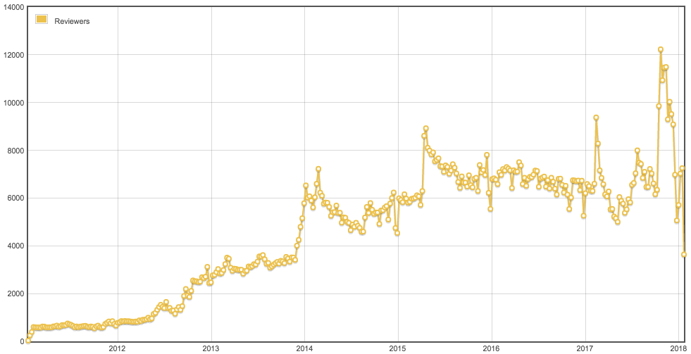
Lately, we've been making adjustments to how the review queue indicator works. Sometimes when we work on some esoteric feature for a long time, we start to lose track of the ultimate goal. In this case, the goal is to direct more people to the review queue so that more posts are reviewed so that overall quality of visible content on the site is increased. All other things being equal, the site benefits from a diverse group of reviewers who have been around the site long enough to earn the privilege. So we're going to focus on reviewers per week:
Usually, the novelty effect complicates analysis, but we can use it to see when major changes occurred. The first major change visible on this chart came in December of 2013 when the original new top bar was introduced. The most important change for our purposes is that we started to show the total number of pending reviews (minus the close queue) next to the review link. After the initial spike, the number of reviewers quiesced to a steady increase that mirrors the overall rate of participation around that time. Unfortunately, the number of outstanding review tasks has been a source of confusion ever since. Regrettably, the number is cached and includes reviews that the user might already have handled.
The next increase came around the time we introduced the new profile and activity pages. I can't find anything else from that time period—the spike occurred the week of April 15, 2015. Presumably the new reviewers were inspired by the next badge progress bar. Once people earned the relevant badges (or stopped looking at their own activity pages) the number of reviewers tapered off again.
In February of 2017, we released a version of the top bar that replaced the word "review" with an icon. This time, however, the number of reviewers settled below what we'd have expected. The most probable explanation is that icons are less readable than text.
In April, we replaced the number with light-up indicator that was triggered when the queues had more than the median number of tasks. Unfortunately, this resulted in the indicator being on about half the time, which is liable to cause alert fatigue.
After the top bar was released the entire network in October, we changed the indicator trigger to the current "danger-level" scheme, which warns approximately one hour in ten. We also introduced the red dot notification. This change boosted usership beyond what we've learned to expect from simply changing the interface. Until the seasonal drop off typical of December, weekly reviewers seemed to be returning to a much higher level than after previous changes. Since we didn't adjust the thresholds for much lower levels of site activity, it's likely the indicator was lit up much less often over the winter break than it would otherwise the year. So the drop could be exaggerated by people not getting warned as much as normal.
Not relevant to this site, but we recently tested a more aggressive indicator which we'll be rolling out to smaller sites this week. But it does bring me to another way to look at the review queue: how long do tasks have to wait to get cleared? And looking at the periods before and after the the most recent change, it's obvious that more hands make lighter work:
epoch  reviews first quartile median minutes pending third quartile
------ ------- -------------- ---------------------- --------------
before 1429699              6                     29            111
after  1493478              4                     18             63
The "after" period includes the December lull, so it's significant that the number of (non-skip) reviews has increased. Especially when it comes to the close queue, faster reviews are better than slow reviews. So the new indicator is a real improvement when looking at the overall health of the site.
I know there are still some annoyances for individual users. Perhaps you prefer a different icon or a text link. There's a chance of false positives for people who do a lot of reviews (especially on smaller sites). We'll be fixing bugs that come up of course, but the overall design seems to be working as intended on Stack Overflow. Is there something I'm missing in my analysis?
