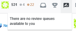
This recent post revealed how non-obvious it is to a user that they're review banned;
It seems that in order to determine whether you're review banned or not you either have to;
- Manually navigate to
/reviewin your browser. - Middle click on the "Review" icon in the header.
... neither of which are obvious.
Can we make it more obvious to the user that they're review banned? Some suggestions;
- When review banned, left clicking on "Review" icon goes to
/review(which shows the user they're banned, how long for, and for what reason). - When review banned, left clicking on "Review" the popup (shown above) includes details on the review ban
- Leave all of the links to the queues there, just like normal, and show the user the ban message when they navigate to a queue (thanks, Servy)
A key part of banning a user from review is the education that comes in the suspension message. Currently, not only is it confusing as to whether a user is banned or not, but we're also making it extremely hard for them to learn from their suspension.


