92

We’ve completed two rounds of A/B tests and we’re ready for phase 3, a final round of testing before we release the new site wide navigation to all users on Stack Overflow (English) and MSO. If you’d like to participate, just go to your user settings under Preferences and opt in to the "New Site Navigation test".

Results of the previous tests

Both previous tests showed great results: users shown the new top nav clicked navigation links 143% more than those shown the current design. This leaves us reasonably confident in the utility of making these tools more accessible. But, there are still a large number of people (including most of our most avid users) who haven’t been involved, so for this final round of testing we want to open it up to everyone; if you weren’t part of the A/B tests, now is your chance to kick the tires!

The goal of this week’s test is to uncover any bugs we missed. Once we’ve resolved any major bugs, we’ll roll it out for everyone. Please create a new post with the tag or post an answer to this question if you find new bugs.

As always, we appreciate your feedback. While there won’t be any major feature changes between now and the first full release, we’ll consider all your ideas for future updates.
57
  • 22
    Can we opt back out if we opt in?
    – TylerH
    Commented Feb 7, 2017 at 2:35
  • 32
    Is more clicks necessarily a good thing? I'd think that you'd want to minimize the number of clicks users make, a more than doubling of clicks sounds concerning.
    – bjb568
    Commented Feb 7, 2017 at 3:44
  • 6
    @bjb568: That depends on whether it's an increase in clicks per task or tasks clicked on; it doesn't seem plausible that it's entirely one or the other, so a breakdown would be necessary. Commented Feb 7, 2017 at 3:45
  • 14
    FYI: it looks like auto-activation is disabled for this, meaning someone has to manually approve folks after they check the box. I don't know if this is an oversight or if there's some intent at rate-limiting here, so I'll wait for a dev to check the queue in the morning (probably the UK morning, so relatively soon). In the meantime, nothing's broken - there are currently 72 of you waiting for your access to be activated.
    – Shog9
    Commented Feb 7, 2017 at 4:55
  • 36
    So how sure are you that the +143% nav link clicks are not due to the lack of contrast confusing people, leading to misclicks all the time? :P Commented Feb 7, 2017 at 10:08
  • 5
    I have enabled auto activation and enabled the new header for everyone who opted in before that.
    – Oded StaffMod
    Commented Feb 7, 2017 at 10:17
  • 26
    FYI, I forgot the bar was sticky. I opted out again as soon as I noticed. (So, as soon as I left the preferences and started scrolling. ~5 seconds, maybe?) Commented Feb 7, 2017 at 10:52
  • 17
    Yet more pointless blank space eating up my screen. Please reduce the vertical spacing everywhere outside text blocks.
    – philipxy
    Commented Feb 7, 2017 at 11:11
  • 10
    @HermannDöppes I didn't know it was sticky, opted in, kinda liked it at first and then quickly opted out when I scrolled down and realized it
    – Lamak
    Commented Feb 7, 2017 at 13:55
  • 62
    Every phase I have looked in on this I see complaints about the contrast and sticky bar. It makes me wonder if you really "appreciate your feedback.". Considering the comments and posts are consistently the most heavily upvoted. Commented Feb 7, 2017 at 14:19
  • 10
    @HermannDöppes same here. Removing sticky headers is one of my most frequently created custom adblock rules. Commented Feb 7, 2017 at 15:47
  • 16
    Haven't read all the comments, so maybe someone already mentioned this, but couldn't an uptick of people clicking things in the toolbar just mean that people are exploring / getting used to the new toolbar? Commented Feb 7, 2017 at 21:31
  • 23
    Here's the bar with minor changes - No obnoxious orange line, no obnoxious box shadow, and the best gray background (#f3f3f3), and a 1px bottom border.
    – Kobi
    Commented Feb 8, 2017 at 9:16
  • 14
    I'm really sorry but... I don't like it, not because it's new or a change, but because I just don't think it works. Its like a jack of all trades and master of none. Perhaps it would be better if it wasn't sticky but nobody needs that much information at their constant beck and call, its a waste of vertical space. Commented Feb 9, 2017 at 14:30
  • 19
    What's any of this for? Such a huge amount of time spent here, by the devs and the community, and for what, exactly? I've read all 3 Meta posts about these design changes and still have no idea what purpose even a single one of the changes is supposed to serve. Wouldn't soliciting feedback be more effective if you told the community what your objectives are?
    – Mark Amery
    Commented Feb 9, 2017 at 15:13

68 Answers 68

7

Paging down hides content behind the sticky navigation

Before the new navigation, I could easily read long questions and answers by paging down using Space (presumably PgUp and PgDn work the same way). With the current implementation of the sticky navigation, text slides behind it, which means that this navigation style has to either be disregarded in favor of arrow keys, supplanted with arrow keys to "fix up" the page amount, or switch completely away from keyboard navigation to the mouse.

Please adjust it so that paging down brings the bottom of the presently-shown content to the top of the effective viewport, not placed behind the header.


After loading a page:

Before paging down

After paging down with Space

After using space to page down

The text that I want to read next is now behind the navigation. It should be directly below it:

What I expected to happen

Bonus animation

Animation of problem occurring

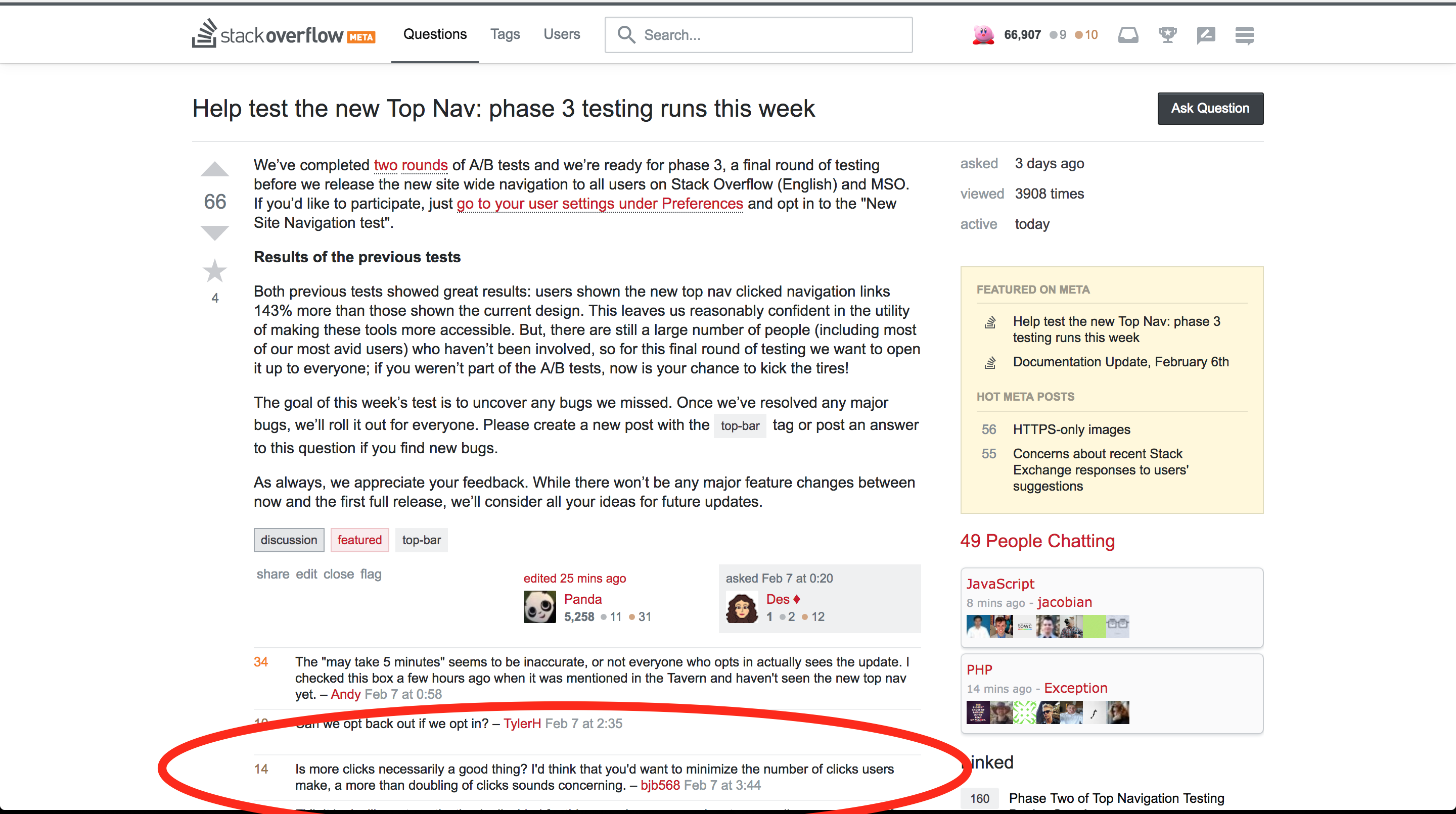
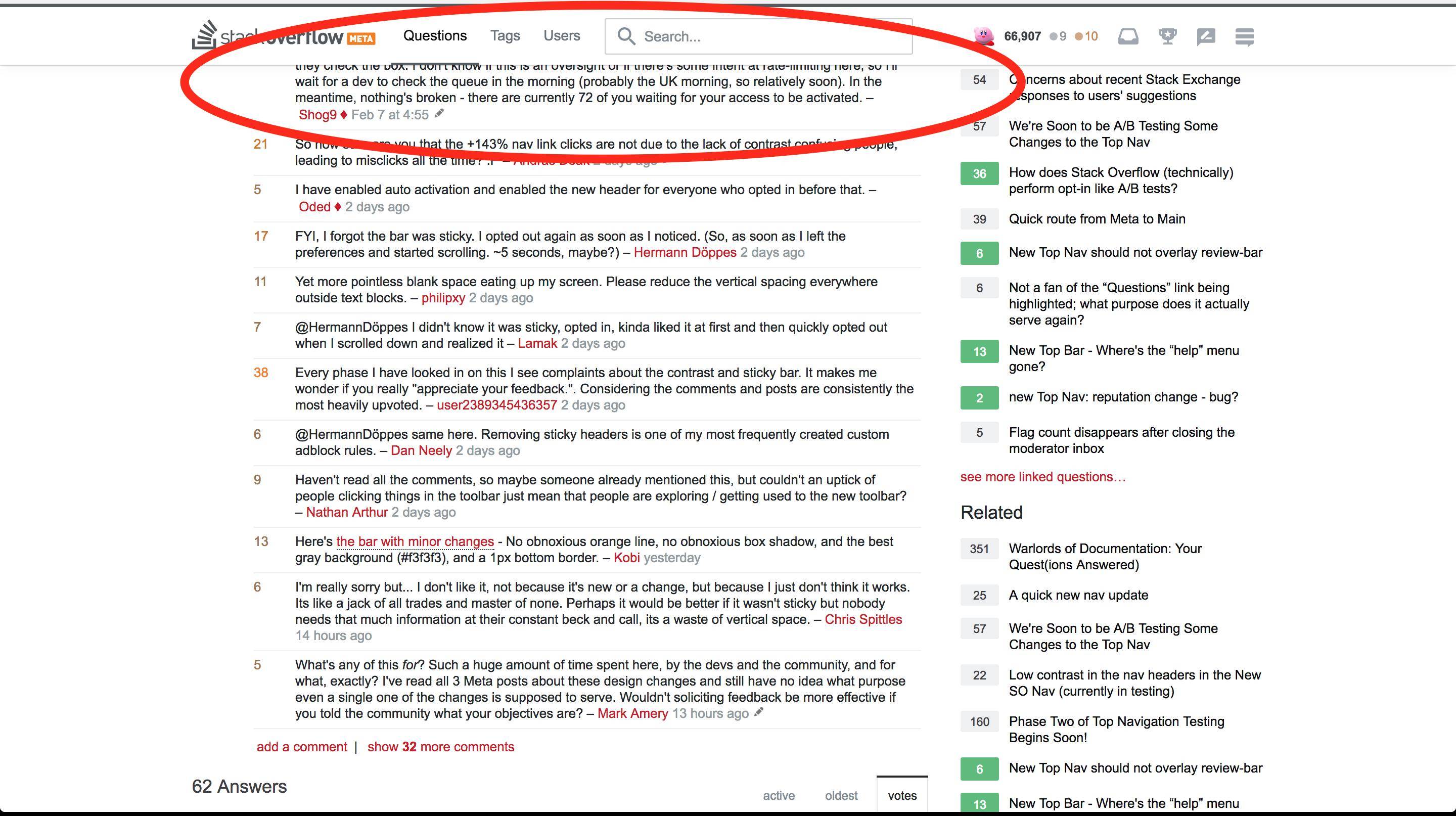
This was taken with all extensions disabled, hopefully ruling those out. Note that an entire comment ("Can we opt out...") disappears behind the navigation in this example.


Environment

  • macOS 10.12.3 (16D32)
  • Chrome 56.0.2924.87 (64-bit)
    • LastPass: Free Password Manager 4.1.39 (also when disabled)
    • React Developer Tools 0.15.7 (also when disabled)
    • Redux DevTools 2.13.2 (also when disabled)
10
  • @Oded I've not participated in this way before — with status-completed, should I expect to see the change already, or is it waiting for a future deploy? It doesn't appear to be live for me (even after a page reload).
    – Shepmaster
    Commented Feb 10, 2017 at 14:56
  • Should already be OK. I can't repro, which is why I marked it as such. What browser/OS are you on, in case this is something specific (also - if you have any user scripts/extensions/plug-ins - they might interfere).
    – Oded StaffMod
    Commented Feb 10, 2017 at 14:59
  • @Oded oops, that was a bad bug report on my end; I've added that and an "expected" picture, to make sure we are on the same page.
    – Shepmaster
    Commented Feb 10, 2017 at 15:06
  • To confirm - this is still an issue for you? What happens when you disable the different extensions? I am on latest Chrome, Windows 10 and can't repro.
    – Oded StaffMod
    Commented Feb 10, 2017 at 15:08
  • @Oded yep. I just disabled all 3 extensions and recorded a GIF of it happening.
    – Shepmaster
    Commented Feb 10, 2017 at 15:19
  • 1
    I've just confirmed this doesn't repro on Win10 with Chrome56 but MacOS Sierra with Chrome56 (through BrowserStack) this does repro.
    – DavidG
    Commented Feb 10, 2017 at 16:21
  • @Oded this is actually a much bigger problem than I originally thought, as when I am linked to a comment, it appears behind the navigation, completely hiding the comment! Would you like me to add another answer, edit this one, or something else?
    – Shepmaster
    Commented Feb 11, 2017 at 21:42
  • 1
    It is essentially the same issue - paging down causes part of the page to be obscured by the header. A couple of people are looking at how to fix this - no need to make any changes/update this post/post a new question.
    – Oded StaffMod
    Commented Feb 11, 2017 at 21:47
  • @Oded yep, it's certainly the same cause, just wanted to make sure y'all were aware of another (probably more common) way of triggering the behavior.
    – Shepmaster
    Commented Feb 11, 2017 at 21:49
  • This doesn't seem to be an "issue", but a matter of browser behaviour vs design. The design stipulates a sticky nav, but the browser couldn't care less. The browser will scroll down the amount it states no matter the design of the page. Commented Feb 14, 2017 at 14:08
7

(in the next build)

The link to the homepage has no visual cue when hovering over it like the rest of the menu items where the background turns gray. In other words, the hover effect is missing on the logo. For consistency I think its background color should change on hover like the rest of the navigation bar items.

enter image description here

I'm also not crazy about the reduction in width of the homepage link. With the current (and soon to be old I assume) navigation, I click the site's text/icon link possibly more than anything else in the navigation, but I didn't realize how easy this was until I had to focus on clicking this much smaller icon instead.

I'd also like to see the "stackoverflow" text returned if room permits. Seems strange to me that the site has gotten so minimalist as to not even show its own name.

2
  • This is notably missing. I'm guessing they didn't add a hover color because it would make two bugs very obvious: The logo is misaligned with the rest of the site (it is too far to the left - it should be aligned with the text), and the logo has no left padding.
    – Kobi
    Commented Feb 12, 2017 at 8:09
  • Left padding fixed: padding-left: 12px; margin-left: -12px; Screenshot
    – Jed Fox
    Commented Feb 12, 2017 at 12:02
6

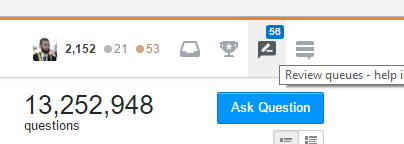
This may be slightly off-topic, but: The Close Votes queue has over 8,600 entries. All of the other review types have a combined 798 entries. What does the count of 846 above the Review Queues button represent?

enter image description here

4
6

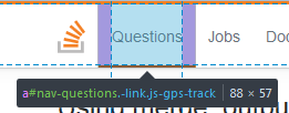
The homepage logo link is too small. To get to the homepage, we need to click exactly on the logo:

enter image description here

This is in contrast to all other links that take the full height of the navigation bar and have extra padding on both sides:

enter image description here

1
  • 1
    clickable area for logo will be increased in coming build.
    – Paweł Staff
    Commented Feb 8, 2017 at 12:22
6

It's not as ghastly as I imagined from the previously published screen shot.

  • I rather like that the notifications are more closely grouped with the other personal info.
  • I like that narrowing the browser steals space from the filter rather than MyStuff scrolling off first, since we will likely have to live with it.

That's all the positive comments I have.

I still don't think the nav/view Tabs belong in the same space. Stack Overflow is about "Questions". Who spends time browsing tags as a primary activity? Or users? I understand Jobs will always and forever be foisted upon us as a key thing, but if I was to ever browse them or tags or whatever, I'd open a new tab for them so that the much much more important question view would still be there.

It basically seems to be designed to highlight the things Stack Overflow wants us to use/visit, rather than facilitating the focal point of Stack Overflow (i.e. "Questions and Answers").

It's stupid suboptimal and lacking conceptual integrity to have the search/filter in the center.

  1. Personally, mine is permanently set to filter to the tags I watch. I don't need it super handy to search something else
  2. It looks highly non-standard since most everywhere puts it top right.
  3. When I do search, I usually use Google for a more comprehensive search. On the rare occasion that I use the built in search, I use it in a new tab so as not to loose my place in Questions. The UI ought to favor, facilitate and accept that Questions are the primary focus of Stack Overflow (not Tags, not Users, not Docs).

Since the nav tabs now inhabit the same space as the filter/search, I would expect them to be fully integrated and they are not. If I click users then go back to "Questions" the filter I had is lost. I understand why, but the new presentation implies more smarts than it has.

Taken together, especially that the Filter/Search box is the first to yield space, it should be on the right.


I am not a fan of the sticky bar - I thought sticky was just supposed to be for new/low rep users? I do like that it means you can always see Notifications, but that does not justify its existence.

I do not need to be able to flick over to Tags (or anything else) at a moments notice. I do need vertical space.

Even as a sticky, a dark background would help identify it as something else.

6

Apparently I don't get counted unless I vocalize that I actually like something in the design, so here goes:

  • I like it white
  • I like it sticky
  • I like it with the search bar in the middle
  • I like it with the menus on the right
  • I like it with the user card thingy where it is

Here is what I would like to see changed, but I can write—and have already written—a userscript to change if they are not changed:

  • I could take or leave the rest of the buttons on the left hand side.
  • I think that removing the bottom border makes it much less intrusive.
  • I think the review button should have a menu linking to the individual review queues, and the 10k+ tools. This would also be a good place to put the moderator flag review stuff.
19
  • 3
    Of course this will be downvoted to oblivion because those who actually like it the way it is won't be scanning through every answer and upvoting the ones that approve of the design, and those who dislike the design will be vehemently scanning through every answer and downvoting the ones that approve of the design. Yet this will be taken as evidence that no one likes the design, and everyone thinks it should be something different. This is why voting is a useless measure in this case.
    – user4639281
    Commented Feb 9, 2017 at 1:33
  • "but I can write—and have already written—a userscript to change if they are not changed" - If that's the result of a re-design, something went wrong with the re-design.
    – Cerbrus
    Commented Feb 9, 2017 at 7:20
  • Re voting: You can't blame the "against" people for "for" users' in-activeness. People that dislike the design aren't responsible for keeping everyone voting.
    – Cerbrus
    Commented Feb 9, 2017 at 7:22
  • 3
    I absolutely do not understand how someone could like the top bar being sticky. The other things just seem like normal, subjective opinions, but making the thing sticky so that it takes up permanent room on my screen when I'm trying to focus on other things just seems absolutely unjustifiable, and I honestly cannot understand how someone would ever be okay with that, much less like it. Maybe it is a fundamental difference in how different people use the site. If you treat it like a chat room, I guess getting immediate notifications would be important.
    – Cody Gray Mod
    Commented Feb 9, 2017 at 11:50
  • @Cerbrus no one is forcing you to use an invalid metric to justify your arguments either. The stuff in the last block is wishful thinking, it doesn't have to change for me to be happy with the design.
    – user4639281
    Commented Feb 9, 2017 at 15:14
  • 1
    @Cody I love instant gratification. Simple as that. Keep in mind that my voting controls are sticky as well.
    – user4639281
    Commented Feb 9, 2017 at 15:15
  • It's like you were eating waffles and got syrup all over your screen!
    – Cody Gray Mod
    Commented Feb 9, 2017 at 15:31
  • @cody I also love waffles and syrup, so that is a possibility
    – user4639281
    Commented Feb 9, 2017 at 15:34
  • 6
    I like the sticky header because it lets me know immediately while I'm scrolling the depths of Meta if someone needs clarification on something I've posted. I like the sticky header because I can immediately and easily access certain parts of the page while my hand is already on the mouse. I was looking up an answer and trying it in my code, found another search worthy issue, and need to search it? The search bar is already right there even though I'm scrolled down to the answer section. I decide halfway through reading something that I want to review? Boom, it's right there. TLDR: I like it.
    – Kendra
    Commented Feb 9, 2017 at 15:35
  • 3
    @CodyGray Liking the bar being sticky is as much a subjective opinion as the other points. Like Kendra, I also like the sticky bar. I like that I can immediately see new notifications even if I am not currently on the top of a page and I like that I can easily navigate to any of the links on the top-bar, no matter how far I have scrolled down on a page. Maybe it is just that my screen size is large enough that I don't mind using a drop of space to make navigation easier.
    – Tot Zam
    Commented Feb 9, 2017 at 19:19
  • I guess that's the difference. All of the people who are addicted to notifications love the stickiness. I try my hardest to ignore the notifications. I get oodles of them every day, and just don't have time to read them all. Sometimes, if I don't sign in for a few days, the counter goes well over 100, I think about reading them, so I click on the icon, but don't want to open 100+ tabs, so they all get cleared and I never see them. Oh well, it's rare that I miss anything important. I'd just as well have the whole notification system go away completely. I certainly don't want more of it.
    – Cody Gray Mod
    Commented Feb 10, 2017 at 10:41
  • @Cody stackexchange.com/users/current/?tab=inbox
    – user4639281
    Commented Feb 10, 2017 at 15:37
  • 1
    @TinyGiant - on your stackexchange.com profile.
    – Oded StaffMod
    Commented Feb 10, 2017 at 15:38
  • 948 pages, Tiny Giant. How do I know which ones are "new" and which ones I've already seen? Would be nice if the highlighting of new messages was persistent there.
    – Cody Gray Mod
    Commented Feb 11, 2017 at 11:58
  • 1
    @mplungjan I'll write something up tomorrow.
    – user4639281
    Commented Feb 12, 2017 at 8:42
6

When I click on the review button, why am I taken to Suggested Edits queue instead of the list of review queues? I don't even have enough rep to review suggested edits. It takes a whole extra step now to get to the rest of the review queues.

Extra step === less likely to bother with the other review queues.

enter image description here

Please switch it back so the button takes you to the list of queues.

1
6

(Psuedo-tagged this as a discussion because it's not really a feature request or a bug.)

enter image description here

I'd like to know how useful the "Questions" link is on the top nav. I realise it's been there for eternity and that it shows all questions with the most recent at the top. However, we have a new set of tabs below that (i.e. the ) that flips us between different sets of questions. Couldn't the "all questions" tab just exist in the secondary nav? If I manually create a tab that mimics it (no filter, order by newest) then clicking the "Questions" link even automatically selects the new tab.

Maybe it's a much-used link and I'm just being too finicky but I personally have never felt the need to click on it. Does anyone else use it? I can imagine it being more useful on meta to see a feed of new questions coming in, but on the main site, it just seems to be taking up a lot of horizontal screen estate.

Not sure this discussion will go anywhere, but I'm interested to hear other people's opinions.

7
  • If you are in the documentation section of the site, how do you get back to Q&A?
    – Oded StaffMod
    Commented Feb 10, 2017 at 14:42
  • @Oded Yeah, that was the only thing I could think of, but the SO icon takes you home again.
    – DavidG
    Commented Feb 10, 2017 at 15:04
  • Home != Questions - they are different lists, sorted differently.
    – Oded StaffMod
    Commented Feb 10, 2017 at 15:07
  • Yeah, that's why I suggested adding a tab to the secondary nav that had the same list of questions.
    – DavidG
    Commented Feb 10, 2017 at 15:13
  • 1
    I'd be curious how many people actually used that uncurated list of all questions too.
    – DavidG
    Commented Feb 10, 2017 at 15:14
  • 1
    I never use it. I have a bookmark with /unaccepted/tagged/jQuery+OR+javascript - see my answer for more comments on useless links meta.stackoverflow.com/a/343582/295783
    – mplungjan
    Commented Feb 12, 2017 at 15:06
  • 1
    @mplungjan Exactly, that's part of my point. I have a tab on the new navigation rather than a bookmark. But the questions link is just a waste of space, at least it is for me.
    – DavidG
    Commented Feb 12, 2017 at 15:09
6

I feel like there's an xkcd comic (or two) that says what we're all thinking…

Workflow

Or alternatively…

UI Change


That being said, the new topbar has some ways to go. My first impression upon visiting this site was that it looked professional. The main reason for this was the contrast between the thin, black header and the big white part beneath it. But now, with the white topbar, I'm getting… warm, fuzzy feelings. Puffy and such. It feels like I'm on TVTropes.

I really would not have taken this site seriously if I had first visited it while the new topbar was at the top. Appearance matters.

6

The old header was half the height of this new design. I very rarely use the header to begin with, so I would appreciate it if the new header was a little shorter.

Here's how the header is now:

Big and fluffy

You can shrink the header from 57px to 40px without any loss in functionality.

Compact

It's not as short as the old one, but it's a good compromise.

1
6

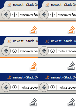
Not standard logo placement

The different height position is easy to notice when switching tabs:

Height Position

4
  • Funny. I was looking at the top of the image and thinking "is that really easy to notice?". Quite some time to determine it wasn't just the change in colour. Then I noticed at the bottom of the image... Commented Feb 10, 2017 at 22:28
  • I meant 'easy to notice' once you're aware of the issue. Like "an easy way to check it is switching tabs".
    – L777
    Commented Feb 10, 2017 at 22:35
  • Yeah, it's burned into the back of my eyeballs already, now. The bottom one now reminds me of a very old "flip paper" animation with a frog. Something on TV from..., well, not recently. I think it was in "Black and White". Now I'm really starting to ramble... Commented Feb 10, 2017 at 22:39
  • this is because label "stack overflow" in our logo is not perfectly centered (with glpyh). so when we have full version next to perfectly centered text (in this case it's navigation) we have to adjust it a little so "stack overflow" label doesn't look off. when we use version without label, we have to remove that adjustment for the same reason - to make it vertically centered. and by "centered" i meant visually centered.
    – Paweł Staff
    Commented Feb 13, 2017 at 13:41
6

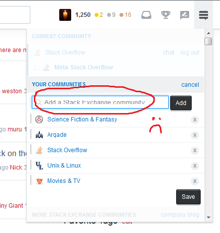
When editing the communities list, the "Add a Stack Exchange community" text is cut off on the top and bottom:

Font is too large

This only happens when using the new top bar.

I'm using Firefox 45.7.0, Windows 7.

4
  • 1
    On Firefox 50.1.0, Windows 8.1 too
    – Arulkumar
    Commented Feb 9, 2017 at 8:35
  • 1
    This is being looked at. Thanks for reporting.
    – Oded StaffMod
    Commented Feb 10, 2017 at 15:34
  • @Oded I have the same error on the previous search box too: i.gyazo.com/84825708f7ad3b074bc29957c71459ce.png Firefox 51.0.1 Windows Vista 32bits
    – L777
    Commented Feb 10, 2017 at 23:39
  • @freestock.tk - thanks for confirming this isn't a new header issue.
    – Oded StaffMod
    Commented Feb 10, 2017 at 23:42
6

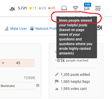
Alignment issue with people reached tooltip

The tooltip of the people reached is partially hidden by the top bar.

Screenshot for reference:

People reached tooltip

The actual tool tip content is

Estimated number of times people viewed your helpful posts (based on page views of your questions and questions where you wrote highly-ranked answers)

4
  • @Oded - I just came here to report this same bug, but it was marked status-completed in February. Is what I'm seeing a regression, or is the fix not live for some reason? Should I re-report elsewhere? Chrome Version 58.0.3029.110 (64-bit) - for reference.
    – Chris
    Commented Jun 5, 2017 at 12:42
  • 1
    Seems to have come back, @Chris - someone is looking into it.
    – Oded StaffMod
    Commented Jun 5, 2017 at 12:43
  • 1
    @Chris : It was reported here
    – Arulkumar
    Commented Jun 5, 2017 at 12:44
  • Ah - search fail! Thanks @Arulkumar!
    – Chris
    Commented Jun 5, 2017 at 12:44
5

The review button looks solitary with all the others being menus. Unlike achievement and the site switcher, which flank the review button, the later doesn't present you a menu. It looks oddly out of place, maybe it should be moved to be besides the user profile link, like this:

enter image description here

3
  • 12
    Maybe it should open a menu with links to the review queues.
    – user4639281
    Commented Feb 7, 2017 at 16:52
  • 1
    I suspect this might be to do with frequency of use going from left to right. Maybe just me but I tend to use inbox most, then reputation, then review queue, then site switcher. Not saying it's necessarily the correct order - but maybe that's why it's currently in that order? Commented Feb 7, 2017 at 21:31
  • We are considering options for the review button - it may end up with a menu, may be some other option.
    – Oded StaffMod
    Commented Feb 10, 2017 at 16:37
5

After spending the day with it I can say: I like it. Contrary to what others have said, I like having it sticky. I can get a quick glance at any notifications at any time. There's just a couple of things I would change.

  1. Make it darker. It's been said over and over again but the white-on-white is annoying. I've already started running some custom CSS to make it darker. In it's dark state, it looks great.
  2. I wish it didn't report how many items are in the review queue. I'm a bit OCD about keeping my notifications clear and constantly seeing 800+ up there drives me a bit crazy. It was easier to ignore how many items were in the queue before. I still like seeing the rest of my notifications at a glance though.

For the time being, I've made the review queue count disappear until I hover over it and it at least feels better to me.

.so-header .js-review-button .js-unread-count {
  opacity: 0;
}
.so-header .js-review-button:hover .js-unread-count {
  opacity: 1;
}
7
  • Am I the only one using this that thinks the white on white is awesome? I think the bottom border should be removed, then it would be even more awesome.
    – user4639281
    Commented Feb 7, 2017 at 22:43
  • 3
    "I like having it sticky" "I wish it didn't report how many items are in the review queue.[ ...] It was easier to ignore before" does not compute!
    – Braiam
    Commented Feb 7, 2017 at 23:05
  • @Braiam It was easier to ignore the review count before. I like being able to see the rest of it at a glance.
    – Mike Cluck
    Commented Feb 8, 2017 at 1:35
  • 3
    There was a review queue count stamped on the old top bar, too. Why did this not bother you as much? Why do you say it was easier to ignore? Maybe because it was a different color than your inbox notifications?
    – Cody Gray Mod
    Commented Feb 8, 2017 at 10:58
  • @CodyGray I think that's precisely the reason.
    – Mike Cluck
    Commented Feb 8, 2017 at 14:53
  • Ditto on making it darker. White on white is VERY hard to differentiate, especially for those of us with older eyes.
    – Stewbob
    Commented Feb 14, 2017 at 1:23
  • Review thing is fixed: meta.stackoverflow.com/questions/252843/…
    – Shog9
    Commented Apr 7, 2017 at 22:18
5

the number inside badge got hidden

I noticed a bug after closing a list of stack exchange sites, I'm not sure if this only for items to review number, but you can test this also, simply click the list of sites:

click the sites list to open it

Then hover your mouse to list of items to review:

hover mouse to number of items

Then hover your mouse back to list of sites, you will see the list opened again.

Then click on the body to hide the list, the numbers will disappear with the menu.

Minor, but I think it is kinda important.

1
  • Afaik, the review indicator badge with numbers shouldn't be dismissible, or at least, when it's dismissed, it shouldn't appear again.
    – Braiam
    Commented Feb 7, 2017 at 14:56
5

for the reasons listed by Paweł in his comment.


This can now be fixed by disabling the sticky nav in preferences.


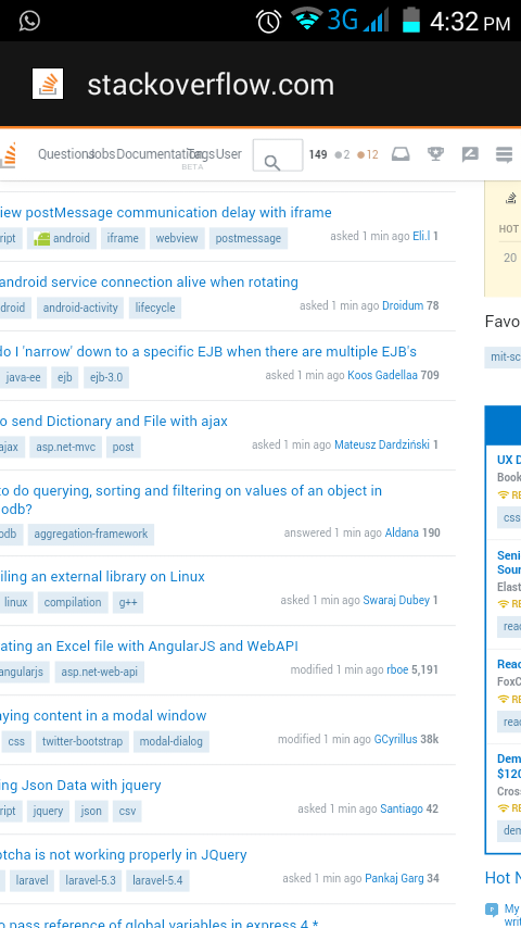
Yes, I know we have a mobile site but I prefer to use the full, desktop site on mobile.

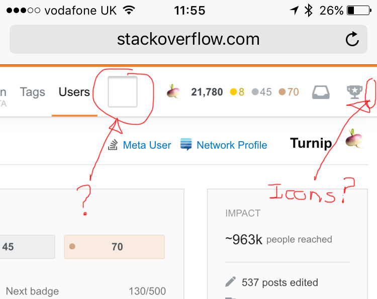
When viewed on mobile the new header is cropped on the right when viewed at anything but 100% zoom.

The "Review queue" and "Stack Exchange" icons are lost and cannot be scrolled to.

The search bar is also deformed in to a white square making it unclear what it actually is.

enter image description here

2
  • 1
    the magnifying glass icon in search field is back.
    – Paweł Staff
    Commented Feb 9, 2017 at 12:17
  • @Oden I don't see the relevance of that comment to the bug in my answer.
    – Turnip
    Commented Feb 10, 2017 at 15:55
4

Looks like something meant for a mobile device. I wouldn't mind seeing that on my phone but on my desktop it looks out of place.

4
  • we don't have mobile update on our roadmap for now.. but some day, maybe.
    – Paweł Staff
    Commented Feb 7, 2017 at 9:30
  • 3
    @Paweł ...in which case I would rather it stayed as a desktop-oriented design. I hate it when websites treat my HD desktop monitor (and desktop browser, and desktop input devices) like a phone. Commented Feb 7, 2017 at 11:08
  • @MichealJohnson I wouldn't exactly say that. Mobile menus like these nearly always have a hamburger menu on the side and nothing else to click/tap/press/etc and this one has the different links still in the header itself.
    – CalvT
    Commented Feb 7, 2017 at 11:11
  • 4
    @CalvT It still looks like the kind of thing I'd expect to see on a mobile device, not a desktop. Maybe a tablet rather than a phone. Desktop interfaces should be small and inconspicuous, not big and easy to tap on. Put it this way: it looks the way everything looked when I ran Android on my laptop. Commented Feb 7, 2017 at 11:17
3

The z-index is incorrect for the job search location bar. This causes the list of suggested locations to appear above the new navigation bar when I scroll up. Link to affected page. The main /jobs page is also affected, as well as the linked /jobs/companies.

Where to find the problem

Incorrect Z-Index

3

- we went with a split of the icon, bringing it back to what it was like with the black top bar.

It'd be nice if the flag count was its own clickable element, going directly to the flag queue instead of needing to go through the dropdown. Changing this element:

<span class="indicator-badge js-unread-count">20000</span>

To this:

<a class="indicator-badge js-unread-count" href="/admin/dashboard">20000</a>

Seems to work fine. Bonus points if there was a way to make it not move around on hover, but that might be too big a design change.

3
  • That seems a bit too finicky to not accidentally mis-engage to me. That's a tiny tiny click target…
    – deceze Mod
    Commented Feb 7, 2017 at 15:32
  • @deceze In my tests, it seems fine... for me, on my MacBook trackpad with young fingers and eyes. Point taken.
    – Undo Mod
    Commented Feb 7, 2017 at 15:34
  • 6
    Dogs are excellent trackpad users, as everyone knows. That's not representative of men slowly beginning to see the beginnings of middle age on the horizon with glasses who mostly push the cursor around randomly and rely on auto-correction when typing.
    – deceze Mod
    Commented Feb 7, 2017 at 15:40
3

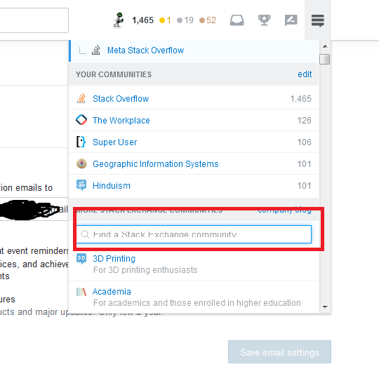
Don't know its browser specific issue or not. But when i click on this url: https://stackoverflow.com/users/preferences/current then click on the sandwich icon then click on the search box and dropdown which appear after click on sandwich icon is disappear.

enter image description here

It happens first time only after that its working fine.
Browser (firefox : 51.0.1 (32-bit))

2
  • 1
    Exact duplicate of this answer
    – Arulkumar
    Commented Feb 9, 2017 at 15:33
  • 1
    We are looking into this - seems to be unique to Firefox.
    – Oded StaffMod
    Commented Feb 10, 2017 at 15:15
2

The topbar design is for desktop browsers, for mobile browsers we have the mobile theme. We are not putting resources into changing the desktop view to be mobile friendly when we already have a specific mobile theme.

On mobile web, full site, when you zoom in, the links on the top all get mixed up with each other.

enter image description here

6
  • It isn't designed for mobile use - that's why we have a mobile theme... (click "mobile" in the footer)
    – Oded StaffMod
    Commented Feb 8, 2017 at 14:45
  • 4
    @Oded right, but I don't like the mobile theme...
    – Mithical
    Commented Feb 8, 2017 at 14:45
  • @Mithrandir So compile a list of things that should be changed, and ask for them to be changed. :P
    – Nic
    Commented Feb 10, 2017 at 0:44
  • 4
    "The topbar design is for desktop browsers, for mobile browsers we have the mobile theme" - this is 2017 guys. You can't release a design that you know is broken on mobile. This is ridiculous.
    – Turnip
    Commented Feb 10, 2017 at 15:59
  • I use the app...
    – mplungjan
    Commented Feb 12, 2017 at 6:24
  • 1
    Why use user agent sniffing at all? Why not switch to the mobile view based on the viewport size? Commented Feb 14, 2017 at 14:10
2

for the reasons listed by Paweł in his comment.

I don't get it. The main site gets a tiny, nice icon.

And meta gets a huge banner logo.

What's the point in this? Do you want there to be space consistency? Because there ain't consistency there.

Extend the search bar for all I care. Just let them both use icons.

Here is a possible design:
no stack overflow text

9
  • 2
    Meta doesn't have Jobs or Documentation…
    – deceze Mod
    Commented Feb 8, 2017 at 12:43
  • 7
    main site has full logo when you're logged out. it's because brand recognition etc.. after you log in, we keep only glyph. for users logo is known enough to hide "stack overflow" text. we're also trying to save some space there and get rid of distraction (SO main site has more nav items than meta). as for meta, we keep full logo for both groups - logged in and logged out. why not using glyph also for meta? logo is too similar to main site and we think it makes sense to show full version. plus we have more space in header because there's no jobs & documentation.
    – Paweł Staff
    Commented Feb 8, 2017 at 12:44
  • @Paweł Please, make search extend instead. Commented Feb 8, 2017 at 13:29
  • 2
    I prefer the much larger meta logo, since the logo is the icon i click the most often... While i had the new header enabled i found myself clicking questions instead, and wondering why the list of questions i was getting wasn't what i was expecting.
    – Kevin B
    Commented Feb 8, 2017 at 16:29
  • @haykam How about this?
    – Jed Fox
    Commented Feb 8, 2017 at 23:06
  • @JF That's awesome. Commented Feb 8, 2017 at 23:07
  • @Paweł How about the proposal I added to the answer?
    – Jed Fox
    Commented Feb 12, 2017 at 18:50
  • @JF it's good idea, however we have some specific guidelines for branding and usage of our logo. then we have other sites (localized SO sites) using similar logo where we would have to figure out "minimized" version as well. plus we dont see meta logo being an issue. so that's why it has status-declined
    – Paweł Staff
    Commented Feb 13, 2017 at 9:04
  • Ok, so never happening. RIP. Commented Feb 14, 2017 at 20:51
2

(in the next build)

Glitch/Flickering search bar on Enter (Mozilla Firefox)

Once I press Enter the search bar visual behavior becomes bugged:

search bar

Firefox 51.0.1 Windows Vista 32-Bit

ps1: this only happens when I press Enter, not when I click on the search button (weird);

ps2: same behavior with the mouse over/not over the bar;

ps3: same behavior on SO/SOmeta.

3
  • No repro using relevant modern webkit based browsers (chrome, chromium, vivaldi, opera, neon, brave). Seems to only happen in Firefox.
    – user4639281
    Commented Feb 11, 2017 at 18:26
  • 1
    @Oded this doesn't appear to be fixed. (separate question here)
    – user247702
    Commented Feb 21, 2017 at 16:27
  • @Oded rev 2017.3.6.25312, still flickering.
    – kennytm
    Commented Mar 6, 2017 at 19:50
2

Firefox / Windows.
Zoom turned off.

Something wrong with pictograms, pixels on the borders are cutted off:

enter image description here

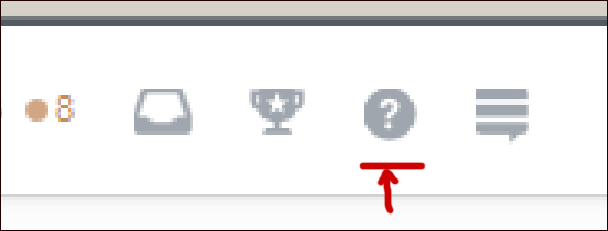
Also the help pictogram is not vertically aligned:

enter image description here

9
  • I can't reproduce this. Using latest Firefox on Windows 10. Given that these are SVG, they should scale just fine. What versions of Firefox and Windows are you on? Do you have any add-ons/plugins/user scripts that might interfere?
    – Oded StaffMod
    Commented Feb 10, 2017 at 15:04
  • @Oded Firefox 51.0.1 on Windows 7 and 10. On both windows it looks exactly like on the screenshot, plugins disabled
    – Mikhail V
    Commented Feb 10, 2017 at 15:43
  • Strange. Same version, Windows 10, I can't repro at all. Are you getting any errors in the console? Did you clear your cache and refresh the page?
    – Oded StaffMod
    Commented Feb 10, 2017 at 15:45
  • @Oded hmm cleared cache, disabled all plugins but still the same. Strange indeed. Probably you can add a screenshot in my answer to see how it looks by you (with disabled zoom)
    – Mikhail V
    Commented Feb 10, 2017 at 15:54
  • I see this: i.sstatic.net/tLVs2.png (but, I am on a high DPI screen - 4k display).
    – Oded StaffMod
    Commented Feb 10, 2017 at 15:57
  • @Oded Ok looks perfect, but I am on normal 96 dpi monitor so it can be the case why you cannot reproduce it.
    – Mikhail V
    Commented Feb 10, 2017 at 16:01
  • Could be an issue with the browser not being able to figure out sub-pixel hinting on 96 dpi :/
    – Oded StaffMod
    Commented Feb 10, 2017 at 16:04
  • @Oded BTW from other answer - second screenshot also has cutted off pixels.
    – Mikhail V
    Commented Feb 10, 2017 at 16:12
  • I think that's mostly because they changed the padding themselves. I have put this up on our bug board to be looked at.
    – Oded StaffMod
    Commented Feb 10, 2017 at 16:14
1

(note: this was not a new header issue but a pre-existing one)

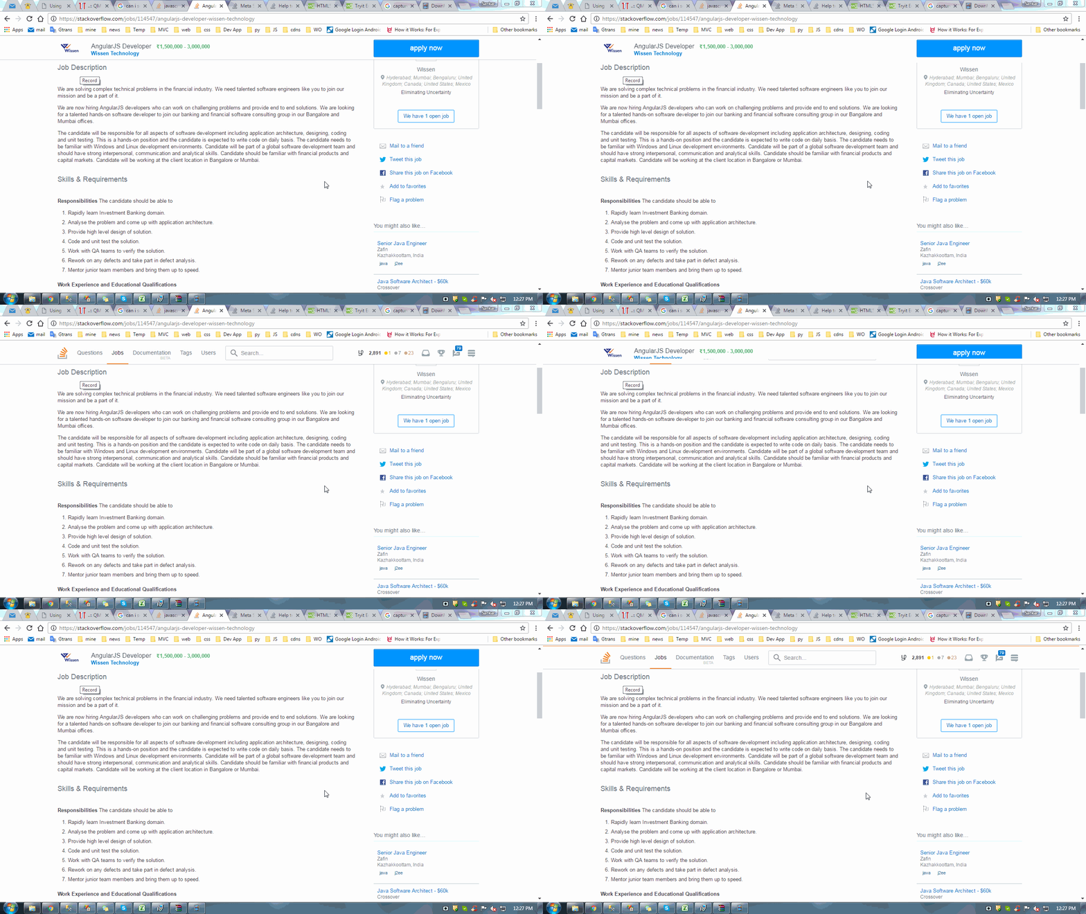
When i am viewing a job offer, while scrolling, i can see the page is flickering and the Top nav-bar is keep on playing hide and seek

enter image description here

Flickering of page is not able to view here, So here shared the video link, http://recordit.co/m4XwPro0lk

This is the URL, i used https://stackoverflow.com/jobs/114547/angularjs-developer-wissen-technology

1

I actually like the theme in itself, it looks rather professional and modern. However to me the whole thing feel a bit cramped. Before "Jobs" and "Documentation" were added it probably would have worked rather well.

Then if you throw in a custom tag declaration as well the top of the page starts to look really busy - stack nav with custom tag

So really my feeling is that I like the style but dislike the overcrowded feel. A dark style would be nice too.

1
  • 1
    I second the dark theme. It would be nice if the "jobs" and "documentation" were removed, but that may never happen as they're likely to be big revenue generators. Commented Feb 14, 2017 at 14:02
1

enter image description here

Just wanted to point out some weird with the auto-expanding search bar. If a user is wanting to select some text that's already in the search bar then it runs away and has to be chased down despite being double-clicked on :)

This behavior could violate the princple of least suprise.

1

The top border of the new navigation looks quite nice.

enter image description here

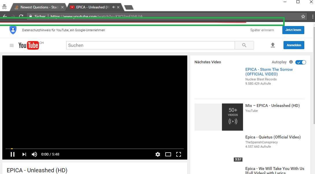
But since a few websites are using the exact same position to display a loading animation which looks very similar to the top border it can be misleading for the user.

Example YouTube: enter image description here

The user could think that something is still loading. I know, after the first few page loads the user will realize that this is not a loading animation but rather only a style element.
I don’t rely have a solution (other than removing the border), but maybe someone has an idea how the border could be improved.

0

Two things regarding the search box:

When using the tab key to navigate through the page, the search box at the top gets focused first. This feels odd as I'd expect the logo to be focused first and the search box to only receive focus when tabbing from the Users link. - I'm not sure how this happened when I first tried it, but I'm now unable to replicate this.

When one focuses the search box it has a nice smooth animation. If we then move away from it, it feels like it goes back to its default state far too quickly - this animation isn't smooth at all.

2
  • 1
    regarding focusout transition: i see that too on meta right now (however it feels fine on main site). will take a closer look at this, thanks!
    – Paweł Staff
    Commented Feb 7, 2017 at 17:52
  • 1
    I personally am fine with the search box collapsing quickly. When you want to use the search, it expands slowly but that is fine because you don't care about the stuff that it overlaps. But when you don't need it, you want it to go away as fast as possible so you can click on something else. At least that is my perspective. Commented Feb 7, 2017 at 18:58

You must log in to answer this question.

Not the answer you're looking for? Browse other questions tagged .