What I suggest is:
If quote isn't prominent then problem with <code> doesn't even apply. I'd extend same concept to <pre> too (to make it more distinct from a code block) but this is another story...
Here it's an example of what I mean (from an hypothetical answer, text has serifs to make clear what's the example and what's this answer text):
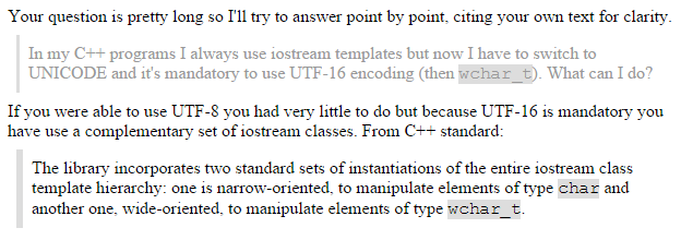
Note how visual flow isn't broken by quotations but they're also distinct from surrounding text. Citation from OP is muted (it's available within same page but it's copied for clarity, moreover different color - even if muted - will also help to quickly identify each section). Citation from another source has same visual importance as answer text (because it's part of it and it completes answer). I'd also support <cite> tag (now it's unsupported and it's not styled), it's especially useful for external resources.
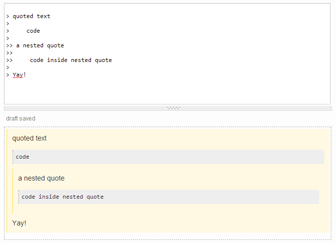
It's not a common case but blank background and border also allows to have nested citations (note it's still easy to understand that inner citation comes from an external resource, no color mixes and transparencies to decode):

Explanation
First of all I'd avoid to use only different background colors (as suggested in other answers) because of it won't work with color blind people (around 8% of male population).
I think quotes doesn't need a strong visual appearance, what you need is a subtle visual element to make it clear.
For example Bootstrap uses a simple thick line of the left of <blockquote>:

Similar style is used in Foundation (with a thinner line and slightly lighter text):

Also just margin and text style work pretty well:

Extra borders may make text nicer and more elegant (IMO) but they don't really improve legibility (creating a too strong separation between paragraphs) so I'd avoid them. Colors may also be used but risk is to make page too noisy and they should chosen carefully again to avoid confusion for color blind people.
Moreover inline <code> has a lighter background than a code block. I think it's good to reduce "visual noise" of the page. Anyway, whatever is the style for inline or block code, I think to make <blockquote> less prominent will greatly improve legibility and it'll match globally accepted typographical conventions (here it's StackOverflow to do something strange: why quote is highlighted compared to normal text?).
<rant>
Actually SO a common usage of blockquote is semantically wrong:
The main purpose of a blockquote is to separate a large section of text — quoted from an outside source — that is relevant to the source material at hand.
A normal usage of <blockquote> is to repeat a sentence from question to answer step by step. It's called Pull quote:
A pull quote is a quotation or excerpt from an article that is typically placed in a larger or distinctive typeface on the same page, serving to entice readers into an article or to highlight a key topic.
This type of quote should be placed in a <aside> element:
The [aside] element can be used for typographical effects like pull quotes or sidebars, for advertising, for groups of nav elements, and for other content that is considered separate from the main content of the page. It’s not appropriate to use the aside element just for parentheticals, since those are part of the main flow of the document.
What I care (here) is not HTML page code itself but visual appearance those quotes should have. IMO it should be clearer if we're quoting OP or we're quoting an external authoritative source.
</rant>

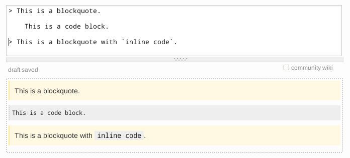
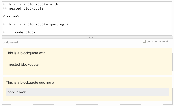
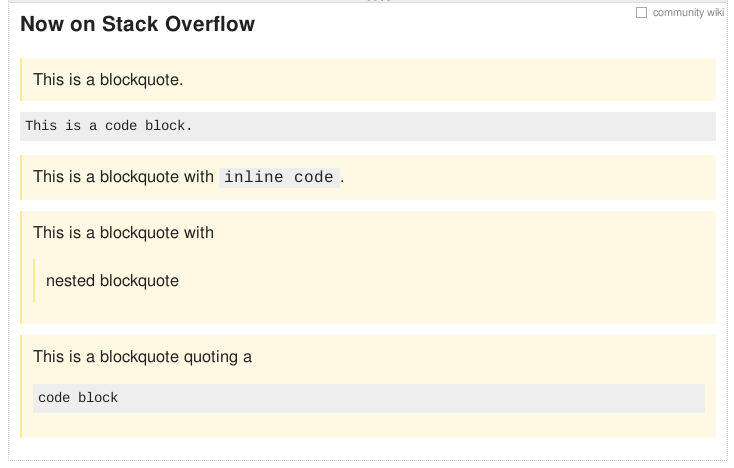


background-color: rgba(200,200,200,.25)so that it's a darker Gray but with only 25% opacity, then as they stack up they get progressively darker