1

Everyone knows that inline code blocks are dangerous.

They attract bad edits at a blistering pace and even when used appropriately they look ugly as hell. So what do we do, us aesthetes and artists, whose eyes and minds are burned by such a sight and we who feel wronged by such cruelty? Where is the light?

Currently, these blocks have a background colour #eee. This, you may know from doing base-16 arithmetic all day, is obviously

rgba(238, 238, 238, 1.0)

I propose it becomes

rgba(238, 238, 238, 0.5)

or 50% transparent. (Alternatively, there are several other styles available to try.)

Here's a now-updated script to test it out with:

head = document.getElementsByTagName('head')[0];
style = document.createElement('style');
style.type = 'text/css';
head.appendChild(style);

keys = ["1", "2", "3", "4", "5"];
forceColour = 'code { background: rgba(238, 238, 238, {colour}) !important; }';

altStyle = [
    "pre code {",
    "    font-size: 14px !important;",
    "    padding: 1px 5px;",
    "    border: none;",
    "    background-color: rgb(238, 238, 238);",
    "    /* border-radius: initial; */",
    "    padding: 0;",
    "}",
    "",
    "code {",
    "    white-space: pre-wrap;",
    "    /* padding: 1px 5px; */",
    "    font-size: 12px;",
    "    box-sizing: border-box;",
    "    /* margin: 0; */",
    "    border: 1px solid {color};",
    "    background-color: #f8f8f8;",
    "    border-radius: 3px;",
    "    padding-left: 3px;",
    "    padding-right: 3px;",
    "}",
].join("\n");
altColours = {};
altColours["a"] = "#ddd";
altColours["s"] = "#eee";
altColours["d"] = "#f8f8f8";

document.onkeypress = function (e) {
    key = String.fromCharCode(e.keyCode);

    if (key in altColours) {
        style.innerHTML = altStyle.replace("{color}", altColours[key]);
    }

    index = keys.indexOf(key);
    if (index > -1) {
        style.innerHTML = forceColour.replace("{colour}", index/(keys.length-1));
    }
};

Just paste it into whatever console your browser has and press:

1: No background
2: 25% opacity
3: 50% opacity (the best!)
4: 75% opacity
5: fully opaque (like always)

Or some variants using CSS stolen from Cupcake:

a: Github-Style
s: Github-Style with lighter lines
d: Github-Style with no visible border

The first link I gave is a good place to test it on.

If you still aren't convinced, here's a large image (direct link):
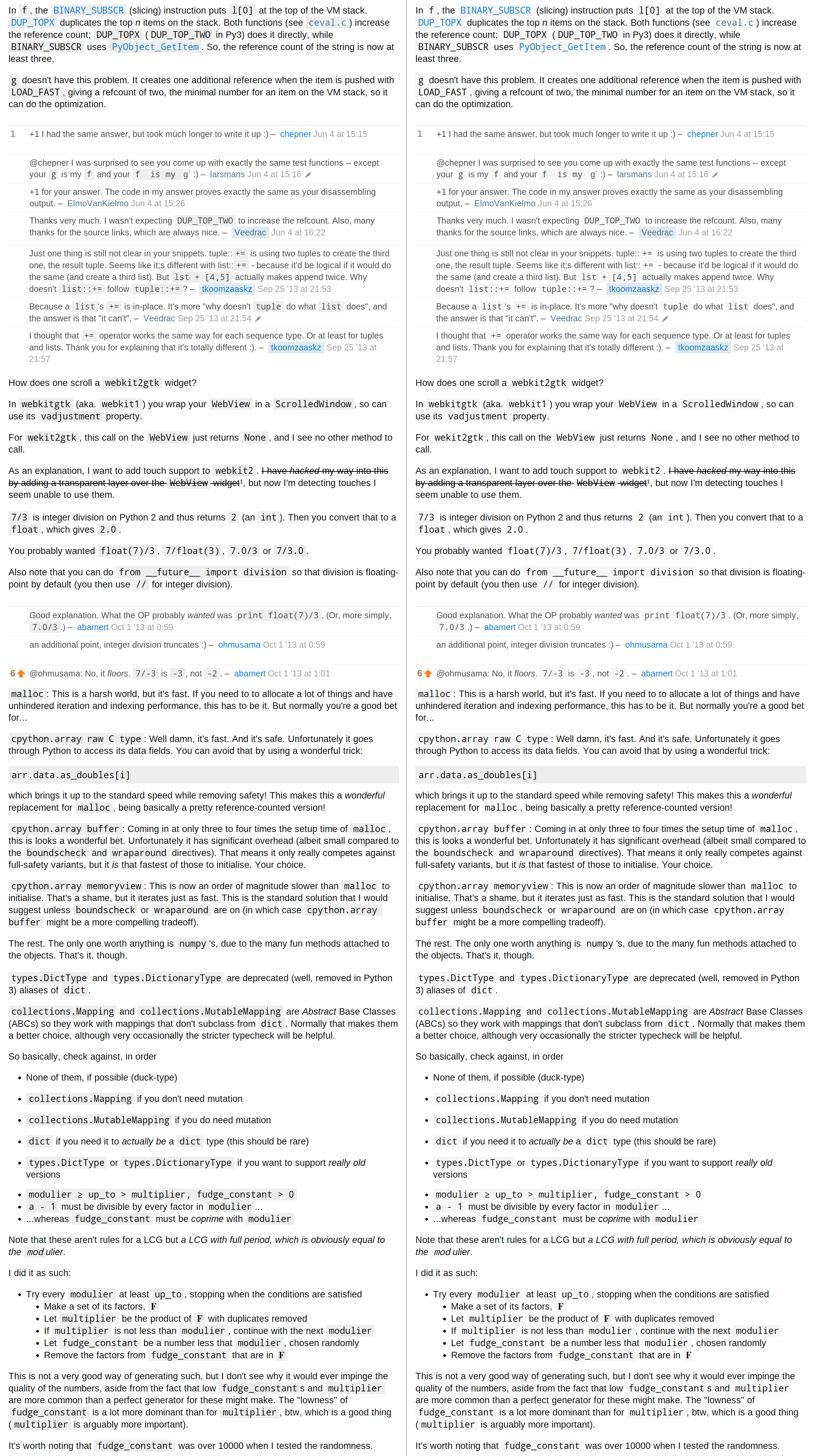
A comparison of aesthetic styles

12
  • The GitHub styling you gave needs work (no left and right padding, for example, although I think GitHub actually uses pseudo-elements for that instead of padding), but already I think it's a big improvement over the existing styling, definitely improved readability.
    – user456814
    Commented Jun 14, 2014 at 17:09
  • 3
    Painting the bikeshed.
    – Robert Harvey Mod
    Commented Jun 14, 2014 at 17:27
  • Regarding your GitHub alternative S and D styles, the closer you get to D, the more it becomes like how Stack Overflow styles inline code blocks, which I don't really like all that much. The border that A uses gives the inline code more "pop", helping to distinguish it from plain text. When you essentially remove the border like in D, then it becomes harder to differentiate code from plain text, which I think reduces readability, instead of improving it.
    – user456814
    Commented Jun 14, 2014 at 17:29
  • @RobertHarvey perhaps, but then also "Understanding code is by far the activity at which professional developers spend most of their time". If a particular styling (like a coding convention) can help me better understand pieces of code (or an answer on Stack Overflow), I think that's something worth considering.
    – user456814
    Commented Jun 14, 2014 at 17:33
  • 1
    @RobertHarvey Painting the bikeshed is fine as long as you spend the time to build it first. We're not yet at risk of being distracted from important activities due to this, which is the reason to be wary of bikeshedding.
    – Veedrac
    Commented Jun 14, 2014 at 17:35
  • [totally missing the point]
    – Robert Harvey Mod
    Commented Jun 14, 2014 at 17:36
  • @RobertHarvey I still do, then. What point am I missing?
    – Veedrac
    Commented Jun 14, 2014 at 17:37
  • The only real difference I see between your version and the original is that yours makes code blocks harder to notice which is a little self-defeating.
    – Daniel
    Commented Jun 14, 2014 at 18:16
  • 1
    I don't like either one of them because it introduces too much space between transitions between the normal and code style. In answers I often leave space characters out to overcome that, but that can affect word-wrapping negatively and the results are inconsistent with those from doing the same thing in comments.
    – martineau
    Commented Jun 14, 2014 at 18:22
  • @martineau Reducing the colour contrast doesn't change the spacing at all.
    – Veedrac
    Commented Jun 14, 2014 at 18:25
  • @Veedrac: True. I didn't phrase what I meant well. I don't like either one because neither addresses my dislike of the way spacing between transitions code and non-code appears.
    – martineau
    Commented Jun 14, 2014 at 18:29
  • 1
    I sometimes find myself wishing there were a means of highlighting that was somewhat less pronounced than backticks, but would nonetheless provide a clear visual distinction between "human"-relevant and machine-relevant concepts. For example, I think it's nicer to talk about an add method than an "add" method, but it would be nice not to have the background-color highlighting in such cases.
    – supercat
    Commented Nov 24, 2014 at 22:46

2 Answers 2

6

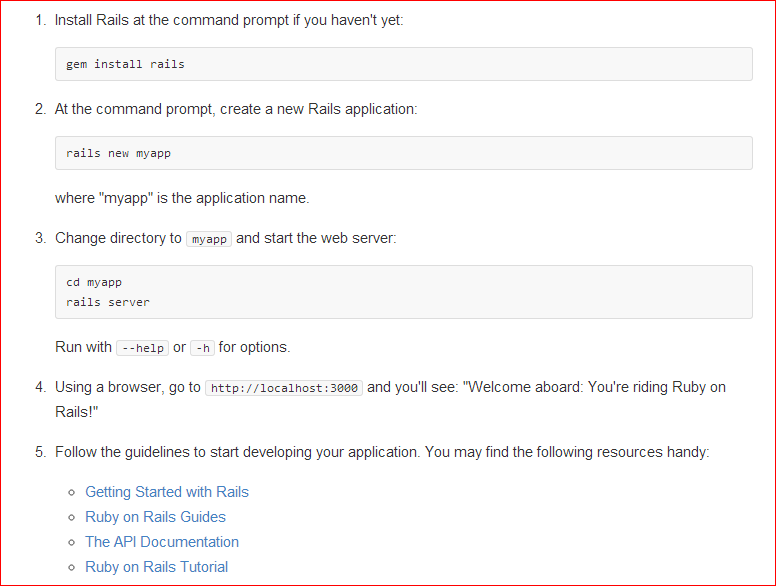
Personally, I'd like to see inline styling the same way that GitHub style's theirs (screenshot from Ruby on Rails on GitHub:

Screenshot

I find their style to be much more readable (maybe because the font-size is slightly smaller for inline code?). The inline code still "pops" out and is easily distinguishable from just plain text, but it does so in a way that doesn't cause the entire page to become too noisy and hard to read either.

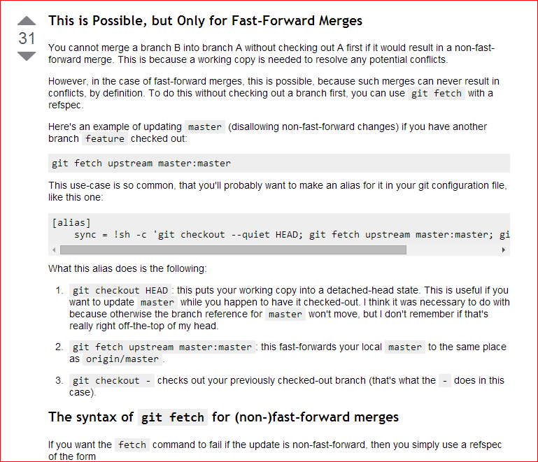
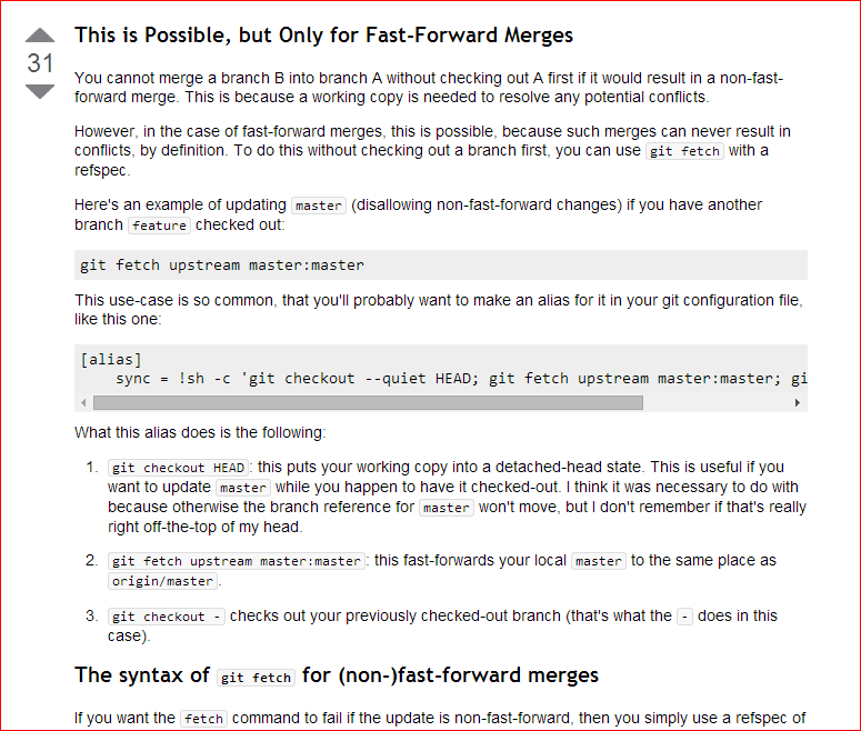
Mockup

Here is a mockup of what the styling would look like (before and after, post tested on):

Before screenshot

After screenshot

and here are the CSS rules to create it:

pre code {
  font-size: 14px !important;
  padding: 1px 5px;
  border: none;
  background-color: rgb(238, 238, 238);
  /* border-radius: initial; */
  padding: 0;
}

code {
  white-space: pre-wrap;
  /* padding: 1px 5px; */
  font-size: 12px;
  box-sizing: border-box;
  /* margin: 0; */
  border: 1px solid #ddd;
  background-color: #f8f8f8;
  border-radius: 3px;
  padding-left: 3px;
  padding-right: 3px;
}

Note that some of those rules aren't the exact rules that GitHub uses, I had to make it work with Stack Overflow's existing CSS rules. It isn't perfect, but it's good enough, considering I didn't want to spend a lot of time trying to get the styling to be perfect.

2
  • Your CSS is now integrated into the script so many thanks. It's nice, although I prefer the less visually heavy style from my original suggestion.
    – Veedrac
    Commented Jun 14, 2014 at 17:07
  • @Veedrac great idea turning it into a JavaScript, by the way, that's a pretty genius way to demo a mockup.
    – user456814
    Commented Jun 14, 2014 at 17:12
5

No, please don't.

Regarding using it for code:

This would make inline code sample that's actually code harder to differentiate, and thus also make the whole post harder to read ... and the whole point of inline code sample is to use it for code. Code isn't English - your brain (well, okay, my brain) needs to make a little switch during processing when going from one to the other - having it clearly differentiated makes helps with that switch.

Regarding using it for something other than code:

Let's either fix the posts (through editing) or try to fix the behaviour (perhaps some combination of gentle notes, firm notes and bans), not make the behaviour a bit better (but not much better than before).

Or we could consider giving them something they could use instead, that they'd be happy with (no idea what). Personally I have no idea why they don't just make things bold instead - this highlights it enough already (italics to some extent as well, but sometimes it's just kind of hard to spot, which kind of defeats the purpose) (although the type of people using inline code sample to highlight things mostly highlight the wrong things anyway - bold would likely be just as bad).

1
  • I think it might be helpful to distinguish "complete" bits of code from "fragments" such as identifiers, function names, etc. Having things like identifiers, keywords, etc. appear in a monospaced font is helpful, but applying the background color to each usage of an identifer can be a bit much.
    – supercat
    Commented Nov 24, 2014 at 22:48

You must log in to answer this question.

Not the answer you're looking for? Browse other questions tagged .