70

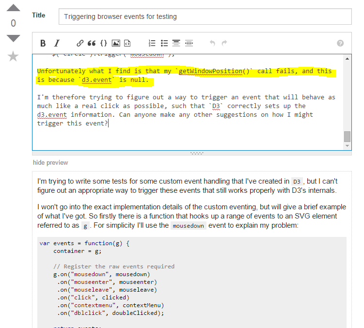
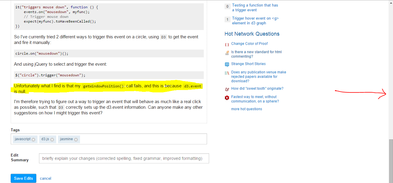
I'd like to raise a request to improve the question asking experience. I find at the moment it requires large amounts of scrolling that I find quite frustrating. To give an example, to view the bit of text that I'm just finished typing in the image below:

I have to use the browser scroll bar go almost right down to the bottom to see what I've typed. Even while typing this question, I can see the top of my preview and am happy with it, but I want to be able to preview the text that I'm typing right now as I write the question.

Could we not have some form of auto-scrolling on the preview pane? If it were giving a scroll bar too and automatically followed the current paragraph being typed it'd be incredibly helpful. Or some other approach, just so I can preview what I'm typing/changing in code blocks.
13
  • 7
    The text editor should be bigger so that you don't have to scroll the text area all the time.
    – usr
    Commented Apr 2, 2015 at 17:18
  • 5
    @usr TextArea is fine. I can see enough to type, it's the fact I can't preview what I'm typing easily
    – Ian
    Commented Apr 2, 2015 at 17:22
  • @AstroCB I'm not sure your edit is correct. The point is that the preview area needs scrolling, not the text editor
    – Ian
    Commented Apr 2, 2015 at 17:49
  • @Ian The "editor" refers to all of the features of the page that you mention (not just the actual textarea). However, it's your post, so feel free to roll it back if I changed the meaning too much.
    – AstroCB
    Commented Apr 2, 2015 at 17:56
  • 1
    @AstroCB no that's cool then. I'm not so active on meta so if that's the general consensus on what the editor means then that's fine. Thanks for the clarification - why I asked before rolling back :)
    – Ian
    Commented Apr 2, 2015 at 17:59
  • @Ian, IMHO, the text area is not fine, as I need to scroll around quite a lot to find what I want. I usually use an external editor (Remarkable is great !), and paste into the box when finished. Commented Apr 2, 2015 at 18:04
  • @JonasCz ok, maybe worth raising another feature request to fix that - regard that as a separate issue.
    – Ian
    Commented Apr 2, 2015 at 18:06
  • 2
    @JonasCz You can adjust the height of the text area much like resizing a window. I often expand it if I need to write a post.
    – ryanyuyu
    Commented Apr 2, 2015 at 18:12
  • @ryanyuyu, It's still too narrow.. Plus, If I use an external markdown editor, I can see the rendered preview beside the text-area, no need to scroll up and down. Commented Apr 2, 2015 at 18:15
  • 1
    @JonasCz It might be a bit narrow. I personally prefer using the existing text area because it's width is close to the same as the post's width. I do use an external text editor for code.
    – ryanyuyu
    Commented Apr 2, 2015 at 18:18
  • 2
    You may be interested in Stack Exchange developer Balpha's user script Dude, where's my cursor? Commented Apr 2, 2015 at 20:27
  • 1
    I would like to see the editor 'remember' how I resized it the last time. This could even be subject to the number of lines within the post if a little intuitive algorithm was designed but if I like it taller than default, I'd rather have it taller every time. If I am on an editing rampage, I'd like to avoid the step of resizing every editor window I open.
    – user4039065
    Commented Apr 2, 2015 at 20:43
  • Related: default-edit-box-too-small
    – juergen d
    Commented Apr 3, 2015 at 10:02

2 Answers 2

29

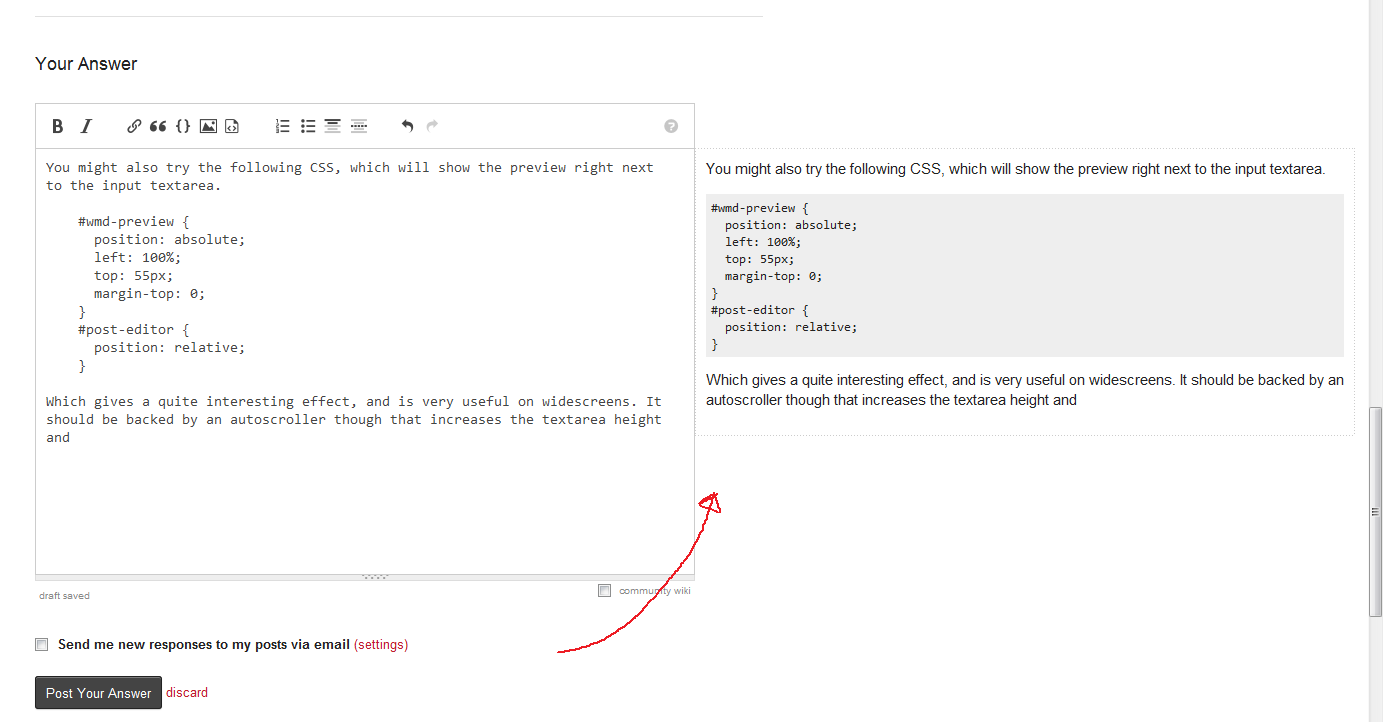
You might also try the following CSS, which will show the preview right next to the input textarea.

#wmd-preview {
  position: absolute;
  left: 100%;
  top: 55px;
  margin-top: 0;
}
#post-editor {
  position: relative;
}

Which gives a quite interesting effect, and is very useful on widescreens. It should be backed by an script though that increases the textarea height and automatically scrolls the preview to the section you currently are editing.

demo of the css on this answer

7
  • 4
    I think that would be very helpful if there is an option where you could drag this window around or click a button that it hop's to the right
    – Rizier123
    Commented Apr 2, 2015 at 20:42
  • 15
    @Rizier123: Rather a setting in the preferences that enables this hop based on the available width. I wouldn't want to click this button every time.
    – Bergi
    Commented Apr 2, 2015 at 20:46
  • 5
    It would be awesome if Stack Exchange in general moved towards more responsive or fluid layouts. Having side-by-side editors and previews would be just one of many improvements. The 1030px wide #content div on a desktop browser is not always but generally starting to feel quite slim.
    – Cᴏʀʏ
    Commented Apr 3, 2015 at 12:39
  • Looks interesting, how would I apply custom CSS though?
    – Ian
    Commented Apr 3, 2015 at 13:39
  • @Ian: Open the dev tools of the browser every time and enter them there - enough for trying them out. If you'd expand this idea to a proper tool, you'd probably use something like a userscript, a browser extension, or put them in the browser's user css (that would not be site specific though iirc)
    – Bergi
    Commented Apr 3, 2015 at 14:38
  • Didn't realise there was a user CSS area, will have a look for it.
    – Ian
    Commented Apr 3, 2015 at 14:40
  • 1
    @Ian The Stylish browser extension allows you to easily specify user CSS for specific sites. It's what I use for tweaks like this.
    – James
    Commented Apr 3, 2015 at 20:49
4

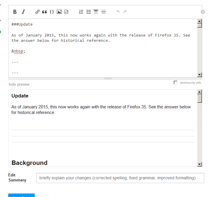
What about giving the preview pane a fixed height, the same height as the input pane?

Combine that with a bit of JS that ties the scrolling together, so that when either pane is scrolled through, the other pane scrolls as well. Then no matter where you are in one pane, the corresponding portion of the other is visible as well.

enter image description here

Additionally, on wide screens, the preview pane could shift over to the right, instead of being positioned underneath.

6
  • How do you want to map between scrolling-positions in either window? Because proportional would be completely wrong. Commented Apr 3, 2015 at 21:03
  • Percentage of the inner height of the pane. It wouldn't be perfect, but it would be close enough.
    – Kelderic
    Commented Apr 3, 2015 at 21:04
  • 4
    Images might cause an issue. There'd need to be a way to calculate in for that.
    – Kelderic
    Commented Apr 3, 2015 at 21:05
  • This is even more problematic because line breaks can't be calculated without parsing the markdown. You need a lot of stuff (like AST parsing) for this to be 100% seamless. Commented Apr 3, 2015 at 21:57
  • 1
    A hacky way to do this would be to insert an anchor tag in the markdown in the current cursor position, then scroll to the anchor element in the preview pane. Commented Apr 4, 2015 at 0:09
  • After trying them side-by-side (which I really like)... scrolling is really important. They need to be kept in sync somehow.
    – Ian
    Commented Jul 7, 2015 at 10:36

You must log in to answer this question.

Not the answer you're looking for? Browse other questions tagged .