25

Since the re-design, the moderator action buttons are 'off' between handled flags and unhandled flags. Here's a picture:
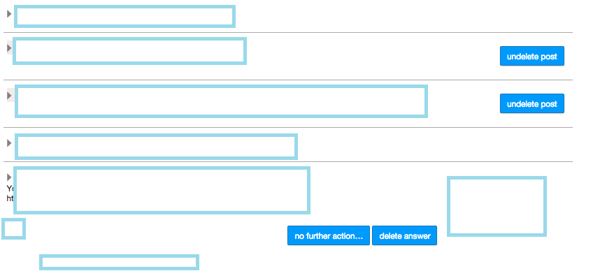
enter image description here

A few notes on workflow:

  • The buttons should be consistently in the same place; wherever that place is, that means: vertical alignment, and horizontal alignment with respect to the text;
  • The questions we close can be removed from the queue entirely; we don't need to continue to see them if there are no buttons for actions for us to take next to them (This happens when a moderator casts a binding close vote from the moderator queue)
  • The location of the button should not change; if the delete post is farthest right; then the undelete post should be farthest right.

Note: the block in the lower right corner (near delete answer) is the user's bio box

3
  • Add it to the list of other places in the new layout that are borked from this new design.
    – j08691
    Commented Jan 22, 2015 at 16:12
  • 1
    Why don't I see any hand-drawn red circles?
    – MattDMo
    Commented Jan 22, 2015 at 17:02
  • Our moderator tools section needs a major overhaul of UX improvements. It's on my list-to-do.
    – Jin Mod
    Commented Feb 25, 2015 at 21:53

1 Answer 1

19

To add to the above, there currently is no difference in formatting for the title of an answer or question in the moderator queue. This makes it really hard to pick out answers being flagged ("not an answer", etc.) from questions being flagged when they are all in the same list.

That's forced me to have to filter flags (or use a userscript) to process them like I used to.

We used to have answers displayed with their titles in a darker grey (and I think a smaller font) and question titles in blue. Could we maybe go back to that for answers displayed in this list, or somehow indicate them at a glance?

You must log in to answer this question.

Not the answer you're looking for? Browse other questions tagged .