105
votes

How do you do, fellow Stackers?

If there’s anything that Stack Overflow is known for, it’s being hip to the latest trends in every field. Gaming? We created StackEgg. Security? We invented Dance Dance Authentication. Self-guided problem solving? Quack Overflow was there for you. Programming? The Key is all you need.

But all that’s in the past,” you say, “That’s, like, a century ago in Internet years.” Don’t worry – we’re never gonna give you up or let you down as influencers. (Wait for it...)

Today, we’re excited to announce our totally sweet new endeavor: Filters for Stack Overflow. (You know that’s right.)

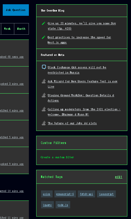
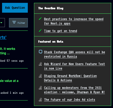
We’ve got a variety of stylin’ designs for you to choose from, ranging from some classic looks all the way to the next dimension. When you see our Terminal filter, we know you’ll say "...I’m in." If you’re looking at classified information on Stack Overflow, make sure you’re using the Top Secret design so others know how confidential it is. And if you’re a fan of delicious flavor, feed your craving with our Hot Dog Stand theme. Other apps might have filters that make you look old – but we have filters that make you feel old.

I know what you’re thinking now: “Word?! Where can I check out this epic new feature?” Just go to Stack Overflow and peep the new Filters bar at the bottom of the screen – and let all our different designs rock your world. (If you want to yeet our new Filters out of your sight, you can do that, too; our regular theme is the GOAT.) Stack it your way, and feel free to show off your Filters in an answer below!

Hey, other social media sites? You just lost the game.
68
  • 13
    A bit jarring with multiple tabs between feature flags. 100% thought that I was on a StackOverflow clone website for a second. :-) Commented Apr 1, 2022 at 0:02
  • 69
    How to turn off this new feature/style?
    – chux
    Commented Apr 1, 2022 at 0:03
  • 14
    "our regular theme is the GOAT" Please ensure your design team has that up on a poster in their offices for future reference. :-)
    – Cody Gray Mod
    Commented Apr 1, 2022 at 0:06
  • 7
    @chux-ReinstateMonica There are very obvious buttons to remove this. An adblocker can be used to remove the floating button. Commented Apr 1, 2022 at 0:07
  • 31
    "Hey, other social media sites?" - I think I missed the rather important memo that we're social media now? Commented Apr 1, 2022 at 0:08
  • 11
    I'm glad this is a joke, because the "feature" is horrid. Are the new header icons part of the joke, too? Commented Apr 1, 2022 at 0:09
  • 11
    At least they listened and added a "disable and hide the new thing" button. If only all the new features came with the same button...........
    – Alejandro
    Commented Apr 1, 2022 at 0:10
  • 19
    Let the "this is fun - we hate fun" battle begin! But honestly, the top secret and 3d themes are so much fun :)
    – 0Valt
    Commented Apr 1, 2022 at 0:24
  • 2
    @OlegValteriswithUkraine Indeed, I'm really quite impressed with the extent of the Top Secret and 3D themes. Must have been quite a lot of work!
    – Clonkex
    Commented Apr 1, 2022 at 0:26
  • 8
    All I can say is thank goodness it can be turned off without a third-party script, which instantly makes it better than most other stack "features" and re-designs that have come out recently. Why can we turn off the April Fool's joke but not any of the other jokes that have been foisted upon us in recent memory?
    – J...
    Commented Apr 1, 2022 at 1:01
  • 5
    I love the references to the filters, "Agents J & K, Child of the ’90s, Luigi Luigi" XD
    – Wolgwang
    Commented Apr 1, 2022 at 1:04
  • 6
    @clonkex, "Must have been quite a lot of work!", a little of which could have been put into restoring the broken functionality on legacy browsers. See my "answer".
    – Ian W
    Commented Apr 1, 2022 at 2:36
  • 3
    Why are you debugging on a production server, @learning2learn? That wouldn't be fun for anyone, on any day, with any theme.
    – Cody Gray Mod
    Commented Apr 1, 2022 at 6:42
  • 20
    I feel like this April Fool's feature has just proved how many people don't bother researching before they ask questions. The [support] and [discussion] tags are just full of the people asking the same question so far. "What's Happen? Why text Green? I switch off how?!"
    – Thom A
    Commented Apr 1, 2022 at 8:17
  • 10
    How much time was invested on that joke instead of investing it on something valuable?
    – MrUpsidown
    Commented Apr 1, 2022 at 11:36

28 Answers 28

100
votes


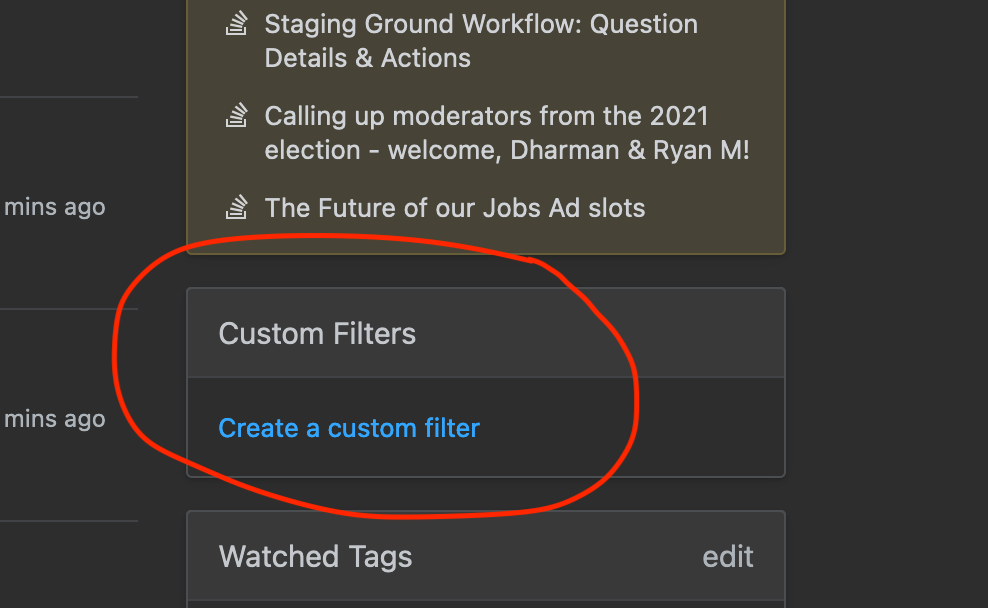
The "Create a custom filter" link from the main page doesn't allow me to create a custom filter at all.

enter image description here

6
  • 35
    XDDDDDDD yeah definitely a bug
    – nicael
    Commented Apr 1, 2022 at 1:08
  • 6
    it took me a whiiiile. Well done, nice catch :p
    – Cid
    Commented Apr 1, 2022 at 6:11
  • 2
    If I'm not mistaken, that button is used to create search filters, correct?
    – Halo
    Commented Apr 1, 2022 at 19:43
  • It takes me to the page for search filters (as in the to narrow down your search results). This might be an April Fools thing, but I don't know.
    – user17585064
    Commented Apr 1, 2022 at 19:51
  • 2
    @Anye and DaCuteRacoon: I'll respond seriously – yes, that link is used to create a custom filter for the /questions page (i.e. a list of questions filtered based on certain criteria you specify). That feature was released fully in 2019, it seems. It has nothing to do with this April Fools' joke. (Now, back to joke mode...)
    – V2Blast Staff
    Commented Apr 2, 2022 at 2:16
  • 7
    Good find on this bug, @Kaiido! We'll get our engineers to fix this critical bug at once.
    – V2Blast Staff
    Commented Apr 2, 2022 at 2:19
91
votes

If this does end up being temporary, please keep the Frisa Lank and MariOverflow themes. I actually really, really like them and they make work that much less boring.

12
  • 4
    It's April Fool's, so it's intended to be temporary.
    – Clonkex
    Commented Apr 1, 2022 at 0:22
  • 20
    You beat me to it. I too want to keep the Frisa Lank theme
    – HFBrowning
    Commented Apr 1, 2022 at 0:23
  • 5
    @Clonkex we got The Key for real, though :)
    – 0Valt
    Commented Apr 1, 2022 at 0:25
  • I liked the Frisa Lank one, but the margins are horribly messed up, so no, please remove this as soon as the day is over.
    – code
    Commented Apr 1, 2022 at 1:00
  • 2
    Seems like this should be pretty easy to apply with a userscript, no?
    – Joe
    Commented Apr 1, 2022 at 1:02
  • 16
    -1 not enough jQuery
    – nicael
    Commented Apr 1, 2022 at 1:31
  • They are really nice. Especially the Mario theme (fits my avatar perfectly ^^)
    – QBrute
    Commented Apr 1, 2022 at 9:23
  • 19
    I created a set of user scripts to bring back the filters after they're gone. Commented Apr 1, 2022 at 12:56
  • 4
    Can we keep bookface too? it's very nice imo
    – JMK
    Commented Apr 1, 2022 at 13:29
  • @JMK I share your sentiment, it's a good design, tbh. Commented Apr 1, 2022 at 17:10
  • 1
    Also bookface is great
    – Halo
    Commented Apr 1, 2022 at 19:41
  • Don't forget Windows 3.1!
    – user17585064
    Commented Apr 1, 2022 at 19:51
68
votes

In all honesty... can we keep the Frisa Lank theme as an option? I actually quite like it :P

6
  • 8
    We need someone to save the CSS and create a userstyle, for all themes. Commented Apr 1, 2022 at 0:27
  • 15
    I still have the cursor trail from the 90s theme a few years ago. Someone made it into a script for me. 🤣
    – Catija Staff
    Commented Apr 1, 2022 at 0:31
  • @Catija I did have to think a bit to figure out what the Frisa Lank one was supposed to be. I've never heard of Lisa Frank so it wasn't immediately obvious to me.
    – Clonkex
    Commented Apr 1, 2022 at 3:08
  • @Clonkex First thing I find about Lisa Frank: Lisa Frank Is Terrible (thumbnail: “death threats, lawsuits and art theft”). That… doesn’t sound great. Commented Apr 1, 2022 at 3:15
  • @SebastianSimon I don't think anything about Lisa Frank is common knowledge beyond "those really cool TrapperKeepers and stationary", at least for folks old enough to have had TrapperKeepers as kids. If the folks at SO weren't aware of what's in that video, I'm not surprised. (Though I hope this doesn't mean a lawsuit against SO!)
    – BSMP
    Commented Apr 1, 2022 at 3:40
  • 2
    Dark mode was all I cared about before it finally arrived. Now I want the bright and cheery Frisa Lank theme to stay. Commented Apr 1, 2022 at 19:31
35
votes

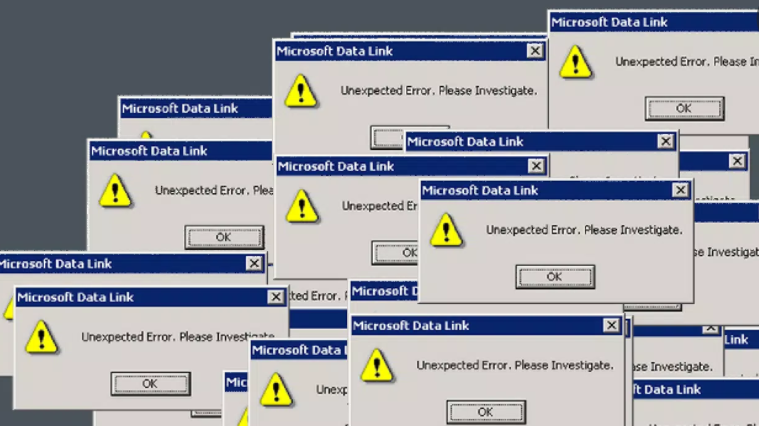
Win95 seems to be missing a more responsive interface...

enter image description here

30
votes

The Windows 3.1 theme is missing an important graphic:

enter image description here

27
votes

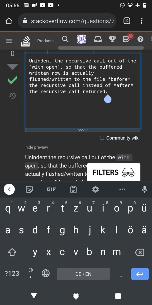
Please let me get rid of that annoying FILTERS button. It's often in the way, especially when editing an answer, where it masks a big part of the preview:

enter image description here

3
19
votes

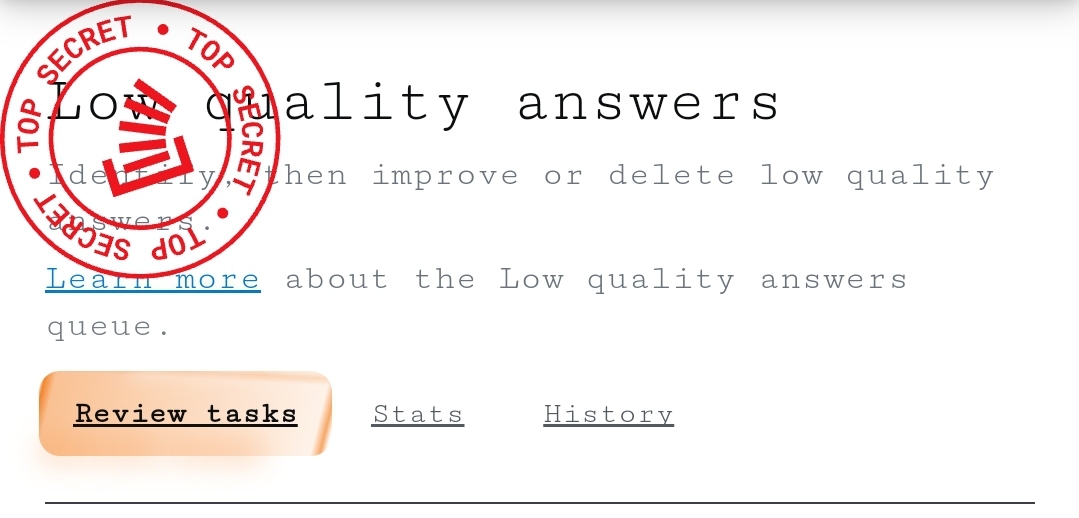
Reviewing Low quality answers with the "Top secret" filter almost makes it read like "Top quality answers" :D

enter image description here

2
  • 2
    "Top Quality Answers" this should be the new tagline XD
    – codewario
    Commented Apr 1, 2022 at 16:16
  • 2
    So Top Quality Answers is a hidden secret feature on Stack Overflow? This would explain so much! Commented Apr 1, 2022 at 23:13
17
votes

This has absolutely demolished me, I've started writing an answer before midnight and submitted it after midnight. Either accidentally selected or was automatically opted in, I was left scratching my head for a while

I couldn't figure out what's wrong with markdown and how my answer did end up looking so strange. A moment later I disabled the filter, but, what's even more hilarious, it was only after running into that post, when I realized that the filter is an April fool joke (yeah, I should sleep a little bit more).

0
16
votes

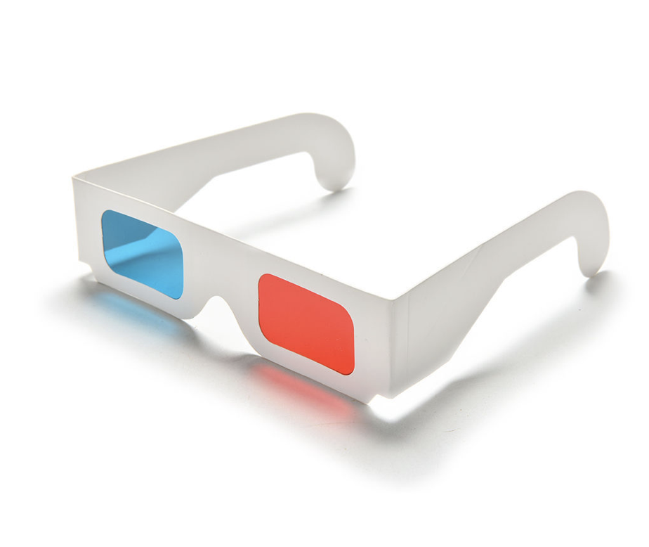
The most important question: how would Stack Overflow look with 3D filter and 3D glasses on?

enter image description here

5
  • 9
    Someone should post a screenshot with 3D glasses on :D
    – Cerbrus
    Commented Apr 1, 2022 at 11:18
  • 4
    I tried a pair and, honestly, it just doesn't seem to work for me? For one, it's cluttered because the black text is still there in addition to the red/cyan that you're supposed to only see with each eye. Added color:transparent and that helps make it look like normal text, not as garbled, but the 3d effect is only visible for me on the bold title of the page. Anyone else having more luck, are my glasses the wrong shade of cyan compared to my monitor or so? (Edit: tried on a much better monitor, same problem.) I really like the 90s kids theme though! Guess that says something about myself :)
    – Luc
    Commented Apr 1, 2022 at 11:34
  • 5
    The anaglyphic filter was a great idea but not done correctly. The text is less readable with glasses on. Some of the widgets are elevated above the white background but nothing special.
    – wberry
    Commented Apr 1, 2022 at 15:55
  • It does work, (Found a pair of 3D glasses in an old DVD movie box) but discovered if I didn't have my reading glasses on, and the 3D glasses on too, didn't work. Works best if you move (tilt?) your head left to right & back By the way, the TikTok logo is not 3D! Commented Apr 1, 2022 at 18:44
  • 1
    It isn't done correctly. They just duplicated the text to the left and right such that there are 3 copies of the text (black, red, and cyan). To have a proper 3D effect, you need two copies of the text (red and cyan) with the overlap being black.
    – WolfLink
    Commented Apr 2, 2022 at 21:40
14
votes

Honestly, shame on you for the inaccessibility of this "feature" showing up automatically. Users with dysautonomia or sensory sensitivities just had their day ruined by this 3D glasses filter because of vertigo, migraines, and meltdowns. An April Fool's prank isn't funny if it leaves a lot of your users in pain or left behind. It doesn't matter that we can turn it off; we already saw it and feel ill instantly.

Don't you have some review for accessibility, diversity, and inclusion before implementing anything, including pranks?

It has come to my attention that the default filter is randomized, as some other coworkers saw a different filter by default. At the very least, Stack Overflow should select the least intrusive/most accessible feature to be the default one to show to all users.

I could have enjoyed the prank too if it did not make me feel ill while I frantically searched for a way to turn it off. This is not just a minor annoyance to some of us-- it can cause real physical reactions.

3
  • 4
    +1 If users are in pain or feeling ill, nothing else should matter. Let’s forget everything else and just vote this answer to the top. (I am not familiar with dysautonomia, but given the MDN advice on seizures, what’s written here makes sense. The MDN advice talks about putting the user in control, which SO has failed to do here.) Commented Apr 2, 2022 at 11:25
  • Thank you for sharing your concerns. Based on the feedback shared with us regarding the 3D filter, the devs removed it from the set of filters randomly displayed to users and moved it to the end of the filter selector. (Sorry for my late response; I was out of the office and unable to respond sooner.)
    – V2Blast Staff
    Commented Apr 4, 2022 at 5:12
  • 1
    Further to what V2Blast said: As soon as we saw this comment, we remove 3D from the randomized filters assigned to people visiting the site and deprioritized it in the list of options. We are constantly looking for ways to make Stack Overflow a more inclusive and diverse place to be, which includes acting on feedback like this as quickly as possible. There's still a lot of work to be done, and plans in progress. Stay tuned for more from us in the coming months.
    – Philippe StaffMod
    Commented Apr 4, 2022 at 14:56
7
votes

Happy April Fools' Day! Great job posting at 0 UTC exactly!

4
  • 8
    Whew! For a second there, I was like "WTF is this screwing up my display!?!?" Commented Apr 1, 2022 at 0:04
  • I clicked a search result link and wondered what corner of the internet I ended up on this time. There are many stackoverflow scrapers/clones/ripoffs in duckduckgo results but this beat everything! Then I noticed the domain and date, first fool of the day for me :)
    – Luc
    Commented Apr 1, 2022 at 11:39
  • How do you define "exactly"? It was 50 seconds off (with the available time resolution). Commented Apr 1, 2022 at 12:30
  • @PeterMortensen I meant rounded down to the minute, not the exact second.
    – Anonymous
    Commented Apr 1, 2022 at 15:50
7
votes

I actually like the Windows 3.1 and Bookface themes. Too bad this is temporary.

1
6
votes

The best part by far is the scroll bar in the Windows 3 theme.

3
  • Do you mean the dropdown menus? I'm using Firefox and don't notice any change in the scroll bar.
    – Anonymous
    Commented Apr 1, 2022 at 15:53
  • 2
    @Anonymous It doesn't seem to work on Firefox. Try it on Chrome for a much more... retro flavor.
    – DLosc
    Commented Apr 1, 2022 at 17:10
  • 1
    @DLosc Wow, you're right, that is amazing! Too bad these will be gone tomorrow.
    – Anonymous
    Commented Apr 1, 2022 at 17:31
5
votes

I love this feature.

I'm just quite sad I don't find my 3D glasses to see what Stack Overflow should really look like.

Also, the Hot Dog Stand seems to be made by someone that tests CSS div.

5
votes

The HTML markup of pages where Filters are available contains the following HTML comment for the curious (click on your own responsibility, let's just say the destination has something to do with what stones do):

<!--Hello Dev! Welcome to our new Filter's bar. If you need direct access to our secret keys, please go to https://s.tk/StackOverflowSecrets. (DON'T SHARE OUTSIDE THE COMPANY)-->

Also, a js-april-fools-2022-random-can-you-believe-they-did-it-this-way class is part of the module JSON config.

Also also, theme selection bars are named "Smol Brain Bar SBB", "Medium Brain Popover MBP", and "Big Brain Bar BBB" respectively.

1
  • 3
    Kudos on digging those up! Nice job ;)
    – Felippe Rangel StaffMod
    Commented Apr 2, 2022 at 23:46
4
votes

Happy April Fools! I love how you managed to get the update in under 1 min 30 seconds (how long the site was down for). I was refreshing constantly waiting for the UTC clock to strike 12...

0
4
votes

This is amazing! Thank you all

I think a little change in some of the themes can be good. For example, in the Bookface theme, the color of the useful button should be different to be more visible

enter image description here

This is completely unclear in the 3D Glasses and Top Secret themes

enter image description here enter image description here

2
  • Keep in mind they're going to go at the end of the day...
    – Anonymous
    Commented Apr 1, 2022 at 15:52
  • 2
    That's the point of the Top Secret theme - votes are redacted :)
    – 0Valt
    Commented Apr 1, 2022 at 15:54
4
votes

Add this userstyle to disable.

.af-bar {
        visibility:hidden;
}
4
votes

The only thing I would recommend is that, when people close the Filters toolbar at the bottom, the Filters tab that still shows on the bottom right should be much less distracting.

The Filters feature is good, and the full toolbar is good (as long as it can be closed, which it currently can). It's just when you close the toolbar, the tab that still shows is just too big, noticeable, and distracting.

enter image description here

3
votes

I know this is an April Fools thing and probably intended to be temporary but I genuinely kinda like some of the themes er sorry... filters and it's kinda neat. Please keep these as an option for the future, although maybe don't make it so loud about it lol

1
vote

Some of these are quite fun but I'm not sure they were meant to look this bad.

Chrome v100 macOS

Definitely something weird going on with that font rendering. I'm on macOS Big Sur using Chrome v100. Looks the same in Safari.

Update: These screenshots are taken from my Full HD external monitor. It looks ok on the retina screen.

Rendering in Firefox is definitely better though so it seems to be a Webkit problem.

firefox

4
  • Right, MacOS Catalina here... most of these filters leave the font unreadable.
    – Drew Reese
    Commented Apr 1, 2022 at 2:28
  • 1
    Interesting looks ok on my monterey (with high-res displays, but even when downscaled to "real pixel size"). Seems like the webkit-font-smoothing: none; didn't work...
    – Kaiido
    Commented Apr 1, 2022 at 2:32
  • @Kaiido ah, I just moved the window to my retina screen and it's all nice again. Screenshots taken from my, err, state-of-the-art Dell 23.6" Full HD monitor
    – Phil
    Commented Apr 1, 2022 at 2:35
  • They don't look like that on Chrome on my Windows 10 machine. Strange.
    – Clonkex
    Commented Apr 1, 2022 at 2:58
1
vote

Offf. Was a nice prank, freaked out not knowing what happened with the site until I realized it.

Tho I have one question? Why some "professionals" can't enjoy being silly for at least one day? It's not like you're working on a cancer curring machine. Be happier. ^^

2
  • 1
    “It’s not like you’re working on a cancer [curing] machine.” — How can you be sure about that? Commented Apr 2, 2022 at 6:30
  • Thanks for the grammar correction :) Do you know anyone who's working on a cancer curing machine and would browse stackoverflow? 🤔 Commented Apr 2, 2022 at 7:04
0
votes

Thanks for giving me a huge headache... Seriously looking at it for the few seconds it took to turn it off gave me enough of a headache I had to get some Advil...

Note: The filter I got first was the 3D glasses filter.

8
  • 16
    I had the same reaction when they rolled out the new top bar. By comparison, the 3D glasses filter seemed like an improvement.
    – Cody Gray Mod
    Commented Apr 1, 2022 at 0:12
  • 7
    I get that you're trying to be funny...but it was really jarring having it come up when I was already frustrated because of a problem I'm trying to solve for work. Now my head hurts and my problem is still not solved. Thanks... Commented Apr 1, 2022 at 0:15
  • 1
    We all have to make allowances for April Fool's ¯\_(ツ)_/¯
    – Clonkex
    Commented Apr 1, 2022 at 0:24
  • 6
    Mm, yeah, maybe they could have made it so that the 3D glasses one isn't the first one you can get (you have to select it). That would have annoyed me as well.
    – HFBrowning
    Commented Apr 1, 2022 at 0:25
  • 2
    @Portaljacker Then upvote Can we *permanently* disable April Fools jokes?. Commented Apr 1, 2022 at 0:28
  • 6
    I am not trying to be funny. Having the top bar break when I was already frustrated because of moderation issues on this site, and making it more difficult to do a job that I volunteered to do and don't get compensated for... Yeah, my head hurt, too. The problem isn't solved yet, either.
    – Cody Gray Mod
    Commented Apr 1, 2022 at 4:08
  • 2
    I actually got really nauseated with the 3d filter, it's being an hour with nausea and headache (and I am not trying to be funny...)
    – Gabrielle
    Commented Apr 1, 2022 at 16:07
  • The nausea set in during the 2 seconds it took you to turn it off, @Gabrielle, and then lasted for over an hour?
    – Cody Gray Mod
    Commented Apr 1, 2022 at 22:56
-2
votes

Not sure if it's related, but I got a "Too many requests" error from my IP address on two separate occasions last night when accessing Stack Overflow. I wasn't doing anything particularly out of the ordinary, so I'm wondering if there's a bug in the filter implementation that's causing extra traffic that got me blocked. Could also be completely unrelated.

1
  • The first time I loaded Stack Overflow with the filters was also quite slow. Took 10 seconds or so to load. Commented Apr 1, 2022 at 23:29
-3
votes

Since we're toying with the layout, can we get a filter that brings back the old layout as discussed here please?

6
  • 1
    You can just hit the None icon on the very left...
    – Halo
    Commented Apr 1, 2022 at 19:46
  • @Anye - that's not what I'm talking about. Commented Apr 1, 2022 at 19:52
  • 1
    Sorry, could you please re-elaborate?
    – Halo
    Commented Apr 1, 2022 at 19:53
  • 1
    @Anye - did you look at the link in my post? Commented Apr 1, 2022 at 19:58
  • 1
    Yeah, I did see it
    – Halo
    Commented Apr 1, 2022 at 19:58
  • 1
    @Anye, so how does hitting none bring back the old layout? And by "old layout" I mean the layout that was there before they mangled it. Commented Apr 1, 2022 at 21:48
-5
votes

You sincerely got me there. Well played.

-6
votes

When I saw the UI gag/style for April 1st, the only thing that came to my mind are the UI degradations over the recent year-or-two:

  • Gratuitous line spacing
  • Uglifying the navbar with garish contrast
  • Switch to tiny, low-readability notification bubbles for messages and reputation change
  • and of course - messing up the vote and view count layout

We explained and explained why this was wrong, but to no avail. And now we're supposed to laugh at jokes and gags? I just feel sad.

5
  • 9
    I guess you can do both: express concern about degrading the UI and like the jokes at the same time. Also: more time spent implementing jokes means less time spent implementing further UI degradations :)
    – Marijn
    Commented Apr 1, 2022 at 8:47
  • 2
    I feel the same way. It's like rubbing salt in the wound. It was funny before; not so much now :/
    – 41686d6564
    Commented Apr 1, 2022 at 11:12
  • Not to forget the sticky topbar and the associated scroll bug (e.g., back-TAB to the title field does not make it visible (if it is not already visible) - a manual scroll operation is required). That is a real usability issue. Commented Apr 1, 2022 at 12:37
  • 3
    @J... why can't one hate the UI changes and still want to have some fun on the platform once a year? We both know that the choice is "fun + bad UI or just bad UI" and not "fun or good UI"
    – 0Valt
    Commented Apr 1, 2022 at 13:39
  • 1
    @OlegValteriswithUkraine I don't see how vandalizing a tool used by professionals is "fun". It's just another unnecessary distraction.
    – J...
    Commented Apr 1, 2022 at 13:40
-7
votes

I think you should keep this feature, after making it more 'polite'.

About half of these themes are worth keeping in my opinion. The Luigi one is my favorite. Top Secret is good but the stamp should be moved to the margins. I even like the Terminal one. I would very much like to see this as a permanent option on your profile page (display preferences tab I guess). Just make the current Dark Mode, which I have been using since it debuted, into one of the choices of alternate style.

If you really wanna go for the gusto, open it up so users can submit their own styles ala the CSS Zen Garden. Maybe give out rep for styles that are accepted/used.

2
  • 3
    Where's the "impolite" part?
    – Cody Gray Mod
    Commented Apr 1, 2022 at 21:29
  • 1
    @CodyGray Imagine you logged into Windows and your system font was changed to Comic Sans. Or your co-workers re-capped your keyboard. It's deliberately provocative - it's intending to piss you off. Contrast this with an easter egg, which is subtle and hides - it forces you to discover it through exploration. This slaps you in the face - it's not subtle, it doesn't require any cleverness to discover, and it forces you to stop what you're doing, break your concentration, and figure out how to turn the damned thing off.
    – J...
    Commented Apr 2, 2022 at 8:18

Not the answer you're looking for? Browse other questions tagged .