503

You're all probably wondering who I am and where Joe is. I'm one of the developers on the Developer Affinity & Growth team with him, and I'm excited to tell you about a prototype that we'd love your feedback on.

Questions and answers are what Stack Overflow is all about. The starting point for a great Q&A site are good questions. We all know that asking a good question is an art, and humans - particularly those in a hurry - aren't naturally good at it all the time. We've also known for a long time that Stack Overflow needs to provide a better "ask a question" experience, especially for people new to the community. We think we can make the experience less intimidating, help people avoid common mistakes when asking, and improve the quality of questions with a bit more guidance baked into the process.

What have we done?

We're off to see the wizard

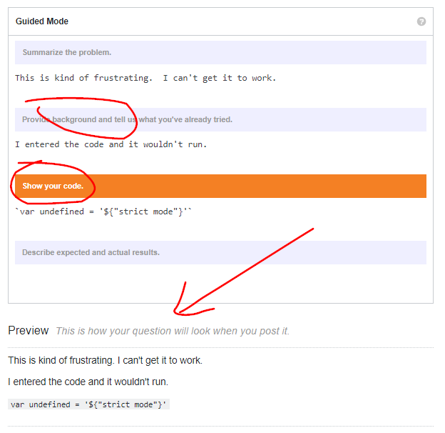
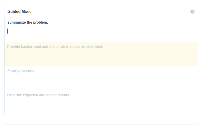
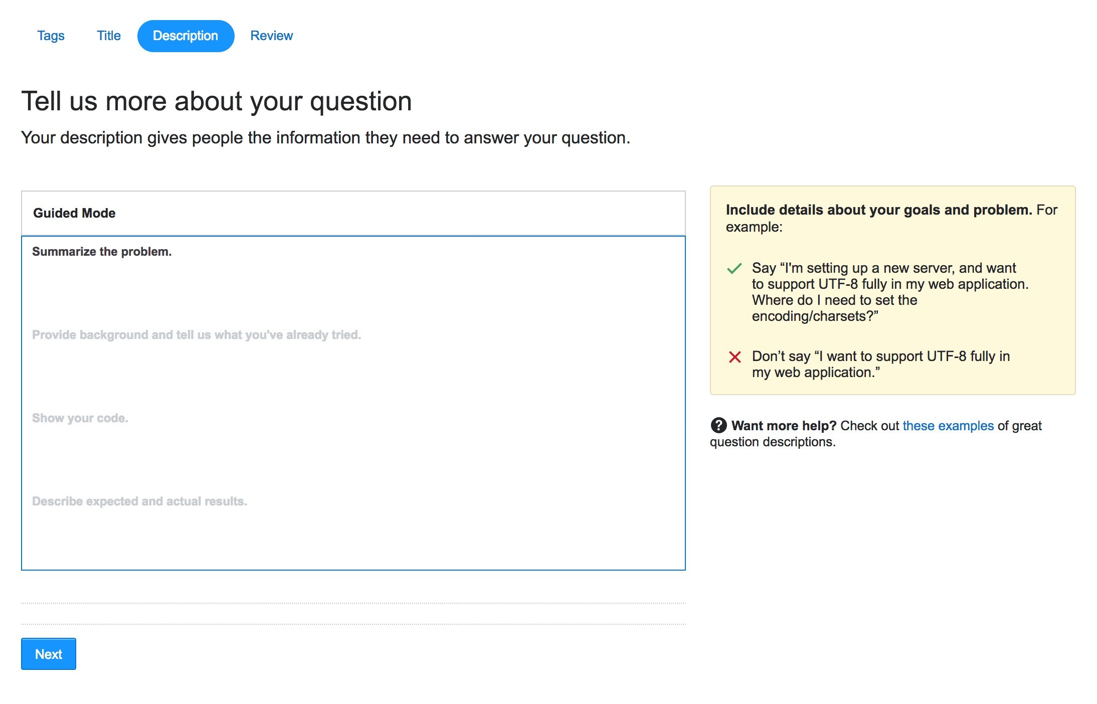
Screenshot of the question body section of the wizard. Section prompts: summarize, Provide background, show your code, describe expected and actual results

Our next step is to run an experiment on a prototype "ask a question" wizard. Before we do, we'd love for you all to kick the tires on it and give us feedback. Our goal is to get this experiment up and running in July. The experiment will be focused on newer question askers, so experienced community members won't see it, except during this comment period.

Check out the prototype here. (Please note this will post a real question on SO)

Feel free to add answers below to suggest improvements to copy, the flow or any part of the experience. We'll review the suggestions to find targeted improvements before running the experiment.

And, of course, once we have some data on how things went we'll report back here.
69
  • 224
    I like the flow in the forward direction, but can you add a Back button on screens after the initial one? The browser back button doesn't seem to always take me back where I expect it to go (the immediate previous screen in the wizard). Commented Jun 18, 2018 at 17:13
  • 10
    ...Okay, fine. Color me skeptically optimistic about this wizard. I'm going to peruse it later to see if there's anything that really juts out.
    – Makoto
    Commented Jun 18, 2018 at 17:16
  • 20
    Is this going to be a thing for all users now? Or just new / low rep users? Commented Jun 18, 2018 at 18:05
  • 6
    I'm curious, how much of the verbiage and/or functionality was directly harvested from meta.stackoverflow.com/questions/358600/…?
    – TylerH
    Commented Jun 18, 2018 at 18:25
  • 129
    I DIDN'T REALIZE IT WAS LIVE! I posted a really bad 'i++ + ++i' question:) Luckily, I deleted it before it got -100 votes:) Commented Jun 18, 2018 at 20:32
  • 17
    On the description tab, nowhere does it tells the poster to explain his/her question in a minimalistic manner. A guide on how to create a minimal, complete and verifiable example for each popular tag will be a good addition. The guide may tell users to post more details in the question, but it doesn't discourage them from posting overly verbose questions.
    – Autonomous
    Commented Jun 18, 2018 at 20:55
  • 8
    This guided mode is a big improvement but I'd definitely rephrase "your code" to "your reproducible code with an appropriate simulation of any relevant datum or data"
    – Hack-R
    Commented Jun 18, 2018 at 21:12
  • 19
    Let me just say thank you for trying to make this less bug reporty inspiring.
    – jpmc26
    Commented Jun 18, 2018 at 21:53
  • 9
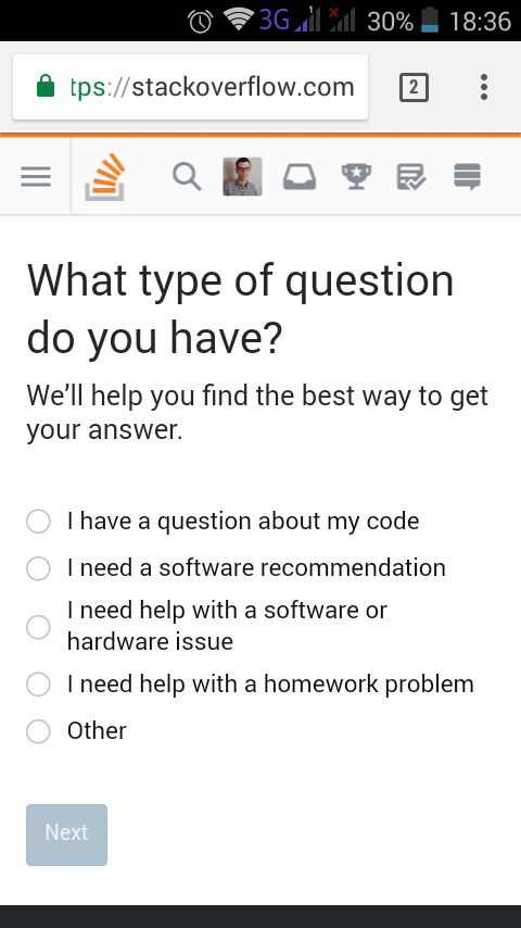
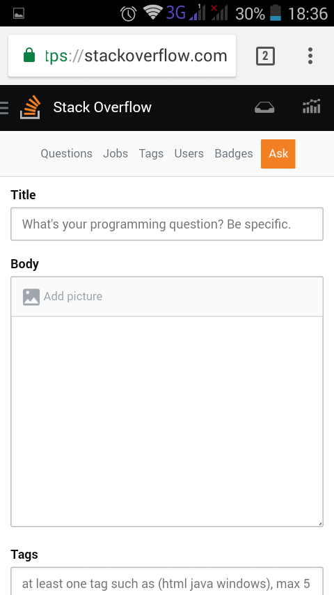
    On mobile, the wizard doesn't really wizard -- it shows the original multiple choice, then instead of walking you through how to write the question, it sends you to the normal ask a question page. status-bydesign? Commented Jun 18, 2018 at 22:19
  • 47
    Needs a back button.
    – clickbait
    Commented Jun 19, 2018 at 3:29
  • 64
    How about automatically treating what is entered in the "Show your code" section as... .. code? (I.e. no need for ctrl+k on this section)
    – visibleman
    Commented Jun 19, 2018 at 4:21
  • 41
    What's up with this constant pat on the back? Why everything is Great? For adults with normal self-esteem that seems like we are being treated as 5 years old- they do need a constant reminder that everything they do is great. Normal adults do not.
    – SergeyA
    Commented Jun 19, 2018 at 16:07
  • 7
    @EricLeschinski isn't 10,000 rep a bit too high? I think it should be somewhere around 500 rep. At that level is the review privilege, so I assume that we think that users who reach 500 rep know at least what counts as a good post (whether question or answer)
    – Keale
    Commented Jun 21, 2018 at 1:32
  • 21
    @EricLeschinski Holy crap dude. 10,000 rep before you stop seeing the wizard?? That's extremely high. It should be more like 500, as Keale says. If you're worried that new users could get that much rep really quickly and start posting bad questions before they've learned how the site works, consider this: If they get 500 rep really quickly, doesn't that imply they're doing well already?
    – Clonkex
    Commented Jun 22, 2018 at 1:53
  • 12
    @Keale I have seen 30K users asking absolutely off topic questions. More than once, and more than single user. I don't think there should be any threshold. Seriously, if someone asks so many questions that going through wizard is a hurdle, then maybe this is an indication that those questions maybe should not have been asked in the first place.
    – Dalija Prasnikar Mod
    Commented Jun 22, 2018 at 13:47

78 Answers 78

1 2
3
4

I'd suggest making the:

Please note this will post a real question on SO

A bit more obvious. I think having a 'prototype' function properly without it being clear with flashing lights and jumping around the screen, people will be posting low quality questions not realising they'll be real questions.

I already accidentally asked this question:

I fully expect more people testing it by asking questions. I mean, it's a prototype that people want to try out... don't make it post real questions!

1
  • 1
    I agree; originally they didn't even have that notice and it was a big surprise that it actually posted your question... kind of dropped that ball a bit.
    – TylerH
    Commented Jun 25, 2018 at 18:49
4

This is a follow-up answer to @CodeCaster's answer about "where did the headers go?"

I think you can help by calling them out as distinct from the post content. Also, making it more clear to the asker that the post preview is exactly how it will appear will guide them to that understanding as well.

enter image description here

2
  • 2
    In hindsight, I should have used == rather than = in the example. :) Commented Jun 28, 2018 at 17:18
  • I should also have made it an animated gif. It's not entirely apparent unless you've used the wizard yet that the appearance of whichever section has focus is different. Orange may be a bit over the top, but in my example it's denoting the active section of the 4. Perhaps something less pronounced would be best. The main idea is to not have the prompts be just text-on-white similar to the user's content. Commented Jul 3, 2018 at 18:20
3

First of all, thank you for building this wizard, it seems magical and wonderful and sparkley. However, I've got a couple suggestions:


This screen appears after you click "I have a question about my code" or "I need help with a homework problem" (or "Other" then "Continue asking my question"):

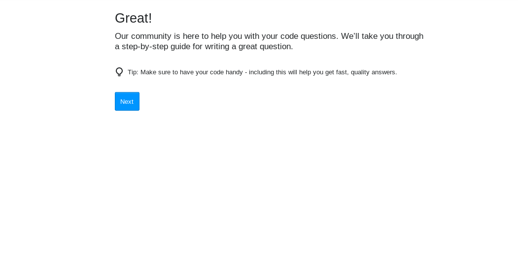
empty second screen

It seems like this screen is full of blank space, which could be used for something better, and doesn't really do much to help the user ask their question. It would be great if we could either integrate this screen with the next one (somehow, I'm no UI expert) or use this space to explaining a bit about SO standards, maybe providing some links to the help center, or just talking about what SO is and what we expect from questions and what makes a good SO question.

There's all kinds of good stuff we could put here, and even though users can just click past, for those that do read it, it would be very useful.


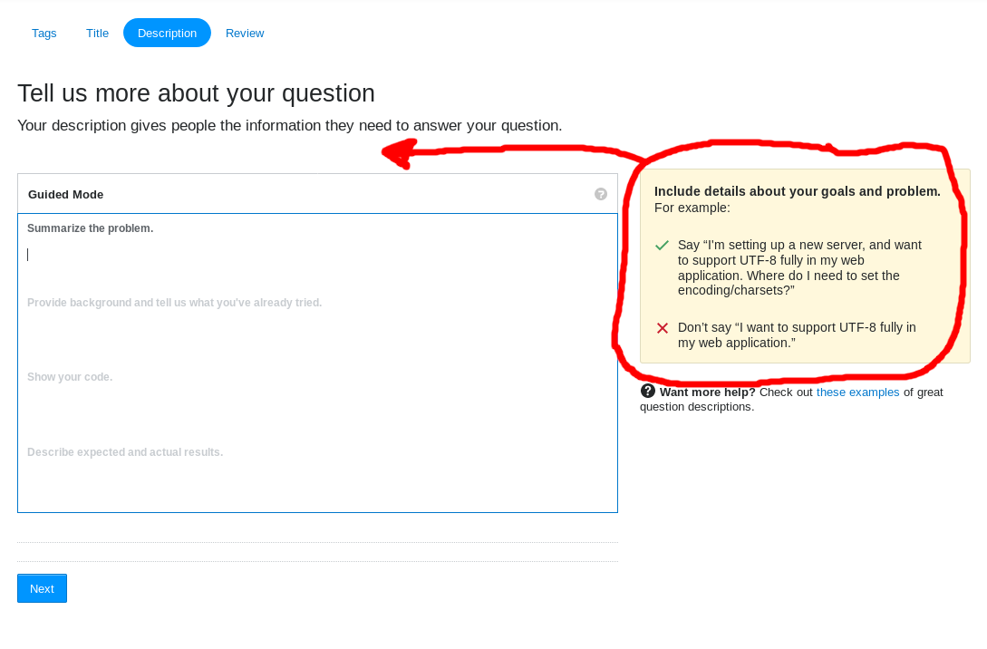
On all of the compose screens (tags, title, description), there's a yellow box in the right sidebar:

description screen

To me, that feels outside of the normal flow that a user would be reading the dialogue in. We want the user to read that advice before they start typing, so I think it'd make more sense to stick that right above the text box, so that as you read down the page vertically, it fits in smoothly.


Besides these minor points and the other minor changes people have mentioned, this really seems wonderful. Thank you again!

One final question for y'all: (how) Will this get rolled out to the rest of the network if it goes well here on Stack Overflow? How are you planning on testing this? Is this already live for some users? How will you judge if this test was sucessful?

2
  • 5
    It's certainly live in some sense of the word. If you throw in some random bad question data and hit 'Post', the Q. goes straignt on to the SO main front page. I found out the hard way that the output does not go into a test database as I was expecting:) Commented Jun 18, 2018 at 20:54
  • 3
    Biiiig up-vote for moving the yellow box from the sidebar to the main content area. Stuff on the sidebar, while live-updating based on what is focused, is never as good or 'in your face' as stuff that breaks up the flow of content.
    – TylerH
    Commented Jun 18, 2018 at 21:08
3

When I was entering tags in the wizard I noticed some curious behavior. Perhaps this has always been going on, but today was the day I payed attention.

I want to enter the excel tag, so I start to type:

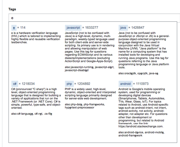
Searching for E

enter image description here Here are just the most used tags, and one relevant search result

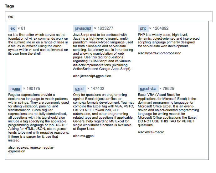
Searching for Ex

enter image description here Here Javascript and Php are still cluttering search results albeit being totally irrelevant Excel should just occupy the second spot here, after the best match Ex.

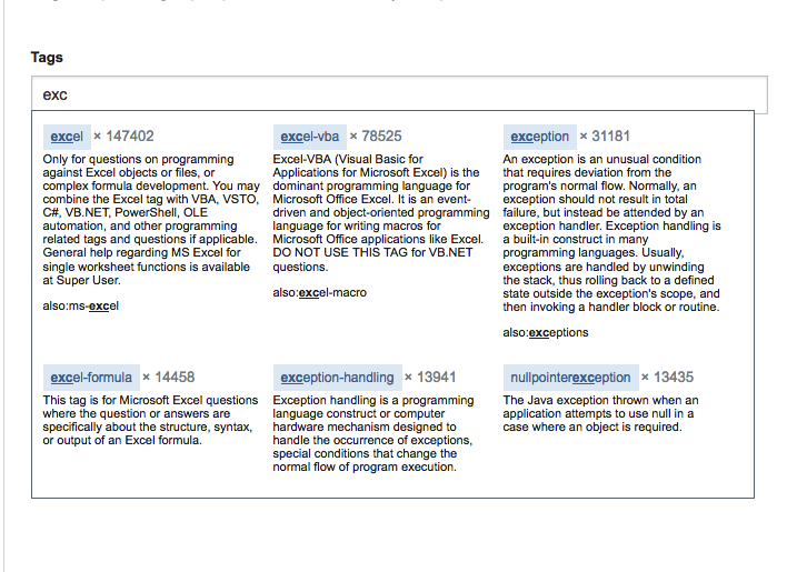
Searching for Exc

enter image description here

Only here Excel is in the first spot


Also: Check out this beatifull allignment of the results box with the search bar: enter image description here

9
  • It's because of the tag synonyms.
    – user4639281
    Commented Jun 19, 2018 at 8:12
  • I don't imagine those synonyms were used much though? I guess those are weighted by popularity of javascript and php and not the synonyms, which I'd expect to be rare ('javascript-execution'?)
    – Rup
    Commented Jun 19, 2018 at 8:56
  • 5
    @TinyGiant, Yes I see those are underlined, but why favour a match in the middle of a string over a match at the start of a string?
    – Luuklag
    Commented Jun 19, 2018 at 9:07
  • @Kobi, some unwarranted passive aggresiveness from my side. Removed that.
    – Luuklag
    Commented Jun 19, 2018 at 9:49
  • @luuklag I'm sure the weighting algorithm considers more than just the position in the string where the two characters occur. It probably has a lot to do with the popularity of the tag because more popular tags are more likely to be used over less popular tags.
    – user4639281
    Commented Jun 19, 2018 at 14:26
  • @TinyGiant That's my understanding of how the current search would work. But how would one want to end up with PHP when typeing exc?
    – Luuklag
    Commented Jun 19, 2018 at 14:28
  • As far as I can see in your example "exc" does not return php.
    – user4639281
    Commented Jun 19, 2018 at 14:32
  • You are right, I meant to say ex
    – Luuklag
    Commented Jun 19, 2018 at 14:47
  • Well with "ex" it's just not specific enough. I mean, it's not going to be able to read your mind, and if it is tweaked just slightly enough that it works as you want here, it will fail elsewhere where it wouldn't have otherwise. Now if you typed in "ex" and the "ex" tag did not show up, then I would be concerned.
    – user4639281
    Commented Jun 19, 2018 at 15:02
3

Great start! I love the helpfulness and positivity!

Using the "I have a question about my code" fork on the question What is the Pythonic way to set up in a class a static dictionary that can be modified at runtime?

  • Needs a Back button as well as a Next button that saves page state. The tabs at the top are not obvious.
  • "Tags" page hint "Don't include version numbers" is not always true. In Python for example, the difference between 2.x and 3.x is often crucial. Strike or improve this hint.
  • "Description" page needs access to markdown language toolbar, not just the "Review" page.
  • "Description" page needs hints for each section. Maybe best to put these in the Guided Mode box under each section heading.
  • "Provide background and tell us what you've tried" should be split into "Provide background" and "Tell us what you've tried"
  • "Provide background" should be fleshed out into types of background that are important.
  • "Provide background" should be moved above "Summarize the problem"
  • "Show your code" should be moved between "Summarize your problem" and "Tell us what you've already tried"
1
  • Upvoted for giving positive feedback first! Great idea!
    – GhostCat
    Commented Jun 19, 2018 at 19:46
3

Looks promising, but there is more opportunity to prevent people from asking really off topic and otherwise completely inappropriate questions.

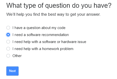
1. Software reccomendation

enter image description here

Off topic recommendation questions are not only about software and libraries, but also books, tutorials, hosting and just about anything else.

If someone wants to ask about best Java book, he will just select Other and will be blissfully unaware that this kind of question is not appropriate for SO.

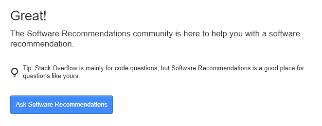
Also, there is a difference between software and library, while libraries are software, they are also connected with coding... it is not absolutely clear that library recommendations are also off topic on SO (someone might think it is coding related question) and it is not absolutely clear that library recommendation questions are on topic (if properly asked) on Software Recommendations site.

enter image description here

Both of above issues with recommendations, could be solved if second bullet would be changed to I need a software, library, tool,.... recommendation and then next screen would give further pointers directing appropriate questions to Software Recommendations or saying that particular recommendation question is completely off topic for SO or any other SE site.

2. Too broad

Many bad questions are programming related, but just too broad. There should be a bullet for too broad "How to..." questions leading to page explaining what makes "How to..." questions inappropriate and how to ask good "How to..." question (if possible) that will not be closed as "Too broad".

3

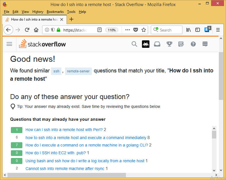
Please consider adding an additional prominent warnings for some tags which seem to attract a lot of off-topic fodder. For example, many SSH questions are off-topic because they concern themselves with SSH login, and not programming SSH.

The SSH tag has the warning:

GENERAL SSH SUPPORT IS OFF-TOPIC. Support questions may be asked on https://superuser.com. Secure Shell (SSH) is a cryptographic network protocol for secure data communication. Use this tag for programming questions related to Secure Shell....

A person who receives results without a prominent warning may be led to believe the question is on-topic when it is probably off-topic.

enter image description here

2

Maybe it's just me, but I think the design of the tip/Eureka bulb can be improved:

enter image description here

Currently it looks a bit like a Venus symbol

which is cool in itself, but probably unrelated to programming.

To improve the current design, having either rays of light or the screw-in bottom part of the bulb or yellow color are usual ways to make it more bulb-looking.

3
  • The feminine symbol is unrelated to programming, but so is a lightbulb. How would you improve the design?
    – TylerH
    Commented Jun 22, 2018 at 18:14
  • 1
    @TylerH A light bulb icon is very commonly connected to "idea" "Useful tip", see for example here. I edited the answer with improvement suggestions.
    – Basj
    Commented Jun 22, 2018 at 19:14
  • Or Kenny from Southpark.
    – QHarr
    Commented Jun 23, 2018 at 4:48
2

I like the idea of a wizard, but it really needs to stick to the basics. Perhaps for new users, all the screens can be included. For more experienced users though, the non-functional screens that comment on your selection will start to become annoying. Users could be required to use the wizard until they reach a certain reputation or for a set number of questions perhaps. For me personally, I would like the wizard to be mandatory for my first question, after which I should have the option to disable this.

I feel like all you need is the last screen, with the guided sections in the question body field, as below: enter image description here

Maybe a checkbox can be added on this page where you can toggle the "Guided Mode" on/off. This way, more experienced users can have the freedom to do as they know is acceptable.

2
  • 2
    What you have described is a template, not a wizard, and it's already been tested/piloted for new users. This is a step above. And the whole thing is already targeted toward new users/askers so there should never be an issue of "for more experienced users [this] will start to become annoying".
    – TylerH
    Commented Jun 25, 2018 at 18:45
  • FWIW (and at risk of sounding like a grumpy old man) a lot of this seems to be taken directly from the behavior I suggested in meta.stackoverflow.com/questions/358600/… - including the conditions of who would see it: new users, new askers, and people who hadn't asked a question/many questions in a long time. So while I'm not affiliated with SO or the development of this feature, if I sound quite familiar with this, it's because I already recommended it last year :-)
    – TylerH
    Commented Jun 25, 2018 at 20:24
2

I like the wizard. It's coming along nicely. The only issue I see with it is that it does nothing to actually curtail bad habits. Instead it just tries to force the user to read everything. I feel like this will just improve user experience for people using the site correctly, and do nothing to people who don't understand what to do. The latter group of people seem likely to just do everything badly.

Can someone add logic to make sure the title follows the form of a good title and not a bad one for example? Can we test the input fields before letting someone continue?

2

Contextually ask for supporting documents.

This might be supported by the suggestion to allow for tag specific templates, but I'd like to specifically call it out.

Consider questions where a user is asking a question. Often times, I have to follow up with a comment asking what specific library is using or how they have their scripts configured. It would be nice if the wizard specifically suggested to the user that they should include relevant information from their package.json file.

Similarly, I think questions should suggest adding their Dockerfile, questions should ask for build.xml, and should ask for makefiles since I usually have to ask for those as well. This basically extends to all configuration based tags.

I think this call out is more direct than asking for code. The wizard asks users to include relevant code. Someone running into an issue with will likely think "What code? I'm configuring a server, the code doesn't matter" in which case we will likely have to ask the user to include their configuration file in a separate comment that wastes time.

1
  • Maybe instead of a custom template, it could display "How to ask a good question about [this tag]..."
    – jkdev
    Commented Jul 2, 2018 at 23:07
2

I would love to see integrated static analysis or code pattern matching.

  • Does a Java question contain (var == "str")?
  • Does a Bash question contain var = "str"?
  • Does a Linux question contain sudo echo?

Common pitfalls like that can be easy to recognize by code, but hard to match by title because they're multiple steps removed:

In the simplest case, this could be a per-tag list of regex and dupe targets that gets matched on whatever the user puts in the "code" part of the wizard.

1
  • I wonder if there's a Stack App for that?
    – jkdev
    Commented Jul 9, 2018 at 19:19
1

I've tried the wizard on mobile (Android) and desktop (Windows) but doesn't work. This is the first step. I'll only say the issues on mobile.

This looks OK but it's not like the Android design.

The second step doesn't work at all.

enter image description here

Here I got the default "ask a question" form on the regular site I've got this on the second step:

enter image description here

2
  • What do you mean by "doesn't work"? You click the "next" button and nothing happens? You click it and errors appear but you aren't scrolled to them automatically? It submits but shows you an error?
    – TylerH
    Commented Jun 26, 2018 at 16:57
  • 4
    @TylerH I'm sure what he meant by it "doesn't work" is explained in the rest of his post. When on a mobile device, it shows the wizard using the desktop theme, but when he clicks next, the site switches to the mobile theme and the regular "ask" page instead of the wizard. I also reproduced the problem. I don't think this is an issue because they are probably not going to present the wizard for new users if they are in the mobile theme (hopefully). Besides, the mobile theme is (I believe) going to be retired once the responsive design is mobile-optimized. Commented Jun 27, 2018 at 0:52
1

Options:

I need help with...

  • Fixing code that doesn't work (Stack Overflow)
  • Improving code that works (Code Review)
  • Hardware or software I'm using (Super User)
  • Business IT or networking systems I'm managing (Server Fault)

I'm looking for recommendations for...

  • Which software to use (Software Recommendations)
  • Which hardware to use (Hardware Recommendations)
  • How to be a better programmer or software engineer (Software Engineering)

For comparison, here's the current proposal:

What type of question do you have?

We’ll help you find the best way to get your answer.

  • I have a question about my code (Stack Overflow)
  • I need a software recommendation (Software Recommendations)
  • I need help with a software or hardware issue (Super User)
  • I need help with a homework problem (Stack Overflow)
  • Other (Stack Overflow)
2
  • 3
    Did you mean to delete the 'other' option? Stack Overflow isn't just debugging questions. Commented Jul 2, 2018 at 18:25
  • I'd be in favor of "Other" if it links to a page that provides clear guidance about which questions are on-topic.
    – jkdev
    Commented Jul 2, 2018 at 22:01
-4

Many questions are not "about my code" -- but they're still on-topic:

"How to" or "How do I" questions

Theoretical questions

So, how would those fit into the wizard's "What type of question do you have?"

Edit 2018-07-02:

Sorry downvoters, but I stand by what I said.

Questions including "Why," "What is," "How do I," and "Which way is better" are useful to thousands of people here. And Stack Overflow has so many of those questions that it's hard to make the case they're off-topic.

But if we don't want such questions anymore... then the wizard should say so, and redirect those questioners to a different Stack Exchange site.

4
  • 1
    There are other choices in that initial list, like Other... Commented Jun 20, 2018 at 23:36
  • 3
    @MikeMcCaughan "Other" and "Homework problem" have the exact same answer template as "About my code": Summarize the problem. Provide background and tell us what you've already tried. Show your code. Describe expected and actual results. But that template wouldn't work for many types of on-topic questions.
    – jkdev
    Commented Jun 21, 2018 at 1:46
  • 2
    your lost me with the very first example, I just stopped reading because that question would be closed as at least Too Broad today No MCVE. It does not show any code. It is a send me teh codez vampire question in todays world. We do not want to encourage more questions like that. Especially because today they would be duplicates 99.999999999999999999999999999999~% of the time!
    – user177800
    Commented Jun 21, 2018 at 16:26
  • 3
    @feelingunwelcome Fair enough. Many questions in these categories are broad or duplicates. On the other hand, thousands of people believe “How do I” and theoretical questions on Stack Overflow are very helpful (and upvote accordingly). If we say they’re no longer within the scope of this site, that’s a major policy change.
    – jkdev
    Commented Jun 21, 2018 at 18:39
-5

I think this wizard is great for helping new users with debugging questions, such as "Why isn't my code working?"-type questions. However, there are other types of questions out there. The wizard isn't very useful for those.

For instance, What is a NullPointerException, and how do I fix it? is a "what is" question.

Let's update the wizard to include all kinds of questions!

2
  • 2
    This was already covered much more thoroughly by Tiny Giant in an earlier answer, and also mentioned by abarnert, and probably by another person or two in the already existing 77 answers. Is your answer really adding anything of value?
    – Davy M
    Commented Aug 15, 2018 at 3:49
  • 2
    Perhaps a good way to make this answer more useful would be to provide a suggestion of new options to put into the wizard so that it does cover other types of questions, that way you're helping make the wizard better instead of just repeating something other people already reported.
    – Davy M
    Commented Aug 15, 2018 at 3:52
-7

I went through the wizard and I lost my interest of even asking the question on Step 3 - "Tags" Tab. There's a lot to read. The point is, I want to ask a question and I expect the process to be simple and straightforward. I don't want to be stuck in the choices of categories, suggestions, etc.

"Great! Our community is here to help you" - Yes, I know that and that's why I am here. It is okay for people who are new to the community (that too for once or twice), otherwise its unnecessary.

I cannot get back to the previous options once I get to Other -> Show Me Other Options

Step 3 - "Description" Tab

I did like the idea of dividing the question in parts, but the problem is, questions don't come in a format to me, there will be times when my question cannot be explained in the specified format. Yes, the next tab does include the old editor, but if I don't know that, then either I will quit the process or will fix my question (after already taking time to fit it into the specified format).

Step 3 - "Review" Tab

By looking at this tab, I really feel that the previous three tabs were totally unnecessary. All the previous things are available to me at one place and that too in an editable condition. Why did I even go through the previous screens?

The process of asking a question should be very simple.

10
  • 8
    "The process of asking a question should be very simple, because the person who is "asking", is already in frustration or maybe is nearing a deadline, etc. Whatever the case, they expect it to be simple." While that's certainly unfortunate for them in many cases, that doesn't actually make it any more likely for them to be able to make a good contribution to the SO library, especially not if they suppose that asking questions on SO is as easy as falling off a log. Giving the wrong impression of what SO is, or means to be, is not what the wizard should do. Commented Jun 25, 2018 at 4:04
  • @NathanTuggy "that doesn't actually make it any more likely for them to be able to make a good contribution to the SO library", I dont understand, who are we helping? Our fellow programmers or StackOverflow? We do have downvotes for irrelevant questions, right?
    – Ajay Gupta
    Commented Jun 25, 2018 at 7:16
  • 7
    We are helping our fellow programmers who read questions and their answers. Secondarily, we are helping the much smaller number of fellow programmers who ask those questions. SO is not mainly about askers. It's about search results, and perhaps 95% of site traffic comes from visitors who do not log in or post. Questions that are off-topic aren't primarily handled by downvotes, but by close votes. Commented Jun 25, 2018 at 9:02
  • Okay. Understood :)
    – Ajay Gupta
    Commented Jun 25, 2018 at 9:26
  • 2
    "Nobody is going to see that you need an answer ASAP and then drop everything they're doing in order to help you. Your emergencies are your own... It might seem paradoxical, but if you're in a hurry, the best thing you can do is slow down..." (Under what circumstances may I add “urgent” or other similar phrases to my question, in order to obtain faster answers?)
    – gnat
    Commented Jun 25, 2018 at 10:27
  • @NathanTuggy Ok, except from that, what else is not right in the statements I made? From line 1
    – Ajay Gupta
    Commented Jun 25, 2018 at 11:56
  • 1
    So, it's working?
    – Kevin B
    Commented Jun 25, 2018 at 18:20
  • 3
    We tried simple, and have decided that there are too many people asking poor questions. So we are going to make it more complex in the hopes that the people asking the poor questions either go away or have their proverbial arm twisted into asking better questions. So as Kevin B said... it's working.
    – TylerH
    Commented Jun 25, 2018 at 18:48
  • Finally someone does know how to appreciate opinions. Thank you @TylerH!
    – Ajay Gupta
    Commented Jun 25, 2018 at 19:33
  • The only answer I agree with. Pages of helpful suggestions make people miserable, and miserable people don't ask better questions.
    – Andomar
    Commented Jul 3, 2018 at 20:42
-20

A lot of questions that get downvoted seem to be victims of language barriers. I suspect that person asking the question sometimes don't know how to express themselves in Engrish.

Would it be possible to let people write questions in other languages (Spanish, Russian, Chinese, Thai, etc) and check a "I need help to translate my question" checkbox? Then SO can put the question on hold in a translation queue where it can be picked up by someone willing to translate it into English?

7
  • 6
    If a person can't ask a question in english how are they supposed to understand/answer the comments and answers? Personally I never downvote a question because of crappy english. Commented Jun 20, 2018 at 13:29
  • 16
    From this FAQ answer: "They need to be able to respond to feedback, and if they cannot themselves translate the post we cannot be certain that they can understand any feedback provided (by comments, answers, or Help Center content).". Commented Jun 20, 2018 at 13:29
  • 4
    Redirecting people to the localized SO sites when appropriate seems like a better idea. Commented Jun 20, 2018 at 18:08
  • 1
    The localized sites have a smaller user base, getting things translated would mean the question (and answers) would reach more people.
    – KristoferA
    Commented Jun 21, 2018 at 0:09
  • 1
    Reading is usually easier than writing, so if somebody can write in sort-of english with a bit of help, then they will usually be able to read the answers as well.
    – GolezTrol
    Commented Jun 21, 2018 at 10:56
  • @goleztrol good point. I can read in 4 more languages than I can write or express myself in. Thus, allowing people to express themselves in their native language and hope for a nice person to help them translate it into English would probably help a lot of users. Heck, I even work with people where we send emails to each other in whatever language we're comfortable with writing in, knowing that the other person can read it but maybe won't be able to respond in the same language.
    – KristoferA
    Commented Jun 21, 2018 at 14:52
  • 4
    I disagree with the implied problem with downvoting non-English questions. Downvotes are perfectly acceptable in that case, just hover over the downvote button to see why. Downvoting is not a bad thing in and of itself, it is part of how the system processes anonymous feedback from the users to the users, stop denigrating downvoting, especially when the downvotes are deserved/earned.
    – user177800
    Commented Jun 21, 2018 at 16:30
1 2
3

You must log in to answer this question.

Not the answer you're looking for? Browse other questions tagged .