-104

UPDATE: We have concluded our tests of the native banner ads on Stack Overflow on July 20th, 2023. With your feedback on this post and the ads’ performance metrics, we have gathered sufficient information that will guide us to develop different ad formats or new products you hopefully will find helpful. Thank you all for the time, patience, and feedback offered.


While we are testing banner ad variations, we decided to add one more design variation to see how it performs. This variation has no logo and a gray background color. We’ve also moved the ad designation (“Ad by Audiobubble”) into the ad box, as was suggested in the original feedback.

All of the same guarantees listed in the original post continue to apply (e.g. testing dates, ad placement, clear identification that it’s an ad, etc.)

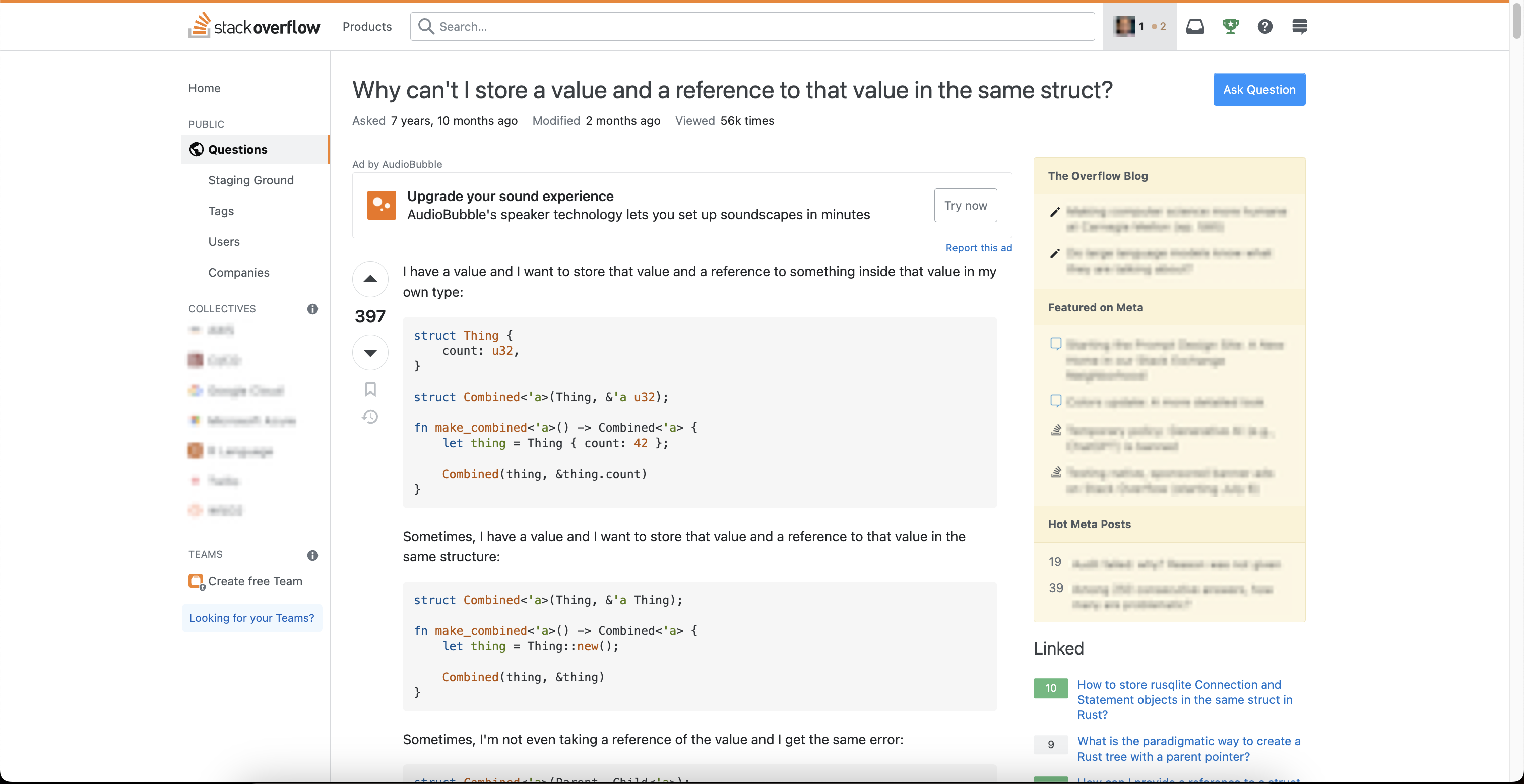
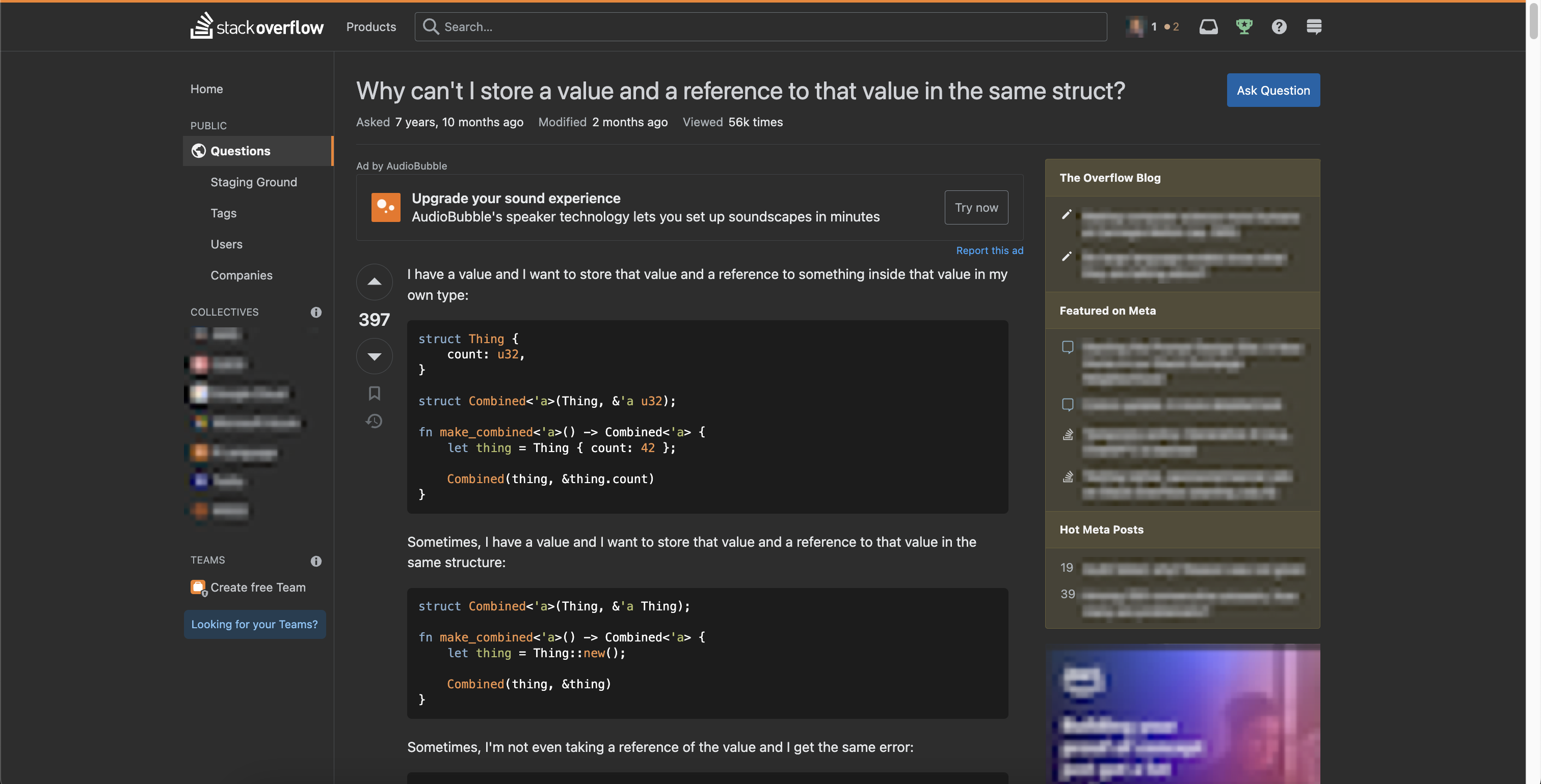
Here's what the new design looks like:

Light mode:

Screenshot of a question page using the light theme, showing a banner ad in the newest style being tested

Dark mode:

Screenshot of a question page using dark mode, showing a banner ad in the newest style being tested


Original post:

We will be conducting a trial for a new ad format on Stack Overflow. The trial will start on July 6 and will run for approximately 3 weeks. The ads will be running worldwide and visible to all users.

These ads will be shown in the same placements you currently see banner ads, and are not an additional ad being added to question pages. (In other words, the existing banner ads in these locations will, for the duration of the trial, some times be replaced with this new type of ad. The existing banner ads are provided by a client, need to abide by our ad guidelines, and undergo an internal approval process, but their designs can vary drastically from one ad to another. The ads with the format being tested will have a more consistent, unified theme.) These ads will also be subject to the reduced ads user setting, as this setting is tied to the ad slot, and not the ad type.

They will take some cues from the site's style, but are still clearly marked as being ads:

  • They'll have a "Ad by COMPANY" on the ads' top left corner;
  • They'll have a "Report this ad" link on the ads' bottom right corner;
  • The ads' call-to-action button will never feature a prompt in the form of "ask," "answer," or anything along those lines that could lead users to think they'd be interacting with the site's main experience when in fact they'd be interacting with an ad.

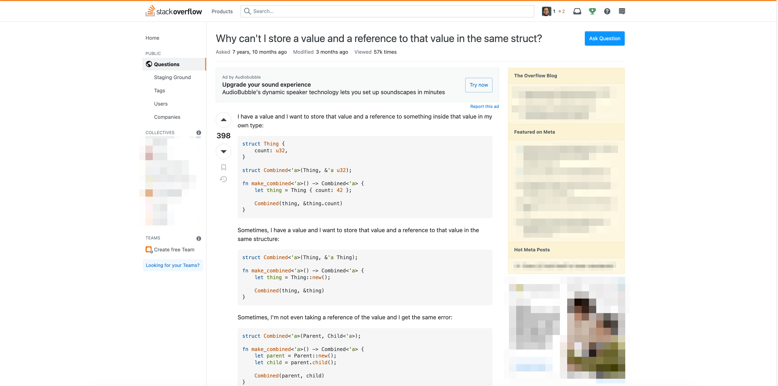
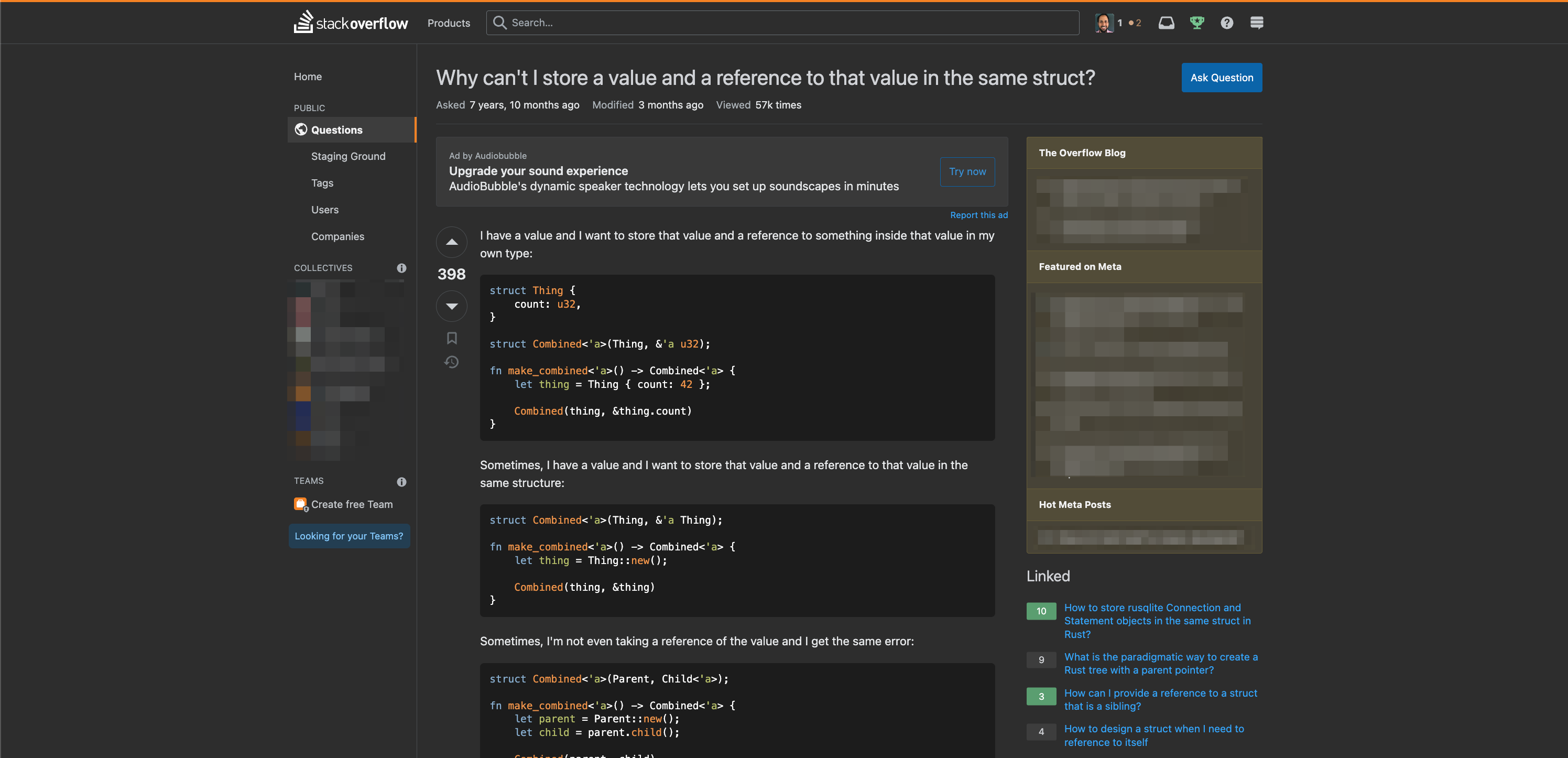
Here's what they'll look like:

Light mode:
Screenshot of a question page using the light theme, showing a banner ad in the new style being tested

Dark mode:
Screenshot of a question page using dark mode, showing a banner ad in the new style being tested

Please note that the current iteration of this project has already been built as of this announcement. Therefore, it is probably too late to change anything for the upcoming trial. However, we are still interested in getting your feedback (as an answer below)! During the trial period, we'll be monitoring the new format's performance, as well as any bug reports and other feedback about the design that we get from the community.

Once this trial is over, we'll be determining the next steps based on y'all's feedback, as well as the new format's performance (including any reports of user feedback). Any feedback provided now will be weighed in potential future revisions of the native banner ad format. Whether we decide to keep the new format or retire it, we'll keep you looped into what our thinking on next steps is.
18
  • 86
    Again? Not asking for feedback? "Please note that the current iteration of this project is already built as of this announcement", no wonder why the strike is stil going. Keep up the good work.... And please tag accordingly, there is no [discussion], it's just another [announcement].
    – 0stone0
    Commented Jun 29, 2023 at 14:29
  • 41
    Wow. That looks extremely annoying. Commented Jun 29, 2023 at 14:32
  • 28
    Why have you blurred so much text in the screenshot? Did some of the HMP/featured posts happen to be about the strike? Commented Jun 29, 2023 at 14:36
  • 15
    @0stone0 This new format is not being rolled out as a full feature at this point, as the post highlights, and will be undergoing a trial period. For that reason, we are asking for feedback — that's what this question's doing. As such, the tagging also feels appropriate to me (additionally, there are a group of mandatory tags, of which [announcement] is not a part).
    – JNat StaffMod
    Commented Jun 29, 2023 at 15:50
  • 20
    @AndreasdetestsAIhype It's not uncommon to blur parts of an image when showing a preview of something, to ensure the focus is kept on the bits we're announcing, and not on, say, a user avatar ;)
    – JNat StaffMod
    Commented Jun 29, 2023 at 15:52
  • 11
    Can't wait to update my 'uBlock' Filter (already handling the annoying Red Dot for the Review Queues + Sticky Navigbar)…! Oh!, I had to disable 'uBlock (Origine)' to be able to see one of the current Ads (about "Stack Overflow for Teams") which was already "naturally" blocked because of the googlesyndication.com URL… Will the "new" Ads also be hosted on that same Domain, or on some "internal" SO/SE Server…? // The "Report this ad" Link is also already outside the Block, and it's clear that it belongs to the Ad
    – chivracq
    Commented Jun 29, 2023 at 16:32
  • 3
    Same domain, @chivracq
    – JNat StaffMod
    Commented Jun 29, 2023 at 17:43
  • 25
    Can you please provide a screenshot of the ad placement on a closed and locked question? I have concerns the ad will look too similar to post notices.
    – Samuel Liew Mod
    Commented Jul 1, 2023 at 9:04
  • 4
    can't wait for my adblocker to update. I know you have to make money to maintain the company but really ? ad like that is so 2000-2010. found something else. no one like ad.
    – Stargateur
    Commented Jul 3, 2023 at 11:13
  • 2
    @AndreasdetestsAIhype I will list the articles they tried to blur: Overflow Blog: >How Bloomberg’s engineers built a culture of knowledge sharing >Making computer science more humane at Carnegie Mellon (ep. 585) Featured: >Starting the Prompt Design Site: A New Home in our Stack Exchange Neighborhood >Colors update: A more detailed look >Unreadable :( >Temporary policy: Generative AI (e.g., ChatGPT) is banned Hot Meta Posts: >Moderation strike: how is the discussion going between the moderators and Stack Overflow, Inc? >Unreadable :( Commented Jul 3, 2023 at 15:10
  • 7
    I laugh, because I use Firefox w/ AdBlocker Ultimate, and I've never seen an SO ad in my life... Commented Jul 3, 2023 at 15:13
  • 13
    @0stone0 As much as I don't like ads, let's be real. No company (of a significant size) will ever asks its users for a permission to make money with ads. Commented Jul 3, 2023 at 20:08
  • 11
    I personally hate the placement and design of these ads, but thanks for engaging and patiently addressing objective feedback @JNat. It's much appreciated. Commented Jul 3, 2023 at 21:26
  • 10
    Thanks for actively engaging with the people posting answers. Commented Jul 3, 2023 at 21:32
  • 3
    I hope this makes ads on the site less annoying. I think that'd be great! Commented Jul 5, 2023 at 23:19

9 Answers 9

98

The design has been changed to have a white background instead, for the duration of the trial. This option might blend too much into the background, but at least doesn't cause a clash with post notice banners. In future iterations, we may explore other options.


The blue background is not an appropriate design for advertisements. The Stacks design system calls these "Notices", which "deliver System or Engagement messaging, informing the user about product or account statuses and related actions". Advertisements about unrelated products do not provide information about this product (Q&A) and so should not be displayed as if they were informational notices inserted within the content area.

Practically speaking, these ads will look too much like the "locked", "protected", and "closed" notices which are displayed by the system as blue banners above the post.

You need to pick a different style. Frankly, I'd urge you to pick a different style before the trial starts. I realize that the infrastructure has already been built and changes are meant to be deferred, but this is a minor change to the styling. And it is a critical one.

Blending in with the page's normal content is not a good thing for banner ads. Not for us, and not for the advertiser.

I'd recommend the classic black border with a white interior. Failing that, perhaps the "default" or the "inverted" styles would be acceptable, given that they are more neutral colors. Neither gray nor black are already used by the system for informational notices or warnings.

2
  • 15
    Lemme see what can be done about this. I'd noticed these would prolly clash late last week too, and we were already talking about how to address this.
    – JNat StaffMod
    Commented Jul 3, 2023 at 11:02
  • 7
    Awesome, @JNat; thanks for following up on this! I agree that the white background may not be the ideal solution, either, but at least it's better than blue. I really appreciate you shepherding this through before the launch.
    – Cody Gray Mod
    Commented Jul 5, 2023 at 5:56
85

Aren't these only more effective because they're inherently deceptive by taking on the design of the site and looking like any other feature of the site?

In the end, they're still ads with a sole purpose of fooling users into reading/clicking on them. They aren't there to surface useful information or something that the user might want, they're there to serve a paying partner who want's their product marketed. They'll always be this, whether they're suggesting learning courses or magic AI solutions looking for a problem.

At minimum, though, could we avoid making them look like a banner meant to convey important information? I know that would inherently be more effective than an ad that looks like an ad, but if now we're gonna deal with ad blindness by turning to ads that look like important information banners... what are we going to do to make actually important information banners stand out?

5
  • 6
    I would really like to see some more specific visual cues indicating that this is an ad rather than just "Promoted by X" above the box to cut down on this exact thing. I don't think it has to be "inherently deceptive" per say, but to avoid that it definitely needs to be labelled accordingly.
    – zcoop98
    Commented Jun 29, 2023 at 16:42
  • 3
    Not sure about the feasibility of this solution, but would something like a tooltip that explains more in detail what "Promoted by X" means accomplish that effect, @zcoop98? Did you have any thoughts on what "more specific visual cues" we could test?
    – JNat StaffMod
    Commented Jun 29, 2023 at 16:48
  • 20
    Would an indication more in the lines of "Paid advertisement from X" be a clearer label, for instance?
    – JNat StaffMod
    Commented Jun 29, 2023 at 18:01
  • 37
    Simply "Ad by AudioBubble" or "Advertisement by AudioBubble" would be clearer, too, I think, @JNat, and shorter. "Promoted" just has too many meanings, whereas "advertisement" is pretty obvious. 0stone0's feedback that these buttons should be inside the box, not outside of it, also makes sense to me. And I really dislike the blue background color, as that looks like an "informational" banner that the site is displaying to me (and does display in many cases) about how to properly use the site, some new feature, or whatever. Ads don't generally look like this.
    – Cody Gray Mod
    Commented Jun 30, 2023 at 0:39
  • 4
    Please have a look at the new screenshots — we've made changes to the design so these don't clash with post notification banners.
    – JNat StaffMod
    Commented Jul 4, 2023 at 16:02
66

The wording has been changed to "Ad by COMPANY" instead.


“Promoted by $company” is not appropriate wording. It implies content authored by Stack Exchange that is being sponsored by someone. “Paid advertisement from $company” would make it clear that the block below is an advertisement paid for and provided by a third party.

1
  • 5
    Thanks for the feedback. We're discussing alternative option internally, as per the discussion in the comments here and your feedback ^_^
    – JNat StaffMod
    Commented Jul 3, 2023 at 11:09
53
  1. 'Promoted by' and 'Report this ad' buttons should be inside the box, seems like the question itself is promoted by that company, not the ad

  2. Please rethink the width/alignment, the ad shouldn't be wider than the question/user-box

1
  • 5
    While I understand your concern on 1., I'm also afraid that moving the "promoted by" to inside the box might make it less visible. "Report this ad" is outside of it as it is on any other ad, I believe. Regardless, your feedback was noted and will be kept in mind when we evaluate next steps ^_^
    – JNat StaffMod
    Commented Jul 3, 2023 at 11:08
27

This information has been added to the question body, for visibility.


Will these still be subject to the “disable ads” setting available to high-rep users, or no?

3
  • Where is this setting?
    – holydragon
    Commented Jul 3, 2023 at 3:31
  • 15
    These will be subject to the same setting, yes.
    – JNat StaffMod
    Commented Jul 3, 2023 at 10:19
  • 9
    Have a look at this, @holydragon
    – JNat StaffMod
    Commented Jul 3, 2023 at 10:20
8

As someone who has whitelisted Stack Overflow (the network) from ad blockers, I really hope this change can improve the user experience. I'll try to comment based on my experience with current ads.

2
  • 4
    Slightly controversial view - but these and other purely text ads are the least evil option as far as ads go. And that's what the sidebar ads used to be - so moving to all text ads would probably the best alternative as far as non annoyance goes Commented Jul 4, 2023 at 10:19
  • 3
    Load time should be similar, I'm told.
    – JNat StaffMod
    Commented Jul 4, 2023 at 16:04
7

I've seen a similar anti-pattern on twitter, though 'worse' in many ways. Twitter's ads tend to 'hide' inside post threads.

  • As an adblock user, will these ads be blocked by adblock 'cleanly' or go through. I've less of a problem seeing those than, well adverse interactions with adblock and finding big ugly gaps in my pages.

  • One of the previous issues with 'new' ad formats was they slipped through the quality guidelines. Its probably worth considering how and who clears these ads to avoid embarassment, though I guess you can't get as bad as this

  • As a Moderator on a smaller site, the question of if we'll get these ads and if they will be tailored to the site comes to mind, but that's a problem for future me (and you)

  • With other ads of this nature, in addition to a "report this ad", a "I'm not interested in this ad" would be nice. It feels like a common pattern where I'm getting organic ads, and it improves the experience of ads my adblocker can't quite deal with.

2
  • 2
    I know folks are paying close attention to the guidelines, so I don't expect mishaps on that front — if you see any, though, please report the ad. For now the ads are SO only, but I'm sure the relevance of them for other sites if we end up rolling them out to the network will be subject to the same requirements we currently have for other ad types. Will keep the feedback for the "not interested" for future iterations (not sure we can squeeze that in at this point), and lemme check on the adblock question.
    – JNat StaffMod
    Commented Jul 4, 2023 at 15:57
  • 5
    Just got confirmation that the ads' behavior as it pertains to ad blockers should be the same as it is with the current ads.
    – JNat StaffMod
    Commented Jul 4, 2023 at 16:05
1

I voted it up. 105 downvotes (well, 104 now that I voted it up), really? This site is a valuable resource, and running a web site costs money which has to come from somewhere. They're not even increasing the number of ads, just changing the appearance of ads in locations they already were. They're not obnoxious ads that make noise (the only ones I ever ad blocked), animated, or pop-up ads. I don't see the problem.

2
  • Just FYI, the vote breakdown is currently +38/-141.
    – Andrew T.
    Commented Jul 8, 2023 at 12:17
  • 3
    SO users are ... touchy ... see the latest drama over a minor adjustment to the voting buttons Commented Jul 9, 2023 at 2:09
-1

We will be conducting a trial for a new ad format on Stack Overflow.


I can still block the ads with AdBlocker Ultimate, right?

1
  • See this comment – the ads' behavior as it pertains to ad blockers should be the same as it is with the current ads.
    – JNat StaffMod
    Commented Jul 10, 2023 at 8:50

You must log in to answer this question.

Not the answer you're looking for? Browse other questions tagged .