103

We've updated the sign up hero that anonymous users see on all question pages. It is now a more subtle bar at the bottom of the window. There was a bunch of on point criticism of the prior version as being too big, too annoying and obscuring the most important content. (See here).


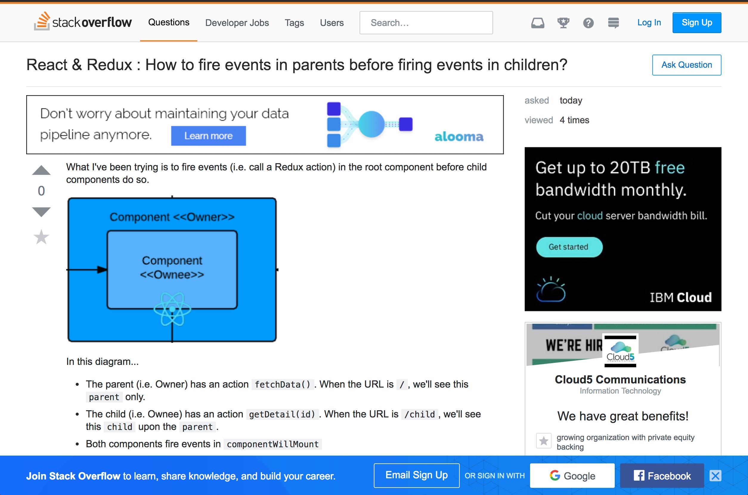
New version

New version; sign up hero on the bottom of Stack Overflow


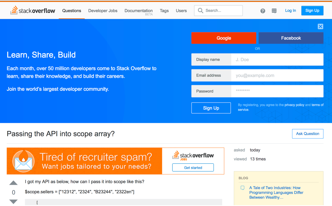
Previous version

Old version; sign up hero at the top of Stack Overflow


A bit of background

In an attempt to move quickly and make improvements (inline sign up) we pushed this huge sign up hero for our anonymous users. We did it first on the home page, where I think the design is appropriate. As we shifted to updating the hero for the Question page, we got focused on a technical challenge. We needed to make it light weight enough that it wouldn't hurt performance on the question page which accounts for the vast majority of our page views. As the focus shifted to this challenge, I never really asked, "Is this a good idea? Is the right design for this experience?"

Once the performance problem was solved, we ran an A/B experiment it and I got excited by the huge gains that the new hero showed (~60% gains) So, we pushed it live. Those huge gains didn't hold up, but they were still significant (low double digits).

However, it became clear that these weren't necessarily "good" sign ups. We weren't seeing the right level of engagement post sign-up. This data along with this community feedback was enough to make us reconsider the approach and make the above change.
18
  • 68
    Are non-web designers supposed to know what a "hero" is? Commented Nov 23, 2017 at 3:09
  • 10
    I am afraid, that Stack Overflow employees are falling victim to selection bias. Neither this one or previous banners are any good. A bunch of shiny, magenta-indigo-orange-red-yellow-colored stuff with offer to "register for amazing goodies"? This is a tell-tale sign of porn/fraud site to avoid. If that stuff have been there, when I started using Stack Overflow back then, I probably would have never registered. What kind of registered users are you trying to acquire with such approach? Commented Nov 23, 2017 at 3:15
  • 3
    @m69 I've never heard the term before in this usage, but upon seeing the post, i'm about 80% sure that a Hero is the stuff that pops up on screens of people who aren't logged in to give them the option to sign in or sign up. Would someone like to correct that assumption?
    – Davy M
    Commented Nov 23, 2017 at 5:04
  • 15
    mumbles something about lack of freehand red circles... Seriously though, thank you! Commented Nov 23, 2017 at 7:53
  • 6
    @m69 it's what Bonny Tyler's been holding out for until the end of the night? ;)
    – Jon Clements Mod
    Commented Nov 23, 2017 at 7:55
  • 1
    @user1643723 it is probably important to keep in mind that this stuff attempts to attract users to register at jobs, not at Stack Overflow (whatever kind users they get registered at jobs, I honestly don't care because it's not Stack Overflow)
    – gnat
    Commented Nov 23, 2017 at 8:29
  • 4
    This looks like a reasonable compromise between "public" interest (having a freely accessible question & answer archive) and business interest (maximizing the number of registered users for Jobs and other shenanigans).
    – Pekka
    Commented Nov 23, 2017 at 8:35
  • 2
    I'd argue that you've replaced the "Hero" with a "Call to action" (I knowz the lingoz)... I little bit of me just died.
    – Liam
    Commented Nov 23, 2017 at 11:36
  • 7
    Good. Hero images should die a fast death. I don't care whether big site X uses it or whether popular UX blogger Y blogged about it, they're annoying as hell and take away screen estate for nothing.
    – CodeCaster
    Commented Nov 23, 2017 at 12:55
  • 1
    There is still so much garbage on the site. Thankfully adblockers make quick work of it.
    – nwp
    Commented Nov 23, 2017 at 13:51
  • You missed a spot (the front page still has the huge obtrusive and confusing version). I know it's on purpose. And I never use SO logged out. It just irks me to know it's there. Commented Nov 23, 2017 at 14:02
  • 3
    “Email sign up or sign in with Google / Facebook” – Are those sign in with Google or Facebook really sign-ins? I remember something about last time where this prompted you to create a new account and this wasn’t an actual login for existing users.
    – poke
    Commented Nov 23, 2017 at 14:27
  • 5
    s/sign-up hero/sign-up prompt/g to make the post more readable for non web developers… (and less eye twitching for people who know that the new thing is not a hero banner…)
    – poke
    Commented Nov 23, 2017 at 14:30
  • 1
    "build your career". Whoa there, the truth is more that you don't break your career ;) The building part you still have to do all on your own.
    – Gimby
    Commented Nov 23, 2017 at 15:49
  • 1
    @AndrewT. I can’t find the exact comment in the old thread right now, just this one, but from what I remember, I think people said that clicking log in there with an existing account would lead them to jobs instead of staying on QA.
    – poke
    Commented Nov 24, 2017 at 8:51

3 Answers 3

58

Thank you.

Seeing a giant banner at the top of Stack Overflow while I had the displeasure of being signed out at work (for legitimate reasons) was probably one of the most frustrating things I've seen. I'm extremely happy that this change has been taken on board.

That said, I do hope that this also means that the amount of "good" sign-ups increases substantially.

1
  • 3
    I think your "Thank you" is too subtle, I suggest you make it larger and CAPITALS... Commented Nov 23, 2017 at 14:30
30

This is a welcome change! Kudos :)

But the banner seems to be hindering the website footer:

enter image description here

Thus partially hiding some of the footer elements and links. I can see the banner is some kind of an overlay, though clicking [x] resolves it.


I hope the same change might get implemented(in the near future) for the SO Homepage's banner.

1
  • 28
    Oh wait, there's a footer on this site? Commented Nov 23, 2017 at 10:48
-5

It is nice to see a clean page rather than a giant blocking me screen.

The footer could be made transparent to see the footer or more fluid and stays on one part of the screen. Also, the Stack Exchange login could also be enabled.

You must log in to answer this question.

Not the answer you're looking for? Browse other questions tagged .