15

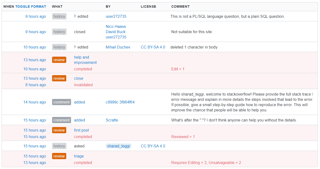
Yesterday, the timeline would have looked like this:

No border between the rows of related review events.

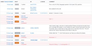
Today, I went to check the timeline of a post, and this is what I saw:

Related review event rows now have borders between them and there seems to be less padding so text is closer together.

…and it just instantly made me very tired.

Now, it's not only cramped up. Multiple "red" events are harder to tell apart. It's not obvious if the "Edit x 1" belongs to the line above or below it.

So, yet again, I spent time fixing a UI change on my own system by fiddling with CSS and user styles. This was time taken away from actually doing something useful on Stack Overflow (I'm no CSS guru, so it's really a lot of fiddling on my part).

Taken together, all of these recent changes to the UI (User Interface) are, in my opinion, demotivating. I'm starting to feel frustrated that these changes are rolled out with minimal testing, and it's starting to feel like busy work for me to fix them on my end.

I didn't really review today. I don't even feel like going back doing it tomorrow.

I'm not trying to be mean, and I do appreciate good changes, but it does feel like stuff is pushed without being tested or reviewed.

Please revert it.
1 Answer 1

16

I’m working on behalf of the design system to ship some improvements to tables that will make them fully responsive (traditionally a pretty tough problem in the ol’ CSS world), and more accessible. In this case, this means applying overrides to the td instead of the tr. As you can imagine, Stack Overflow is a pretty big codebase, with many different applications of tables. Some entire layouts are built with tables, complicating things even further.

We’re going to revert these changes for now and try to scope them to just the tables that need to be responsive. But here’s the problem, every table needs to be responsive. It’s tricky. Product design is tricky.

This is why we have version control. We have some visual regression testing, but that assumes we have properly-formed markup, and often only tests scenarios that are closer to ideal than reality.

We’ll get it fixed up. Enjoy your weekend!

4
  • 1
    Thank you for your quick response. I almost can't wait :) (P.S. I plan to post about the over sized blue boxes telling me what I can't review in the review overview page too. I changed them to this on my own system)
    – Scratte
    Commented Jul 25, 2020 at 0:10
  • 1
    @Scratte Related MSE post: meta.stackexchange.com/questions/351195/…
    – janw
    Commented Jul 25, 2020 at 8:14
  • 3
    @janw Thank you, but that post is so not focusing on the right thing ;)
    – Scratte
    Commented Jul 25, 2020 at 8:36
  • Oh, my bad. It's caused by a userscript. Not your fault. I'm going to remove the comment.
    – Cody Gray Mod
    Commented Jul 27, 2020 at 23:18

You must log in to answer this question.

Not the answer you're looking for? Browse other questions tagged .