42

I came across this blog post that did analysis of the most popular times and days to post on Reddit, and had the idea to try it myself for SO. I parsed roughly 2 years worth of XML data from the archive, grouped the data by time and day of posting, found the averages for the scores and views for each time, and graphed the results using Incanter as a heat-map.

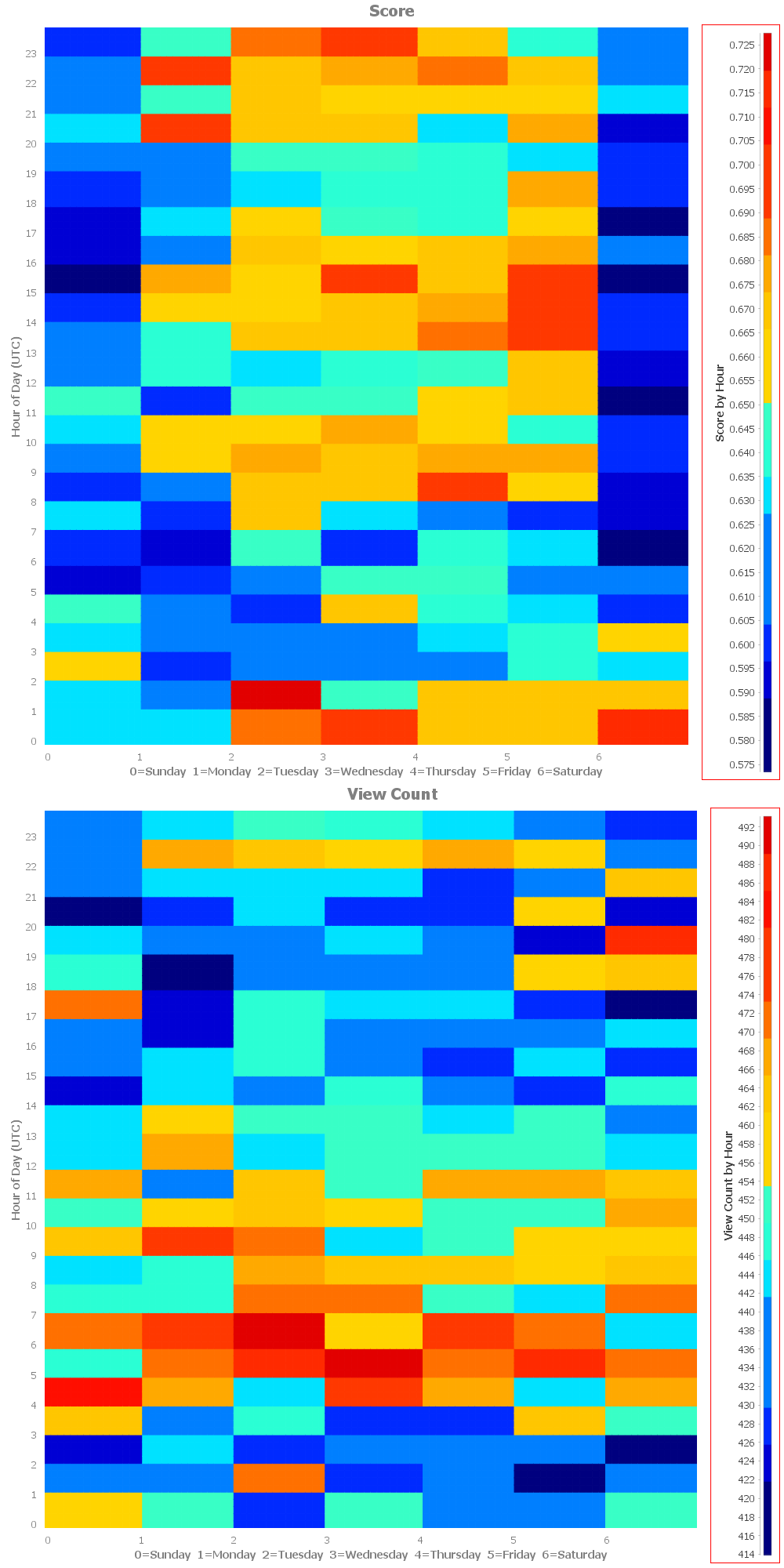
I thought I'd share the results here. The below images show the mean score and view count that questions achieved, grouped by the day of the week and hour (in UTC) that the question was posted:

Colorized Scores and View Counts by Hour and Time of Day

Please excuse the x-axis labeling. It's proving abnormally difficult to fix.

Some interesting things:

  • The score chart is somewhat opposite of the Reddit results. Reddit posts have more success when posted on the weekends, whereas SO posts seem to do much worse on the weekends.

  • Views however seem to depend more on time of day than on the day of the week.

  • ... which means the views to a question don't necessarily correlate with the score of the question.

And some things to note:

  • View counts are not adjusted for question age.
  • The post hour is the result of rounding. 15:29 would become 15:00, while 15:30 would become 16:00.
  • The data is, as mentioned above, supplied by Stack Exchange's archive of dumped data, which indicates the state of the site as of roughly 2018-12-02 04:52:10.250 (the time of the last included post).

Obviously, this information isn't quite as useful as it is on Reddit unless you're really willing to withhold asking until a particular time. I still thought that it was interesting though.


It should be noted that I only included data:

  • with a PostTypeId of 1 (questions).
  • posted on or after 2016/01/01 00:00:00, and up to the date of the data dump (2018/12/02). I figured data more than a few years old is less relevant to now.
  • that wasn't deleted, since I don't have access that information.

Here's a simpler black and white version for colorblind people like me, and those who want a less noisy representation:
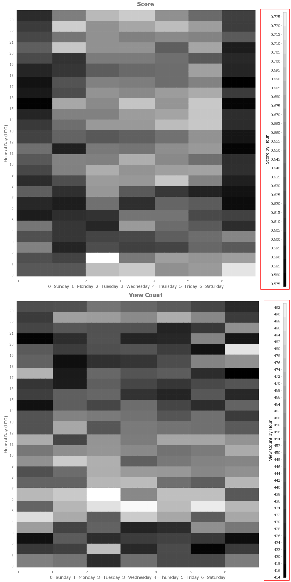
Grey-scale Scores and View Counts by Hour and Time of Day

23
  • 19
    Heh. I guess I'm not the only one who spends too much time on SO while I'm at work...
    – Comintern
    Commented Mar 1, 2019 at 4:23
  • 3
    If you swap hour/day you can have a wider heatmap with a way smaller height, that can fit nicely in a laptop/desktop screen (I'm thinking about something with these proportions, for instance). On top of that, it would allow an easier comparison between hours in different days (by just moving the eye up/down). Commented Mar 1, 2019 at 4:25
  • @GerardoFurtado That should be trivial to change. I can try that tomorrow. Thanks for the suggestion. Commented Mar 1, 2019 at 4:32
  • @Carcigenicate if SO had a API for retrieving that data (or if we had it in a JSON/CSV somewhere) we could show that heatmap live, using JS in the Stack snippet! Commented Mar 1, 2019 at 4:34
  • 2
    @GerardoFurtado It actually does have a usable API. I could make a live version fairly easily with the code I've already written. I figured a long-time-span version would be more interesting though, and the API is impractical to use when gathering data over the span of a couple years. Commented Mar 1, 2019 at 4:37
  • Also, the request/day limits of the API would limit how often a "live" result could be generated. Commented Mar 1, 2019 at 4:39
  • 2
    @Carcigenicate Another idea: I'm seeing that you have UTC hours, but it's hard to understand how does that translate to each user's hour (for instance, why so many views at 5am? Are people insomniac or is that because 5am UTC is late night in US?)... so, what do you think about a small multiples of heatmaps? Something like what I did here. You could create a small heatmap for each country. That way you can have local time in each heatmap, allowing us to really see the differences in different countries. Commented Mar 1, 2019 at 5:15
  • 2
    @GerardoFurtado I concur. UTC is the normal way of displaying time on SO; and this way there are just two graphs. 'Shifting' the graph for each timezone is an unnecessary replication of data. A simple table/additional y-tick to tell people about 'noon in Europe' would be sufficient I'd say.
    – Adriaan
    Commented Mar 1, 2019 at 15:04
  • Well, my point is that aggregating all the data in a single heatmat using UTC doesn't tell us how the user behaves, it just tell us how the site as a whole behaves: a give hour may be more red just because a given country with a big population is more active at that time. On the other hand, creating small multiples (by country or, as an alternative, by time zone) would really tell us how the users behave. Commented Mar 1, 2019 at 15:08
  • 2
    @GerardoFurtado I still beg to differ. You'd get a map of how the world behaves at that certain moment, unless one can discern visitors based on their location (which only the devs can afaik), so you'd simply shift the map, as I said. Carcigenicates idea of adding noon in a few 'key places' (however one may choose those) is much more useful imo.
    – Adriaan
    Commented Mar 1, 2019 at 15:18
  • 1
    @anatolyg No, it's showing the number of views that a question ended up with at the time of archiving, sorted by the hour the question was posted at (rounded). The view counts are not adjusted for the age of the post. Older questions will have more views, but that shouldn't matter. If I had tried to group posts by month of posting (which I was originally going to do), January would be skewed since it's had more time to gather views. The effect over a single week should be negligible though. Commented Mar 1, 2019 at 17:28
  • 1
    Are the questions archived at some specific point in time, like 2 days after posting, or on each Wednesday? It seems to be common knowledge, but some people don't know it. You might want to specify in your post what exactly the numbers mean.
    – anatolyg
    Commented Mar 1, 2019 at 22:46
  • 1
    @vestland Are you referring to the color scheme? That's the default. I only figured out how to change it after I had created this. It's actually a hardcoded list of 3-tuples representing the colors, so I don't think it's a named scheme. I could play around. I'm actually not a fan of the one I used here since I'm red/green color blind, but I figured that wouldn't be a big deal for most other people. Commented Mar 3, 2019 at 22:25
  • 1
    @vestland I generated a simple BW one. See the bottom. It's definitely easier for me to differentiate close colors now. Commented Mar 3, 2019 at 22:50
  • 2
    @vestland I posted it on r/dataisbeautiful this morning. Commented Mar 3, 2019 at 22:58

0

You must log in to answer this question.

Browse other questions tagged .