49

Last month we kicked off our monthly series of regular, bite-size, data-focused updates for Meta. Thanks to all who contributed to the discussion and suggested ideas for upcoming analyses.

One topic many people were particularly interested in hearing about is recent change to improve how welcoming Stack Overflow is; let's take this month to look at this issue a bit. Internal teams at Stack Overflow have been working on many projects related to how developers engage here but let's focus on two events:

Notice that the blog post is a statement of values that did not involve any product changes, while the CoC launch (while also a statement of values) did involve product changes. When the CoC launched, we updated options for comment flagging, including adjusting flagging reasons and allowing all users to flag comments on their own post.

What kind of impact can we measure from either of these events? First off, let's walk through a (non-exhaustive) list of quantities that don't exhibit any change over the past year, through both of these events.

  • The proportion of questions that are of good quality, and the proportion of questions by new users (Rep < 111) that are of good quality
  • The proportion of questions that are closed
  • The number of comments ever posted per question
  • Voting patterns on questions (proportion of questions with positive or negative votes)

We do see changes in flagging patterns since August, but that is expected since more people can flag in more ways since the launch of CoC.

WOW, not so interesting, right?! This is all largely good news for us, though. These changes/events were not disruptive to how Stack Overflow functions overall.

Voting patterns on answers are slightly different. First, let's take a look at the trend for answers that have a positive score.

enter image description here

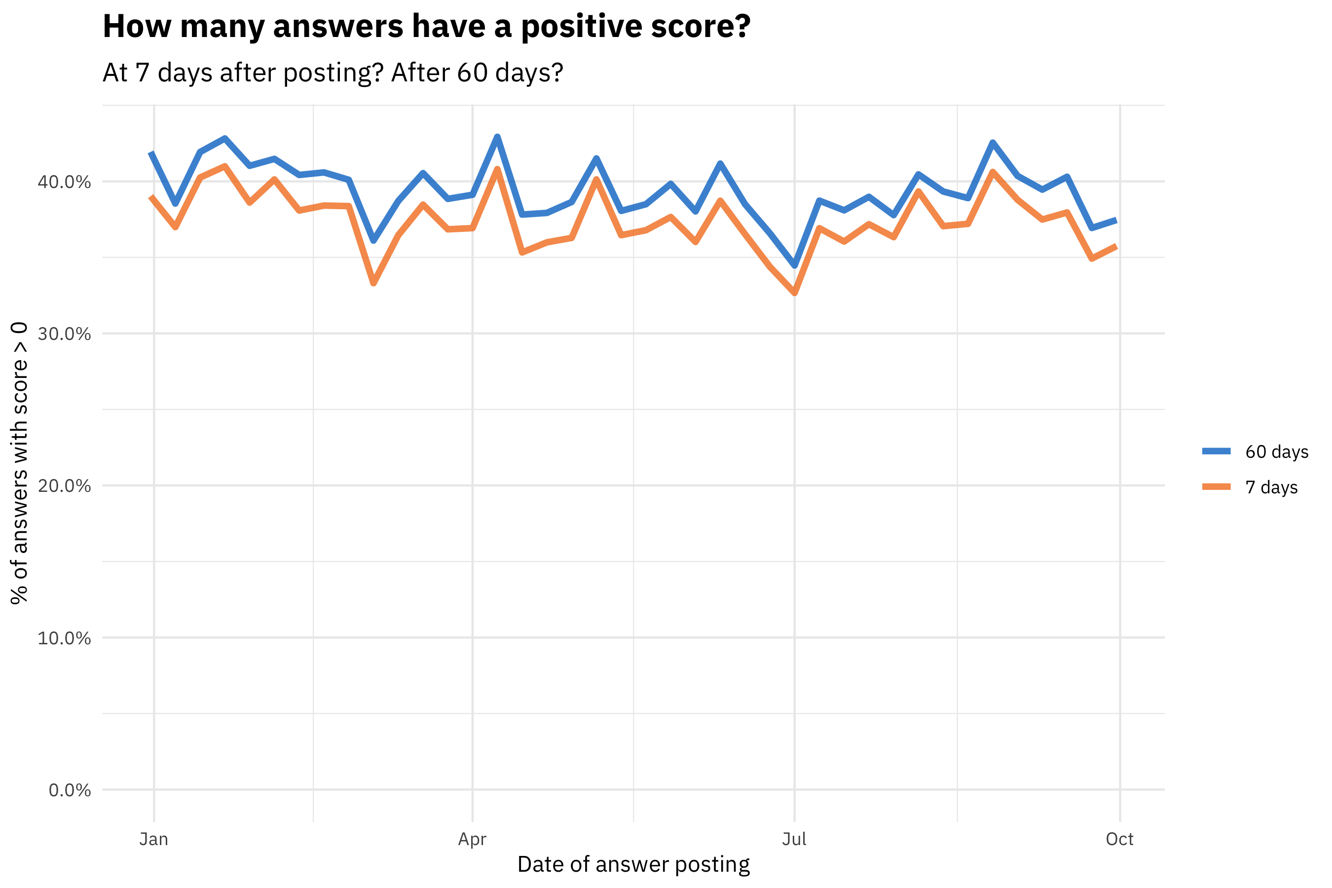
This plot shows, since the beginning of 2018, what proportion of answers have a positive score at 7 days after posting, and at 60 days after posting. The trend is overall mostly flat, indicating no significant change over the year (this is what the plots of the other quantities I mentioned above look like as well). See how the line for 60 days is shifted higher, indicating that more helpful answers are discovered by 60 days than are found by 7 days.

Next, let's take a look at answers that have a negative score.

enter image description here

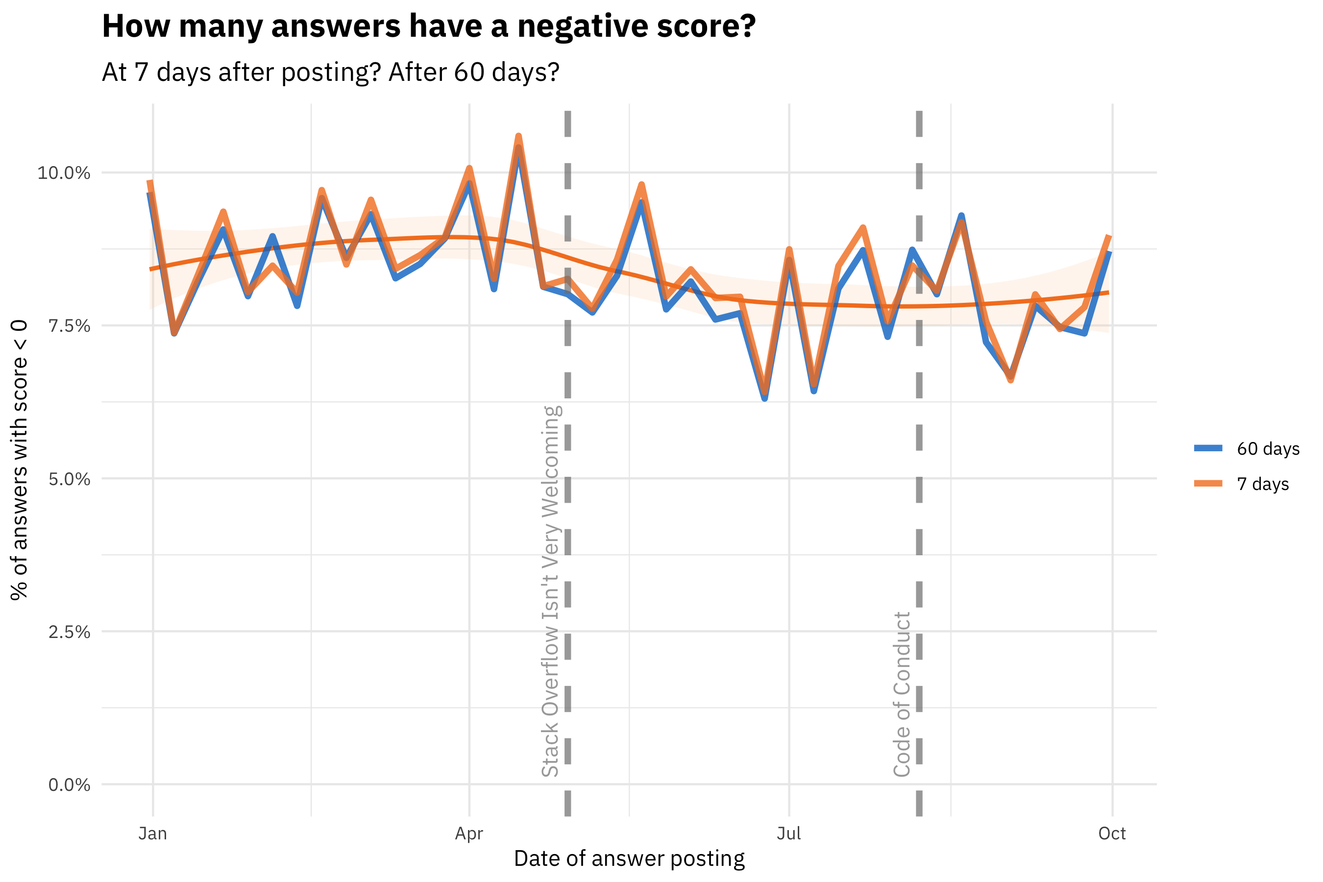
There are several differences for the answers that have a negative score, compared to the positive ones. There isn't much difference between 7 days and 60 days after posting, indicating that new unhelpful answers aren't being "discovered" or identified the way new helpful answers are. Also, the overall proportion is much lower; more questions are identified as helpful through a positive score than unhelpful through a negative score by about 4 or 5 times.

Why I chose to include this analysis is that we can see some evidence of change with time here. The proportion of answers with a negative score appears lower after Jay's blog post than before. How much lower? Using a t-test, about 1% lower, dropping from about 9% to about 8% (p<<0.05).

The p-value says this is unlikely to be a random effect, but let's think about this a little more. I did just tell you that I looked at a lot of different metrics on Stack Overflow, which means we should worry about multiple comparisons. On the other hand, this small shift is robust to subsampling approaches. I think it's likely to be real.

So what does a small shift in answer downvoting like this mean? Is it good news or bad news? I am quite confident that opinions will differ, but paired with the lack of change in answer upvoting, question voting, question quality, question closure, etc. I mostly find it interesting that we can probably measure a change in site behavior from a public statement of values alone. These types of metrics are only a few of the ways we are working to understand and quantify the impact of decisions, and we can share more, if there's interest.

That's this month's slightly-more-than-bite-size data science time! Thoughts? Do you have topic ideas for future data science explorations?
26
  • 33
    re: downvoted posts: How many "first downvotes" were accompanied by a comment? That seems like a more useful datapoint indicating "welcomingness" than the score alone.
    – Vogel612
    Commented Dec 11, 2018 at 18:07
  • 27
    Can we assume this data includes deleted answers / answers to deleted questions?
    – Shog9
    Commented Dec 11, 2018 at 18:29
  • 16
    @Shog9 Yep, this includes deleted answers, and what I said about comments includes deleted comments, and so forth.
    – Julia Silge StaffMod
    Commented Dec 11, 2018 at 18:53
  • 9
    About the second graph, isn't it a bit strange that the yellow line is (mostly) above the blue line? Does this mean that some answers have initially a negative score, and as time passes they become positive? It is like the tag followers dislike some answers, but then the googlers that find the answers find them helpful and their score balances out...
    – user000001
    Commented Dec 11, 2018 at 19:03
  • 6
    I'd be curious how often over a much longer time period the proportion of answers with a negative score has shifted by a comparable amount without any obvious reason or trigger.
    – joran
    Commented Dec 11, 2018 at 19:31
  • 1
    In the plot analyzing answers, could you mark the two events you highlight at the next plot? Could you share the exact p-value and the odds-ratio? Also how did you make it: comparing the mean before and the mean after the event? It seems like the number of answers with a score different from zero is decreasing. What are the absolute values ?
    – llrs
    Commented Dec 11, 2018 at 19:32
  • 1
    It's also unlikely to be a random effect since stackoverflow.com/site-analytics shows a 20% decrease in downvotes at the end of april, which is consistent with fewer negative scores. I'm just surprised answers are affected more than questions.
    – sth
    Commented Dec 11, 2018 at 19:33
  • 1
    @sth I would say that this graphs analyzing voting trends should be on answers and questions, instead of just answers. Parteto says that 20% of the users cast 80% of the votes. A single critic user quitting may explain differences.
    – Braiam
    Commented Dec 11, 2018 at 19:35
  • 6
    Heh, I wonder how many SO users thought the [welcoming] campaign was about questions. The only really obvious affect it had was on the number of downvotes, dropped by ~16%. Answers might be slightly affected by that drop, most DVs are applied to questions. At arm's length, the total question volume dropped a bit faster than normal, making the average number of answers/question increase. Until November, the end-of-semester assignments are always rough. Commented Dec 11, 2018 at 19:48
  • 4
    @user000001 Answers sometimes improve over time, but rarely get worse over time. I assume that this is what happens: someone posts an answer worthy of downvotes. It gets downvoted. It gets edited to be worthy of upvotes. The original downvoter(s) don't retract their votes. Over time, people find the (now helpful) answer through google, and upvote it. At some point between 7 and 60 days, this is enough to turn it from < 0 to >= 0. Commented Dec 11, 2018 at 21:00
  • 68
    Can you post the same graph for previous years? The "isn't very welcoming" thing coincides well with end-of-semester for college - possible confounding variable.
    – Undo Mod
    Commented Dec 12, 2018 at 5:30
  • 8
    "This is all largely good news for us, though. These changes/events were not disruptive to how Stack Overflow functions overall." My initial reaction was a bit different. I would have expected an effect (any effect), otherwise why do it at all. I still hope there was a positive effect. Commented Dec 12, 2018 at 13:44
  • 6
    Your definition of "good question" is still fundamentally flawed.
    – jpmc26
    Commented Dec 12, 2018 at 19:34
  • 4
    @DanHulme or it means less people care about categorizing questions properly now so we're flooded with more low quality then ever before and the people who care enough to downvote it have reduced. I'm not sure how this dataset makes a statement about either.
    – Magisch
    Commented Dec 13, 2018 at 10:22
  • 6
    @jtlz2 The blog post resulted in more meta posts than I can count and seemingly endless pages of meta debate (not to mention various high profile users leaving or threatening to). I'm not sure I could have missed it if I was trying to...
    – mbrig
    Commented Dec 13, 2018 at 23:27

5 Answers 5

84

What makes you think that post quality has any relation to the CoC changes in the first place? Voting should hopefully reflect post quality and nothing else. While the CoC changes were almost exclusively about the content of comments, once a question has already been posted.

Voting patterns change over time regardless of blogs and CoC. It is well-known among veteran users that SO has a dip in quality whenever schools start or have exams. It seems to me that the negative score graph is mostly a graph over when most schools have vacation. Turns out that's in the summer. A comparison against previous years is obviously needed.


Overall, I would like to see more use of the scientific method. Establish a hypothesis, explain why it is a sound one to begin with, then describe why the methods to verify it make sense. Question your own hypothesis and results, apply critical thinking.

It gets tiresome when SO keeps publishing what's actually just loose theories as "science". Some of the past articles like for example the "every programming technology older than a few year is in decline" were very poor, because it looked at percentage of total rather than amount of questions asked. Yet people don't question them but keep spreading them over the internet as facts.

If you call yourself scientist and these publications science, then prepare to be judged by the quality standards you have set yourself.

What is for example the rationale for using a scale with 1.5 months per square in a graph? What does 7/60 days after posting relate to in the graph - does it show the score of the post 7 days after it was posted? As in, what we see for July 1st actually happened June 23th and May 1st? Or is it showing score of what the post posted at July 1st would get in the future? It would seem that the second version is true? A bit confusing. At any rate, I'm having a hard time applying 7/60 days units to the 1.5 month scale, to for example determine if the post time was made 60 days before school exams.

6
  • 1
    Instead of comparing it against previous years, I'd like to see it in the context of month-to-month variation against perhaps a whole year. Is there a spike in variation in the amount of downvoted answers, or is this within normal month-to-month variation? Because there certainly is month-to-month variation, and using a T-test with the sample size Stack Overflow provides, it will nearly always be a significant difference.
    – Erik A
    Commented Dec 13, 2018 at 12:46
  • 29
    This hits the nail on the head. One of the first things I learned about statistics is that correlation does not imply causality. This question boils down to "here is a correlation, any speculations on the causality?"
    – Comintern
    Commented Dec 14, 2018 at 2:18
  • 4
    Take for example the article where every programming technology older than a few years was described to be in rapid decline, while all new ones were becoming increasingly popular. They came up to this conclusion by looking at the percentage of questions asked on SO, as a metric for popularity. While the truth was that more questions were asked about pretty much all technologies, old ones and new both gaining in popularity. With the difference that the newer ones took up a percentage once invented, at the cost of already invented ones. The study wasn't scientific but harmful.
    – Lundin
    Commented Dec 14, 2018 at 8:07
  • 1
    I obviously disagree with your assessment of our work, but I want to clarify what you brought up about what the lines in the graph are communicating. This is marked on the graph, but just to reiterate, the x-axis of each graph shows the date answers were posted, and the lines show the proportion of those answers that have a positive/negative score 7 days after posting or 60 days after posting.
    – Julia Silge StaffMod
    Commented Dec 14, 2018 at 18:42
  • 2
    @Comintern it's "Correlation does not imply causation". Causality is the principle that every effect has a cause, and every cause has an effect. Causation is the relationship between the cause and the effect.
    – user4639281
    Commented Dec 14, 2018 at 20:20
  • 3
    I doubt we will come to a consensus here on what exactly the discipline of "Data Science" is, but I think it is safe to say, it is not used in this posting. All I see are two queries run and then ruminated on. A Data Scientist this does not make - just an curious Analyst.
    – MikeTeeVee
    Commented Dec 18, 2018 at 9:17
24

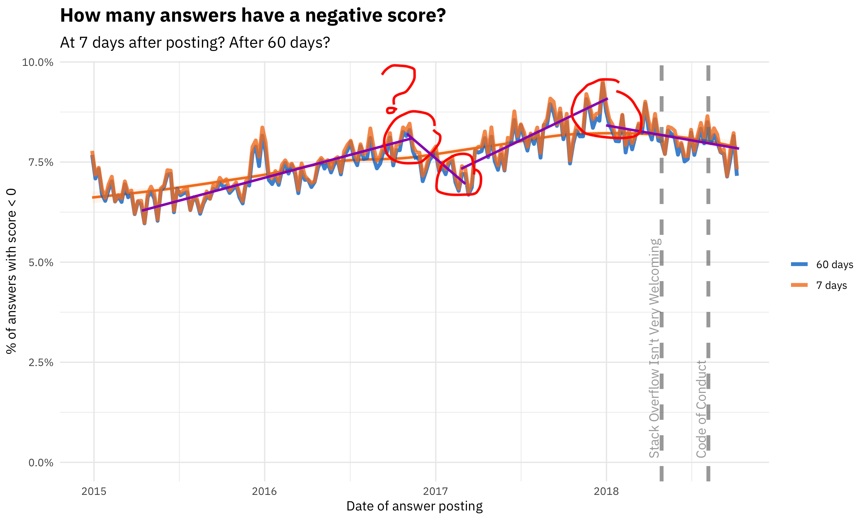
The fitted line in the graph over 2018 in the OP doesn't match at all the fitted line in the same data over a 4-year period shown in this answer. Which one should be believe?

To find out, I did some high-tech data fitting, and come to totally different conclusions:

Julia's plot with manual annotations

Something big happened October 2016 through March 2017 that caused a change in voting patterns! And what happened at New Year's Eve last year???


The comment above is obviously tongue-in-cheek, but serves to point out that trends in time data depend very much on interpretation and on the choice of start and stop points. Unless there is a hypothesis to test, such trend lines can be highly misleading. For example you can prove there is no global warming by picking just the right start and stop dates.

2
12

"One topic many people were particularly interested in hearing about is recent change to improve how welcoming Stack Overflow is"

Not very much for screenreader users.

Meta Stack Overflow Not Using Alt Attributes

10

The post listed a series of proportions that were not affected by these changes. These are of course important metrics, but I think they tell only part of the story. The other part would be to look at actual numbers indicating the volume of activity (e.g., number of questions, number of answers, number of new registered users, etc.), compared to the general growth trend.

Presumably, an increase in this growth (above the current trend) would indicate that users are encouraged to be more involved, and a decrease would indicate that the existing userbase found this change unwelcome and dialed back on their activity.

Were such numbers looked at?

1
  • 1
    Those are also interesting numbers to see; maybe a good idea for a future one of these posts.
    – Julia Silge StaffMod
    Commented Dec 14, 2018 at 18:55
0

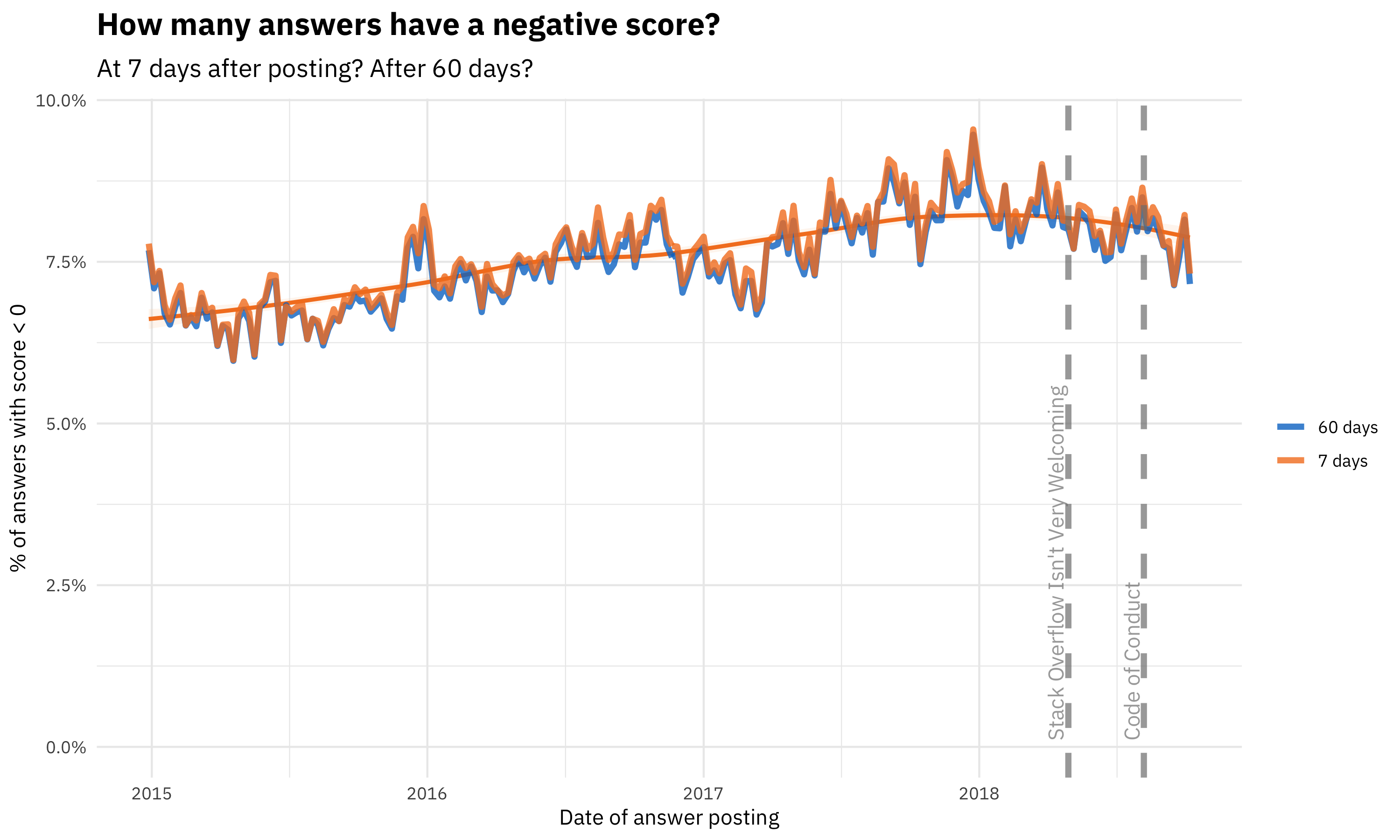
Thanks to all for your comments and discussion. One great point brought up in a couple of ways was how much these proportions vary over longer periods of time, and how surprising a shift like this is.

enter image description here

You can see here that there was a long-term trend toward higher values of this proportion of answers with a negative score, and it appears there may have been an inflection point this year. Week-to-week variation is also high.

Like I said in my original post, we can't be sure these kinds of changes are not random but they are some of the important metrics of our community for us to understand and notice in the context of decisions we make.

11
  • 7
    Of course you can't trust your eyes much for statistical inference, but doesn't the inflection point precede The Blog Post?
    – AkselA
    Commented Dec 14, 2018 at 23:30
  • 1
    That looks likely to me too. To be clear, we can't use observational data like this to understand causality like with an A/B test. We want to see if there are changes in important metrics in our community as we make changes and communicate values and so forth.
    – Julia Silge StaffMod
    Commented Dec 15, 2018 at 0:22
  • 7
    The trend line in this graph does something completely different to the one fitted over only 2018 in OP. How do you want us to trust such results? Also, compared to previous years, 2018 is actually pretty flat. Commented Dec 15, 2018 at 5:40
  • 7
    While you state "we can't use data like this to understand causality" you go on to see "we want to see if there are changes in important metrics ... as we make changes". Why else would you do that if you weren't using this data to understand causality?
    – rsjaffe
    Commented Dec 16, 2018 at 22:34
  • 2
    the unkindness in these threads is ironic.
    – worc
    Commented Dec 17, 2018 at 19:54
  • 1
    So you're not sure this isn't random, but using it for decisions nonetheless?
    – DonQuiKong
    Commented Dec 18, 2018 at 10:49
  • 3
    @worc: Pointing out errors and logical fallacies is not unkind. I’d say it’s the kindest thing you can do, as it allows others to learn from their mistakes and grow. The unkind thing to do is to let people keep their wrong ideas in their heads. :) Commented Dec 19, 2018 at 14:14
  • 1
    it's awfully close to "just asking questions" and the condescending tone is pretty obvious. that's the irony. not that there aren't mistakes or flaws to point out.
    – worc
    Commented Dec 19, 2018 at 16:34
  • 3
    @CrisLuengo: I suspect the effect Julia is reporting is random rather than caused by the blog post or CoC. But many of the comments here either imply or outright say that she is bad at her job. The truth is she is an excellent data scientist and offered to publish these posts because she thought meta would be interested in reading bite-sized data analysis. I hope she continues writing them, but I wouldn't blame her if it's not worth the hassle. :-(
    – Jon Ericson Staff
    Commented Dec 19, 2018 at 16:54
  • 1
    @JonEricson, Julia — I hope I didn’t imply that Julia is bad at her job, sorry if I came across that way. I have read some pretty insightful posts by Julia. This post just feels too rushed. A blog post (can I call this that?) should not merit the same effort and attention to detail that a scientific paper requires, yet it is being examined here with the same expectations. :/ Commented Dec 20, 2018 at 3:18
  • 1
    @CrisLuengo: I wasn't thinking of you specifically. It sounds like maybe part of the issue is expectation setting?
    – Jon Ericson Staff
    Commented Dec 20, 2018 at 18:28

You must log in to answer this question.

Not the answer you're looking for? Browse other questions tagged .