122

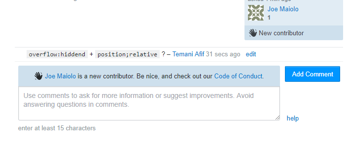
I am aware about this new feature discussed here: Come Take a Look at our New Contributor Indicator!, but I find it somehow intrusive in some cases, especially for comments. I get the banner for each comment I will add to the question which is a bit bothersome.

Enter image description here

I think we should show the banner only for the first comment and avoid the same information to be shown again and again. Also a comment can be a reply to someone else, so it's not necessarily a direct comment to the new user.


PS: I didn't write this to debate/discuss about the feature itself even if I don't like it (it's already done in meta.exchange). I simply don't like how it's intrusive especially in the comment section.
24
  • 61
    Gotta admit, it makes an obvious barrier to trying to help new users, especially for any curator-type feedback. The chances of the poster accepting the feedback positively is extremely low.
    – fbueckert
    Commented Aug 21, 2018 at 22:34
  • 72
    Do we actually need that at all? I feel like attending a basic traffic learning course, after driving without an accident for 30 years now. There are really some feckin' bloomers coming up here. It's just like Yield. Commented Aug 21, 2018 at 22:48
  • 47
    So... It's never about the poster, except if the user is a new contributor?.... Nice to know...
    – Patrice
    Commented Aug 21, 2018 at 22:52
  • 7
    Man panta, I hate your name on my cell lol. When I see learner on the highway I react differently. Which means I react based on the driver. Afaik, in Stack, you shouldn't act based on the poster.... So I feel this notice is weird....
    – Patrice
    Commented Aug 21, 2018 at 23:03
  • 8
    Oh you are cool and I think back to my Greek roots Everytime I see you. You're just tough to ping on an English only keyboard, with no easy c&p lol
    – Patrice
    Commented Aug 21, 2018 at 23:16
  • 5
    @Patrice Yeah, that's much intentional, for making it hard to ping me ;-). Lessons, ya know. Commented Aug 21, 2018 at 23:19
  • 65
    Counter proposal: I think we should show the banner only for the first zero comments. Do people really have a hard time seeing the new contributor banner under the user profile so this is also necessary? For me that is about as easy to miss as a bright flashing light that's shining directly into my eyes, carried by someone shouting on a megaphone. Commented Aug 22, 2018 at 0:00
  • 27
    Look, just because someone is new to SO, does not mean that they are new to asking questions. That's something they've been doing their whole life. If they cannot formulate a question correctly then they should not be asking here. Same goes for existing users with several k rep that still manage to ask horrible questions.
    – JK.
    Commented Aug 22, 2018 at 3:53
  • 6
    @JK.: Very few people ask questions, write titles, etc competently. And the skill of asking questions conversationally, one-on-one, is somewhat different and certainly far less demanding than the skill of asking a generally useful SO question in text. Commented Aug 22, 2018 at 4:09
  • 23
    PLEASE be nice, and remember who read the COC and don't show them this ever again! Commented Aug 22, 2018 at 4:33
  • 2
    You mean this is not related to the Dark Brotherhood, or a new faction of Saruman's Orcs? Just in case, I will give them a quest. Commented Aug 22, 2018 at 9:36
  • 8
    I am Drag and Drop, a Speaker f̶o̶r̶ ̶t̶h̶e̶ ̶D̶a̶r̶k̶ ̶B̶r̶o̶t̶h̶e̶r̶h̶o̶o̶d̶ On SO. And you, you are a k̶i̶l̶l̶e̶r̶ New Contributor. A taker of l̶i̶f̶e̶ vote. A harvester of s̶o̶u̶l̶s̶ Reputation. Your work, your deathcraft, pleases the N̶i̶g̶h̶t̶ ̶M̶o̶t̶h̶e̶r̶ SO Community. And so, I come to you with an offering. An opportunity... to join our rather unique family. Commented Aug 22, 2018 at 9:36
  • 9
    Why askers are called contributors, can anybody please kindly explain?
    – SergeyA
    Commented Aug 22, 2018 at 20:40
  • 2
    @SergeyA no only askers, because you can be called a contributor if you answer too ... so they decided to use a neutral name, you will contribute by asking or answering Commented Aug 22, 2018 at 20:42
  • 8
    The "new contributor" indicators scream "use kid gloves" and do not strike me as being very professional. It's even styled with a baby blue color. It's very annoying.
    – Taplar
    Commented Aug 23, 2018 at 14:49

3 Answers 3

86

Here's a quick rule for your favourite adblocker to make the element as unobtrusive as it can possibly be:

##.new-contributor-indicator

Or using a userstyles plugin:

.new-contributor-indicator{
    display:none;
}

Or a userscript:

$('<style type="text/css">.new-contributor-indicator {display: none;}</style>')
    .appendTo($('head'));

That'll completely remove the banner from the answer field and the user information block on the question.

7
  • 1
    You can also do it with a userscript - var style = document.createElement("style"); style.appendChild(document.createTextNode(".new-contributor-indicator {display: none !important;}")); document.head.appendChild(style); Commented Aug 22, 2018 at 0:18
  • 2
    @Dukeling Or, more tersely: document.head.appendChild(document.createElement('style')).textContent = ".new-contributor-indicator {display: none !important;}" ;) Commented Aug 22, 2018 at 0:35
  • 3
    Or with CSS: .new-contributor-indicator{display:none;} // Seriously, meta discussion is not just for the OP, it's for other people too. "It's possible to workaround this with an userscript" is not an answer to "this feature is terrible, let's remove it"
    – user202729
    Commented Aug 22, 2018 at 7:33
  • 10
    @user202729: Workarounds to revert to old functionality are perfectly acceptable meta answers.
    – Cerbrus
    Commented Aug 22, 2018 at 7:47
  • 11
    It's a shame it doesn't also send "do not want!" feedback to the site. Commented Aug 22, 2018 at 10:38
  • 1
    @AndrewMorton I think they get plenty of that via Meta...
    – TylerH
    Commented Aug 22, 2018 at 19:25
  • 1
    @Cerbrus I have seen in some cases (myself included) the desire to see it under the user card but not on the comment and answer boxes; in that case, I use this CSS for my user styles plugin: #post-editor .new-contributor-indicator, form[id^="add-comment-"] .new-contributor-indicator { display: none; }
    – TylerH
    Commented Aug 22, 2018 at 19:26
67

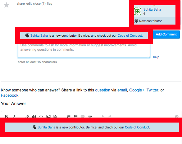
Is that not a bit too much in our face to have 3 rather rude injunctions to "do as the man said", on the same page, on every new comer post? It seems that there is a suspicion that the intent of people wanting to help is bad!

enter image description here

8
  • 63
    no freehand circles? :(
    – Tim
    Commented Aug 22, 2018 at 7:36
  • 101
    Those circles are terriby squary looking, too thick, and extremely regular. Your freehand leaves a lot to be desired. Are you a new contributor by chance?
    – yivi
    Commented Aug 22, 2018 at 7:38
  • 87
    Is this a new suggestion on how the banner should look? That way they would get a lot more attention and I am sure that would increase the quality of posts massively
    – Lino
    Commented Aug 22, 2018 at 7:44
  • 7
    @yivi Hey, he might be a new contributor, be nice! Or I'll call the CoC police.
    – Lundin
    Commented Aug 23, 2018 at 7:36
  • 16
    @Lundin: Do you want to get CoCblocked?
    – Cerbrus
    Commented Aug 23, 2018 at 10:08
  • 12
    Can we get these red borders on the site as well? I feel like it draws the needed attention to the matter. Commented Aug 23, 2018 at 11:33
  • 6
    The user icon though...
    – Trooper Z
    Commented Aug 23, 2018 at 23:26
  • @TrooperZ user icon has 4 fingers too many.
    – zx8754
    Commented Oct 3, 2018 at 6:49
-14

I for one don't mind those reminders at all. There isn't any reason anyone needs to be mean to a new or existing user. Yes, people can ask some pretty horrible questions that make you question the efficacy of the education system, but a snarky response to those questions will not net anything and silence or a polite reply wouldn't also get you.

Personally, I find it very easy to want to reply with sarcastic comments to bad questions and I'm sure I have actually done so in the past. It's a good stress release! However, I've noticed since they've started stressing being nice I'll stop and think if I actually need to post a comment on this question. Many times, I don't and just move on.

Further, I'm not sure how many of you use the other Stack Exchange sites, but many of those communities are very welcoming and warm. It makes you care more about that community and in turn its rules.

Change is always tough and it can be so much fun to mock someone when they seem deserving, but not doing so isn't really taking away from your community, it's making it better. I'm sure eventually the reminders won't need to be so in our face, but I would imagine you'll get used to them pretty dang quick!

4
  • 6
    well, I was sure this question will be turned to talk about the feature but I don't care about this feature even if I don't like it, it's here but it's very intrusive ... usefull or not, I don't think we need to have it for each comment we add. Let's consider it as a simple information, no one want to see it all the time. Commented Aug 24, 2018 at 0:00
  • this is a test comment to see if my second comment will show the helping hand
    – user3956566
    Commented Aug 27, 2018 at 12:23
  • 1
    @TemaniAfif oh wow. Yes it shows up for every comment
    – user3956566
    Commented Aug 27, 2018 at 12:24
  • I actually like this answer. Yep, soon the helping hand will be like a vacuum cleaner left out in the lounge room. People won't realise they're stepping over it.
    – user3956566
    Commented Aug 27, 2018 at 12:25

You must log in to answer this question.

Not the answer you're looking for? Browse other questions tagged .