53

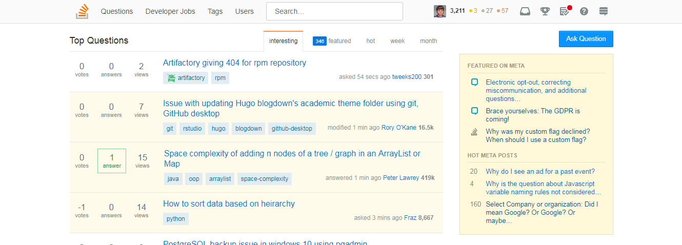
On June 5th, the redesigned left-sidebar started appearing for me on Meta Stack Overflow.

Meta Stack Overflow with sidebar

The sidebar doesn't seem to be appearing on the main Stack Overflow site.

Stack Overflow without sidebar

I didn't see an announcement for this in the featured Meta posts or the SO blog.

Has Stack Exchange started rolling out the new sidebar? Or was this an unintentional change?

19
  • 3
    meta.stackexchange.com/questions/310908/…, it should appear in the community bulletin soon (caching)
    – user247702
    Commented Jun 5, 2018 at 16:33
  • 108
    Shh, don't mention it and maybe they'll forget to turn it on for SO...
    – TylerH
    Commented Jun 5, 2018 at 16:37
  • 7
    Maybe they thought we wouldn't notice?
    – Script47
    Commented Jun 5, 2018 at 16:39
  • 5
    @Script47 Ha, funniest thing I've ever heard.
    – Joe Friend StaffMod
    Commented Jun 5, 2018 at 16:42
  • 20
    tl;dr There is a check box to hide it under site preferences.
    – user2285236
    Commented Jun 5, 2018 at 16:56
  • 6
    Pity, disabling it adds another hamburguer menu... [Questions] button now is two clicks away...
    – brasofilo
    Commented Jun 5, 2018 at 17:11
  • 16
    The benefit of this is what again? Other than change for the sake of change of course.
    – j08691
    Commented Jun 5, 2018 at 17:23
  • 2
    @j08691 That was covered in meta.stackexchange.com/questions/307862/… back in March - tl;dr they say a left nav is required with Teams layouts and they also want to combine their codebases so that non-Teams people see the same codebase but slightly tweaked.
    – TylerH
    Commented Jun 5, 2018 at 17:25
  • 23
    @TylerH So this is all the fault of Teams? Got it.
    – j08691
    Commented Jun 5, 2018 at 17:26
  • 20
    Honestly this redesign is terrible. An important aspect in web design is content balance, and the left sidebar takes so much space that it clutters the entire design and shifted everything to the right. Commented Jun 5, 2018 at 23:07
  • 23
    This sidebar is utterly useless. I'm not saying it's terrible, but it's useless. It literally has no purpose and assists with nothing. Commented Jun 6, 2018 at 2:41
  • 1
    It looks weird and out of place, but I'll get used to it soon enough.
    – Gimby
    Commented Jun 6, 2018 at 9:13
  • 3
    @immibis completely agree. The top bar still exists, just now with a gap where the links used to be. All it's done is unbalance the central alignment. Commented Jun 7, 2018 at 19:39
  • 7
    It is very annoying!
    – SaidbakR
    Commented Jun 12, 2018 at 18:45
  • 1
    Yay! a big column of whitespace sitting to the left of the window. How about you add a row of say, 5cm of extra whitespace between answers to further remove the amount of content you can see at one time?
    – mcalex
    Commented Jun 13, 2018 at 3:07

2 Answers 2

15

Posted an announcement on MSE and we'd like to have feedback go there.

tl;dr

Today we are releasing an early sneak peak of work that has been in progress for several months on Meta Stack Overflow and later this week on Meta Stack Exchange. The motivation for this work is covered in my post entitled Ch-ch-ch-changes: Left nav, responsive design, & themes, so check that out if you have any questions about why this work is important.

22
  • 82
    It seems to be wasting a lot of space though. It is two times wider than it's content
    – user000001
    Commented Jun 5, 2018 at 16:49
  • 12
    @user000001 Well previously that space was just margin, so it's "wasting" space that is also wasted in the old layout. That is, unless you're using a small window size (small enough that the main content can't fit at its max size); then it's actually wasting space.
    – Servy
    Commented Jun 5, 2018 at 17:03
  • 3
    @Servy: Yes, I often pin the browser to one side, so on the laptop 25% of the entire screen is the side panel i.sstatic.net/X4h8f.png
    – user000001
    Commented Jun 5, 2018 at 17:07
  • 14
    @user000001 So unpin the left nav via the new pref and I'm pretty sure that your 25% window scenario is actually better today than before. Let me know what you think.
    – Joe Friend StaffMod
    Commented Jun 5, 2018 at 17:23
  • 4
    Is it intentional that the search bar no longer expands when focused?
    – j08691
    Commented Jun 5, 2018 at 17:25
  • 2
    @JoeFriend: Thanks, really cool that you can unpin it, now it looks really good
    – user000001
    Commented Jun 5, 2018 at 17:26
  • 5
    @user000001 I applied a temporary Stylish fix for my tastes that works so long as the window is fullscreen at 1080px wide; a responsive fix to come later, for sure... i.sstatic.net/PZaQu.png
    – TylerH
    Commented Jun 5, 2018 at 17:29
  • 11
    As a designer/developer, this is a terrible move. Anything this small is almost always horizontal (aka the way it was).
    – jhpratt
    Commented Jun 6, 2018 at 0:00
  • @jhpratt The current MSO is the most extreme version in terms of simplicity. With Teams and other features we are currently working on (see links in the MSE post) there will be the potential for much more in the left nav that could never have fit in the top bar. That's why we made the change. For example, here's my SO.com left nav with teams.
    – Joe Friend StaffMod
    Commented Jun 6, 2018 at 1:53
  • 8
    Sure, but for the majority of people that aren't on a team? It's just dead space, shifting the rest of the content to the right. At a minimum, make it sticky like the current header bar is.
    – jhpratt
    Commented Jun 6, 2018 at 1:54
  • 3
    @jhpratt The space won't be only used for Teams. I'd really encourage you to read the first post that lays out the background and the follow up post to see what I'm talking about.
    – Joe Friend StaffMod
    Commented Jun 6, 2018 at 2:36
  • @Servy: It depends entirely on the width of your browser window if that space was wasted margin in the old layout. For smaller windows the main content area is often smaller now.
    – sth
    Commented Jun 6, 2018 at 10:15
  • 1
    The left-only vertical line all the way down feels so wrong to me...
    – Pac0
    Commented Jun 6, 2018 at 16:49
  • 1
    @Servy Earlier The focus was on question, and answer, but now there is this sidebar which take some focus, in other words, it is at wrong place acc to me.
    – Suraj Jain
    Commented Jun 8, 2018 at 4:15
  • @JoeFriend Above ^.
    – Suraj Jain
    Commented Jun 8, 2018 at 4:15
-27

This is good. I like this design. But It is better if you can make left sidebar as fixed sticky sidebar.

7
  • Seems like all others disagree with my idea. normally being sidebar fixed is really easy for me. So I don't want to scroll again to find menu. Why others think it is too bad? Commented Jun 6, 2018 at 6:54
  • 7
    Maybe they disagree because feedback should be posted on MSE. And is it something like point 2 in my answer there? Commented Jun 6, 2018 at 8:28
  • I doubt people are downvoting the sticky idea. They are downvoting because they don't like the left sidebar at all. If your statement was closer to "If we must have this, then at least make the selections in the sidebar always visible", then people wouldn't be downvoting as much.
    – Makyen Mod
    Commented Jun 8, 2018 at 7:53
  • @Makyen May be, but then how this post receive so many upvotes.... Commented Jun 8, 2018 at 9:08
  • At +6/-23, perhaps some people are seeing past the first part to the sticky idea. Perhaps some people like the left sidebar. There isn't a good way to tell why people are voting the way they are. We can only guess.
    – Makyen Mod
    Commented Jun 8, 2018 at 9:28
  • it's meta, who cares. personally though I don't even know what you're talking about, because isn't the sidebar already "fixed sticky"?? Commented Jun 22, 2018 at 19:04
  • @sweaver2112 When I write the answer, it wasn't sticky. Seems like SO team care about what I and others request about sticky it. Commented Jun 25, 2018 at 4:11

You must log in to answer this question.

Not the answer you're looking for? Browse other questions tagged .