Context
This post suggests some changes to the question asking form (https://stackoverflow.com/questions/ask) in order to improve question quality.
Problems and suggestions
We have an extensive guide on how to ask good questions. Unfortunately most newcomers have never read that page and I honestly can't blame them: It's a wall of text hidden behind a text link. Many of the points mentioned there are not reflected in the associated question asking form at all, anyways.
1. Re-layout the title field
For example, the title bar appears as the first input field on the form but the guide tells you to
write the title last
2. Change the title placeholder text
The help mentions how a good title looks like and all examples start with a question word. However, the form says
What's your programming question? Be specific.
While this makes the purpose of the site clear (programming questions), it fails in telling the user how to choose a good title. All top-voted questions on SO are starting with a question word. People are great at learning by copying, so how about showing a random good title in the placeholder?
3. Emphasise the code inclusion button
The help also mentions to
Include just enough code to allow others to reproduce the problem
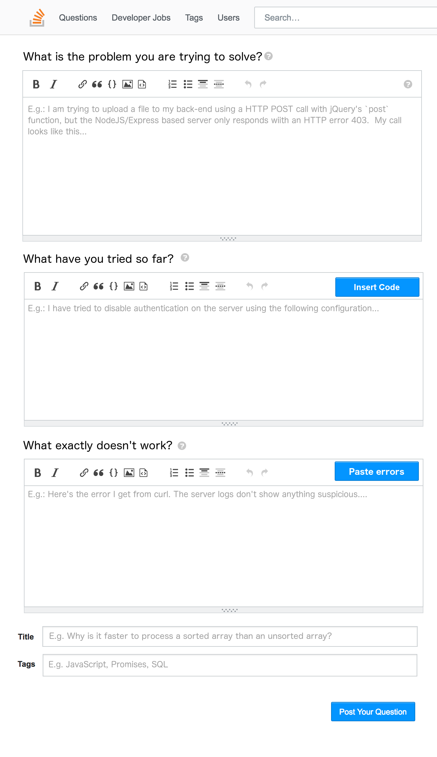
But on the form page the code inclusion is hidden in the formatting bar. Judging from the many first questions I've seen, many people do not include or do not format their code at all. Contrary to web links, quotes or bullet lists (other tools from the editor bar), I think almost every question on StackOverflow should contain a code example. How about we put that code sample button next to the Post Your Question button or somewhere else just more prominent? If the tags contain CSS, JS or HTML also emphasise a button to the extended runnable code snippet editor. Runnable samples are worth gold!
4. Make the question text area bigger
Most questions are lacking context and even without looking into the statistics, I bet the most popular reason for closing questions is "Unclear what you're asking". Have you ever wondered why shopping carts are always so big? It's so you feel obliged to fill it. We should do the same with the text area for questions. Resizing it from Twitter-size to Blogger-size offers the users a better understanding of the expectations for a problem description.
5. Offer multiple text areas
This is a follow-up on the last point. The guide isn't very specific on this other than telling you to Introduce the problem.
Whenever working through the queues or commenting new questions, my most often used comments are
What have you tried so far?
and
What exactly is the problem?
Therefore I would like to suggest splitting the text area into the following parts:
- Context: What are you trying to do?
- What have you tried so far?
- What exactly isn't working?
Summary of suggestions / Mockup
I've thrown together some of the suggestions above into this rough mock-up. I am not a designer, so please bear with me.
