20

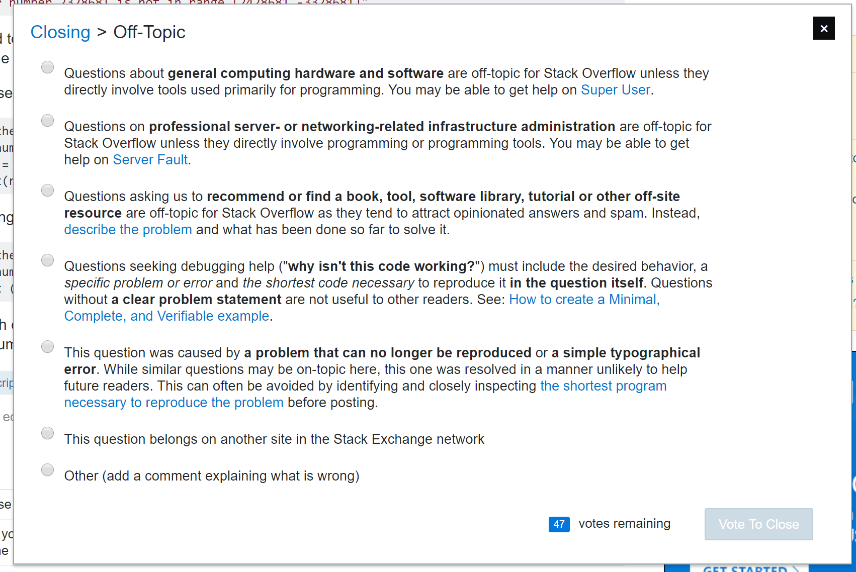
The 2nd level of close reason's radio buttons are misaligned. Chrome, Windows 10, 4k screen.

enter image description here

7
  • 5
    It's caused by the margin on .close-as-off-topic-pane .action-name.
    – user247702
    Commented Sep 15, 2017 at 13:00
  • 2
    looks like its been broken again: meta.stackoverflow.com/questions/340234/… Commented Sep 15, 2017 at 13:06
  • 3
    I can replicate this on Chrome 60, Windows 7 on a 1280*1024 screen, so not a high-DPI issue
    – Erik A
    Commented Sep 15, 2017 at 13:09
  • 14
    Freehand circles?? Commented Sep 15, 2017 at 16:52
  • 4
    Ah yes, CSS and vertical alignment. A continual source of "fun". Commented Sep 15, 2017 at 18:10
  • 7
    @alexanderbird: i.sstatic.net/kvQMJ.png there you go Commented Sep 16, 2017 at 11:29
  • 1
    @MatteoItalia you seem to be a pro at Freehand drawing :D Commented Sep 17, 2017 at 14:14

1 Answer 1

5

I've cleaned up that layout a little bit, so this should look better from the next build on. Not great, mind you, but a little bit better. A little birdy told me there may be some design work in progress to make all the popups nicer and more consistent, but no promise on a timeline here.

3
  • Consistency with the old design would also be desirable. Please don't move our cheese from one side of the dialog to the other without a good reason.
    – Cody Gray Mod
    Commented Sep 28, 2017 at 15:03
  • 1
    Related post in MSE Alignment issue in the Flagging > Closing > Off-Topic section. If the alignment issue was fixed, can that post's status will be changed?
    – Arulkumar
    Commented Sep 29, 2017 at 7:55
  • 2
    @Arulkumar Sure, will do, thanks!
    – balpha StaffMod
    Commented Sep 29, 2017 at 7:57

You must log in to answer this question.

Not the answer you're looking for? Browse other questions tagged .