27

I just reached 25k rep and gained access to the site's analytics, where with a quick glance I saw that the number of upvotes is six times greater than the number of downvotes.

Since the voting system is for the quality assurance of Stack Overflow, I was wondering if that ratio makes sense. And if it is not, does that mean that the users prefer to upvote, rather than downvote (which could be the result of the penalty a downvote takes on an answer-which might explain the ratio after all)?


Related: Average ratio of upvotes and downvotes.

25
  • 10
    Part of it is the cost to down vote questions but there are users who flat out refuse to down vote anything. I don't know how common they are but every once in a blue moon someone will admit to as much. I recently ran into a user who insisted that down voting a question no one could understand was irrational.
    – BSMP
    Commented May 25, 2017 at 17:54
  • 31
    The number, by itself, doesn't actually tell you much. It doesn't tell you if people are inherently more inclined to upvote content than they are to downvote it, or if there is simply 6x more good content than bad content (In reality, it's undoubtedly some of both, but you don't know how much of each is at play).
    – Servy
    Commented May 25, 2017 at 17:55
  • 38
    Also, if the vote counts are ignoring deleted questions, that would skew the numbers too. A lot of content that gets down voted ends up deleted.
    – BSMP
    Commented May 25, 2017 at 17:56
  • @BSMP that's bad. Hmm Servy you have a point here...
    – gsamaras
    Commented May 25, 2017 at 17:56
  • 4
    Also, downvote needs more rep than upvote (you can upvote in any sites just with association bonus rep), and casual users tend not to downvote because they aren't sure if it worths the downvote, compared to upvoting answers that are useful even slightly for them
    – Andrew T.
    Commented May 25, 2017 at 18:03
  • 12
  • 6
    @ryanyuyu That's a somewhat misleading stat, as a much higher percentage of the users in the former group aren't active on the site. If you look at users who have been active recently you'll get a very different number.
    – Servy
    Commented May 25, 2017 at 18:35
  • 2
    @BSMP I... I will admit to it as well. I tend to save my downvotes for things that I feel very strongly about (usually answers) and poorly worded questions just make me scratch my head, comment asking for clarification, and occasionally vote to close. The 1-point cost isn't very heavy (particularly as I'm over 3k) but there's still that psychological barrier. Commented May 25, 2017 at 18:54
  • 6
    i mean... people upvote answers just because they tried, while saying it doesn't work in the same sentence.
    – Kevin B
    Commented May 25, 2017 at 22:03
  • 4
    I'm with other people. I downvote sloppy questions quite frequently. I reserve my downvotes on answers to material that's harmful: that will introduce bugs into software if people use it. And I try to explain my answer downvotes.
    – O. Jones
    Commented May 26, 2017 at 18:27
  • 5
    I constantly seem to run into questions showing no research effort, have no future value and don't have enough information that get nothing but upvotes - that's probably a better signal that things are not okay than a purely numerical stat. Commented May 26, 2017 at 18:43
  • 5
    Very good questions can get thousands of upvotes. Very bad questions get a few downvotes and are deleted/closed/hidden. Many more people will see and get the chance to vote on good questions than bad ones.
    – Andrew
    Commented May 26, 2017 at 18:45
  • 1
    @Dukeling Is that with or without showing deleted content?
    – Servy
    Commented May 26, 2017 at 18:50
  • 1
    A lot of people remember that there's a penalty to downvote an answer and forget there's no penalty to downvote a question.
    – briantist
    Commented May 26, 2017 at 18:58
  • 1
    @KevinWorkman I take "makes sense" in this context to mean "is an accurate representation of the quality distribution of posts". Commented May 26, 2017 at 19:22

1 Answer 1

30

Consider this graph of score distribution:
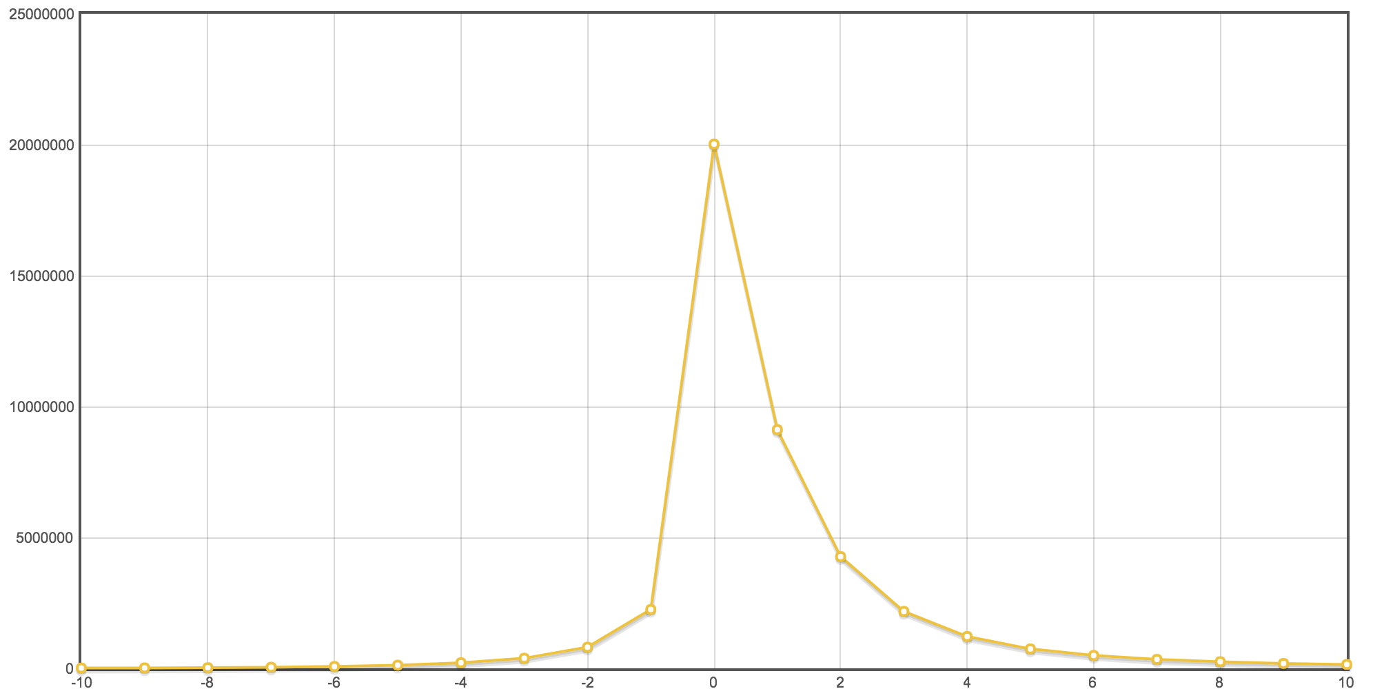
Score distribution

As you can see, the most common score for a post is 0. While some of those posts are something like +1/-1, far and away the majority of these posts are simply ignored by the community. If they do get a vote, +1 and +2 are more common than -1. Stretching that disparity across the long tails of each extreme gets us to the 6:1 ratio.

According to Sturgeon and evaluating random samples of posts, we might expect something closer to one great post for every 6 not-so-great post. But votes on Stack Overflow tend to strongly correlate with views which (hopefully) correlate to quality in turn. Truly unhelpful posts tend to be seen by a handful of people and then ignored forever. Truly useful posts will accumulate upvotes for just as long. Truly terrible posts tend to get deleted.

Looking just at deleted posts we see a different profile:

Score distribution on deleted posts

My guess is that many of the positively scored posts in this sample are answers to deleted questions. (Feel free to verify that guess using SEDE. My queries ought to be a good starting place.) Of course, once a post is deleted, it can't get more votes of any sort. That means there's a structural reason for more upvotes than downvotes.

Finally, there's an active disincentive for downvoting answers. When we removed the -1 penalty for downvoting questions, there was an immediate increase in question downvoting. (There's also a small impact from increasing the quota of question downvotes at the same time.)

Summary

It's difficult to know what the "right level" of downvoting might be, but many posts are ignored or deleted rather than downvoted. As a result, useful posts tend to accumulate votes while unhelpful posts don't.

4
  • If someone shows a code editor in a talk, someone will inevitably say "embiggen". If someone shows a graph, will someone inevitably say "make the y axis log scale"? (Though the point is well and truly shown with a linear scale) Commented May 27, 2017 at 14:44
  • 1
    Deleted with log 10, Undeleted with log 10 Commented May 27, 2017 at 14:53
  • 1
    A bar chart would be better, wouldn't? There are no values for the fractions, but only integer values.
    – usr1234567
    Commented May 27, 2017 at 21:01
  • 1
    @usr1234567: Yep. But SEDE puts out line charts by default, so I used that. ;-)
    – Jon Ericson StaffMod
    Commented May 27, 2017 at 21:05

You must log in to answer this question.

Not the answer you're looking for? Browse other questions tagged .