-6

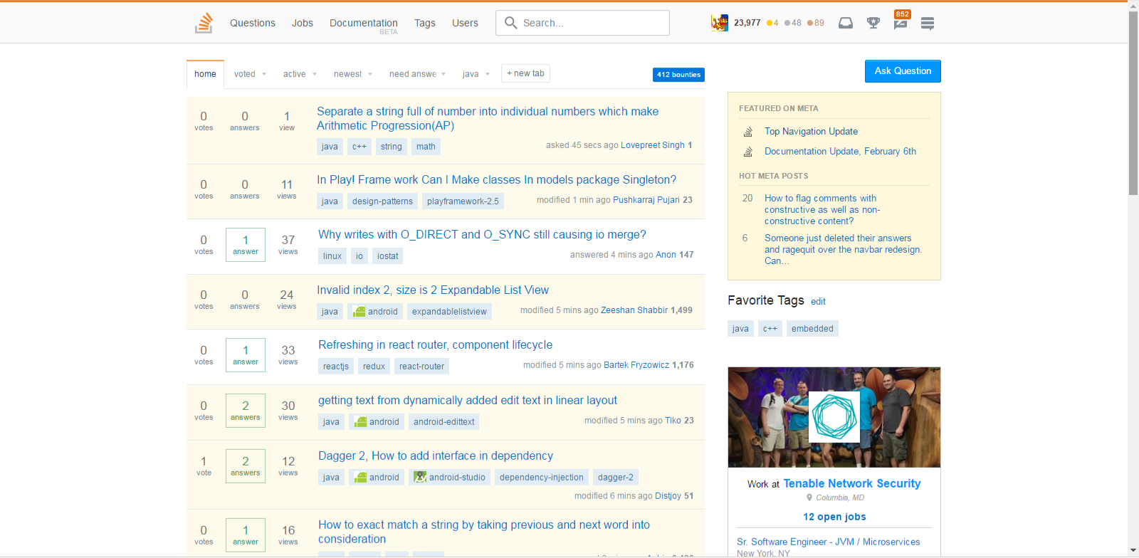
This is how the main site looks for me right now:

enter image description here

The problem is, I'm not sure what it's called, because the name of the site appears nowhere on the page!

Actually, that's mostly joking, but I really am getting a vaguely uncomfortable feeling on the page as the lack of header makes it feel like I am constantly scrolled to somewhere in the middle, or that I've got an AdBlock filter set too loose. Compared to any of the other sites (Super User for example, or RPG as an extreme), SO feels like it lacks individuality, identity and... "coziness" for lack of a better word. It's a rather bleak layout.

The top bar also seems a bit crowded since everything that used to be in the header got packed up into the bar. It's been about a month or so since the change and, while I do like the bar itself, I've been giving myself a chance to get used to the change and this is one of the things that I can't shake.

Can you give the page a header again?
17
  • 13
    It has become such a strong Trade Mark, all it needs is a logo. Stack Overflow entered the ranks of Shell, Nike, McDonalds and Coca Cola, the image is stronger then any words...
    – rene
    Commented Feb 18, 2017 at 8:45
  • 7
    Surely you remember the site's name from when you took the tour! Or read through the Help Center! Commented Feb 18, 2017 at 8:46
  • 1
    @rene Of those, only McDonalds' site does not say "McDonalds" on the page (unless you count the third slide in their little slide show). The only other site I was able to find like that in the 20 random ones I just visited was Facebook, although that one's debatable since its search box does say "Search Facebook...".
    – Jason C
    Commented Feb 18, 2017 at 8:52
  • 4
    Stack Overflow is once more taking the lead. The others will follow soon. Expect more low contrast floating top bars everywhere and name-less sites.
    – rene
    Commented Feb 18, 2017 at 8:54
  • 5
    The logo is shortened for logged in users only, to make space for the user controls to the top right. For new users, the name shows in full.
    – Pekka
    Commented Feb 18, 2017 at 9:11
  • 20
    @rene Have you seen Google's SO-inspired redesign yet? You might not have, they're A/B testing it.
    – Jason C
    Commented Feb 18, 2017 at 9:13
  • 14
    Welcome to Experts-Exchange!
    – Bart
    Commented Feb 18, 2017 at 9:16
  • 2
    The more I look at the site, the more I can't escape the feeling that I've cranked up the AdBlock filter slider too high or something.
    – Jason C
    Commented Feb 18, 2017 at 9:50
  • 6
    Kinda funny how nobody can see the elephant in the room. He is hard to see when he's always there. This is the view you get when you are logged-in to the site. Expectation is that you have some idea what site you logged-in to :) Use your browser's "incognito mode" (aka "private browing") feature to see what it looks like to a newbie. He'll know. Commented Feb 18, 2017 at 10:38
  • I don't really mind the name not being there but the logo / button is quite narrow which makes it a little bit harder to find quickly. The clickable space should probably be extended to the left to make navigation a little easier. (I'm not sure if anyone has already requested that feature yet)
    – Keiwan
    Commented Feb 18, 2017 at 10:59
  • 2
    Fwiw I don't mind the logo-only in the nav bar, I just think the site needs some headers back. Something feels missing (like, scrolling all the way to the top still feels like you're in the middle of the page somewhere), and there's no identity -- it's just... Web Site, Inc. -- especially when compared with the generally beautiful headers and themes on most of the other non-beta sites.
    – Jason C
    Commented Feb 18, 2017 at 11:09
  • Most of people know the Stackoverflow logo, but I think that we should put a tooltip or something like that to show the name of the web site when users put the cursor over the logo.
    – Nicolaesse
    Commented Feb 18, 2017 at 12:30
  • 2
    What's the name of the site? 'Darude - Sandstorm' of course.
    – ForceBru
    Commented Feb 18, 2017 at 17:39
  • Note the tab in your browser is named "StackOverflow".
    – Mistalis
    Commented Mar 23, 2017 at 12:23
  • "We" can add it back, yes, using browser extensions. I added it back after removing Questions, Users, Jobs, and the review queue from the header.
    – Kevin B
    Commented Mar 23, 2017 at 15:31

1 Answer 1

0

I can identify the site by the logo yes, but I do miss the name in the logo for some bizarre reason.

Update: Thanks to @Kevin-b, whose comment finally made me realise why I miss the logo. Like him, I use the logo heavily for navigation to get back to the homepage.

Proposed solution:

Currently we have this, with arguably some extra pixels that could be utilised:

enter image description here

Could we not just reduce / rearrange that space to something like this:

enter image description here

Note, remember the search box expands with focus, so you get more space when you want to type. I have no issues with seeing the smaller logo when the search box in expanded as it's only temporary:

enter image description here

2
  • 2
    What irritates me about not having the bigger logo is that i'm so used to clicking the logo to get to the page i want and so used to it being the full logo that i would often accadentally click "questions" instead and not get what i expected. That's why i switched it back with a gist.
    – Kevin B
    Commented Mar 23, 2017 at 16:11
  • @KevinB Thank you - I think you've just made me realise why I miss the logo, as I also used it for navigation in the same way.
    – Tanner
    Commented Mar 24, 2017 at 9:17

You must log in to answer this question.

Not the answer you're looking for? Browse other questions tagged .