337

Administrative Note July 6, 2017: development for this project is currently on hold; if you find it useful you may continue to use it and report bugs or suggestions, but fixes / improvements may not be forthcoming.


TLDR: We overhauled the navigation again. To get it you need to opt in via the user preferences page, and we want your general feedback (love it / hate it) after you try it for a few days. We are planning to deploy it before the end of the year, and your feedback is important.
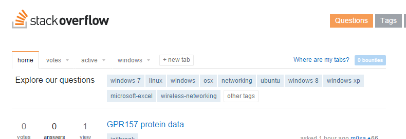
New new nav

New new nav: back to the drawing board

It has been 6–8 weeks since the last release of new nav, and we have been adding all the features that you have requested based on the previous iteration, plus working on an anonymous mode of the navigation. Initially we simply tried to add stuff, but we realized that adding more features by itself was making the interface too cumbersome. A new approach was needed. Or, as our fearless leader David said: we had reached a local maximum (technically the plural word maxima was used, but we can forgive that).

We went back to the drawing board and between August and early September 2015 we redesigned the navigation based on all the input of the previous months. In September we built a prototype, and tested it internally. Now we have reached what we consider an MVP which you can try out.

This has been released in the alpha channel on Stack Overflow (currently 10,000 users have opted in to this) from today. Once we smooth out the known issues and the bugs you identify we will begin testing on a larger scale, and we will A/B test the solution to see if our users navigate better with it.

Here's how it works.

Basic Navigation

The purpose of basic navigation is to give a simple set of tabs for users that only want to use the mouse. Think of it as a “GUI” version for users. Numbers show that most navigation currently happens on these tabs (this covers 94% of the hits on question lists):

  • Home page
  • Newest questions
  • Questions sorted by vote
  • Active questions

Homepage

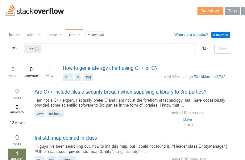
Our solution brings these tabs on the homepage, directly linked (no typing necessary). Furthermore we have an explicit call-out to favor bountied questions.
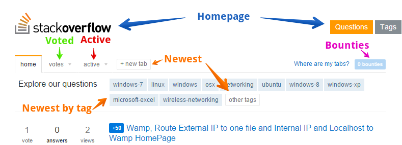
Homepage

This introduces clicking on tags as a navigation element. Furthermore it directs users to the new tag filter interface which is introduced later.

Inner pages

All inner pages are now shown as “temporary” tabs on the homepage. This is indicated by a “*” prefix on the tab name. For example, clicking on the “windows” tag leads here.

Temporary tabs will go away if the user navigates away from the page. This interface supports all links that are supported by the current navigation, including those not filtered by tag.

The temporary tab is automatically given an appropriate name, similarly to how page titles currently behave. For example, if the “windows” tag is filtering the list, then the tab is called “windows”. If, however, there is no tag filtering, but the questions are shown by activity, then the tab is called “active”.

In the specific case of clicking on a tag the tag excerpt is shown, which includes new submenu entries.
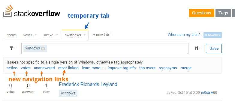
Temporary tab

If a link leads to a page which is the same as a tab which already exists (e.g. active, votes…), then the corresponding tab is selected instead of adding a new tab.

Real time

If any tab is eligible to get real time updates, we will track it, whether it is in the foreground or not. This has the advantage of alerting the users of new questions on multiple tabs, similarly to what currently happens if a user has multiple browser tabs open (titles get the number of new or updated posts).
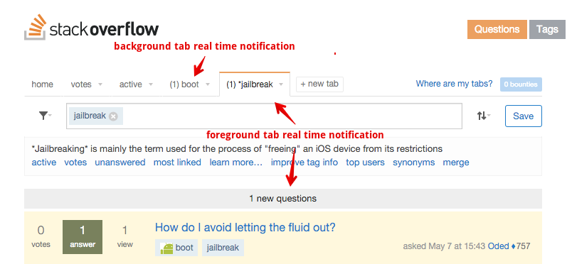
Real time

Advanced Navigation

Advanced navigation covers the new features we are introducing with the new, new nav. Their purpose is to enhance navigation and to increase the likelihood of finding a question to answer.

These include the possibility of saving tabs (a registered user only feature), restoring old navigation tabs and renaming or deleting tabs. Furthermore we are extending real time notifications so it works with multiple in-page tabs.

Saving tabs

Temporary tabs are saved by clicking the “save” button. Thus they become permanent tabs. This function is disabled if the tab is already saved.

Once a tab is saved, it will be saved on the user account (currently this is not fully implemented as tabs are saved in the browser’s local storage instead). The tab will always appear to the user.

Tab save

Permanent tabs can be modified, for example renamed. This will make them appear unsaved: they will have the “*” prefix and the “save” button will be enabled. Navigating away will restore the previous version, saving will make the changes to that tab permanent.

Restoring old nav tabs

It is likely that experienced users will have differing opinions regarding what tabs is useful to have on the home page. This is fine, and we do not want to force them to re-create them manually. To explain this change and to allow the users to restore tabs easily we introduced the “Where are my tabs?” link. Clicking it shows a configuration pop up that allows users to restore the tabs they want to keep or remove the ones they do not like.
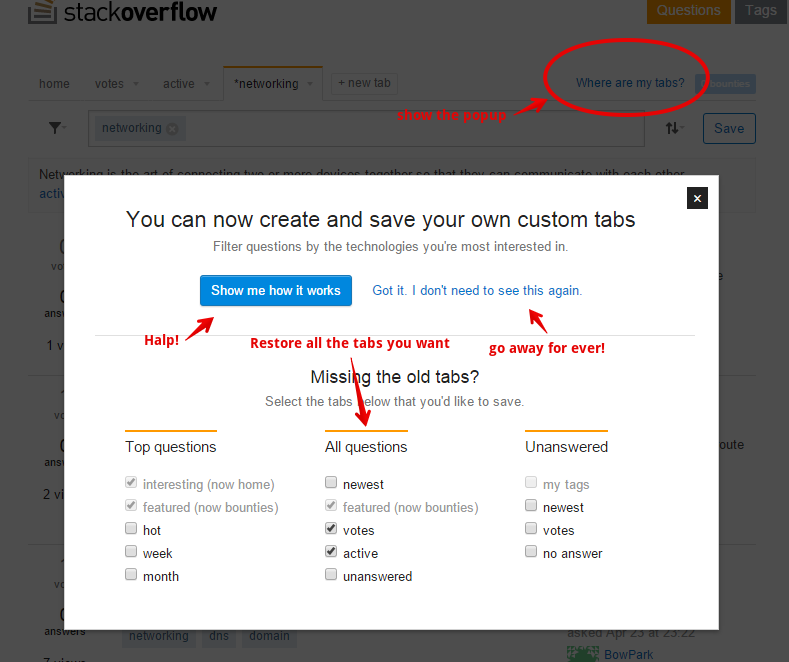
Where are my tabs?

This pop up will also be permanently dismissible. The “Show me how it works” link will send the users to a help center page with an explanation similar to this document. For the moment, it will point here.

Adding tabs, Renaming, Deleting or Duplicating Tabs

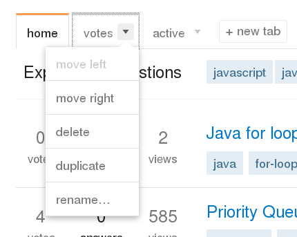
A new tab is added by clicking on the "+ new tab" button. This creates a new tab with all the questions sorted by creation date. There is a drop down menu next to each tab, excluding home, that allows the user to rename, duplicate or delete a tab.
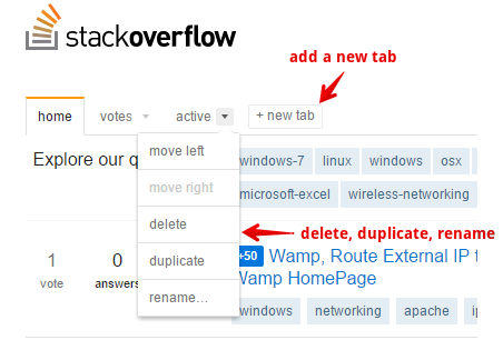
Tab editing

Clicking on rename, or double clicking a tab, will show the rename interface. The user can rename the tab by typing directly in-line.

Power User Navigation

If simple navigation is our “GUI”, power user navigation is our CLI. This includes the features that we are introducing for users that like extreme customization. It consist of features that either support old nav behaviors we are maintaining for backwards compatibility or features which are non-essential but likely to appeal to our hardcore user base: advanced filters, sorts, tab reordering and relatively complex boolean searches.

Advanced filters and sorts

When in a tab different from the “home” tab, users will be able to filter questions based on state (need answer, no answer, has bounty) or time (today, last week, last month). This is done through a drop down conventionally positioned on the left. Furthermore they will be able to change how the questions are sorted via a drop down conventionally positioned on the right.
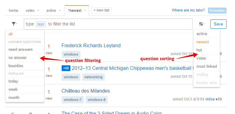
Sorts and Filters

These drop downs allow users to reach lists that are currently seldom used.

Tab reordering and limiting

A user can move the tabs around by using the drop down and choosing “move left” or “move right” as appropriate. This is valuable if users have many tabs, because we will limit the number of visible tabs to one line. Once that limit is reached the size of the tabs will shrink. This is a bit awkward on purpose: we’re assuming most people won’t need excessive numbers of tabs.
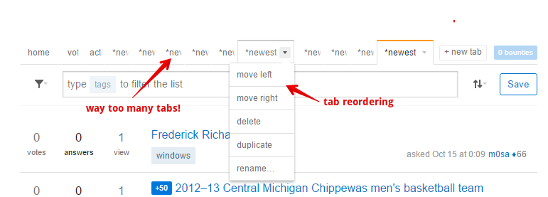
Tab reordering

Boolean searches

Many power users like to use complex searches. As long as they do not use sub expressions (i.e. brackets), we allow them and they are going to be supported in the tag filter.
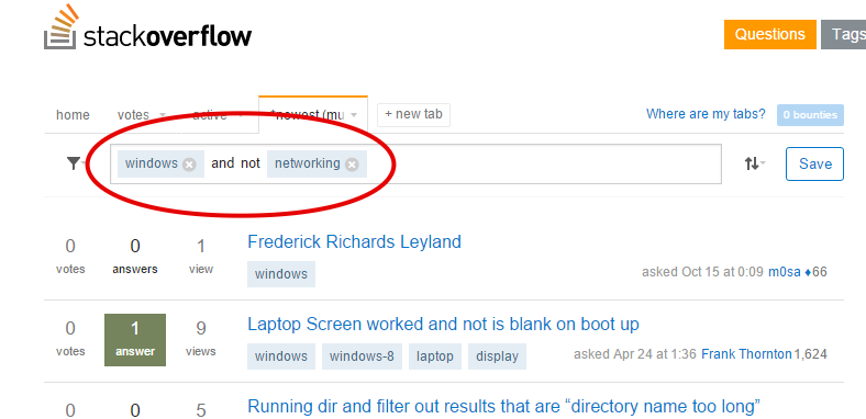
Boolean searches

Known Issues

We have chosen to get your feedback as early as possible. Because of this we are shipping with a few known issues:

  • Tabs are saved in the browser, not in the user account
  • Tabs flicker on first load
  • Deep linking to tabs is currently handled client-side
  • Question counts need to display the current tag if one is selected
  • Realtime notifications may not work with complex tag queries

Feedback

We welcome general feedback here, such as feature requests or general impressions, but please use separate questions for bug reports so we can track them in our internal bug tool. Please use the tag for bug reports, one bug per question.

Next steps

We are going to deliver bug fixes and close the known issues above without further announcements. After that, we are going to A/B test this navigation for a subset of victims users and take it from there.

Once again: if you’re not currently in the alpha channel you can join by checking the box under New Navigation in your profile settings.

80
  • 70
    For the boolean search support alone, thank you from the bottom of my heart.
    – Makoto
    Commented Oct 27, 2015 at 17:59
  • 6
    Is there really a demand to sort questions by vote? I just don't get that. I'm either looking for an answer (sorting questions by vote in that list may be a good idea), or I'm looking to answer, in which case I'm looking through the newest questions, bountied questions, or questions without answers in my fav tags... I'd never sort by votes. Is it me who's wrong here, or everybody else like I think?
    – user1228
    Commented Oct 27, 2015 at 18:02
  • 5
    @Will yes, a lot of low rep users use it (also google likes to spider it)
    – Sklivvz
    Commented Oct 27, 2015 at 18:07
  • 10
    @Will Seeing vote sorting being included again was my favorite part of the changes. It's not really useful, but I like having it when I'm bored and want to find interesting questions to read.
    – resueman
    Commented Oct 27, 2015 at 18:09
  • 94
    None of those annotations are freehand ... some aren't even red ... I don't like where this is going.
    – Bart
    Commented Oct 27, 2015 at 18:18
  • 8
    @Bart I know, right? I feel so dirty now
    – Sklivvz
    Commented Oct 27, 2015 at 18:19
  • 4
    Clicking on the show new bar doesn't remove the (2) (or whatever it may be) from the title bar
    – user4639281
    Commented Oct 27, 2015 at 18:21
  • 10
    Am I the only one who cannot find a link to my favorite tags?
    – Dipen Shah
    Commented Oct 27, 2015 at 18:23
  • 4
    The add tab thing is godmode! Commented Oct 27, 2015 at 18:26
  • 5
    @DipenShah: nope, the favourite tags appear to be gone. I just hand-typed them all into a new tab. But the UI is terrible for more than a few tags, so be prepared to scroll through a huge single-line text field when doing so.
    – Martijn Pieters Mod
    Commented Oct 27, 2015 at 18:35
  • 7
    stackoverflow.com/unanswered?tab=mytags @MartijnPieters
    – Sklivvz
    Commented Oct 27, 2015 at 18:36
  • 4
    tagFilter=favorite has been removed. I'm sad.
    – spender
    Commented Oct 27, 2015 at 18:36
  • 3
    I think the Votes tab is also useful for looking at common problems and finding solutions when learning a new language. The top question for javascript is asking about closures, which is a very important part of coding in JS.
    – Scott
    Commented Oct 27, 2015 at 18:38
  • 7
    @Sklivvz That's unfortunate. I typically monitor MSO for newest questions with no filter to see if there is anything that might need attention.
    – Taryn StaffMod
    Commented Oct 27, 2015 at 19:07
  • 4
    Is it possible to automatically filter the current tab to my favorite tags, like we could with the old new nav? I don't like typing tags manually.
    – Kevin
    Commented Oct 28, 2015 at 1:52

36 Answers 36

88

Please make the “explore our questions” tag list only occupy a single row.


Explore our questions

I don’t know where the tag list comes from, whether it’s based on the current active questions or whatever (it certainly is not from my list of tags), but please make sure that it always stays in a single line. Especially that lone “other tags” tag in the second row makes it feel taking way too much space. So consider removing less prominent tags to try to fit it into a single line.

16
  • 3
    This makes sense and should be easy to implement. Good call.
    – Kurtis Beavers Staff
    Commented Oct 27, 2015 at 19:30
  • 2
    +1 i thought this immediately after seeing this
    – DLeh
    Commented Oct 27, 2015 at 19:32
  • 46
    but even better would be to remove it altogether... I see no value in this bar.
    – DLeh
    Commented Oct 27, 2015 at 19:33
  • 32
    No need for this bar at all, what is its purpose? This would be a tutorial for newbies. The advanced users should have the x to remove it.
    – JonH
    Commented Oct 27, 2015 at 20:04
  • 1
    It's likely it will be present just for anonymous people and, like @JonH suggested, anyone who hasn't yet set favorite tags.
    – Kurtis Beavers Staff
    Commented Oct 27, 2015 at 20:41
  • the list is the top 10 tags ordered by number of questions
    – Sklivvz
    Commented Oct 28, 2015 at 0:42
  • 3
    If it's targeted at newcomers, could we maybe put the search box there instead? Commented Oct 28, 2015 at 1:35
  • 8
    Agree on removing this completely for any users with favorites. The list is very likely irrelevant to them. If it's the top tags by question, then chances are I'm seeing all of those questions anyway by default.
    – Nick Craver Mod
    Commented Oct 28, 2015 at 10:24
  • @NickCraver but you are not filtering
    – Sklivvz
    Commented Oct 28, 2015 at 10:25
  • 1
    @Sklivvz - I dont think it matters - its not interesting to even use if you have favorites and know how favorites works. I am definetly in favor of making search more noticeable.
    – JonH
    Commented Oct 28, 2015 at 14:54
  • Also, when you click "other tags", it creates a "newest questions" tab, so suddenly shows you a different list of questions before you've typed anything, which feels a bit surprising, and distracts the eye by changing the whole content of the page.
    – IMSoP
    Commented Oct 29, 2015 at 11:53
  • 9
    So here's what we are going to do: 1) one line only and 2) it goes away *as soon as you have any favorite or ignored tag. In general it is meant to be a feature for users who are not engaged and users with favorites are clearly engaged. Otoh, it is still useful on sites where engaged users don't go often -- for example here on meta.so it's great to have a link on the home to filter by bug/feature-request/discussion. We are also planning to have a better overall favorite experience but that is a rabbit hole and we are punting it for now.
    – Sklivvz
    Commented Oct 29, 2015 at 14:29
  • @Sklivvz Should JamesDonnelly's answer be marked "status-planned", then, since the change you describe would also address his concerns? Commented Oct 29, 2015 at 15:48
  • and hide this completely when a tagged list page opens. Causes ugly jump waiting for javascript to remove it
    – charlietfl
    Commented Oct 31, 2015 at 15:52
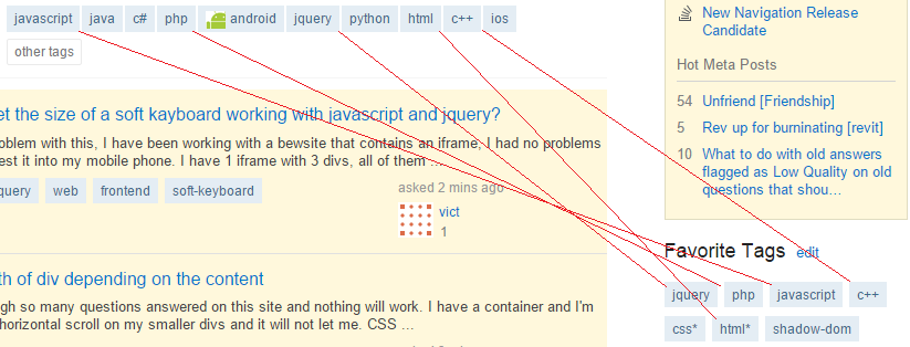
  • Does anyone else think if those tags were drag-able life would be a little easier? Then you could just drag them to the search bar. See my answer for more detail
    – user7627726
    Commented Jun 14, 2017 at 9:28
62

As a long-time, high-rep user the explore our questions tag list is a bit pointless... especially as it also clashes with my own Favourite Tags list.

Favourite Tags List

...and my Ignored Tags list:

Ignored Tags List

At the very least I think it should skip ignored tags. Perhaps for 5k+ users it could be renamed to Have You Seen These Tags? instead and only list popular tags we haven't participated in?

8
  • 7
    This! This was my immediate first reaction. Why would I want to explore my ignored tags, or popular tags which I see all the time anyway?
    – tripleee
    Commented Oct 28, 2015 at 14:19
  • 2
    Yes, enjoy your default view which has a bunch of stuff you've specifically elected to ignore!
    – canon
    Commented Oct 29, 2015 at 12:59
  • 1
    I would suggest to either move the favorite tags there or remove it completely. As it is now, I think its not useful to anyone.
    – luator
    Commented Oct 29, 2015 at 15:36
  • 1
    In case anyone hasn't seen it yet, Skliwz replied on poke's answer that they'll remove this list for anyone who has any favorite or ignored tags. Commented Oct 29, 2015 at 15:45
  • 1
    I do like the "Have You Seen These Tags" list idea, though, at least in theory. Commented Oct 29, 2015 at 15:47
  • 9
    We will remove the list of tags if you have favorites (or ignored tags).
    – Sklivvz
    Commented Oct 29, 2015 at 17:10
  • is it me only feeling that flow of questions are slow ? Commented Oct 31, 2015 at 14:35
  • Am I missing something with your last paragraph? Showing a bunch of popular tags to long term users seems kinda backwards. A new user might not realize he can ask also about C++, iOS, javascript, etc if he's came here for the first time with a python question. By the time someone hits 5k rep, a user should know stuff like that and if they've never done anything here with a common tool/language it's probably by choice and shoving mentions of it into their face would be counter productive. Or are you suggesting something totally different. Commented Nov 3, 2015 at 21:16
43

Feature Request

I would like to be able to delete/hide the Home tab, or at least be able to move it left or right. I will never use that tab, so I really don't want it to be first.

13
  • 7
    Or set some other view as the default. I'm pretty sure that was actually possible in a previous new-nav preview.
    – davidism
    Commented Oct 27, 2015 at 22:55
  • I'm not that hot about this because having an immutable home tab is an important feature for many casual users: it's like the "home menu" in our "gui". I am open to be convinced otherwise, but we need to advocate for all users :-)
    – Sklivvz
    Commented Oct 28, 2015 at 0:45
  • 3
    @Sklivvz I think being able to move it to the left (or in other words, move tabs to the left of it) is of no harm to casual users. Right now I have a tab for the tag in which I spend all my time and I can't move it to the left of the Home tab because... other people might not like that I can do that?
    – TylerH
    Commented Oct 28, 2015 at 2:46
  • I agree that the ability to delete what's essentially the default home page is going to create a lot of problems. Moving it seems less of a problem, particularly if the "default" tab(s) have some indication that they're the special ones?
    – Jaydles Staff
    Commented Oct 28, 2015 at 13:32
  • 3
    @Jaydles Well to be fair you wouldn't be deleting the home page itself, just a tab (the home page can always be accessed by clicking the "stackoverflow" logo at the top of every page). But anyway, yes, moving it would be nearly as good, in my opinion.
    – TylerH
    Commented Oct 28, 2015 at 13:40
  • 1
    @TylerH, sorry - lazy language on my part. I meant "delete the primary nav/breadcrumb back to the home page." But like I said, the ability to move it may be a more benign option that sounds like it'd address your case.
    – Jaydles Staff
    Commented Oct 28, 2015 at 14:31
  • 2
    While we feel there's potential value to this feature request, we think we cannot measure its actual impact until the new nav is deployed to low reputation users, so we decided to postpone any decision until then (around 1 month)
    – Sklivvz
    Commented Oct 29, 2015 at 17:17
  • @Sklivvz Is that because of the risk that a low-rep user might inadvertently delete/hide the home tab and not be able to get it back? Commented Oct 29, 2015 at 22:05
  • 1
    @KyleStrand exactly - or better, we need to weigh that risk against the actual usage and that measurement would be heavily skewed given our current "alpha" userbase.
    – Sklivvz
    Commented Oct 29, 2015 at 22:28
  • In the meantime, span.intellitab:nth-child(1) { display : none; }. Won't change the default view, but will hide that home thing.
    – Kyll
    Commented Oct 29, 2015 at 22:53
  • While I would not like UI features to be part of the privilege system (users should not strive for higher rep just to get fixes for poor/missing site navigation experience), I still think that some of the requested features here could be bound to a minimum reputation. This definitely is one of them. Must be a low threshold though.Possibly the 100 is a good bar because it transfers to other sites on first logon there.
    – cfi
    Commented Nov 19, 2015 at 18:40
  • So while this is [status-deferred], you may want to try out this UserScript I wrote. It not only hides the home tab, but also smoothly switches to the first tab after that.
    – Kyll
    Commented Jul 5, 2016 at 20:55
  • @Kyll Make a gif for me <3
    – TylerH
    Commented Jul 5, 2016 at 21:02
38

Confusing feature report

I started reading this post, thought wow, then I went ahead and created some tabs. Coooool.

Then I noticed you can rename a tab. Great! So I went ahead and renamed one. But, a star appeared, and I immediately thought it was a bug. I refreshed the page: sure, the change didn't persist. Shrug, it's an alpha after all and the custom tabs feature alone is awesome - they'll fix that later on.

But then I went on and read the rest of this post, most notably this part:

Permanent tabs can be modified, for example renamed. This will make them appear unsaved: they will have the “*” prefix and the “save” button will be enabled. Navigating away will restore the previous version, saving will make the changes to that tab permanent.

Ehm... why?? That's really confusing. A change in the tags should certainly be validated with a click on the Save button, but renaming a tab? That's not necessary IMHO. Think of renaming a file in the file explorer - I just didn't expect this kind of UI behavior.

8
  • 6
    This is also noted here: meta.stackoverflow.com/questions/308893/…
    – Kurtis Beavers Staff
    Commented Oct 27, 2015 at 22:34
  • 6
    So, tl;dr: Renaming a tab should save automatically…
    – poke
    Commented Oct 28, 2015 at 7:35
  • What should happen if a tab also has unsaved changes?
    – Sklivvz
    Commented Oct 28, 2015 at 10:58
  • @Sklivvz I'd say it should save them too. Since you're naming something, I'd presume you don't want it to vanish. Commented Oct 28, 2015 at 10:59
  • @think about renaming a saved tab, it would be weird that "renaming" saves your changes overwriting the previous version. I'm trying to understand how to make this super-smooth
    – Sklivvz
    Commented Oct 28, 2015 at 11:04
  • @Sklivvz hmm yes I see that could also lead to unexpected behavior, and a solution which feels natural to everyone could be tricky... But I think you're right, renaming an unsaved tab should leave it in an unsaved state. I initially thought maybe naming a temporary tab and thus making it permanent by virtue of giving it a name could be a good feature, but it would introduce an inconsistency with the renaming of an existing tab, and consistency is better. Commented Oct 28, 2015 at 11:22
  • 1
    FWIW I've added an answer in the feature request so we can have a bit more space for designing this correctly. Suggest away!
    – Sklivvz
    Commented Oct 28, 2015 at 11:26
  • 7
    This is what we want to try: renaming a tab will always save it (including any unsaved change). The rationale is that if you put in enough effort to actually type a custom name, it's very unlikely you want to discard the changes at next refresh.
    – Sklivvz
    Commented Oct 29, 2015 at 17:19
34

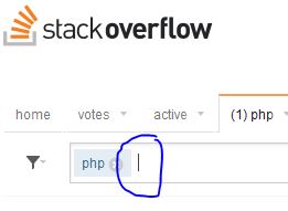
I dislike the cursor loading into the search bar by default if you've saved your options. The cursor should not show up on predefined tabs, only when you're making a new tab

enter image description here

3
  • 8
    I like to press the space bar to scroll down. Input boxes grabbing the focus prevent that. Commented Oct 28, 2015 at 7:02
  • 14
    This shouldn’t be an input on saved tabs anyway. Make it a static list and add a “modify this” button that toggles into an edit mode.
    – poke
    Commented Oct 28, 2015 at 7:37
  • 1
    I dislike the search bar being visible. I set up a favorite tab. There should be an edit for it or something that search bar shouldn't be visible once its saved. Really like being able to create my own tabs. Would be nice if we could set it as main so that when we click Stackoverflow picture it pops to that one and not Home. Commented Nov 13, 2015 at 8:01
33

UI:

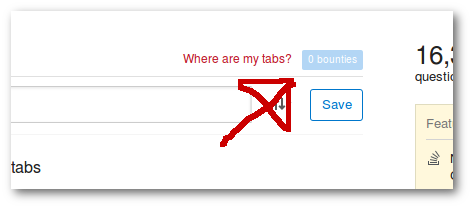
It shouldn't show the "bounties" tab on Meta IMHO, as there aren't any bounties on Meta.

enter image description here

2
  • 8
    Useless UI elements which can never be used are bad IMO.. Commented Oct 27, 2015 at 22:22
  • 1
    That's should be gone now.
    – Sklivvz
    Commented Oct 28, 2015 at 16:04
31

Please redirect routes that previously worked to their new equivalent.

For instance:

https://stackoverflow.com/questions/new?show=all&sort=newest&tagFilter=favorite

is now a 404. That's not very graceful.

5
  • it seems that this is the replacement stackoverflow.com/unanswered?tab=mytags
    – Steve
    Commented Oct 27, 2015 at 23:23
  • 2
    @steve : yes, I know there's the replacement... it's more about the unannounced retirement of routes that previously worked. Without prior warning, I think a redirect would be appropriate here. I don't believe that this would be the only example.
    – spender
    Commented Oct 27, 2015 at 23:25
  • This needs more upvotes. My browser has a good memory, unfortunately when that memory points to a 404 page, I need to then navigate to the new home page Commented Oct 27, 2015 at 23:42
  • 34
    The assumption is that we are free to break compatibility with alpha versions, and guarantee compatibility with releases.
    – Sklivvz
    Commented Oct 28, 2015 at 0:16
  • 2
    @Sklivvz fair enough. For some reason I thought the old "new-nav" reached beta. Commented Oct 28, 2015 at 0:32
31

Feature Request

When I rename a tab, I would like it to remain case sensitive. I dislike having my custom tab names converted to lower case; it looks amateurish and sloppy.

5
  • I completely agree with you, however, the rest of the navigation is in all lowercase so they probably just wanted to keep it uniform.
    – matt.
    Commented Oct 28, 2015 at 3:51
  • @enki.dev Well, there are the five buttons at the top right that are capitalized, along with the Meta sidebar headers (also capitalized)... personally I'd prefer capitalizing all the navigation items; it'd be an improvement.
    – TylerH
    Commented Oct 28, 2015 at 6:45
  • 4
    Definitely case sensitive. If you save a tag with your favorite tags and save it as "FavTags" (shorthand) it gets renamed to "favtags". The effect isn't really the same.
    – Arc676
    Commented Oct 28, 2015 at 8:48
  • 2
    +1 because I thought I was the only one for whom this was annoying. Commented Nov 1, 2015 at 9:19
  • 2
    And for us who do enjoy the lower-case-only naming schemes, adding this doesn't make our life any harder. +1 Commented Nov 2, 2015 at 5:54
23

Feature Request

Automatically create a tab to track the favorite tags; so I don't have to duplicate it.

I would prefer this to be one tab "Favorites", with the tags automatically added; but others may prefer a separate tab for each of the favorites so maybe have this as a user profile flag/option?

2
  • 4
    Equivalently, provide a way to auto-populate a new tag filter with your favorite tags; this way you can create several "favorite tags" tabs with different sorting/filtering algorithms, and/or use your favorite tags as a starting-point for a new tab tracking some subset of your favorite tags. (In any case, if the automatic "favorites" tab were implemented, you could use the "duplicate" feature for these needs.) Commented Oct 28, 2015 at 18:40
  • 1
    Indeed. Also noted here: meta.stackexchange.com/q/268787/245360 Commented Nov 4, 2015 at 7:10
15

A feature request

I'd like to have a system to hide the line with TAGS. At least when there is an active custom TAB. In this scenario it is clear that I made the TAB choosing the TAGS of my interest and the new navigation system greatly facilitates this activity. But, at that point, the line takes up space that can be reserved to look at questions titles and excerpts.

Perhaps the line could automatically disappear or made visible again with a command link when the need arises while it could be constantly active in the Active tab to apply a custom filter on the fly.

Now, to really go overboard with this request, I would suggest to add a new dropdown menu item to the TAB menu. Hide/Show filter. Of course every TAB remembers its configuration :-)

Seriously, I think that once you have set up the customs TABS there is no need to have that line constantly displayed.

2
  • 7
    This. 1000 times this. I don't need to see that I've filtered my tab (called 'active c#"') by C#, and active, nor do I need to see the tag wiki excerpt for it every freaking time I load the tab.
    – Matt Mod
    Commented Oct 29, 2015 at 17:35
  • I agree. I think a "Lock" option could be helpful here, to hide the filter and tag wiki.
    – Addison
    Commented Nov 28, 2016 at 5:04
14

I like the idea of custom tabs. I tend to frequent many tags, and so having a small set of the large ones preset sounds intriguing. I set out to test a custom tab with jQuery because I am close to the gold badge for it.

I had some bad results. It doesn't seem that this is the intended result of setting "needs answers" and sorting "by votes"

As you can see, this brought back only the set of highest voted questions, even from as far back as 2009 and 2008. The set of questions all had accepted answers. I am not sure the "need answers" feature is working properly.

2
  • Should be completed now
    – Sklivvz
    Commented Oct 28, 2015 at 0:48
  • @Sklivvz I still see the described behaviour... [java] sorted by votes, need answer gets me a 12k score question as the first result...
    – Vogel612
    Commented Oct 28, 2015 at 10:10
14

Feature Request

Add a "set as default" item to the tab menu to allow us to choose the default view.

Previous versions of new-nav allowed me to choose the default view for the home page. I don't have a screenshot, but there was a little house icon with a dropdown.

I was really used to having my default Meta.SO page be "newest questions", so that I could click the meta link in top left nav menu and see that first. Now I have to click that, then remember to click the "newest" tab. I know, not that big a deal, but it keeps tripping me up.

13

Feature request

Can we be shown the tabs when viewing a specific question? Maybe not the whole header, but it would be nice to be able to jump back to specific tabs after viewing a question.

1
  • 13
    even better, temporarily store questions we are monitoring on the tab bar? Commented Oct 27, 2015 at 20:54
13

Feature request

Usually, I open newest questions tab and update it every minute or two.

Earlier, I could simply click tab again and reload new questions.
Now, clicking an active tab does nothing. I need to refresh the page using F5 or select another tab and click back again. Or there could be a button like "10 new questions".

1
  • 6
    It would be nice if all tabs auto-updated. This way we wouldn't have to refresh the page over and over again.
    – user4639281
    Commented Oct 29, 2015 at 18:11
13

Feature request (and possible bug)

Summary

Since you can click-and-drag tags (dropping them into a text-field pastes the tag URL there), it would make sense if the tag-filter search bar automatically recognized tag URLs and converted them to tags.

Pictures!

When you do this:

enter image description here

You currently get this behavior:

enter image description here

... this looks like a bug, but it's not too bad; clicking on the tag-search bar again cleans it up to look like this:

enter image description here

... but the filter doesn't actually work in this state, and you can't save the tab this way.

Here's what it should look like:

enter image description here

1
  • 1
    FYI, I discovered this behavior because I was surprised that there's no default tab populated with a "favorite tags" filter (i.e. what BurhanKhalid requested, which is by far the feature I'd most like to see implemented), and I figured it would be trivial to make one by clicking-and-dragging. Commented Oct 28, 2015 at 18:55
12

Feature request

Allow a way to quickly access my questions/answers and the favorites (I currently either use the notification area or my own profile page).

For instance add a "mine" and a "favorites" tabs.

This will greatly ease the monitoring

3
  • "Favorites" meaning starred questions, or something else? Also, what is the purpose of the "mine" tab, since you already have notifications for everything, plus the various sections of your profile page which provide access to your posts? Commented Oct 29, 2015 at 4:47
  • Yes, I meant "Starred" with favorites. The purpose of the "mine" tab is to monitor the questions where I posted an answer: if another answer is posted, or a comment is done on the question, I don't think that we receive a notification for instance. It can also be useful to grant a bounty to an old question which didn't received much attention.
    – oliverpool
    Commented Oct 29, 2015 at 7:25
  • 1
    +1 I posted a separate request before noticing this.
    – tripleee
    Commented Oct 30, 2015 at 8:00
11

Great feature, poor UX.

I see that most of the feedback you get is from power-users, so it will be biased. In my opinion the interface looks complicated. For example, I first time I click ▼ on "votes", I see "move left", "move right" (options which could be removed from this menu and replaced with drag-and-drop, like in browsers), then "delete" (delete what? votes? wtf.). Imho this is confusing for beginners and needs to be simplified.

Additionally, the interface doesn't explain to me what I'm currently seeing on the screen. What I see is not "votes", it's "top voted questions". Maybe the whole feature could be named "filter tabs" instead of just "tabs". (Naming things is hard.)

As a programmer, I can figure it out for me, but as an UX designer, I can see the problems that this design can cause for others. I can't say I know it for sure, it's my gut feeling and I believe that tests with beginners would actually support my point :)

4
  • I am not sure I agree with your assessment, but maybe I simply don't understand it, could you explain better? The tab menu is fairly hidden and is not intended as a basic feature. We are already planning drag-and-drop, but the menu contents are modeled after well-known interfaces (e.g. google spreadsheets) which are certainly usable and within our user base grasp. Our users are programmers :-) The tab names are chosen to be consistent with the previous behavior, which might not be the best, but consistency beats perfection IMO, and also the names need to be short.
    – Sklivvz
    Commented Oct 28, 2015 at 13:35
  • We already conducted some tests on new users as we were building this, and we will A/B test and measure once this is releasable. We will of course follow up if anything interesting turns out.
    – Sklivvz
    Commented Oct 28, 2015 at 13:37
  • 4
    I had some of the same thoughts testing this, but we wanted to see what other users experienced. Helpful input here!
    – Jaydles Staff
    Commented Oct 28, 2015 at 14:09
  • 2
    @Sklivvz I mean that the UI doesn't make it clear where does this feature fit in a "big picture". It's not obvious. Is it navigation between content categories, or different views of the same question list? Is it my own, or global list? User has to guess this with the current design, and it would be better to show it explicitly. And this doesn't necessarily mean adding explanations everywhere: even changing option order or wording in some places might be enough.
    – mik01aj
    Commented Oct 28, 2015 at 15:21
9

Feature request

This isn't specific to the new navigation, but the new navigation affects this.


When I read through the questions, I often find the following, but only at the bottom of the page:

enter image description here

The new navigation makes it so that it always defaults to 15 per page. This is not what I want. I always want 50 per page. Unfortunately, when I click on 50, I have to scroll back down again and find the last question on the page. I'd like the "# per page" selection to be at the top of the page.

2
  • 2
    Yes! And the new navigation always forgets that at the drop of a hat. Commented Nov 5, 2015 at 18:20
  • I want that change to be PERSISTED!
    – sergiol
    Commented Feb 13, 2017 at 1:15
5

Feature request: Even if I am a keyboard-guy I love new implementations but this is too messy and confused to me.

I would like to have the ability to toggle the entire new new nav with the previous one (to make fast queries) directly on the page where I am without having to pass by the user preferences page.

2
  • 4
    Eventually (soon-ish) there is going to be only "one" navigation, so having a separate toggle does not make much sense in this context.
    – Sklivvz
    Commented Oct 28, 2015 at 13:53
  • Well I'll do it by my self, thank you ;) Commented Oct 31, 2015 at 19:14
5

When there's a new question and I click to update, it is displayed in the compact layout, even when I'm using the "big" one.

Error

1
5

I find it a little confusing that clicking on the bounties button creates a new tab.

The bounties button should be moved underneath the tabs, and be a toggleable button that somehow shows that only bounties are being shown

2
  • clicking on bounties sends you to the bounties with the current tag filters. As you move around tabs, the number changes and so the effect of clicking. Its behavior is not consistent with the other tabs so making it similar to the would be incorrect.
    – Sklivvz
    Commented Oct 28, 2015 at 13:51
  • @Sklivvz that makes sense, but it still seems a little misplaced... I've updated my answer
    – Jojodmo
    Commented Oct 28, 2015 at 16:27
5

Minor Annoyance

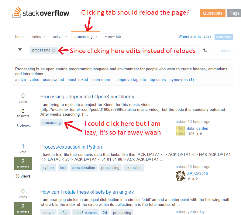
I like to reload the page by clicking on the tag link that used to be at the top of the page.

However, now clicking the tag link switches the tag to "edit mode" instead of reloading the page.

This wouldn't be a problem if I could just click on the tab to reload the page, but that doesn't actually seem to do anything.

This is helpful if I've had the page up for a while but have been away from the computer. Just clicking the "there are X new questions" link loads in the new questions, but it also loads questions that have since been deleted, so a reload is necessary. And the refresh button is so far away!

Edit 1: This is doubly annoying if I have a tab that consists of multiple tags. To get the latest, I have to refresh the page, since clicking on a tag on the page will take me to just that tag's tab. It seems cumbersome to have to refresh the page instead of staying "inside" Stack Overflow. This would all be solved if clicking the tab reloaded the data.

Edit 2: Having the tag tab reload upon click would also be consistent with a question reloading when you click its title.

6
  • 1
    why do you need to reload? can't you press F5 or click the browser icon?
    – Sklivvz
    Commented Oct 30, 2015 at 12:55
  • @Sklivvz It certainly comes down to laziness. I'm accustomed to just clicking on the tag again. I guess the question is: why should I have to reload? Doesn't that defeat the purpose of a lot of the "dynamic" features? But you're not wrong, which is why this is just a minor annoyance. Commented Oct 30, 2015 at 13:08
  • That's exactly my point. I'm trying to understand why you need to reload because there are dynamic features like notifications which make reloading pointless.
    – Sklivvz
    Commented Oct 30, 2015 at 13:11
  • @Sklivvz Well, I described that in my post, but it goes something like this: I start out on my tab, but then I walk away for an hour. When I come back, I click the link for 10 new posts, which loads those posts. But then I click one of those posts, just to find that the question has since been deleted, or answered, or closed (not all of which are reflected in the dynamic content). So I have to reload, which I usually do by clicking the tag. This is just a minor annoyance, and won't break my heart if it isn't dealt with, but I thought I should mention it. Especially since the fix seems easy. Commented Oct 30, 2015 at 13:18
  • 5
    Ah, interesting -- that annoys me too, actually.
    – Sklivvz
    Commented Oct 30, 2015 at 13:20
  • @Sklivvz I've edited my "answer" to include a case where this is even more annoying: tabs with multiple tags. Commented Nov 4, 2015 at 13:36
4

Bug

How can I rearrange/ reorder tabs?

enter image description here

enter image description here

I have done "move right". But after refresh it again move to previous position. Also I thought there need to "Save". But "Save" button is still disabled after clicking "move right".

3
  • workaround: add a tag, save, then remove it, then resave, it will now have saved the position Commented Oct 29, 2015 at 16:36
  • Yes. But Bug is bug :P Commented Oct 30, 2015 at 5:58
  • Bug reports should be their own questions, with the new-nav tag. Commented Nov 1, 2015 at 5:48
4

Yes Yes Yes !!!!

Finally I can arrange my favourite tags into groups (like one group containing all the many Excel tags, another one on the subject AVR + Atmel) and get all relevant questions within these groups that matter most to me.

No more searching for [Excel*]

Love it!

Thanks!

4

The thing I miss immediately is the ability to drag tabs to reorder them.

Replace these "move left" and "move right" buttons:

(I understand perfectly that these are easier to implement than drag and drop! No harm done, but it is a little tedious to move a tab right three times.)

1
  • 1
    This is on the roadmap :)
    – Kurtis Beavers Staff
    Commented Nov 9, 2015 at 14:23
3

Just wanting to offer my feedback...I keep finding the center search bar (the tab search?) confusing, wanting to use that to search for questions related to that tag. I have to make a conscious effort to go up to the upper right corner to actually do a question search.

I would probably echo that the tab/tag navigation does seem sort of redundant since i have some tags favorited already.

1
  • I agree that it looks a bit too 'active', but total disagree@redudancy (it replaces that, but now with FAR FAR more control) Commented Oct 28, 2015 at 22:34
3

Feature request

Can you please make a separate menu for tab creating and tab related settings? Something like a gear icon next to the tabs would be great. Or a checkbox that hides the "new tab" button and tags options.

I'm consistently clicking on "new tab" by mistake, which clutters my nav up. It drives me crazy. About the tag bar: I don't see why would anyone need to see this additional bar after creating the tab. It could be hidden inside that little menu. Or at least there could be an option to hide it on some tabs.

2

Feature Request

Previously, when we click on Intresting tab, it reloads the page with latest viewed question. but now when i am on Home tab and trying to click on Home again it is re-loading the section. I think this feature should have to be remain there.

1
  • 2
    For bug reports use a new question with tag new-nav
    – Jehof
    Commented Oct 28, 2015 at 9:43
2

I get confused every time I'm looking for unanswered questions in a tag. First I look for a nav button. Then I make a new tab and look for it in the sorting dropdown. Then I click on a tag and look for a new header link. Only after that do I finally spot it mixed in with the rarely-used links under the tag wiki. I finally save it as a new tab... but when I select that tab the UI doesn't indicate the unanswered filter anywhere except the URL.

Maybe you've got stats showing that the "unanswered" filter is never used to justify this. If not, it's currently pretty weird.

2

Feature Request

It might make sense to return to the last opened tab when clicking on the Stack Overflow logo to return to the home page.

Your thoughts?

Not the answer you're looking for? Browse other questions tagged .