In 2021 we introduced a new section to the Technology chapter of our annual Developer Survey results. We titled this section Worked With vs. Want to Work With. Our hope with this section is to expand on the popular Most Loved, Dreaded, and Wanted section (first introduced in 2015) by showing precisely what developers used in the past year and what they want to work with in the following year at a granular level.
This post aims to clearly explain Worked With vs. Want to Work With and how to interpret the visualization we chose. It can also explain the intuition behind "Loved, Dreaded, and Wanted" if this is your first time reading our survey results.
Refresher on "Loved, Dreaded, and Wanted"
Before jumping into how to interpret the visualization let's have a quick refresher on how we structure our survey and what in the world Love, Dread, and Want mean.
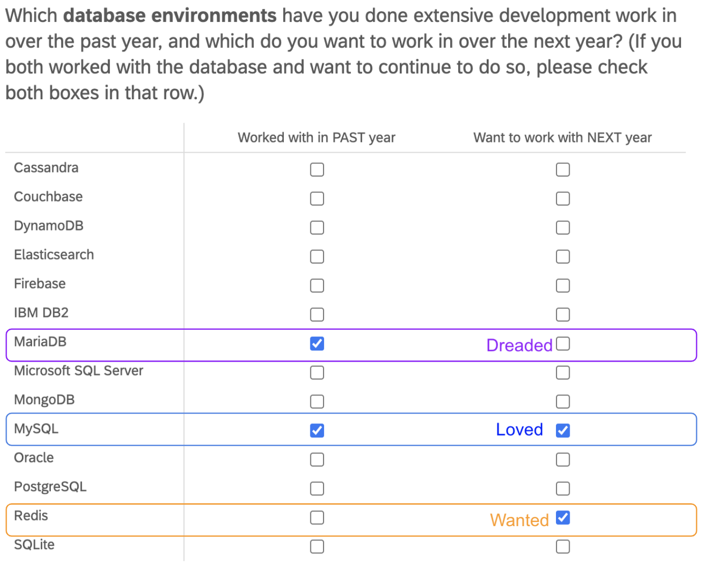
Above we are looking at the database question. You can see that there are multiple databases listed and the survey respondent can choose what databases that they have worked with and the ones they want to work with.
We defined the categories as follows:
Loved (MySQL) = Worked with in PAST year AND Want to work with NEXT year
Dreaded (MariaDB) = Worked with in PAST year BUT DO NOT Want to work with NEXT year
Wanted (Redis) = DID NOT Worked with in PAST year BUT Want to work with NEXT year
These three metrics have become an integral part of our developer survey in recent years. And rightfully so as they are able to take our quantitative results and share them in a way that developers and non-developers can connect to.
Why
In the above example, you can see that Loved, Dreaded, and Wanted can only describe a single database. But we can plainly see that this respondent wants to move away from MariaDB, continue using MySQL, and start using Redis.
Introducing Worked With vs. Want to Work With
This "from and to" path is exactly what we wanted to show in this year's survey. To visualize this path we chose to use a Chord Diagram. While chord diagrams can look intimidating (they were for me) at first glance they can offer lots of insights if interpreted correctly. Especially if they are interactive which was a must-have if we wanted to use them.
Single From and To Path
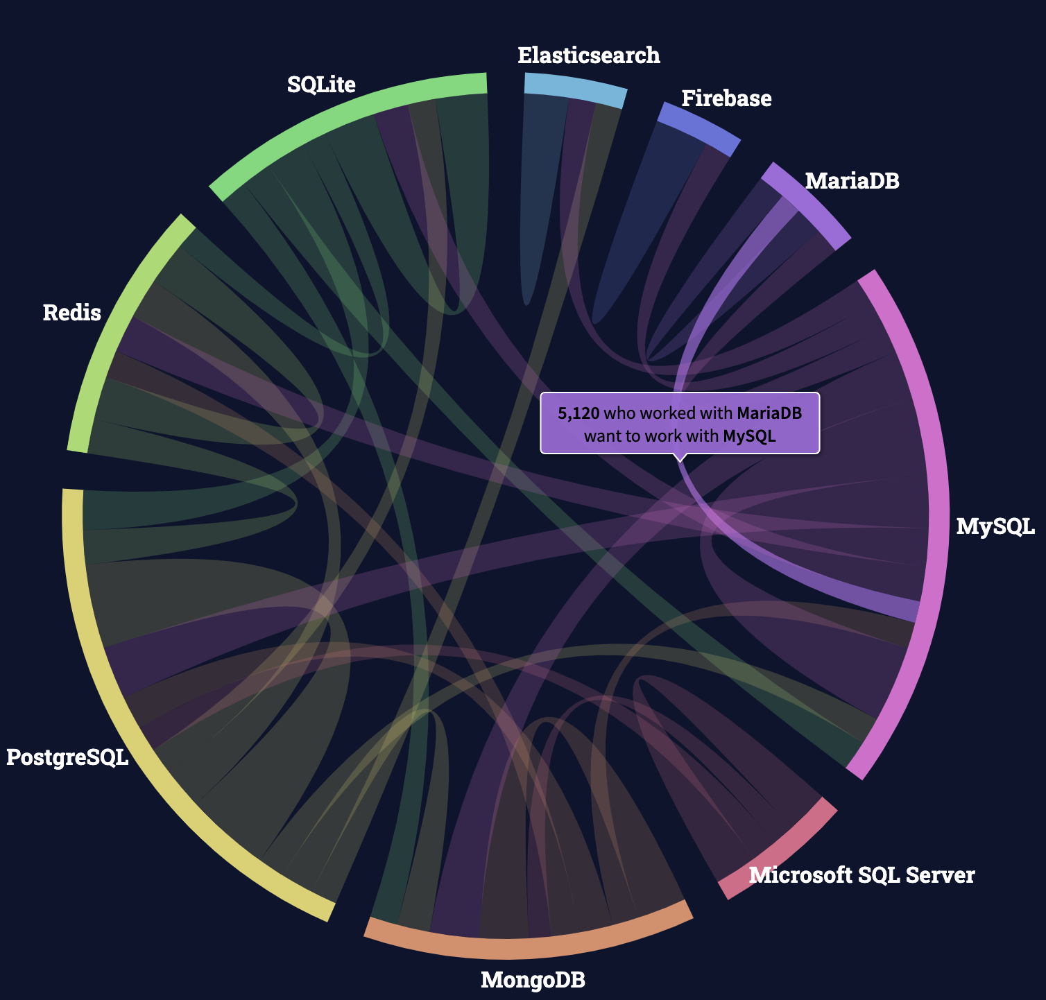
When highlighting a single path we can see it's from and to databases. Here we see that 5,120 respondents worked with MariaDB this year but wanted to work with MySQL next year.
All Paths
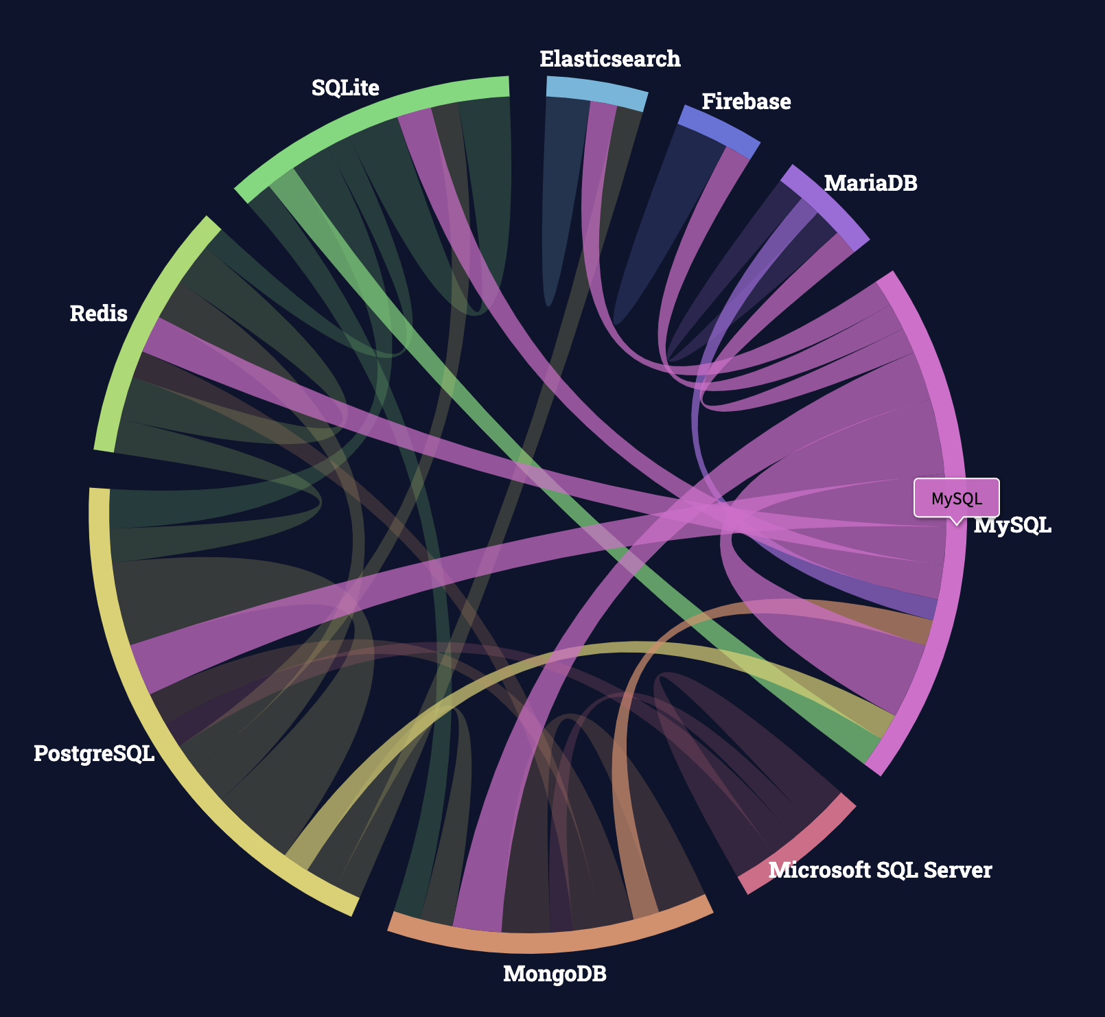
When hovering over a single database we can see all the paths that connect to it. It looks like MySQL has paths moving to every other database with the exception of Microsoft SQL Server. When looking at the different colored paths we can see that only four databases are leading to it (MariaDB, MongoDB, PostgresSQL, SQLite):
Self Connecting Paths
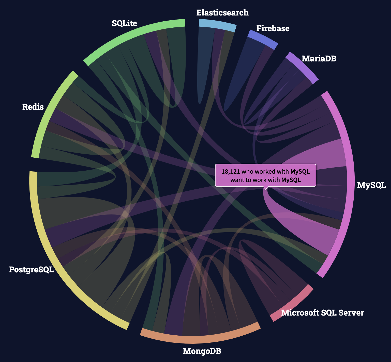
If a path is from and to the same database then this is the equivalent of Loved because these developers are currently working in MySQL and want to continue working in MySQL:
FAQ
Why aren't all options visualized?
- We set a minimum number of responses an option must have in order to be visualized. If we included every path the visualization would be extremely hard to interpret.
Why not use a parallel plot?
- We considered it but were unable to get the results we wanted with the categorical data that we have.


