109

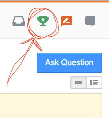
I have Deuteranopia (red-green color blindness), so when the "achievements" button in the top bar is highlighted in green, it's still pretty close to the grey color in its inactive state:

close-up image of the top bar, with the "achievements" icon lit up in green, encircled with a red freehand circle and arrow

For what it's worth, the red color of the "review" link to the right looks perfect.

14
  • 37
    I would appreciate a theme for Stack Overflow optimised for color blindness. Or is that icon currently the only thing that is hard to distinguish? (I don't know myself, since I don't have Deuteranopia) Btw you can use a broswer plugin to alter the CSS style and change the color for that icon (as a hotfix until the developers implemented your suggestion).
    – Tom
    Commented Sep 11, 2017 at 8:56
  • 9
    If you want to use such a browser plugin (like Stylish for Firefox), then use this additional style .so-header .secondary-nav .-link._highlighted-positive { color: #da670b; }, it should set the highlight color to the same as for the reviews.
    – Tom
    Commented Sep 11, 2017 at 9:05
  • 4
    Is this the only example of something you have trouble with? If there are more problems it is a good idea to tackle them in one go. For example: the color of a question having an accepted answer is the same shade of green, I assume you have trouble distinguishing that as well?
    – Gimby
    Commented Sep 11, 2017 at 9:12
  • 4
    Shamas, would a brighter shade of green help? In other words, how does brightness translate with deuteranopia?
    – Cerbrus
    Commented Sep 11, 2017 at 9:24
  • 33
    The approach that's been standard since Microsoft released their first UI guidelines (if not since IBM CUA) is to never limit the feedback to color change alone. The shape should also change.
    – user3458
    Commented Sep 11, 2017 at 11:15
  • 7
    BTW Shamas the color for the active review icon is orange.
    – TylerH
    Commented Sep 11, 2017 at 13:55
  • @Gimby, while I don't have Deuteranopia, I believe there's a large difference between a green/gray small icon that is always present versus a green/white check that is only present for an accepted answer. That said, I agree, tackle things all at once. It would have been nice to have done this - accessablilty - correctly the first time. But let's do it right now.
    – user7014451
    Commented Sep 11, 2017 at 20:18
  • 2
    @Cerbrus, my first comment should say I don't have color-blindness of any sort. But simply changing the shade of color of something that exists at all times like an icon isn't the right route to go. I up-voted a comment because at least that is a change in appearance that goes beyond what one would see as default. In mobile apps you can add a "badge" - think that. No matter the color, shade, tone, default, whatever - it isn't there and then it is.
    – user7014451
    Commented Sep 11, 2017 at 20:24
  • 3
    Wait a sec. These things change colour? Commented Sep 11, 2017 at 21:00
  • 2
    @dfd: Hey, it's just a suggestion. I'm genuinely curious if brightness helps. A lot of us are unfamiliar with the complications of being color blind. Please don't assume I'm implying just a brightness tweak is enough. I'm not.
    – Cerbrus
    Commented Sep 11, 2017 at 21:45
  • 2
    @Gimby The accepted question tick and greyed question tick do present the same issue, but the size is bigger, which helps. Even when I zoom into the screen, I can tell clearly if the achievements is green or not. When it's small, it's challenging.
    – Shamas S
    Commented Sep 12, 2017 at 1:21
  • 2
    @Cerbrus The confusing bit is that there isn't a hard and fast rule. Brightness does help. I guess the confusing bit is the smaller size and the closeness between unselected grey and highlighted green.
    – Shamas S
    Commented Sep 12, 2017 at 1:24
  • 2
    @TylerH Will you be willing to meet me halfway on orangish-red? Reddish-orange is my final offer.
    – Shamas S
    Commented Sep 12, 2017 at 1:26
  • 7
    Ugh. Color should never be the only way to convey information. That's basic accessibility.
    – ale
    Commented Sep 12, 2017 at 12:10

4 Answers 4

105

Why not put a dot in the green area that indicates unread notifications instead?

Example of notification with dot in the rep notification area at the top right

The dot is meant to emulate the badge icons.

I considered coloring the dot to indicate what sort of badge, but a colored dot on a green background would probably be worse for people (not to mention ugly).

Pros:

  • Color-blind friendly
  • Unobtrusive (matches the current UI)
  • Easily distinguishable from rep notifications (as long as there isn't a rep notification at the same time)
  • Can be styled to match badges for each site using each site's custom sprite sheet

Alternative

As suggested by Kobi and Cerbrus, here is a version that has just the dot:

Example of notification with just a green dot on the lower right

Pros:

  • Also color-blind friendly
  • Matches current UI fairly well
  • Distinguishable from rep notifications
  • More intuitive than the dot on the green background (thanks for saying "dollar bill" and ruining the first design, Kobi)
  • Allows badge notifications to be distinguished from rep notifications when both appear at the same time
13
  • 16
    This is by far the best option, as it means the color just plain doesn't matter anymore. Although I'd go with something like "NEW" when there is no reputation change, rather than a dot (not all sites use a dot for badges, and this eventually will be used on all sites).
    – animuson StaffMod
    Commented Sep 11, 2017 at 22:31
  • 2
    I was thinking maybe each site could put their custom dot replacement in there instead. If a dot were done, it would probably be done using the sprite sheet, since that's how the current badge dots are done. With that assumption, it would be easy for each site to customize this as they saw fit (since each site has a custom sprite sheet already). Commented Sep 11, 2017 at 22:37
  • I think this is a great solution.
    – Travis J
    Commented Sep 11, 2017 at 22:44
  • 10
    Good idea, but this mockup looks like a dollar bill. Maybe just a green dot.
    – Kobi
    Commented Sep 12, 2017 at 4:43
  • 2
    How would this work when there are both unread badge notifications and unread rep notifications?
    – Kaiido
    Commented Sep 12, 2017 at 5:05
  • @Kaiido Is it important to know that there is an unread badge notification along with the unread rep notification? Being a low-rep, low-rep-change user, the thought hadn't occurred to me. But I can imagine a situation where somebody gets upvotes often enough to be more interested in badge changes. That's a very good point. Commented Sep 12, 2017 at 5:15
  • @AndrewMyers well I always thought this badge color thing was only meant for this case. Most of the new badges I recently got are linked with reputation changes and I think I can tell I have seen this green icon more often with the rep span, than without.
    – Kaiido
    Commented Sep 12, 2017 at 5:19
  • 3
    To be honest, I think it's ugly and inconsistent. IIrc, the review icon has a small dot on the corner if something requires special attention. A similar dot can be applied to this icon as well. Not some kind of vague square-with-dot... As long as the shape of the icon changes, the change can still be subtle.
    – Cerbrus
    Commented Sep 12, 2017 at 6:50
  • 1
    As a user with mild color-blindness, I fully approve. There are many forms of color-blindness so trying to figure which set of colors to use to work with all of them is just a nightmare. Instead, it is much easier to use colors that are pleasing to normal users as an enhancement on top of shape changes (distinguished not by color, but brightness). Commented Sep 12, 2017 at 12:29
  • 1
    Make it a dot then, not an ugly dot-cutout.
    – TylerH
    Commented Sep 12, 2017 at 14:20
  • Why does it have to be a dot, why not a square.
    – Braiam
    Commented Sep 12, 2017 at 23:06
  • 5
    @Braiam Dots are a universal symbol of joy, hope, and happiness. Dots bring sight to blind stick figures. Dots are what bring TLDs and domain names together. Dots are used in many languages to retrieve properties and separate angry sentences. Without dots, regexes would be more verbose and .NET would be plain NET. DOTS MAKE THE WORLD GO 'ROUND. ...Squares are just boring. Commented Sep 12, 2017 at 23:27
  • 1
    I prefer the "dollar bill" since it's more consistent with the reputation notifications. Commented Sep 13, 2017 at 9:21
43

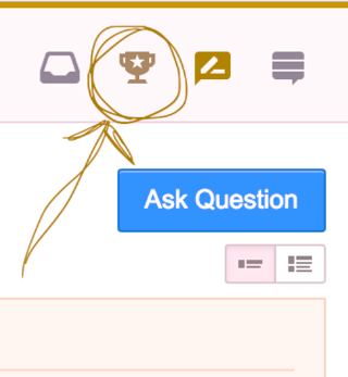
For awareness, this is what this color-blindness simulator says the image looks like with deuteranopia:

enter image description here

I can't tell you how accurate the representation is, but at least it should give you some idea.

9
  • 51
    Nice green free hand cycle Commented Sep 11, 2017 at 14:07
  • Change something more than this! Seriously, there's being subtle, and then there's being obscurely subtle when you don't mean to be. Your screenshot is easily twice as large as realtime on a 13 inch screen. Hate to think what it is mobile. The new design is good. But there are things that can improve.
    – user7014451
    Commented Sep 11, 2017 at 20:27
  • 20
    @dfd: Ehm, I didn't change anything. I just took the OP's screenshot, put it through the simulator, and uploaded it, so people that aren't color blind can get an idea of what it looks like right now. Informative, that is all. This is not a traditional "answer" in the sense that it solved the OP's problem, but a comment wouldn't have sufficed to visualize what the OP's problem is.
    – Cerbrus
    Commented Sep 11, 2017 at 21:42
  • Apologies if you misunderstood me. (Both comments!) Reading through the comments, I began to realize how poor a simple color change is. An accepted answer gets a check, regardless of the color, it wasn't there before. Same with badges. When I receive rep points, I get a badge, so I know it's not only technically possible, it should be relatively simple to deploy. (Stress intended - after all, a site devoted to helping developers know how to code things for future upgrades, right?)
    – user7014451
    Commented Sep 11, 2017 at 21:52
  • 3
    @dfd: I don't disagree, but I don't see what that has to do with this answer?
    – Cerbrus
    Commented Sep 11, 2017 at 21:53
  • I guess I misunderstood you. After seeing a comment wondering if a different "shade" of green would help I then saw this and, um, assumed you were thinking this is enough. Again, apologies. I don't hang on MSO much, only asked a few questions and never answered AFAIK. Peace!
    – user7014451
    Commented Sep 11, 2017 at 21:56
  • 1
    @Cerbrus This is spot on! The screenshot is greatly scaled up. So it's easy for me to tell that there is a difference in the shade of color between messages and achievements. But if I were to scale it down, it will become confusing and will give me false positives.
    – Shamas S
    Commented Sep 12, 2017 at 1:31
  • 1
    @ShamasS: Good to know :-) The scaling seems to be a side-effect from the tool...
    – Cerbrus
    Commented Sep 12, 2017 at 5:30
  • @Cerbrus You can scale it down in imgur (appending m to the image name) - i.sstatic.net/f0SaQm.png looks approximately the right size
    – Rob Mod
    Commented Sep 12, 2017 at 8:05
16

I don't like the idea of changing the green color. Rep is green. We need to show modified lines to make this clearer for all SO users.

Here's my try at an alternate UI:

enter image description here

I'm not a UI guy, so forgive me if this looks terrible.


Edit: An additional idea, make the icon slightly larger as well:

enter image description here

14

I have written on the UX exchange about color accessibility.

ColorHexa has an awesome tool that helps with these types of scenarios.

In the link, you can see in the color blindness section the issue described by the OP:
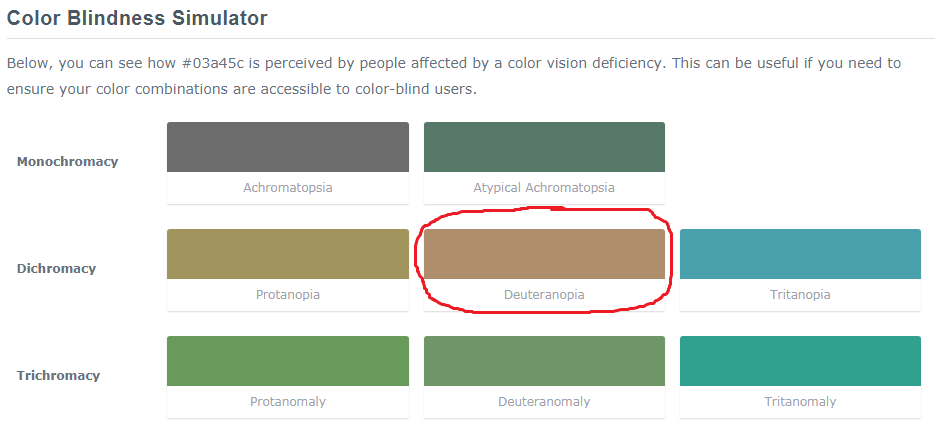
enter image description here

For reference, this is also why modern traffic lights are blue-ish green and no longer pure green as a percent of the population was having issues determining the difference under poor weather conditions between red and green (a clear problem).

Making a color that works for users who do not see green is a little complicated. I understand that color accessibility is also complicated for people affected by deuteranopia, so please don't take the purely technical color analysis as an indication of dismissal.

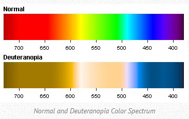
It hard to make anything which is supposed to be green, then look like a similar color as the only conversion to go on is that there is no longer green present. Either move away from green, or accept that parts of the UI may look to some as a salmon color.

This is what the color range looks like as far as conversion goes
enter image description here

The problem is that the best bet is a shade of blue to ensure everyone sees the same color, however that does change the intent of the icon in general. Reputation gain at Stack Overflow has always been green.

Here are some options, although to be honest, I do not think any are that ideal.
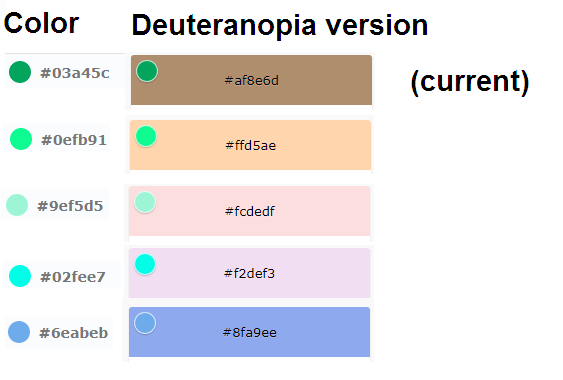
enter image description here

1
  • 14
    The question is, does it matter that everyone sees exactly the same color, does it just matter that the color changes are discernible? I think the latter is the bigger issue. If color-blind people perceive what is "actually" green as being orange/salmon, then that's not really interfering with their ability to use the site.
    – Cody Gray Mod
    Commented Sep 12, 2017 at 9:57

You must log in to answer this question.

Not the answer you're looking for? Browse other questions tagged .