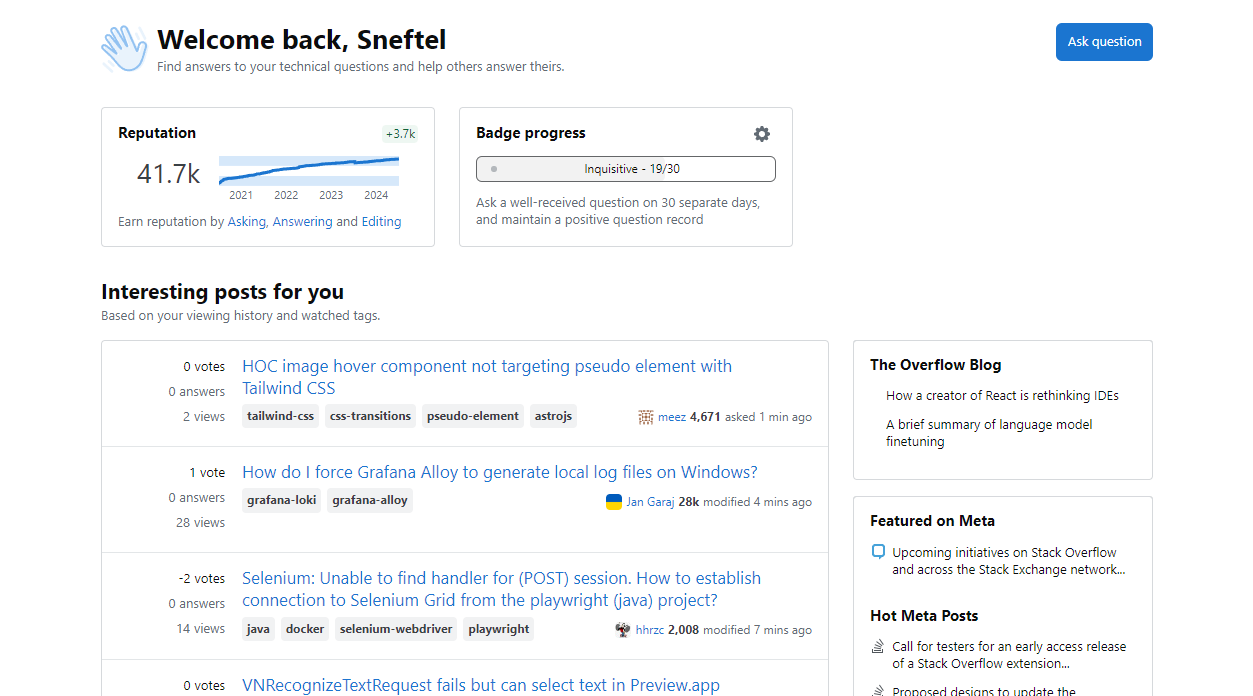
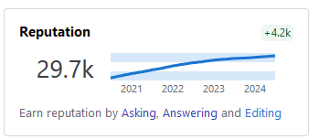
-278

Update October 28th, 2024

Today and for the rest of this week, we will begin releasing the new homepage experience to registered users. By the end of this week, everyone should be able to see it as it has been proposed.

We appreciate all the feedback we have heard up to this point and are considering it for further additions to the homepage.

If you have feedback after using it, see bugs, or notice anything wonky, please leave it on this post.


A few weeks ago, we shared a rough outline of how the default homepage experience could look for logged-in users. We appreciate all the feedback we received and have come back to share a more detailed vision of what our first pass at updating the homepage will look like. There are still a few things we are sorting out at this point, but consider this about 98% of the way finalized.

For our first pass at a homepage, we wanted to be sure we came up with a strong default experience that would support all users. However, some of the feedback we received has been put into our v2 bucket for consideration and won’t be addressed on this first pass. After we have completed this default user experience, we will go back to the drawing board to explore what features we can add to better support our curators and power users for a v2 iteration.

Homepage Widgets

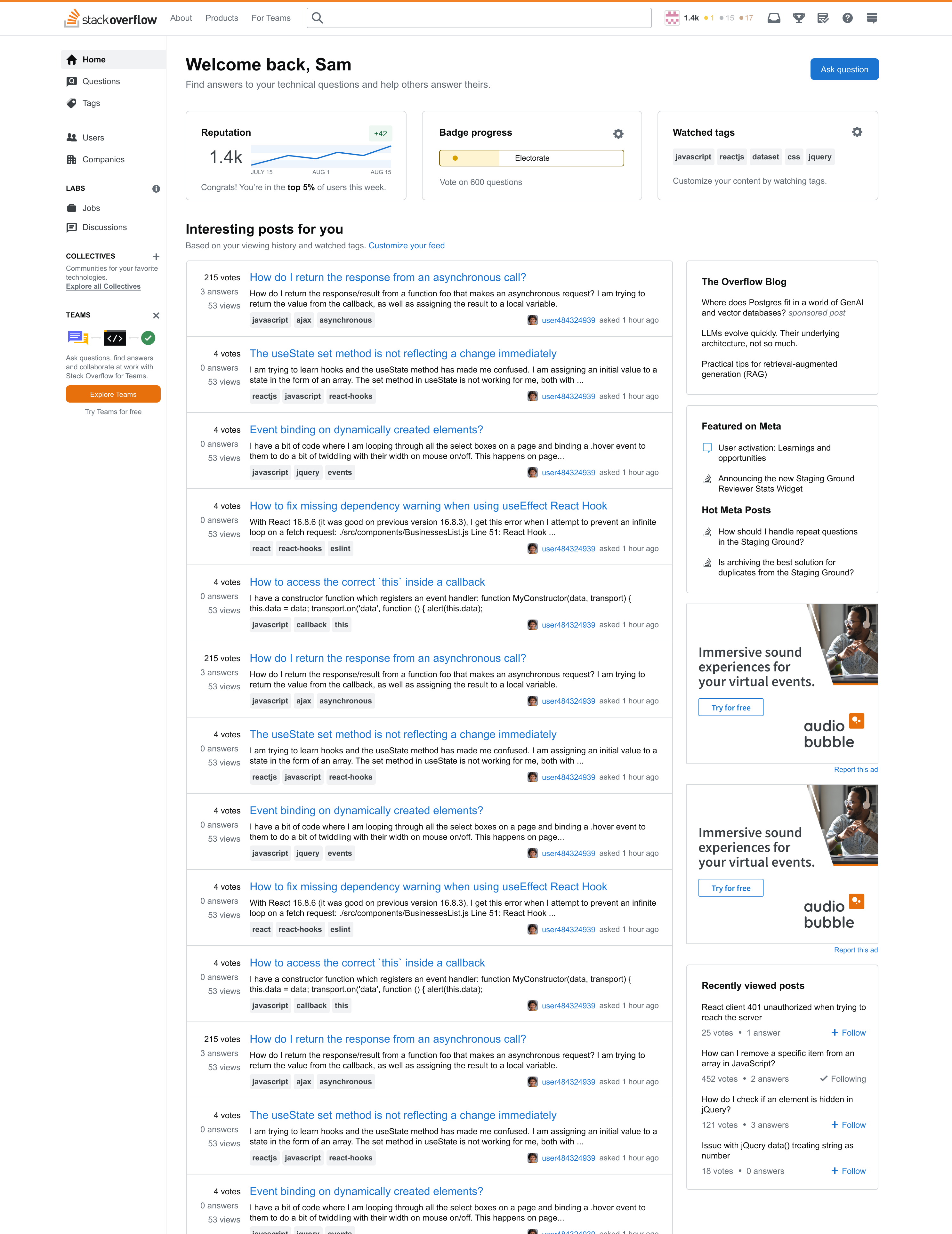
Image showing all three of the widgets on the homepage: reputation, badge progress and watched tags

Version one of the homepage update will have three widgets at the top that will vary a bit depending on your activity on the site. The content in those widgets includes:

Badge Widget

Screenshot of the badge widget with the get started here as a primary button

The middle widget will track badge progress. Users who have not completed the tour will be prompted to do so here. To add some extra emphasis on driving users to the tour, we have made the “Get started here” button primary and the “Ask Question” button secondary to drive newer users to it. Please note that we're exploring updating the tour page itself as a part of these efforts and will follow up with more communication around it.

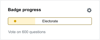
Badge widget for established users. It shows the typical badge progress bar with the example of the electorate badge

For more experienced users, the badge progress widget will show the progress with a brief explanation of the required actions. The gear icon in the top right will allow a user to change the badge they’d like tracked in the widget.

Reputation Widget

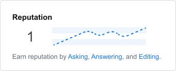
Reputation badge widget shows a line graph of potential rep increase, shows a rep of 1 and links to the asking, answering and editing help center articles

New users will see the widget displayed at one reputation point with links to asking, answering, and editing.

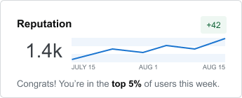
Rep badge for establishes users. Shows a rep of 1.4k, a line graph from July 15th to August 15th and indicates the users is in the top 5% of user that week

Users with more than one rep will see their current rep score, a generalized graph of rep activity, their rep score change over the last 30 days, and possibly where they fall percentage-wise among other users. We are undecided on the percentage piece as nobody is going to care to know if you are # 18,567,283, but it is fun to know if you are in the top 2% or something similar. So this may be something that we decide to leave out and roll out conditionally for people near the top.

Watched Tags Widget

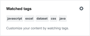
Widget showing the users watched tags which are: Javascript, ractjs, dataset, CSS, jquery

The final widget we are launching will allow users to see what tags they are watching. This widget is the same regardless of the user's experience with the network. The gear icon in the widget will allow users to add more watched tags or ignore tags.

Interesting Posts for You

Complete screenshot of the entire homepage and how everything comes together with a question feed titled "Interesting posts for you"

This will be a feed of questions that are curated for you. We will start with the existing logic that is on the homepage today. For a v2 we are exploring if we can do something a bit more personalized based on your viewing history and watched tags. You will have the option to customize this to some extent by adjusting your watched/ignored tags.

Right Sidebar Changes

Shows the new sidebar with the following components in order: The overflow blog, featured on meta, hot meta posts,  two ad units and newly added component recently viewed posts

As part of this project, we are updating the right sidebar to simplify and modernize it. As you can see in the image above, it looks a bit different. The order of the sidebar components is not entirely settled, so you may see some A/B testing of it in various orders. We are also exploring releasing these changes network-wide:

  • No more yellow in the sidebar, moving to a more modern and simple look, so we made the component boxes consistent with neutral colors throughout.
  • Hot Meta posts will no longer include a score next to them.
  • We will add a new recently viewed posts component beneath the ad spots, which, as you might guess, shows recent posts as well as the total number of votes answers and includes an option to follow the post.
  • As you may notice, we are removing the collectives component, hot network questions, and the RSS feed button from the bottom of the right sidebar. This is for the homepage only.

Next steps

We are currently finalizing the pieces of the design. Any major differences from what we outlined here will be updated in this post. After that, we will begin development work on V1 of the homepage for logged-in users and keep this post updated when we begin rolling this out.

If you have any thoughts, feedback, or questions, please let us know, we will be keeping tabs on this post for October 16th, 2024.


61
  • 10
    for the top% bit, is that different from the currently limited to 400 users reputation league top n%? if it's not... it probably won't matter for most users on SO because most users aren't in that top 400.
    – Kevin B
    Commented Oct 2 at 19:59
  • 31
    This is your irregularly scheduled reminder to please post anything that you want staff to respond to as an answer. Back-and-forth discussions in comments are very hard to follow due to the lack of threading. Don't worry too much about whether it's a proper answer for feedback posts like this. I really don't want to have to manually extract each discussion into answers again; that was quite tedious.
    – Ryan M Mod
    Commented Oct 2 at 23:02
  • 22
    As someone who does a lot of curation, I don't really see anything I'm interested in. I'm probably not the target audience for these changes, and I already use Stylus and userscripts to customize the site for myself, so I guess I'm resigned to twiddling those tools to ward off these "improvements". Commented Oct 3 at 12:29
  • 14
    Do y'all even read the feedback you're getting on those proposals? Not implementing it is fine, but at least acknowledge it! I brought up the importance on having more vertical space for questions in the previous thread. Now the top answer here brings it up again. Commented Oct 14 at 5:07
  • 30
    I can't believe y'all seriously mocked up a design that removes HNQ but not the blog. All so you could have, what, two ads right next to each other? Why is Recently Viewed Posts a table with descriptions and titles, and not just a link to a separate page?
    – TylerH
    Commented Oct 17 at 15:36
  • 20
    I don't understand why you are building this at all, what is there here that is actually useful to any logged in user?
    – DavidG
    Commented Oct 23 at 14:00
  • 29
    Seriously, though, now that it's here, how do I turn it off? I don't want the noise at the top. I want to see a non-personalized feed. (Feel free to highlight ones with tags on my watchlist, but I want to see all the latest stuff.) Please, please, please. Even if this new view is the default, please give us an option to turn it off. Think of it as the ultimate form of personalization: letting the user decide. Commented Oct 29 at 6:13
  • 38
    Holy crap! Did you really stop highlighting questions with watchlist tags on the feed? Why would you do that?! And why did you remove access to the watchlist from the home page? Now I have to go to my user page, edit my profile in order to deal with my watchlist? Why would anyone bother if they watchlist matches aren't highlighted?! Commented Oct 29 at 6:19
  • 34
    Great, so now I have to go to stackoverflow.com/questions in order to get away from this new irrelevant crap and reach my filter so I can see what I want to see. Nice job. Not.
    – matt
    Commented Oct 30 at 14:45
  • 16
    All the bugs introduced are fixed by updating your bookmarks to stackoverflow.com/questions
    – Alejandro
    Commented Oct 30 at 15:10
  • 14
    How do I turn it OFF, it's ghastly. The white outlines in dark mode - who makes this stuff up? The loss of real-estate at the top, not good. Remember - "If it ain't broke, DON'T FIX IT", and ... "a new FEATURE is a BUG if it cannot be TURNED OFF". My .02. Commented Oct 30 at 18:06
  • 10
    @SpencerG how can you possibly justify pushing this through with such an overwhelmingly negative response here on Meta? I simply do not understand the company's reasoning behind these pig-headed moves. Is it just sunk-cost fallacy? What?
    – Phil
    Commented Oct 31 at 2:00
  • 13
    Can you please return the yellow highlight on questions with watched tags? It's really hard to spot them otherwise. Commented Oct 31 at 4:24
  • 8
    Now it's live. Farewell good old HNQ. And what a crazy idea to tell me my own name in big letters on top. Thank God, I can block this. Commented Nov 1 at 8:52
  • 10
    This redesign looks awful on desktop, removes features that I use regularly, adds visuals I don't want on my home page, and makes the interface look both sparse and crowded, somehow. Please revert to the previous version
    – vbnet3d
    Commented Nov 1 at 15:45

59 Answers 59

292

Why is the hot network questions being removed? I'd much rather have that than the overflow blog

25
  • 59
    Agree, I never read those blogs.
    – Poul Bak
    Commented Oct 4 at 9:09
  • 115
    I really enjoy seeing a glimpse of the weird and wonderful questions on the other networks. It really helps promote networks I'd have never come across before. The adverts could be moved to the left-hand side where there's already lots of free space. Although I'm sure most users are just adblocking anyway.
    – akiller
    Commented Oct 4 at 13:56
  • 53
    Yeah, now that most of the blog posts are about AI things I really do not care.
    – SamB
    Commented Oct 5 at 5:18
  • 48
    HNQ is definitely the most common thing which draws me into other networks, without it in the sidebar I'll view fewer total pages on the SE network for sure
    – Wolfie
    Commented Oct 9 at 16:34
  • 4
    Maybe they are putting the blog(s?) there to try to get us to read them. I never read them either. I won't read them if they are shoved down my throat like this. I love the HNQ feature! Removing it is an awful idea. They won't listen to us though.
    – Ellie K
    Commented Oct 16 at 11:16
  • 6
    The SE PMs seriously think users - any users newbie to experienced - would prefer a box with "Featured On Meta"/"Hot Meta Posts" to HNQ? Wait, never mind that: They think it would drive more site traffic to have "Featured On Meta"/"Hot Meta Posts" instead of HNQ? (If nothing else consider the rate of change in HNQ vs meta posts: Which will be most often novel and new and create clicks?)
    – davidbak
    Commented Oct 17 at 21:05
  • 4
    To be fair I have disabled HNQ (this can be done in settings) because it distracts me too much - which is just a testament to how effective it is! The blog is just an ad that I'll never click, especially since half of them are just ads anyway and the other half are vlogs
    – Tas
    Commented Oct 20 at 21:04
  • 38
    What?! Hot network questions is the reason I even know more than just Stack Overflow exists. I've learned so much from unrelated fields just being a wallflower. HNQ is orders of magnitude more helpful/useful than blogs which clearly people don't care about.
    – Drew Reese
    Commented Oct 23 at 18:04
  • 8
    I stopped caring that much about programming, but mainly visit SO for the HNQ. Commented Oct 29 at 19:14
  • 16
    HNQ was the only thing on the homepage that I used.
    – Player One
    Commented Oct 29 at 23:13
  • 11
    Now that HNQ is removed, I have no reason to visit the SO homepage ever again.
    – BurnsBA
    Commented Oct 30 at 16:05
  • 5
    HNQ is pretty much my main reason for visiting the site, as there's always some interesting/entertaining things. It's even driven me to join up to some of the other sites so I can delve in and answer things. I really, really think you should reconsider this one!
    – HappyDog
    Commented Oct 30 at 16:49
  • 4
    @EllieK I wouldn't mind seeing blog posts emphasized, if they were actually blog posts. Instead they're videos masquerading as blogs, and that frustrates me to no end. I have no interest in watching a video. Commented Oct 30 at 20:49
  • 3
    @MarkRotteveel Which seems like entirely the wrong place to put it. It's a homepage feature, full stop. Commented Oct 30 at 21:05
  • 3
    @RobinWhittleton sshhhh, if you remind them, it’ll be replaced with more ceo-trying-to-justify-existence crap before you can blink…
    – Clive
    Commented Oct 31 at 11:13
201

Questions and answers are the actual content. The reputation graph is nice, but this is really something for the user profile. The badge progress is pretty meh. The list of watched tags is important and useful, but I think you really could do more with that and integrate it better into the site. It feels out of place at the top there.

Your screenshots also don't show how this will appear for a typical user as they don't show the viewport but the entire page. There is a lot less vertical space on a typical screen, and this means that the widgets at the top will push the actual content lower and off-screen.

As a purely personal opinion, I don't want the site to talk to me. The welcome at the top is superfluous.

16
  • 102
    Frankly I find the welcome message creepy. It's mostly spammers and Twitter trolls that like to try to address me by name. Welcome back, Colleen. Colleen, have you done any reviews lately? Hey Colleen, there are new posts in your watched tags! Shut up already. I might change my profile name to dumbass so the automated attempts to make me feel connected will at least make me laugh.
    – ColleenV
    Commented Oct 3 at 14:10
  • 2
    Hey "dumbass", that's unironically a great idea. I think I'll change my username to "dude", although I guess "icedwater" is also fine.
    – icedwater
    Commented Oct 8 at 8:55
  • To be honest, I think the widget area would be good if you can collapse it.
    – dan1st
    Commented Oct 13 at 9:11
  • 3
    The badge progress is designed to keep users contributing for the feeling of working towards a reward. Commented Oct 20 at 10:30
  • 2
    @CriticizingSEisbannable Because what we need is more people posting because they're addicted! That will surely improve the site.
    – jpmc26
    Commented Oct 24 at 8:49
  • 1
    @jpmc26 that is the reason stack overflow is popular. People wouldn't write answers if they didn't get brownie points for doing so. Commented Oct 24 at 23:00
  • 5
    Also, why does it say "welcome back"?? I was never away, 99% of the time I look at that page. And yes, the greeting is pointless. Commented Oct 29 at 12:21
  • 9
    Yeah... Welcome back is both creepy and domineering the whole page. Watched tags on top is good only if you have few of them. Side position was better as they can freely expand by height there.
    – Dalija Prasnikar Mod
    Commented Oct 30 at 13:40
  • 3
    @ColleenV Sorry, taken.
    – dumbass
    Commented Oct 31 at 6:53
  • @dumbass Dang it. Welcome back dumbass47732! doesn't hit the same way and I don't like to be a copycat:)
    – ColleenV
    Commented Oct 31 at 13:08
  • You could still try something like “man, we are reinstating Monica”…
    – dumbass
    Commented Oct 31 at 13:17
  • 3
    @dumbass Microsoft just patted me on the head and said "Nice job!" after I enabled desktop notifications for Teams in my browser. I am irrationally enraged by it. I turned that setting on, and by God I'll turn it off if you abuse it MS! Are there people that find automated patronizing affirmations a happy thing? Am I just damaged from being a latchkey kid?
    – ColleenV
    Commented Oct 31 at 16:50
  • "The list of watched tags is important and useful, but I think you really could do more with that and integrate it better into the site. It feels out of place at the top there." Perhaps in the right sidebar, where it used to be?
    – kaya3
    Commented Nov 1 at 15:22
  • The list of watched tags is the worst redesign ever made to SO. I guess it depends on how you use the site, but for me, the homepage is now USELESS! Give me back my full list of watched tags and not that utterly stupid scroll list that show two AND A HALF lines of tags. Total fail once again.
    – MrUpsidown
    Commented Nov 1 at 16:39
  • 1
    @ColleenV I find your reaction to be entirely rational. That pop up is there to trigger your reward psychology, and the people who designed it knew exactly what they were doing and did it to get more people to use their product. And you understand that. You are fully aware of an attempt to manipulate you in an insidious manner. You should be angry about that.
    – jpmc26
    Commented Nov 3 at 5:07
131

Please do not greet me by name. You don't know me. The message has no impact on whether I feel welcome or not. It wastes precious screen real estate.

Please let me eliminate those top widgets for myself. Ideally, don't foist them onto anyone. The gamification aspects of Stack Overflow were once pretty important, and they still serve a role, but they also (unintentionally) incentivize quite a bit of less-than-great content, so it would be best not to over-emphasize them. The essence of rep changes and badges are all already in the top status bar. The widgets are already available on the user pages for people who are interested.

And, of course, the widgets waste precious screen real estate.

It's not just the loss of one or two fewer questions above the fold. It's the deemphasis on what's important: questions about software development.

Remember the old blog posts by Joel Spolsky? The point of the home page was to make it immediately obvious what the site is about. Seeing the question titles (hell, even the name Stack Overflow) makes it instantly obvious to a software developers that this is the right place. (It also makes it clear to non-developers that this probably isn't the place to ask for help with a computer issue.) Putting a too-familiar greeting and gamification widgets above the questions dilutes that signal.

Remember how browsers broke the GUI models in order to make their interfaces as minimal as possible? Essential functionality was jammed up onto the window's title bar, the menu bar was eliminated, the search box was unified with the URL box, seldom-used buttons were hidden by default, bookmarks were relegated to popup menus, and status bars became ephemeral. This was all about de-emphasizing the browser in order to make way for as much of the content as possible.

Treat the home page the same way: Show only the most essential non-content navigation and status UI in a compact, efficient, and usable way, and then let the site be about the content.

The gamification is not the content. It's a feature that tries to incentivize the creation and curation of good content.

Please do not automatically "personalize" the feed. I've never seen this done well. Recommendation engines can assist with discovery of relevant content, but they should never be a gatekeeper.

Seeing the same feed as everyone else is a feature. Trends in the types of questions appearing in the feed are more telling (and timely) about what's new, what's old, and what are other developers working on and struggling with than the SO developer surveys.

When I go to a news site's home page, I don't want or expect to see headlines of articles some algorithm thinks I'm most likely to read. I want to see which news stories the editorial staff thinks are most important for everyone to see. (If the site has other pages for tailored content, fine, but the common-for-everyone home page is a feature.)

SE seems weirdly obsessed with building "community" among its users. I don't understand this desire, but I'm happy to leverage it. So consider this: Shared cultural experiences build a sense of community. If each user exists in a unique filter bubble, then there's no common experience to bond them together.

Please do allow me to have a longer tag watch list. There are several topics I'd love to see highlighted, but there's been a pretty low limit on the number of tags you can watch (like 25?), which has forced me to make some painful cuts.

3
  • 12
    The badges and reputation progress just seems so entirely useless to me. Like what do I care what my reputation is over time? And badges, what can I even do with them? If they were physical then yeah, I guess, but they're basically just records in a database and entirely meaningless to me
    – Ja Da
    Commented Oct 16 at 7:10
  • @JaDa Badges and progress do matter. But once you get to a certain level (varies by person as to what that level is) most people don't want to see anything except a single total # unless they specifically want to think about it all for some reason. And then all they have to do is click into their profile and they can look at the details. Commented Oct 30 at 23:17
  • @manassehkatz-Moving2Codidact: Even for those who find value in reputation and badges, these widgets don't actually provide anything useful. The tiny plot of reputation over time doesn't convey much and isn't as motivating as a green "+10" floating by your visible-on-every-page rep on the status bar. A widget that tracks your progress toward one specific badge (without even telling you what that badge represents) can be just as demotivating as motivating. Meanwhile, the amount of prime home page screen real estate devoted to these is hugely disproportionate to what's actually important. Commented Oct 31 at 17:50
124

October 28th; The day Stack Overflow became even less user-friendly.


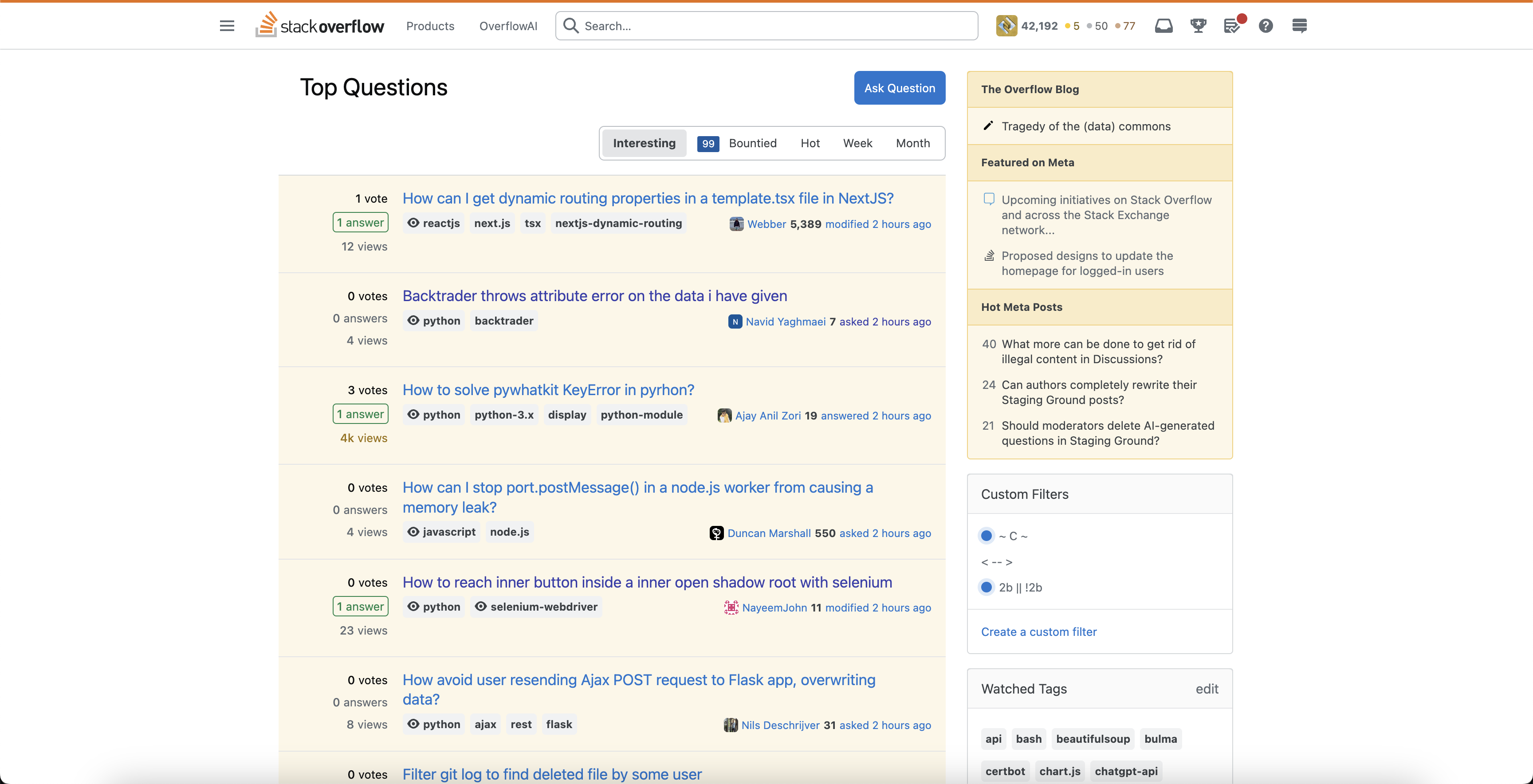
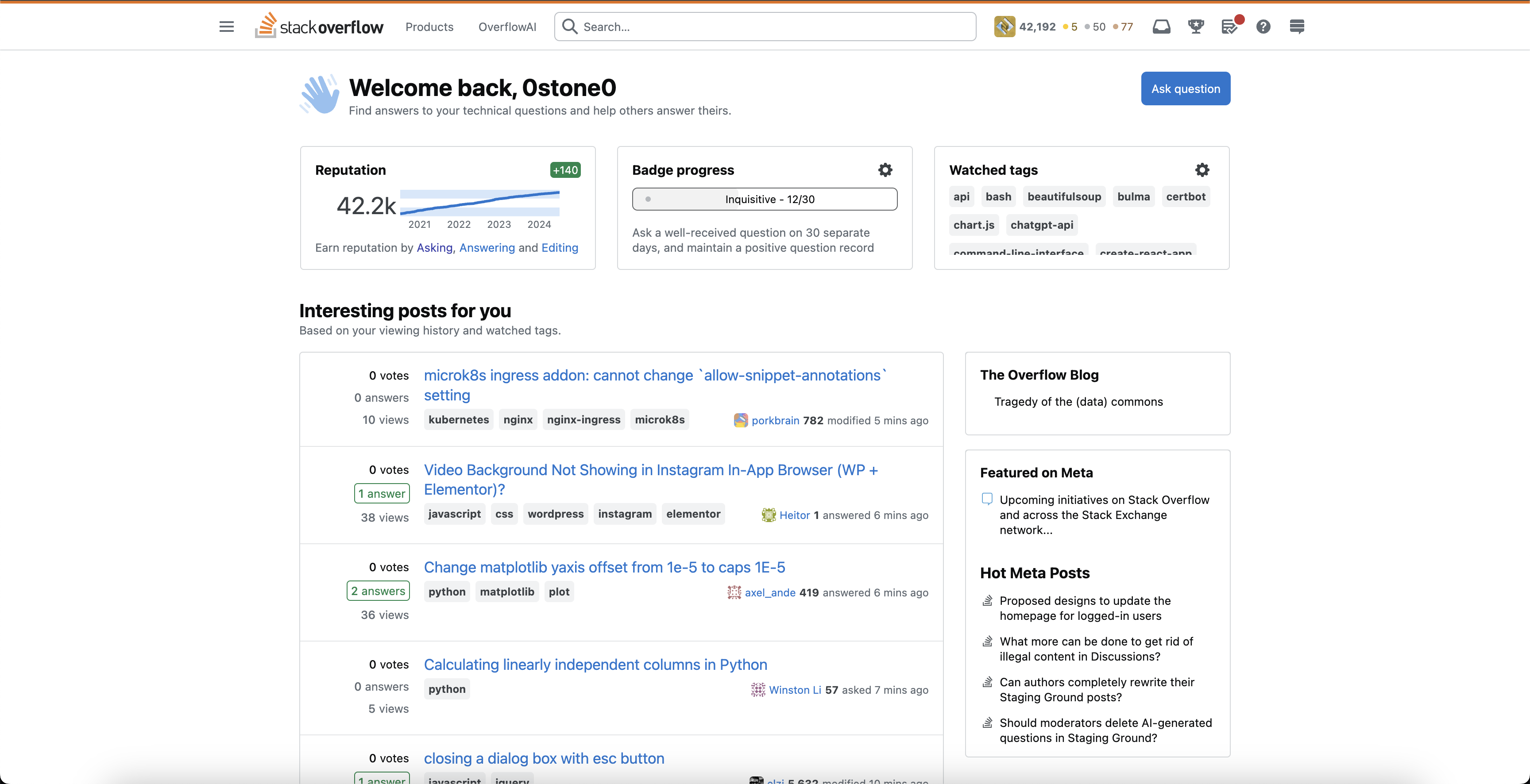
Please compare these 2 images side by side

example 1

example 2


  1. Welcome back, 0stone0

    • I was here 2 minutes ago, no need to welcome me back?
  2. Reputation, badges and tags

    • Thanks for showing me where I can earn reputation, as somebody with 42k rep, I had no idea
    • Thanks for showing me my watched tags. Even tho I've picked those myself, I really need to be reminded of those starting with a, b or c every time I open the homepage
    • In general, this kind of information should not block me from seeing the questions I came for. That information should be on the side (desktop) or on your profile.
  3. Where did the bountied, hot etc buttons go?

  4. 'Overflow Blog' & 'Meta Posts'

    • Buttons are missing an outline/color, impossible to distinguish
    • Where did the Overflow Blog icons go?
    • Where did the Hot Meta Posts votes go?
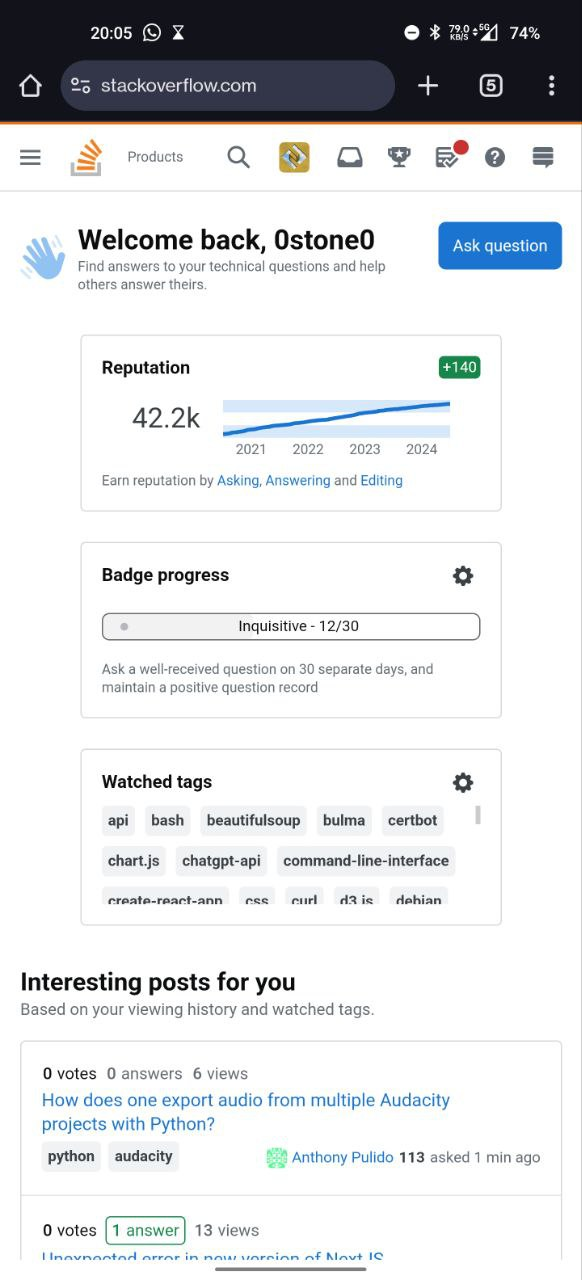
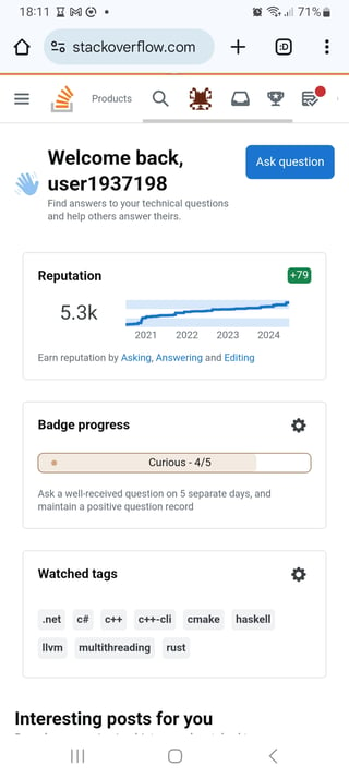
  5. Mobile screen became these 3 blocks (My specific phone shows only 1 question without scrolling):

enter image description here


I really hope this is an early a/b test and not the actual final design.

11
  • 18
    I don’t even see that one question on mobile.
    – Kevin B
    Commented Oct 28 at 19:31
  • 16
    I'd like to chime in to describe my first experience with this new design: I opened the page, scrolled down, noticed that the hot network questions were gone, tried to adblock the gigantic useless (for me) widgets, noticed that they reappeared when I reloaded the page, and subsequently changed my bookmark to stackoverflow.com/questions, which still shows me exactly what I want to see. Who knows, maybe the new design will help with user activation, but for me that was just a bad time.
    – lo-asys
    Commented Oct 29 at 8:21
  • 9
    100% agree, if I hadn't seen this answer, I would've written it myself. On my list there's also 6. missing HNQ and 7. no highlight for questions with a watched tag.
    – Christoph
    Commented Oct 29 at 9:04
  • 4
    Oee nice breakpoints! Graphic design is my passion
    – 0stone0
    Commented Oct 29 at 11:52
  • 2
    Agreed the mobile view is less than ideal is bad, we are working on a fix for that. I think we are gonna condense them all into one widget that you can scroll through and drop the welcome message and/or change the cadence to be pretty infrequent. Up in the air at the moment.
    – SpencerG StaffMod
    Commented Oct 29 at 18:12
  • 12
    Then please allow us to disable the widget all together. Combining it into 1 makes it better, but does not solve the issue.
    – 0stone0
    Commented Oct 29 at 18:43
  • 4
    OMG I had not looked at the mobile appearance. That's a major screw-up. Somebody was not testing well. Commented Oct 31 at 14:26
  • 2
    Regarding your point 2, second bullet, I use the watched tags to quickly navigate to the specific tag pages or tag-filters I'm interested in, but the old location to the right was much better. Commented Nov 1 at 11:21
  • 3
    If reducing the number of visible widgets from 3 to 1 is an improvement, imagine how much better reducing it from 3 to 0 would be.
    – kaya3
    Commented Nov 1 at 15:27
  • 2
    @SpencerG Working on a fix? Why don't you just bin all that garbage and bring back the old design which was just fine?!
    – MrUpsidown
    Commented Nov 1 at 16:43
  • 1
    @SpencerG please just revert back to the old page instead of trying to polish the turd you released in a mvp state.
    – l4mpi
    Commented Nov 4 at 15:52
102

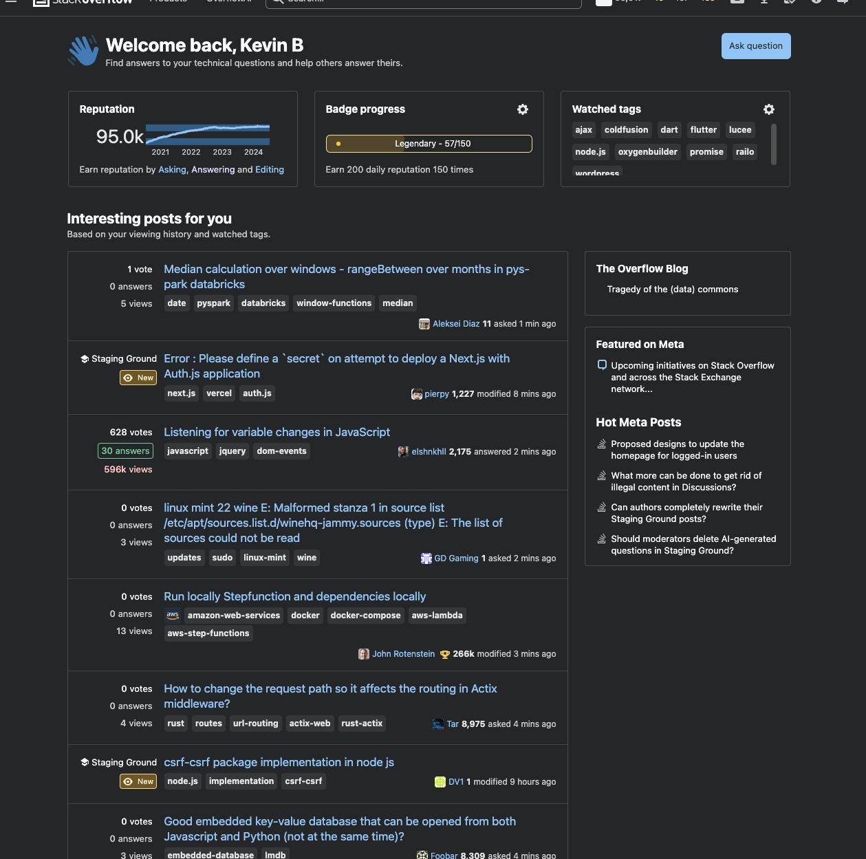
👋 Welcome back, Marco Bonelli

screenshot

This has to be one of, if not the worst UI/UX update you guys have ever forced on to us. It's a big nope for me, and I'm probably going to repeat things that have already been said, but let me explain what I don't like:

  1. I don't know why anyone would "welcome" you saying your full name. A lot of people use their full name on their SO profile and this is what happens. Reading "Welcome back, Marco Bonelli" feels off. It feels eerie. Secondly, why is this thing welcoming me every single time I browse to the homepage? I've been here 2 seconds ago, what is the "welcome" for? No other website I use does this. Heck, I wouldn't even know why would a website welcome you at all.
  2. Reputation and badge progress is something I really do not care about that much, and it's already in my profile, where I would expect it to be. Putting it in my face at the top of the homepage just makes it annoying. It makes it look like a passive-aggressive reminder that I need to somehow improve the metric and that's the most important thing that I need to care about. It delivers the wrong message. Reputation is also visible at the top in the status bar, where it's always been, so this is also redundant.
  3. Watched tags used to be nicely displayed in the side bar and now they are compressed down into a tiny amount of space with a scrollbar where I cannot even see 3 full rows of them. Come on... how can anyone in their right mind think that this is an improvement?
  4. The whole right sidebar now feels useless. Where did my custom filters go? Custom filters are the most helpful tool I use on a daily basis to find questions to answer. I would definitely rather have those than a duplicated reputation counter and a useless badge progress bar. Thankfully they are still in the sidebar in the /questions page (which by the way I am making my new homepage at this point).
  5. I do not use SO on mobile that much (thankfully), but as others have pointed out, this new banner thing now fills the entirety of the browser viewport and you have to scroll one full page to get to what you actually want to see, i.e., the questions. If this isn't a big UI/UX failure I don't know what it is.

These were just 5 points off the top of my head. I am sure if I keep staring at this new homepage design I could come up with even more, but I really don't want to look at it that much. I'll simply redirect stackoverflow.com to stackoverflow.com/questions with a user script and call it a day for now.

10
  • 5
    "Maybe I am remembering incorrectly, but weren't custom filters on the homepage too?" Yes, on the right sidebar: i.sstatic.net/rq68jakZ.png
    – VLAZ
    Commented Oct 29 at 7:03
  • @VLAZ glad to see I wasn't going insane :'). Thanks, updated my point above. Commented Oct 29 at 9:00
  • 3
    "glad to see I wasn't going insane" let's not be so hasty in declaring sanity :P
    – VLAZ
    Commented Oct 29 at 9:02
  • 4
    I entirely agree with your point 1; on top of that, I really hate (hate!) the use of that waving hand icon Commented Oct 30 at 8:15
  • 3
    Seconding the missing Custom Filters box! That's how I find (found, apparently?) questions to look at!
    – genpfault
    Commented Oct 30 at 14:48
  • 4
    Thank you for pointing out that stackoverflow.com/questions still has the old sidebar!
    – M. Justin
    Commented Oct 30 at 16:45
  • 3
    The fact I now have to open a random (likely irrelevant) question, just to get to my custom filter is already frustrating me greatly...
    – Thom A
    Commented Oct 31 at 8:53
  • 1
    @ThomA careful doing that, you're going to mess up the suggestions on the new amazing homepage /s Commented Oct 31 at 11:29
  • 1
    Good, it'll further evidence how s**t the design is, @MarcoBonelli . I'm never using that page other than to navigate away from said page.
    – Thom A
    Commented Oct 31 at 12:11
  • 1
    "why is this thing welcoming me every single time I browse to the homepage?" - because this site stopped being about content and expertise long ago, now it's all about fluff and happy vibes and being welcoming. As "being welcoming" doesn't exactly translate well into useful technical requirements for website development, it seems like it was just taken literally...
    – l4mpi
    Commented Nov 4 at 15:56
75

Are these widgets going to be in a container we can target all at once? I'm definitely going to want to remove them, they serve no purpose for me.

My account name and rep is at the top of the page, increases and decreases are on the trophy icon at the top, and I'm not chasing badges. :shrug:

Watched tags are somewhat important on this page, given this is where you'd generally want to see it, but they're not important enough to be at the top of the page. The right side bar is fine for that. (where are ignored tags? that used to be in the side bar too.) Also... with watched tags up here we can't even remove this section without losing functionality or adding userscripts. :(


I generally think this is an improvement for newer users and users who are still actively chasing badges/rep/etc, but... it's just more stuff to scroll past every time I open the page. Even just adding an X that closes it out and duplicating the watched tags widget on the right column where it was would be fine.

6
  • 21
    Will be working on a userscript to hide the widgets once they roll out... Shouldn't take more than 15 minutes or so :) Commented Oct 2 at 21:07
  • @M-- I just right click and "Block Element" using an ad blocker. Though in this case, one would have to block the watched tags too. Commented Oct 24 at 5:54
  • Yea, that's my annoyance. i don't want a user script, i want to just block with with my browser... but if i do that with these elements i lose watched tags
    – Kevin B
    Commented Oct 24 at 14:19
  • @M-- while you're at it, could you also remove the "max-width" attribute from the content pane? xD I don't know what's the idea behind that, but it always bothered me to have like 800px worth of dead space left and right...
    – QBrute
    Commented Oct 30 at 19:25
  • @QBrute that's already done: github.com/samliew/SO-mod-userscripts/blob/master/… Commented Oct 30 at 19:30
  • Even though I'm low-key chasing badges, I don't really need to see the widget up top and in my face. I would like to see my watched and blocked tags back, though, as a widget or otherwise.
    – icedwater
    Commented Nov 1 at 4:31
74

Let me tell you a couple of stories.

  1. I got sent a link to Amazon by a friend. It was accompanied with a message like "look what they sell, lol". It was a door. A front door, that you can order. It was amusing - I looked at it for 30 seconds, smiled, and closed the tab.

    For the next few weeks Amazon was recommending me front doors when I visited the front page. I do not want front doors, I looked at one. But Amazon did not distinguish between what I looked and what I actually want.

  2. A very similar story. But it was eBay and a toilet. Somebody sent me a message like "look what they sell, lol" and a link. Again, for a while (maybe only a week or two) I would get suggestions for toilets.

    Again, eBay did not differentiate between what I looked and what I want.

I will also let you in on not-so-much a secret. This happens all the time. Many platforms do this. YouTube is another example. A lot of platforms conflate "user visited page for X" with "user wants X". I have found that basically all sites/services/applications that try to recommend me stuff are just wrong. Or maybe I am supposed to commit to purse everything if I have ever looked at it. But I do not want to.

To bring it back to this topic:

This will be a feed of questions that are curated for you. We will start with the existing logic that is on the homepage today. For a v2 we are exploring if we can do something a bit more personalized based on your viewing history and watched tags. You will have the option to customize this to some extent by adjusting your watched/ignored tags.

(emphasis mine)

The "Interesting" Stack Overflow already fails for me.

I visit a lot of questions that I otherwise have no interest in other than maybe close vote or edit the question. I am completely certain that is neither what you thought about nor will be something you implement in your algorithm to present questions for me. Most likely, the algorithm you have in mind is that if I have visited a question with tag [x] I will get more questions from the same tag. But it will not check if:

  • I opened the question because it had tag [y] on it and I wanted to remove it.
  • Or maybe I visited because I wanted to edit the wording - like a typo in the title.
  • Or because somebody posted spam in the answers and I went to flag it.
    • Come to think about it, I doubt it will even check if I visited a question to flag it as spam.
  • Or because I visited from a review queue.
  • Or I visited because I checked some user's contributions.

And so on. I would be surprised if your intention is to provide me questions with wrong tags and with typos and so on as interesting for me to open and edit or do whatever other actions.

Watched/ignored tags are too crude of tools to control this. I do not want to ignore all tags I do not want to see in my feed. I want to ignore tags for a reason that is my own, not just to Appease The Algorithm™. Same with watching.

9
  • 5
    it also... will tend to pigeonhole people into areas and not really organically help them explore past that. I like the current interesting tab, because for me it's a relatively broad set of results, some that are relevant to my watched tags and many others that aren't, but it's what i'm looking for: a broad set of questions. If i wanted something tailored to a particular type of question... we have custom filters for that.
    – Kevin B
    Commented Oct 7 at 21:27
  • 3
    @KevinB yes, the pidgeonholing is something I've also experienced with other platforms. When they try to suggest me stuff but also feed off on their suggestions, then form this magic inescapable circle that locks itself because it only suggests stuff that were similar to other suggestions. YouTube and music apps do this all the time. You'd start some "randomised" playlist and it just gives you the same stuff. YouTube in particular used to be really bad (probably still is) - you play some song, it continues with similar ones and narrows the range until it plays the same 3 songs over and over.
    – VLAZ
    Commented Oct 8 at 11:05
  • 5
    no, the users are wrong. you're supposed to open anything you don't want the machine to think you want more of in an incognito window (I'm joking around, but I wish I was only joking about this)
    – starball
    Commented Oct 9 at 19:05
  • I think we are pretty receptive to feedback on this point. If you have different data points or site behavior you think we should incorporate, do let me know, and I can bring it up.
    – SpencerG StaffMod
    Commented Oct 10 at 20:31
  • 2
    @SpencerG I've shared my experience. That was the data point I wanted you to consider. Because it seems nobody who does suggestion systems does that. The application I use to order fast food is even mocking me with this - if I open it, I get suggestions for "Since you ordered salads" which...I really should be ordering instead of the pizzas and burgers I actually order. But the suggestion algorithm seems to believe that since I've ordered from places that contain salads (which is most places. As side dishes), then it will suggest me this category.
    – VLAZ
    Commented Oct 15 at 11:07
  • 8
    I'd be amazed if whatever you were thinking of didn't end up doing something similar. "Seems you've been looking at questions for arrays - here are other questions for arrays for languages you don't know". The behaviour I'd want to avoid is is that one. I feel I've given more than enough examples where that's wrong.
    – VLAZ
    Commented Oct 15 at 11:08
  • @VLAZ: For that, they would do well to focus recommendations on those questions which share "tags which many people have in favorite tags list". Languages and frameworks will tend to be favorited a lot. Cross-cutting primitives like arrays won't be favorited by anyone. Cross-cutting research level stuff (neural-networks perhaps) will be favorited somewhere in between.
    – Ben Voigt
    Commented Oct 15 at 21:35
  • Instead of views, I think substantial interactions (e.g. answering a question) might be a better input signal. Commented Oct 24 at 5:58
  • 1
    Spot on for review queues! Just because the next random question involved Cobol, doesn't mean I want to look at any Cobol questions.
    – Robert
    Commented Oct 29 at 1:38
47

The current proposed design seems noisy, and on wide screens, it feels like you're overloading the vertical space available, and ignoring the horizontal space. We'd note that we already have a sticky top bar and now I'd guesstimate about a fifth of a front page is taken up by widgets. I suspect its an attempt to play up the gamification aspects of the page.

Did y'all consider adding these to the right side, or somewhere else less critical?

5
  • It would be good to know how many questions appear above the fold on the old vs new design for a typical screen height. And consider if that can be improved. Commented Oct 3 at 13:00
  • Doing a rough estimation based on the screenshot size and my 1080p viewport, it's not as big a difference as I first expected, only about 1 or two questions depending on how you count. I get about 7 question "stubs" on the current home page (since the body snippet is hidden there right now), and 6 on the current /questions page; the new home page screenshot, which now includes body excerpts like the questions page, still gives me 5, so it only sacrifices about 1 question.
    – zcoop98
    Commented Oct 3 at 18:24
  • 1
    I have always wondered why only the middle half of the screen is used for content here on SO, wouldn't it be better to use all the screen? We don't have VGA screens anymore.
    – Poul Bak
    Commented Oct 4 at 9:06
  • 1
    as I understand, there's a design rule that there's a maximum optimum line length - though I'm half certain it very much depends on quite a few factors. In that respect I really like how wikipedia does it, with basically almost full control over those settings. Commented Oct 4 at 9:09
  • @JourneymanGeek Multiple columns FTW. Commented Oct 16 at 20:34
47

This sucks.

It eats up too much space at the top of the screen, presents information I don't need to see every minute (rep and badges, which I could already see in the page header), badge progress (which if I cared about seeing, I could see in my profile), and watched tags (which were fine where they were on the right sidebar), but only a small subset of the tags I watch. (I can't figure out the logic used to determine that subset, either. At least one of them is a tag that almost never sees any activity, and it's among whatever random tags were selected.)

It also seems to filter questions out that I didn't choose to have filtered out. We had the ignored tags functionality for that purpose.

I don't see a single thing that this UI change improves, and a whole lot that it spoils. The first thing I did when I saw it had been rolled out was to go to the Settings in my profile to see if it could be disabled, and was extremely disappointed (read that as pissed off) that I couldn't.

45

After 15 years and 300k rep, thousands of visited days, thousands of answers, through controversy and churn, I've never actually encountered a change that made me just close the tab and think "ok, that's just too hard to bother with." Until today. What the heck?

I've been long used to the fact the "interesting questions" list only mildly intersects my interests. For years, I just skim for the highlighted questions that I actually care about because I set a tag to say I care about them. And now...that's gone? Less than 10% of the questions on the main page are even tangentially interesting to me, and zero are interesting enough to open. None are highlighted so I have to look at every one of them. And the answer to that is "no, I'm not going to do that."

I really don't care what you do with the page. I don't care how much you churn it and rearrange it and put unneeded graphs at the top. It's fine. Web designers get paid to change things. But you've made it impossible to find questions I care about, which is all I've ever cared about.

I don't know what your criteria was for this change. My guess is that it's AI-centric, based on the assumption that your algorithms know what I want. They've never known very well, but at least I could get to the tags I subscribed to. Without that, I don't know how I'm supposed to use this site anymore.

4
  • 3
    As people rightfully noted, you can go to the "questions" page and see the old page, before these changes. If you use bookmarks, just change the link in the bookmark. If you (like me) don't, tough luck.
    – anatolyg
    Commented Oct 31 at 15:51
  • @anatolyg Thank you. That feels less targeted than it used to be. Often it now has zero tags I follow. I feel it used to be at least ~25% (it's never been very good). But maybe I'm deceiving myself about how much my tags ever influenced that page, and I was just lucky then, less lucky since this deployed. The vast majority of things I respond to are in the Swift/iOS worlds, which are a small corner of SO. I suspect that "the most common user, who is a web dev" is driving the AI.
    – Rob Napier
    Commented Oct 31 at 17:35
  • The Questions page isn't the same as the old home page and shows all questions. There's no way to get the old home page back, the one that showed mostly the questions we cared about. Commented Nov 4 at 7:33
  • I've been able to recreate what I want with a custom filter. You can select "Sorted by Recent Activity" and then "Tagged with My watched tags" and it'll be pretty good. It's hard to make a bookmark to it (since the result hard-codes all your tags), and I can't make it my default screen, but it does make SO usable. (That I must do so much work to make SO usable is its own discussion....)
    – Rob Napier
    Commented Nov 4 at 14:27
40

The widgets should not push all questions below the fold on smaller screens. This is what the homepage looks like on my phone now:

enter image description here

Not a single question is visible. The widgets are crowding out all the space and all question have been pushed below the fold. If the screen isn't big enough to display the widgets on a single row at the top, it probably isn't big enough to display them at all, and it would be better to hide them than let them flow.

1
  • Yup, we are considering some options to fix this, but we are undecided. Not a great experience though.
    – SpencerG StaffMod
    Commented Oct 31 at 15:12
33

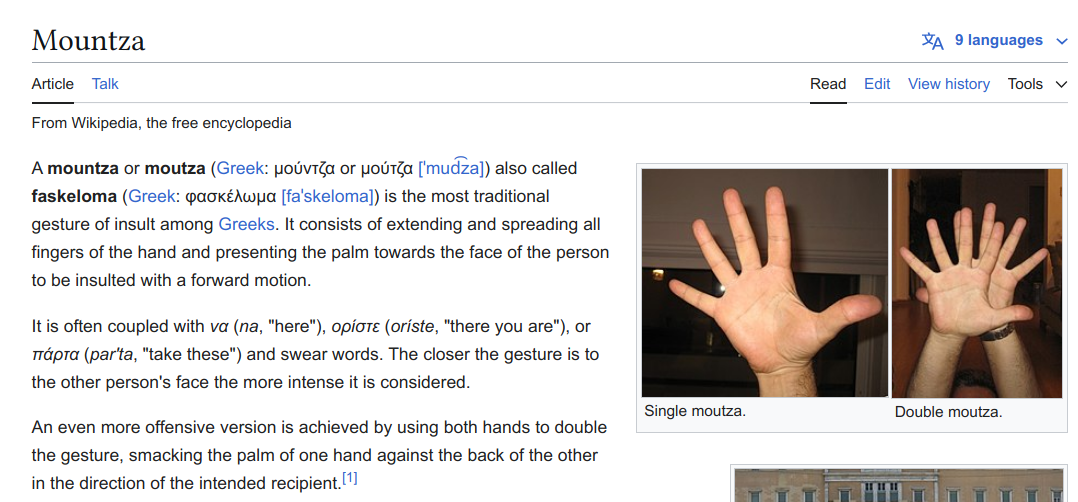
In addition to the various reasons mentioned in other answers why the greeting and hand waiving isn't welcome, please note that a hand with splayed fingers is a rude gesture in certain cultures (or at least in mine):

screenshot of the wikipedia page for mountza


Please don't insult me every time I visit the site. Not only is this exactly the kind of noise we strive not to have here, it is actively insulting your users or, at least, your Greek users. Please don't. If you absolutely must have this rather pointless thing, at the very least make the fingers be close together and not spread out.

15
  • 1
    (Somewhat tangential) To me the SE logo looks like a waving hand emoji. Looking at the historic designs for Apple; iOS 4 had one similar to the SE icon/mountza, where iOS 5 changed to have the fingers not spread out. Would you find the iOS 5+ icons to be offensive?
    – Peilonrayz
    Commented Oct 30 at 15:04
  • 5
    No, not at all @Peilonrayz. The spread fingers are essential to making it offensive. So the iOS 4 one, with the fingers spread, immediately registers as a mountza to me, while the 5+ ones with the fingers together do not. The 4.0 actually looks like it was specifically designed to look like the rude gesture. I imagine it wasn't, but it's that close.
    – terdon
    Commented Oct 30 at 15:29
  • 1
    The same icon (minus maybe a motion line or two) has been used for years on SE. What type of "welcome" have you been giving new users exactly :p?
    – Laurel
    Commented Oct 30 at 17:08
  • 1
    Is the hand supposed to be blue in dark mode? o_O Commented Oct 30 at 18:45
  • 2
    Interesting. Definitely was not something we were aware of. Will bring it up with this team.
    – SpencerG StaffMod
    Commented Oct 30 at 21:22
  • 7
    Thanks, @SpencerG. To be clear, it is COMPLETELY understandable that the team didn't know it. Nobody expects y'all to be familiar with all hand gestures used by all cultures in the world.
    – terdon
    Commented Oct 30 at 21:27
  • @SpencerG seeing only uninteresting questions in the last few days does make me fill a bit ... double-facepalmed. Like someone doesn't care what I want to see, only what they want answered Commented Oct 31 at 12:19
  • I had no idea this was offensive in some cultures but damn, what a total fail this redesign is from A to Z. This just shows how thoughtful they were with the whole project.
    – MrUpsidown
    Commented Nov 1 at 16:51
  • 2
    To be fair, @MrUpsidown, that wavy hand is relatively common and it isn't reasonable to expect folks to be aware of what might be offensive in which country.
    – terdon
    Commented Nov 1 at 16:55
  • @terdon what "folks" are you talking about? The whole Stackoverflow UI/UX team? How about the V sign? You do know it has different meanings (to different people) depending on the side of the hand that you show? They could have done a bit of research really. It's like if you launch a new brand and realize afterwards that it has a terrible meaning in the 2nd most spoken language on earth...
    – MrUpsidown
    Commented Nov 1 at 17:21
  • @MrUpsidown a "bit" of research would likely have discosvered the V issue you mentioned since that is a British thing, so part of the anglosphere and anglo saxon culture, but I don't think it is reasonable for a dev team to be expected to know the minutiae of cultural differences that can be found across a few hundred countries. If, as seems likely, this is an exclusively Greek thing, Greece is a country of ~10 million people, it would be unreasonable for us to expect non Greeks to be aware of something like this. Dunno, I don't mind that they weren't aware, I would't have expected them to.
    – terdon
    Commented Nov 1 at 18:12
  • @PanagiotisKanavos I'm guessing you're Greek from your name. Out of curiosity, do you also interpret this hand as a mountza?
    – terdon
    Commented Nov 1 at 18:15
  • @terdon Fair enough, but anyway nobody needed that hand and welcome message in the first place so the solution sounds easy enough...
    – MrUpsidown
    Commented Nov 1 at 18:28
  • @terdon I was being polite about how annoying the new design is, and how it seems the company is trying to push us to "work" on questions they care about. So yeah, while at first it seemed funny, it feels worse every day Commented Nov 4 at 7:31
  • @PanagiotisKanavos yes, it's awful, dds nothing useful and makes it harder to see the actual content. But I am wondering whether you, like me, perceive the waving hand as a literal μούντζα or not. Does it look like it's waving at you or like it is giving you a μούντζα?
    – terdon
    Commented Nov 4 at 10:24
32

I don't want curation. I know what I want to see, and how I like to use the site. I don't want you to curate questions "just for me" like all the other recommendation algorithms online that I don't want.

Also, please please do not remove the Hot Network Questions! OMG that would be awful. I would never know what was going on at other SEs.

Why do you have to make changes?! Please consider not making these changes?

32

To shortly cover some thing others have said: Welcome back is creepy and domineering the whole page, top widgets are not useful and occupy vertical space, tags would be better on the side under Featured on the Meta as they would have vertical space for expansion, Hot Network Questions should be there, too, whole page is just too white and looks like polar bears in snow storm.

One thing that was not mentioned by others is that for unregistered users new Home page is extremely unwelcoming.

If you come there from some Q/A you found by searching the Internet, you will get a popup asking you to fill some preferences like tags you are interested in. If you close that dialog, you will stay where you were which is confusing.

But the worst part is that if you start customization by adding tags and choosing theme (followed by unnecessarily long 5 second animation) you will be greeted by login screen. Why?

If you are going to force people to create account, then show them login screen first, and then customization process. There are many users that don't want to create account and setting preferences that you will not store in any other way (cookies) will leave them seriously annoyed. You have just removed Home page for all of them.

6
  • 4
    Ah, so they implemented the super hostile "Customize your experience! Great, thanks, now login to save it or you lose it all!"
    – Kevin B
    Commented Oct 30 at 16:09
  • 1
    meta.stackexchange.com/a/400651/200898
    – Kevin B
    Commented Oct 30 at 16:15
  • 1
    @KevinB I never noticed that is was proposed... it is hard to keep track of every new feature announced... and it takes time to read everything carefully. And I don't have enough facepalms for everything that keeps coming our way...
    – Dalija Prasnikar Mod
    Commented Oct 30 at 16:31
  • So far i haven't been able to trigger it, so it might be an A/B test
    – Kevin B
    Commented Oct 30 at 16:35
  • @KevinB Lucky you... I am triggering it all the time when not logged in, so I guess that I am either very unlucky with A/B testing, or this is something they stored in cookies.
    – Dalija Prasnikar Mod
    Commented Oct 30 at 16:37
  • 2
    Actually, it only triggers when you click the home link, not the logo. How you reached the site is irrelevant.
    – Kevin B
    Commented Oct 30 at 16:43
29

The homepage is now less useful to me with this new design. The new Watched Tags widget hides most of my watched tags behind a little scrollbar.

My primary activity when landing on the StackOverflow homepage was to click one of the tags in the Watched Tags widget in the sidebar, to see if there were any new questions in that tag. Then I would do the same thing again on another watched tag, and eventually go through several tags that I wanted to check for any new questions.

Now that experience is really janky because the list of watched tags is in a different location on the homepage than it is in all other pages, and I have to deal with this tiny scrollbar to try to get to the tag I want to click on.

At this point I'm just going to change the StackOverflow bookmark in my browser's toolbar to go to some other page than the home page, and I'm probably never going to go to the home page ever again.

This homepage change is a net negative for usability and usefulness.

26

As a logged-in user, (and I'm aware I probably should have said this during the previous round of feedback instead of just now), at least for me, I'm realizing now that my feeling about a homepage for Stack Overflow is... I don't really need one. I don't want one either. I operate in different modes- only one mode at a time, and each mode already has a page(s) for it (none of which are the homepage). I have NAtOQ for finding non-answers, I have my profile page for seeing my own activities, and I have my custom filter pages to find things to answer. That's basically all I ever use now, and unless something dramatic changes (like becoming a mod or something), that's basically all I'll probably use for the foreseeable future. The only thing I'd need from a homepage is to contain links to those places (and even then, as a power user, I wouldn't use it- I'd just use my browser's omnibar and keyboard shortcut navigation once autocomplete there has initialized). The /questions page (and sort of almost every other page) already/also fulfills that role of being that hub for links. Of course, this is just my PoV. I'm just speaking for myself here.

26

Not only did you eliminate the highlight on questions with watched tags, you eliminated the eyeball icon on the tags themselves. Now I have no way to know which questions I care about. Which means I no longer have a reason to look at the question list. I can't answer questions that I don't look at - congratulations.

2
  • 1
    I've seen this feedback a couple of times; thanks for sharing. Our intention with the interesting posts is that you should see your watched tags there more frequently. But I can understand that since it's less obvious, it means more work on your part to identify them. We are in the process of discussing what we could do here.
    – SpencerG StaffMod
    Commented Oct 31 at 15:15
  • 1
    @SpencerG: just let users configure their own landing page. I want X, Mark wants Y. Why should you choose Z instead? Commented Nov 2 at 22:25
25

Reputation Widget

Reputation badge widget shows a line graph of potential rep increase, shows a rep of 1 and links to the asking, answering and editing help center articles

New users will see the widget displayed at one reputation point with links to asking, answering, and editing.

Since you will incentivise new users to do those actions, do you plan any better onboarding for any of these? Or is some alternative planned that will reduce the pressure on the system and the community?

In particular, I am interested what steps you would take for the editing. The review queue is usually hovering around full and part of the reason is new users making trivial edits that are either not enough or should not have been made at all. If you tell users they can win reputation by editing, that will lead to:

  • New users editing more.
  • ...if they succeed because the queue is always an issue
  • ...and if they do a suggested edit, chances are it will not be one that should have been made

Overall, leading to frustration for new users (if they fail to submit their suggestions or have them rejected) and reviewers (it is just more of the usual).

From a comment by Ryan M:

Alternatively: are there plans to improve the throughput or efficacy of suggested edit review? Or plans to reduce its necessity, by, say, allowing users to earn editing privileges by submitting a certain number of useful edits?

While the suggested edit queue is, in my opinion, the biggest issue, it will still be good to know what you plan to do for answering. I suppose Staging Ground can be assumed to take care for asking.

9
  • Was the will there be onboarding training a serious question, because, we know there won’t be any training or guidance. This comment is slight parody to the fact, new users have almost no guidance, on any of the numerous features that have recently been added. Commented Oct 6 at 2:22
  • Well, asking, answering, and editing aren't new but it sounds like their attempts to provide guidance might be worse than useless
    – SamB
    Commented Oct 7 at 23:45
  • @SamB they aren't new, sure. But now they will be seen as goals. New users have been editing to gain rep and some have just been doing the bare minimum edits, like only adding minor punctuation. I don't expect anything new here - we'll just have the same. But more of it. Which will strain the suggested edit review queue even further and...there isn't much further you can stretch it.
    – VLAZ
    Commented Oct 8 at 4:33
  • 3
    Alternatively: are there plans to improve the throughput or efficacy of suggested edit review? Or plans to reduce its necessity, by, say, allowing users to earn editing privileges by submitting a certain number of useful edits?
    – Ryan M Mod
    Commented Oct 8 at 17:14
  • @RyanM good point. I planned to ask for something similar but I seem to have forgotten in the process of writing this post. I added your question to the post.
    – VLAZ
    Commented Oct 8 at 17:20
  • Right now, in terms of onboarding, we are considering updating the tour page. We have discussed suggested edits internally but have not quite landed on what we think we can do there, but it has been a frequent topic of discussion while working on this particular project.
    – SpencerG StaffMod
    Commented Oct 10 at 20:20
  • @SpencerG how much are visitors actually engaging with the tour?
    – canon
    Commented Oct 29 at 15:22
  • "New users will see ... links to asking, editing, and answering." So will old, high-rep users. Commented Oct 30 at 14:39
  • 1
    @canon I don't have the historical numbers off hand, but I know when we discussed it earlier this year, it was pretty low, to nobody's surprise. So I am interested to see how that changes with just making it more visible, but of course the tour needs some attention and I think its gonna get it. Not a guarantee at this stage though.
    – SpencerG StaffMod
    Commented Oct 30 at 16:05
24

The one thing I use daily -- my custom filter link -- is now only available on questions.

WTF -- Can we at least have an option for selecting our landing page?

Things I DO NOT NEED TO SEE

  • Badges (Do not Care)
  • Reputation (Do not Care)
  • Watched Tags (I know these)

and yet there they are atop the page.

This helps who, exactly?

By all means, make it harder for me to find questions I might answer.

8
  • This helps our new users! We've gotten feedback from many users that they aren't aware of the game and how to play. This top row is intended to help get our newer users engaged. A reminder that this is our MVP. It is one homepage to fit all needs which is HARD. We hope to be able to put more time into customizing this page for everyone's unique needs in the future.
    – Piper StaffMod
    Commented Oct 31 at 14:26
  • 2
    @piper "We hope to be able to put more time into customizing this page" -- in other words -- too bad, so sad, you just have to live with it.
    – dbugger
    Commented Oct 31 at 14:30
  • 4
    @Piper If it's only useful for new users why force it on everyone?
    – Kevin
    Commented Oct 31 at 14:50
  • 1
    I can appreciate the frustration. It doesn't serve what you want the homepage to do for you, and as you mentioned is making things harder. One thing, in my opinion, we did was communicate that this would be worked on in phases and that we would be focusing on the default first. I can appreciate that this is undesirable to some, but these widgets, in particular, draw attention to different actions that new users take to find the content they might want to see and directly expose them to the gamification aspect of the site.
    – SpencerG StaffMod
    Commented Oct 31 at 15:22
  • @dbugger Not at all! We'll address it in the next version.
    – Piper StaffMod
    Commented Oct 31 at 15:22
  • 1
    @Piper you are working so hard to serve new users, who a small percentage of the total and of whom an even smaller percentage stay to contribute, to the direct detriment of the primary contributors in the community. If this is indeed intended to serve new users, then why is it being pushed on everyone, without even an opt out, much less a filter to actually show it to new users?
    – vbnet3d
    Commented Nov 4 at 18:39
  • @vbnet3d That is actually incorrect. Our new users are 4x the number of contributors the last few months and 8x the number of content creators. We simply did not have time to build out filters, opt outs, etc because of the deadline to get the test out before the holidays to accurately measure the impact. This does not mean they will never come.
    – Piper StaffMod
    Commented Nov 4 at 20:23
  • @Piper I wasn't talking about raw new user data - I was talking about long-term retained contributing. Yes new users have higher raw contribution numbers because they tend to create an account to ask a few questions - but do they actually stick around to continue contributing, especially in the high quality answers realm? Past data suggests that they do not. Edit: If you didn't have time to build the feature out correctly it should have remained an optional A-B test.
    – vbnet3d
    Commented Nov 6 at 16:14
23

The top questions view currently used as the front page is generally where I land, and I'm used to this workflow.

Would it be possible to keep the clean, 'common' top questions view, possibly as a questions page option?

3
  • 2
    This. Yes please
    – sehe
    Commented Oct 13 at 1:56
  • No, this is a bad idea. Different users want different first pages. Let the user specify the landing page that stackoverflow.com automatically switches to. Commented Nov 2 at 22:23
  • @user2554330 looks like xkcd.com/1172 to me.
    – bfontaine
    Commented Nov 25 at 9:19
23

You forgot one of the most basic rules: if it ain't broken, don't fix it.

I'm not saying that there is nothing that can be improved about the https://stackoverflow.com/questions but this new home page addresses none of it; it's just a straight downgrade.

I'm not gonna list all the things that are wrong with the home page because there is already a lot of answers that do that comprehensively.

Instead, I'll tell my personal story. I'm not a very active user, but there is a few topics that I have some knowledge of and that are not very popular. I try to keep eye on the questions there because on bad days I'm the only one to attempt answering them. I have custom filters for that and whenever I visit the site and there is something new in there, I can notice the blue dot next to the filter name. With this new home page I no longer see the custom filters. I leave the conclusion to your imagination.


If you're looking for something that really should be fixed, here is one: I've just got a notification. Paraphrasing, it was something along the lines "You're upvoting only answers. Questions need some love too.".

I'm usually upvote both question and a few best answers, sometimes even only the question, so this wasn't a general statistic over a longer time. It looks like the algorithm noticed that the last 10 things I upvoted was only question and it freaked out, without considering that they were all answers for a single question that I've already voted at, so here is something for you to work on.

3
  • FYI, the "questions need some love too" message has been network-wide for many years. It doesn't actually do anything, just an annoying nag.
    – Kevin
    Commented Oct 31 at 4:58
  • As far as the filters are concerned those are still available on /questions. But this first pass was about improving the homepage experience for new users. Its fair if you believe that was the incorrect place to start, but its ultimately where we landed. We are looking at v2 to bring more advanced functionality and customization that serves more experienced users.
    – SpencerG StaffMod
    Commented Oct 31 at 15:25
  • 2
    @SpencerG If you want to know whether a change intended for new users is beneficial for new users, then A/B test it on new users.
    – kaya3
    Commented Nov 1 at 15:47
22

After actually seeing it live:

The greeting is weird and a waste of space, at least make it a dismissible banner and ideally only if someone hasn't been seen for a while, though that might be even more annoying when it does pop up.

The widgets are nothing but an even more annoying waste of space that belong in the profile—where they already are and have been since their introduction—and at the least should be configurable (show/hide, type, order).

The "personalized" list doesn't have any more relevance to me than the /questions list. It seems like it's even less relevant, but I think that's just because it doesn't even distinguish favorite tags. WTF is that?

When I go to the homepage, I want to see the questions with the most recent activity, just like it always has been. That, btw, is going to be much more important on other, smaller sites that rely on a handful of active users keeping an eye on everything.

It's so annoying to keep having to go back and add /questions, I'm going to make sure to dedicate some more time to the iOS client I've been poking at here and there.


After mulling things over for a bit I think I'd summarize this update as forcing a pushy new-and-returning-user experience on the site's oldest and most active members every single time we come here. You're targeting the wrong people. And over the years, I've seen the company's receptivity to feedback wax and wane, but I've gotta say this redesign certainly seems like a new low for willingness to listen to your users.

21

Oct 28th update:

I generally find this update frustrating; I don't see how any of the concerns that were brought up here were addressed.

Watched Tags

The watched tags widget gains a scrollbar when there are more than 2 rows of tags; this was unnecessary with the old design. It's mostly "ok" on desktop (despite being a poor location for a widget of this style,) but on mobile there's no reason for the height of this widget to be limited... it's in a column anyway. Can this widget be replaced with something more relevant/purpose built for this location and put back where it belongs?

Question List

We lost the filters, as expected, and it's frustrating mostly. There's no harm in these headers existing and taking us to the appropriate /questions page for them. We also lost watched tag highlighting. The copy at the top of the list indicates that the selection of questions is based on viewing history and watched tags, but, what about ignored tags? it makes no mention of those. Do they get omitted as before or are they not relevant to this page anymore? Do they follow the settings in our profile for ignored tags? FWIW the first question returned for me was a question unrelated to anything i've viewed recently and not relevant to any of my watched tags. Maybe it shouldn't state what you're wanting the list to eventually be and instead describe the existing solution more accurately?

Blog/Featured Meta section

On your samples, there was no space in the blog section for icons. On what was released, there is space for icons but the icons don't exist. Can we bring back the icons and actually use them to indicate what kind of blog post it is?

Recently Viewed Posts

Where is it? I didn't really want it anyway but uh, it's missing? my right column is entirely empty... those three widgets up top would be much better over there.

i don't care

Reputation Graph

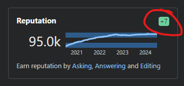
The reputation widget in this location gains a little indicator when you earn rep... except... there's no way to dismiss it without leaving the page... guess I'm just gonna have a constant notification on my page now... Why can't it dismiss when i dismiss the other reputation gain notification in the top menu?

i still don't care

2
  • The blog section was a bug. We already have a fix for that coming. Agree that the scrolls bar with the watched tags is not ideal. The question list is almost unchanged from the previous homepage list for Top Questions. There have been some improvements and we are working on a few more.
    – SpencerG StaffMod
    Commented Oct 30 at 21:27
  • The recently viewed posts is not quite ready for prime time, but should be in the very near future.
    – SpencerG StaffMod
    Commented Oct 30 at 21:28
21

tl;dr: Lots of information important to me as an experienced user is gone, in favor if uninteresting and irrelevant things probably catering to newcomers.

  • The greeting as well as the three top boxes are redundant and irrelevant to me. The greeting is more creepy than anything else (it reminds me that you are tracking me personally, even though that is, of course, crystal clear in principle), I do not care much about my badges, I am aware of my tags because I chose them, and the reputation (of which I'm vaguely aware anyway) is displayed already elsewhere. Prime GUI real estate is used for redundant or irrelevant information. What were you thinking?
  • With the hot network question list you eliminated even more information that is very relevant to me, perhaps more relevant than anything else on my "home page". You are hopefully aware that I open my home page never because I need an answer to a programming question (I use google to find such answers, here or elsewhere); I open it to distract me from work (cough), which is in your direct interest because it is one way of user engagement. I really like the variety of topics on the site — the hot question list is a main reason I come back to the site that often. It makes zero sense that I have to open an arbitrary question (in which I'm typically not interested) in order to see the hot question list.
  • Additionally, the central list of SO questions is (and has been for a while, I think) vertically more spaced out than it used to be, additionally reducing information of actual interest.

I understand that you try to engage and retain new users. Some of this, like reputation and badge mechanics, may be less self-understood for new users. New users may also feel flattered about a personal greeting. I understand you want them to connect to the gamification aspect of the site. I respect that the site needs to generate revenue. Perhaps the new home page could be the default for new users while experienced users are presented with more concise information. Alternatively, a customization option would be nice, with the new design being the default. Because detecting any customization options needs experience most new users would keep the new design for a while, but experienced users could fill the page with more relevant content.

Addendum: Funny that I was never aware of the /questions URL/page that popped up in another comment thread; that is pretty much the old homepage, isn't it? Tag-matching questions highlighted, not much space wasted above, a bit of text with the title of each question, HNQ ... I could do without the "teams", "watched tags" and "collectives" side bar widgets but I can simply ignore them and scroll down, no prob.

12
  • With the HNQ, we removed it since it generally doesn't get a ton of traction, but it is still available on /questions on the sidebar. But granted that isn't a great place for it either.
    – SpencerG StaffMod
    Commented Oct 31 at 14:28
  • As far as the feedback on the welcome message is concerned, we are reading everything being said about that and thinking about how we can improve it.
    – SpencerG StaffMod
    Commented Oct 31 at 14:29
  • 3
    @SpencerG I suppose the idea is to make new users feel recognized and valued. "Hey, this site cares about me, they even remember my name, they are so friendly!" It has about the opposite effect to experienced users. Commented Oct 31 at 14:33
  • 6
    @SpencerG Is it true that the HNQ is not used much? It is my favorite pastime and questions on it get lots of views. (Of course, "lots" is relative, and you have, hopefully, the numbers. But I'm astonished.) Commented Oct 31 at 14:37
  • 1
    Its been a couple of months since I heard the number but something like less than 2% of SO users ever click on anything there in year. I could be off a bit here though. That being said we have been talking more broadly about network discovery on SO as of late so I wouldn't quite call it gone forever from the homepage yet. Obviously not helpful for someone who wants it there now though.
    – SpencerG StaffMod
    Commented Oct 31 at 14:41
  • 6
    @SpencerG Considering that the space that used to be filled by HNQ is now filled by literally nothing, surely it couldn't hurt anything to leave it there for those who are interested. Commented Oct 31 at 17:38
  • @JohnMontgomery That space is supposed to be for the recently viewed posts feature, but we had to delay it a bit as we identified some last second items that needed to be considered for it. That is a fair point overall, though.
    – SpencerG StaffMod
    Commented Oct 31 at 17:40
  • 9
    @SpencerG Maybe you should consider that that 2% of users are probably your most active users... Commented Nov 1 at 11:46
  • 2
    Just because people don't click on HNQ does not mean they don't read it. It is not that there will always be something interesting there worth clicking, but how useful it is having nothing at all there? No matter how small is percentage of users are using (clicking) it should still be fair number of people and it does not hurt having HNQ there.
    – Dalija Prasnikar Mod
    Commented Nov 1 at 14:28
  • 3
    2% of SO users are the ones you absolutely need to keep on the site, or there is no Stack Overflow. Remember that.
    – kaya3
    Commented Nov 1 at 15:14
  • 4
    @SpencerG I'd highly encourage rethinking how you weight interaction with the HNQ, whatever flaws it may have. It's basically the main way within the site for people find out about the rest of the network. I don't know how many total HNQ links I've clicked on my time here, but that's how I found the four sites I moderate and the sites where I've answered over 2000 questions. Having it technically accessible in some other page isn't actually helpful because it's not a thing people necessarily go looking for, it's something that they stumble upon and you want them stumbling on it often. Commented Nov 1 at 16:02
  • @SpencerG do you have numbers on how many non-users use HNQ? I know a few.
    – LonLon
    Commented Nov 8 at 12:13
17

Is the "Custom filters" widget on this new design? I don't see it anywhere. If not, please add it back - the only thing I really do on the homepage right now is click a custom filter so I can start answering/moderating questions.

3
  • 2
    @trincot you should still be able to access the custom filters on the /questions page
    – VLAZ
    Commented Oct 29 at 8:20
  • 2
    @VLAZ, thank you! Relieved it is still there.
    – trincot
    Commented Oct 29 at 8:23
  • 1
    Yeah, looks like stackoverflow.com/questions still has the old homepage sidebar
    – M. Justin
    Commented Oct 30 at 16:45
17

Interesting posts for you

How is this list generated? Most of the technologies on the list do not appear in my watched tags and filters. I have certainly never seen questions or answers with .net-core, electron, windows terminal, angular etc.

8
  • This is actually using the same logic that the old homepage was using! No changes. But if you have feedback on what you would like to see from a v02, this is a great place to share.
    – Piper StaffMod
    Commented Oct 31 at 14:24
  • 7
    @Piper It claims to be "Based on your viewing history and watched tags", but that seems to be completely wrong. None of the 23 tags of the top 8 questions have ever been of any interest to me, I never watched them and likely never even viewed them. Instead it simply seems to be the most recently created/modified questions (and some staging ground questions for no apparent reason whatsoever).
    – no comment
    Commented Oct 31 at 15:35
  • @bademeister If you don't like the staging ground questions in your profile settings under preferences, you can remove them. Otherwise, as Piper said, the logic is the same as before. Granted we don't have a visual indicator calling out watched tags now.
    – SpencerG StaffMod
    Commented Oct 31 at 17:42
  • @nocomment Thank you for your comment and reply. Yes, the description "Based on your viewing history and watched tags" suggests something that is not. Commented Oct 31 at 18:23
  • 1
    @SpencerG But the description is "Based on your viewing history and watched tags". Commented Oct 31 at 18:26
  • @Bademeister Correct, its not really accurate at this stage. Though, my understanding is that we are pretty close to completing that part.
    – SpencerG StaffMod
    Commented Oct 31 at 18:40
  • 6
    @SpencerG Well, then please put that text there when that part is completed. Not before.
    – no comment
    Commented Nov 1 at 14:28
  • 1
    @Piper If this is the "same logic", then it is broken, because the old logic filtered the questions by tag. Now I get questions that are completely wrong, because none of the tags match.
    – Bevor
    Commented Nov 2 at 11:41
16

Badges? We don't need no stinking badges!

Seriously, I don't care about badges one bit. Making them the centerpiece of these changes seems misguided to me.

14

The watched tags are now constrained into a small box which requires scrolling to view what I have there.

This also breaks navigation, as scrolling with the mouse wheel stops scrolling the page if the scrolling focus is shifted to the watched tags box, and instead scrolls its contents. This happens for me on Firefox simply by having the mouse in that column whilst scrolling.

I can't help but repeat that this change is not an improvement.

1
  • Thanks, just to confirm, when you move your cursor off the watched tags your page still scrolls normally?
    – SpencerG StaffMod
    Commented Oct 31 at 15:29
14

As mentioned by others, the top half of the front page is almost entirely a waste of space... but now it is entirely a waste of space, as the "watched tags" widget has entirely disappeared. enter image description here

BTW, it would be nice if users could disable the new design from their profile options while you're still iterating. Yeah, I know, you're gonna roll out the new design no matter how people feel about it... but please give us a little longer with the older and more usable version.

10
  • 4
    Given that SE is capable of A/B testing changes, it isn't too far fetched to expect them to allow opting into new features. Yes, it's probably not zero work to get there. But it also shouldn't be an insurmountable obstacle. The amount of features that get released and bork the site in various ways is too damn high. Moreover, even users who want to opt-into beta testing might find use to switch and opt-out to verify functionality is the same before and after.
    – VLAZ
    Commented Nov 1 at 12:10
  • A/B tests only give statitistically useful results for users who didn't choose one or the other. But an opt-out for people who have already been put in the B group seems like it should give some useful data (i.e. these people consider this change to be worse).
    – kaya3
    Commented Nov 1 at 15:00
  • @kaya3 I don't think VLAZ is talking about actual A/B testing here, but the infrastructure needed to A/B test is almost exactly the same as for a feature that users can opt in/out of, the only difference is the condition is (approximately) random for A/B tests and a user setting for a opt-in feature.
    – cafce25
    Commented Nov 1 at 15:58
  • @cafce25 Sure. But specifically for features that are currently undergoing A/B testing, it's expected that users can't toggle those features for themselves.
    – kaya3
    Commented Nov 1 at 16:03
  • I am not able to duplicate the missing tags widget on Chrome or Firefox. What browser are you on?
    – SpencerG StaffMod
    Commented Nov 1 at 16:36
  • @SpencerG It occurs with both Brave and Edge (both for Windows).
    – Sneftel
    Commented Nov 1 at 16:39
  • @SpencerG ...and with Firefox. Can't test with Chrome, due to privacy issues.
    – Sneftel
    Commented Nov 1 at 16:41
  • Thank you, I will pass this along.
    – SpencerG StaffMod
    Commented Nov 1 at 16:49
  • 1
    The Watched tags are missing for me too. This appears to have to do with my screen resolution (I'm at 1280x1024). I can see the Watched tags again if i use the browser developer tools and use the icon where you can view the site at various screen sizes for responsiveness and change to a higher (or lower) resolution. If I check the css, one of the divs the Watched tags are in gets hidden with this css: @media (max-width: 1280px) and (min-width: 906px) { .right-widget.svelte-1shgxe0 { display: none; } }
    – Marleen
    Commented Nov 1 at 17:01
  • @Marleen Well-spotted, the box comes back for me too if I change the screen size.
    – Sneftel
    Commented Nov 1 at 17:11
14

Let me give you an example of how useless that reputation graph is.

my reputation graph

The last answer I posted was in 2019, before this graph even starts. My last question was even longer ago in 2018.

The reason I continue to gain reputation at such an alarming rate with no posts is because I did my damnedest to post quality content, and if this graph is any indication, I even succeeded a few times. People are still finding some of my posts useful 5 years later.

Stop trying to use psychology to manipulate people with meaningless rewards. Focus on creating a good product, which in your case means having great questions and answers. That means you need competent people to trust you, and the company threw that trust away 5 years ago for cash and political/social activism.

You must log in to answer this question.

Not the answer you're looking for? Browse other questions tagged .