46

We are exploring updates to the homepage to offer logged-in users a more personalized, engaging, and informative experience. We want this new homepage to better serve users in finding content that interests them, and encourage them to engage more deeply with the platform.

We believe that a homepage shouldn’t act just as a starting point for new users but as a hub that eventually guides all users through their Stack Overflow experience. This page serves a different purpose than the logged-out marketing homepage where users learn more about all things Stack Overflow. We want new and old users to be able to learn how to use the platform, discover more content, and have more obvious jumping-off points to where they can positively contribute to the community for the first time or the 1000th time.

At this stage, we have some guiding principles about how we want this to look. We see those as such:

  • Delivering relevant content to users. We believe that a homepage is helpful for users if it's not a one size fits all. The more we can tailor this experience to a user, the better experience that user will have.
  • Encouraging active participation. We believe a useful homepage should provide a broad overview of what a user can do, but it will be even more helpful if there are steps that a user can take to participate on Stack Overflow.
  • Exposing and educating users to different aspects of Stack Overflow. We believe the homepage should be an entry point to helping a user explore the different aspects of Stack Overflow.

We will measure success based on whether users who are coming to the homepage are more likely to take action, and whether users who come to the homepage are coming back more frequently. For newer users, these are actions like watching a tag, following or saving a post, etc.

Feedback Requested

This is where you come in. We would like input on what information and types of actions need to be highlighted to benefit both new and experienced users, how we might encourage users to take action, and positively contribute to the community. We do not want this to become a dumping ground for everything the network offers; instead, we are looking to guide and drive users toward taking useful actions.

We will be monitoring feedback on this post until July 11, 2024.
20
  • 28
    Post a link to the homepage, so it would be clear which one you are talking about?
    – anatolyg
    Commented Jun 27 at 16:01
  • 26
    I almost never engage with the homepage. For curation, I go to the review queues. For answering, I check /questions/tagged/.... It's once in a blue moon that I see a homepage question that I'm actually interested to click on.
    – tdy
    Commented Jun 27 at 16:13
  • 9
    I think you will find this blogpost relevant stackoverflow.blog/2017/03/09/…
    – Braiam
    Commented Jun 27 at 16:15
  • 81
    There's a home page?
    – Drew Reese
    Commented Jun 27 at 17:09
  • 29
    If it ain't broke, don't fix it! Words of wisdom all UI (just gotta add something) designers should learn and live by. Don't destroy any more screen real-estate. It matters for laptop and small screen users. The SO logged-in main page is fine. It has gone through many iterations in the past decade and each time more is added and it takes more space but adds nothing meaningful in return. Above all, whatever changes you make provide an OPTION in settings to turn them off. Rule 2 - a new "feature" is a "bug" if it cannot be turned OFF. Change for change's sake never ends well. KISS succeeds. Commented Jun 27 at 23:49
  • 3
    @NoDataDumpNoContribution yes, that'd be the home page.
    – VLAZ
    Commented Jun 28 at 10:38
  • 1
    New users will have to visit the Questions page anyway (and thus gain experience with it) to establish their interests with the site, and they won't have the privileges required to participate in things like the Review Queue. Experienced users already know where to find what they're looking for. The notifications for received privileges (at least for me) are clear enough that users can understand what they're for and where they are. Sure, there are homepage updates that would be "nice", but overall I don't really see anything that desperately needs to be changed... Commented Jun 28 at 12:44
  • 5
    I don't use homepage. Either I start SO directly with such link or I use google to find question/answers. I don't have plans to start using SO homepage, no matter what you will put there. Period.
    – Sinatr
    Commented Jun 28 at 14:00
  • 7
    Just leave it alone! It's worked fine for the past 15 years I've been using it... don't mess with it. What's there is fine, and meets your stated goals already. Don't touch it.
    – Brad
    Commented Jun 29 at 7:36
  • 4
    all the "please leave it" sounds a little bit like "please don't make it worse". I hope someone up there wants to be gentle with the community, which is the people curating and answering, not the people endlessly throwing their homework/work assignments at us. Commented Jun 29 at 14:03
  • 1
    On my iPhone it would be great if the Custom Filters section was at the top, so I wouldn't have to doom scroll to find it.
    – matt
    Commented Jun 29 at 16:09
  • 4
    Not being forced to log in.
    – ouflak
    Commented Jul 2 at 13:40
  • 6
    "We want this new homepage to better serve users in finding content that interests them, and encourage them to engage more deeply with the platform." - I think most visitors just want to find the answers to their questions and go away. Don't see haw any home page is going to change that.
    – ouflak
    Commented Jul 6 at 13:39
  • 1
    The homepage should just be stackoverflow.com/questions?tab=Newest. Commented Jul 6 at 15:39
  • 6
    We want this new homepage to better serve users in finding content that interests them, and encourage them to engage more deeply with the platform." This is backwards. Why should the home page in particular serve those goals more than any other aspect of the site? (Rhetorical.) What is the XY problem?
    – philipxy
    Commented Jul 9 at 21:53

21 Answers 21

105

I mean... I just want it to do what it does currently. Being the page you reach when you click the logo, it's the most reachable page on the site and one I use as a launching point for finding questions I want to investigate.

This is a Q&A site, there's no content other than Q&A that should be prominently displayed on the homepage. All of the other content types that have been added to the network in the past 3-4 years run counter to that.

5
  • 6
    When you say you want it to be the point for "finding questions I want to investigate," Are you referring to finding questions to curate? Answer?
    – SpencerG StaffMod
    Commented Jun 27 at 14:55
  • 5
    well, both. I like seeing a mix of both questions i'm interested in based on what i've watched and what i've answered/visited/voted on, as well as things I haven't
    – Kevin B
    Commented Jun 27 at 14:56
  • 22
    I primarily look through the question list for any questions that i find interesting, but what i find interesting is a broad range of things. Not just things i might want to answer, but also things i think may need curation, or even just a topic that i'd like to learn about. The current functionality of the interesting tab, whatever it currently is, is working for me.
    – Kevin B
    Commented Jun 27 at 15:17
  • 2
    Agreed. It's all there already (and takes up a whopping 1/4 of the screen on the right side) Custom Filters, Watched Tags, Ignored Tags. Whatever else is there just takes up space. If you want to improve the functionality, make the right-side panel collapsible so I can hide it until I need to change something on it. Right now we have 2-questions worth of wasted space up top where "Top Questions" and a button live along with the category selection. That could all go in the right panel and be collapsible so it recovers the wasted space. Commented Jun 27 at 23:58
  • 5
    Yeah, agreed completely. Just leave it alone!
    – Brad
    Commented Jun 29 at 7:34
44

I never use the front page because it is bad at giving me relevant results.

When I need something I have at my disposal:

  • Custom filters
  • Search
  • Tags

To find what I am actually interested in. Not what the front page thinks I might be interested in.

I flipped over to the front page to see if it is any different and I counted how many questions were in any way relevant to me (based on tags) vs how many were not. The result was 48 relevant vs 50 irrelevant (yes, the front page showed me 98 questions total). No exaggeration at all - half the relevant questions were at the very end. I mean literally the last 24 questions on the page managed to bring the ratio to just below 50/50. If I were not there to count the occurrences, I would have quit scrolling down by the time I hit the big chunk of relevant questions.


A reason I might reconsider using the front page would be if there were widgets that can show stats or other things. Here are some example widgets:

  • Custom filter widget showing few items from a filter. I have a few custom filters I watch for new content - right now, I keep a tab for each. If I could see at a glance the changes, that would be a lot more useful.
  • Some statistics for various stuff. I personally might be interested in number of pending anonymous edits. There are probably other numbers that would people would find useful.
  • Vanity/showcase widgets. I am not too interested but I can see use of people seeing a reputation graph or maybe even badge tracker(s), so they know what to focus on.

If the front page is customisable with different widgets one can pin, it can start off with some defaults. Like maybe just a widget that mimics the current functionality and shows "interesting". Then users would be able to add/remove/change these.

3
  • 2
    my count is ~97 irrelevant results, then three relevant results. "relevant" meaning they contain some of my watched tags. yes, I follow niche tags, nothing broad. that also makes it harder to collect updoots on this badly gamified website. Commented Jun 29 at 13:56
  • 1
    0/100 for me. @ChristophRackwitz Yep, I only got a silver badge on my main tag late last year after being on the site for 10 years.
    – Dijkgraaf
    Commented Jun 30 at 22:15
  • "I never use the front page" - You and me both. It's pointless - why would I want to go there? Commented Jul 22 at 21:46
35

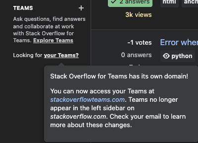
I've never clicked on it before but apparently theres a button on the side just to tell me that something no longer exists. So maybe a cleanup to only show things that do exist

enter image description here

8
  • 1
    As long as it's not really taking up space that could go to better use, I have used this a few times to conveniently go to Teams. Otherwise, I have to type out most of the domain before my browser realizes I'm not trying to go somewhere on stackoverflow.com
    – Ryan M Mod
    Commented Jun 28 at 23:37
  • 2
    @RyanM I have too, but why not just show the link though? :/ Commented Jun 29 at 5:28
  • @RyanM - what does this show when you do have teams, a list of them? I saw there was a link to teams in the products dropdown which seemed like it may have been put there as a replacement to this
    – Sayse
    Commented Jun 29 at 13:31
  • 2
    I hate those callouts that randomly show up from things in the left side panel. I hate them. every time one of these showed up, it blocked my access to something in the main column. and that nonsense wasn't dismissable by clicking/tapping elsewhere, nor by clicking a "get lost" widget. If the thing doesn't get out of my face right this instant, it makes me want to assault whoever is responsible for this UX war crime. Commented Jun 29 at 13:59
  • @Sayse It looks the same regardless of whether you have any Teams accounts.
    – Ryan M Mod
    Commented Jul 2 at 9:25
  • 6
    remove the text, and the pop up, and put the teams link there instead, any marketing for teams can be the logged out view of the teams area Commented Jul 8 at 8:29
  • 1
    A link to show u the link, so why not just display the link? We use teams and this is so annoying, just put the stupid link there?
    – JonH
    Commented Jul 9 at 16:32
  • 2
    Yeah, this bit of the sidebar has been there so long that I think it's no longer necessary. It was originally there when Teams moved to a separate domain and got separated from main-site accounts, so folks weren't confused at where the Teams links had suddenly gone. I don't think there's any reason to keep it around at this point; at least, it could be replaced with a direct link to the Teams domain.
    – V2Blast
    Commented Jul 19 at 18:30
21

What makes a homepage useful for logged-in users

Ways people participate on Stack Overflow primarily include:

  1. Reading/searching for questions/answers to their problems
  2. Asking/answering questions

Once they are here and established, they may also participate heavily in:

  1. Curation of existing questions/answers via edits, 10k tools, or review queues
  2. Participation in chat rooms

So I think optimizing the logged-in user homepage to each of those, in order, would be ideal. It is already optimized in large part for #1 and #2, which is good, and no small part of why Stack Overflow managed to become a top 50 visited site in the world years ago (not sure if it is still top 50...).

Any changes to the homepage should be very careful not to ruin or break optimizations for #1 or #2. That being said, optimizing a bit more for #3 and #4 (literally just adding a direct link to chat to the sidebar would be a huge improvement over the last ~10 years of the site).

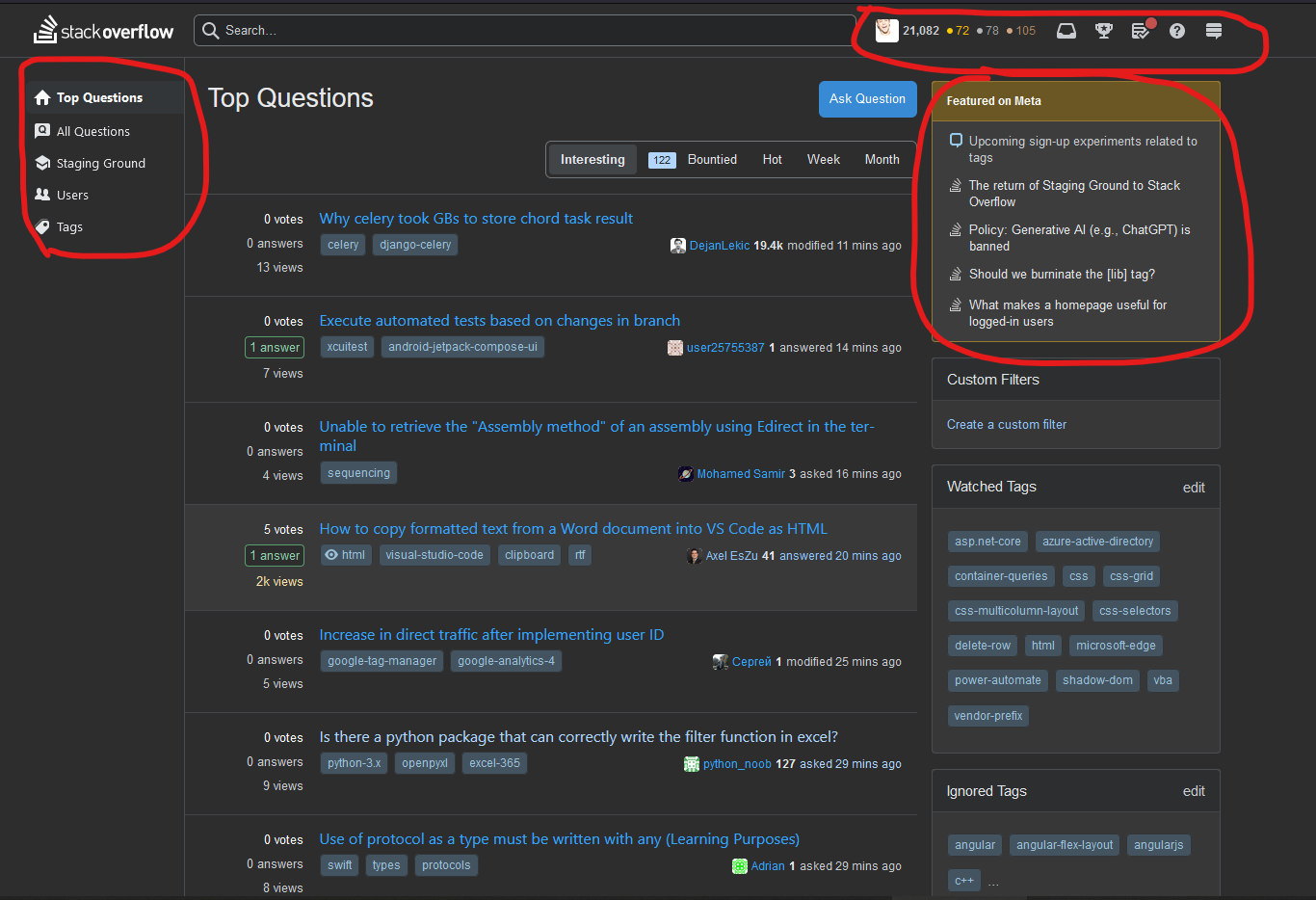
For one Stack Overflow power user data point, here's what my homepage looks like, below. I generally utilize the functions in the top bar the most, and then the options shown in the sidebar second most. I only click elsewhere when something catches my eye (like a question that catches my attention or a Meta post announcement that seems interesting/relevant)-- what is use most (top 90% of my clicks) is circled in red.

A large part of this is because it is more or less unchanging on top of being relevant to why I'm here, so I can rely on it as a quick way to get to where I want to go; whether the content outside of the circled areas is relevant or useful is a toss-up literally every time, so it's not so much use to me, especially when there are ample links nearby to search for specific questions or filter for specific types of questions.

Notice also the content I have hidden from view, in particular... that means I find it useless and distracting from the purpose of Stack Overflow. I have also reordered the remaining sidebar content via user styles so that it better fits what I believe to be an order of importance/relevance for users.

Screenshot of my homepage with custom user styles applied to hide and reorder top/sidebar elements

3
  • 6
    I would be careful about the ordering of asking and answering. In my experience people looking for answers to specific questions (the primary 'seekers' workflow) aren't doing it through the home page. They are using external search engines and specific question pages. The home page is likely used more by answers, with a small amount of casual knowledge gaining. Commented Jun 27 at 19:33
  • 3
    For me this "Interesting" tab is way too broad (not to mention the other tabs). My homepage would be a custom filter. Just noting the difference. Actually I think that users in categories 3 and 4 don't need a home page. At home I hardly ever use the front door. Commented Jun 27 at 19:38
  • 2
    I just noticed, the "Watched tags" box has no direct link to a search including those tags. That's awful. Commented Jun 29 at 13:54
14

What makes a homepage useful

I use the homepage as an entry point just because it has the bare domain as URL. Its usefulness is being 1 or 2 clicks away from what I want and I also enjoy the occasional random post.

The most relevant functionality the homepage offered for frequent readers hasn't been working since late 2022 - the blue activity indicator for new posts after you click one of your custom filters. So that's when it stopped making sense for me to visit the homepage to keep up with new posts.


For me the lack of the blue dot killed two of the items you list:

  • Encouraging active participation

I no longer felt encouraged to read up on my custom filters because most of the times I couldn't remember where I had left off on my reading. That in turn lowered my participation because I was less likely to take interest in something.

  • Delivering relevant content to users

Since I've gone through the trouble of configuring 1-click custom filters for the techs I follow or am learning, the lack of having new posts marked just isn't delivering them to me. Instead when I open one of the listings I'm left wondering which posts I've previously read or not... So that's one less delivery to me and instead each click became a memory strain.

2
  • "where I had left off", I use a custom user style to give question URLs different colors, a:visited. I've customized/repaired this site, for myself, in various ways that I'm unaware that others still suffer through. Commented Jun 29 at 13:50
  • @ChristophRackwitz I might spend some time before going through a filter and wipe my browser history in between... So it isn't reliable for me depending on a:visited. A good feature request IMO would be to keep the blue dot on individual posts and not just on a date range based on the filter (some sites use that feature and I like it) otherwise the functionality still left something to be desired since I'd loose the blue dot if I didn't go through all posts after clicking the filter.
    – bad_coder
    Commented Jun 29 at 14:17
13

A few things come to mind. First of all, let me define how I personally use Stack Overflow: sparingly. I don't want to spend all my time on Stack Overflow so I pick moments in the day. Of course I will go there when I'm searching for information or solutions to problems through a web search engine, but when I deliberately navigate to the site it is as a break from work to get my mind off of things. I go to meta to see what new storm is brewing, I go to the main site to find a question to answer. One question. I would be so happy if I could achieve just that. I am really not going to actively do curation/reviewing, I only do that as I naturally stumble onto content.

So those are two key factors: time constraint and finding one question to answer. Just one! Not too much to ask for, right?

Unfortunately the home page right now is not useful to me because there is just too much noise to wade through. I don't find questions that deserve answering, I find questions which are completely out of scope or either off-topic or duplicates. But I don't see the latter as a problem of the home page, that is more a problem for the staging ground. I do hope focus is not dropped from making that feature the best it can be because pretty much everything else depends on it. There is no amount of improvement that can be done to the home page to make it work if the incoming stream of content is Stack Overflow-incompatible.

That being said.

Why do I need to ignore tags?

I need the tag ignore function to be gone. It doesn't work anyway as the feed still fills up with questions I have no vested interest in. What do you expect me to do, put 2000 tags in the ignore list? No, it should be rather blunt; if I don't put Ruby or Python on my watched tags list, I should get no questions related to them in my feed.

I - do - not use Stack Overflow to "discover new interests", it's just not that kind of site. I watch specific Youtube channels for that purpose and other than that I have my colleagues to from time to time tell me I'm dumb for having never used XYZ before. So filter and filter hard.

This includes collectives, by the way.

Prominently display the status of your own recent questions and answers

Right now to see how your (recent) questions and answers are doing, you need to go to your user CP. It is so important that people keep an eye on how their content is doing, to respond to any comments and to be aware of downvotes and/or close votes being applied in a timely manner. But for some reason it is pretty well hidden away and what is out of sight is also out of mind. Put it front and centre - in the home page.

Put stuff in the top menu in there as normal links

Stack Overflow likes its ambiguous icons. I don't. It has two hamburger menus in the top bar and the right one looks like a chat bubble. People can't even find the link to log out. And then there is the fact that important links are hidden away in that top bar, but also in the bottom bar which most of the time is not even visible on screen until you scroll.

So put the most important links in the home page, with readable text. I would personally like:

  • Help (maybe even have the help search right there?)
  • FAQ
  • Ask a Question About the Site (AKA "Meta")
  • Contact Us
  • User CP
  • Review Queues
  • Staging Ground
  • Log out

Having a need to use the top bar should be the exception to the rule.

Make it a dashboard

All of that would of course require a complete make over because there just isn't space to fit any of that with all the pretty pointless information the home page currently shows (well not specifically the home page, the entire site does it). Does anyone ever actually look at the "recent tags" or collectives? Aren't the tags you want to have on your watch list something you'd interact with only from time to time? Do I really care that people are chatting when I'm not looking at chat.stackoverflow.com?

Responsive design is technology we now have. The home page at least should apply it. Give more space for things on screen, give the ability to toggle panels on and off.

5
  • 4
    " if I don't put Ruby or Python on my watched tags list, I should get no questions related to them in my feed." The problem here is that the system has no built-in recognition of what tags describe languages (or major libraries or other technologies). If you only want questions that are related to your watched tags, then either you'll have to accept seeing the questions that people tag as both Python and a language you do care about (and most of these questions shouldn't be tagged that way), or else you'll almost never see something that has more than one tag. Commented Jun 29 at 14:36
  • 1
    I'm divided on ignored tags. It usually sucks that the questions are displayed anyway, only greyed out; but occasionally I actually find that to be useful, too. But probably the default should be to really ignore the stuff you promised to ignore.
    – tripleee
    Commented Jun 30 at 7:40
  • 3
    "I need the tag ignore function to be gone." -- This seems extreme, and I doubt it would improve your experience (emptying your ignore list would accomplish the same thing, no?). Instead of focusing on the ignore list, you might want to focus on the watch list. What you seem to want is a feed that shows only questions with a tag that you are watching (even if they happen to be also tagged "Ruby" or "Python"). Or maybe the option to specify a subset of (watched?) tags for your feed? That might be a useful feature.
    – JaMiT
    Commented Jun 30 at 22:26
  • It is extreme, it was intended as such. Even if you wouldn't completely agree with my personal feedback, I think there is some overlap in our collective thinking that tags currently aren't all they could be which is causing limitations.
    – Gimby
    Commented Jul 2 at 7:34
  • Just click on the tag page for ruby or do a search for two tags if you only want to see questions tagged with those. Don't break the site for others just because you want to use 5% of it.
    – TylerH
    Commented Jul 18 at 19:44
11

The biggest feat of the homepage in its current form is that it is a page with a well-known URL that still contains links or buttons to most of the things I actually want to do. That being said, I don't find most of its current content (especially the new questions) particularly useful to me.

I don't think I'm the only person that is mostly knowledgeable in a well-established language and technology (C# and WPF). This leads to a situation the current homepage does not address well:

  1. All questions inside my domain that I could comfortably answer have either been answered years ago, or are duplicates of said questions.
  2. All questions inside my domain that haven't been answered aren't answered because they concern a very involved or specific part of the domain, that I'm no expert in either.
  3. All other questions are outside of my domain and knowledge.

In other words, regarding what I can cover with my current knowledge, I feel like Stack Overflow is "done" and participation in the "A" part of "Q&A" is not really an option for me.

On the other hand, all content promoted on the homepage that should invite me to participate is about technologies that I have neither knowledge nor interest in, e.g. the 1475th JavaScript library that will disappear into irrelevance in a year or two, or technologies related to cloud, distributed computing, machine learning and co.

This also means I cannot really participate in the curation of queues either, because 99% of the time I am confronted with content that is foreign to me. I can't tell if a new question or answer is plausible or nonsense or a duplicate, because I have no knowledge about the topic. But looking at questions ad infinitum where 99% of the time I click "Skip" anyway is not fulfilling and feels like a waste of time, so I don't do it.

The main reason I would come to the site is

  • to ask a question myself - to which nothing of the homepage content is contributing in a meaningful way, or
  • to look at interaction to my earlier content (comments, answers, upvotes), which is available from the quick access - but almost any stackoverflow.com URL would serve this purpose.

If I could redesign the homepage, I'd make it more a dashboard-style with a few big areas to click on to get me where I want to go. And if one of that buttons took me to a list of questions, those would have to be filtered to "must contain at least 1 of the watched tags and must not contain any of the ignored tags", because the current signal to noise ratio of the question list is 1 relevant question within 50 questions (and the "relevant" thing to do being "can be closed as duplicate", which I do not find appealing or motivating search for or to do).

1
  • you can set the review queues to show you specific tags. last I checked, I was granted three tags for the filter in review queues. I too rarely bother with review queues. the same work I already do on new questions in my tags. -- to whoever it may concern: yes yes, there are queues that don't match browsing for new questions. not my point. Commented Jul 3 at 18:01
8

The chat feature could be more prominently displayed to increase activity there. Right now, the feature is kind of hidden away and not many know about it.

Chats mainly fill two purposes:

  • Soak up opinion-based questions, lengthy discussions and off-topic questions instead of them ending up in the main Q&A.
  • Site or tag moderation of the main Q&A, including space to live for the various moderation bots.

My point here is that chats are already part of the primary Q&A product and moderation in particular would struggle significantly without chats. So increased activity there ought to increase the quality of the Q&A.


The only disadvantage of giving chat more exposure is that diamond moderators are supposed to be chat moderators as well, so increasing chat activity might increase their workload in an area which mods might regard as a secondary priority to keep tidy.

But chat moderation seems like something we could also trust active veteran users with. At least things like edit/delete and a temporary user suspension (in hours not days).

7

As a frequent (and high rep) user of a corporate Stack Overflow for Teams, I'd like to recommend taking a look at the homepage there and request not doing any of that here.

The homepages of Stack Overflow and other stacks are great in comparison. They focus on new question activity -- my #1 most important thing to see. Not having question activity on the homepage in Stack Overflow for Teams makes it harder for me to get my coworkers engaged. The "Trending this month", "Your Impact", and everything else on the Teams homepage is useless and blocks real engagement. Please don't bring those here.

1
  • Which just prompted me to log into my teams account for the first time in while, which (when I found it again), took me straight to the /questions/ page and not the homepage... Commented Jul 23 at 17:17
4

The utility of a homepage is to reduce clicks and loading.

A homepage is simply a more concise or accessible path towards existing content or features, but it will have nothing in and of itself (unless features are inlined, which is perhaps beyond the scope of this current approach, if I am wrong let me know).

As a result of click or nav reduction, I think the homepage would best be served if it focused on my recent activity, on predefined shortcuts, included something that is usually of interest to me, or something that is broadly applicable to the community at large.

If we were using AI, it would be nice if AI could tell me how my recent week went, with regards to post scores and activity.

3

If I'm not coming here from Google, it's either to review my own activity or feedback (trophy and inbox dropdowns work fine), or check out new questions from tag/s I'm following (filters work fine), so the homepage is already doing what I want it to do.

3

To me (a user who mostly answers questions), the homepage works fine already, I don't see the need for any drastic changes.

  • I use it to navigate to my custom filters and favorite tags.

  • Sometimes I see an interesting question directly on the homepage (maybe it has one of my favorite tags and thus a highlighted background, but not necessarily).

  • Sometimes I look at the featured Meta posts in the 'community bulletin' box.

  • Sometimes I look at the hot network questions.

I also don't see an obvious potential for streamlining it (other than hiding the left sidebar, which I already disabled in the settings).

7
  • 1
    Everything except the second bullet point does not rely on the home page working the way it does now. It's not even reliant on there being a home page. Even then, the second bullet point is a very weak endorsement of the home page working the same as it does now.
    – VLAZ
    Commented Jul 5 at 8:51
  • 1
    @VLAZ ¯\_(ツ)_/¯ Sure, there are infinitely many home page designs that could achieve the same thing. I'm just saying it works fine already (for my taste). Commented Jul 5 at 8:58
  • I'm saying that /question works the same for bullet points 1, 3, 4. Well, probably even some of 2. The home page seems to offer almost nothing distinct to you, the way you've described it.
    – VLAZ
    Commented Jul 5 at 9:01
  • @VLAZ I need some sort of a hub to bookmark perform 1,2,3,4, and the homepage seems like the obvious choice. Sure, /questions works too, but arguably the most used page should have the shortest URL. Commented Jul 5 at 9:08
  • Ultimately, I just want to get my feedback out there, not argue about what's better. There's no point in convincing me how it should work, because I'm not the person who's going to implement it. :P Commented Jul 5 at 9:09
  • 1
    The home page offers the "interesting" tab, which isn't a thing on /questions. /questions either gives you a bunch of random stuff unrelated to your tags, or what you specifically filter it to. the /questions page requires you to configure it or choose a filter to get a useful set of results, where as the home page just does it automatically, no additional clicks or setup needed.
    – Kevin B
    Commented Jul 5 at 15:34
  • 3
    Put another way, to effectively use the questions page you need to first setup a custom filter to show what you're looking for, then A: either bookmark it in your browser so you don't have to repeatedly choose the custom filter, or B: go to the questions page and choose the filter again since it doesn't save your selection. The home page filter is generally good enough as a starting point if you have your watched tags chosen. Which, yes, is a similar amount of setup, but once done it's far more streamlined than needing to repeatedly choose a custom filter to get the same result.
    – Kevin B
    Commented Jul 5 at 16:10
3

My biggest request would be to merge "Top Questions" and "All Questions".

Both of these have multiple tabs with different lists of questions; one is available on the home page, the other by clicking "Questions", but the distinction seems completely arbitrary.

Home page, "Top Questions"

"Questions" link, "All Questions"

These could easily be combined:

  • "Active" is already on both pages (presumably with the same content?)
  • "Top Questions" as a title is pretty meaningless, since the filters have different filters and sort orders
  • "All Questions" as a title is just wrong, since as soon as you click on a filter, you aren't seeing all questions
  • "Week" and "Month" could be re-labelled "Hot this Week" and "Hot this Month"; I'm not sure what the current "Hot" should be called - the tool-tip rather vaguely says "the last few days"

Then the homepage could embed the whole set of question filters, maybe with a different default and choice of which go in the "More" tab.

If this was one of multiple widgets on the home page, it could have a prominent link to the "Questions" page, which would then essentially be the same content, but full-screen.

2
  • 1
    What about the "Interesting" filter? That's what I use, but it's unfortunately not available on "all questions", just top questions/home page. Commented Jul 18 at 17:10
  • @RoddyoftheFrozenPeas Ah, I took the screenshots on meta, and didn't realise there were additional fillers on the main site. I'll update if I get round to it, but don't see why it shouldn't live in the list with the other built-in filters.
    – IMSoP
    Commented Jul 18 at 19:12
2

I ignore the Home page. It serves no purpose to me. It merely lists arbitrary questions, ranked in various ways that I don't care about.

The Home page is for new users only. Those are people who don't know the site, don't know what to get out of it, who need to explore it first. The Home page is exposition.

I think no regular user has a use for it. Those users come here with a specific goal in mind. I can see a few major goals people have. A single page can't serve all those goals.

  • People wanting to ask their question? They'll click the "Ask Question" button and ignore that list of random questions.

  • People wanting to search for existing solutions? They'll use the search box. Or a search engine linked them to a specific question directly.

  • People looking to spend some time solving puzzles they're good at? They'll have a set of watched tags, and they'll want those questions. I have that search bookmarked in my browser. Why? Because the Questions page is indistinguishable from the Main page, except for the abstract with every question. It does not show filtered results initially. You have to enable that filter every time (or have it bookmarked), and then you have to hide that dialog to get a clean view of the puzzles (again circumvented with a bookmark where edited=true is removed from the URL).

I don't see how "make the Home page useful for regulars" is an achievable goal, or a sensible goal. It is not for regulars.

SO is a big bazaar. I care about the piece of it that I have expertise in, not the whole thing. I think most users come here with very specific goals.

A Home page can at best be like a fountain or monument in the middle of the market, a landmark. A landmark serves no on-topic purpose. It's something meta, e.g. it facilitates socializing ("meet me at the fountain"). We don't do "social" here.


If you wanted to make the Home page more useful to some users, you could just replace it by ChatGPT. Catch all those first time askers. Let the AI catch all their simple beginner issues. The ideal outcome would be that the asker gets their problems solved without any answerer having to deal with these problems. It benefits both sides. The asker gets an infinitely patient tutor, can no longer complain that we're sticklers for protocol at best. The answerer is freed from having to deal with the ever same questions that take five seconds of googling.

If you wanted to reach for the stars, you'd interpose AI between those two camps. Let AI learn how each side wants to be talked to. I don't mean throw verbose generic ChatGPT-written questions at answerers. We'll reach for the pitchforks. I hope you get what I mean.

7
  • 1
    "I think no regular user has a use for it." I've seen many regular users mention they use the home page.
    – VLAZ
    Commented Jul 1 at 8:31
  • 1
    "If you wanted to make the Home page more useful to some users, you could just replace it by ChatGPT. Catch all those first time askers." and what? Lie to them? Gaslight them into something that's not their problem? Hallucinate until they just give up and walk away?
    – VLAZ
    Commented Jul 1 at 8:33
  • I'm not here to convince people with strong opinions. Especially not after noticing that answers suggesting AI receive strong disagreement. That kind of environment is the opposite of conducive to debate. Commented Jul 1 at 9:06
  • Of course you aren't. Your argument is only really going to be convincing to people with strong opinions that ChatGPT is magic silver bullet. You've evidently not examined your position critically.
    – VLAZ
    Commented Jul 1 at 9:10
  • If you're not aware of it they have integrated generative AI in Stack Overflow for Teams. I particularly don't fancy that coming to Stack Overflow or any of the network sites though. Keeping that aside though I don't believe such features will come to the public platform (at least for quite a few years) anyway, it would be too costly for Stack Overflow to actually do that. Commented Jul 1 at 9:29
  • If you need to create customised bookmarks for what you want, surely the homepage could be improved for you, by supporting more personalised and granular filtering to achieve exactly what you're currently doing with bookmarks?
    – DBS
    Commented Jul 3 at 15:15
  • I have stopped asking others to accommodate me or see my position. attempts usually result in disappointment. examples aplenty. I have and will work around anything on my own. people are awful and I want nothing to do with them. Commented Jul 3 at 17:54
2

New Users

In short, the homepage for new users should be an improved version of the site tour.


The homepage should help new users learn what the "question and answer" site is and how to perform the most basic tasks:

  1. Understand the site scope and the most basic description of how to find good questions and answers:
    • Question and Answers score.
    • Questions page, paging and sort options.
    • Question page, answer sort options.
    • Tags including tag wikis.
    • Search
  2. Introduce new users to the most essential privileges
    • The privileges for new users:
      • Ask and answer questions, including Staging Ground.
      • Comment on their posts and why they can't comment on any post yet.
      • Accept one answer to each of their questions.
      • Suggest edits
      • Notifications / Inbox
  3. Introduce new users to the privilege system:
    • Stack Overflow user reputation.
    • Badges.
    • Tag Badges.
  4. Introduce new users to Meta and Chat (including the required reputation).
  5. Showcase of other features like follow posts, Saves, etc.

Once a "new user" makes their first question, explain flags, review and vote to close.

Once a "new user" becomes an assiduous user, introduce them to Saved Filters, Watch Tags, and other features for assiduous users.

Once the "new user" earns their first reputation points, introduce them to the user profile, starting with

  • Track reputation and privileges earned.
  • Track tag scores
  • How to get their flair

Once the "new user" earns privileges, explain the most recently earned privilege.

2

Personally, when I come on Stack Overflow, I want to check my notification to see comments on my post, or answer I received.

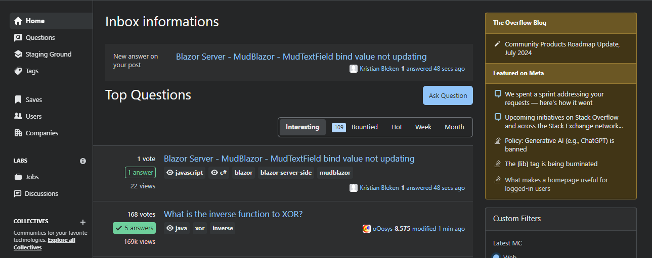
That could be nice if we have a quick summary on top of the homepage about all update on Q&A we are following. One advantage of this, is to keep the Q&A as main information of the homepage (as requested by the actual most upvoted answer by Kevin B).

Suggestion (made in few minutes) :

fake home page with suggestion

We could also imagine having a summary of reputation changes with like "x upvoted post, y accepted answer".

3
  • I could see this being annoying for someone who purposely leaves certain things unread to be looked at later, as now they're going to be bothered with it at the top of their home page every time they open it. I could though see this being a useful widget for the side bar to replace "recent tags" and or "recent badges" which both, rather than listing recent tags or badges you've interacted with or earned, list recent tags or badges the community has interacted with or earned.
    – Kevin B
    Commented Jul 3 at 15:57
  • @KevinB I partially understand. Firstly, I don't see "recent tags". Also, if you ask a question, it's to have an answer. That's the point: it's the main feature of SO to have answer, to for me, it would be logic to have unread answer from your post. I can understand for people that want to read their inbox later, but idk how many it represent
    – Elikill58
    Commented Jul 3 at 16:56
  • fair on recent tags/badges, they're "extra" sections that show up when you have ads blocked and HNQ disabled iirc
    – Kevin B
    Commented Jul 3 at 16:58
2

New users and users that only search, but never engaged need to be encouraged, and nudged to participate in the community. I have had many colleagues that only look for answers, and never bothered to create an account and actually engage in the site.

I tried to persuade one of my friends (and coworker) to actively participate, and he ended up getting fed up. I would encourage the developers of SO to create a new account for themselves and try to experience the new user experience for themselves. Many of the beginner questions have already been asked and answered, and if you are truly a beginner and don't know what terms to search for, SO is not very welcoming, to be honest.

Regarding retaining existing users, I would imagine that some intelligent highlights might be interesting. For instance: based on the latest searches and questions, potentially show some "potentially interesting questions".

Personally, my experience is that either I extrapolate answers from some searches, or end up asking questions that are so niche that the chance of other developers having a solution is not always a given.

2
  • 1
    This answer isn't really explain why it would be beneficial for such users to engage. SO was designed around the idea of a large passive community to amplify the work of the small number of people with expertise to answer. If they aren't adding to the capability to answer, and their questions are already answered, what benefit could they give to the site or themselves? Commented Jul 6 at 18:58
  • @user1937198 I don't agree - I see SO as a potential to learn and grow, and to encourage the users to learn and grow. If we can't attract passive users to engage, then part of the potential is still unused.
    – JoSSte
    Commented Jul 6 at 19:17
2

The more we can tailor this experience to a user, the better experience that user will have.

There's a misconception here that I feel is important in this discussion. It's true that the homepage would be more useful if it was tailored to the user's needs. The problem is with the third word in the quote above. You (meaning the developers behind the site) should not be tailoring the site to my needs. You don't know me at all. You don't know what I need or what I'd find irritating. You have millions of site users, each a unique person with unique desires, and there's no feasible way for you to get to know each of them enough to create something tailored for them. The best you could do is tailor the site for some abstract representation of an average site user, but you'd still end up with lots of people for whom the design wouldn't work at all.

Thankfully, the solution is straightforward. Don't tailor the site to me. Give me the tools I need to tailor the site for myself. You shouldn't have to waste the time and energy trying to guess what I need. The person that knows my needs the best is me, so why can't I decide what my homepage looks like?

IMO, the ideal StackOverflow homepage would work similar to the old iGoogle service. The page itself is just a container where users can place widgets in columns and rows. The user chose what they wanted to see (newsfeeds, weather, email, games, etc.), and how to arrange it. You could put together a good, very usable setup in a few seconds, or you could take your time and fine-tune it into a masterpiece of productivity. Maybe I want a single column view (like the current homepage) that shows me the newest Stack Overflow posts but only for my watched tags. Maybe I want a three-column view where I can see recent unanswered posts on Stack Overflow, History, and Home Improvement side by side. Maybe I want to combine all posts tagged emacs on Stack Overflow, Superuser, Server Fault, and Ask Ubuntu into a single column. Maybe I want a 3x2 grid of widgets showing information about the review queues on my favorite subsites. Maybe I want a list of the most recent activity on questions that I've asked.

In a sense, it's the basic UNIX philosophy. Don't build something that dictates my workflow. Instead, give me a collection of simple, useful tools and the flexibility to combine them in whichever way suits me best. The end result will provide far more utility for users across the board, plus seems like it would be easier for you to implement. Most of the data feeds people would want are already available on your website in various places. It would simply be a matter of empowering the user to indicate which ones they want and how to arrange them. This architecture makes it easy to add more advanced capabilities (like combining results from multiple sites, or specifying content via a SEDE query string) down the road. New functionality can be added without friction. Users can use new widgets if they want, or don't if they don't. Users have as much power and flexibility as they want to have, with a sensible default that works for most people.

0

I have two primary goals for the home page:

  1. I want it to be easy to ask a new question.

  2. I want it to be easy to find a list of questions that I might be interested in answering, and might be able to answer.

Right now, the existing home page does a great job at #1, and a terrible job at #2.

This seems like an outstanding opportunity for AI/ML to help identify questions that I might be able to answer and I might be interested in answering. It seems like it might not be too hard to build a classifier, based on questions I have answered in the past, to predict which questions I might be interested in answering in the future.

Right now the site has some tools to support that goal (e.g., tags, watched tags, search, etc.), but those tools have many limitations and haven't changed in over a decade. Rather than trying to make small incremental polishing improvements on those existing tools, I encourage you to think ambitiously about how you could make a major change in the relevance of the questions that are displayed on the home page, so that they are much more likely to be questions that I'm interested in answering and able to answer.

0

What a new user needs on Stack Overflow, and a home page is one way to support implementations of that, is:

  • tracking of the progress the newbie makes with understanding Stack Overflow rather unique concepts
  • use of that tracked progress to be better guided to avoid the many typical newbie mistakes
  • use of that tracked progress to be better guided to contribute to the goals of Stack Overflow
  • benefit of that by reducing the impression of toxic Stack Overflow (the impression, I am not saying Stack Overflow is)
  • gamification of the learning progress; feats, badges, challenges, displayed prominently on their homepage
    • "Your privilege to express gratitude for helpful posts is just a few helpful edits away"
    • take the guided tour to create your own follow-up question (safely in a simulator or the real thing)"
    • "ten clear steps to make your own well-received homework-related question"
    • "see the world of sibling sites, e.g., for having your working code reviewed for potential improvement"
  • investing in that learning progress, as a treat, an incentive, to spend the effort of learning. E.g. "Welcome to Stack Overflow, and thank you for creating an account. You are eligible for a free class of excellent contribution to the goals of Stack Overflow; at your own university, your city or online at your home". Or maybe only the least expensive one online...

For example:

You are creating your first answer post. But from your phrasing, it seems that what you actually want to do is say 'thanks', 'me too', or to ask a different question, even if a direct follow-up. Would you like help with doing one of those things in the Stack Overflow way?

(Sorry for the clippy vibe. I only spot the lack of guidance, while myself being not very gifted in providing it.)

And later in progress:

Thanks for creating another answer post, but after successfully doing so a few years ago, some time has passed, and it seems that the new post is not on the same level of quality. Instead, it seems to rather be a new separate question.
Would you like to review the guide on creating an answer in contrast to a question, or the guide to create your own follow-up question which refers to this one?
We know that the 'Ask Question' button is rather unobviously hidden at the top right of the page, while the 'Post Your Answer' button is the most inviting after reading through a page. So this is the offer to help you make the best use of it for your purpose.

The precise implementation of this (few false positives and false negatives...) could be based on the many ingenious bots used in moderation chat rooms (e.g. SOBotics) and of course could be an excellent way to leverage the new commitment to using AI in a user-friendly and helpful way.

If this leads to a change of the common meme "Stack Overflow is toxic to newbies" to "Stack Overflow is very good at helping newbies to find great help, as long as they log in", then several benefits could be harvested with one (admittedly huge) change.

Most successful to make that change of meme would be hearsay, after people found out about it.

It might however be worth to contact some education institutions (university lectors/professors, anything offering programming courses ...).
The current impression that students get bad advice there on how to (mis-)use Stack Overflow could be turned around to students getting recommendations to create an account, log in and use the guidance. Currently, they seem to be told to expect toxicity and how to (unhelpfully) try to deal with it (Oh hello September, you seem somewhat early this year...).

I could go into details of observable behaviour... but I think that is unneeded here for several reasons. Anybody really concerned about the experience new users have is already aware of them.

-6

One thing I haven't read yet, is the fact that Stack Overflow is just one of the many Stack Exchange sites:

Therefore, I would like to emphasise, next to encouraging active participation, on encouraging well aimed active participation.

3
  • 2
    How does this answer the question, which is "what would make the Stack Overflow home page useful for logged in users?" (emphasis mine)
    – TylerH
    Commented Jun 28 at 15:13
  • most askers happen to be logged in. what people are primarily considered "logged in users"? Commented Jun 29 at 13:45
  • My read of this is to suggest that the logged-in homepage should encourage users to check out the rest of the network. Whether one agrees with that or not, it appears to answer the question.
    – Ryan M Mod
    Commented Jul 23 at 17:52

You must log in to answer this question.

Not the answer you're looking for? Browse other questions tagged .