-12

I got tested in this answer and didn't pass. The answer:

try using argon2-wasm-esmpackage, instead of argon-browser, this solution worked for me, and I got the same errors as you did...

https://github.com/imyelo/argon2-wasm-esm

Since I don't really understand the problem or the answer, this level of detail looks OK to me. I took a look at the question, but still saw it as OK. I understand that perhaps I'm not the right person to judge if this level of detail is enough or not, but at least the test should ask me if I'm confident on the answer before giving it to me. I have 10 years of experience on this site, so if I still not be able to tell how much level of detail is needed, then I guess the problem doesn't come from the lack of experience of the site's norms nor the lack of paying attention as the notice claims, but on the nature of the question and answer. I hope I'm not denying anything.

I think this can happen to others as well. Obviously they should skip the review, but as the UX does ask them if they think it's OK or not, there is a chance that they will click on it. I think having direction on this will help them review better. The notice should also state that if they don't feel sure about the question, they can always skip it.
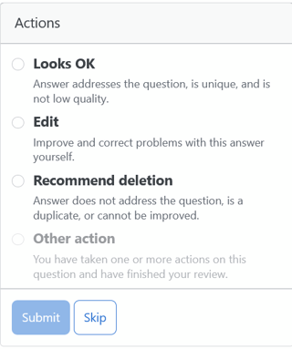
enter image description here

10
  • 10
    If you're not sure, you can always skip.
    – VLAZ
    Commented Mar 23 at 11:28
  • 11
    "Since I don't really understand the problem or the answer" => [Skip] Commented Mar 23 at 11:43
  • thanks for the suggestion. I didn't get that. I've changed the question slightly.
    – Ooker
    Commented Mar 23 at 12:17
  • 5
    So are you saying that Skip isn't prominent enough? The button is right next to the Submit button, and just as large (in terms of height, it's not in width as "Skip" is a shorter word than "Submit"). You suggest the UX is less than desirable, but don't suggest alternatives; what, in you opinion, would make the UX better?
    – Thom A
    Commented Mar 23 at 12:39
  • @ThomA yes, it's right there and still I didn't think that I should have clicked it. My suggestion: "I think having a direction on this will help them review better". Maybe just a text saying "if you don't feel sure about what the problem is, click skip"
    – Ooker
    Commented Mar 23 at 13:05
  • 1
    You should add that to your question then, @Ooker .
    – Thom A
    Commented Mar 23 at 13:46
  • 3
    I suggest showing in this case Hey, this is an audit! Click here!. I'm pretty sure we'll still have folks fail that audit.
    – rene
    Commented Mar 23 at 17:33
  • 3
    Does something this obvious really need to be explicitly explained? The review queues are a form of quality control. What other sensible thing is there left to do when asked to review something you don't understand, other than moving on? What's next? Instruction sheets on chairs telling people how to sit?
    – Dan Mašek
    Commented Mar 23 at 22:19
  • 1
    @DanMašek you see it as chair, but it may not be that obvious to everyone. That's one point of doing UX research: to know that when you need to print instruction to sit on chairs
    – Ooker
    Commented Mar 24 at 3:03
  • 3
    I certainly see the point. The UX railroads one into taking an action, the UI part that allows skipping is something one (at least I) only focuses on after deciding on an action. It might help if the actions themselves include a "I don’t know" option. Commented Mar 24 at 5:41

1 Answer 1

0

I am not a subject-matter expert but I do not have to be one to tell that the answer is recommendation of a tool argon2-wasm-esmpackage and then provides a link. According to Why and how are some answers deleted, link-only answers are not considered answers and get deleted.

Though there is some nuance, for example if someone is asking how to perform a task with a specific technology or API and an answer says to use a specific function within the technology they are already using, and by the way they provide a link to the documentation, the answer may appear to be a link-only answer even though the answer is arguably useful without the link. But recommending a third-party tool, without showing how the tool works and solves the problem, is not.

Over time I have developed mental heuristics to distinguish between the first kind (Delete) versus the second kind (Looks OK or maybe Share Feedback), but ultimately they boil down to if the link is a third party repository that requires installing the tool, or a link to an existing documentation that is part of the technology the question. Or asking yourself if the answer would be useful at all (even a little bit) without any links.

3
  • 1
    "recommending a third-party tool, without showing how the tool works and solves the problem, is not [OK]" — is there any further discussion on this? Because I see that there are tools or libs that don't really require much effort to learn how to use it. In here, the name of the package feels useful enough even without the link. I know you will say that this is better a comment, but I don't see how it's not an ok answer
    – Ooker
    Commented Mar 26 at 3:51
  • 2
    @Ooker Because it's still fundamentally a 'here, you can find a solution behind this tool' rather than 'this code/method/whatever will solve your problem and you will not need to leave the answer to find it.'
    – CPlus
    Commented Mar 26 at 3:52
  • Ah, so you mean that if it's a function, then just merely telling its name and not how to use it will be enough for the experienced askers to solve their problems without having to read the the docs?
    – Ooker
    Commented Mar 26 at 6:56

You must log in to answer this question.

Not the answer you're looking for? Browse other questions tagged .