This experiment has concluded. We've gathered and analyzed the results in Results of the voting arrow experiment.
This week, we're rolling out a test to update the appearance of voting arrows for both questions and answers, which will bring some accessibility gains, namely affordance, feedback, and meeting WCAG compliance; it also maintains aesthetic cohesiveness between services, by bringing them in line with the voting displays on Teams and articles within Collectives. To be clear, this does not include comment voting arrows, nor does this update include any changes to the mechanisms in voting.
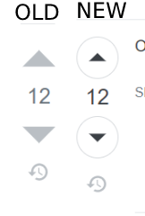
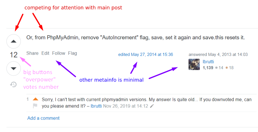
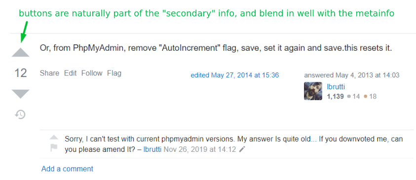
First, the up and downvote buttons are getting fancy new coats. Wrapping the vote buttons in an outline like this makes them look more actionable, which is an environmental clue for users, especially new ones. (These are buttons, come press them!) This should make them easier to use and more obvious, which should lead to more engagement with them.
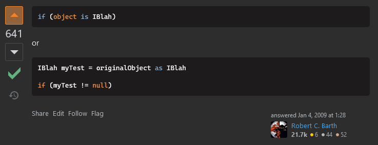
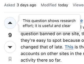
We're also updating how the arrows look after a user has voted. The older arrow contrast change upon voting does not meet WCAG accessibility contrast tests. Along with updating the color for compliance, we're also adding clearer feedback for vote status. You'll see contrasting colors for up and downvotes. This offers more clear and visibly distinct feedback upon voting.




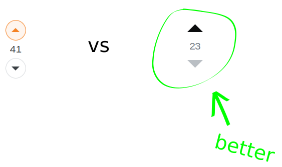


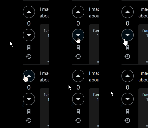


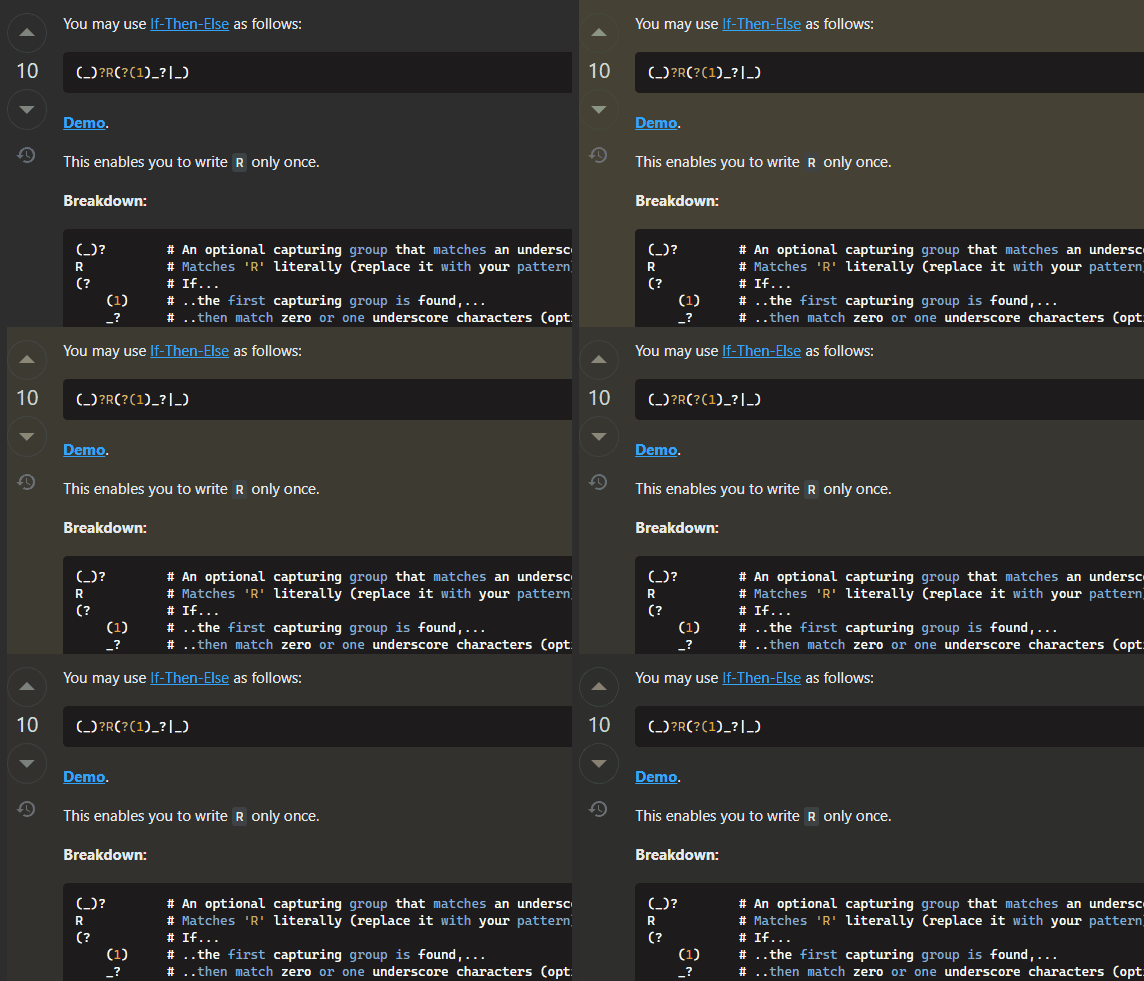
border-radius: 1000px;which would fit with the rest of the UI much better. And since we're at it, I have never been a fan of that orange color once the button has been actioned. Orange has a warning / caution connotation for me (even though people will disagree with that statement). I would either use green for up, red for down, or blue for both.