22

Observe, from my profile page:

enter image description here

This appears when you navigate to the Profile of any user on Stack Overflow. Every other site in the network (including MSO) shows the older UI (again from my profile, this time on MSO):

enter image description here

Why was this change made? Is it going to be applied to Meta Stack Overflow as well? What about other sites on the Stack Exchange network?

7
  • 3
    Looks to be on MSO now, too.
    – Cody Gray Mod
    Commented Jun 23, 2021 at 15:19
  • @CodyGray Looks the same as always for me. Caching perhaps? Commented Jun 23, 2021 at 15:19
  • 3
    Oh wow. Now I'm not seeing it on Meta, either. Definitely caching, or a roll-out in progress. Either that or I'm going crazy.
    – Cody Gray Mod
    Commented Jun 23, 2021 at 15:21
  • 1
    shouldiblamecaching.com? :þ
    – pxeger
    Commented Jun 23, 2021 at 15:23
  • 2
    Hope it's a roll-out in progress, because that looks guuuud. Especially with Dark Mode.
    – Ollie
    Commented Jun 23, 2021 at 15:31
  • 4
    similar MSE post When will the new Stack Overflow badge design come to other sites?
    – Tomerikoo
    Commented Jun 23, 2021 at 15:43
  • I like it, but wish I saw it on meta as well. It seems to be a caching problem on the other sites.
    – 10 Rep
    Commented Jun 23, 2021 at 18:45

3 Answers 3

13

This was a part of the Collectives launch earlier today. We added a "badge" (sorry, no better term here) to the profiles if a user was a part of a Collective. In order for this to fit better visually, design felt that something else on the page should be modernized as well. Based on research, we also decided to move badges up within the profile as well.

10
  • 8
    So, does this updated badges/tags UI in the profile page roll out to all other sites for consistency? Or will it remain SO-only because only SO has Collectives?
    – Cody Gray Mod
    Commented Jun 23, 2021 at 15:37
  • 4
    What is a Collective(s)?
    – Luuklag
    Commented Jun 23, 2021 at 15:48
  • 3
    @Luuklag meta.stackoverflow.com/questions/408585/…
    – Cody Gray Mod
    Commented Jun 23, 2021 at 15:48
  • 3
    @CodyGray the Public Platform team will get this scheduled for an upcoming sprint
    – Piper StaffMod
    Commented Jun 23, 2021 at 16:16
  • 7
    I'm sorry, but this doesn't look like it's using the real estate on the profile page in a way that's interesting. The big images do not convey any information at all. It may look fancy, but it just forces me to scroll more to get the information that I'm interested in. Badges are the least interesting part of a user's profile.
    – Scratte
    Commented Jun 23, 2021 at 23:18
  • 5
    They look much, much better than the old ones. Commented Jun 23, 2021 at 23:23
  • Re "...to the profiles if a user was a part of a Collective": I must have been absorbed into a Collective, then... Commented Jun 23, 2021 at 23:35
  • "Your Collectives" appears empty and says "We couldn’t find any collectives. Have you joined a collective yet?" Commented Jun 23, 2021 at 23:40
  • 1
    @PeterMortensen When I go to that link on your profile, I can see the "Other collective invitations" toggle and turn it off :O
    – Scratte
    Commented Jun 23, 2021 at 23:50
  • 2
    it is terrible decision, and terrible design. I don't care what badges a user has. why would I? I sometimes check what tags they participate in the most, and this new thing totally gets in the way. just terrible. do remove it ASAP.
    – Will Ness
    Commented Jun 25, 2021 at 16:38
4

This is now network-wide. Enjoy!

enter image description here

1
  • 2
    I had hoped the roll-out would have been to put it back to the bottom of the page. But no.. :'(
    – Scratte
    Commented Aug 4, 2021 at 22:31
3

Here is a rough (pre-coffee) first pass from this morning at reverting the styles for anyone who wants that in their user script. It's not pretty, but it works. If I get some free time or people bug me I may clean it up or replace it with a JS version, which I'm sure would be much cleaner. As usual add it in a user style add-on to sites on the domain of stackoverflow.com or meta.stackoverflow.com.

One arguably more important change made in combination with this is the reordering of badges to be above tags and posts... this is a mistake, in my opinion, because badges another user has earned are the least important of the three, and should be at the bottom of the page.

This new order means we have to scroll past the badge section space to get to a user's more relevant content, even if the user hasn't earned any badges (or only a few 'beginner' badges)...

body.user-page #badges svg {
    display: none;
}

body.user-page #badges > .grid > .grid--cell > .grid > .grid--cell:not(.mb12):last-child ul > li > div a, body.user-page #badges > .grid > .grid--cell > .grid > .grid--cell:not(.mb12):last-child ul > li > div > div {
    font-size: 12px !important;
}
body.user-page #badges > .grid > .grid--cell > .grid > .grid--cell.mb12 > .grid > .grid--cell.fl1 {
    display: flex;
    flex-flow: column;
}

body.user-page #badges > .grid > .grid--cell > .grid > .grid--cell.mb12 > .grid > .grid--cell.fl1 > div {
    text-align: center;
}
body.user-page #badges > .grid > .grid--cell > .grid > .grid--cell.mb12 > .grid > .grid--cell.fl1 > div:first-child {
    order: 2;
}
body.user-page #badges > .grid > .grid--cell > .grid > .grid--cell.mb12 > .grid > .grid--cell.fl1 > div:last-child {
    order: 1;
}
body.user-page #badges > .grid > .grid--cell:first-child > .grid > .grid--cell.mb12 > .grid {
    border: 1px solid #f1b600;
    border-radius: 3px;
    background-color: #fff4d1;
    color: #3c4146 !important;
}
body.user-page #badges > .grid > .grid--cell:first-child > .grid > .grid--cell.mb12 > .grid > .grid--cell.fl1 > .fs-caption {
    visibility: hidden;
    position: relative;
    margin-top: 4px;
}
body.user-page #badges > .grid > .grid--cell:first-child > .grid > .grid--cell.mb12 > .grid > .grid--cell.fl1 > .fs-caption::after {
    content: "GOLD";
    font-weight: bold;
    color: #6a737c;
    font-size: 11px;
    visibility: visible;
    position: absolute;
    left: 0%;
    right: 0%;
}
body.user-page #badges > .grid > .grid--cell:first-child > .grid > .grid--cell.mb12 > .grid > .grid--cell.fl1 > .fw-bold {
    color: #3c4146 !important;
}
body.user-page #badges > .grid > .grid--cell:nth-child(2) > .grid > .grid--cell.mb12 > .grid {
    border: 1px solid #9a9c9f;
    border-radius: 3px;
    background-color: #e8e8e8;
    color: #3c4146 !important;
}
body.user-page #badges > .grid > .grid--cell:nth-child(2) > .grid > .grid--cell.mb12 > .grid > .grid--cell.fl1 > .fs-caption {
    visibility: hidden;
    position: relative;
    margin-top: 4px;
}
body.user-page #badges > .grid > .grid--cell:nth-child(2) > .grid > .grid--cell.mb12 > .grid > .grid--cell.fl1 > .fs-caption::after {
    content: "SILVER";
    font-weight: bold;
    color: #6a737c;
    font-size: 11px;
    visibility: visible;
    position: absolute;
    left: 0%;
    right: 0%;
}
body.user-page #badges > .grid > .grid--cell:nth-child(2) > .grid > .grid--cell.mb12 > .grid > .grid--cell.fl1 > .fw-bold {
    color: #3c4146 !important;
}
body.user-page #badges > .grid > .grid--cell:last-child > .grid > .grid--cell.mb12 > .grid {
    border: 1px solid #ab825f;
    border-radius: 3px;
    background-color: #f2e9e1;
    color: #3c4146 !important;
}
body.user-page #badges > .grid > .grid--cell:last-child > .grid > .grid--cell.mb12 > .grid > .grid--cell.fl1 > .fs-caption {
    visibility: hidden;
    position: relative;
    margin-top: 4px;
}
body.user-page #badges > .grid > .grid--cell:last-child > .grid > .grid--cell.mb12 > .grid > .grid--cell.fl1 > .fs-caption::after {
    content: "BRONZE";
    font-weight: bold;
    color: #6a737c;
    font-size: 11px;
    visibility: visible;
    position: absolute;
    left: 0%;
    right: 0%;
}
body.user-page #badges > .grid > .grid--cell:last-child > .grid > .grid--cell.mb12 > .grid > .grid--cell.fl1 > .fw-bold {
    color: #3c4146 !important;
}

body.user-page #user-card + div > div.grid--cell.fl1:nth-child(2) {
    display: flex;
    flex-direction: column;
}
#top-tags {
    order: 1;
}
#top-posts {
    order: 2;
}
#badges {
    order: 3;
}

Here's what it'll look like back at the bottom of the profile page:
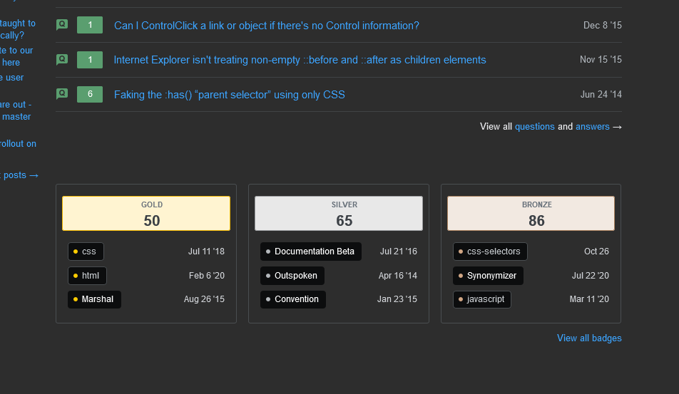
enter image description here

I've noticed extra-long badge titles will overflow the badge 'background'... a consequence of adding flex properties, borders to things that previously didn't have borders, and restricting the width of the column. I'll work on that later, if I have time.

11
  • 5
    It's nice that you've done the CSS work. However, your point about the vertical position of the badges on that page is something that's worth a complete feature request question on its own, not just stuck as a brief side mention in what is primarily sharing the CSS work you've done.
    – Makyen Mod
    Commented Jun 23, 2021 at 19:11
  • @Makyen I agree, but I think given all the changes going on today it is something that should wait a few days or maybe even weeks, otherwise it will just get lost.
    – TylerH
    Commented Jun 23, 2021 at 19:12
  • 3
    Given that they've said they're actively working on this area now to bring it to all SE sites, I disagree that it's a good idea to delay.
    – Makyen Mod
    Commented Jun 23, 2021 at 19:13
  • 1
    @Makyen By all means feel free to take the issue and run w/ it with your own FR; I am a bit busy currently :-)
    – TylerH
    Commented Jun 23, 2021 at 19:14
  • 1
    Yeah, I know that feeling.
    – Makyen Mod
    Commented Jun 23, 2021 at 19:15
  • Are you aware that "grid" and "grid--cell" is being deprecated?
    – Scratte
    Commented Jun 23, 2021 at 23:21
  • @Scratte No, since I'm not part of the Stack Overflow developer team I don't know what changes they plan to make to their code base.
    – TylerH
    Commented Jun 24, 2021 at 13:26
  • I think one doesn't need to be part of the developer team for this. It can be seen On Stack Design and on StackExchange/Stacks on GitHub
    – Scratte
    Commented Jun 24, 2021 at 21:52
  • @Scratte Which are places not really visited except by the developers...
    – TylerH
    Commented Jun 24, 2021 at 22:37
  • 1
    I visit those places because I make user scripts and custom CSS changes. But by your response, I reckon you'd prefer to not be informed.
    – Scratte
    Commented Jun 24, 2021 at 23:03
  • @Scratte No, I'd rather they just not make certain changes, honestly. Barring that, I am not interested in the changes to be proactive, e.g. anticipating them. Currently I'm still content with reacting to bad changes. It is what I've grown used to.
    – TylerH
    Commented Jun 25, 2021 at 13:41

You must log in to answer this question.

Not the answer you're looking for? Browse other questions tagged .