I work at Stack Overflow as a Senior Analyst and I have helped create many of the data visualizations you have seen recently on the blog!
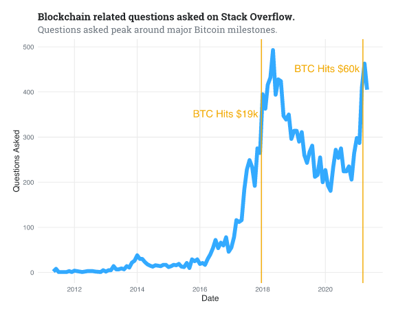
In this most recent post, the charts were first created using ggplot2. ggplot2 is a very popular data visualization library in R. Why use R? Well at SO we have a long history of using R and RMarkdown to create and share our analyses internally. Because many analyses require some form of data cleaning R becomes preferable as we can keep the entire data extraction, data cleaning, and analytics in one environment. We also have created custom ggplot themes with our brand font and color palettes. This theme allows us to standardize how we present internally and externally. But we can go a step further as you saw in our most recent post.
Example plot exported from R with our branded theme and color

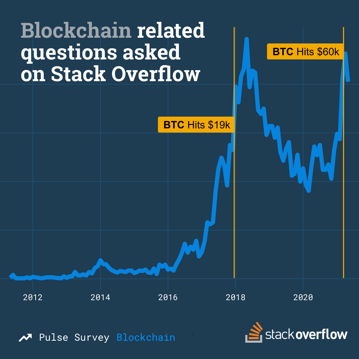
Since R allows us to export images as an SVG we can then pass all files over to our brand design team where they can further customize the appearance. Currently, they use Figma which lets them change colors, change background add text, and so on. The end product is what you see on our Most developers believe blockchain technology is a game changer post.
Example plot with additional Stack Overflow branded elements

Hope this answered your questions and feel free to ask anything else!


