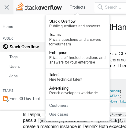
All other dropdowns in the top bar are somehow implemented the same way, sharing their style and allowing only one of them to be open at the same time. Products, however, does not only look different, but can also be opened in parallel to other menus.
This should probably be changed to use the same look and feel as well as technology, to create a cohesive user experience.
