-84

Background

We’re kicking off the first bit of work that will allow us to better communicate with members and visitors via the website. This work will be done incrementally over the coming months. Ultimately it will work across the entire Stack Exchange network, but initial usage will focus on Stack Overflow.

The overall goal of this work is to provide the product team a direct method for onsite communication with members and anonymous users in a way that is appropriate for the message being delivered. This means there will be unique designs that match the intent, priority and objectives of the message. We will be targeting our messages to the people who we need to communicate with. In some cases we will notify everyone on a site or the entire network, in some cases we will limit a notification to users of a specific product (e.g. Jobs or Channels) or a very small subset of a community with a particular problem (e.g. people who have a problem with their account).

We know that some users may not be happy about seeing these messages. We will do our best to try to give you control by making messages dismissible. Please understand that better array of communication options are critical for our business in order to deepen user engagement.

New Feature notification details

The first new notification you will see is for announcing new or significantly improved features. We call it the "new feature" notification (creative, eh?). Maybe some of you saw it for a brief moment on Tuesday. We had to turn it off after some bugs were discovered with the notification and the feature it was announcing. It will likely be turned back on tomorrow (Thursday 9/21).

The “new feature” notification shows up in the top bar and looks like this:

It is accompanied with content balloon that informs you about the details of the new feature:
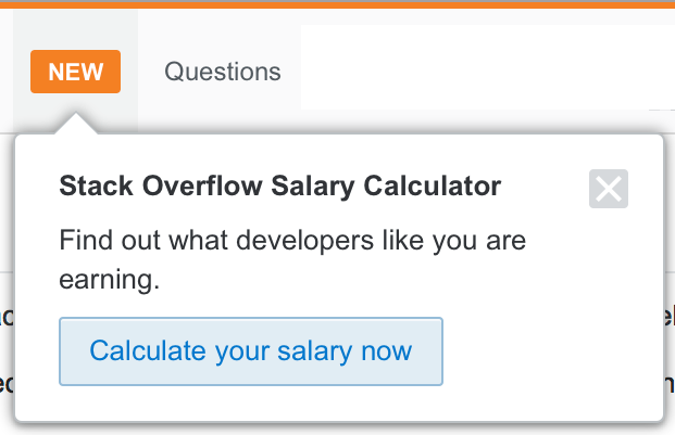
We are testing a couple variations of the interaction and dismiss logic. Our desire is to create something that stands out when it needs to, but goes away when it isn’t needed any longer.

This is a work in progress and we appreciate your constructive feedback.

Clarifications based on feedback in the comments and answers

Why are you shoving Jobs at me? I’m not interested!

The “new feature” notification (from here on referred to as NFN) is telling you about new features or significant future improvements. These features could be for Q&A, Jobs, Channels or some future product area. This is NOT a feature to push users who aren’t interested in Jobs to Jobs.

Why don’t you show the notification to only those who care?

As mentioned above, there is a lot of work that we will be doing in the future to enable us to target these messages to just the right folks. In this case, we think the salary calculator is generally interesting even if you aren’t looking for a job. Also, we are hoping that people in regions where we don’t have data, will volunteer their data so that we can build out the calculator. For those reasons, we are notifying all our users.

Why didn’t you use the inbox or community bulletin?

  1. Increased visibility: We want to really draw attention to new features as they are released. This helps expose everyone to them and gives us good data on what is working or not. We want a special notification for this purpose so that is doesn’t get lumped into other general communication
  2. Wrong medium: Inbox messages are highly targeted and relevant to you, not a general broadcast mechanism.
  3. Anonymous users: These notifications need to reach anonymous users as well as signed in members. Neither the community bulletin or the inbox currently work for those users. We're planning to redesign the community bulletin, but taking the current iteration of either to anonymous users is not in the cards.

Aren’t you testing two versions?

Yes, we tested two versions:

  1. simply displays the orange NEW in the topbar. It would persist for the duration of the campaign unless you interact with it. When you click on NEW it displays the content bubble. After clicking the CTA or click dismiss it would go away.
  2. auto displays the content bubble. If you click on the X it goes away.

We are going with design #2. It is a more direct and clean experience and it resulted in 350% more visits to the new feature.

Notification dismiss

Users can dismiss a notification and you won’t see it again. This is a per-instance dismiss. You will see a NFN when a different feature is released. There is no connection between the email settings and on-site notifications.

NOTE: The initial version required two clicks to dismiss permanently. It was my choice and it was wrong. My logic was to distinguish between two user scenarios: 1) let me carry on with what I'm doing and get back to this later vs. 2) get rid of this forever. My logic was wrong. We are fixing it so that clicking X will immediately dismiss. Clicking off or esc key will hide the balloon.

THIS is what DAG is working on?

The DAG team is working on a variety of projects simultaneously. I'm working on a post to update everyone on the work that is on ongoing and on the top of our backlog. And, we are coming back to the community with an update on how the mentorship experiment went (really cool stuff).

What the heck, you’re announcing this thing three different ways!

Currently there is the “new feature” notification and two items in the Community Bulletin that are promoting the same new feature. Each one plays a unique role. The NFN points directly to the feature, the blog post provides details, the meta post is where you give feedback. As mentioned, we are in the process of reworking the Community Bulletin (how we point people to important blog posts and meta discussions). One approach we will evaluate is to rationalize these things into one thing that points to the various components. This is the start of reworking some of the mechanisms that allow us to communicate with the community. It will include significant changes and minor tweaks. We don’t have it all planned out, but we certainly want all the parts to work well together.

I hope these additional details help clarify some things raised in the answers/comments below. Active users on meta give us early indication of feedback from our most dedicated users. We treat that feedback seriously in the context of the over 3 million signed in users who visit the site each week and the over 50 million monthly visitors who visit monthly. Keep the feedback coming.
31
  • 2
    Will this be automatically enabled if we check to receive emails of new features? or will it be separate from that.
    – Kevin B
    Commented Sep 21, 2017 at 6:51
  • 21
    Besides the possibility to give messages a fancy look and feel, why didn't you choose to deliver these messages via the existing global inbox?
    – user247702
    Commented Sep 21, 2017 at 8:31
  • 5
    @Stijn We tried that before with the announcement about the ToS changes. It did not go well. People were getting their inbox items days/weeks later. We had hack it to remove the notification from inboxes - Jon mentions that here. This allows us to remove the notification after a period of time.
    – Taryn StaffMod
    Commented Sep 21, 2017 at 12:27
  • 7
    Oo. I really don't like it. I really don't like it. I do quite like Tanner's suggestion in that answer.
    – Ajean
    Commented Sep 21, 2017 at 23:14
  • 17
    Also, I think this announcement needs to be featured - I didn't see anything until I was hit in the face with the BIG orange button, went to Meta, saw Travis J's question (now closed as a dupe of this), followed it here. I think there will be churn when people see the BIG orange button without knowing what the heck is going on.
    – Ajean
    Commented Sep 21, 2017 at 23:23
  • 7
    It's not? I thought it was about that big orange button-looking thing that you can click and dismiss if you want in the top bar. So maybe it's not technically a button, but I think if you at least make it clear via all caps on "new" or some other way that that is what it's about. When I look at the Meta front page the first thing that makes itself obvious to me about this topic is Travis J's closed question.
    – Ajean
    Commented Sep 22, 2017 at 1:25
  • 14
    Informs user base, gets overwhelmingly negative responses, does it anyway.
    – Liam
    Commented Sep 22, 2017 at 14:13
  • 12
    hmm... that's even worse than what i was imagining. I was picturing the innards of the dialog being slightly smaller and part of the header, but that's instead a dialog that sits over site content until you interact with it... At least with the 'NEW' button alone it stays out of your way
    – Kevin B
    Commented Sep 22, 2017 at 20:57
  • 10
    If your goal is for every user, regardless of interest, interacts with this particular part of the site, what you are doing is no better than those sites who open up a modal dialog when you visit the page asking for you to sign up for a newsletter. but... at least with those you can dismiss them by clicking away or pressing escape.
    – Kevin B
    Commented Sep 22, 2017 at 21:11
  • 9
    "We are going with design #2. It is a more direct and clean experience and it resulted in 350% more visits to the new feature." - Does this mean every time there is a new feature, we get the annoying overlay we have to click past? (Like so...and I want you to appreciate the irony of that article title with the overlay)
    – Andy Mod
    Commented Sep 28, 2017 at 1:49
  • 7
    so much for feedback. why bother
    – Kevin B
    Commented Sep 28, 2017 at 1:57
  • 7
    If you're going to outright ignore my feedback, can you at least give me a profile option to turn of "NFN" permanently?
    – user4639281
    Commented Sep 28, 2017 at 2:09
  • 34
    The "we've heard your feedback, but decided to ignore it and move ahead with what we had already planned" attitude is extremely off-putting. As in, reading this update actually made me angry. You call them "clarifications", but they're really just dismissals, and suggests that your whole "we want feedback" message is really just a farce. I realize this sounds harsh, but it's how I'm starting to feel a lot lately when dealing with announcements from the team, and it's really starting to affect my attitude regarding the site. I can't tell if you mean it that way, or it's merely accidental.
    – Cody Gray Mod
    Commented Sep 28, 2017 at 9:03
  • 18
    I'll second what @CodyGray has stated above. Also, "we think the salary calculator is generally interesting even if you aren’t looking for a job", I don't believe this. The aim of that was to get people to look at jobs when they realise they are underpaid. The result screen leads directly to: Get started with Stack Overflow Jobs and Jobs you might like
    – Tanner
    Commented Sep 28, 2017 at 11:21
  • 14
    "These notifications need to reach anonymous users as well as signed in members. Neither the community bulletin or the inbox currently work for those users." the update on my answer shows that the sidebar (blog links) do show for anonymous users, so that's not entirely accurate as it's there in some guise.
    – Tanner
    Commented Sep 28, 2017 at 13:02

9 Answers 9

110

As others have mentioned, I would very strongly prefer to see these notifications added to one of the places that already exist for housing notifications: either the omnipresent Community Bulletin on the right sidebar of all pages, as Tanner suggested, or as special types of messages pushed to the global inbox (where users are already accustomed to looking for new updates), as Stijn suggested.

I very much dislike the idea of putting yet another new widget in the top bar. Why? Well, for starters, it's already crowded enough up there. Additionally, dynamically-inserted widgets create confusion and disrupt muscle memory, because they re-shuffle the positions of the normal items that I'm expecting to see there. (Sure, this might lead to more clicks for purely statistical purposes, but that's pretty dishonest, and accidental clicks from frustrated users aren't what you're looking for.)

If this absolutely must go into the topbar as a dedicated new item, then my third and final plea would be that you reconsider its proposed location. Where it's placed now makes it look like Stack Overflow itself is new—it looks like a "badge" on the Stack Overflow logo, much like the "Meta" badge that appears to the right of the Stack Overflow logo on the Meta site. It might help if you tweaked the design so it looks a bit more like a button, rather than a static badge, but I still don't think that's the correct approach. It's a notification, not a navigation link, and all notifications in the topbar go on the right-hand side. Please move it so it is among friends.

On a positive note, I think it's reasonable to have a way for the company itself to reach out to and communicate directly with users, so I don't hate the idea. I also appreciate that you've taken the time to make it dismissable. I just think it could be better incorporated within the existing features and design.

16
  • 3
    Yeah, I dislike the idea of having this type of notification in the top bar, that's for ever present navigation links and that shouldn't change IMO. Documentation... Cough... wait where did it go?!
    – Tanner
    Commented Sep 21, 2017 at 10:37
  • 6
    Failed due to lack of notifications, @Tanner
    – Cody Gray Mod
    Commented Sep 21, 2017 at 10:45
  • 1
    unfortunately... if it's implemented as currently planned... i won't benefit from it. (it won't exist)
    – Kevin B
    Commented Sep 21, 2017 at 15:38
  • 1
    great. now i have a flashing orange box in my header every time i reload
    – Kevin B
    Commented Sep 21, 2017 at 18:31
  • @KevinB It should be dismissible? Are you not able to do that?
    – Taryn StaffMod
    Commented Sep 21, 2017 at 18:49
  • 6
    stackoverflow.com##A[data-unread-class="unread-feature-notice"] fixes it
    – Kevin B
    Commented Sep 21, 2017 at 18:50
  • 2
    @KevinB click the "X" in the box that pops up, it dismisses the pop up, and the "NEW" tag... it seems a little non-intuitive to me
    – CDspace
    Commented Sep 21, 2017 at 20:25
  • 3
    yeah, but that requires me interacting with (validating) a feature i don't want.
    – Kevin B
    Commented Sep 21, 2017 at 20:29
  • 9
    Ah, thanks @CDspace, never thought of clicking it. Seems the New button needs a notification about the New button. Commented Sep 22, 2017 at 1:23
  • @HansPassant We have two different versions running. One auto-pops the content bubble. It results in 400% more traffic to the new feature. It is also WAY more obvious what you need to do to dismiss it. So, overall it's better UX. Looks like you're seeing the more passive version.
    – Joe Friend StaffMod
    Commented Sep 22, 2017 at 18:09
  • 31
    @JoeFriend I think you are confusing "user experience" with "page views". Being forced to interact with a dialog doesn't improve my experience. It forces me to find a way to clear the dialog so that I can do what I wanted to do in the first place.
    – Andy Mod
    Commented Sep 23, 2017 at 2:18
  • 2
    @JoeFriend I'm seeing the auto popup version every time I load a Stack Overflow page. Clicking X dismisses it until I load a new page and it's back again! Most annoying! Commented Sep 24, 2017 at 20:17
  • 3
    @joe if all you want is to increase the number of requests incoming to the server, a simple userscript can do the trick. Let me know if you want me to swamp you with HTTP requests... Commented Oct 12, 2017 at 20:41
  • Stackoverflow Meta New :)
    – gitsitgo
    Commented Oct 16, 2017 at 20:40
  • 1
    Stack Overflow is still [NEW] and the notification still sucks...
    – Tanner
    Commented Apr 30, 2019 at 15:33
100

Just posting this in case anyone else was wondering.

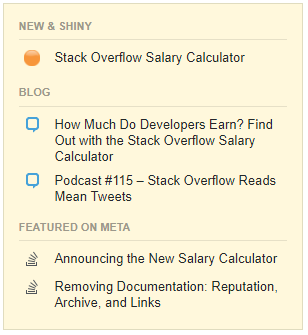
Why not just use the current sidebar for notifications? What are the benefits or doing the extra development work to add this functionality for announcements over the existing mechanism that people currently use?

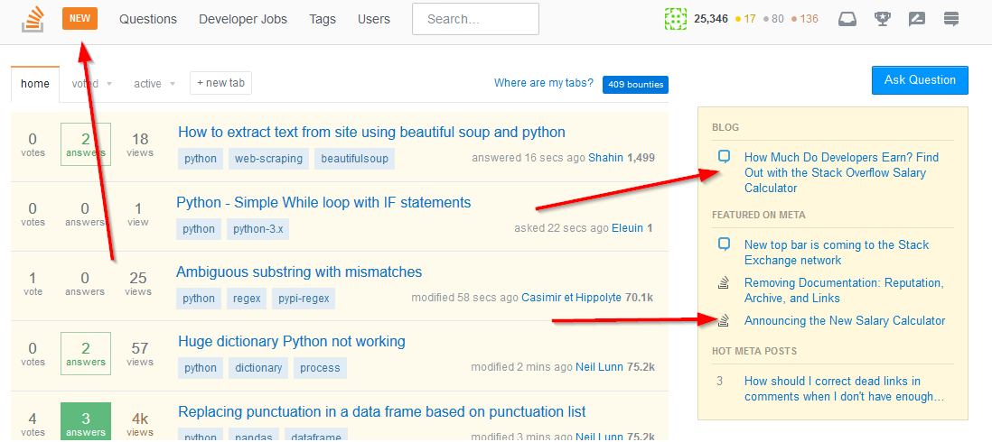
Example:

enter image description here

I'm aware that you have the extra information and the balloon, but presenting it in the sidebar would allow people that are interested to click through and get to that information if they choose to.

With regards to communicating with the community, what will the new mechanism achieve over using meta as you've always done?

Update:

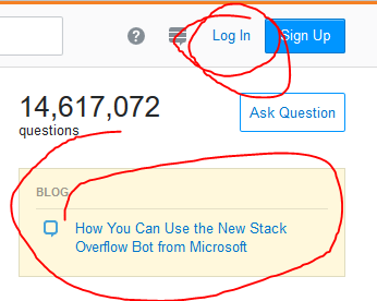
I'm generally always logged in, so I wasn't aware of this, but as @Shog9 commented, you don't see the bulletin when you're not logged in.

However, you do see the Blog links, so these kind of announcements could in theory live along side that content.

enter image description here

Update 2 [BUMP]

Stack Overflow is still [NEW] and the notification still sucks... Just had the displeasure of trying to get rid of it with multiple clicks... again!

10
  • 42
    I refuse to accept this as a sidebar addition unless the "& Shiny" part can be kept. I don't like non-shiny things!
    – animuson StaffMod
    Commented Sep 21, 2017 at 17:27
  • 1
    Any suggestion that gets rid of that huge baby-blue button gets my vote, really. But yes, shiny is good.
    – Gimby
    Commented Sep 22, 2017 at 7:31
  • 2
    I'll only upvote this answer if the "shiny" word is a reference to Firefly....
    – DavidG
    Commented Sep 22, 2017 at 8:56
  • @DavidG I can confirm it is... goes off to Google Firefly
    – Tanner
    Commented Sep 22, 2017 at 14:13
  • 1
    Even if not that is how I shall choose to take it :). Plus, shiny things are always good, even if you don't know the Firefly reference. I really love this mockup you made, it's new-looking enough to get extra attention, it's in the same area as other featured things, and it evokes positive feelings about what is there.
    – Ajean
    Commented Sep 22, 2017 at 15:28
  • 1
    I like this idea, given that it's exactly the sort of problem that the bulletin was created to address. Just one problem: you don't see the bulletin if you're not logged in. That's a show-stopper for any feature available or of potential interest to anonymous users or that affects login itself.
    – Shog9
    Commented Sep 22, 2017 at 18:40
  • 29
    then... show it when you're not logged in... ?
    – Kevin B
    Commented Sep 22, 2017 at 19:35
  • 7
    @Shog9 I'm not clear on exactly what makes SE think anonymous users that don't even care enough to register a profile, could be a showstopper for anything. Commented Sep 24, 2017 at 16:23
  • 2
    By that logic the entire site could go behind a login, @matt. Anon users are the vast majority of readers; even folks who have an account aren't necessarily logged in on a given site or machine.
    – Shog9
    Commented Sep 24, 2017 at 17:06
  • 11
    @Shog9 the blog links in the bulletin are visible though when you're not logged in, so it's not entirely a show-stopper.
    – Tanner
    Commented Sep 25, 2017 at 13:20
71

This feels completely unnecessary.

First, it's not obvious at all that "NEW" is something I should be clicking on. Instead, it looks like Stack Overflow is new. Hooray...9 years late. I didn't click on it. I just assumed it was a badge thing. It also rolled out around the same time as the network wide top bar changes that I'd noticed on another site. I thought it had something to do with that.

Second, now I see the same announcement three times. Just in case seeing it once or twice wasn't enough, there is now a third option. It's NEW!

Same announcement three times!

This is the biggest reason it feels completely unnecessary. The information under that "NEW" button is already listed twice on Stack Overflow and once on other Stack Exchange sites. If I click on it and end up at the exact same spot either of the other two options provided me, I've wasted my time.

Third, a question about your goal:

Please understand that better array of communication options are critical for our business in order to deepen user engagement.

The way it is described, this will be used for one way communication. Stack Exchange to user(s). What user engagement metrics are you aiming to improve with this change?

Prior to this answer being posted, there were three other answers. One flat out suggests you tricked them into clicking the link. A second implies that accidental clicks will occur due to how this is manipulating the top bar. Neither of those statements sound like positive user engagement.

Users are waiting with bated breath for the announcements regarding changes to the Q&A side that will help improve quality. That's the user engagement announcements many are waiting for.

5
  • 10
    I agree with this; I'm puzzled about what the use case/user story was here. To be fair, however, I am assuming that they want to use this to announce the new Q&A features. But I'm still not holding my breath, because I'm pretty sure I'd pass out waiting.
    – jscs
    Commented Sep 22, 2017 at 12:12
  • @Andy You raise some excellent points. I'm working on updating the post to address them. I don't understand this point: "Prior to this answer being posted, there were three other answers. One flat out suggests you tricked them into clicking the link. A second implies that accidental clicks will occur due to how this is manipulating the top bar. Neither of those statements sound like positive user engagement." Can you help and guy out and explain or point to the examples?
    – Joe Friend StaffMod
    Commented Sep 22, 2017 at 18:16
  • 9
    "I felt a bit tricked by the NEW button, and also annoyed at the continued focus on Jobs at the expense of Q&A." - Jeffrey's answer "Sure, this might lead to more clicks for purely statistical purposes, but that's pretty dishonest, and accidental clicks from frustrated users aren't what you're looking for." - Cody's answer
    – Andy Mod
    Commented Sep 22, 2017 at 18:18
  • @Andy We aren't trying to be dishonest nor trick anyone. We will adjust the experience if that is a continued perception. I certainly don't think that any users should feel tricked at all into clicking on the "Calculate your salary now" button on that notification. The content in that notification is very direct and clear. I think that the version of the experiment that didn't auto-display the content bubble has serious usability issues and is less successful in leading people to the new feature. So, while it is more "aggressive" it actually works better.
    – Joe Friend StaffMod
    Commented Sep 22, 2017 at 18:46
  • 30
    @JoeFriend Sure it is more effective in getting users to interact with it, it is extremely jarring and must be interacted with in order to see the content on the page. If you're looking for more effective ways, you could just replace the entire page content with a giant blinking ad for Jobs. That would be sure to have the same or better effect in alienating your user base, all while being much more effective at getting people to click the link.
    – user4639281
    Commented Sep 22, 2017 at 21:12
47

When I saw the NEW button, I thought, "Hey, they actually implemented something!"

Then I clicked it and was disappointed to find it's the salary calculator, which is pretty much a Jobs ad. I felt a bit tricked by the NEW button, and also annoyed at the continued focus on Jobs at the expense of Q&A.

If you want to show off a new Jobs feature, move the NEW button into the "Developer Jobs" section on the bar. At least that way I won't feel like you tricked me into clicking on an ad.

As for the lack of focus on Q&A, just giving us a periodic progress report on what Team DAG is doing would help. SO's done the ask for suggestions, then ignore them thing before, so if you're not showing us anything, I'm not giving you the benefit of the doubt.

7
  • 8
    I wholeheartedly agree
    – user4639281
    Commented Sep 22, 2017 at 0:19
  • It's not just for the salary calculator, it's for any announcements and new features they want us to know about. The salary calc just happened to be the current one they tested it with
    – CDspace
    Commented Sep 22, 2017 at 2:42
  • 8
    @CDspace Yes, I understand it's not just for the salary calculator. I'm annoyed that, despite recent promises of reinvestment in Q&A (the "Team DAG" stuff), the feature they feel is worth obtrusively notifying everyone about turned out to be a Jobs ad. It served only to remind me of the disconnect between what they feel is worth doing (or what they feel they have to do) with what I think they should be doing. Like my answer says, I would feel less bad about it if it was in the "Jobs" section of the topbar, because I wouldn't have felt tricked. Commented Sep 22, 2017 at 3:14
  • 15
    I dared not mention it, but this is exactly the seed that Joe's question planted in my mind. So, you're the PM for DAG, and this is what you've been working on? Not exactly what we were promised...
    – Cody Gray Mod
    Commented Sep 22, 2017 at 6:14
  • What @CDspace said. I, personally, think that salary calculator is valuable to people who aren't looking for jobs. But that's just me. Also, the DAG team is working on a variety of projects simultaneously. I'm working on a post to update everyone on the work that is on our backlog. And, we are coming back to the community with an update on how the mentorship experiment went (really cool stuff).
    – Joe Friend StaffMod
    Commented Sep 22, 2017 at 18:19
  • @CodyGray Does your team at work execute on only one thing at a time? Probably not. Neither does DAG. We are working on a variety of projects including ideas in the question quality space which is what we promised to do. More details coming next week.
    – Joe Friend StaffMod
    Commented Sep 22, 2017 at 20:44
  • 10
    @JoeFriend I look forward to it! But do keep in mind that we can't tell what you're doing if you don't let us know. Probably the reaction to this notification would have been significantly better if it happened after the DAG status update. Timing is sometimes everything.
    – Ajean
    Commented Sep 23, 2017 at 0:17
18

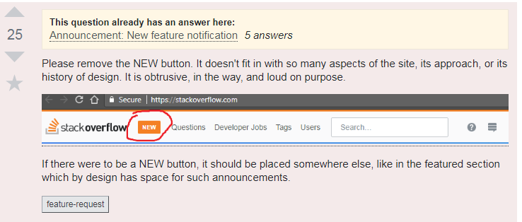
Remove the NEW button.

Apparently I missed this announcement and asked a separate question regarding removing the new button. I deleted the question, as I didn't know this one was available, and did not want to spread this all over the place.

Here is the feature-request I posted for <10k

enter image description here


edits

I see that apparently I was not properly using the feature. There is an [x] in the dialog box which opens after clicking the new button. Clicking the [x] will then remove the new button.

However, this is rather counter intuitive. Perhaps it would be better if the new button itself had an X in the upper right hand corner, or if once opened it simply went away. As it stands now, if you select the new button, and look in there, then go somewhere else, it remains. This causes it to lose its reddish color for grey, however, it still remains indefinitely. From a UX standpoint that makes it rather hard to use. If the new button is visited, it should simply go away after page refresh.

1
  • 3
    I'd like to see an option for logged in users to not see the new button at all, and just show us new stuff in the community bulletin as we're used to. If you're not logged in and don't see the bulletin, as stated in the comments on my answer, fair enough, show the new button if it's impossible to add the sidebar in. I think this would please the core community that have shown their disappointment in this implementation. It probably won't align with the work they've already done in the background though for stats collection. I guess they could have considered that people don't like change.
    – Tanner
    Commented Sep 28, 2017 at 17:15
17

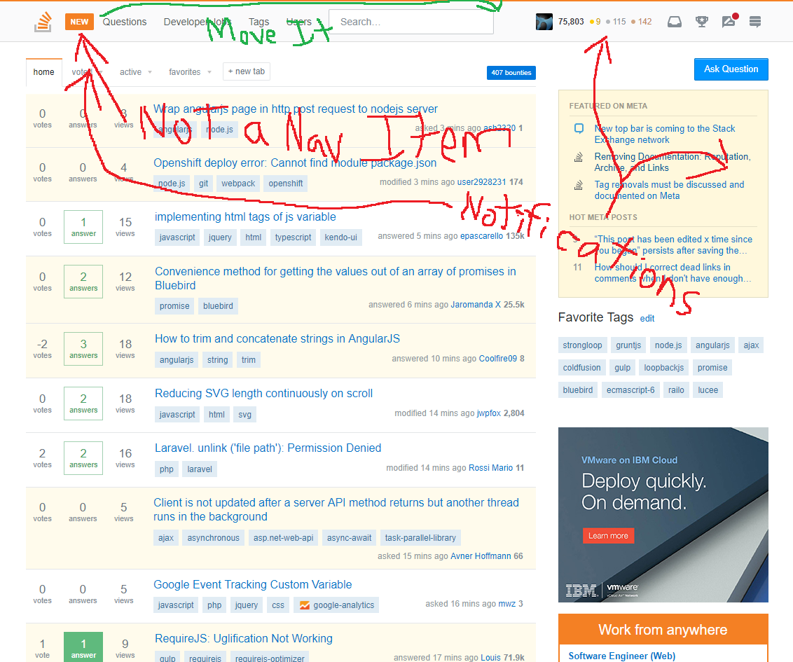
At the very least, move the 'NEW' icon to the right of the search bar, make the icon permanent, and make the icon far less noisy. Give it a red dot until it's been read like most other notifications.


What we have here is an advertisement thinly disguised as a notification that is further disguised as a navigation item. I don't mind notifications. I don't mind advertisements. What I do mind is when advertisements are injected into my navbar. The fact that the salary tool was chosen for this test case proves to me that SO as a company cannot adequately discern the difference between an advertisement and a notification. This deeply worries me due to past actions involving political messages. If it's already being abused just in the test scenario, all hopes of it not being abused later are thrown out the window.

enter image description here

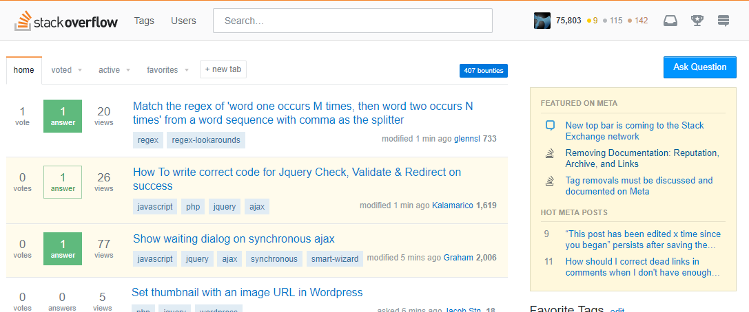
Ever since we got our new and improved navbar, I've been making my own small modifications to it to tailor it to my usage. I don't care about the Jobs area and feel it shouldn't be part of Q&A, I find the Questions tab to be redundant, I prefer the larger logo so it's easier to click the link I use the most, and don't want to be notified about review queues that I never visit. Here's what it looks like when I'm done:

enter image description here

The notifications on the right stay within the right column; Q&A on left side of the page, shiny things on the right. This allows me to easily keep focus on the areas of the site I am interested in. New/featured meta posts and blog posts in the bulletin, inbox notifications where they belong, no flashy review queue icon pressuring me into reviewing garbage posts, a far more productive environment for finding answers and answering questions.

As far as blocking the new feature notification, I'd rather the notification be done in such a way that I don't feel the need to block it. I like finding out about new features, but I do not want that notification sitting right next to the link I click the most nor do I want a popup that I might miss by simply clicking the page. Keep the notifications quiet and to the right. I'd rather it be a permanent icon on the right side of the search box or in the bulletin where notifications like this belong.

14

I've seen many sites with this kind of "new feature" notification, and they're always a sign of designing for what corporate wants instead of for users, just as much as having a front page with a million links. If your new feature were actually relevant to me, I would discover it in the course of using your site, without you having to wave it in my face. If you want people to actually engage with your feature, not just do the minimum action necessary to improve your "engagement numbers", you need to show it to the user when it's relevant to them - and when I've just googled an unrelated question is not that time.

The choice of feature to experiment with is really not a good one if your aim is user acceptance. As it happens, I already clicked through to the salary calculator when it was announced in the community bulletin. It doesn't work for me at all, because my skills are not listed. From the look of the discussion on meta, it only works for a minority of people.

In all, my experience of this new feature was like this: I came to a question from Google. In front of the page I expected to get was a pop-up message, "Hey, use our new thing," for a thing I'd already tried to use previously and which doesn't work for me at all.

Did you hire the person who invented Clippy? I don't know how else you could have arrived at an anti-feature so insensitive to user needs.

11

This seems counterintuitive and incongruent with the rest of the site design.

If there wasn't this automated popover, I probably never would have noticed the new addition there (or only much, much later).

SE has always been displaying new / interesting stuff on the right hand side of the screen, with HNQ and announcements and blogs and meta features being there.

Why exactly add another bar? I'd think most people will probably not look on the left side for announcements when most of them have been on the right side for years now.

3
  • 1
    Simple answer is that this is the beginning of reworking how we communicate interesting stuff. It will include Community Bulletin. We will be doing this work in small chunks so that we can experiment and learn. Ultimately it will result in a coherent system that works well together.
    – Joe Friend StaffMod
    Commented Sep 22, 2017 at 18:22
  • 3
    @JoeFriend I totally get the "small chunks" idea and and I don't object to that at all, but in this case I think it's actually working against you in terms of user reaction. It's not very clear from this announcement post that the goal is a "complete and coherent system" (the first paragraph touches on it but not as explicitly as it could). So from our perspective all we can see is a new thing that doesn't groove at all, quite literally popping up in our faces (in some cases). It might have been better to pitch it as "we're reworking this whole notification stuff, and ...
    – Ajean
    Commented Sep 23, 2017 at 0:13
  • 2
    ... here's just part one - what do you think?" rather than posting in a way that makes it seem like it's being rolled out in isolation "here's the new feature notification that we're going to be using from now on". If I really read super carefully I can maybe pull what you said in your comment out of the question, but it takes work, and I don't think I'm the only one who didn't interpret it that way right off the bat.
    – Ajean
    Commented Sep 23, 2017 at 0:13
11

I have heard from a friend who does not have an SO account that he gets this message nearly once a day.

That seems... excessive.

7
  • 1
    The current behavior is that if you ignore it or if you just click off of it, then it will come back. If you directly dismiss it, then it won't come back. Also, it will also stop displaying after the end of the campaign date. Each new feature is only featured for a specified period of time. We should probably put a max number of impressions so that it isn't displayed over and over again during the same campaign. Other constructive suggestions are welcome.
    – Joe Friend StaffMod
    Commented Oct 16, 2017 at 20:37
  • 12
    @JoeFriend Or you could come up with something that your entire userbase doesn't hate... I know that doesn't seem like a logical thing to do at all (I mean the goal is to alienate the userbase, right?), but I have a sneaking suspicion that it might actually be a better path to take, though it may defeat the purpose of the exercise (alienating users) so I understand if that isn't in the cards.
    – user4639281
    Commented Oct 16, 2017 at 20:48
  • @TinyGiant If you have something specific to propose that provides a unique focus on new features as we release them (e.g. not a putting them in a generic place like the community bulletin), then the team is all ears.
    – Joe Friend StaffMod
    Commented Oct 16, 2017 at 20:55
  • 11
    @JoeFriend You've had plenty of feedback and ignored all of it. Ultimately it isn't my job to come up with a design that doesn't alienate, aggravate, or frustrate users. That's your job, and you're not doing it very well, in fact you're doing the opposite. Let alone the fact that you seem to think that the opinion of the community is completely irrelevant to your job. Why would I do your job for you, knowing full well that you would just ignore it, and take the fact that I had done said work to prove that your design was in fact perfect. Honestly I haven't seen much much sense in what you say.
    – user4639281
    Commented Oct 16, 2017 at 21:00
  • 3
    Any solution that isn't irritating to us isn't going to achieve the goal of getting as many users as possible to see/interact with it. that's just how it be. Before long it'll have a pinging sound.
    – Kevin B
    Commented Oct 16, 2017 at 21:13
  • 2
    Ok this wasn't posted to be a singular "argue with everyone" post. Just a single piece of feedback that it's excessive for someone without an account (and who mustn't click dismiss?).
    – enderland
    Commented Oct 16, 2017 at 22:05
  • 1
    The thing is.. it isn't excessive for anonymous users any more so than it is for non anonymous users. If you dismiss it with the X or click the action, it'l go away. If you dismiss it in any other way, it'll keep coming back until the campaign is over. If you clear your cookies/stored data every day when you close your browser, it will of course keep coming back regardless of whether or not you dismiss it as an anonymous user. Not much anyone can do about that, technically each case is a new user at that point.
    – Kevin B
    Commented Oct 16, 2017 at 22:13

You must log in to answer this question.

Not the answer you're looking for? Browse other questions tagged .