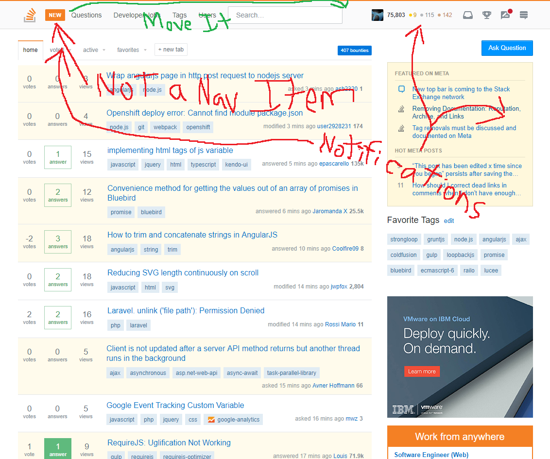
At the very least, move the 'NEW' icon to the right of the search bar, make the icon permanent, and make the icon far less noisy. Give it a red dot until it's been read like most other notifications.
The way it is now, I get pissed off every time I see it.
What we have here is an advertisement thinly disguised as a notification that is further disguised as a navigation item. I don't mind notifications. I don't mind advertisements. What I do mind is when advertisements are injected into my navbar. The fact that the salary tool was chosen for this test case proves to me that SO as a company cannot adequately discern the difference between an advertisement and a notification. This deeply worries me due to past actions involving political messages. If it's already being abused just in the test scenario, all hopes of it not being abused later are thrown out the window.
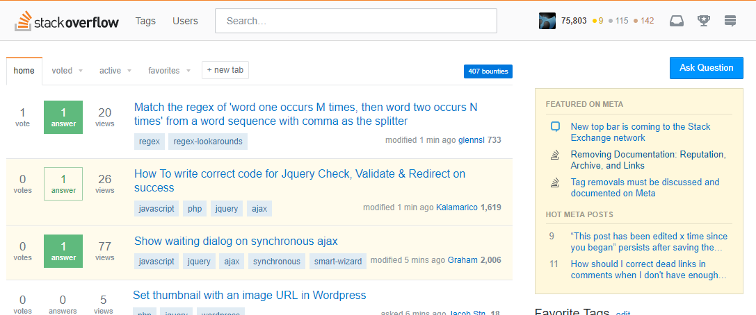
Ever since we got our new and improved navbar, I've been making my own small modifications to it to tailor it to my usage. I don't care about the Jobs area and feel it shouldn't be part of Q&A, I find the Questions tab to be redundant, I prefer the larger logo so it's easier to click the link I use the most, and don't want to be notified about review queues that I never visit. Here's what it looks like when I'm done:
The notifications on the right stay within the right column; Q&A on left side of the page, shiny things on the right. This allows me to easily keep focus on the areas of the site I am interested in. New/featured meta posts and blog posts in the bulletin, inbox notifications where they belong, no flashy review queue icon pressuring me into reviewing garbage posts, a far more productive environment for finding answers and answering questions.
As far as blocking the new feature notification, I'd rather the notification be done in such a way that I don't feel the need to block it. I like finding out about new features, but I do not want that notification sitting right next to the link I click the most nor do I want a popup that I might miss by simply clicking the page. Keep the notifications quiet and to the right. I'd rather it be a permanent icon on the right side of the search box or in the bulletin where notifications like this belong.

